Use Pinterest to Help Create the Home of your Dreams

pinterest_fultonAre you planning to move into a new Fulton Home soon? Or maybe you’re still getting settled and deciding how to decorate your new home. Well, even if you’re just looking for ideas to update your home and add some pizazz, we suggest checking out Pinterest.

If you’re not familiar with Pinterest, it is set up like a collection of bulletin boards, allowing you to capture a favorite room, product, color or idea and save it in categories of your choice. For example, you may want to look at kitchens, or possibly just different backsplashes. Just open a Pinterest account of your own, add a board named for whatever you want to explore, and then use the search option at the top to see what’s out there.

Of course, you’re welcome to visit our Pinterest site. We have 70 boards holding almost 1,400 pins, and we add new ones just about every week. Our pins range from various home categories such as dining rooms and closets to more family-oriented topics such as our newest addition: Arizona Summer Safety.

The Fulton Home’s Pinterest site has been designed with you in mind. Whether you’re looking for ideas for general entertaining, birthday parties or something special for Father’s Day, we invite you to check our boards out for suggestions and tips. And if you like it, follow it for a chance to stop by easily whenever you want.

And if you discover something of value, whether on one of our boards or any others, you can just repin to your own Pinterest site to hang on to the idea and information. Then when it’s time to plan that party or redo that bathroom, all of your ideas are saved in one place.

If you are looking for information or ideas that we don’t list on our site, just let us know and we can add a board or pins to answer your questions or provide tips. After all, it’s there for you. Check out our Pinterest site by clicking here. We look forward to your visit.

Pops of Red add Personality to Bedroom.

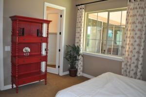
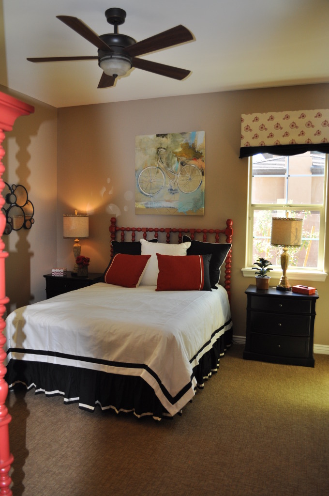
DSC_0090 (1)Whether the bedroom is a guest room, a child’s room, or your own, would you take a chance at adding strong color into the space?

Today it’s easy to find furniture in bright and inviting colors, or maybe you have a few pieces with nice lines but a dull look. A little paint and that boring piece can become the focal point of a room.

DSC_0091 (1)Two choices make this bed head and étagère stand out. The color is definitely one of them. The other highlight comes from the turned wood spindles that link the two red pieces together.

At one time, a bedroom like this would be loaded with at least one chest of drawers or dresser. These days, thanks to larger closets and well-arranged built-ins, most bedrooms can use furniture for decoration and style rather than clothes storage.

If you would like to create a mood like this in one of your own bedrooms but don’t have the furniture pieces, you can take advantage of consignment or thrift shops to look for older furniture with inviting lines. You don’t have to worry about the finish since you will be painting it.

Choose an accent color that works for you. It might be a red such as the one in this bedroom, or maybe a bright yellow, blue or green. If you prefer a more subtle color palette, consider a warm pumpkin or dark forest green. If you’re more daring, orange is still a popular color.

Pull the color into the room in other areas. For example, the curtains in this bedroom display elements of that same vivid red, and help bring the room together. You don’t have to keep everything red; the nightstands in dark wood work well in this space. Too much of even a great color can be overwhelming.

Want to take a closer look at this room as well investigating as a number of other interesting and creative design ideas for bedrooms? Visit our newest community, Legacy. We look forward to seeing you there.


Lighting that shows Style as well as Function

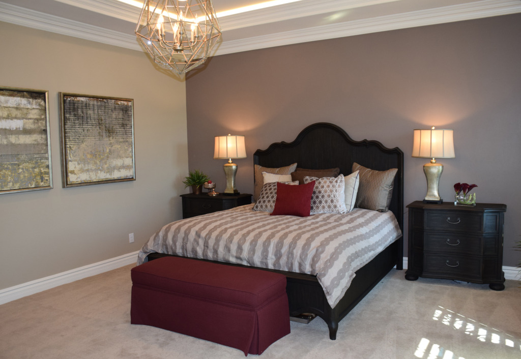
masterAs you plan your new Fulton home, don’t underestimate the design impact of the right lighting. A good lighting plan provides two benefits: the appeal of the lighting elements’ style in the home and the way the lights create the ambience you want.

Legacy Models 041More and more, chandeliers are moving out of dining rooms and appearing in master bedrooms, bathrooms and even walk-in closets. Any space that would benefit from the charm of an interesting hanging light works with the right choice of chandelier.

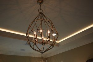
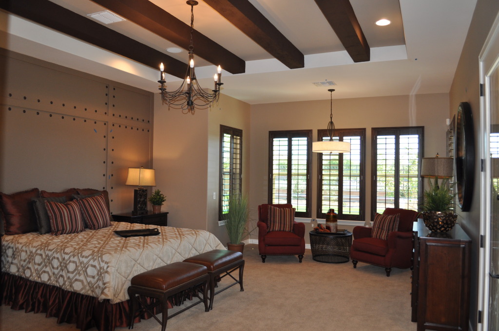
Take a look at the chandelier in this master bedroom from the Fulton model home at Legacy. The traditional candle style is modified into a transitional piece by the geometric cage surrounding it, creating a piece of interest and charm. Additional ceiling lighting combines with matching table lamps to make a space that is sophisticated and still inviting.

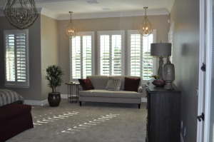
DSC_0091Adding to the mood, two smaller examples of the same style light up the seating area, helping to make it a special niche all its own.

Plenty of natural lighting also contributes to the mood of this room. Using shutters allows homeowners to adjust the light according to the time of day, bringing in the outdoors while shading away any glare.

Have you spent any time thinking about a lighting plan for your home? Combining style, mood and ambience, your home’s lighting can make the difference between a nice place and a well-designed space. For more ideas, visit the Fulton Design Center or the model homes at Legacy.


The Basha Unique Master Suite

DSC_0057 (1)Bedrooms tend to be boxes with closets, and master bedrooms tend to be larger boxes with larger closets. However this master bedroom, from Fulton Home’s Basha model at Legacy, takes several big steps outside the box.

Start with a rich coffered ceiling highlighted by dramatic dark wood beams. This creates a sense of a room within a room, providing a special focus on the area above the bed. Contributing to the special feeling provided by this “fifth wall,” the chandelier lets you recognize that luxury has an important role to play in this space.

Notice next the wall behind the bed. The pattern mirrors the feeling of fine leather with well-placed oversize tacks supporting this image. By providing a special wall feature combined with an indentation for the bed and nightstand placement, a cozy and private space for sleeping is created within the room itself.

Finally, the window-rich embrasure gives the bedroom’s occupants a separate area to relax after a long day. Imagine settling in those chairs with a cup of tea or your favorite beverage for a break before getting ready for bed. It would also make the perfect morning coffee location, with a few minutes to read the paper or check your phone for news or messages before starting your day.

Is this the kind of master bedroom you’ve dreamed of having? Does the rich warmth draw you in and make you want to relax within its walls? If so, we encourage you to explore it in person at the Fulton Home luxury Legacy community in Gilbert.


Guest Room Comfort

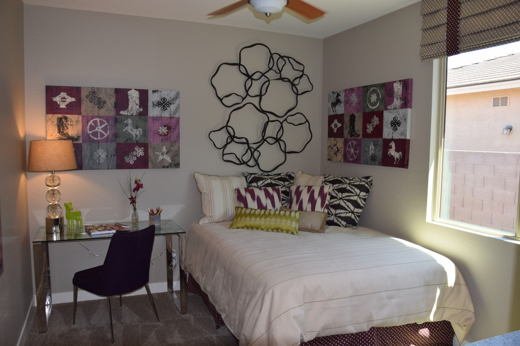
Corsica Model at Ironwood Crossing 027When you stay at someone’s house, what special features make the guest room memorable? The first and best thing a guest room can offer is comfort. After a day of sight-seeing or socializing with friends or family, it’s a pure pleasure to sink into a bed with a good mattress and a nice selection of pillows. This bed provides extra coziness with the plush bedcovering and plenty of pillows in all shapes and sizes – enough to prop your back against if you want to read in bed.

Have you thought about what guest room amenities you would appreciate? This room, from the Fulton Homes Corsica Model at Ironwood Crossing, offers a nice desk with a comfy chair in case you want to check email on your laptop, phone or tablet. Selecting a transparent desk and lamp keeps them unobtrusive while still functional.

A ceiling fan helps visitors from more temperate climates handle our hot summers in Arizona. And choosing carpet for the flooring will be appreciated by guests who forget their slippers.

To make your guest room more inviting, how about fresh flowers, several books or magazines for reading or just browsing through before bed, a few favorite snacks and some space in the closet for hanging clothes that wrinkle easily. Welcome your guests with a few little touches – if possible tailoring those special features to the personality and preferences of your guest.

So spend some time thinking about what you want in a guest room when visiting, and apply those thoughts to your own guest space. You’ll find that welcome guests enjoy their stay and will visit again.

Transitional Design – Bedrooms

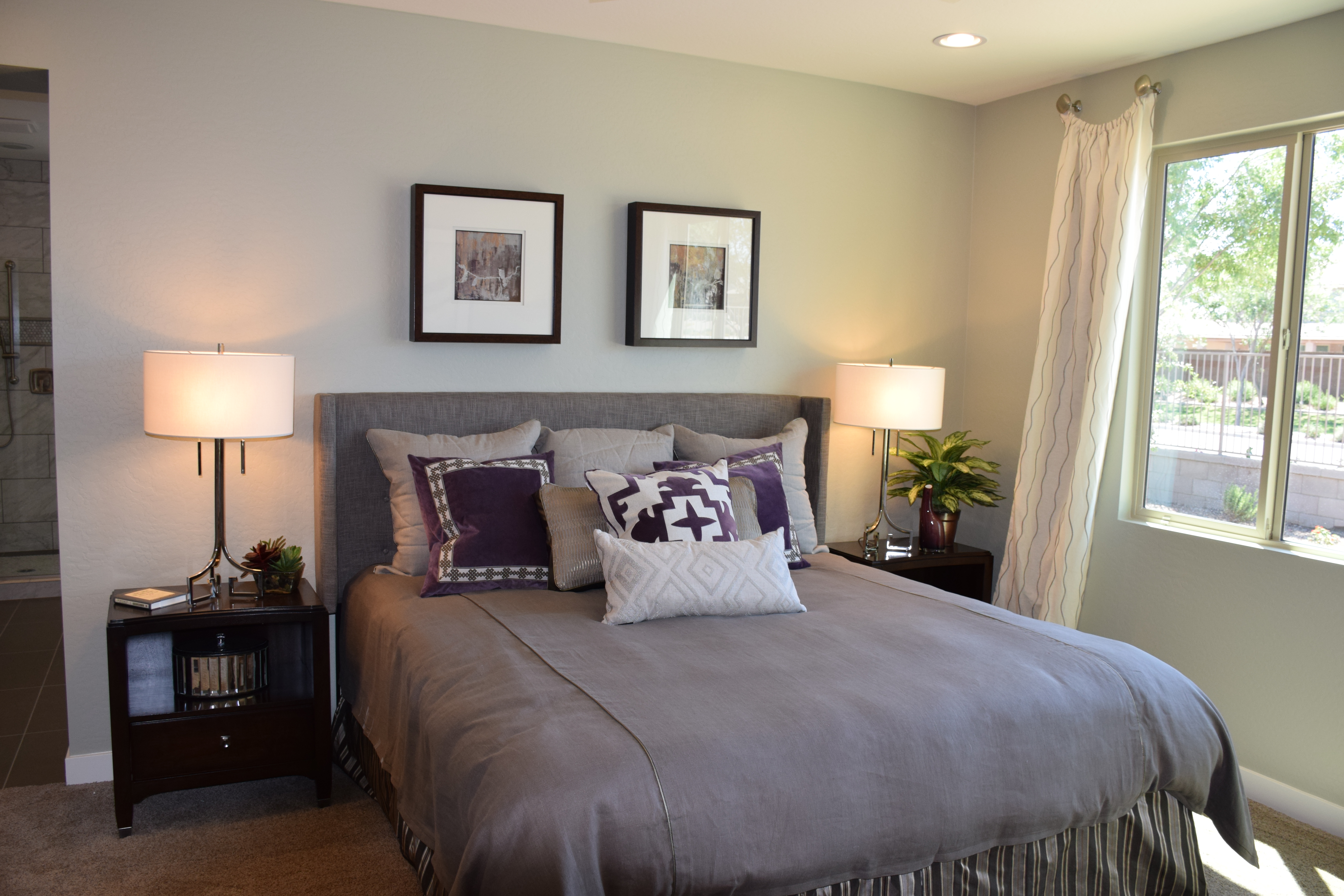
Corsica Model at Ironwood Crossing 028If you love contemporary design but still want a bedroom that is as warm and inviting as a traditional one, consider a transitional look. This combines the clean lines and colors of modern taste along with some traditional elements to maintain a warmer feel throughout your home. Let’s take a look at this transitional bedroom, from the Fulton Homes Corsica model at Ironwood Crossing.

First, the cool colors in the bedding reflect a contemporary sensibility. Black, grey and purple combine to make a bed that challenges standard color choices. Notice the rich selection of textures to add interest, with the velvet square pillows, wool bed headboard and cotton twill bedspread.

The shape of the headboard emulates traditional wing chair corners, but squared off to modernize the look. This headboard with its padding also makes the bed into a comfy spot for reading.

Matching lamps and nightstands demonstrates a classic traditional look, but the sleek lamp design and pure cylindrical shades provide the modern perspective.  The art is minimal and contemporary in flavor, but still follows the traditional symmetrical approach experienced with the nightstands and lamps.

With minimal accessories and simple window treatments in a contemporary fabric, this bedroom combines the best of traditional and modern to create a transitional space that is clean and still inviting.

Does the transitional style appeal to you? Then you may want to visit our Corsica model to see more ideas for designing and decorating the home of your dreams.

Decorating a Boy’s Room for Fun & Flexibility

Fire Bedroom DSC_0287

Fulton Homes Daylight Model

It’s fun to decorate a child’s room, and the photo to the left shows a delightful way to make a boy’s room special while allowing easy opportunities for changes as this child grows up. Take a look at the essential furniture. The headboard and lamps will work with almost any design.

One fun choice in this room comes from selecting shipping containers in place of standard nightstand/chests of drawers. While these will appeal to a small boy, they have the potential to be interesting elements as he grows into his teens. When choosing furniture for a child’s room, don’t be afraid to have fun, but think of the future for more substantial pieces.

The fireman theme carries through with inexpensive pieces such as bedspread, pillows and various toy fire trucks. By using stick-on and peel-off decorations on the walls rather than wallpaper, making a change to reflect the boy’s changing tastes is easy. These are available online and at various home stores in a good selection of themes. Notice that the sophisticated paint color allows transitions without repainting.

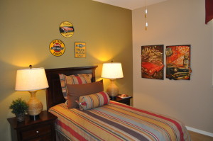
Car Bedroom DSC_0288The photo to the right provides a design choice for an older child. The metal signs and old-fashioned posters reflect specific interests while still demonstrating a sense of style.

The strong green focal wall gives extra oomph to the room and pulls in the stripes on the bedspread and pillows.

Both rooms would work well with either wood floors or a neutral carpet choice. It’s also smart to look for neutral window coverings such as wood blinds to keep the space flexible.

By taking this approach to a child’s room, you create the opportunity for the design to change frequently to reflect his or her changing interests without creating a need for a great deal of effort and expense.

Movie Design Inspiration: “American Hustle”

20672687_SThe film “American Hustle” is set in Atlantic City in the 1970s. For many people, this era is still too recent to bring back into your home, but there are elements to this style that may be worth a second look.

First, remember that this is Atlantic City – an East Coast version of Las Vegas. Therefore you’re looking at not just 70s décor, but over-the-top décor. Consider the luxurious evening gowns worn by the women in this movie – it’s all about glamour.

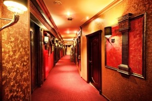
This hotel hallway carries through with that imagery. Patterned wallpaper, red carpeting and dark wood all combine to create the mood of the film. Notice the use of shaded sconces on the walls. This adds an old-world feel that spells money. This hotel was designed to give you the experience of a high-end hotel with a look that is much more common in the Eastern U.S.

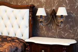
4550128_SWhile you may not want to carry the theme this far in your own home, capturing a bit of the design of the film is possible while still developing a décor that is glamorous without looking campy or dated. Take a look at the bedroom below.

The patterned wallpaper has a hint of the 70s style, but choosing a matte brown and white paper tones down the gaudiness present in the photo above while still capturing the best of that era.

Dark wood furniture also matches the style of the film, and the furniture selected here is rich with an authentically luxurious appearance.

Finally, by using shaded sconces with a light color to coordinate with other furniture in the room, this bedroom moves from furnished to thoughtfully decorated.

You don’t have to totally leap into a film’s style to use some elements from it to make a room in your home more interesting or inviting. Just select those ideas that work well for you.

Movie Design Inspiration: Breakfast at Tiffany’s

16689959_SIn honor of the Oscars last week, let’s celebrate movies by looking at how films can inspire room designs.

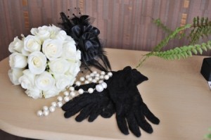
“Breakfast at Tiffany’s” provides a classic image of black, white, pearls and more than a bit of excess. The film made the little black dress with pearls a look that is always in style.

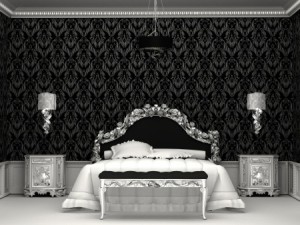
You don’t need a little black dress in your closet to set the stage for a room with a sophisticated and glamorous Tiffany feel. Start with black and white – a combination as classic as the movie. Black needs to be the strongest element, with only a few white elements for contrast.

10329773_SThe next step is some serious bling. The room to the right demonstrates this with the headboard, bench, sconces and nightstands sporting a metallic gloss. It really doesn’t matter whether the metal choice is silver or gold – it’s the sparkle that matters.

Notice also the ceiling molding. The edge looks something like a string of pearls – apropos for the Tiffany look.

Want to add a touch of color? The best choice to bring the movie to life would be Tiffany blue – that classic light color that covers every box from Tiffany’s.

8334795_SNo one who has ever shopped at Tiffany’s ever forgets their particular shade of blue –as much a part of their brand as the name and the store itself. If you’re fortunate enough to receive a gift from that store wrapped as the package on the left, it’s almost impossible to toss that box.

A throw pillow, vase or small box in Tiffany blue would give your room the final touch – and maybe you will feel just a bit like Audrey when you’re in it.

Making 2014’s Top Color Work in Your Home

25272599_SPantone, one of the most influential color companies in the world, selected its 2014 color of the year: Radiant Orchid. Soon you will see clothes, accessories, and home elements such as wallpaper, paint and linens in this vibrant shade.

If you’d like to incorporate Radiant Orchid into your life, here are a few suggestions, ranging from all out to a simple touch of this warm mid-tone lavender.

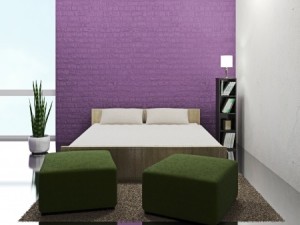
One inviting option involves paintable textured wallpaper and just the right shade of paint. This accent wall captures the feeling of Radiant Orchid, using a slightly darker tone to ground the wall.

11879796_SIntroducing a pop of the color in one strong block gives you the impact you want while making it easy to change in a few years if you fall in love with another color. Surrounding this wall with neutrals and bringing in a rich green – the natural complementary color for purple – allows the wall to draw the eye without overpowering the rest of the room.

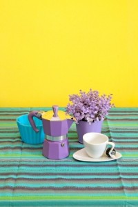
If you want to incorporate this Radiant color into your everyday life without a large investment of time, space or dollars, look for small functional home items to spark up your bathroom or kitchen. This espresso maker adds a splash of Orchid, and the tablecloth supports this with stripes that pull purples in as well as other colors to balance the look.

10643751_SMaking this type of decorating choice allows you to play with trending colors while still maintaining the longer-term look and style you enjoy. Combining trendy with classic elements such as the white cup and saucer shown provides a design balance that’s fun with staying power.

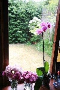
One final option: how about going simple by adding an actual orchid in Pantone’s radiant color such as this one to the left? After all, long before Pantone selected this color for 2014, nature had it featured in a number of its finest products!