Cozy Lounge

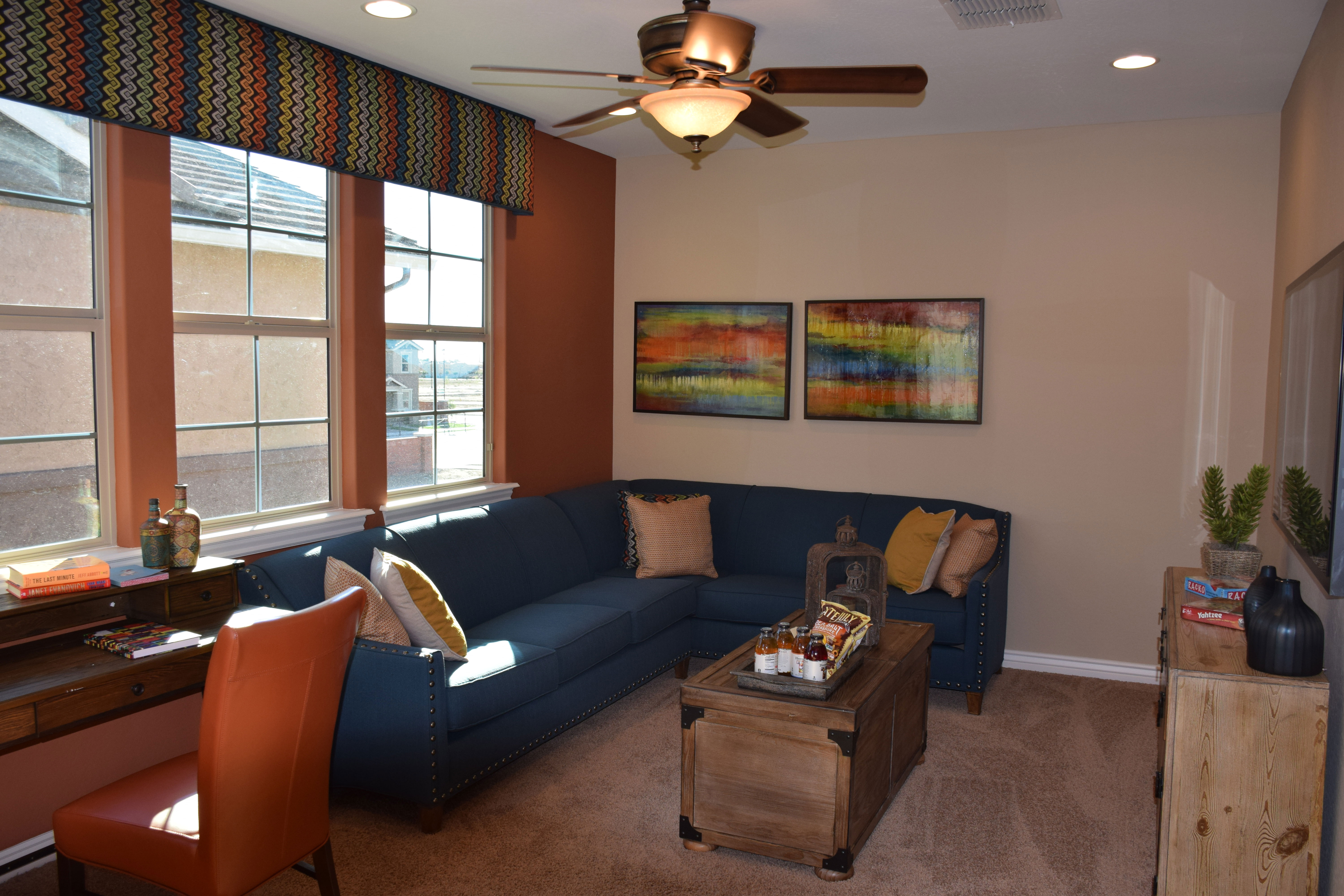
Cooley-Station-089-web - CopyHaving a living space up on the second floor right by the bedrooms makes sense. This cozy area, from the Sunset model in Cooley Station, provides an inviting space for lounging in the evening, watching TV, or just talking together.

This second-floor lounge is perfect for so many things. Parents with small children can relax here after a long day, taking a few minutes for themselves after the kids are asleep. Yet still being handy if someone has a bad dream or needs a glass of water. Teenagers can hang out here in a space separate from the rest of the house yet close by when it’s time for dinner. Or maybe you need a break from your day. This nook is a great spot to read a book, curl up and watch a favorite television show, or just nap on the sofa.

If you sew or have a hobby, this space is perfect to assign as you wish for working on a project. And everything is upstairs and out of the way of the rest of the family.

The colors of this room, rust and navy, work so well together. Using a strong rust-toned focal wall sets the stage for a space that’s not afraid of color. As a separate area, this lounge provides the opportunity to be daring and bring in colors that may not be part of the rest of your home decor choices.

To see this space in person, we invite you to visit our models in Cooley Station. We think you’ll find a lot to like there.

 

Family Room Uses Brown

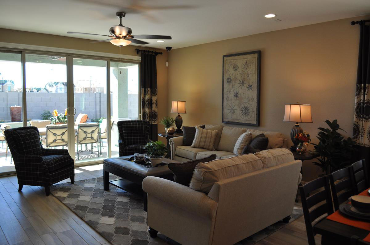
family-room-uses-brownwWith a strong dark grey influence, it would be easy for this family room from the Capital model at Seaboard in Cooley Station to feel cold. But it doesn’t, and that’s because of the careful use of brown. From the light brown/almost beige of the sofa and loveseat to the dark brown leather on the coffee table/ottoman combo, brown pulls in a feeling of comfort and welcome. Let’s look at the design choices that warm up this space.

Gold walls: The rich gold-brown tone on the walls creates a cozy feeling. Using darker tones helps draw people to a room, making it feel like a special club. This tone is warmer than the flooring so that together they play on the grey and brown tones that make up the color palette of the space.

Plaid chair upholstery: Plaids have always said comfort, and this windowpane pattern in dark tones brings comfort to the foreground. With the ottoman and curtains, they are the darkest elements in the room, and help anchor it without making it feel dreary.

Area rug choice: The mix of greys has an almost tweedy feel, fitting well with the plaid and maintaining the traditional comfort approach. This is a room made for wearing slippers.

Plants: Houseplants in a room always make it feel fresh and homey. Just a few green plants make a difference.

When decorating your family room, think about the choices you can make in both color and style to create an environment that says comfort, to encourage family and friends to relax and stay a while.

Integrating Space in an Open Floor Plan

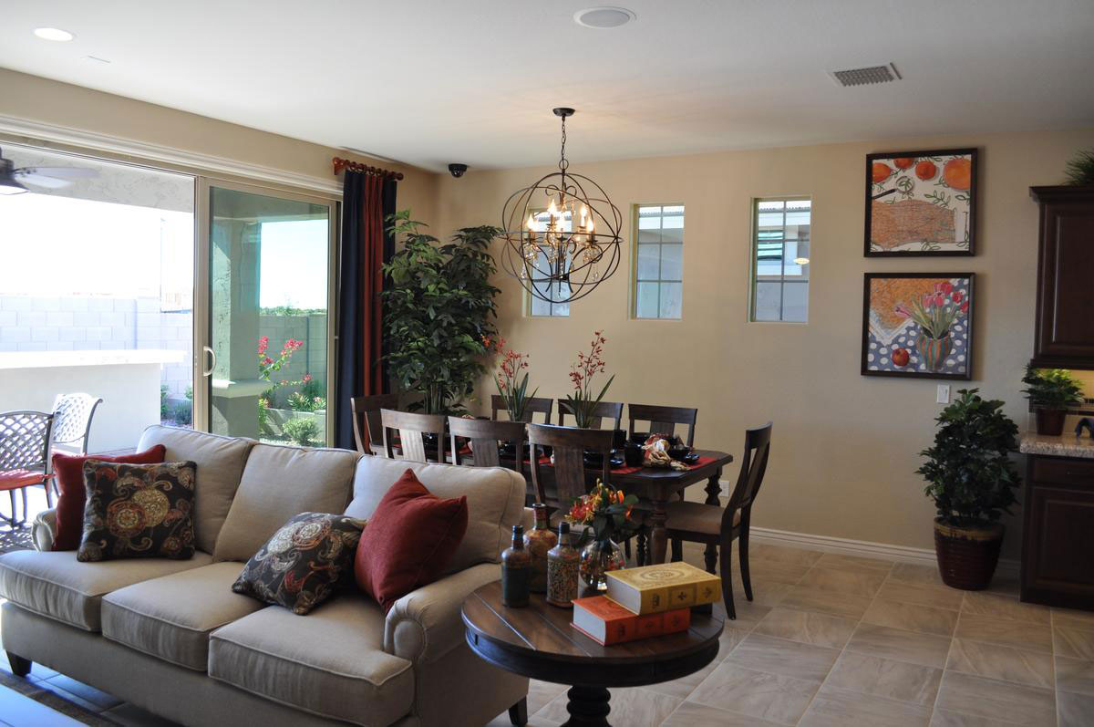
integrating-space-in-an-open-floor-planwLiving with an open floor plan has so many advantages.  The space works well for families and entertaining and arrangements can be modified to expand and contract living and dining areas to meet specific needs. However, open architecture does present decorating challenges. Here are some tips to make your open living space work well.

Define living areas: Use furniture, area rugs and artwork to define each living area. Without walls you can have the back of a sofa, a bookshelf, or a table set limits for a particular space.  Notice in this photo from the Cooley Station community how the sofa defines the end of the dining area and the start of the living area. Large pieces of furniture like sofas are some of the best tools for defining each space.

Create transitions: The plants on the kitchen counter and the floor and artwork make a softer natural transition between the kitchen and the dining area. Without these, the adjustment from one area to another can feel too abrupt. Having two larger houseplants in the dining area also helps define that space and keeps it connected.

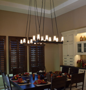
Use lighting: Chandeliers such as the one over the dining table also help create a specific mood in one area of a large living space. Often the family room will have a ceiling fan. Our brains turn those light fixtures into room definitions.

Use color: Pulling the same accent colors throughout the space helps everything feel integrated. Throw pillows, area rugs, artwork and accessories in this room all use dark rust and peach tones to tie this living space together.

Pink can be Sophisticated

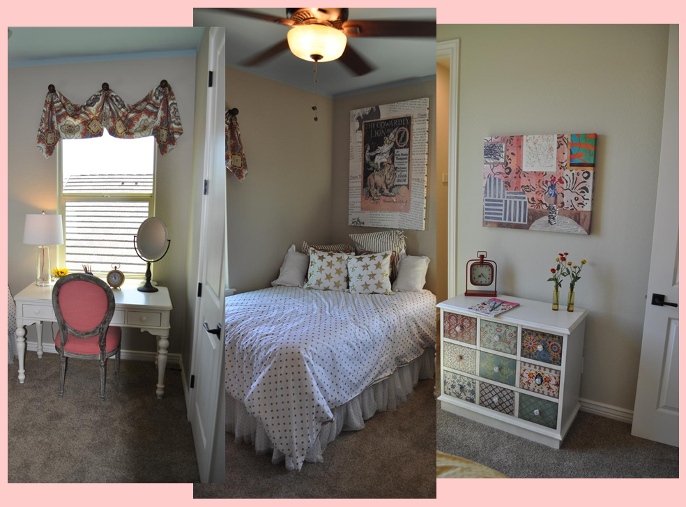
girl's_bedroom_montageFor most of us, when we hear that a girl’s bedroom has pink in the color scheme, it sounds cute and pretty, but not very sophisticated. But don’t limit your thinking. With the right accents and style, pink will surprise you. Let’s take a look at how this girl’s bedroom makes that happen.

The right accent colors: One quick and powerful way to add sophistication to any room is by throwing black into the mix. Used judiciously, black makes other colors pop and grounds the space. By mixing a light ballet-pink and black together, the final feel is daring and interesting, and definitely more than cute.

Using metallics: The bold gold on the bedding and poster make everything in the room pop. This is a risky choice and you can’t have a sophisticated look without taking some risks.

Mature fabric choices: It’s easy to go with a juvenile fabric when working with pink, but these fabrics pull you away from that. Adult patterns and moods in the fabric help make this room more grown-up.

Unusual artwork: The Wizard of Oz theme on the poster over the bed says it’s a children’s room, but the retro illustration combined with images from the book itself in the background make this poster worth more than a glance. Really, this piece feels like the inspiration for the entire room.

Eclectic furniture choices: The vanity has an old-fashioned style but the white paint makes it feel up to date. The small chest gets its personality with the different designs on each drawer, which are echoed in the canvas above. Once again a risky mix-and-match mood adds a chic feeling to the space.

Altogether, this room works for a young girl, yet opens up a glimpse of what kind of grown up she will eventually become. Visit Oasis at Queen Creek for a closer look.

Mosaic makes Strong Statement in Bathroom

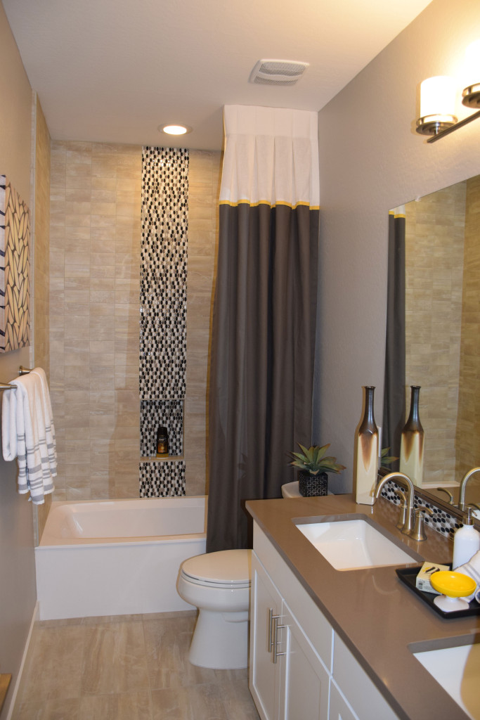
Ironwood-bathroom-web-readySmaller spaces can capture interest with just a couple of daring design decisions. This bath, from the Marquesas model at Ironwood Crossing, has all the elements of a good design, particularly given the available space. Let’s take a look at why this bathroom works so well.

Make a splash with mosaic tiles. By choosing to position a stripe of highly contrasting tiles in the shower surround, this bathroom moves from blah to drama. Notice that the mosaic is repeated on the vanity backsplash. This shows a consistency of design and connects the two pieces – vanity and tub – together from a design standpoint.

Match flooring and tub surround materials. When working with a smaller space, using similar colors and textures for large surfaces help the room feel bigger. This choice has personality but doesn’t overtake the room.

Pull from a consistent color palette. In this case, white, taupe and cool browns integrate well with each other making this bathroom feel like a well-crafted unit.

Stay contemporary with clean lines. When your space is smaller, the simple lines of modern styles are less distracting. Your eye moves easily from one element to the next, making the room flow.

Add a few sophisticated elements. The color-blocked shower curtain adds an element of style that complements the mosaic. Altogether this is an interesting and inviting design.

Choose one accent color that pops. Notice the small elements of bright yellow in this room. The oval soap dish toward the front of the photo gets an echo from a thin yellow stripe on the shower curtain. Adding just one or two items in a signature accent color add a spark to this well-designed space.

Decorate Using the Four Elements: Water

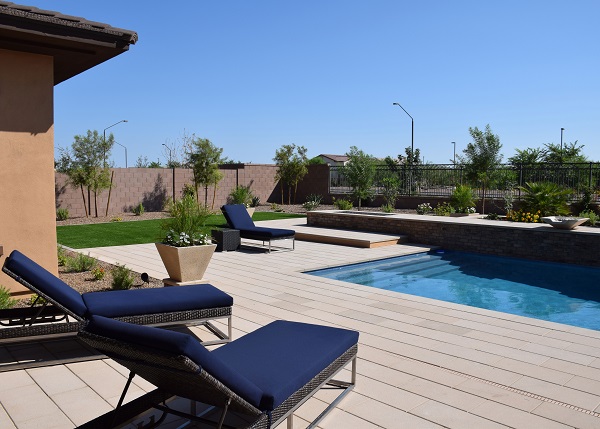
water-3-cropped-webWhen decorating a pool area, it’s natural to lean toward the element of water in your design decisions. You already have the blue from the pool, and sand tones or grey bring a natural look to the space. Blue and white also make a great combination for a water-themed space. In this photo, the light hardscaping is the color of driftwood, which makes the area feel a bit beach-like.

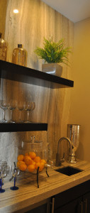
water-cropped-webYou don’t actually need water to have a water-themed area. Take a look at this butler’s pantry to the left. The natural stone backing combined with the countertop creates the feeling of water running down the wall and across the counter into the small sink. This mood is enhanced by the clear glasses along with gold and silver metallic accessories. The water theme makes this spot the perfect place to serve drinks to family and friends.

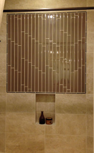
water-2-cropped-webA bathroom is the most logical place to carry through a water theme. Once again, even without the blue-green color scheme that is common to water spaces, the sensation of water can come by using ultra-shiny tile in a vertical display, as the photo on the right shows. In both smaller photos, placing a light above the wall so that it shines across the surface helps create that feeling of water flowing.

Whether you use this concept outside by a pool or water feature, or inside near a sink or bathroom, expanding the water theme beyond the function of a space into the design allows you to enhance your home décor. All photos are from Fulton’s Legacy community.

Decorate Using the Four Elements: Fire

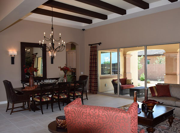
fire-3-cropped-sized-webThe power of fire first shows in a room with color choice. Look for red, rust, maroon, orange and gold. A fire room reflects the flames of an open fire either with the main color or in accents. Notice how this room brings rust tones into the living area through curtains, furniture, dining chairs, throw pillows and the tabletop décor.

Look next for some sort of open flame, or a close representation. In this room the two-tier chandelier holds electrified versions of candles. You may even find a candle-abra with actual candles in some fire rooms.

Accessories are often glass, formed when sand meets fire, in vivid colors. Notice the large glass bowl on the coffee table, colored like the flames that created it.

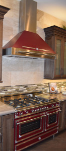
fire-2-cropped-webKitchens are effective rooms to introduce a fire theme because of their focus on cooking food. This amazing range and hood from Bertazzoni perfectly represents fire, with its style patterned on the company’s original wood stove design, enameled in this fire-inspired dark red.

fire-1-cropped-webTake a look at this cozy breakfast nook. Once again the lighting
sends a fire message. You can imagine real candles in those glass shades. The rich metallic tile on the built-in breakfront brings fire colors to your attention, supported by orange and rust tones in accessories and the tablescape. A smoky wall color finishes up the look.

Fireplaces and outdoor fire pits always help create a fire-driven mood. On cold nights, everyone will feel warmer in a room designed with fire in mind. All photos are from Fulton’s Legacy community.

Bring Color Outside

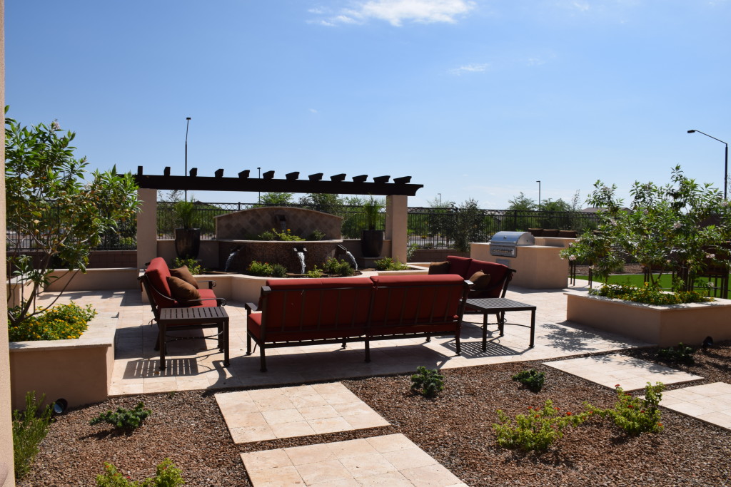
exterior color 1For years, the best way to introduce color to your patio or courtyard was through flowers or painted furniture. But today’s indoor-outdoor fabrics allow you to introduce cushion color to your outdoor living areas. Here are some suggestions for making your exterior areas as colorful as your home is inside.

Plan a color scheme: Just as every room in your home has a predominant color or set of colors, you want to do the same for outdoor areas. Consider issues such as the type of patio, plants and trees, and whether you have a pool or other water feature.

The photo above uses light terracotta for the hardscaping combined with dark brown beams on the cabana. The choice of dark furniture combined with rich rust cushions allows the seating area to stand out while still complementing the entire outdoor space. The splash of color makes that seating a focal point in the yard, drawing guests to the comfort of a space designed for conversation.

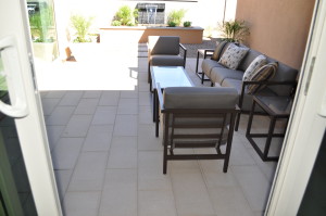
exterior color 2Bring in patterns: The photo to the right uses a neutral color scheme to fit well with the warm wall and fountain surround. Here the contrast comes from patterned throw pillows. They add interest to the seating area along with a touch of modern style. Indoor-outdoor fabrics are now available in a variety of patterns in every style and color combination.

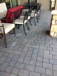
exterior color 3Combine color and pattern to add interest: The furniture waiting to be distributed on this patio combines a tone-on-tone stripe with a pop of bright red. Don’t hesitate to use vivid colors in controlled ways to make your outdoor space interesting and inviting. See this patio furniture in person when you visit Fulton Home’s Legacy community.


Your Entertainment Wall

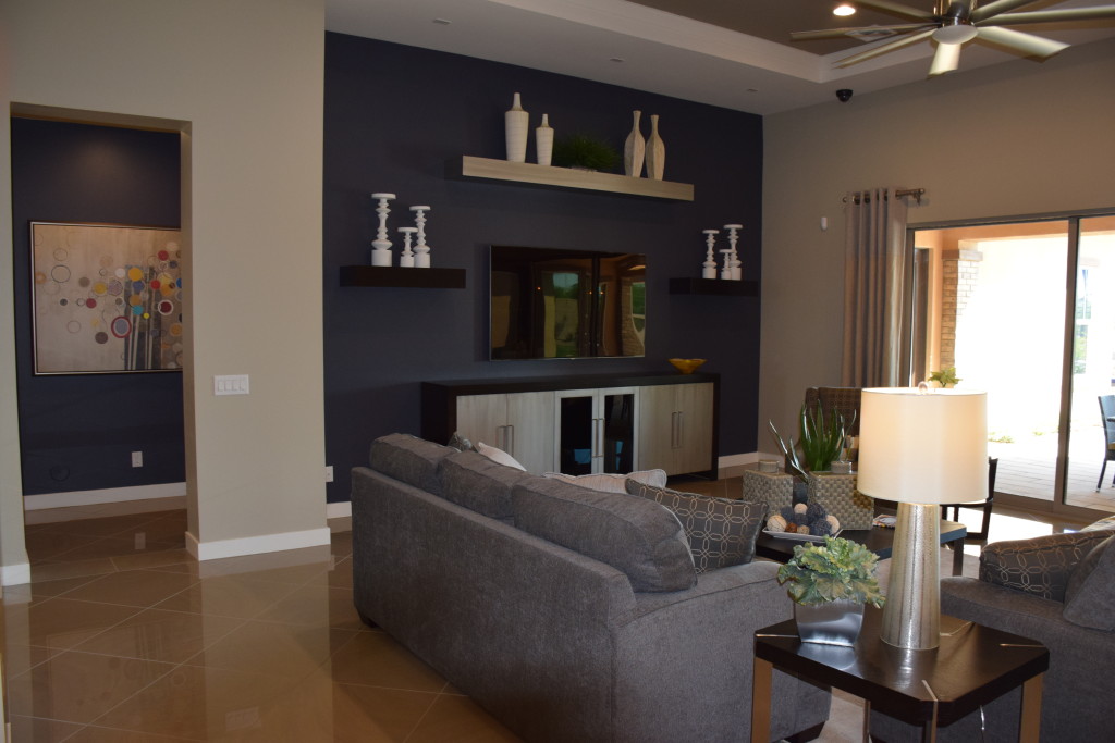
Legacy Models 071 (1)Designing an entertainment wall involves balancing design and function. You want a good place for the large HD TV while still keeping the screen itself low-key when it’s not turned on. These suggestions can help you think about what will work in your home.

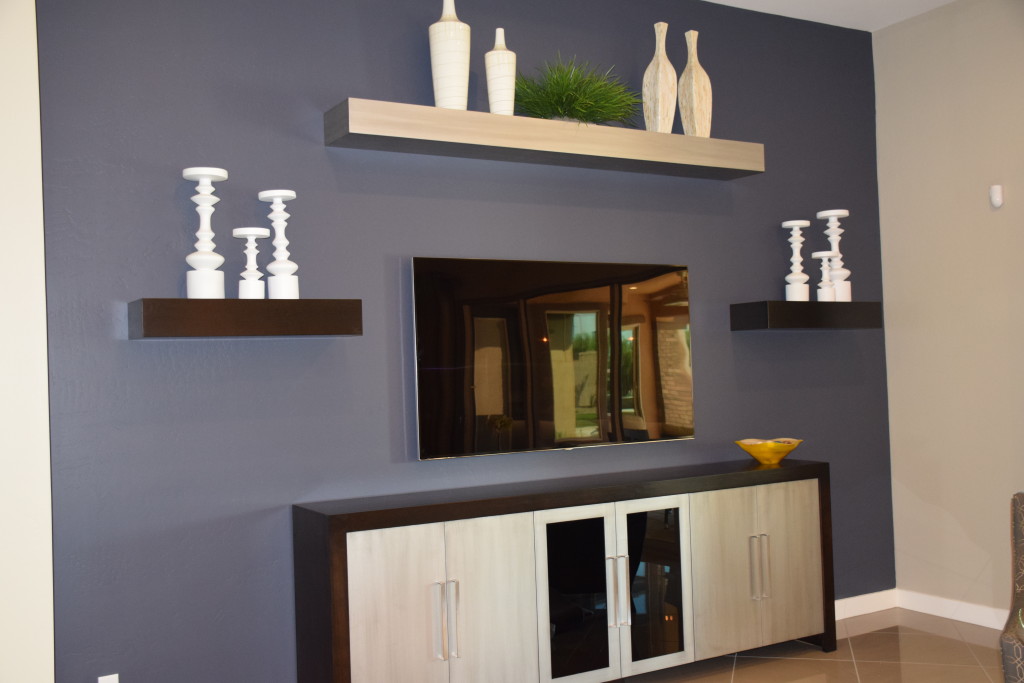
Use color wisely: Dark grey-purple on the focal wall in this photo from Legacy draws the eye while reducing the footprint of the screen. The shelves and cabinet bring in lighter tones and the space is large and flexible enough to make changes in the future.

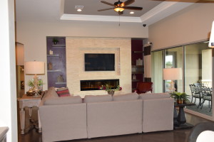
Models 065Incorporate an additional focal point: By adding the fireplace under the niche holding the television in the photo to the left, also from Legacy, the space feels nicely orchestrated. The screen becomes another dark rectangle, adding depth and balance to the light stone face. Once again dark purple draws the eye, with free-floating shelves providing opportunities to display accessories and carry the light tones out to the sides.

Consider seating: Positioning seating toward the entertainment area makes it more comfortable to watch programs, but you may want to place some seating facing toward the conversation area rather than aiming everything at your entertainment wall. This encourages discussion when you have guests, and the chair or chairs can easily be turned if they are needed for viewing a particular event or program.

Create flexible lighting options: A lighting arrangement that works well for a gathering may not serve your needs while watching your screen. Make sure you plan for both situations when setting up your lighting. A few ceiling spots may be all you need for television viewing, or consider a dimmer switch to provide enough ambient light while avoiding a glare on the screen.

Your family room can be flexible enough to meet all of your entertainment needs, whether you’re spending the evening chatting with friends or enjoying a DVD of a favorite film. Take the time to create a space that works for you and your family –in terms of both style and function.


Pops of Color

Legacy Models 057Neutrals always feel safer when you’re decorating, but staying safe keeps you from enjoying the power of color in your home. If more vivid colors seem overwhelming or just too risky, consider taking a chance with a few pops of color. Here are a few ways to let color help bring your home to life.

A strong accent wall: Paint, wallpaper or fabric can turn one wall into a natural focal point with a strong color choice. And the option is relatively easy to eliminate if you aren’t happy with the result. Take a look at this entertainment area in the family room of the O’Connor model at Legacy. The deep purple has enough gray in it to soften the impact on the wall, and neutral furniture, shelves and accessories keep the overall feeling rather low-key.

Contrasting accessories: Adding the yellow glass bowl on the right side of this console helps the space to really pop. Yellow is the complementary color to purple, which means that they are on opposite sides of the color wheel. By adding just a small touch of yellow, the purple becomes more purposeful in the space. The other complementary colors are blue and orange and red and green. If your colors seem drab, adding just a spot of the color on the other side of the wheel will add a spark.Legacy Models 027 (2)

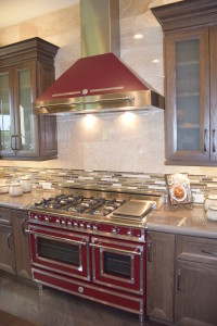
Let color infuse your focal point. This Bertazzoni Range in rich dark red creates a new energy in this kitchen. Other neutrals start to feel like the background elements, allowing this retro range to stand out. (Photo from the Fulton Model at Legacy.)

So jump into color – starting small or with a big push – and let your home’s décor pop!