As 2025 begins, homeowners in Arizona are reimagining their spaces to reflect modern trends that blend functionality, sustainability, and aesthetics. Living in a desert climate comes with unique design opportunities and challenges, and this year’s trends are perfectly suited for Arizona’s vibrant, sun-drenched environment. From embracing natural elements to integrating cutting-edge technology, these ideas will inspire you to create a stylish, comfortable, and functional home.
Let’s explore the top design trends that are making waves in the Arizona market this year.
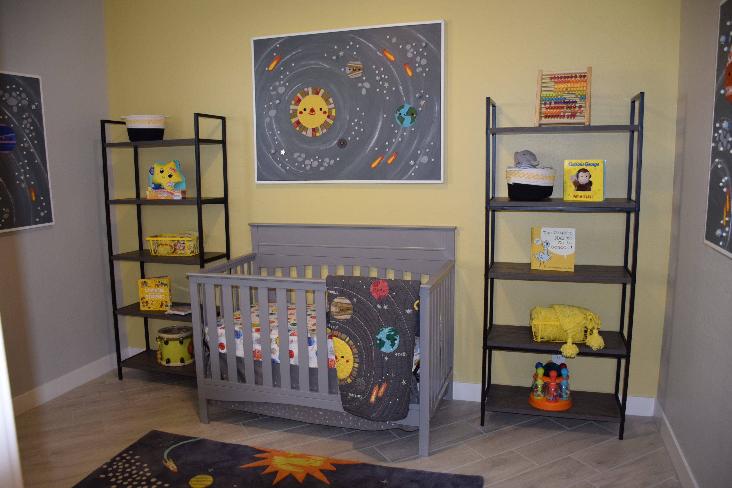
1. Earthy, Desert-Inspired Color Palettes
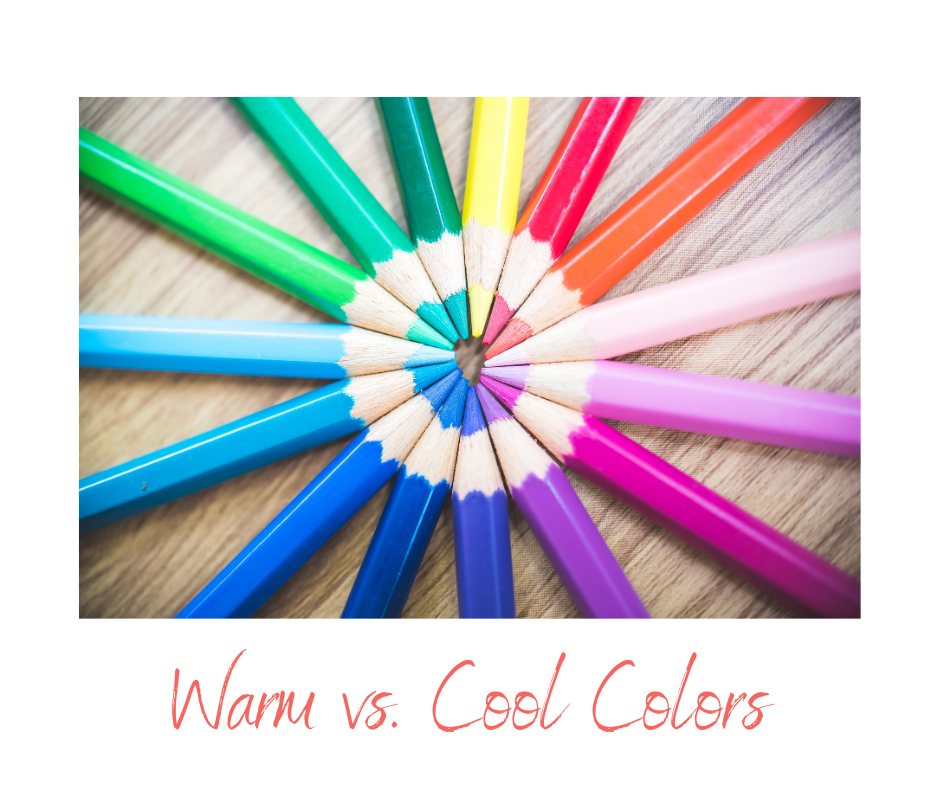
Arizona’s breathtaking desert landscape serves as the perfect inspiration for 2025’s trending color palettes. Homeowners are moving toward earthy tones that echo the natural environment, such as terracotta, sandstone, sage green, and soft clay. These hues create a calming, grounded atmosphere while harmonizing with the region’s unique beauty.
How to Incorporate These Colors:
- Use warm neutrals like beige or taupe for walls, creating a versatile backdrop.
- Introduce accent colors like sage green through furniture, throw pillows, or rugs.
- Experiment with two-tone kitchens by pairing terracotta lower cabinets with off-white upper cabinets.
Pro Tip: Combine earthy tones with natural materials like wood, rattan, and leather to create a cohesive, desert-inspired design.
2. Sustainable Materials for Eco-Friendly Living
Sustainability is no longer a trend—it’s a way of life. In 2025, Arizona homeowners are prioritizing eco-friendly materials that are both durable and beautiful. The desert climate demands materials that can withstand extreme temperatures while minimizing environmental impact.
Popular Sustainable Materials:
- Reclaimed Wood: Perfect for adding warmth to rooms as accents or custom furniture.
- Clay and Terracotta: Tiles, pottery, and decorative elements.
- Metal Accents: Copper and bronze decorative details, nodding to Arizona’s mining history.
Why It Matters: Sustainable choices reduce your home’s carbon footprint and often lead to long-term cost savings through energy efficiency and durability.
3. Luxurious Outdoor Living Spaces
Arizona’s weather invites outdoor living, and in 2025, homeowners are maximizing their exterior spaces with luxury and functionality. Outdoor areas are no longer just patios; they’ve evolved into fully equipped extensions of the home, complete with kitchens, seating areas, and even entertainment zones.
Design Tips for Outdoor Living:
- Shade Solutions: Pergolas, retractable awnings, or sail shades provide relief from the sun while maintaining an open feel.
- Outdoor Kitchens: Include a grill, sink, and refrigerator to create the ultimate entertaining space.
- Desert Landscaping: Use xeriscaping techniques with drought-tolerant plants like agave, succulents, and desert marigolds.
Pro Tip: Install string lights or in-ground lighting to create ambiance and extend the use of your outdoor space into the evening.
4. Energy Efficiency as a Design Priority
Energy-efficient homes are a necessity in Arizona, where cooling costs can soar. In 2025, homeowners are turning to smart design features and innovative technology to reduce energy consumption while keeping their homes comfortable.
Must-Have Energy-Efficient Features:
- Low-E Windows: Reflect heat while letting in natural light.
- Cool Roofs: Roofing materials designed to reflect sunlight and reduce indoor temperatures.
- Smart Thermostats: Automatically adjust your HVAC system for optimal efficiency.
- Solar Panels: Harness Arizona’s abundant sunshine to power your home sustainably.
Pro Tip: Combine energy-efficient features with passive cooling techniques, such as planting shade trees or installing window overhangs, to further reduce energy use.
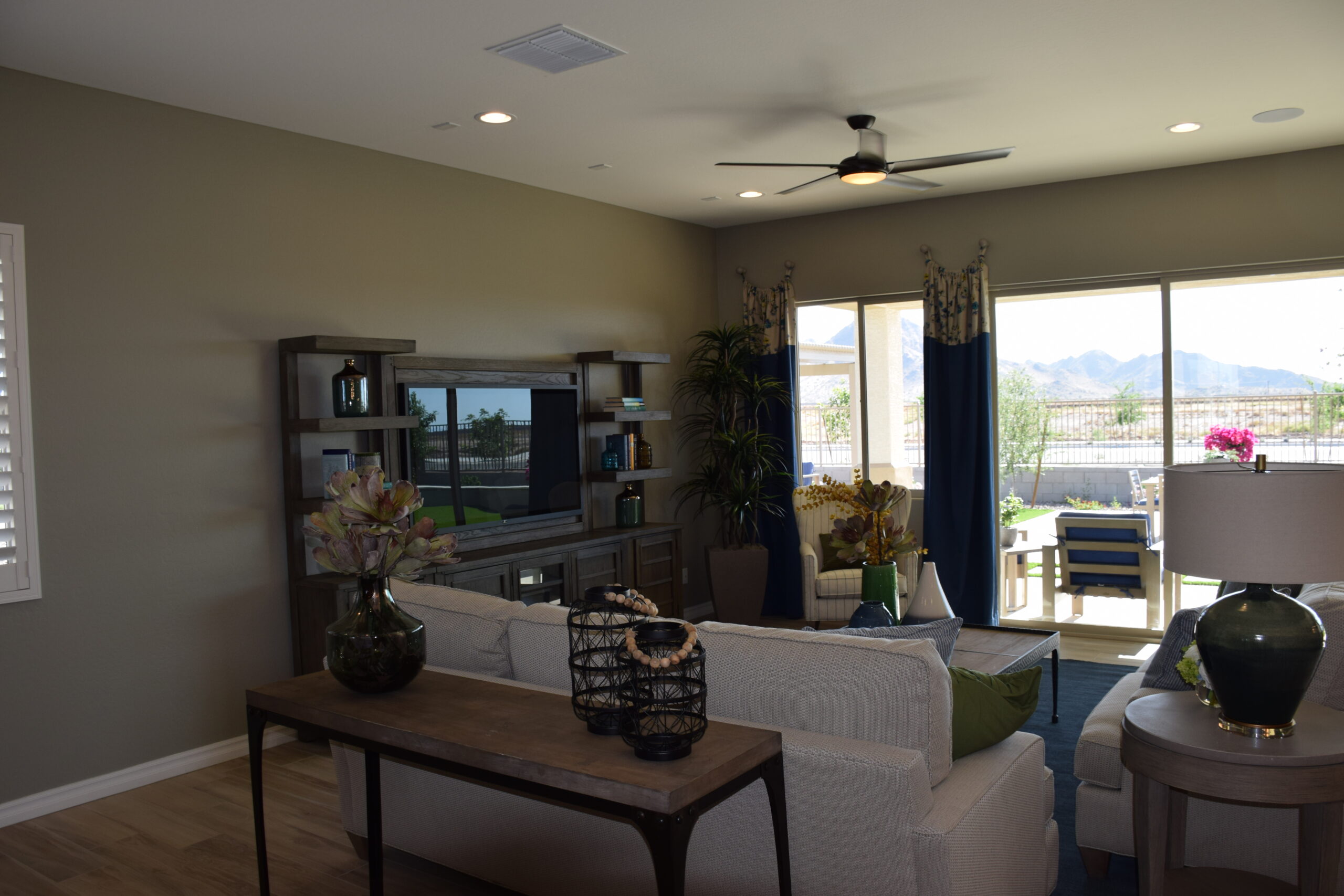
5. Open-Concept Living with Multifunctional Spaces
The open-concept trend continues to thrive in 2025, with homeowners seeking flexible layouts that cater to modern lifestyles. In Arizona, open spaces provide a sense of airiness and facilitate indoor-outdoor living, which is ideal for the region’s climate.
Open-concept living in Arizona is more than a design choice—it’s a lifestyle. By breaking down traditional barriers, homeowners can enjoy spaces that flow naturally and adapt to various needs. In the desert climate, open layouts blur the line between indoor and outdoor living, creating harmonious transitions perfect for entertaining or relaxation. Large sliding glass doors and windows not only maximize natural light but also provide easy access to shaded patios and courtyards, encouraging year-round use of outdoor spaces. To enhance functionality, consider zoning areas within open layouts using rugs, furniture arrangements, or partial walls. This approach maintains the open feel while subtly defining areas for work, dining, and play.
For busy families, combining elements like a kitchen island with built-in charging stations or a media nook transforms a space into a true command center. Similarly, small touches such as collapsible partitions or plant walls can provide privacy when needed without sacrificing the expansive atmosphere. To tie the look together, use cohesive materials like stone or wood for a seamless, grounded aesthetic. In Arizona, where the desert landscape inspires creativity, open-concept designs reflect both the beauty of the environment and the flexibility of modern living.
Ideas for Multifunctional Spaces:
- Combine a home office with a guest room by using a wall bed or convertible desk.
- Create a family hub with a large kitchen island that serves as a dining table, workspace, and social area.
- Use creative room dividing solutions to seamlessly connect indoor living areas with outdoor patios.
Design Insight: Emphasize natural light by incorporating large windows to make open spaces feel even larger and more inviting.
6. Biophilic Design: Bringing Nature Indoors
Biophilic design continues to gain traction as homeowners seek to connect with nature. For Arizona homes, this trend often involves integrating natural elements that mimic the desert landscape, creating a seamless blend between the indoors and outdoors.
Elements of Biophilic Design:
- Indoor Plants: Succulents, cacti, and other low-maintenance greenery add life and color to your interiors.
- Natural Light: Letting in as much natural light as possible is a simple way to connect with nature indoors.
- Organic Materials: Incorporate stone, wood, or woven textures into your furniture and decor.
Pro Tip: Use natural textures and colors to complement views of the surrounding landscape, making your home feel like an extension of the environment.
7. Smart Home Integration
Smart technology has become a staple in modern homes, and in 2025, it’s about creating seamless integration for enhanced convenience and efficiency. Arizona homeowners are leveraging smart systems to improve comfort, security, and energy use.
Top Smart Features for Arizona Homes:
- Smart Irrigation Systems: Conserve water while keeping your desert landscaping healthy.
- Voice-Activated Assistants: Control lighting, temperature, and appliances hands-free.
- Smart Appliances: Energy-efficient refrigerators, ovens, and washers that can be managed remotely.
Why It’s Trending: Smart homes not only enhance daily living but also offer significant energy savings, making them a practical choice for eco-conscious homeowners.
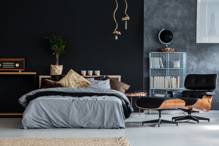
8. Statement Walls and Bold Textures
While neutral palettes dominate, 2025 also welcomes bold textures and statement walls that add depth and personality to interiors. These design elements serve as focal points, allowing homeowners to showcase their unique style.
Ways to Make a Statement:
- Use textured plaster or 3D wall panels for an accent wall.
- Incorporate artisanal tiles with intricate patterns in kitchens or bathrooms.
- Add woven or macramé wall hangings for a bohemian touch.
Pro Tip: Keep bold textures confined to one or two areas to maintain balance and avoid overwhelming your design.
Designing Your Arizona Dream Home
2025’s design trends offer exciting possibilities for creating a home that’s stylish, functional, and uniquely suited to the Arizona lifestyle. From embracing earthy palettes to maximizing outdoor spaces, these ideas can help you craft a home that reflects your personality while catering to the desert environment.
If you’re ready to explore these trends in your next home, our team is here to help. Contact us today to learn more about our floor plans, design options, and customizations https://www.fultonhomes.com/. Let’s bring your vision to life and make your Arizona dream home a reality.