The Positive Psychology of Color – Part 3: Bold Colors

How to use color to convey in interior design

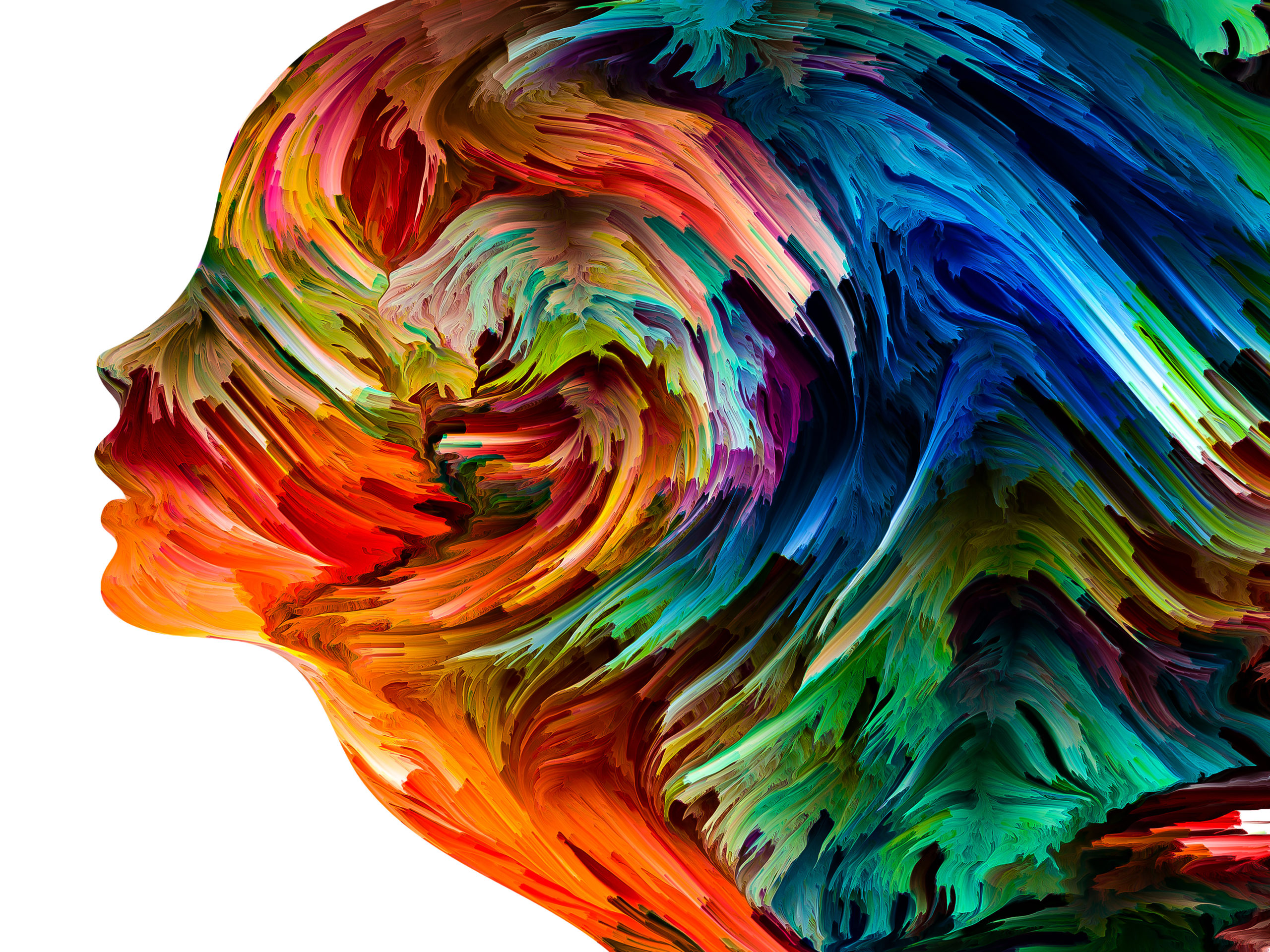
Now that we’ve discussed both light and dark colors it’s time to step up the excitement and learn how to use bold colors to create a mood in a room! As mentioned in Part 1 and Part 2, color has a dramatic effect on space. It influences energy, emotional response, and overall enjoyment. Perhaps you’re already savvy or perhaps this is your first exposure to this method. Either way, our series of guides to the power of specific colors is sure to aid in creating a space that you adore. If your goal is for others to adore it as well then all the better!

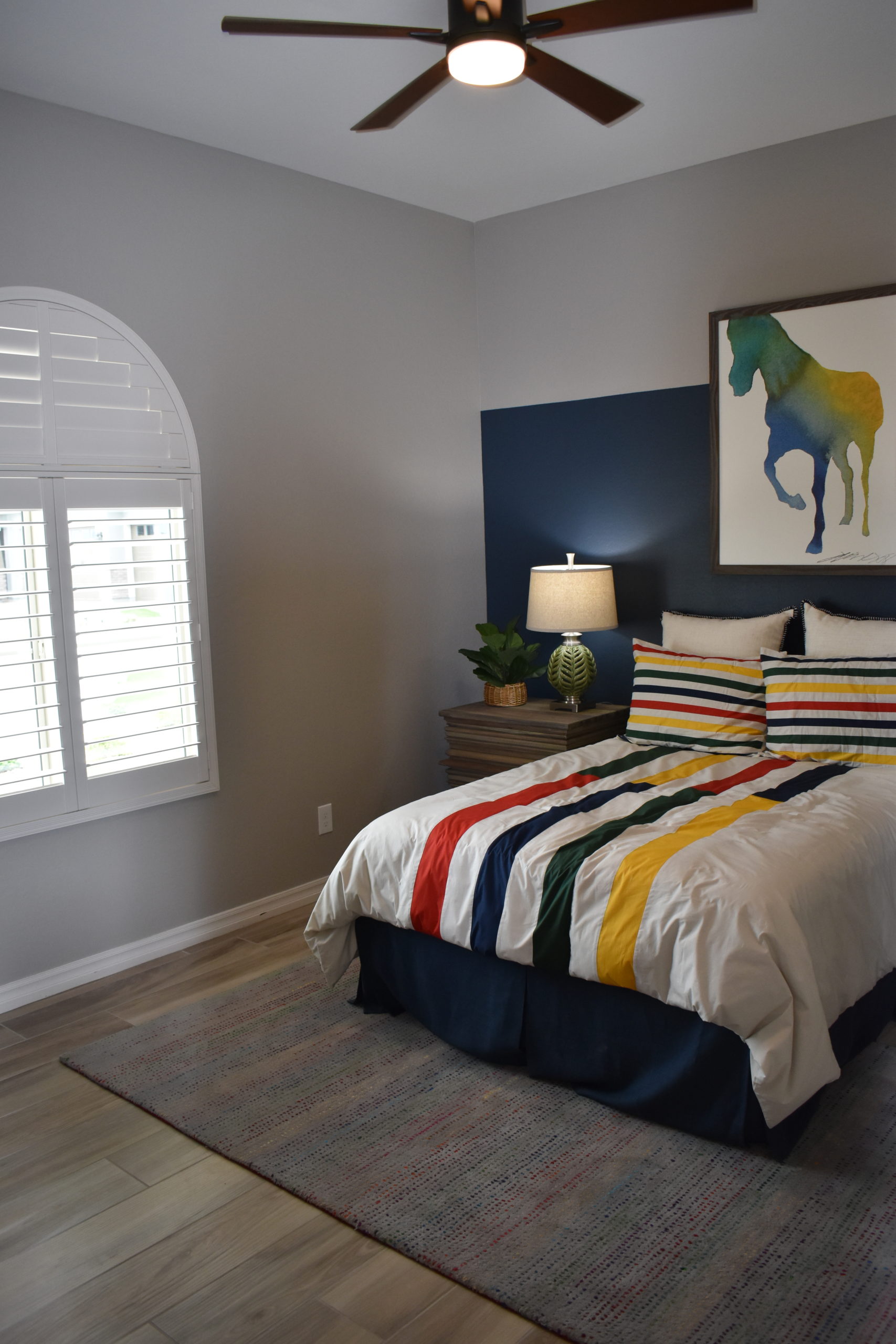
An important consideration is to think about the way combining colors changes things. For example, if you use just bright red and bright pink in a room it might feel energetic and festive, but after a while that could seem like too much. So, try incorporating golden yellow so it also feels comfortable. You can control this even further by minimally using the colors that evoke stronger responses, and liberally using colors that are inherently mellower. 

Blue Purple – contemplative, meditative, spiritual, soul-searching, intuitive, mysterious, enchanting

Bright Red – exciting, energizing, passionate, hot, dynamic, provocative, dramatic, powerful, courageous, assertive, impulsive, adventurous, spontaneous, motivating

Bright Pink – exciting, playful, attention-getting, high energy, wild, tropical, festive, vibrant

Bright Yellow – illuminating, joyful, hot, lively, friendly, luminous, enlightening, energetic, sunshine, innovative, aware, surprising

Ginger – spicy, flavorful, tangy, pungent, exotic

Golden Yellow – nourishing, buttery, tasty, sun, hospitable, comforting

Lavender – romantic, nostalgic, fanciful, light

Lime – fresh, citrusy, youthful, refreshing

Red Purple -thrilling, intense, exciting, dramatic, creative, expressive

Tangerine – vitality, fruitfulness, energizing

Turquoise infinity, compassionate, protective, faithful, water, coolness, sky, gemstone, tropical, oceans

Stay tuned for Part 4!

The Positive Psychology of Color – Part 2: Light Colors

How to use color to convey in interior design

In Part 1, we began our discussion about the psychology of color. Using color to expertly influence the way people experience a space is a very powerful tool. Have you ever visited a model home and been stunned by how serene the bedroom is or how welcoming the family room is? That’s because professional interior designers know exactly how to use color to create a room that makes you say, “This space is absolute perfection!”

Now you can give it try too, by using our handy guide to what colors mean. Have fun with it, and try to get creative by thinking of ways to combine colors for an overall effect. For example, rather than just choose light pink because you want a room to feel youthful, combine it with aqua so it also feels dreamy! The possibilities are endless, have fun!

Light & Medium Colors

White – innocence, purity, clean, new

Amethyst – restorative, protective, peaceful

Aqua – water, refreshing, cleansing, young, cool, dreamy, soft, light

Ivory – classic, neutral, soft, warm

Light Blue – calm, quiet, patient, peaceful, cool, aquatic, clean

Light Pink – romantic, affectionate, compassionate, soft, sweet, tender, delicate, innocent, youthful

Light Yellow – cheery, soft, sunny, warm, sweet, easy going, pleasant

Light Green – calm, quiet, soothing, airy

Peach – nurturing, soft, funny, delicious, fruity, sweet, fragrant, inviting, warm, comfortable, modest

The Positive Psychology of Color Part I

How to use color to convey in interior design

Have you ever thought about deciding the color scheme of your home based on the psychology of color? Certainly, it’s perfectly fine to go with your favorite colors, but one of the great things about knowing how color affects the way people experience a space is that you can create an ideal setting.

This doesn’t mean you have to forego colors you love, but the meaning of color is so effective that it actually changes with the intensity of the color. For example, the color blue can be light, dark, bold, pastel, etc, and each of these is a little different. Selecting a certain shade allows you to create a very specific effect! Intrigued? Keep reading Part One – Dark Colors. Then check out our other blog posts that explain additional options!

Dark colors:

  • Amber – multi-cultural, mellow, abundant, original
  • Black – powerful, elegant, sophisticated, mysterious, bold, basic, classic, strong, expensive, magical, night, prestigious, stylish, modern
  • Brick Red – warm, earthy, established, strong
  • Charcoal Grey – reliable, responsible, accountable, conscientious, resolute, restrained, conservative, professional, classic, sophisticated, enduring, mature, business
  • Chocolate Brown – scrumptious, rich, robust, appetizing
  • Deep Blue – credible, authoritative, basic, conservative, classic, strong, reliable, traditional, service, nautical, loyal, confident, professional, clarity
  • Deep Purple – visionary, wealthy, royalty, prestigious, subdued
  • Dark Green – nature, trustworthy, refreshing, cool, restful, stately, mountains, hushed, woodsy traditional, reliable, money, prosperity
  • Foliage Green – natural, fertile, healthy, balance, life, growth, soothing, harmony, restful, restoration, lively, spring, renewal, lush
  • Teal – serene, cool, tasteful, sophisticated, confident
  • Vibrant Dark Orange – fun, whimsical, childlike, happy, glowing, sunset, hot, energizing, active, gregarious, good natured, spontaneous, optimistic, talkative, jovial, sociable, self-assured, persuasive, animated

What do color choices say about your home? Part II

Your color choices in your home can say a lot about you and the overall environment. Therefore, knowing when and where to use colors can help you master how each room feels. Combining colors can help influence different feelings as well. As we explored in five colors in part one, we saw how different colors can have significantly different impacts on an environment. Today, we will look at several more common colors used in design themes. Let’s get started!

Purple

Purple is known as a mysterious yet spiritual color. It is a compassionate color; however, it can make for a more calming atmosphere. Using purple is a perfect way to create a luxurious or imaginative environment while being very versatile.

White

This crisp color can make any room feel clean and spacious. White is a heavenly color that is pure and feels very refreshing. It pairs best with cool tones more than warm tones, which is vital to know when designing your space.

Green

If you are trying to add more life to a room, green is the color of choice. It can help revitalize and energize a space. Also, it subconsciously reminds us of plant life, which can help invigorate any atmosphere.

Gray

Gray can steal benefits from both white and black. While sophisticated and classy, it can also keep a room feeling more open and spacious. It is still neutral and leans toward black for more benefits, or you can go light to explore more white inspiration.

Yellow

Yellow is a creative color to use in a room. It is very eye-catching as it is used to capture attention. It will radiate throughout the room, making it feel more optimistic and charming. In essence, you can add more energy to a room by using yellow.

What colors do you use in your own design? There are so many ways we can add color to our homes to help give them life. Knowing these characteristics can help you tailor a room to your specific needs.

What do color choices say about your home? Part 1

Today’s interior design is ever-changing. Many homeowners are being more expressive in their design by adding more personal touches to their homes. In fact, designers believe that our homes are an outlet in which we can express ourselves. The music we enjoy, the way we dress, and even our interior design styles can say a lot about us. However, did you know color has psychological references as well? The colors we are adding to our homes all have meaning. Today, we are going to take a look at some of the most popular colors in homes to analyze what they say about you.

Pink

This color is a compassionate tone. It can be associated with femininity but is slowly becoming more gender-neutral. It evokes kindness and empathy into the atmosphere, and it is known as an innocent color that does not feel aggressive in a room.

Brown

From walnut, coffee, mocha, and even woods, this earthy tone can be expressed through many shades. It feels organic, which makes a room feel more secure and grounded. Being a neutral-based color, brown feels approachable and wholesome in any room.

Red

Red is an extremely bold color! It can make a room feel warmer and add more energy to the space, making for a more exciting environment. However, if it is used too much in a room, it can feel aggressive. Using this color can be great for stimulating a passionate atmosphere or used in another area to make a daring and dynamic statement.

Black

Pure black can feel quite sophisticated. It makes for creating a strong and authoritative atmosphere. It can absorb light, making a room feel darker, which makes for a more mysterious-feeling environment as well.

Blue

Feel confident by adding blue to a room and make a cool-toned space. It is very soothing and evokes calmness and serenity. This peaceful color is perfect for reducing stress and makes for a great area to reflect and relax.

While color psychology is subjective, these expressions are general ideas. Did you know these colors’ psychologies before you read this article? If not, what do the colors in your home say about you? Remember that combing colors or using more versus less of specific colors can influence different thoughts or feelings about your environment. If you are looking to add more color to your home, consider some of these color psychologies. They can help you personalize your space and tailor it exactly how you want it to feel. Make sure to check out the second part of this series to explore even more colors!

How to Decorate with Split Complementary Colors

Timber Cove

Looking for ways to transform a blank canvas? A split complementary color scheme will no doubt add great contrast to a room which instantly brings interest and variety to your space. However, the downside is that you can end up with a design that looks busy or messy. If you’re interested in doing something different with your home’s decor, this article will show you how you can pull this off successfully.

What Is A Split Complementary Scheme?

In a split complementary color scheme, you’ll be using three different colors. This decor consists of two complementary colors and then the color that sits opposite from the complementary color on the wheel. For instance, yellow and green are complementary colors. Violet is the split complementary color of yellow. Usually, this palette will consist of two warm colors and a cool tone. However, you can adjust the temperature balance as you see fit. If you want to create a warm and welcoming atmosphere then you should use more of the warmer colors in your decor. Paint your walls and use this color in your furniture upholstery. On the other hand, if you prefer to set a cool mood then you would do the opposite.

Clashing of the Colors

Yes, using a split complementary scheme can be challenging especially if you’re not particularly skillful at using colors. To avoid a harsh clashing of colors, which can make for an aesthetically unpleasing look, make sure you don’t overdo the contrast. For a sophisticated look, you can tone down the hues of the opposite color. You can even use more of the two complementary colors and the third color sparingly.

Example: Blue, Violet, and Orange

Blue and violet are complementary colors. In a split complementary design scheme, blue and violet are the dominant colors. Orange should be used sparingly as an accent color to make your space come alive. For instance, in a bedroom, you could consider painting the walls a pale violet and covering the arches in blue. Perhaps your bedding would also be violet or blue and you can add orange pillows as an accent.

Coordinating Colors

Good design has a synergy between colors in the room. The wall, floor, furnishings and accents all work in harmony to create a beautiful color palette for the room. For professional designers and decorators, designing the color palette is a key part of the overall finished room’s successful design.

Learning to coordinate colors between different design elements can help you create a room that has a professional polished look.  Coordinating colors doesn’t mean using the same color on every surface and object.

Picking up a color from one piece and bringing onto another surface can unite the two pieces.  The paint chips pick up a highlight color in the fabrics.  The same process can be used for the flooring and wallpaper in the room.

Using a single focal point unifies the overall design in the room. Upholstery or other fabrics can be a starting point. Paint color is next. Once the paint color is chosen the paint chip can be used to select carpet or an area rug.

Wallpaper, pillows, or other fabrics are great places to begin when coordinating colors for a room. Once you have the main colors coordinated you can introduce contrasting colors that appear on the opposite side of the color wheel from the main colors in the room. Use these in objects and small pops around the room.

Tips for Adding Color to a Gray Color Scheme

Do you feel stuck with your all-gray color scheme? Well, it is time to unlock the magic hidden in this cool-toned hue. Grey is so much more than just a combination of black and white. In fact, this color scheme is versatile, and there are numerous possibilities for designing it to compliment your home’s interior. In fact, although grey is considered a neutral color, it is much more interesting than white or black. The best way to make a gray room pop is to implement color into the design. In fact, you will find that gray serves as the perfect backdrop for a bold accent color. It also has the power to enhance more subtle hues as well as frame colors. The color palettes are virtually limitless. Look at some of the ways you can use add color to a gray room.

Soft Furnishings

If you find that your taste is subject to change from time to time, gray is the perfect backdrop for ever-changing designs. Use bright colors such as orange, blue, and yellow as accent colors in your soft furnishings. Whether you are designing a living room or bedroom, you can select soft furnishings like pillows, curtains, and comforter sets that feature unique patterns and bright hues.

Metallics

You do not have to just stick to traditional color palettes. In a dull room, find the perfect area to install a copper panel, or you can opt for metallic fixtures. Add an extra dimension to the room with accessories such as pendant lights and place settings. When paired against gray, metal is able to take center stage.

Electic Patterns

When adding some spice to the gray room, combine colors with eclectic patterns to further add emphasis to the room’s design. You can even mix different patterns within the space while the gray walls further highlight the decor. Area rugs, couch slipcovers, and other types of textiles add variety.

Using Texture

Be sure to add some colorful texture to your cool gray rooms. For instance, you can combine natural stone, distressed wood, and plush accessories against your gray walls to add dimensions.

What ways would you add a pop of flair to an all-gray room? Let us know below in the comment section.

Bring Color Outside

exterior color 1For years, the best way to introduce color to your patio or courtyard was through flowers or painted furniture. But today’s indoor-outdoor fabrics allow you to introduce cushion color to your outdoor living areas. Here are some suggestions for making your exterior areas as colorful as your home is inside.

Plan a color scheme: Just as every room in your home has a predominant color or set of colors, you want to do the same for outdoor areas. Consider issues such as the type of patio, plants and trees, and whether you have a pool or other water feature.

The photo above uses light terracotta for the hardscaping combined with dark brown beams on the cabana. The choice of dark furniture combined with rich rust cushions allows the seating area to stand out while still complementing the entire outdoor space. The splash of color makes that seating a focal point in the yard, drawing guests to the comfort of a space designed for conversation.

exterior color 2Bring in patterns: The photo to the right uses a neutral color scheme to fit well with the warm wall and fountain surround. Here the contrast comes from patterned throw pillows. They add interest to the seating area along with a touch of modern style. Indoor-outdoor fabrics are now available in a variety of patterns in every style and color combination.

exterior color 3Combine color and pattern to add interest: The furniture waiting to be distributed on this patio combines a tone-on-tone stripe with a pop of bright red. Don’t hesitate to use vivid colors in controlled ways to make your outdoor space interesting and inviting. See this patio furniture in person when you visit Fulton Home’s Legacy community.


Colors Set a Mood

How do you decide what colors to use in your home? You may have a favorite color that you want to incorporate into your home, or you could prefer to stick with neutrals, but color choices are more complex than that. Colors affect our emotions, and the right choices can make your home more inviting and comfortable. Here are some of the basics of how color affects us.

Red: This is an energizing color. It’s a great color to associate with food and entertaining. It’s flattering to people’s complexions and encourages interaction. That’s why it’s a particularly effective color in dining rooms.

Yellow: This color makes people’s complexions look sallow, so it’s a bad choice for bathrooms. It is an optimistic color, however, and helps build self-confidence. That makes it a good choice for many other rooms. Its energizing nature, though, means that it’s a mistake in bedrooms and a really bad choice for nurseries unless you want your baby to be up all night.

Blue: The most relaxing color of the spectrum, this color is an effective choice for bedrooms. This also means that it’s a bad choice for dining rooms, unless you want quiet and boring dinner parties.

Green: As a natural tone, it’s a stress-reducer that can help people keep their emotions balanced. It’s a good relationship color, which makes it great for living spaces.

Orange: A stimulating color, it’s best used sparingly in a home. It creates a lively mood. This makes it a good choice for restaurants because it will stimulate conversation and enjoyment.

Purple: This is actually a good color for quiet thinking – it can help create insights.

When you plan the colors in your home, you may want to consider what you want to accomplish in terms of mood, and let your colors reflect those choices.