
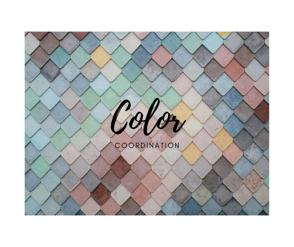
Good design has a synergy between colors in the room. The wall, floor, furnishings and accents all work in harmony to create a beautiful color palette for the room. For professional designers and decorators, designing the color palette is a key part of the overall finished room’s successful design.
Learning to coordinate colors between different design elements can help you create a room that has a professional polished look. Coordinating colors doesn’t mean using the same color on every surface and object.
Picking up a color from one piece and bringing onto another surface can unite the two pieces. The paint chips pick up a highlight color in the fabrics. The same process can be used for the flooring and wallpaper in the room.
Using a single focal point unifies the overall design in the room. Upholstery or other fabrics can be a starting point. Paint color is next. Once the paint color is chosen the paint chip can be used to select carpet or an area rug.
Wallpaper, pillows, or other fabrics are great places to begin when coordinating colors for a room. Once you have the main colors coordinated you can introduce contrasting colors that appear on the opposite side of the color wheel from the main colors in the room. Use these in objects and small pops around the room.