Just the Right Neutral

Carpet Design Center 055
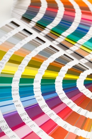
Most people want neutral carpeting, but how do you choose the right neutral for your new home? Here are a few tips to help you define your best choice.

Choose carpeting later: There is such a large selection for neutral carpeting that you can find a shade and tone to work with any décor. So if your new home has an open floor-plan spend time first on those options that have fewer choices such as cabinetry or countertops. Then bring samples of your choices along when you select your carpeting.

004 carpeting
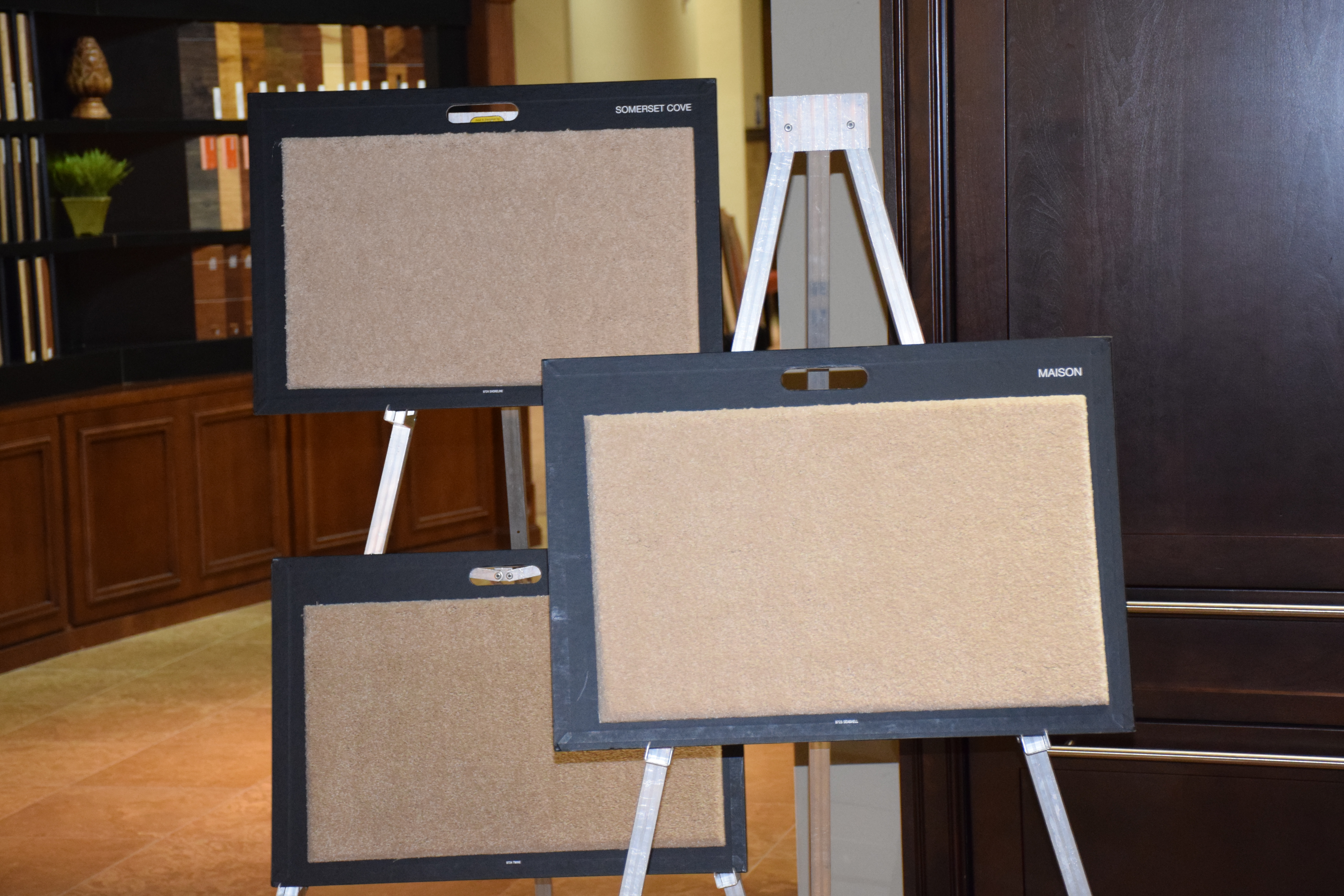
Narrow your search: Select three or four samples of carpeting and pull them away from the rest. Your favorite may pop out at you once you see your selections together.

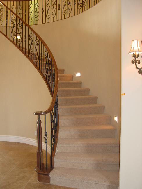
Look for contrast: Is your furniture dark? A lighter carpeting choice will showcase your décor more effectively. On the other hand, if you have light colors in your home, darker carpeting can add drama. Overall, balancing dark and light creates a more interesting look.

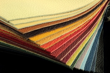
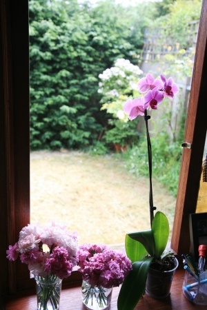
Pull a color out of your upholstery fabric: Are there any prints highlighted in your home? Look for a neutral tone that you could pull out to integrate your furniture with your flooring more effectively. Guests may not notice the connection consciously, but your home will feel more coordinated.

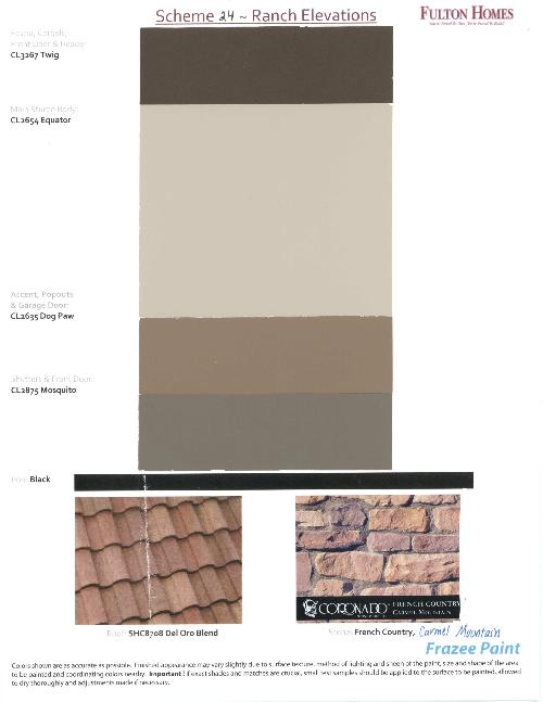
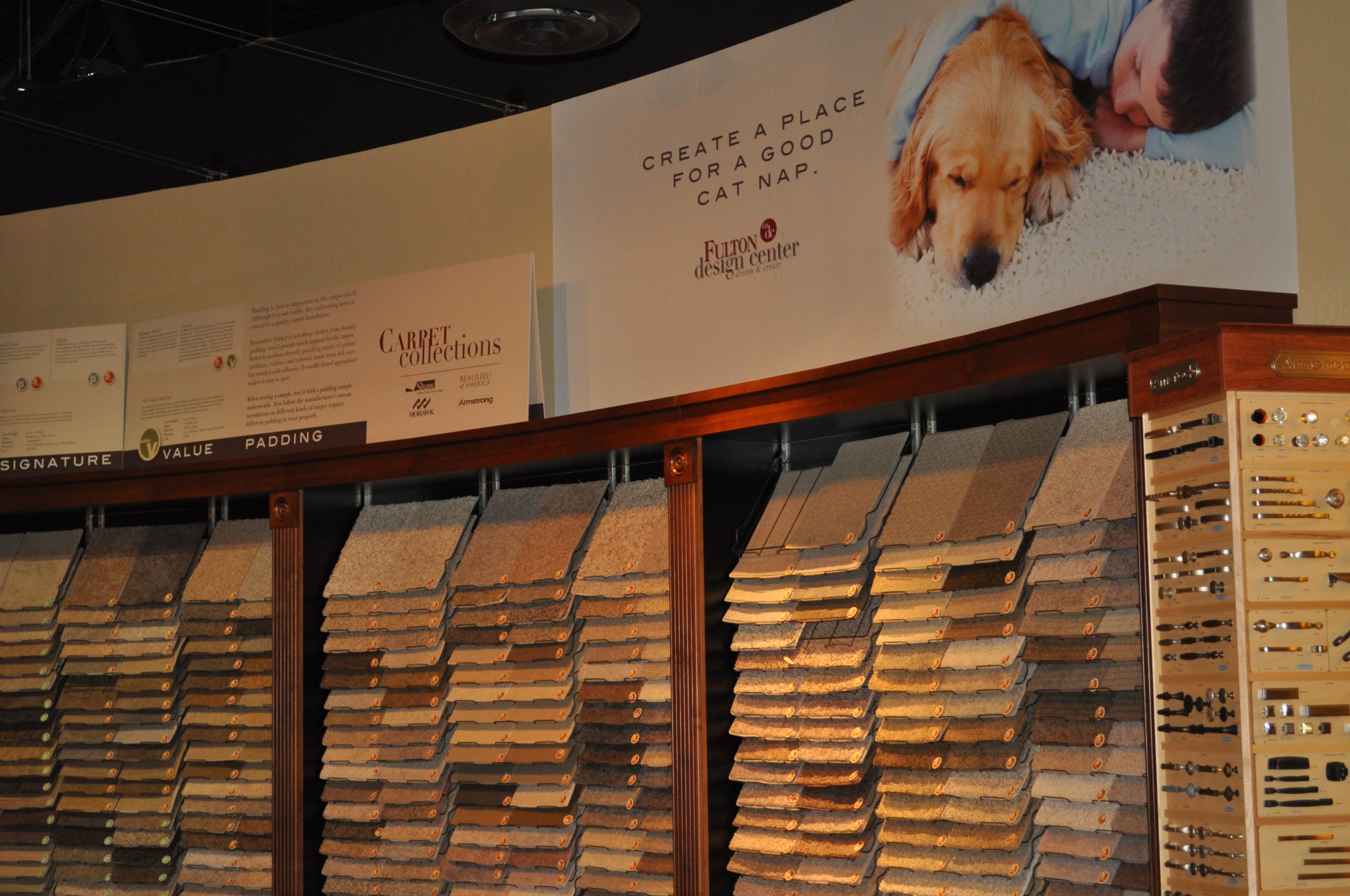
Connect your carpeting with your paint choice. When you visit the Fulton Design Center, you have an interesting selection of neutral palettes to choose from for custom paint for your walls, and you may find it easier to make a paint choice first and then use that tone to determine the best carpeting for your new home.

Pinterest on Paint

20237301_SWhen you visit the Fulton Design Center, it has a good selection of neutral paint colors for your home. The right neutrals can make a big difference in how your home looks.

Suppose, however, you want to add some color to your walls. Visiting a paint store can seem overwhelming. If you want yellow, how yellow do you want to go? It’s easy to move from a light lemon to a horrifying egg yolk without realizing it until you see the final version on your walls.

With its strong focus on visuals, Pinterest provides a great resource for choosing the right paint colors. Instead of studying 30 different versions of the color you want, you can see various rooms with the paint colors listed. Pinterest also lists popular colors with designers which can help you determine the right choice for your home.

If you need direction for choosing the right color, several pins provide clear steps that explain a process for selection that will help ensure success. In addition, check out the many tips and tricks to enable you to tackle any painting project like a pro.

The Fulton Homes Pinterest site has a board, Painting Your Home with pins selected to help you approach painting successfully. Our board is just the beginning of the support Pinterest can offer as you begin your search for just the right wall colors to make your home perfect. While you’re at it, how about visiting some of our other boards? You may find just the decorating or design advice you are looking for!

Don’t be afraid of color

Loft DSC_0312 don't be afraid of color
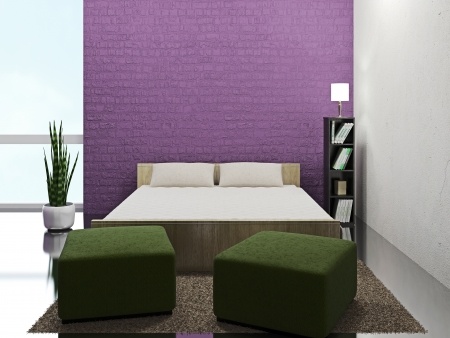
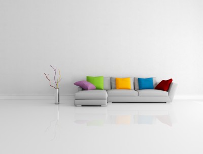
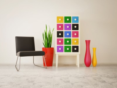
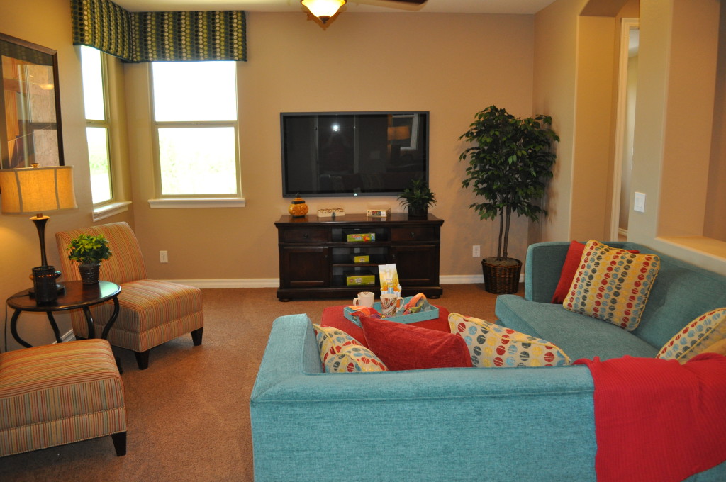
When it comes to larger furniture investments, many people are hesitant to choose color, preferring instead to stick with neutrals. But color creates its own magic, as you can see with these two rooms from the Fulton Homes Cascade model.

You can bring color into a room with less committed options such as paint and pillows, but take a look at how appealing this loft room is thanks to the inviting blue on the sofas and the fun stripe on the coordinating chairs.

Color makes a space interesting. Too many neutrals and you can have a home that looks more like commercial space. Why not show off your color preferences? In this room the soft light-brown carpeting and gold walls provide the neutral tones and then the blue becomes a strong focal point rather than the television.

A red-orange ottoman pulls the pillow and throw colors into the room while the slipper chairs with their stripe play a nice supporting role. Patterns and solid fabrics play well together, creating the feel of a family-only space appealing to kids and adults alike.

Master bedroom DSC_0317 - don't be afraid of colorNot quite ready for prime-time color? How about dipping your toe into the pool with a focus wall such as the one in the photo to the right? The contrast between the light blue and the brown and rust colors from the bedding and curtains works well to keep color front-and-center in this master bedroom.

Blue and brown work well together, creating a sophisticated color palette. If you want to get started with color, you might enjoy visiting a shop that carries upholstery-weight fabric. Choose a colorful print that appeals to you and build your room around it. You may find yourself saying yes to color in your home in ways you would never have imagined.

Personalize your Home: Color

15825954_SDo you find yourself always choosing “safe” neutrals when you make a purchase for your home? Well, maybe it’s time to add some of your favorite colors!

If you’re not sure where to begin, take a look at these ideas to kick-start color in your décor.

It’s just paint: This seems like a daring place to add color, but it’s actually one of the easiest and least expensive ways to change a space. Here’s a suggestion. When you’re looking at paint samples, move down the color cards to the rich darker tones at the bottom. Then get sample pots of several of your lighter choices and a few of the brightest hues.

Now, challenge yourself to paint at least one wall with the vivid shade. Use the sample pots to see which wall and which color works best for you. Be sure to live with those sample colors for at least a week. You may find that a color that was startling at first grows on you over time.

20700581_SPlant a pocket of color: Whether it’s bookshelves, a guest room or some simple storage in the kitchen, consider adding a splash of various colors in combination. Take a look at how appealing the vivid mix of tones appears on the right. Simple lines pop when you add color to the mix.

Take a chance: Instead of a brown leather sofa, how about choosing one of the colors shown below? The rich blue, warm olive green, or even one of the daring reds could turn your safe living or family room into something dramatic and inviting.

Does a sofa seem just too much? Why don’t you start with a chair; then add some color in a rug. You never know, you may end up with a home as bright and colorful as you are!19877392_S

Making 2014’s Top Color Work in Your Home

25272599_SPantone, one of the most influential color companies in the world, selected its 2014 color of the year: Radiant Orchid. Soon you will see clothes, accessories, and home elements such as wallpaper, paint and linens in this vibrant shade.

If you’d like to incorporate Radiant Orchid into your life, here are a few suggestions, ranging from all out to a simple touch of this warm mid-tone lavender.

One inviting option involves paintable textured wallpaper and just the right shade of paint. This accent wall captures the feeling of Radiant Orchid, using a slightly darker tone to ground the wall.

11879796_SIntroducing a pop of the color in one strong block gives you the impact you want while making it easy to change in a few years if you fall in love with another color. Surrounding this wall with neutrals and bringing in a rich green – the natural complementary color for purple – allows the wall to draw the eye without overpowering the rest of the room.

If you want to incorporate this Radiant color into your everyday life without a large investment of time, space or dollars, look for small functional home items to spark up your bathroom or kitchen. This espresso maker adds a splash of Orchid, and the tablecloth supports this with stripes that pull purples in as well as other colors to balance the look.

10643751_SMaking this type of decorating choice allows you to play with trending colors while still maintaining the longer-term look and style you enjoy. Combining trendy with classic elements such as the white cup and saucer shown provides a design balance that’s fun with staying power.

One final option: how about going simple by adding an actual orchid in Pantone’s radiant color such as this one to the left? After all, long before Pantone selected this color for 2014, nature had it featured in a number of its finest products!

Fulton Homes Design Online – Colors & Textures

Std Int 2-Tone Paint ColorDecorating your home starts before you place your first piece of furniture. Choosing the right paint color provides a great start to the decorating process.

Gone are the days when every wall in a new home is painted the same Navaho White. Fulton Homes provides a choice of 12 designer colors for your walls, all 12 available in low VOC paints.

Or maybe you want to go with a two-tone look with Frazee eggshell wall paint in 16 Designer Colors? Take a look at choices online at Fulton Homes Design Online and then make your final selection at the Fulton Homes Design Center.

Doors, baseboards, casings, trim, closets, garage and ceilings will all be painted with Swiss Coffee. This soft off-white complements any wall paint choice.

You may want to bring samples of your upholstered furniture colors, and consider your flooring and cabinet and countertop choices when making your final paint selection. By spending a few minutes, you will find that the right paint choice helps bring everything in your home to a coordinated whole.

Exterior Color Scheme 24CYou have a choice of exterior paint choices also, along with Coronado stone trim. These colors are chosen to coordinate with your home’s particular elevation. Paint samples are available in both the Sales Office and Design Center. The photo to the right shows only one of the options you can choose from for your own home.

Fulton Homes Design Online also shows you the textures offered on the interior and exterior walls of your home. Browse through the “colors and textures” section and discover those options that may stay in the background, but will have a real impact in the final look of your new Fulton Home.

Decorating with Your Colors

11052685_SWhen you were little, chances are you didn’t limit yourself with color. Drawing with crayons, colored pencils or paints, most children will use almost every color in the box.

What happens when we grow up? Suddenly we seem to limit ourselves to a very few options from the rich selection available. Walk through your home and peek in your closet. How many of these colors can you find? Are you seeing lots of the grey, brown and black, or are you letting your bright side show?

8064776_SHere’s a low-risk introduction to more color. Throw pillows are inexpensive, portable and temporary. This room shows what it looks like when you dip your toe into color. It’s better, but it’s a pretty wimpy leap into the spectrum.

Take a look at the vignette below. Here colors play a starring role. The chest grabs six different hues from the pencils above, and the vases and pot add more. The neutral background and flooring and splashes of black simply showcase the colors more strongly.

8960162_SWhat was your favorite color as a child? Do you see it in your home? Purchase a box of crayons and count the colors you see in your life now. Have you accidently gone kind of taupe? It’s time to make a change.

Pick out your favorite crayons from the box and go shopping. Would you like a bright blue vase? How about a red glass bowl or a yellow side table? Have some candlesticks that you’re tired of – how about spray painting them all orange and setting them on a table together?

Bring your favorite colors back into your life – in your home and your wardrobe. You may be surprised at how well they brighten your days.

Help your Child Redecorate -Color and Pattern

12105159_S This stage is the most exciting part of redecorating a child’s room – or any room for that matter. There are a few simple ways to help your child define the colors and look of a bedroom without taking over the process. Here are some ideas.

Picking colors: One easy way to determine a good main color for your child’s bedroom is to focus on a favorite color or colors. Another option is to consider the colors of your child’s favorite clothes. Don’t discourage bright tones – a child’s room can handle more vivid colors than you may want in the rest of the house. This is a great time to encourage experimentation and creativity. Colors can also be mixed – take a look at the broad variety of choices in the room above!

Choosing patterns: Fabric, rugs, stencils and wallpaper can all add pattern to a child’s space. In the room above, a simple mural provides the largest element of pattern. You might want to visit a fabric store or look at bed sheets and coverlets to see what appeals to your child. Be sure to consider stripes, checks, ginghams, polka dots, and other standard pattern styles.

6249365_SApplying color and pattern: Paint is the easiest way to establish color in a room, and the easiest to change later as your child’s taste changes. This can include walls and furniture. Wallpaper can also be applied to one wall or a piece of furniture to add pattern. Just be sure to prime the surface first so you will be able to strip the paper off later. Curtains, bed linens and rugs also provide methods for introducing color and pattern.

Working with existing choices: You can introduce colors that don’t seem to work with the current room options and still be successful. Take a look at the girl’s room to the right. The pastel pink and blue scheme wouldn’t be expected to connect with the light camel carpeting, but it does. As long as options such as flooring don’t actively clash, they will retreat to the background once the overall look of the room is established. An area rug or two also keeps the focus on the décor rather than the carpet.

So encourage your child to be daring – a child’s room should be fun, colorful, happy and expressive, and as a parent you have the chance to encourage those abilities in your children with their bedrooms and their lives.

Thinking about Walls: Dark

How daring do you want to be with your walls? Would you risk painting your walls this dark?

As you can see, it’s a dramatic look that works very well here. Let’s take a look at the choices that make a midnight black wall work in this room.

To start, plan to paint multiple coats to get this rich a tone. When you choose a dark shade, at least three coats are generally needed to build depth of color. You may be able to get away with two if you use a tinted primer, but don’t hold back – an extra coat or two will really make a difference.

Next, take advantage of contrast. The bright white sofa and chair upholstery help the walls pop and make the room feel light. Take a look at the mirror frame and the curtains. Once again, the pure white works well with a dark, dark wall. Adding the brown pillows provides a contrast on top of contrast. This contributes to the drama of the space.

Make sure the lighting lets the space feel open and inviting. During the day this space stays well lit thanks to the two large windows. At night, look for lighting options that pull light into corners and highlight the shine on this luscious floor.

Notice that we’re working with white, black and brown here. There are a few plants, but they play as neutrals rather than color because they are living elements rather than accessories. A splash of color – yellow, red or orange – would make a fun element.  Are you ready to take a chance?

Thinking about Walls: Yellow

Yellow can brighten up a bathroom or kitchen, or make a bedroom seem extra sunny. But it is the most difficult paint color to get right. The wrong choice can make a room gold instead of yellow, or turn a space into egg yolks rather than lemon. If you want to bring yellow into your home, take these steps first.

Go lighter: Yellow dominates a room much more than you would expect. Whatever tone you want, choose one at least two shades lighter. The color strips available at paint stores make this easy. Don’t worry that it will be too light. Yellow reflects off every wall and the color naturally intensifies.

Test test test: Buy a sample of two or three possible yellows. Paint poster boards, one in each color, and try them close to each other. If one of the yellows has an orange or green cast, you’ll be able to tell thanks to the contrast. Choose the purest yellow you can find. Also, put the painted posters on every wall of the room and then see which works best. Yellow changes its mood depending upon the type of light, so check in daylight and artificial light.

Combine with white: Don’t be tempted to use too much yellow. Paint the ceiling white and don’t add yellow cabinets or furniture. Too much yellow quickly takes over a room. White areas help the yellow look brighter without becoming overwhelming.

Yellow can be gorgeous or a real problem. Doing your homework at the start will give you a space that uses yellow at its best.