Understanding Color: Warm vs Cool Neutrals

Warm vs. cool neutrals – which choice works best for your home.

Neutrals are wonderful tools when decorating. A completely neutral room can be both restful and sophisticated, while showing off different textures. A neutral room can also look like the person decorating it was afraid to take a chance with colors. One of the differences between the two rooms is an understanding that neutrals are not just a “safe” choice, but actually as powerful as colors.

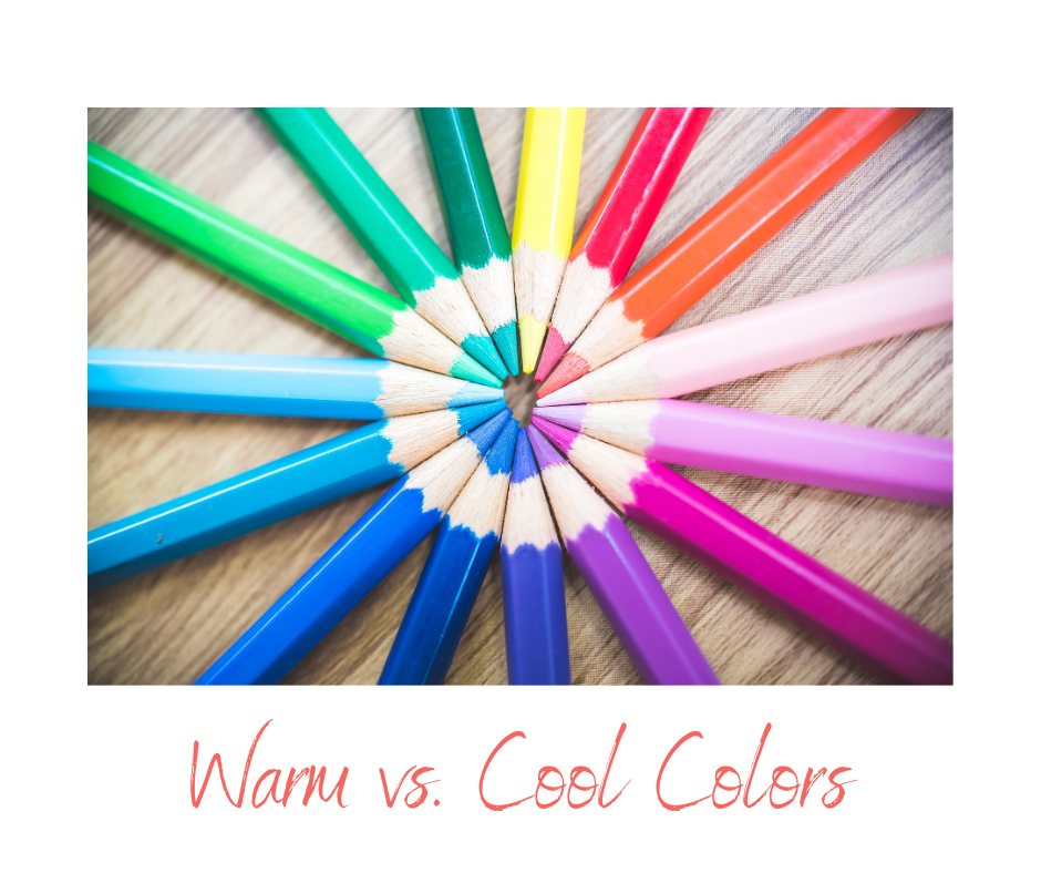
A good place to start when analyzing neutrals is determining whether they are cool or warm. Just like colors, neutrals fall into these two categories. Warm neutrals include black, gold and tans, as well as beige. Cool neutrals feature white, gray, ivory and silver. Like colors, neutrals run on a continuum between cool and warm. If you’re not sure where a specific neutral falls, look for color undertones. If you see blue, it’s in the cool spectrum. Yellow or orange undertones take a neutral into the warm direction. Comparing neutrals can also help you decide the relative cool/warm nature of the tones.

Neutrals provide an effective background to a color-filled room and allow two challenging colors to live in the same space without competing. Many people choose neutrals for flooring for the flexibility they provide with the rest of the space.

When bringing a new neutral into an existing room or a new space, consider the neutral or neutrals in combination with the colors you will be introducing. Pull all of your samples together when shopping, or bring store samples home to see how they work in the designated space before making your final choice. Take time to evaluate everything to give you the opportunity to make the right selections. Neutrals can be remarkable – providing the glue that pulls a room together.

Understanding Color: Warm vs. Cool Colors

Often decorators will mention that a particular color is warm or cool. This can be confusing, particularly for those of us who haven’t taken art since primary school. Understanding the difference and meaning of warm vs. cool colors can be a helpful addition to your bag of tools when you are making decorating decisions. The good news is that this concept is easy to learn and apply.

Warm colors are called that because they are the colors of a sunny day. Yellows and oranges, as well as affiliated colors such as orange-reds, yellow-greens, and browns, constitute the easiest to spot warm colors. Cool colors reflect a rainy or foggy day. Blues, purples, turquoises, and some blue-toned reds and pinks make up the cool collection. Colors can vary in their warmth and coolness, so don’t expect to recognize every color as warm or cool right away. If you’re not sure, compare it with others in the space.

Warm and cool colors from a decorating sense behave very differently. Warm colors seem to approach you. They are inviting and energizing. Cool colors are distant, and create a sense of serenity. Because of their characteristics, warm colors work well in dining rooms or areas where conversation and energy are valued. Cool colors are effective in bedrooms, where the goal is to relax and fall asleep.

Most rooms have both warm and cool colors in various combinations. Rooms that are all one or another can be uncomfortable, although you may not be able to determine why. Cool colors keep a warm room more under control, and even a few warm color elements, with their relatively strong visual impact; help a cool room seem more welcoming.

If you’re planning to make some color changes, factor the balance of cool vs. warm colors you want in each room. Experiment by removing a number of warm or cool pieces from a room, to see how it affects the feeling of the space. By factoring in the level of warm and cool color elements in your home, you may be surprised to discover how much more effectively you can capture the feeling you want in each room.

Cool Colors for Hot Days

We’re halfway through the summer and as our utility bills rise and the sun never seems to set, there are things you can do with your home’s decor to help you and your family beat the heat. Here are a few suggestions.

Bring cool colors into your home. Cool colors include blue, green, purple and pink. These colors help us perceive a space as cooler in temperature. Most rooms have a combination of warm and cool tones. Consider removing some of the warmer color accessories, pillows or linens – red, yellow and orange – and replacing them with cool colors for the summer. A few small changes can make a big difference in the color balance of a room.

Add more white. White is a cool tone, and the more white you have in a room, the cooler it feels. How about covering your sofa or upholstered chairs with white canvas slipcovers? These can be washable, making summer spills less of a problem. Take a look at the room below to see an example of how fresh and cool white can be.

Eliminate clutter. What looks warm and cozy in the winter can feel stifling in the summer’s heat. The less your eyes have to rest on, the more open and cool a room feels. You may also want to remove a few accessories or even small furniture pieces.

Add fresh elements. Flowers, plants or even fruit in a bowl can help a home feel cooler. You may also want to put those fresh items in vases, pots or bowls made of cool materials such as crystal or silver to double-up on cool images.

With just a few design changes, you can help your home feel cooler all summer long. Look for opportunities to bring a cool feeling into every room of your home.