Area Rugs Pull Rooms Together

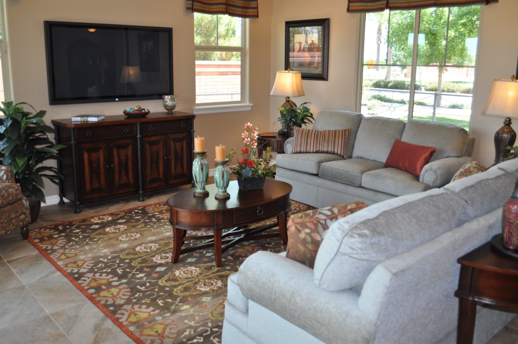
Family Room DSC_0323 area rug 3Do you find that some of your rooms feel a bit unfinished? If you’re satisfied with your furniture placement, art on your walls and accessory choices, look a little lower and see if a rug will provide the final touch.

Most interior decorators will encourage you to start with the flooring, including area rugs, but if you are already through with much of your decorating, the vast selection of colors and styles means that it’s never too late to add an area rug.

Start by taking a good look at your space. Would a darker or lighter rug fit better? What about colors? Finally, what style would fit your home’s décor the best? Could a contemporary pattern add flash to your traditional furniture selections or would a more classic choice connect everything together?

Next, go online to start visualizing some of your options. The Fulton Design Center carries Feizy area rugs – a company that has a long tradition of quality and style. They have choices in a wide range of colors and materials to fit every budget.

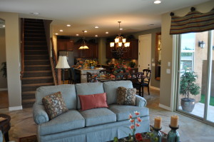
Be sure to bring a few photos of your room when reviewing rugs in person. It will help you understand the proportions of the design and color choices. Notice in this room from the Fulton Homes Cascade model, the rug pulls out the accent colors rather than the primary ones. This brings a rich note to the room through expanding the dark tones with just a few hints connecting to the lighter sofas.

An area rug is a worthwhile investment – one that can add to the mood and charm of your home in any room.

Say Hello to Spring with Projects

20849225_SIf you’re looking for a way to give your home a blast of spring color and mood, consider visiting Pinterest for some ideas. Our Fulton Homes Pinterest site has a board “Everything Spring.” with bunches of fun spring photos, design ideas and projects for you to bring the season into your home.

Let’s take a look at a simple and fun way to add an unexpected touch of spring to any room in your home. The photo to the left shows a flurry of paper butterflies in bright yellow. You can cut and set these up in an afternoon, and have a fun wall that says spring in no time.

For paper, visit your local scrapbooking store and investigate your choices. Or you can hit an office supply or paper store. This yellow is available in the Astrobright line of papers in standard paper weight or card stock if you want a sturdier display. You can also find a vivid pink or bright light green in this line of paper.

It looks like these butterflies were cut with a die-cut paper machine – available at hobby stores. The perfect size and shape of these butterflies makes that clear. But there’s no reason not to simply cut your own. A little variety in the look of the butterflies would add charm to the presentation. You could also add flowers and leaves in other colors. Double-sided masking tape or masking tape loops will hold the butterflies to the wall without any permanent damage. You might want to include any children in your life on the project – or just keep it to yourself and have the kids wake up to discover that spring arrived while they were sleeping.

Say Hello to Spring with Home Décor

25712497_SDo you feel challenged making your home feel like spring without changing out the colors in your home? It doesn’t take a lot of time or money to add a splash of spring.

You can create a feeling of spring in your home simply and easily with flowers. The photo on the left shows several good options.

Forcing bulbs will create a lovely and long-lived flower arrangement. Here snowdrops and daffodils brighten up the day.

Forsythia and pussy-willow branches – cut and put in water – will bloom and last for several weeks. Although these don’t grow in the Phoenix area, a number of grocery stores and flower shops stock them this time of year.

The tulips are cut and in water. If you want to avoid drooping tulips, cut a small slit in the stem just under the flower itself with a sharp knife. By the way, tulips will continue growing after being cut, so don’t be surprised to find your flower arrangement taller than it was.

22337400_SIf you want a simpler arrangement that still adds spring charm to a room, how about the flowers on the right? Some stores sell small bunches of daffodils for less than two dollars in the spring.

By placing one or two flowers in a collection of brightly-colored vases, you can create a festive spot of spring yellow in your home. If you don’t have vases, even water glasses will work. Don’t worry about making it perfect, the flowers will carry the spring mood.

Fountain Magic

Courtyard20DSC_0250In desert countries centuries ago fountains helped relieve the feeling of heat and a burning sun, creating an oasis of cool water to refresh the eyes and the throat.

Today in Arizona we have misters outside and air conditioners inside to help us tolerate the heat of summer. But we can still create our own oasis in the desert by placing a fountain on a patio or courtyard.

Fountains provide a visual break from the desert heat – cool water on the move just seems to make a space fresher and more inviting. But that’s only part of the charm. The sound of water running through a fountain relaxes the most stressful guest and provides a much-needed melody to help you find your feet after a rough or extra-busy day.

This fountain from the Fulton Homes Starlight model allows a bit of space to perch next to the water and run your hands through it. Water soothes and provides solace. In the middle of summer’s heat, there’s a promise of cooler times to come.

Whether you prefer a wall-based fountain such as this one or a stand-alone piece – a contemporary architectural design like this inviting choice or something with cupids or dolphins – consider adding a fountain to your home. There’s no denying that this space begs you to step outside and enjoy the day or the evening. By bringing a fountain into the mix, you kick the entire outdoor space up a notch to something that welcomes you home and says, “Sit back and enjoy.”

Linking Kitchen and Dining Spaces

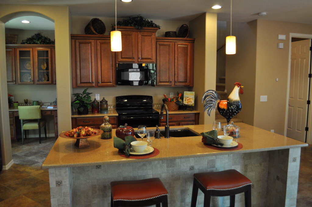
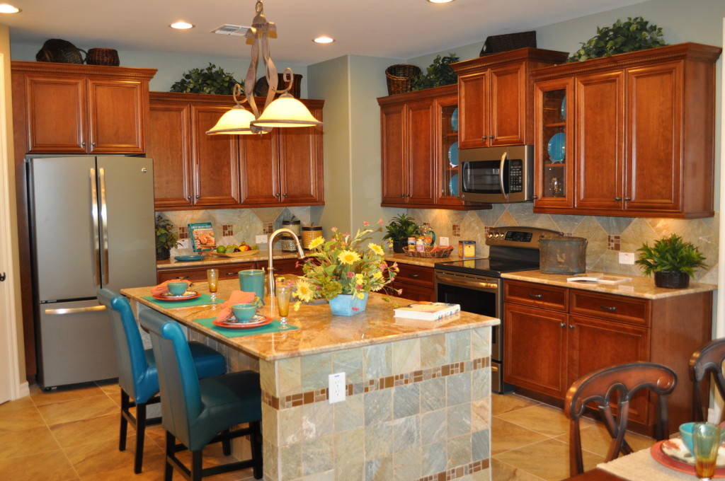
Kitchen20and20Nook20DSC_0244With an open floor plan it’s easy to connect with friends and family when fixing a meal. The distance to the table is short, making the transfer of food to table and dirty dishes back only a few steps.

If you have lived in a home without this kind of space, an open floor plan is a luxury indeed. But planning the décor requires attention to make the space feel unified. This Fulton Home model demonstrates how to connect the kitchen with the dining space. Let’s take a look at some of the decisions that make this space work so well.

Flooring: By staying with dark wood flooring throughout, everything feels like one room. The island provides the only break between the kitchen and dining table.

Cabinetry & Furniture: The cabinetry in the kitchen and the dining table and chairs coordinate in wood tone. Another connection comes when the chairs at the island sport the same design as the dining chairs. This keeps the one-room feeling intact.

Lighting: Although the pendant lighting above the island has a different function than the chandelier in the dining area, the glass globes are the same shape and both have the same brass finish. They are from the same family of lighting fixtures and they help integrate the space beautifully.

Accessories & Colors: The dishes, flowers and kitchen décor mirror the dining table’s tablescape. This causes your eyes to travel freely around the entire space without a pause. A difference in color or style from kitchen to dining room could create a jarring interruption.

If you are moving to a home with an open floor plan for the first time, be sure to factor the need to integrate several spaces into your design and décor plans.

Dining Room with Drama

From Fulton Homes Daylight Model

From Fulton Homes Daylight Model

What makes this dining space special? A sense of drama captures the eye and invites you to have a seat and a meal. Let’s take a look at why.

Color: The walls have a rich tone that is darker than expected, creating a sense of intimacy. The leather-colored flooring echoes that warmth.

The artwork and tablescape complement each other – with rich red and dark olive green combined with a sunny gold. Brown links it all together, with the furniture, chandelier and art all showing a brown base color.

Comfort: The chairs are built for comfort with backs that slope and cushioned seats. If you want a lively dining experience with people lingering over their meals, be sure to select dining chairs that will be comfortable for several hours. Don’t be seduced into uncomfortable chairs by a certain look or style.

The lighting also makes the space feel inviting. Having the shades facing up makes the room bright enough without any glare. The slight amber tone also warms the space, helping to relax the environment.

Style: Everything in this room is consistent in flavor. The feel is sophisticated Mediterranean, building the expectation of a meal that starts with bruschetta and ends with a bowl of fruit, with pasta and maybe fish in the middle. Imagine the hostess removing the flower arrangement from the center of the table, replacing it with a large bowl of tossed salad and a basket of bread still warm from the oven.

Cloth napkins with napkin rings, the dark red chargers under the white plates – food always looks better on a white plate – and the simple ceramic apples at each dish promise a meal to remember. This room is set up in anticipation of a lovely meal with congenial company, and it invites you to sit down and enjoy it all.

Furniture Shows its Curves

Family Room rug DSC_0278Rooms, windows and most furniture tend to be sharp-edged. Sofas are basically rectangles. Windows, rugs and cabinets have corners.

You can soften this look by bringing in some curves. Take a look at the coffee table in the photo. The soft oval shape and curved legs bring another inviting element into this room. With the circular side table to the left and table lamps with round elements, the space moves beyond angles.

Take a look at the arms of the sofa on the far wall. These curves soften its rectangle presence. Notice the circular upholstery tacks and the round buttons running under the cushions at the front of the piece. This homeowner clearly understands the value of varying the shapes in this room.

Family Room and courtyard DSC_0272We have a different view of this same room to the right. More curves come into play with a half-oval table behind the sofa  in the same style and structure as the coffee table.

The accessories on the sofa table also focus on curves – from the containers on top to the globe bookend sitting on the lower shelf.

Take a look at your rooms, breaking down all of your furniture and accessory choices to their basic shapes. How many squares and rectangles are there? Have you brought in any curves to add interest and variety?

If you think your spaces could use some curves, consider adding some full curtains, soft pillows and round and oval accessories to the mix. You don’t have to replace major pieces of furniture. Small additions will make a real difference.

Outdoor Living – Many Choices

Courtyard DSC_0273 (2)

Fulton Homes Daylight Model

Now while we’re in the outdoor living stretch in Arizona, take a few minutes to think about how you want your yard to function. Do you enjoy having your coffee and reading the paper in comfy chairs outside in the morning? Are family dinners more fun outside? Should there be a spot for the kids to play, or is your focus entertaining and your dream a plush outdoor kitchen?

This time of year it’s tempting to buy outdoor furniture first and then arrange the space, but you may find yourself with pieces that don’t coordinate, or that don’t meet your real outdoor goals. Just a bit of planning can help you create a space that looks beautiful and really works for you.

Take a look at the table in the foreground. It seats six comfortably, and you could put three chairs on a side and make it big enough to handle eight. Planning a larger party? How about using the table as a buffet, and arranging the chairs around the yard. The raised planters have a nice wide ledge that’s perfect for perching with a plate.

The fact that the two chairs in the background are the same color as the dining set but a different material and style keeps this yard from being too matchy-matchy. With today’s amazing weather-proof fabrics, you can find cushions that can handle the outdoors in a rich selection of colors and prints. Adding cushions to the dining chairs in a stripe that picks up the rust from the easy chairs would pull everything together beautifully.

With careful thought and shopping, you can make your backyard lovely, functional and versatile enough to meet all of your outdoor plans this spring.

More than Pictures on your Walls, Part 3

4552270_SIf you’re looking for ways to make room for some special items, consider turning your walls into active storage, while adding some style and variety to the look of your home at the same time.

The guitarist whose wall is shown in this photo created a truly wonderful display of his instruments while keeping them safe and handy for playing. Other musical instruments could be used in the same way. If you have a favorite hobby, consider hanging some of your favorite elements of it in plain sight.

11323448_SIf you’re a cook who enjoys the ability to grab the right tool without opening a drawer, how about hanging some of your favorites on a wall in your kitchen?

You can purchase a similar system of S-hooks and metal cross pieces at stores such as Ikea, and the pop of all this stainless steel would be a wonderful backdrop to complement your stainless appliances. Add a couple of colorful pot holders and you have a work unit that’s also a work of art.

The kitchen display below combines decorative pieces from long ago with a nice selection of useful pots and pans. Maybe the teapots and trays atop the copper shelves belonged to the cook’s mother or grandmother, and they provide a nice reminder of helping to prepare meals as a child.

493988_SThe bright copper pot racks and the collection of cheese knives below bring life and color to the montage.

What do you have hidden in a drawer or cupboard that could add unexpected charm to some space in your home? You may want to position a shelf or two and see what you like sitting on them. All it takes is some imagination and a little daring and you can have walls as interesting as these are.

More than Pictures on your Walls, Part 2

25932550_SIf you’re drawn to the rustic look or just need to decorate a man cave, look no further than your garage or backyard shed for wall décor.

The display of three hard hats on the left really works, grime and all. It seems as though three guys came in and hung their hats up before taking a well-deserved break from a day of hard work. This hat display is very different from the one in the last blog on wall art!

6715183_SThese work boots have a dramatically different feel from the ballet slippers in the last blog also. Once again, it’s the sense that these boots have seen some hard use that makes them work so well. Don’t discard options because they are well worn. Instead, think of the scars and damage as the patina of long years and enjoy those things that make your choices unique.

Other options for your walls include tools, ropes, harness and tack, and gardening implements. You may find that some things work well together. Creating a montage of old tools or favorite baseball caps could add interest to a weathered wall.

7933900_SIf you’re not satisfied with the options in your own home, shop local stores for collectable items such as the horseshoe to the left. The shoe is well-worn, like the other items in the photos above, but it’s the old handmade nail that brings the age of the piece to life.

Do you have a rec room or family room that could benefit from this type of unique approach to your walls? These photos demonstrate how something that’s thrown in a corner can have a real impact when it’s given a chance to shine. Look with new eyes and you never know what you’re going to find for your walls.