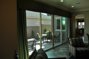
Outdoor Living Space

As we move through Arizona’s short and easy winter months – all two of them – it’s time to think about one of the best times of year here – spring. From about February until the heat finally comes upon us, we can spend serious time outside. Fulton Homes always factors appealing outdoor options into its home designs.

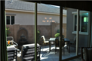
This patio, part of the La Quinta model at Oasis at Freeman Farms, provides a secluded space to enjoy our perfect weather. This inviting side patio shows the four F’s of working outdoor space –four smart decisions that make the space particularly appealing and effective. Take the time now to determine what you need to do to make your outdoor area ready for spring.
Function: What do you want to do with your outdoor space? Before you choose furniture and accessories, it’s smart to determine how the space will be used.

Flooring By continuing the inside tile choice outside, the space feels like a continuation of the indoor area. This makes both the indoor room and outdoor patio seem larger more integrated. Choosing tile also makes it easier to keep the patio clean and attractive.

Furnishings: Creating an outdoor space with a feel similar to indoor areas is easier than ever given the wide variety of sun and rain resistant fabrics and cushions. This patio is spacious enough to include a comfy conversation corner and a place for al-fresco dining. The consistency between the outdoor furnishings and the indoor pieces further the connection between the two areas.

Fountain: A wall-hugging fountain adds warmth to an outdoor space, both visually and aurally – with the sound of splashing water helping to reduce stress and creating an inviting ambience.

Well, alright, the fountain shouldn’t really count as the fourth F – it is optional. But if you spend some time in an outdoor space with a fountain, you may quickly determine that it is a necessity. To help you decide, we’d like to invite you to visit this outdoor area – currently on display in our La Quinta model home.

Classic Dining Room

Well, most of us do not have a dining room that will support a dinner party with 14 guests the way this one does, but the things that make this room work can be used in a dining room serving eight or even four people. Let’s look at the consistent features that every classic dining room should contain.

Space: Make sure every guest has two to two-and-a-half feet of linear space at the table. This oval table provides an additional advantage – it gives the people at either end extra leg space. Also plan on at least two feet of area rug beyond the edges of the table so that people don’t end up bumping off the edge every time they push their chairs back. Did you notice the padded chairs? Just like our contemporary dining room in Monday’s blog, the comfort of your guests is important if you want people to linger to chat after meals during your dinner parties.

Lighting: A chandelier’s height should be about 30 inches above the dining table’s surface, but you may hang it higher to make sure it lights the whole table. With a table this long, two chandeliers would also work, but the wall sconces and mirrors will help keep the room well-lit. Notice the medallion on the ceiling. This makes the light hold a stronger place in the room and works well with the rich display of crown molding on the edges. A medallion is a simple, inexpensive and effective way to emphasize your chandelier or any light fixture.

Tablescape: The crystal in the center of this table echoes the items in the cabinets along the wall as well as the mirrors and windows, keeping everything integrated. Be sure to keep anything in the center area of your table low enough for people to talk across.

Your dining room may not have the size and majesty of this one, but following the same rules for good dining allow you to make dinner parties at your home just as enjoyable.

Contemporary Dining Room

Contemporary doesn’t mean cold, as this image shows. The colors, furnishings and accessories all combine to create an inviting space for dinner parties and family meals. Let’s take a look at what makes this room work so well.

Color: The dark brown tones, combined with cream and grey, transition well with the stainless steel appliances from the kitchen while creating a warm space for eating. These colors are neutral enough to allow the homeowners to set the table to suit their mood or the season.

Furnishings: The box-like table says contemporary very well, and the wall-mounted buffet and shelf support the clean lines while staying low maintenance. Large rectangular tiles also suit the modern feel. Notice the chairs, however. Although contemporary in style, the padded seats and backs make for comfortable seating, encouraging people to linger after meals for conversation. When choosing dining room chairs, always factor in comfort before style.

Accessories: The choices made are all modern and some are almost sculptural. The bell artwork makes best connecting piece with the bells echoing stainless tones and the background connecting with the dining room tones.

Altogether, this dining room features the best in contemporary design while still remaining warm and welcoming.

Special Bedroom: Glamorous

Would you like your bedroom to echo the glamour of old Hollywood? You can create a space to make you feel like a star by using certain techniques. Here are a few suggestions.

Use silver: The cool shiny metallic look provides a mood that resembles Hollywood in its heyday. Look for furniture in silver gilt or something mirrored for a similar effect. Wallpaper like the one shown behind the bed in this image also pull silver into the room. It’s a sophisticated look.

Bring some bling: Notice the sparkly chandelier-type lighting fixtures on either side of the bed. The crystals provide the feel of diamonds in the space. The mirrors on either side of the bed reflect the lighting, doubling the light and the bling. Adding a crystal-laden light or two to your space – either as chandeliers or wall sconces – recalls a past era of glamour and poise.

Take advantage of texture: The soft white rug in this room contrasts well with the silver-coated leather covering the bed’s feet and the headboard. The shimmer of the headboard is emphasized by the old-style tufting provided by the buttons in a diamond pattern. The draperies are ceiling-high and drape gracefully on the floor. The floor itself is polished to a brilliant sheen to add another layer of texture and shine to the space.

Keep colors subtle. Silver, lavender, white and gray carry out the sophisticated theme. The subtleties of the color scheme express the feeling that this room is special and unique. It’s easy to imagine this room as the set in an old black-and-white movie. Make your bedroom a glamorous space and you can feel like a star every day.

Setting a Lovely Thanksgiving Table

For most people, Thanksgiving is about food and family – generally in that order! But with a few extra minutes of time, you can also make it about the beauty of the season.

There’s a saying that people eat first with their eyes, and building a Thanksgiving table that captures attention and represents the best of autumn can make even a rather dry turkey taste better.

The photo to the left shows a fully-planned table. With fresh sunflowers, votives, tablecloth, plates, napkins and napkin rings all coordinated to create a Thanksgiving feeling, it looks like a decorator was hired to fix it.

If you have the skills, budget and time to put something like this together, that’s wonderful. But many of us don’t have the Martha Stewart gene, and are rushed just trying to get the dinner on the table let alone make it look this fancy.

Instead, consider something like the photo on the right. A simple gold tablecloth, one or two interesting candles, a pumpkin or two and some apples and pine cones and you’re finished.

White or neutral plates allow you to decorate for any season without needing closets full of dishes. Add the good silverware and some nice glasses and you have a beautiful table with minimal time and effort.

If you’re going to present Thanksgiving buffet-style, how about a simple display among the dishes? A few fall leaves, a couple of candles, one of those mini-pumpkins and some nuts and dried plants and you quickly add charm to your buffet table. Walk through your yard or visit a hobby shop and pick up just a few special items that you can use and rearrange every year to make your Thanksgiving table as special as the holiday itself.

Thinking about Walls: Pattern

Wallpaper seems like an old-fashioned concept, but today’s patterned walls are anything but dated. Take a look at the image to the left. These oversized leaves create a dramatic and original accent, which is emphasized by the more traditional art.

In most homes, walls serve as a background to the furniture and accessories, but your walls can play an active role in your decorating plans. You are only limited by your imagination.

The room shown to the right demonstrates how walls can take over a room, creating the basis for the total design. This is difficult to do well, but in this case everything works.

To begin, every bit of architecture has its own highlight. The coffered ceiling receives special attention thanks to the dramatic large crystal chandelier. The window nook also has its own wallpaper; the black, grey and white offer an effective but curious contrast to the soft beiges 0n the walls in the rest of the room.

One thing that makes this wallpaper feel more contemporary is the large format of the patterns. The two choices on the back wall – separated by some white molding – complement each other because of the size of the patterns and the colors. Using two different wallpapers emphasizes the separation created by the molding.

Notice how the simple furniture keeps a focus on the walls. The clean lines and pure light tones allow the patterns to shine. The only other pattern comes from the cushion and rug in the foreground – which are also large format and bring some pink and green into the space.

How do you feel about bringing pattern into your home this way? Are you willing to be this creative with your walls?

Thinking about Walls: Dark

How daring do you want to be with your walls? Would you risk painting your walls this dark?

As you can see, it’s a dramatic look that works very well here. Let’s take a look at the choices that make a midnight black wall work in this room.

To start, plan to paint multiple coats to get this rich a tone. When you choose a dark shade, at least three coats are generally needed to build depth of color. You may be able to get away with two if you use a tinted primer, but don’t hold back – an extra coat or two will really make a difference.

Next, take advantage of contrast. The bright white sofa and chair upholstery help the walls pop and make the room feel light. Take a look at the mirror frame and the curtains. Once again, the pure white works well with a dark, dark wall. Adding the brown pillows provides a contrast on top of contrast. This contributes to the drama of the space.

Make sure the lighting lets the space feel open and inviting. During the day this space stays well lit thanks to the two large windows. At night, look for lighting options that pull light into corners and highlight the shine on this luscious floor.

Notice that we’re working with white, black and brown here. There are a few plants, but they play as neutrals rather than color because they are living elements rather than accessories. A splash of color – yellow, red or orange – would make a fun element.  Are you ready to take a chance?

Thinking about Walls: Yellow

Yellow can brighten up a bathroom or kitchen, or make a bedroom seem extra sunny. But it is the most difficult paint color to get right. The wrong choice can make a room gold instead of yellow, or turn a space into egg yolks rather than lemon. If you want to bring yellow into your home, take these steps first.

Go lighter: Yellow dominates a room much more than you would expect. Whatever tone you want, choose one at least two shades lighter. The color strips available at paint stores make this easy. Don’t worry that it will be too light. Yellow reflects off every wall and the color naturally intensifies.

Test test test: Buy a sample of two or three possible yellows. Paint poster boards, one in each color, and try them close to each other. If one of the yellows has an orange or green cast, you’ll be able to tell thanks to the contrast. Choose the purest yellow you can find. Also, put the painted posters on every wall of the room and then see which works best. Yellow changes its mood depending upon the type of light, so check in daylight and artificial light.

Combine with white: Don’t be tempted to use too much yellow. Paint the ceiling white and don’t add yellow cabinets or furniture. Too much yellow quickly takes over a room. White areas help the yellow look brighter without becoming overwhelming.

Yellow can be gorgeous or a real problem. Doing your homework at the start will give you a space that uses yellow at its best.

Highlight your Fireplace

Now that the weather is cooling, those fireplaces that are only so much decoration all summer may see some use. With the attention your fireplace may start getting, it might be time to update its look. Here are a few suggestions for updating your fireplace.

Think proportion: A large piece of art is a nice touch over your fireplace. Make sure it’s sized smaller than the mantel and set low enough to connect to the fireplace below. If you’re concerned about getting the right shape and size, consider using proportions similar to the fireplace itself.

Consider a mirror: Mirrors often flatter a fireplace. However, do check to see what the mirror will reflect before hanging one. That reflection will be visible every time someone looks at your fireplace so you want it to be attractive.

Have your accessories connect the mantel and its art: The candlesticks on this mantel – a classic choice – frame the mirror and take advantage of the larger mantel. Both the clock and the plant reach into the frame and the mirror. These elements make the entire space feel like a cohesive whole.

Integrate the fireplace with the rest of the room: Notice how the candlesticks and candles coordinate with the wall sconces? This connection helps make the fireplace integrate with its location. The area rug also mimics the soft tones of the fireplace surround and the richer tones of the wall.

If you’ve left your mantel alone lately it’s time to take a second look. Shop your own home to find some new pieces to spark up your fireplace before the colder weather encourages your family to pay it more attention.

Design Inspiration – Chandelier

This chandelier provides a great inspiration point for a formal dining room. This last blog on using different inspirations when decorating focuses on creating a mood.

First, notice that the chandelier below is not an exact match with the one in the dining room. The photo shows an antique chandelier that was quite beyond the budget of the couple whose room is shown below.

Instead of trying to reproduce the specific chandelier, the goal was to reproduce the feeling the piece invokes. This photo combines drama, sparkle and old-style elegance, and the dining room below captures the same feelings.

Let’s look at the style of this dining room. The classic chairs and table immediately recreate that old-world look. Notice how shiny the table top is, allowing the crystals to reflect on its surface.

The colors chosen for the room are in the champagne family, echoing the rich shades established by the bowl of crystals at the bottom of the light in the photo.

Extra touches such as the curtains pillowing on the floor and the faded but lovely Oriental rug echo the old-fashioned luxury represented by the original chandelier photo.

Although the chandelier in the room is different from the photo, it has the same circle of candles, additional crystals at the bottom, and the same basic shape. The large gilded mirror and the small ornamental shelves also fit the mood and message this dining room demonstrates.

Perhaps you prefer a dining room that is more simple or contemporary. But no matter what style you want, a light fixture provides a perfect starting point for your design plan.