Furniture Shows its Curves

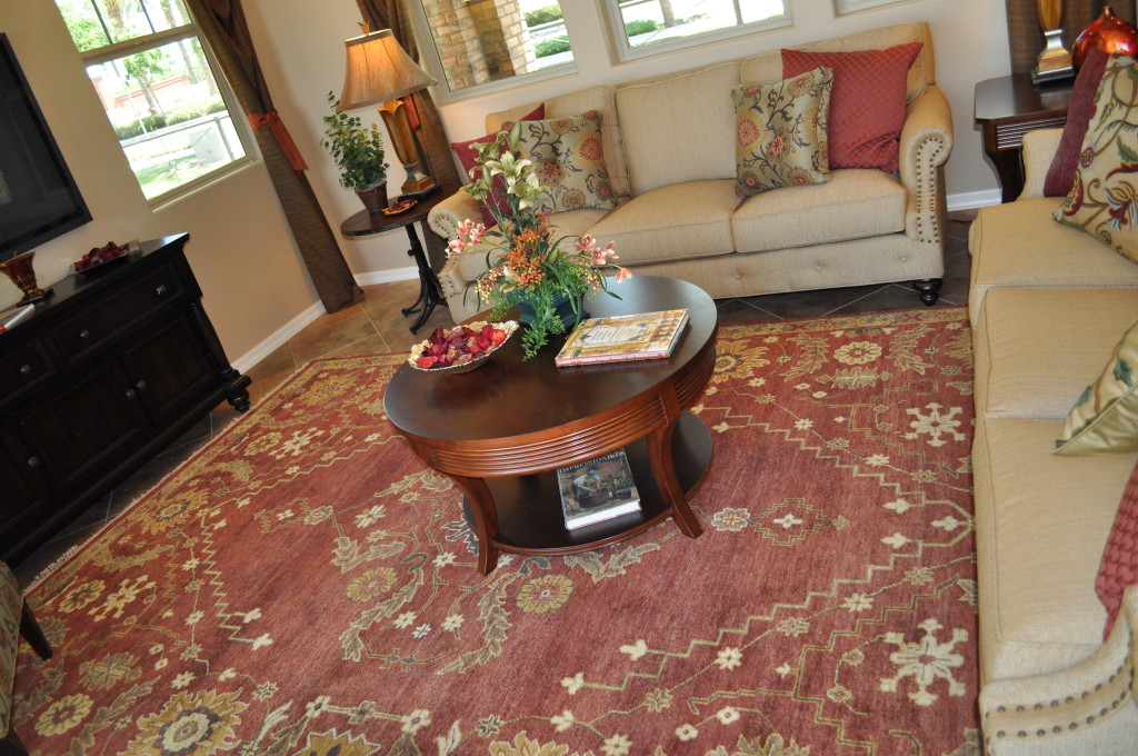
Family Room rug DSC_0278Rooms, windows and most furniture tend to be sharp-edged. Sofas are basically rectangles. Windows, rugs and cabinets have corners.

You can soften this look by bringing in some curves. Take a look at the coffee table in the photo. The soft oval shape and curved legs bring another inviting element into this room. With the circular side table to the left and table lamps with round elements, the space moves beyond angles.

Take a look at the arms of the sofa on the far wall. These curves soften its rectangle presence. Notice the circular upholstery tacks and the round buttons running under the cushions at the front of the piece. This homeowner clearly understands the value of varying the shapes in this room.

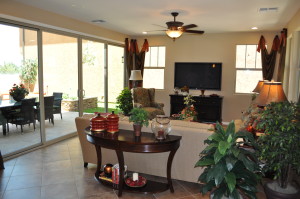
Family Room and courtyard DSC_0272We have a different view of this same room to the right. More curves come into play with a half-oval table behind the sofa  in the same style and structure as the coffee table.

The accessories on the sofa table also focus on curves – from the containers on top to the globe bookend sitting on the lower shelf.

Take a look at your rooms, breaking down all of your furniture and accessory choices to their basic shapes. How many squares and rectangles are there? Have you brought in any curves to add interest and variety?

If you think your spaces could use some curves, consider adding some full curtains, soft pillows and round and oval accessories to the mix. You don’t have to replace major pieces of furniture. Small additions will make a real difference.

Decorating a Boy’s Room for Fun & Flexibility

Fire Bedroom DSC_0287

Fulton Homes Daylight Model

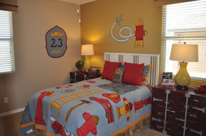
It’s fun to decorate a child’s room, and the photo to the left shows a delightful way to make a boy’s room special while allowing easy opportunities for changes as this child grows up. Take a look at the essential furniture. The headboard and lamps will work with almost any design.

One fun choice in this room comes from selecting shipping containers in place of standard nightstand/chests of drawers. While these will appeal to a small boy, they have the potential to be interesting elements as he grows into his teens. When choosing furniture for a child’s room, don’t be afraid to have fun, but think of the future for more substantial pieces.

The fireman theme carries through with inexpensive pieces such as bedspread, pillows and various toy fire trucks. By using stick-on and peel-off decorations on the walls rather than wallpaper, making a change to reflect the boy’s changing tastes is easy. These are available online and at various home stores in a good selection of themes. Notice that the sophisticated paint color allows transitions without repainting.

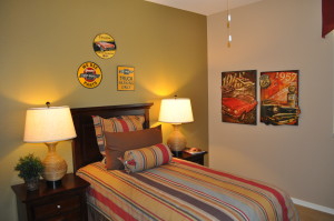
Car Bedroom DSC_0288The photo to the right provides a design choice for an older child. The metal signs and old-fashioned posters reflect specific interests while still demonstrating a sense of style.

The strong green focal wall gives extra oomph to the room and pulls in the stripes on the bedspread and pillows.

Both rooms would work well with either wood floors or a neutral carpet choice. It’s also smart to look for neutral window coverings such as wood blinds to keep the space flexible.

By taking this approach to a child’s room, you create the opportunity for the design to change frequently to reflect his or her changing interests without creating a need for a great deal of effort and expense.

Outdoor Living – Many Choices

Courtyard DSC_0273 (2)

Fulton Homes Daylight Model

Now while we’re in the outdoor living stretch in Arizona, take a few minutes to think about how you want your yard to function. Do you enjoy having your coffee and reading the paper in comfy chairs outside in the morning? Are family dinners more fun outside? Should there be a spot for the kids to play, or is your focus entertaining and your dream a plush outdoor kitchen?

This time of year it’s tempting to buy outdoor furniture first and then arrange the space, but you may find yourself with pieces that don’t coordinate, or that don’t meet your real outdoor goals. Just a bit of planning can help you create a space that looks beautiful and really works for you.

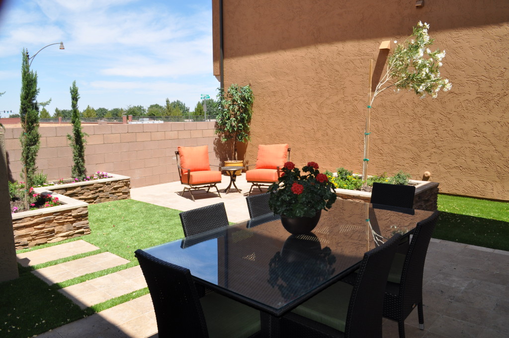
Take a look at the table in the foreground. It seats six comfortably, and you could put three chairs on a side and make it big enough to handle eight. Planning a larger party? How about using the table as a buffet, and arranging the chairs around the yard. The raised planters have a nice wide ledge that’s perfect for perching with a plate.

The fact that the two chairs in the background are the same color as the dining set but a different material and style keeps this yard from being too matchy-matchy. With today’s amazing weather-proof fabrics, you can find cushions that can handle the outdoors in a rich selection of colors and prints. Adding cushions to the dining chairs in a stripe that picks up the rust from the easy chairs would pull everything together beautifully.

With careful thought and shopping, you can make your backyard lovely, functional and versatile enough to meet all of your outdoor plans this spring.

More than Pictures on your Walls, Part 3

4552270_SIf you’re looking for ways to make room for some special items, consider turning your walls into active storage, while adding some style and variety to the look of your home at the same time.

The guitarist whose wall is shown in this photo created a truly wonderful display of his instruments while keeping them safe and handy for playing. Other musical instruments could be used in the same way. If you have a favorite hobby, consider hanging some of your favorite elements of it in plain sight.

11323448_SIf you’re a cook who enjoys the ability to grab the right tool without opening a drawer, how about hanging some of your favorites on a wall in your kitchen?

You can purchase a similar system of S-hooks and metal cross pieces at stores such as Ikea, and the pop of all this stainless steel would be a wonderful backdrop to complement your stainless appliances. Add a couple of colorful pot holders and you have a work unit that’s also a work of art.

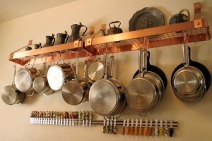
The kitchen display below combines decorative pieces from long ago with a nice selection of useful pots and pans. Maybe the teapots and trays atop the copper shelves belonged to the cook’s mother or grandmother, and they provide a nice reminder of helping to prepare meals as a child.

493988_SThe bright copper pot racks and the collection of cheese knives below bring life and color to the montage.

What do you have hidden in a drawer or cupboard that could add unexpected charm to some space in your home? You may want to position a shelf or two and see what you like sitting on them. All it takes is some imagination and a little daring and you can have walls as interesting as these are.

More than Pictures on your Walls, Part 2

25932550_SIf you’re drawn to the rustic look or just need to decorate a man cave, look no further than your garage or backyard shed for wall décor.

The display of three hard hats on the left really works, grime and all. It seems as though three guys came in and hung their hats up before taking a well-deserved break from a day of hard work. This hat display is very different from the one in the last blog on wall art!

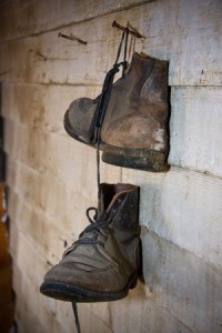
6715183_SThese work boots have a dramatically different feel from the ballet slippers in the last blog also. Once again, it’s the sense that these boots have seen some hard use that makes them work so well. Don’t discard options because they are well worn. Instead, think of the scars and damage as the patina of long years and enjoy those things that make your choices unique.

Other options for your walls include tools, ropes, harness and tack, and gardening implements. You may find that some things work well together. Creating a montage of old tools or favorite baseball caps could add interest to a weathered wall.

7933900_SIf you’re not satisfied with the options in your own home, shop local stores for collectable items such as the horseshoe to the left. The shoe is well-worn, like the other items in the photos above, but it’s the old handmade nail that brings the age of the piece to life.

Do you have a rec room or family room that could benefit from this type of unique approach to your walls? These photos demonstrate how something that’s thrown in a corner can have a real impact when it’s given a chance to shine. Look with new eyes and you never know what you’re going to find for your walls.

More than Pictures on your Walls: Part 1

5534193_SWhen you plan your walls in your new home, don’t limit your thinking to traditional two-dimensional art.

Yes, posters, prints and paintings make for a wonderful look in a space as well as showing your taste and preferences and providing pleasant views for you. However, don’t let your imagination stop there.

With the help of a few hooks or nails, you can hang almost anything and make an inviting wall display.

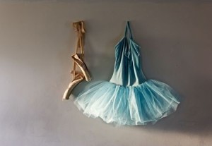
Take a look at the simple photo to the left. A young girl’s ballet costume and a pair of classic toe shoes combine to do more than fill space, they tell a story of part of a child’s life.

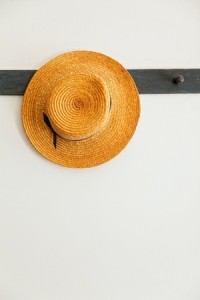
10483559_SYou can go even simpler with just one hat. The dark painted wood board with matching knobs sends an old-fashioned message which is complemented by the classic straw boater shown here to the right.

This display is functional as well as charming. The other hooks can be used for outdoor gear when needed and in the meantime, it creates the image of a country home from the past.

You may not even need to go shopping to add interest to your walls. Revisit some of the things you’ve accumulated over the years to see if they would make an intriguing wall display.

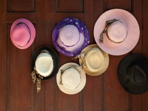
10703497_SFor example, take a look at the wall to the left. These hats may have belonged to the homeowner, or a mom or favorite aunt. By combining them together in a casual way, they’re out of their hatboxes and given the opportunity to paint a picture of another time.

What clothes or accessories do you have hiding in your closets that would make a fun display in your home?


Movie Design Inspiration: “American Hustle”

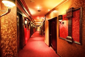
20672687_SThe film “American Hustle” is set in Atlantic City in the 1970s. For many people, this era is still too recent to bring back into your home, but there are elements to this style that may be worth a second look.

First, remember that this is Atlantic City – an East Coast version of Las Vegas. Therefore you’re looking at not just 70s décor, but over-the-top décor. Consider the luxurious evening gowns worn by the women in this movie – it’s all about glamour.

This hotel hallway carries through with that imagery. Patterned wallpaper, red carpeting and dark wood all combine to create the mood of the film. Notice the use of shaded sconces on the walls. This adds an old-world feel that spells money. This hotel was designed to give you the experience of a high-end hotel with a look that is much more common in the Eastern U.S.

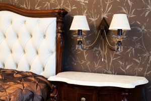
4550128_SWhile you may not want to carry the theme this far in your own home, capturing a bit of the design of the film is possible while still developing a décor that is glamorous without looking campy or dated. Take a look at the bedroom below.

The patterned wallpaper has a hint of the 70s style, but choosing a matte brown and white paper tones down the gaudiness present in the photo above while still capturing the best of that era.

Dark wood furniture also matches the style of the film, and the furniture selected here is rich with an authentically luxurious appearance.

Finally, by using shaded sconces with a light color to coordinate with other furniture in the room, this bedroom moves from furnished to thoughtfully decorated.

You don’t have to totally leap into a film’s style to use some elements from it to make a room in your home more interesting or inviting. Just select those ideas that work well for you.

Movie Design Inspiration: The Great Gatsby

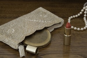
14671866_SIf you saw “The Great Gatsby” with Leonardo DiCaprio this year, you may have been drawn to the art deco drama present in the film. Long strings of pearls, beaded purses, and over-the-top sets created a world that tempts us to find a way to bring it home.

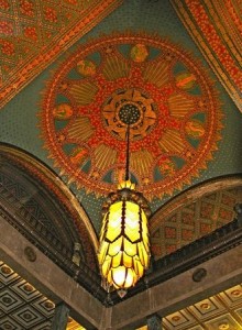
However, the look of that time is rather overwhelming for 916182_Scontemporary tastes. For example, check out the photo below of a deco hotel ceiling complete with a dramatic lighting fixture highlighting it. Layer upon layer of what is probably wallpaper in the high-contrast combination of red, green and gold emphasizes the varying levels of the ceiling itself. Setting off the look the over-sized bronze and amber glass pendant, about human-size, hangs on a long chain.

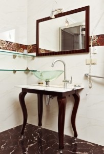
8566943_SYou can create a deco feel by grabbing a few elements from that time and incorporating them into your home. Take a look at the bathroom pictured. The rich colored border – set at eye-level – creates the same mood as the bevy of wallpapers in the earlier photo but on a much smaller and simpler scale.

The black marble floor echoes the style of long-ago and the look carries forward with white marble walls.

The vanity also shows an art deco flavor with its shaped and curved legs and marble top. Notice though that the faucet and fixtures are highly contemporary. This brings the space to the present.

One last art deco touch comes from the soap dispenser with its aura of another time. This bath could include some period art and possibly a small statue or vase from the era to finish the look. Think about what you could do in your home to bring the magic of “The Great Gatsby” to life.

Movie Design Inspiration: Breakfast at Tiffany’s

16689959_SIn honor of the Oscars last week, let’s celebrate movies by looking at how films can inspire room designs.

“Breakfast at Tiffany’s” provides a classic image of black, white, pearls and more than a bit of excess. The film made the little black dress with pearls a look that is always in style.

You don’t need a little black dress in your closet to set the stage for a room with a sophisticated and glamorous Tiffany feel. Start with black and white – a combination as classic as the movie. Black needs to be the strongest element, with only a few white elements for contrast.

10329773_SThe next step is some serious bling. The room to the right demonstrates this with the headboard, bench, sconces and nightstands sporting a metallic gloss. It really doesn’t matter whether the metal choice is silver or gold – it’s the sparkle that matters.

Notice also the ceiling molding. The edge looks something like a string of pearls – apropos for the Tiffany look.

Want to add a touch of color? The best choice to bring the movie to life would be Tiffany blue – that classic light color that covers every box from Tiffany’s.

8334795_SNo one who has ever shopped at Tiffany’s ever forgets their particular shade of blue –as much a part of their brand as the name and the store itself. If you’re fortunate enough to receive a gift from that store wrapped as the package on the left, it’s almost impossible to toss that box.

A throw pillow, vase or small box in Tiffany blue would give your room the final touch – and maybe you will feel just a bit like Audrey when you’re in it.

Personalize your Home: Art

21188321_SThis photo portrays how most people add art to their homes. However, by using the dark wall as a foil, choosing four pieces in the same style and tone, and hanging them at the same level the result goes far beyond the impact of the art itself. When you add art to your home, do you just think that you want something on that bare wall, or do you consider taking the next design step as these people did?

This photo shows more than art – it is an art installation, with as much thought to hanging the art as was taken in selecting it. As a result, we learn something about the personality, style and taste of the people who live here. What do you want your art to say about you?

15285255_SThe next photo, right shows how art can take over a space, defining it and expanding the drama. It starts with a large-scale modern piece which is used to define the colors and style of the entire room. The result is exciting and contemporary. Notice how the brown, black and light green add depth and keep the space from being too expected. Would you create a space like this one in your home?

11754859croppedFinally, don’t limit your thinking of art to two dimensions. The three African carvings below, when positioned together, add a strong focal point against the white backdrop. Separating these three pieces or not providing the strong-contrast background would diminish their effect.

Look for opportunities to showcase your culture or your travels with art. Instead of standard souvenirs, how about selecting something special that represents the best of the folk art of the area?

When you select art for your home, look for pieces that reflect your interests, taste and personality. Also, whether it’s an antique quilt from your family or your second cousin’s block print, make your art stand out by your choice of position and backdrop. That way your art reflects more than something on the wall, it reflects you.