Movie Design Inspiration: “American Hustle”

20672687_SThe film “American Hustle” is set in Atlantic City in the 1970s. For many people, this era is still too recent to bring back into your home, but there are elements to this style that may be worth a second look.

First, remember that this is Atlantic City – an East Coast version of Las Vegas. Therefore you’re looking at not just 70s décor, but over-the-top décor. Consider the luxurious evening gowns worn by the women in this movie – it’s all about glamour.

This hotel hallway carries through with that imagery. Patterned wallpaper, red carpeting and dark wood all combine to create the mood of the film. Notice the use of shaded sconces on the walls. This adds an old-world feel that spells money. This hotel was designed to give you the experience of a high-end hotel with a look that is much more common in the Eastern U.S.
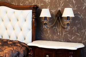
4550128_SWhile you may not want to carry the theme this far in your own home, capturing a bit of the design of the film is possible while still developing a décor that is glamorous without looking campy or dated. Take a look at the bedroom below.

The patterned wallpaper has a hint of the 70s style, but choosing a matte brown and white paper tones down the gaudiness present in the photo above while still capturing the best of that era.

Dark wood furniture also matches the style of the film, and the furniture selected here is rich with an authentically luxurious appearance.

Finally, by using shaded sconces with a light color to coordinate with other furniture in the room, this bedroom moves from furnished to thoughtfully decorated.

You don’t have to totally leap into a film’s style to use some elements from it to make a room in your home more interesting or inviting. Just select those ideas that work well for you.

Movie Design Inspiration: Breakfast at Tiffany’s

16689959_SIn honor of the Oscars last week, let’s celebrate movies by looking at how films can inspire room designs.

“Breakfast at Tiffany’s” provides a classic image of black, white, pearls and more than a bit of excess. The film made the little black dress with pearls a look that is always in style.

You don’t need a little black dress in your closet to set the stage for a room with a sophisticated and glamorous Tiffany feel. Start with black and white – a combination as classic as the movie. Black needs to be the strongest element, with only a few white elements for contrast.

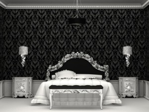
10329773_SThe next step is some serious bling. The room to the right demonstrates this with the headboard, bench, sconces and nightstands sporting a metallic gloss. It really doesn’t matter whether the metal choice is silver or gold – it’s the sparkle that matters.

Notice also the ceiling molding. The edge looks something like a string of pearls – apropos for the Tiffany look.

Want to add a touch of color? The best choice to bring the movie to life would be Tiffany blue – that classic light color that covers every box from Tiffany’s.

8334795_SNo one who has ever shopped at Tiffany’s ever forgets their particular shade of blue –as much a part of their brand as the name and the store itself. If you’re fortunate enough to receive a gift from that store wrapped as the package on the left, it’s almost impossible to toss that box.

A throw pillow, vase or small box in Tiffany blue would give your room the final touch – and maybe you will feel just a bit like Audrey when you’re in it.

Making 2014’s Top Color Work in Your Home

25272599_SPantone, one of the most influential color companies in the world, selected its 2014 color of the year: Radiant Orchid. Soon you will see clothes, accessories, and home elements such as wallpaper, paint and linens in this vibrant shade.

If you’d like to incorporate Radiant Orchid into your life, here are a few suggestions, ranging from all out to a simple touch of this warm mid-tone lavender.

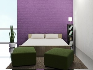
One inviting option involves paintable textured wallpaper and just the right shade of paint. This accent wall captures the feeling of Radiant Orchid, using a slightly darker tone to ground the wall.

11879796_SIntroducing a pop of the color in one strong block gives you the impact you want while making it easy to change in a few years if you fall in love with another color. Surrounding this wall with neutrals and bringing in a rich green – the natural complementary color for purple – allows the wall to draw the eye without overpowering the rest of the room.

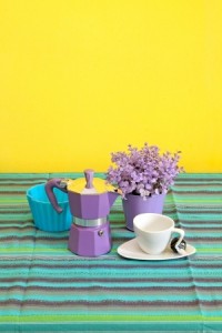
If you want to incorporate this Radiant color into your everyday life without a large investment of time, space or dollars, look for small functional home items to spark up your bathroom or kitchen. This espresso maker adds a splash of Orchid, and the tablecloth supports this with stripes that pull purples in as well as other colors to balance the look.

10643751_SMaking this type of decorating choice allows you to play with trending colors while still maintaining the longer-term look and style you enjoy. Combining trendy with classic elements such as the white cup and saucer shown provides a design balance that’s fun with staying power.

One final option: how about going simple by adding an actual orchid in Pantone’s radiant color such as this one to the left? After all, long before Pantone selected this color for 2014, nature had it featured in a number of its finest products!

Help your Child Redecorate – Room for Growth

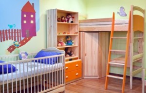
8829658_SAs you and your child plan and redecorate his or her room, it’s up to you as a parent to think about the future. Those dinosaurs or princesses that seem so appealing now will feel too juvenile in just a few years. Color favorites may also change or head to more subtle hues. Here are a few things to include in your plans to help the room redo hold up as your child gets older.

Paint is easy: Colors can be changed by simply repainting one or more walls. Try to keep the ceiling – which is harder to paint – a neutral tone. Look for temporary additions such as wall stickers or wallpaper borders rather than painted murals or wallpaper.

Linen options: Combine solid bed linens with a few theme items to make a room seem focused on the interests of your child without investing a great deal of money on a particular story or character. It’s easier to give away or recover a few throw pillows or shams than replace a full set of sheets and bedspread once your child has lost interest in the merchandise from a current children’s film or TV series.

Function: Your child may be too young for much or any homework at the moment, but it’s wise to plan for bookshelves and a desk or table in the future. Modular furniture makes it easier to transition over time.

Show and tell: Include a bulletin board, shelves or other space for your child to display items of current interest or any awards and recognition. It’s easy to change the contents of these items as your child matures.

Requirements: You may want to set up expectations when you initiate the redecorating process, such as keeping the room tidy. That way the redecorated room makes life easier for you as well as more fun for your child!

Help your Child Redecorate -Color and Pattern

12105159_S This stage is the most exciting part of redecorating a child’s room – or any room for that matter. There are a few simple ways to help your child define the colors and look of a bedroom without taking over the process. Here are some ideas.

Picking colors: One easy way to determine a good main color for your child’s bedroom is to focus on a favorite color or colors. Another option is to consider the colors of your child’s favorite clothes. Don’t discourage bright tones – a child’s room can handle more vivid colors than you may want in the rest of the house. This is a great time to encourage experimentation and creativity. Colors can also be mixed – take a look at the broad variety of choices in the room above!

Choosing patterns: Fabric, rugs, stencils and wallpaper can all add pattern to a child’s space. In the room above, a simple mural provides the largest element of pattern. You might want to visit a fabric store or look at bed sheets and coverlets to see what appeals to your child. Be sure to consider stripes, checks, ginghams, polka dots, and other standard pattern styles.

6249365_SApplying color and pattern: Paint is the easiest way to establish color in a room, and the easiest to change later as your child’s taste changes. This can include walls and furniture. Wallpaper can also be applied to one wall or a piece of furniture to add pattern. Just be sure to prime the surface first so you will be able to strip the paper off later. Curtains, bed linens and rugs also provide methods for introducing color and pattern.

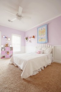
Working with existing choices: You can introduce colors that don’t seem to work with the current room options and still be successful. Take a look at the girl’s room to the right. The pastel pink and blue scheme wouldn’t be expected to connect with the light camel carpeting, but it does. As long as options such as flooring don’t actively clash, they will retreat to the background once the overall look of the room is established. An area rug or two also keeps the focus on the décor rather than the carpet.

So encourage your child to be daring – a child’s room should be fun, colorful, happy and expressive, and as a parent you have the chance to encourage those abilities in your children with their bedrooms and their lives.

Help your Child Redecorate

6607525_SAs your children grow, it’s up to you as a parent to give them opportunities to make decisions. One great way to expand the thinking of a child is to involve them in redecorating their bedroom. You can include budgeting, planning, prioritizing, space planning and combining function with style. Here are a few steps to get you started.

Set a budget: How much money is available for the remodel? Before you and your child make a plan, it’s important to determine the amount that can be spent.

Make a plan: Will you be buying furniture? What about new window treatments? Balancing the budget against the desired changes can help your child determine what goals are most important.

There may also be problem-solving opportunities. For example, if your child would like to replace flooring but the budget won’t cover it, how about an area rug instead? Furniture could be repainted rather than replaced. Using graph paper, draw the furniture layout for the room. Using a tape measure and laying out a room is a great way to show your child how math can have real-world value.

Negotiate: This process also provides an opportunity to negotiate with your child. Would you be willing to up the budget if the child gave up presents for an upcoming birthday? Can he or she grab the desk from the basement to make a homework station in his or her room?

Set a schedule: When you’re redecorating, what needs to be done first? With your child, set up a reasonable schedule for selecting and installing the new look. If you have more than one child, you may want to stagger the remodels so that you are not overwhelmed.

Make it fun: Yes, this is a learning experience, but it’s also a real treat. Look for ways to make the process enjoyable rather than stressful. Mistakes will probably happen, but that’s part of making changes in your personal space.

Design Grammar: Good Phrasing

833591_SWhen you’re looking at the grammar of design, phrasing is all about creating moments of charm that capture the eye, just like a phrase in a sentence or a paragraph will capture your attention.

This bright red bench shines against the white and dark teal wall, while the red tile pillar brings the bench closer to the background. The grey stones with the little bit of green moss separating them provides a great contrast to the red. This is a well-phrased space.

15314602_SDesign phrasing is as much about the space between elements as it is about the moments of charm themselves. Too much stuff and the message can be lost in the abundance of words, or items. The eye needs white space, on a page or in a room.

Take a look at the children’s room to the right. While it appears cute at first, there are no places to rest the eye among all of the colors, designs and textures. There’s a lot of stimulating things to look at, but no place for your eyes to take a break. It’s simply too busy.

15058099_SThe bedroom shown on the left, on the other hand, uses design phrasing very well. The bed represents one phrase, with light bedding contrasting well with the dark wood wall behind it. Matching sconces and nightstands create a symmetrical presentation that is easy to read and draws the eye.

Another phrase comes from the upholstered chair with a side table and plant. The curtains connect the bed and chair, but they are neutral and undemanding enough to provide a break in the room. The flooring and the ceiling also provide good visual breaks in the room.

If you think of designing a room as a way to create and separate phrases of design, you will find yourself with a space that is both interesting and relaxing. How does the phrasing work in your home?

Wall Decals Spark Child’s Room

This year your son may love dinosaurs, and next year it could be cars or insects or certain Disney characters. Wall decals are the perfect option for decorating a room that’s destined to change.

Unlike wallpaper, these contemporary choices stick on and peel off without damaging the underlying paint. The relatively low cost and ease of installation make it easy to see decals as temporary. You may want to require a certain length of time for your child to live with any decal choice – say a year – to ensure that your child thinks carefully about the decision.

This child’s room, part of the Rancho Mirage model in the Oasis at Freeman Farms community, really works with the jungle animal theme. The hippo, monkey and elephant are darling representations, and the decals are echoed in the quilt on the bed. Add the stuffed monkey and a throw pillow in coordinating colors, and this bedroom has a finished and inviting feel.

Sometimes having art hanging on the walls can lead to accidents with overly-energetic kids. Decals provide the feeling of art without hanging things on the walls that might tumble off. You can just see the corner of the window on the left. Putting up wood blinds and a simple valance at the top removes the temptation to swing from curtains but still provides a nice-looking window. Hunter Douglas window coverings have special child-safe pulls, which makes them even better for this room.

The padded headboard and table lamps encourage a child to sit up and read in bed before going to sleep. Plan space for those activities you want your children to engage in and you provide unspoken encouragement to help develop the right habits. And when your child outgrows the elephant and hippos, you can just put up new decals, pick up a new quilt, and the room is remade.


Cozy Guest Room

With the coldest of winter weather across the country, this is a great time for family and friends to decide to visit Arizona. Our sweater weather is still warm enough for folks from the East Coast to wear shorts, and they are totally unused to sunshine.

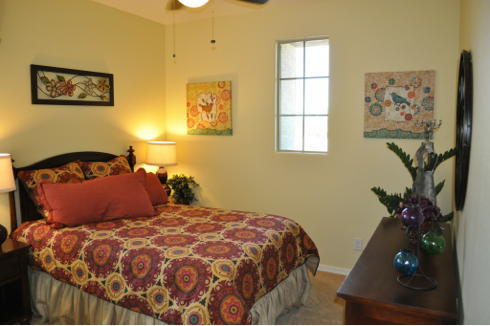
Given this, it’s wise to plan a guest room in your home. This room in the Whitewater model in Fulton Home’s Oasis at Freeman Farms community is a good example. A few simple choices can make your spare bedroom a welcoming space that keeps your visitors comfortable. Here are a few suggestions.

Use color: Look for a coverlet and shams in bright colors and lively patterns. This choice warms up a room and provides a strong focal point. Look for bed linen sets that include a duvet, shams, a dust ruffle, sheets and pillowcases. These packages are often on sale, or available with coupons. They also come in a variety of colors and styles so you can find one that appeals to your taste. Choose art that complements the bedding so that the room feels coordinated. It’s also nice to have a mirror in the room.

Provide lighting: This room has two bedside lamps that can be turned off once your guest or guests are in bed. This is particularly important considering that your guests don’t know their way around and you don’t want them wandering in the dark. You may also want to put a nightlight in the room.

Include extras: A chest of drawers and some space in a closet make your guests feel welcome. You may also want to place basic sundries such as travel sizes of shampoo and conditioner, a toothbrush and toothpaste. With just a few touches such as this, your guests will find themselves enjoying more than our warm weather and sunshine.

Special Bedroom: Charming

It’s difficult, and expensive, to find this type of unusual embroidered linens if you would like to produce a look similar to this bed. But a few handmade pieces can add immediate charm to your bedroom.

Visit a few antique stores to capture some vintage linen at a reasonable price. You may also have some luck at odd-lot stores such as Tuesday Morning.

Recreating the shabby-chic look of the bed requires some focused shopping for a simple four-poster in dark wood tones. If you paint it with a paint/primer combination that will work on the stained wood, then sand the edges to bring out the dark color underneath, you can easily get a similar effect.

This room is about layering textures until you reach the point where the space has an inviting, cushy feel. There is a sense of gentle abundance about this room, and it is pretty feminine. Notice the ruffled shade on the lamp and the few dark colors introduced by the artwork in the background. Sticking with white and off-white helps the space feel soft and integrated. With a few choice purchases, you can give any bedroom the same gentle charm you see here.