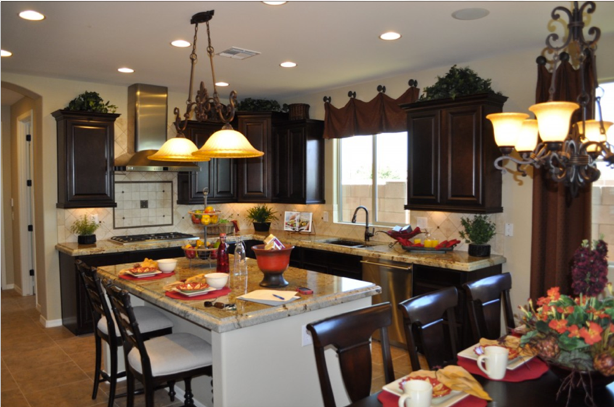
Design Center Basics: Have Fun!

Design 20Center 20023 designerOne of the best parts of buying a Fulton Home is selecting your options at the Fulton Home Design Center. You have the opportunity to work with a skilled designer to choose your kitchen, bathroom and flooring, making your home uniquely yours.

At first, choosing may seem overwhelming, but if you did your homework before your appointment (see the two blog posts for earlier this week) this can be a truly enjoyable experience.
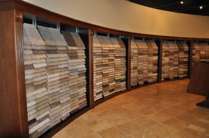
Design 20Center 20059 carpetingVisiting the Design Center can feel like walking into the HGTV studios. Fulton has pre-selected suppliers and products that are reliable and provide a rich selection of styles to individualize your home. For example, look at the carpeting options available. Take your time to enjoy the various textures and tones.

One of the best features of the Fulton Homes Design Center is the well-trained and savvy designers who will work with you to help make just the right selections. Years of experience working with homebuyers to help create lovely homes provide every designer with the skills to give valuable insights and support as you make your home your own.

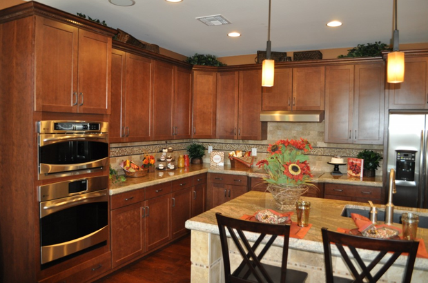
Whether your taste is contemporary or traditional, you’ll find the right choices of cabinetry, countertops, lighting and more. Take the time to investigate the kitchen vignettes. They may help you determine whether you want light or dark cabinetry, how much contrast you want in your kitchen and any specific color choices.

Everyone at Fulton Homes wants you to enjoy your time at the Design Center, so relax and take full advantage of this opportunity to make your home as special as you and your family are.

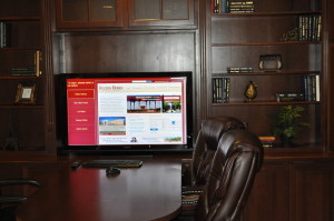
Design Center Basics: Planning Ahead

Design20Center 20077 built insAll of the options and choices available at the Fulton Homes Design Center can be exciting and a bit overwhelming. You can make the process more fun and productive if you do a little planning ahead of time. Here are a few suggestions.

Visit the models: The Design Center has a number of vignettes to provide ideas, but there is a wealth of options visible in the models, and positioned within a home. From cabinets and countertops to faucets and built-ins, models are a wonderful resource. Spend some time and take notes of what you like in each model. You may even want to take pictures of those choices you particularly like. Bring this with you to your Design Center appointment to help your designer understand your taste and preferences.

Take advantage of browse nights: These provide time for you to look at everything available and make some preliminary choices. Designers are there to answer questions and educate you on various choices.

Visit the Design Center section on the Fulton website: You can pre-design your kitchen and review many of your options. This gives you a chance to experiment with various combinations of cabinets, countertops and flooring at your leisure.

Keep an open mind: While it’s good to get a feeling for your preferences, you may discover something at the Design Center that captures you unexpectedly. There are some amazing choices, and the designers are experts at helping you make combinations that you will love to live with for years.

The more you plan ahead, the more time you will have to make any tougher decisions – and totally enjoy the rich variety of choices that await you when you visit Fulton Home’s Design Center.

Daring Kitchen Tile Choices

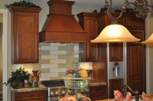
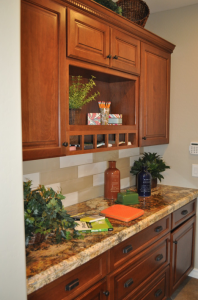
Peninsula 167You don’t have to spend a lot of money to create a kitchen backsplash that captures attention. Take a look at this kitchen design from Fulton Home’s Woodside model in the Oasis at Freeman Farms community. One type of tile in two colors combine to create an exciting look that is different with a modern twist.

The granite chosen for this kitchen has a strong pattern with contrasting shades of gold, brown and black. Combine this with an intense tile pattern and the space would feel busy rather than interesting.

Total room design involves making choices that work well together to make a space intriguing. It’s the interaction among the various elements – cabinets, countertops, tile, flooring and lighting – that makes this kitchen stand out.

Peninsula 165Many people like to have a special look behind the range, and this kitchen creates that impact simply by changing the dark and light pattern of the long rectangular tiles. Notice in the photo to the right, the light tiles move down in a stair step design, but move in a back-and-forth direction over the range. This simple change helps create a meaningful difference in the kitchen.

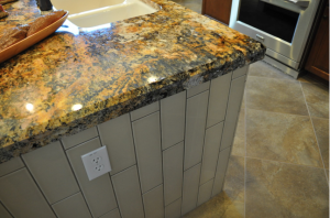
The imagination of this kitchen designer didn’t stop at the backsplash. Take a look at the tile design on the island below. The same tile laid in vertical rows creates a very different look whilestill keeping everything integrated.

Peninsula 159Here’s a great look at this granite countertop. An island is a perfect place to showcase your granite choice, because the large expanse of open stone really displays the grain.

Don’t be afraid to make a daring choice for one or more of your options when designing your new home. And be sure to take advantage of the knowledge of your Fulton Design Center designer when determining which options will combine to help you create a home that demonstrates your taste and style.

Finishing Touches make Kitchen Special

Oasis at Freeman Farms 072When designing a kitchen, you can easily get caught up in choosing just the right appliances, the perfect cabinets, and knock-out flooring. But don’t ignore the smaller decisions that can bring your kitchen from well-designed to wow! Let’s take a look at just a few of the finishing touches available at the Fulton Homes Design Center that help create a kitchen to turn heads.

Cabinet crown molding: These straightforward Shaker-style cabinets step it up with crown molding at the top. This is dentil crown molding – called that because the row of wood squares below the crown resembles teeth. This type of trim dresses the cabinets up and adds perceived value far beyond the minimal additional cost. Be sure to investigate your trim options when choosing your cabinets.

Pendant lights: These pendants have an industrial-appearing foundation with the look of matte iron, and a sharp squared-off glass shade. Add an amber tone to the glass and you have a stand-out sculptural look to these pendants. Check out the choices for pendants available at the Fulton Design Center and add that sophisticated and functional touch over your kitchen island.

Tile or stone trim: This kitchen’s backsplash is splashier thanks to the row of decorative stone running a few inches below the cabinets. Choosing to install a row of interesting tile or stone within a simpler pattern creates a much more interesting look with a minimal increase in cost. By adding a small line of the same stone as part of the tile surrounding the island, the two areas are tied together and both end up more interesting.

Each of these three choices had a minimal impact on this kitchen’s cost, but the result far exceeds the expense. So take the time to look at the details and create a truly special kitchen!

Mix of Colors Pop in Kitchen

Did you ever wonder why some spaces just seem more colorful than others? Well, one reason is the result of using complementary colors in a room. Complementary colors sit on opposite sides of the color wheel.

The primary complementary colors are orange and blue, yellow and purple, and red and green. If you put bright versions of these color pairs next to each other they will actually seem to vibrate. However, you may not want to use the strongest versions of those colors. Instead, choose a slightly different, lighter or darker shade to take advantage of the contrast without creating too much of a color conflict.

This kitchen, from the Fulton Homes Rancho Mirage model at Oasis at Freeman Farms, uses a coral shade of red and a few yellow-green hues combined to add color to the space. Although the fundamentals in this room – cabinets, flooring, countertops and appliances – are neutral, the careful addition of colorful accessories makes the room feel full of color.

This design concept continues onto the great room sofa visible in the foreground. Once again the larger piece – the sofa – is neutral but brightened by two throw pillows which echo the coral and green colors visible in the kitchen. The fun thing about this approach to color is that it’s easy to change out your choices without spending a lot of money. Paint, pillows and accessories could be adjusted with the seasons or even your mood.

Do you want more color in your home? Don’t let your current neutral decor keep you from adding pops of whatever colors take your fancy.

Kitchen Lighting Four Ways

This kitchen, from the Whitewater model at the Fulton Homes Oasis at Freeman Farms community, offers many advantages to a cook. There’s plenty of counter space, a generous kitchen island, a gas range and stainless appliances. But one feature that any cook – casual or serious – will really appreciate is the generous lighting from four sources.

First, the space is designed to provide plenty of natural light. The window over the sink gives both visibility in the kitchen and a view of the back yard. More light comes from the sliding glass door in the dining area. This saves energy as well as making the kitchen brighter. You may find that you don’t always need additional lighting during the day.

The double light over the island provides directed lighting. This makes the island useful for chopping or baking, as well as after-school homework and snacking. Notice how the light’s style matches the chandelier over the dining table, integrating the space and adding charm as well as functionality.

General lighting comes from an abundant number of ceiling spotlights. These spots wash the kitchen in even, clear lighting. This makes the kitchen nice and bright even in the evening, with no glare or dark spots.

The final lighting source is also the most specific – task lighting running under the cabinets. This is particularly useful for smaller tasks such as reading recipes or instructions. If you have never experienced this type of task lighting, you will soon realize what a difference it can make in a kitchen.

Enjoy the flexibility and functionality of a kitchen with four types of lighting, available because at Fulton Homes, we’re proud to build a home you will enjoy and appreciate.

Thinking about Walls: Yellow

Yellow can brighten up a bathroom or kitchen, or make a bedroom seem extra sunny. But it is the most difficult paint color to get right. The wrong choice can make a room gold instead of yellow, or turn a space into egg yolks rather than lemon. If you want to bring yellow into your home, take these steps first.

Go lighter: Yellow dominates a room much more than you would expect. Whatever tone you want, choose one at least two shades lighter. The color strips available at paint stores make this easy. Don’t worry that it will be too light. Yellow reflects off every wall and the color naturally intensifies.

Test test test: Buy a sample of two or three possible yellows. Paint poster boards, one in each color, and try them close to each other. If one of the yellows has an orange or green cast, you’ll be able to tell thanks to the contrast. Choose the purest yellow you can find. Also, put the painted posters on every wall of the room and then see which works best. Yellow changes its mood depending upon the type of light, so check in daylight and artificial light.

Combine with white: Don’t be tempted to use too much yellow. Paint the ceiling white and don’t add yellow cabinets or furniture. Too much yellow quickly takes over a room. White areas help the yellow look brighter without becoming overwhelming.

Yellow can be gorgeous or a real problem. Doing your homework at the start will give you a space that uses yellow at its best.

Build Style and Function into your Kitchen

How do you decide what you want your kitchen to look like? Today’s classic look includes stainless appliances and granite countertops, but within that mix you have a wealth of choices.

This kitchen vignette from the Fulton Homes design center blends white and dark painted cabinetry with a rich stained wood floor. While many people may worry about having a wood floor in the kitchen, it can work well as long as you protect it with a good polyurethane finish and wipe up serious spills immediately. Wood flooring is actually a floor with give so it’s great for a cook’s feet at the end of a long day of cooking and cleaning.

The wipe-clean painted white cabinets use differences in depth to create personality. That is enhanced by the intriguing dark painted island in the center. More and more kitchens are taking advantage of a mix and match approach to help kitchen cabinetry integrate with the rest of the home, and this is a good example. Fulton’s crown molding for cabinetry is also designed for customization, as shown here with the special addition of dentil trim.

A generous fridge, the large gas range and a double oven makes this space ideal for a serious home chef. The tile backsplash is decorative and also easy to clean. The island is ready for a couple of bar-height chairs, so that friends and family members can chat or help. Come visit our design center on one of our browse nights and experience this inviting kitchen for yourself.


Multitasking easy with Extra-large Kitchen Island

Kitchen islands provide much-appreciated extra storage and counter space for serious cooks. But cooking is only the first purpose for an island. You will soon find that your island can become a location for many projects and tasks.

You can encourage using the island for other purposes by planning to optimize the space for the whole family. Here are some uses to consider and tips to support these ideas.

Breakfast bar: Pre-set the island with bowls and position various cereals on the table. Add granola, some chopped nuts and fresh or dried fruit. In the morning, each family member can create a favorite mix and add milk. The best part of this approach? Everything can be set up the night before except for the fresh fruit, which could be ready cut-up in the refrigerator. Different schedules or preferences are supported with this system. Make regular changes in the selection to keep the idea fresh. This makes an easy breakfast one or more mornings a week.

Homework center: You may need to fix dinner while your children complete their homework for the night. Make it a family affair by setting up the island to meet homework needs. Have a supply of paper and writing instruments available and a laptop for computer needs. You can answer questions or help solve problems while working in the kitchen. Your regular attention makes it more likely that your children will take their homework assignments seriously. You might want to designate a drawer or shelf nearby for each child to keep track of assignments and ensure that school books or day packs are ready to go the next day.

Sous chef set-up: If you want your children to be comfy in the kitchen, you may want to start them as your assistants with some simple chopping or prep work. By providing a cutting board, the raw veggies and a good knife if they’re old enough, you can start developing their skills and take advantage of their help at the same time.

No matter how you chose to use your island, it will provide a wealth of possibilities. You may even find yourself using it for your own cooking efforts.


Silver Hues in the Kitchen

Silver is the choice for metal surfaces in the kitchen. Cool silvery hues like stainless steel, chrome, and nickel continue to be popular finishes for ranges, hoods, sinks, faucets and hardware in the kitchen. The influence of commercial kitchens with their stainless steel surfaces can be the source for this popular metal in today’s residential kitchens.


Stainless steel appliances set the tone for all other metals in the kitchen. When your largest appliances like the fridge or stove are stainless steel, they demand that other metals in the kitchen coordinate with them.  Of course you could add other metallic finishes to the room like oiled bronze or brass, but using silvery finishes with stainless steel gives the room a more unified appearance.


Silvery chrome and nickel work well with stainless appliances and sinks.  Chrome and nickel come in a number of finishes including satin and polished.  The more shiny the finish, the more the metals will stand out and sparkle in the space.


Silvery metals also work with any number of cabinet and floor choices. Dark wood cabinets and floors get a pop of sparkle with silvery chrome or nickel pulls.  The silvery pulls are like sparkling jewelry against the wood, like a sparkling bangle or necklace is against a little black dress.


These metals also look great with glass front cabinets and marble counters veined with grey.  Using silver against grey and white is a sophisticated look for the kitchen. It is also a great look for a bathroom.