Design Grammar: Nouns

12283909_SIn the second blog about design grammar, we’ll consider the nouns of writing a room. These define what the room or the story is all about, and in the case of design, they are the larger upholstered pieces: sofas and chairs.

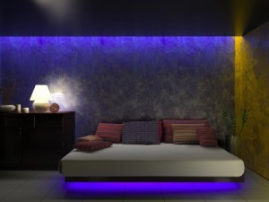
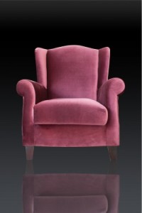
The two photos here involve a pink sofa and pink chair. From a description standpoint, there isn’t that much difference, but in reality each one sends a completely different message.

The sofa is bright pink and very contemporary. It would work well in a commercial environment such as a beauty salon or women’s clothing shop. In a home it would feel bright and exciting and young. This sofa as a noun is vivid and almost demanding. Think about the message a room built around this sofa would send.

11898370_SThe pink chair, on the other hand, has a traditional style and a soft color that almost looks faded. It’s quiet and comfortable. There are no demands from this chair. It would sit quietly in a corner until someone needed it.

These two pieces of furniture need very different spaces. They tell very different stories and send very different messages. Ask yourself, if you could get either piece of furniture for free, which one would you choose?

In a sentence or a story, nouns set the stage. They can be simple vanilla words such as flower or boat, or strong words that draw your attention such as pendulum or patisserie.

Because of their fundamental position in a room or a sentence, upholstered furniture and nouns give you a good place to start designing or writing.

Design Grammar: Your Home’s Décor can feel like a Well-written Story

734809_S Your home is about more than good design. Your home’s décor is a direct reflection of you. So take a minute before you start planning your home’s décor, or when it’s time to update a room’s look. Stretch your imagination and ask yourself some questions about what you want your home to say about you.

To make this easier, we’re going to think of decorating a room using the same tools used to write a story.

To begin, ask yourself some overall questions:

15207724_SHow does the room feel? You can start by using words to describe a room, but it’s more complex than that. If a room is elegant, does that mean that you feel elegant in it? Or do you feel like you shouldn’t sit down? Does a room feel welcoming or uncomfortable?

What message does a room send? For example, does a room say “I’m important?” A good example of this message is the Oval Office in the White House. A fast food’s décor may say, “Sit down, but just for a minute to gulp down your sandwich and fries.”

14809528_SIs the message consistent? Do some things in a room say one thing but others send a different message? For example, a formal, antique velvet sofa may tell people to stay away, but a cushy old leather chair might invite people in to get comfy. Sitting next to each other, the overall message may be confusing.

What message do you want to give? Think of your home as an unspoken voice for you with family and friends.

This week and next week, we’re going to take a look at how you build a room that sends whatever message you want to present. With this perspective you will end up with more than a room that looks nice; you’ll have a space that reflects what you want to say.

Décor Choices Bring the Sun Inside

5128757_SWe’re fortunate here in Arizona to live in a climate that gives us so many sunny days. In many parts of the country, this time of year presents gray, dark weather with plenty of rain and snow. But no matter the weather outside, you can bring the sun into your home by choosing the right colors, accessories and fabrics.

Take a look at the curtains in the photo to the left. The soft rust tone of one curtain combined with the second rich gold fabric curving over the top feels like a perfect balance of sunshine and shadow. The metallic layer on the gold curtain adds shine to the sunshine message, and the sparkles on the two-tone tassel also contribute.

10866785_SIt may be tempting to stay with the bright gold shades, but notice what happens in this photo thanks to the darker rusty orange. The contrast makes the gold seem even brighter and stronger. When you decorate your home, it’s best to use contrast to emphasize your style. Staying in the same tone range creates an uninteresting room. In this shot the contrast comes through in several ways: on the fabric, tassel and the braided tie holding the upper curtain back.

You don’t have to go for the traditional, almost baroque feel shown above to bring sunshine into your home. Take a look at the photo to the right.

Orange, gold and brown work together to create a sunny space. The metallic gold art is brightened by the contrasting dark mats and frames. In the same way, the metallic decorations on the pillows and bed runners really pop thanks to the dark brown base of the ribbon. Notice how that orange wall has depth and power. It probably took three or more coats of paint to obtain that richness.

Do you want a room that spells out sunshine? Consider these colors and an introduction of warm metallic elements to bring the sun into any room in your home.

The Decorating Power of Red

8161349_SRed is daring. Red is romantic. Red is sexy. That’s one reason why it’s the color of Valentine’s Day. A splash of red makes an outfit come alive. Whether you love red or not, the color is almost impossible to ignore.

In honor of the holiday, how about looking at red in decorating? Here are three variations on using red in your home, depending on just how daring you feel.

Hard-core red: This photo shows a room where red is the dominant color. This rich dark shade of red takes over the space. Red can be a great color for dining rooms because it raises the energy level in a room and draws people together, encouraging conversation. Your dinner parties could be livelier with red walls.

The secret to this type of luminous and rich red color on your walls is multiple coats of paint. Stop at one or two and you will end up with a red that looks washed out and flat. Plan on at least three coats, and consider five. It’s a lot more work, but getting a result like this makes the effort worthwhile. Also, notice that the rest of the room’s decor is fairly neutral. Once you commit to red, really watch out for any other color choices. Red like this is generally enough color for one space.

2409263_SA splash of red: By choosing red leather for this dining room’s chairs, the homeowner adds style and a spark to the space. Once again, neutrals keep the red to the forefront without having the color overwhelm the room. You may notice that the brown flowers in the rug look almost rust against the red. This actually works because of the extremely neutral effect of the rest of the room. The red chairs ensure that the table is the focal point of the room. Remember that your eye will always be drawn to any red in your home.

8961688_SJust a touch of red: If you’re not ready to jump into the world of red full-blast, how about dipping a toe in? This light fixture provides a dramatic impact in the room and saves it from a boring neutral look. If a permanent fixture seems too extreme, how about adding in a couple of throw pillows or a vase? You could even test out your red comfort zone with a bouquet of red flowers. But you might want to wait until later in the month – those red blooms are quite expensive at the moment!


A Beautiful Bath is all in the Details

Oasis at Freeman Farms 081Monday’s blog took a look at how finishing touches could dress up a kitchen. The same approach can turn a nice bath into an oasis in the middle of your home. Let’s check out the choices that are showcased in the master bath at the Fulton Homes Whitewater model in the Oasis at Freeman Farms community.

First, a double sink allows space for two to get ready for work in the morning. Many couples value their own sink, and both of these have plenty of counter space and storage.

Separating the two, a lower counter with a drawer provides the perfect place for styling –with a hair dryer and/or make-up. The comfy ottoman adds a splash of class with its simple cylindrical shape and luscious upholstery.

Oasis at Freeman Farms 082Warm tones enrich the look of this bath with gold/brown porcelain tile on the floor, different but still coordinated tile countertops, and inviting wallpaper carrying the gold tones up to the ceiling. Notice the backsplash behind the sinks. The small tiles set the space apart. The large mirror is framed to coordinate with the cabinetry – another option offered through Fulton Homes that creates a more finished look.

Oasis at Freeman Farms 083Oil-rubbed bronze faucets and lighting stay with the warm-toned theme. This finish has become a classic since its introduction and it works beautifully in both modern and more traditional homes. The light fixtures with their bronze bases and amber glass shades echo that warm feeling while their design stands out over the more standard bathroom fixtures.

These details separate this bathroom from a more basic look, and create a space that will serve as a particularly enjoyable spot to get ready in the morning and prepare for bed at night.


Power Shower Creates Good Mornings

Oasis at Freeman Farms 079With our busy lives, who has time to linger long enough for a bath in the morning? This master bath, part of the Fulton Homes Whitewater model in the Oasis at Freeman Farms community, offers a generous-sized shower option. Here are a few things that make this shower something to be appreciated.

Sheer size: No running an elbow into walls with this shower. With lots of space and dual shower heads, there’s room for two on busy mornings. For those with limited mobility, this shower has plenty of room for a seat, and the handheld shower head makes washing much easier.

Step-up entrance: Rather than dripping water through the bath, this side opening provides the perfect spot to towel off after a shower. Add a couple of bath mats – one just outside the entrance and another at the bottom of the step, and your bathroom floor will stay dry easily.

Light-rich space: The glass-block window just outside the shower combined with the clear glass shower surround provides plenty of natural light to help wake you up in the morning. The feeling is airy rather than over-enclosed.

Shower with style: The tile surround complements the rest of the bathroom. The row of decorative tiles running along the upper third of the shower area adds personality. The oiled bronze shower fixtures and trim on the shower surround connect with the sink faucets and bathroom lighting to create a feeling of indulgence.

How about giving yourself a chance to start your days with a power shower in a bathroom with this level of luxury? It will help you start every morning in a really good mood!

Finishing Touches make Kitchen Special

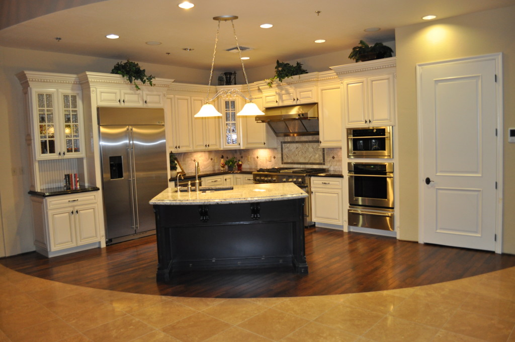
Oasis at Freeman Farms 072When designing a kitchen, you can easily get caught up in choosing just the right appliances, the perfect cabinets, and knock-out flooring. But don’t ignore the smaller decisions that can bring your kitchen from well-designed to wow! Let’s take a look at just a few of the finishing touches available at the Fulton Homes Design Center that help create a kitchen to turn heads.

Cabinet crown molding: These straightforward Shaker-style cabinets step it up with crown molding at the top. This is dentil crown molding – called that because the row of wood squares below the crown resembles teeth. This type of trim dresses the cabinets up and adds perceived value far beyond the minimal additional cost. Be sure to investigate your trim options when choosing your cabinets.

Pendant lights: These pendants have an industrial-appearing foundation with the look of matte iron, and a sharp squared-off glass shade. Add an amber tone to the glass and you have a stand-out sculptural look to these pendants. Check out the choices for pendants available at the Fulton Design Center and add that sophisticated and functional touch over your kitchen island.

Tile or stone trim: This kitchen’s backsplash is splashier thanks to the row of decorative stone running a few inches below the cabinets. Choosing to install a row of interesting tile or stone within a simpler pattern creates a much more interesting look with a minimal increase in cost. By adding a small line of the same stone as part of the tile surrounding the island, the two areas are tied together and both end up more interesting.

Each of these three choices had a minimal impact on this kitchen’s cost, but the result far exceeds the expense. So take the time to look at the details and create a truly special kitchen!

China Cabinet Provides Great Home Office Storage

A home office that’s visible from other places in a home, particularly one like this one in the Fulton Homes La Quinta model at the Oasis at Freeman Farms community, needs to look like residential space. Metal file drawers and other evidence of a working space don’t suit most homes.

One smart solution for home office storage comes from the dining room – with a full-size china cabinet. If you choose one like this piece in the photo, the glass distracts from the office supplies within the cabinet, and it looks elegant and appealing in this room.

A china cabinet can hold files, paper and office supplies, as well as current projects. Combined with the simple desk and leather chair, the space feels more like a study than an office. Add a laptop that can be put away when you’re finished, and you have a fully functioning office that still works well in this residential environment.

With the help of a wireless router, peripherals such as printers can be located in another room with every computer in the house able to access them. The laundry-room countertop provides a great location for central access – out of the way yet convenient.

Be sure to decorate your home office with the same care you use in the rest of your home. Placing a floor lamp in the room allows you to work with softer lighting than a ceiling fixture. Art and accessories finish this space and connect it with the rest of the house. Window coverings should be selected to minimize glare on your computer screen.

With just a little thought and effort, you can have a home office that is functional and still suits your home’s style.


Lighting Connects Great Room Spaces

When you’re working with a great room, you want to balance the need to separate the functional areas with choices that integrate the spaces. Consistency in design helps make that integration possible.

In this great room, from the La Quinta model at the Oasis at Freeman Farms community, one unifying feature comes from the lighting. Let’s consider the light fixtures in this space.

First, take a look at the chandelier over the dining table. It has an appealing warm finish, with bell-shaped glass shades in an amber tone. Now notice the ceiling fan. The metal finish and the amber tone match the dining chandelier, although the type of fixture is completely different.

The pendants over the kitchen island have a more streamlined shape. This works well as they are in line-of-sight from the kitchen to the rest of the room. However, the glass mirrors the same amber tone that’s been part of the other light fixtures.

Finally, take a look at the sconces above the fireplace. The finish, the shape of the glass shades, and the color of the glass are the same as the chandelier.

Design consistencies such as these make a space feel connected throughout. Other elements such as the similar tiles on the kitchen island and the fireplace surround, the same flooring, and the paint choice integrates every aspect of this space.

A great-room design depends on choosing lighting, flooring, tile and colors that work for every functional area. In this room, everything flows together to create a warm and inviting space.

Mix of Colors Pop in Kitchen

Did you ever wonder why some spaces just seem more colorful than others? Well, one reason is the result of using complementary colors in a room. Complementary colors sit on opposite sides of the color wheel.

The primary complementary colors are orange and blue, yellow and purple, and red and green. If you put bright versions of these color pairs next to each other they will actually seem to vibrate. However, you may not want to use the strongest versions of those colors. Instead, choose a slightly different, lighter or darker shade to take advantage of the contrast without creating too much of a color conflict.

This kitchen, from the Fulton Homes Rancho Mirage model at Oasis at Freeman Farms, uses a coral shade of red and a few yellow-green hues combined to add color to the space. Although the fundamentals in this room – cabinets, flooring, countertops and appliances – are neutral, the careful addition of colorful accessories makes the room feel full of color.

This design concept continues onto the great room sofa visible in the foreground. Once again the larger piece – the sofa – is neutral but brightened by two throw pillows which echo the coral and green colors visible in the kitchen. The fun thing about this approach to color is that it’s easy to change out your choices without spending a lot of money. Paint, pillows and accessories could be adjusted with the seasons or even your mood.

Do you want more color in your home? Don’t let your current neutral decor keep you from adding pops of whatever colors take your fancy.