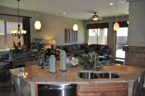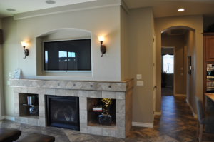
Fulton Homes Super Browse Night

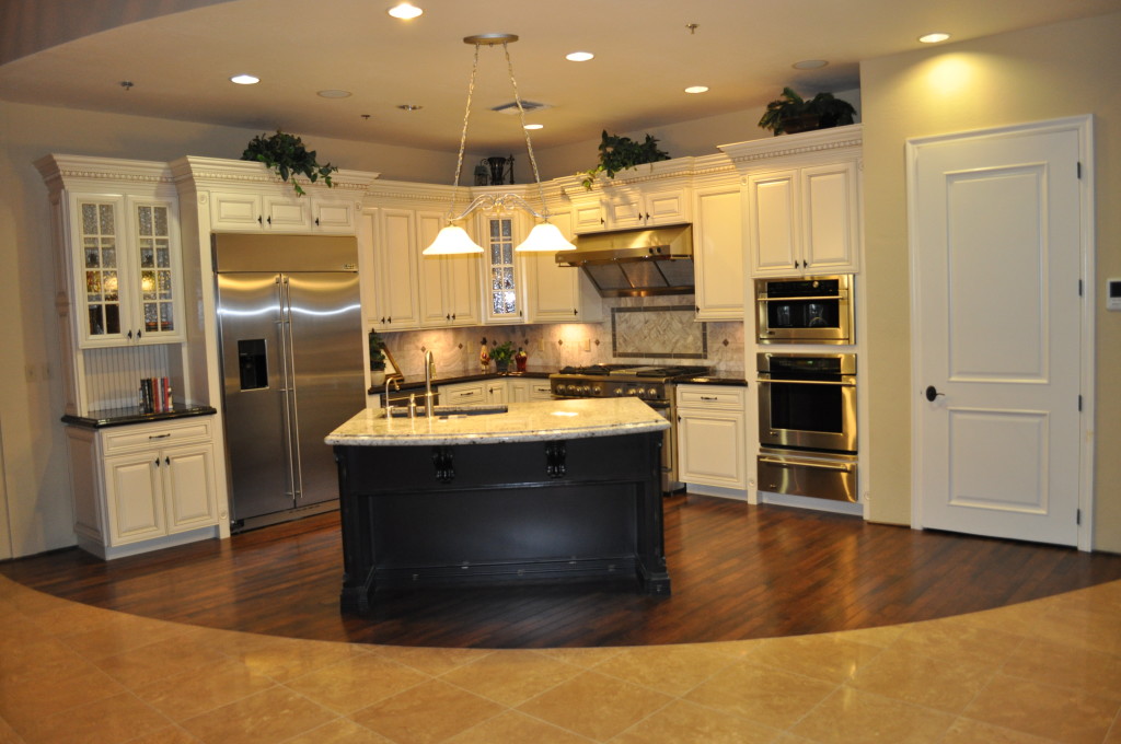
Design20Center20074 kitchen 4Would you like a chance to explore kitchen and bath ideas, talk with designers and product-knowledge specialists, and see some of the latest home design options available?

Fulton Homes invites you to join us this Thursday night, March 21st 2013, for Super Browse Night at our design center in Tempe. With 13,000 square feet of kitchen and bath vignettes, a rich variety of product displays, and our team of designers ready to answer your questions, this is an amazing opportunity to see the newest home products in a comfortable and inviting setting.
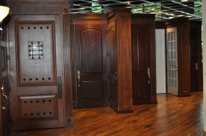
Desig20Center20071-doors-2-300x199From countertops to carpeting, cabinet doors to front doors, appliances to area rugs, you can browse every kind of home interior option set up in inviting and exciting displays.

Whether you’re considering a new home, purchasing a new home, or just want some good ideas for your current or future home, you’re welcome to join us for this exceptional event. We’ve invited our trade partners to join our designers and sales associates to share their insights into the best ways to make your home as special as you want it to be.
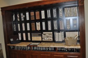
Design 20Center 20015 listellesJoin us Thursday March 21st 2013 from 5-8 p.m. at the Fulton Homes Design Center, 1241 West Warner Road, #106, Tempe, AZ. To find us turn south on Beck between Priest and Hardy. Turn right in the second driveway.

As an extra incentive (Maybe to help get your spouse to join you?) we’re giving away a 40 inch Samsung flat-screen TV to those who attend our event, with no purchase necessary to win. We look forward to seeing you there.

Daring Kitchen Tile Choices

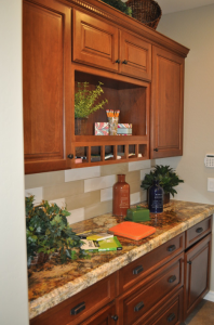
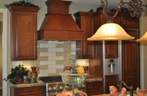
Peninsula 167You don’t have to spend a lot of money to create a kitchen backsplash that captures attention. Take a look at this kitchen design from Fulton Home’s Woodside model in the Oasis at Freeman Farms community. One type of tile in two colors combine to create an exciting look that is different with a modern twist.

The granite chosen for this kitchen has a strong pattern with contrasting shades of gold, brown and black. Combine this with an intense tile pattern and the space would feel busy rather than interesting.

Total room design involves making choices that work well together to make a space intriguing. It’s the interaction among the various elements – cabinets, countertops, tile, flooring and lighting – that makes this kitchen stand out.

Peninsula 165Many people like to have a special look behind the range, and this kitchen creates that impact simply by changing the dark and light pattern of the long rectangular tiles. Notice in the photo to the right, the light tiles move down in a stair step design, but move in a back-and-forth direction over the range. This simple change helps create a meaningful difference in the kitchen.

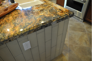
The imagination of this kitchen designer didn’t stop at the backsplash. Take a look at the tile design on the island below. The same tile laid in vertical rows creates a very different look whilestill keeping everything integrated.

Peninsula 159Here’s a great look at this granite countertop. An island is a perfect place to showcase your granite choice, because the large expanse of open stone really displays the grain.

Don’t be afraid to make a daring choice for one or more of your options when designing your new home. And be sure to take advantage of the knowledge of your Fulton Design Center designer when determining which options will combine to help you create a home that demonstrates your taste and style.

Create an Outdoor Room

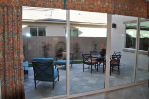
Peninsula 149This is the time of year when it’s wonderful to live in Arizona. So before the heat shows up, how about creating an outdoor space that can substitute for your living and dining room only outside?

It doesn’t take that much effort, just add a few things to make your patio an inviting place to eat a meal or spend an afternoon. Take a look at this space from the Fulton Homes Woodside Model at the Oasis in Freeman Farms Community.

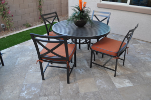
Peninsula 153This patio has plenty of room for a living-room style seating arrangement and a comfortable spot for al fresco meals. Thanks to the new outdoor fabrics, all-weather cushions add comfort as well as color. Here are a few other ideas to build a living space outside.

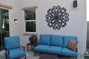
Hang outdoor art: Metal or ceramic wall art such as this cast iron piece adds an element of charm while still able to handle the elements. Check patio stores, garden shops and small boutiques for pieces that match your style.

Add accessories: The throw pillow and plant on this patio help build a fully-furnished feeling. These pieces warm up the space.

Remember lighting: Your outdoor lights help make your outdoor space work through the evening. Add candles or lanterns to brighten the patio for parties and family gatherings.

Peninsula 150Choose flooring that mimics indoor style: Choosing tile, pavers or stone instead of settling for standard outdoor concrete allows you to add color and texture to your outdoor rooms. Consider picking up an outdoor rug to add even more color and personality.

Take your time choosing the right furniture and accessories, and you can take advantage of this season’s weather and add living space to your home by spending time outside.


Design Grammar: Articles Connect Nouns

2751374_SHow many of you remember what articles are from your grade school grammar class? Come on, raise your hands. If you’re one of those trying to hide behind Mary Grace because you’ve forgotten, articles are words such as “the” and “and”, which are used to connect other words together.

In the grammar of home design, articles represent the end tables, coffee tables, nightstands, and other items used to connect other pieces of furniture together.

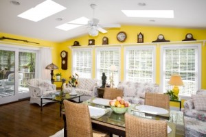
What’s important to remember about articles in decorating? First, to make sure you have all of the pieces or words you need so that your design or your sentence make sense. For example in the room above, the square coffee table, the small woode table between the love seat and te sofa, and the glass-topped side table that matches the coffee table serve as the connecting articles in the space. Their purpose is primarily utilitarian, and they shouldn’t draw attention to themselves. The tables in this space complement the rest of the furniture without overpowering them.

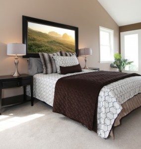
13888922_SArticles also include nightstands such as the ones in the photo to the right. These pieces are also utilitarian, yet the style fits the contemporary look of the room. You can see the lamps serving a useful purpose as lighting for reading or dressing and the drawer provides hidden storage.

However the slightly bowed drawer and simple silver pull pull in the lamp’s curves and metallic finish. The dark wood tone mimics the art over the bed and choosing symmetrical matching lamps carries the modern masculine theme preented by the bedclothes through the room.

Remember to choose articles that aren’t intrusive yet still manage to make the sentence and the design stronger,


Design Grammar: Verbs

12620942_SIn this series on design grammar, verbs are the things in your home’s design that have some kind of action associated with them. These include lights, electronics, appliances and water features.

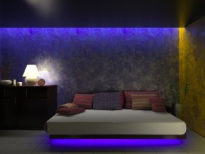
Take a look at the lighting choices in this bedroom. There are four light sources in the room, each with an active role in the design. The light showing under the bed adds color and makes the bed appear to be floating. The purple and gold lights shining down the walls provide color and space definition, and the simple lamp by the bed is functional and adds warmth.

13738899_SThis photo has two verbs in it  – light and water. Notice how candlelight provides soft and yet directed light, and adds to the inviting feeling of the space. The water in the background contributes movement and sound. Although this is just a snapshot, it has the feeling of action because your mind can infuse it with motion and sound to match the image.

8969356_SEven when it’s off, an electronic element such as a television provides an action point in a room because of its potential. One reason people like to hide a TV in an armoire or behind doors is so that potential is not part of the everyday living space. Take a look at the photo to the left. You don’t need to see the television to know exactly where it is and what these people are doing. The people are reacting to the main action in the room: whatever is on the invisible television.

When you choose to put verbs in your home, be sure to balance them in the space. A room with too many action items may become overwhelming. On the other hand, no verbs make a room feel static and boring. Take the time to figure out the right verbs to build your story/design with excitement but not to the point of exhaustion!

A Beautiful Bath is all in the Details

Oasis at Freeman Farms 081Monday’s blog took a look at how finishing touches could dress up a kitchen. The same approach can turn a nice bath into an oasis in the middle of your home. Let’s check out the choices that are showcased in the master bath at the Fulton Homes Whitewater model in the Oasis at Freeman Farms community.

First, a double sink allows space for two to get ready for work in the morning. Many couples value their own sink, and both of these have plenty of counter space and storage.

Separating the two, a lower counter with a drawer provides the perfect place for styling –with a hair dryer and/or make-up. The comfy ottoman adds a splash of class with its simple cylindrical shape and luscious upholstery.

Oasis at Freeman Farms 082Warm tones enrich the look of this bath with gold/brown porcelain tile on the floor, different but still coordinated tile countertops, and inviting wallpaper carrying the gold tones up to the ceiling. Notice the backsplash behind the sinks. The small tiles set the space apart. The large mirror is framed to coordinate with the cabinetry – another option offered through Fulton Homes that creates a more finished look.

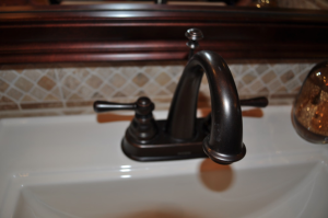
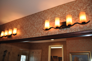
Oasis at Freeman Farms 083Oil-rubbed bronze faucets and lighting stay with the warm-toned theme. This finish has become a classic since its introduction and it works beautifully in both modern and more traditional homes. The light fixtures with their bronze bases and amber glass shades echo that warm feeling while their design stands out over the more standard bathroom fixtures.

These details separate this bathroom from a more basic look, and create a space that will serve as a particularly enjoyable spot to get ready in the morning and prepare for bed at night.


Power Shower Creates Good Mornings

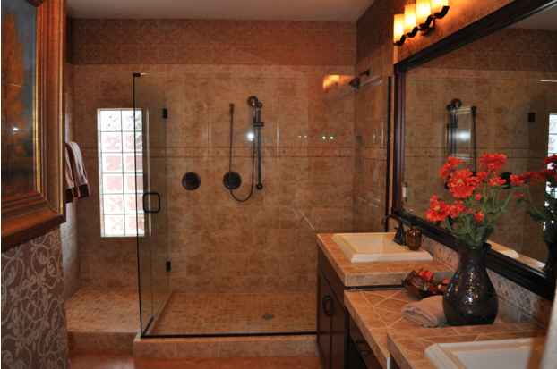
Oasis at Freeman Farms 079With our busy lives, who has time to linger long enough for a bath in the morning? This master bath, part of the Fulton Homes Whitewater model in the Oasis at Freeman Farms community, offers a generous-sized shower option. Here are a few things that make this shower something to be appreciated.

Sheer size: No running an elbow into walls with this shower. With lots of space and dual shower heads, there’s room for two on busy mornings. For those with limited mobility, this shower has plenty of room for a seat, and the handheld shower head makes washing much easier.

Step-up entrance: Rather than dripping water through the bath, this side opening provides the perfect spot to towel off after a shower. Add a couple of bath mats – one just outside the entrance and another at the bottom of the step, and your bathroom floor will stay dry easily.

Light-rich space: The glass-block window just outside the shower combined with the clear glass shower surround provides plenty of natural light to help wake you up in the morning. The feeling is airy rather than over-enclosed.

Shower with style: The tile surround complements the rest of the bathroom. The row of decorative tiles running along the upper third of the shower area adds personality. The oiled bronze shower fixtures and trim on the shower surround connect with the sink faucets and bathroom lighting to create a feeling of indulgence.

How about giving yourself a chance to start your days with a power shower in a bathroom with this level of luxury? It will help you start every morning in a really good mood!

Finishing Touches make Kitchen Special

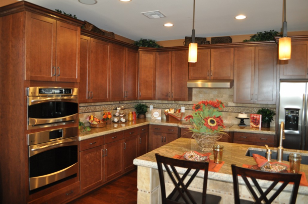
Oasis at Freeman Farms 072When designing a kitchen, you can easily get caught up in choosing just the right appliances, the perfect cabinets, and knock-out flooring. But don’t ignore the smaller decisions that can bring your kitchen from well-designed to wow! Let’s take a look at just a few of the finishing touches available at the Fulton Homes Design Center that help create a kitchen to turn heads.

Cabinet crown molding: These straightforward Shaker-style cabinets step it up with crown molding at the top. This is dentil crown molding – called that because the row of wood squares below the crown resembles teeth. This type of trim dresses the cabinets up and adds perceived value far beyond the minimal additional cost. Be sure to investigate your trim options when choosing your cabinets.

Pendant lights: These pendants have an industrial-appearing foundation with the look of matte iron, and a sharp squared-off glass shade. Add an amber tone to the glass and you have a stand-out sculptural look to these pendants. Check out the choices for pendants available at the Fulton Design Center and add that sophisticated and functional touch over your kitchen island.

Tile or stone trim: This kitchen’s backsplash is splashier thanks to the row of decorative stone running a few inches below the cabinets. Choosing to install a row of interesting tile or stone within a simpler pattern creates a much more interesting look with a minimal increase in cost. By adding a small line of the same stone as part of the tile surrounding the island, the two areas are tied together and both end up more interesting.

Each of these three choices had a minimal impact on this kitchen’s cost, but the result far exceeds the expense. So take the time to look at the details and create a truly special kitchen!

Lighting Connects Great Room Spaces

When you’re working with a great room, you want to balance the need to separate the functional areas with choices that integrate the spaces. Consistency in design helps make that integration possible.

In this great room, from the La Quinta model at the Oasis at Freeman Farms community, one unifying feature comes from the lighting. Let’s consider the light fixtures in this space.

First, take a look at the chandelier over the dining table. It has an appealing warm finish, with bell-shaped glass shades in an amber tone. Now notice the ceiling fan. The metal finish and the amber tone match the dining chandelier, although the type of fixture is completely different.

The pendants over the kitchen island have a more streamlined shape. This works well as they are in line-of-sight from the kitchen to the rest of the room. However, the glass mirrors the same amber tone that’s been part of the other light fixtures.

Finally, take a look at the sconces above the fireplace. The finish, the shape of the glass shades, and the color of the glass are the same as the chandelier.

Design consistencies such as these make a space feel connected throughout. Other elements such as the similar tiles on the kitchen island and the fireplace surround, the same flooring, and the paint choice integrates every aspect of this space.

A great-room design depends on choosing lighting, flooring, tile and colors that work for every functional area. In this room, everything flows together to create a warm and inviting space.

Wall Decals Spark Child’s Room

This year your son may love dinosaurs, and next year it could be cars or insects or certain Disney characters. Wall decals are the perfect option for decorating a room that’s destined to change.

Unlike wallpaper, these contemporary choices stick on and peel off without damaging the underlying paint. The relatively low cost and ease of installation make it easy to see decals as temporary. You may want to require a certain length of time for your child to live with any decal choice – say a year – to ensure that your child thinks carefully about the decision.

This child’s room, part of the Rancho Mirage model in the Oasis at Freeman Farms community, really works with the jungle animal theme. The hippo, monkey and elephant are darling representations, and the decals are echoed in the quilt on the bed. Add the stuffed monkey and a throw pillow in coordinating colors, and this bedroom has a finished and inviting feel.

Sometimes having art hanging on the walls can lead to accidents with overly-energetic kids. Decals provide the feeling of art without hanging things on the walls that might tumble off. You can just see the corner of the window on the left. Putting up wood blinds and a simple valance at the top removes the temptation to swing from curtains but still provides a nice-looking window. Hunter Douglas window coverings have special child-safe pulls, which makes them even better for this room.

The padded headboard and table lamps encourage a child to sit up and read in bed before going to sleep. Plan space for those activities you want your children to engage in and you provide unspoken encouragement to help develop the right habits. And when your child outgrows the elephant and hippos, you can just put up new decals, pick up a new quilt, and the room is remade.