Kitchen Pantry Pleasure

pantry 2 fultonOver the years, homeowners have enjoyed the pleasure and convenience of walk-in closets, and now many homeowners are discovering the benefits of a walk-in kitchen pantry.

Once a common feature in farmhouse kitchens where food storage was as important as preparation, pantries are now a luxury well worth the investment. Here are some of the advantages.

Large container storage: If you’re a fan of those warehouse stores, often you may need to set up a spot in the garage to hold the space-robbing containers of canned goods or paper products. With a pantry, you control shelf height, enabling you to fit even the most massive purchases right next to the kitchen.

Easy visibility: Instead of having to search through cabinets and drawers to find the cranberry sauce or soup, everything is easily visible when you walk in.

Perfect for storing serving pieces: The long shelves provide the space you need for larger trays or stock pots.

Off the kitchen but not in the kitchen: That much storage space would create a bank of bulky floor-to-ceiling cabinets in your kitchen extending out into the family room. Instead with a pantry an incredible amount of kitchen storage is just a doorway away.

Hidden storage: When guests come, simply close the door to hide the pantry and everything inside it. It’s also a perfect place to put half-empty bags and boxes of crackers or chips where they are out of sight but easy to grab when restocking appetizers or snacks at a party.

How will you use your walk-in pantry? Chances are once you have one, you’ll constantly find new ways to incorporate it into your regular kitchen routine, and you’ll wonder how you ever cooked or entertained without it!

Balancing Cabinetry and Appliances in your Kitchen

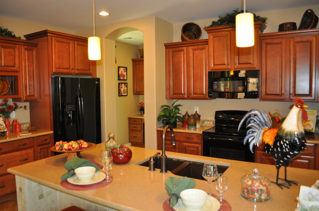
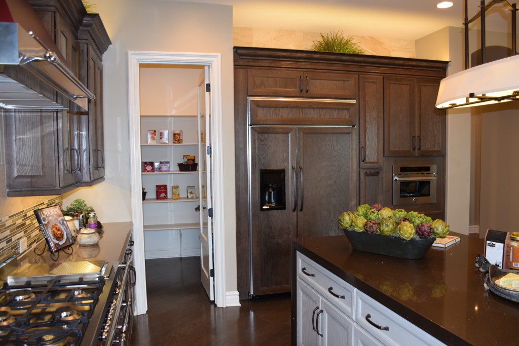
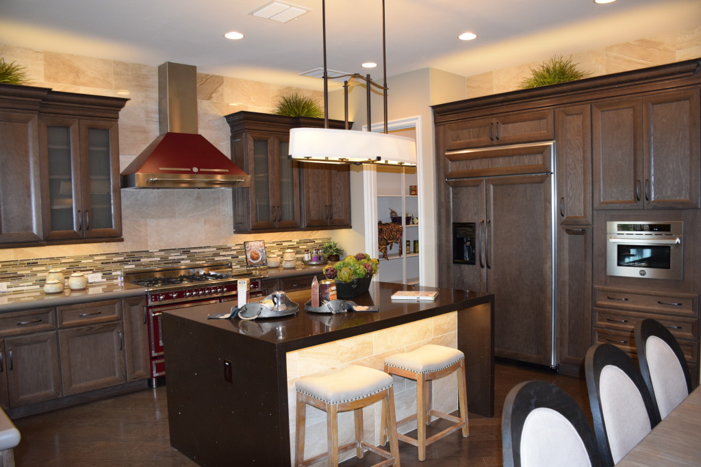
Models 061This kitchen, from the Fulton model at Legacy, shows two ways of approaching appliances in your kitchen: showcasing them like this Bertazzoni range and hood, or reducing their impact by blending them in with the cabinetry. You can see this with the built-in refrigerator to the right.

In this example, both design choices work. The drama and color of the oven creates a focal point in the kitchen. The generous size of the space allows this dramatic piece to shine without overwhelming the room. On the other hand, if the refrigerator had a stainless skin, it would be a distracting influence. Its size would draw the eye away from the strengths of this kitchen – the range and the island.

Transitional design allows you to take advantage of many choices combined into one integrated whole. In this case the moderately-traditional cabinets take a back seat to a strongly-contemporary island and a retro-style range. Smartly, the dark red of the range is allowed to stand alone rather than having the color echo throughout the kitchen. If you wanted to carry the color further, a few accessories would provide all the impact you need.

Notice the stainless microwave to the right. That could have been installed in black, but there are enough stainless accents throughout the kitchen to make this work. The small size ensures that this appliance does not become a distraction. However, cabinet pulls are dark rather than stainless. Design is always about balancing strong features with others that fall into the background.

For a better look at this kitchen as well as two others with interesting style and design elements, visit Fulton Homes Legacy in Gilbert and wander through our three new model homes.


The O’Connor: Entertaining from the Kitchen

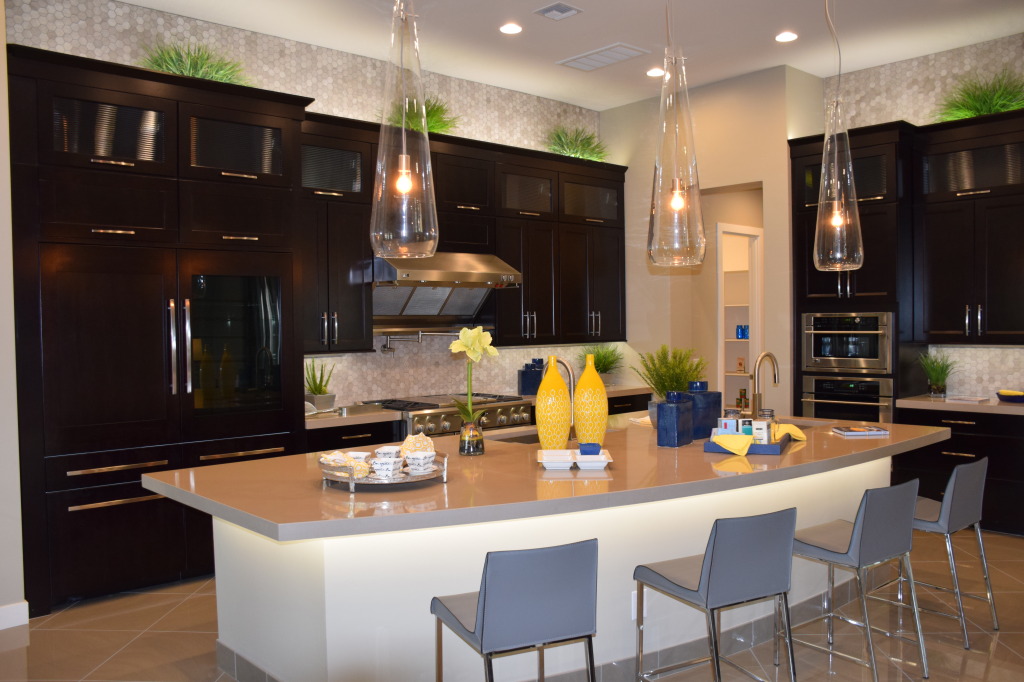
Models 081If you enjoy cooking for friends and family, this kitchen could make your dreams come true. With plenty of space for helpers and gawkers, you can prep, heat and dish up to your appreciative audience.

The Viking range and hood provide a close-to-professional cooking space with four gas burners and a center section that can serve as a grill or griddle, you have the capability and BTUs to fix a gourmet meal.

In the meantime, set up a buffet of appetizers to keep your guests happy until dinner. The generously-sized island has the perfect shape to share prep space with munchies. Two sinks provide flexibility to have helpers assigned to different responsibilities.

This kitchen is remarkably functional, but just as important, it shows style and flair. The rich dark color of the cabinets work well against stainless appliances, and the backsplash tiles become even more intriguing by also showing up above the cabinet lines. With two ovens, hot appetizers can bake while the meal does. And notice the pantry through the door in the back – ready to store all of your serving dishes until it’s time to plate.

The refrigerator/freezer is oversize, but with the doors matching the cabinetry, it is still a subtle look. Contemporary countertops and stainless handles work well with the stand-out industrial-style pendant lights over the island. Overall, this kitchen is designed to capture attention and serve as the center of your entertainment events.

Want a closer look? Visit Legacy and see what the O’Connor has to offer.

The Basha Backsplash that makes a Splash

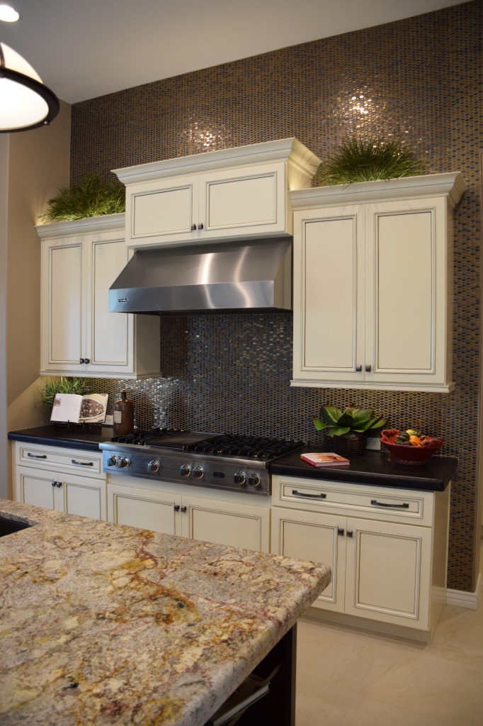
Models 093How daring do you want to be with your backsplash? More than a protection against food splatters, a backsplash provides the best opportunity to make your kitchen stand out from the standard.

Take a look at this choice. The small ovals in various metallic tones create an overall dramatic presence, lifting this kitchen to another level of style and design.

The cream cabinets could lend themselves to a traditional, even basic look. But with the addition of the dark countertops and the shiny-yet-dark backsplash, everything links into an effective space that stands out from the ordinary.

Consider the impact of the island contrasting with the back wall of cabinets. A dark cabinet finish connects to the wall while the choice of light granite on the countertop warms and links the two with strong gold veining. This grabs the backsplash and pulls the two areas together.

Another exciting feature about this choice is having the backsplash tile reach above the cabinets to the ceiling, turning from the traditional approach to something more contemporary and fresh. This tile actually frames the cabinetry. The stainless stove top and hood also contribute perfectly to the space.

This kitchen demonstrates what can happen when designers’ takes a risk, creating a space that makes you sit up and take notice. Would you be willing to make this kind of design leap with your own home? To get a better idea of whether a kitchen like this one fits your profile, we invite you to see it in person in Fulton Home’s Basha model at Legacy.


Kitchens made for Entertaining

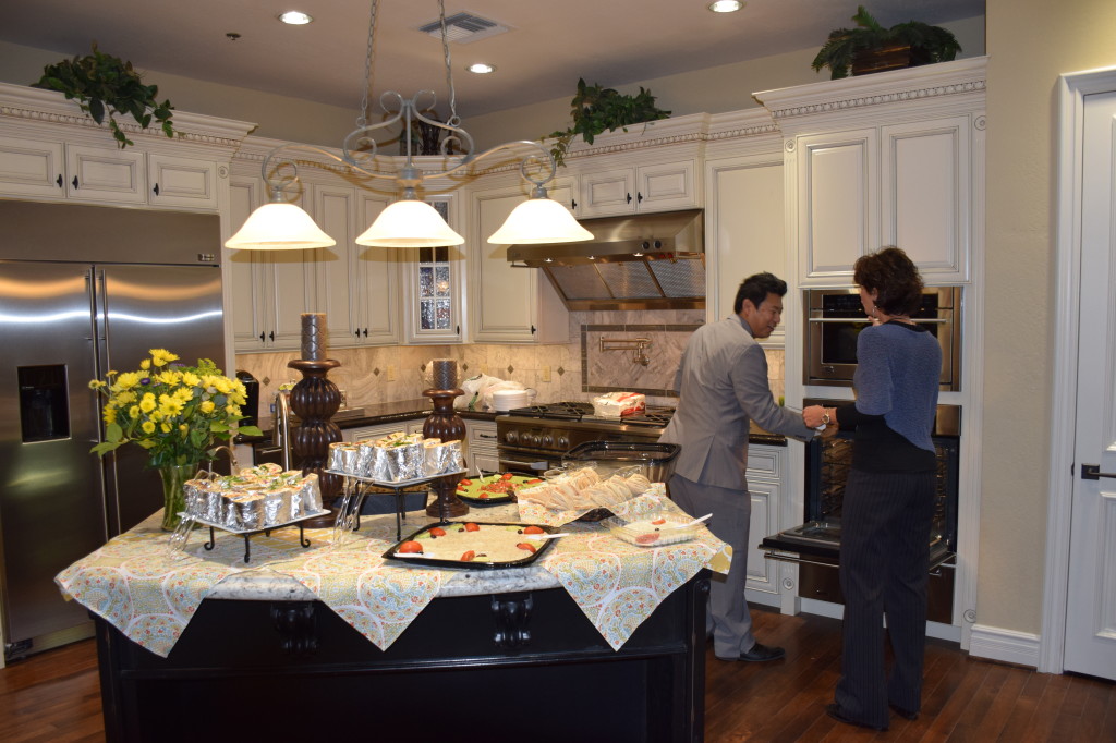
002 super browseDoes your kitchen become the central location for every party you host? Then why not create a kitchen made for entertaining in your next home? This kitchen, from the Fulton Design Center, demonstrates how a kitchen can come alive during a party.

Use your island as buffet central: With its close proximity to the oven and fridge, you can easily refresh the food as needed. Take advantage of this to provide special piping hot appetizers fresh from the oven and even offer a hot drink such as mulled cider on the stovetop for winter events.

Add height to your buffet display: The open flat counterspace that your island provides makes for a great functional kitchen but it diminishes the punch of a buffet. Find ways to include height to make the display more interesting. Place some food on pedestal stands, and include candles and fresh flowers. Setting up the buffet this way also encourages guests to serve themselves on the side away from the kitchen. This keeps them out from underfoot while you’re working.

003 super browseSet up a drinks area: You can use a corner of the island, as shown in the photo to the right, also from the Fulton Design Center. Provide cups and cocktail napkins and place sodas and other drinks in the refrigerator for easy access, or keep wine chilled in an ice-bucket on one section of the counter.

Plan your lighting: This allows you to create several moods in different parts of your home. Want the kitchen to be the light and bright area? Turn on all of your kitchen lights. On the other hand if you want people to linger around the buffet but not in the main kitchen space, use only the pendant lights and keep all the other kitchen lighting off for the duration of the party. You can turn them back on when it’s time for clean-up.

Check out these and other kitchen vignettes at the Fulton Homes Design Center. Our open browse nights happen from 5 p.m. to 8 p.m. every first and third Thursday of the month. For more information visit our website at: http://www.fultonhomes.com/design-center

Painted Kitchen Cabinets

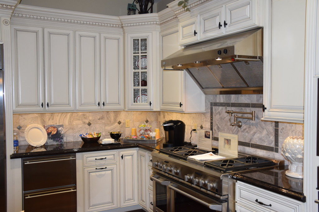
Design Center 003There’s a fresh clean look about painted cabinets in a kitchen. They bring light into a space yet still work well with black or stainless appliances. With the black countertops shown here combined with the black and white marble backsplash, this kitchen has the perfect combination of traditional and modern.

design center 002003Painted cabinets today take advantage of some of the options you see with stained cabinets such as glazes to create a more three-dimensional appearance. Take a look at the finish on these cabinets, from one of the kitchen vignettes at the Fulton Design Center.

The detailed trim on the cabinet doors combined with a rich crown molding option offer the perfect surfaces to showcase the dark glaze on these off-white cabinets. The rubbed bronze knobs and pulls suit this inviting style.

If you are considering hardwood flooring in your kitchen, or laminate or tile with a hardwood look, painted cabinets bring a positive contrast between the cabinets and flooring. Adding the dark countertops provides a strong delineation and keeps the kitchen looking interesting.

Old farmhouse kitchens often sported painted cabinets because it was easy to keep them clean and a new surface was only a can of paint away. But with today’s cabinet finishes, a quick wipe with a damp cloth will keep this kitchen sparkling.

With painted cabinets your color and décor options are almost unlimited. Bring in bright jewel tones, earthy colors or pastels and this kitchen provides the perfect background. Enjoy the beauty and flexibility of painted cabinets in your new Fulton Home. For more ideas visit the Fulton Design Center or the Fulton Homes Design Online center at https://edc.envisionoptions.com/welcome/browser.aspx?oid=506&iid=8007295&type=brw&src=edc&toid=505.

Little Touches Make Kitchen Pop

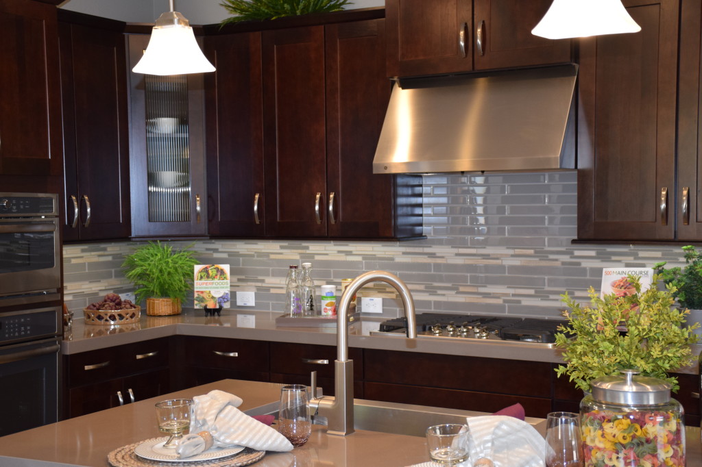
Corsica Model at Ironwood Crossing 009A smart, functional kitchen can also be lovely. This room, from the Fulton Homes Corsica model at Ironwood Crossing, demonstrates some of the best features a kitchen can offer when the goal is to combine practicality with style.

Let’s start with the cabinets. While glass-fronted doors add appeal to a space, many cooks worry that their cabinets are often just not tidy enough to make glass work for them. By choosing only one cabinet door – the angled one – for a glass front, this kitchen owner can place just the right dishes and bowls in this space to create the impression that every cabinet is this inviting.

Take a look at the type of glass on this cabinet. The vertical lines provide some shielding from seeing exactly what the inside holds and at the same time contribute another design element. Also, this type of glass is less likely to show fingerprints.

The glossy backsplash adds another pop of texture to this kitchen. While the tile and sealed grout make for an easy clean-up of any splashes, the grey, white and light coral tones provide a subtle element of color to the space.

Notice also the high-profile faucet. The clean look and strong curve provides another positive design element, while the skilled kitchen chef recognizes the height advantage when filling large pots. This oversize sink is ready for any culinary adventure.

Finally, the comfortable island invites family and friends to spend time in the kitchen talking to the cook after school or during parties. Overall this kitchen provides high style in its finishes yet still remains functional and welcoming for everyone.

Pinterest on Kitchens

From Fulton Home's Cascade model

From Fulton Home’s Cascade model

If you’re in the process of choosing finishes for your new Fulton Home, you may be challenged by all of the cabinets, countertops and other options. Pinterest provides a great way to start determining the right kitchen look for you. Check out the Fulton Homes Pinterest site and our board Kitchens. There you’ll find many of the kitchens created at the Fulton Design Center as well as in the various model homes.

Wondering if you want dark cabinets? You’ll see a number of kitchens with that choice. On the other hand, if you want painted cabinets take a look to see whether the look appeals to you. You can also get ideas for just the right backsplash, flooring and appliances.

Are you thinking of some special tile choices to make your island stand out? Fulton’s Pinterest board has some good examples. You’ll also see many of the kitchen lighting options in place.

While you’re looking at the photos, you may also want to read some of our past kitchen blogs to gain insights into the design process for your kitchen. You can access them at this site, or review the kitchen blogs on our Pinterest kitchen board.

Fulton Homes on Pinterest has been custom designed to make your home buying experience easier and provide interesting information for you once you’re settled in your new home. We hope you’ll visit it often.

Kitchen/Family Room with Color

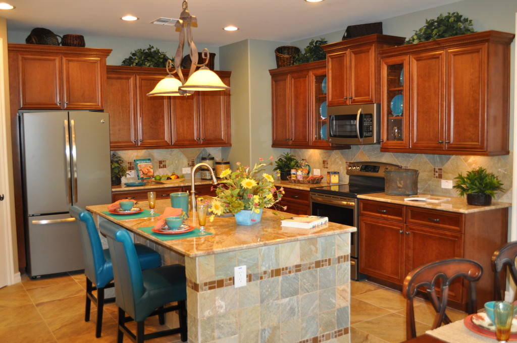
Kitchen DSC_0324Wood cabinetry, granite countertops and tile floors limit the color options unless you are willing to commit to a strong color choice that you will have to live with for a long time. But color can come into a space like this in so many ways.

This kitchen and family room, from the Fulton Homes Cascade model, demonstrates smart ways to introduce color. Let’s take a look.

Glass cabinet displays: Glass in several upper cabinets opens up a space and adds personality. This kitchen takes advantage of the visual by displaying blue plates. Notice that the tile on the side of the island has a blue cast, and this color is carried throughout the kitchen.

Island chairs: Selecting chairs to match the cabinets would be a safe choice, but lacking in creativity. This blue leather brings the plate colors to the other side of the kitchen while the wipe off finish makes them perfect for coping with after-school snack accidents.

Accessories: Placemats, dishes and flowers pull more colors into the space. Other counter accessories and even the items above the cabinets can carry a colorful theme throughout the room.

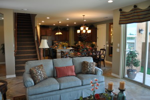
Family and Kitchen DSC_0306 outdoor connectionFamily room coordination: The family room provides more opportunities to introduce color, and the sofa, window treatments, accessories and throw pillows echo the kitchen colors. \

These choices keep color front-and-center in this family-friendly space. Blue and rust bring the space to life. What colors would you like to see in your kitchen and family room? Whatever you choose, color will warm your home and add interest while saying welcome to you and your guests.

Linking Kitchen and Dining Spaces

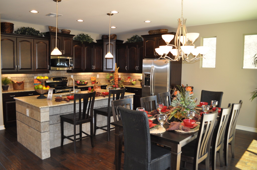
Kitchen20and20Nook20DSC_0244With an open floor plan it’s easy to connect with friends and family when fixing a meal. The distance to the table is short, making the transfer of food to table and dirty dishes back only a few steps.

If you have lived in a home without this kind of space, an open floor plan is a luxury indeed. But planning the décor requires attention to make the space feel unified. This Fulton Home model demonstrates how to connect the kitchen with the dining space. Let’s take a look at some of the decisions that make this space work so well.

Flooring: By staying with dark wood flooring throughout, everything feels like one room. The island provides the only break between the kitchen and dining table.

Cabinetry & Furniture: The cabinetry in the kitchen and the dining table and chairs coordinate in wood tone. Another connection comes when the chairs at the island sport the same design as the dining chairs. This keeps the one-room feeling intact.

Lighting: Although the pendant lighting above the island has a different function than the chandelier in the dining area, the glass globes are the same shape and both have the same brass finish. They are from the same family of lighting fixtures and they help integrate the space beautifully.

Accessories & Colors: The dishes, flowers and kitchen décor mirror the dining table’s tablescape. This causes your eyes to travel freely around the entire space without a pause. A difference in color or style from kitchen to dining room could create a jarring interruption.

If you are moving to a home with an open floor plan for the first time, be sure to factor the need to integrate several spaces into your design and décor plans.