Choosing the front door for your Fulton Home

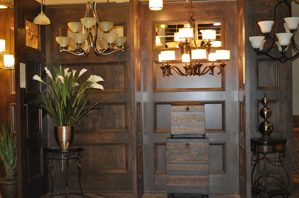
Door DisplayDesign Center 046We all know the saying, “It’s the first impression that counts,” and Fulton Homes is giving you the opportunity to create a terrific first impression for visitors to your home. With an amazing variety of styles, wood tones or even color, the Fulton Design Center can create the entry look you dream about.

Do you want a traditional door with the strong detailing that comes through as a powerful entrance with an established presence? Take a look at the door to the right in the photo above. With its deeply-grooved panels and oak grain, this door looks as though it’s been around for generations. The old-fashioned brass door handle also conveys this feeling.

Maybe you’re looking for something a little more rustic. Take a look at the door in the center of the photo. The sturdy wrought-iron door handle with its squared-off style fits a more hand-hewn rustic mood.

Then take a look at the lighter-hued door between the other two. With its bead board styling and curved top, this door suits a more casual country feeling. The soft wheat color fits the style, creating an inviting feeling before people even step inside the house.

Your front door introduces visitors to your home. Fulton Homes understands the importance of that first impression, and your selection options for your home’s entry door demonstrate that. When you take the time to find just the right look for your style, your front door will say “Welcome” to every friend and family member.

Choosing the Kitchen Faucet for your Fulton Home

Fuacets Design Center 022We use faucets every day but don’t really think about them. However, when you walk into the Fulton Design Center to select your kitchen faucet, it pays to consider what you want in terms of both function and style.

Take a look at the faucet selected for the kitchen above. It’s a simple style that would work well in a traditional and a more eclectic kitchen design. The polished nickel finish works beautifully with the stainless appliances while showing fewer water spots than chrome.

Notice the high profile of this faucet. This provides room underneath to easily fill large pots and pitchers. The handle is ergonomically sound. The lever style makes it easy to control with one hand. It also has a pull down sprayer that’s incorporated into the faucet itself rather than set separately. Many of today’s faucets are designed this way.

Some faucets offer water patterns that range from a standard flow to a strong spray designed for rinsing fruits, vegetables or dishes. Many cooks find that they really appreciate the spray option. While you’re selecting your kitchen faucet, you may want to add one or more built-in soap dispensers. It’s tidy and convenient to have easy built-in access to both hand and dish soap without having to pull a container out from under the sink.

Finally, if you’re creating a kitchen with an old-fashioned country look, be sure to take a peek at the pump-style kitchen faucet. It has all the functionality of the modern faucet, while showing a style and finish that makes it feel like it came from your great-grandparents’ time.

You’ll enjoy checking out all of the choices available to you for your kitchen faucet in your new Fulton Home.

Exploring the Fulton Design Center: Kitchen Counters

Design Center 018In our last Fulton Design Center blog, we recommended starting your kitchen design plan by choosing your cabinets. The next decision is countertops. Do you want granite? The look and feel of real stone is dramatic, and it seems that everyone’s dream kitchen includes granite countertops.

Fulton offers a wealth of granite choices, along with the option to pick out your slab, which helps to ensure that you are happy with your selection. Certainly granite adds to a kitchen. Take a look at the strong personality of the granite in this kitchen. It picks up the warm tones from the cabinets but also adds some cooler colors to connect the cabinets with the stainless appliances. This countertop choice truly pulls the kitchen together.Granite Design Center 015

Large slabs of the most popular granite options allow you to really see and appreciate impact of each stone. And with today’s sealed granite, it no longer requires the repeated treatment that was common not so many years ago.

Although you may be captured by this countertop option, take the time to look at some of the other choices. Quartz and other countertop materials may suit your taste more than granite. It pays to at least consider other countertops.

One final tip when making your selection: remember to create contrast in your kitchen. If your cabinets are dark, a lighter countertop can build a well-defined distinction between various aspects of your kitchen. Decide if you want your counters to add a strong personality or subtly blend into the background.

Will your kitchen be an adventure or a refuge? Your countertop choice helps contribute to the mood and feel of your final kitchen design.

Exploring the Fulton Design Center: Kitchen Start-up

Bertazonni KitchenReady to plan your kitchen? The Fulton Design Center offers such a variety of styles and options that it may be challenging to narrow down your choices. These suggestions may help you with the process.

Choose your overall style: Do you love the richness of the traditional Tuscan look? Features such as the carved columns on the island above can help recreate that mood. If you lean toward a simpler option, take a look at the Shaker-style cabinets and start from there. However, do not feel obliged to be entirely consistent with your style choices. Take a look at the lighting in this kitchen. The contemporary pendants have a strong impact and help sharpen the more traditional look of this space.

Choose your cabinets: As you can see from the photo above, cabinetry makes the biggest design statement in this room. Your choice of cabinets affects every other decision you make, so make your cabinet choice the foundation of your kitchen’s design.Cabinet Display Design Center 034

The Fulton Design Center has a rich selection of styles and finishes, with sample doors that you can take throughout the Center to coordinate your total space.

Consider cabinet style and tone: You have two important choices with your cabinets. The first – style – provides the framework for the entire kitchen design. The second choice – cabinet tone – affects every other option you select.

A dark cabinet choice may lead to a lighter countertop and flooring selection. Painted cabinets can create a farmhouse feeling and a bright kitchen space. Light cabinets have a younger, more contemporary style, particularly when paired with a dark countertop and exciting backsplash.

So when you make that first decision – your cabinets –you’re well on your way to creating the perfect kitchen for you and your family.

Design Inspiration: Set a Stormy Mood

5775664_SThere’s nothing restful about a stormy day. Clouds roll over the sky, threatening rain or hail or snow. Lightning flashes unexpectedly, followed by the rolling roar of thunder. A stormy room wouldn’t be restful or dull. Instead, it would demand your attention.

Take a look at the stormy scene to the left. Even in a static photo, you can see the movement of the clouds and the explosion of lightning. Dark colors, browns and greys and touches of black, provide the color palette for a stormy room.

731973_STo begin to determine what makes a space feel like the outdoors in a storm, take a look at the photo on the right. This indoor space – a tunnel – echoes the mood of the storm. The ceiling is dark like the stormiest of storm clouds in the sky. The lights and the stripes on the street move like lightning across the sky. Unintentionally, this tunnel mimics some of the feel and even the sounds of a stormy day within its enclosed space.

15750868_SLet’s take a look at a room that captures the intensity of a storm in its design. While this could be a residence, it could as easily be a hotel lobby with its air of grandeur.

The colors are primarily dark, appropriate to a stormy mood. But the shiny lit stripes across the back of the ceiling and the walls provide the same stripes of light we see in the storm above and the tunnel to the right.

Lightning is more than just white – it is a light that temporarily blinds your eyes if you look right at it. The silver shine and lighting design of this room carry a reminder of lightning at its powerful best, as though it strikes and then lingers in the mind.

This design is daring and strong like a stormy day at its most powerful and overwhelming. A design like this may be too much for most homes, but how about capturing this mood in one corner of a den, or in an exciting dining room?

Storms can be frightening, but they are also energizing and interesting. Think about capturing a bit of that energy inside your home.

Design Inspiration: Set a Snowy Mood

22974805_SThe number of times we’ve seen snow in the Phoenix area in the last decade can pretty much be counted on one hand, but we can visit snow country all winter by driving just a few hours.

With the holidays coming, some people from other parts of the country may miss the winter weather, while others are grateful for no shoveling off driveways and scraping snow and ice off cars.

If you would like to capture some of the feeling of a crisp snowy day, your decorating decisions can help make that vision a reality. Let’s imagine a January morning in the country just after the first fall of “real” snow – the kind that sticks to the ground and piles up rather than just melting away.

Here’s the first surprise. There’s a lot more than white happening. In the photo above, tree trunks look black against the snow, and shades of grey appear with the contrasts of sunshine and shadow.

Look again and you will see textures and patterns visible at no other time of the year. You can make your home reflect this mood with a few choices.

22549326_STake a look at the room shown to the right. White shares space with several shades of grey and some black. But it’s about more than color – notice the texture of the wall – matching well with the dappled look of snow in the shadows of the landscape above.

The rug mirrors the mix of white and grey visible in the scene in the combination of branches, ice and snow. If you look at that rug with winter in mind, it almost seems as though it might melt under your feet. The sheer curtains mimic the white sunlight coming through the snow in the distance.

The blue and white coverlets on the sofa bring in a color often visible on a snowy day, and the space finishes up with pops of red – always a powerful contrast color and perfect with a winter landscape.

Would you like to bring a snowy mood into your home just in time for the holidays? You can do it, with the right combination of color and texture. And maybe just a few sleigh bells?

Design Inspiration: Set a Breezy, Windswept Mood

17624016_SAt first it may seem impossible – to create the movement of the wind in a static room design. But if you take a look at the photo to the left, one thing stands out – the wind creates curves.

Palm trees fare well in windy areas because their trunks bend with strong breezes rather than break. The fronds also create a lovely picture of curving branches in this strong wind.

The photo below takes full advantage of curves to create a windswept mood. While the flooring is a straight plank wood, it still captures the curves with the line of three steps from one section of the space to another.

Curves are echoed throughout this room. The ceiling’s curving flow really stands out thanks to the contrast of orange and white. Lights follow the orange streak in the middle, providing a curve of light along the room in the evening.

9348004_SThe outside and inside walls are also curved, and the open-air stairway arc sweeps into the room like its own breeze.

The hanging lamp and black chairs continue the theme with circles and ovals as part of their design.

Even the plants look windswept, with their leaves demonstrating a number of curving positions. There’s hardly a straight line in the place, and the shift of colors keeps the eye moving.

You don’t need a fan to create a breezy mood in your home. Look for opportunities to introduce curved rather than straight lines – in furniture, rug designs, artwork and fabrics. Add some sheer curtains or blinds to the mix and you can create your own windy day.

Design Inspiration: Set a Sunny Mood

9417150_SDesigners will use many things for inspiration. They may think of a movie, a historic time period, a specific style or color, or they may choose something vaguer – something that sets a mood rather than openly defining their inspiration.

This week let’s consider a “what if.” What if weather provided design inspiration? With Fulton’s metropolitan Phoenix location, the obvious first choice is sunshine.

This room announces a sunny day with floor-to-ceiling windows flooded with light. The dark wood window trim makes a strong contrast to the bright view outside and the light colors inside. Choosing deep orange echoes the sunny mood without being obvious while the bright citrus green chair and coffee table provide the clear colors that appear with sunshine.

Although the sky outside is a cool light blue, the expectation of a strong bright blue sky appears with the contemporary light fixture in an inviting blue/teal. A few live plants bring us that much closer to being outside in the sun.

12760827_SA sunny mood is relatively easy to demonstrate with these windows and all the sunshine as support, but what if you wanted to create a sunny mood without the outdoor advantages? Take a look at this photo to the right.

This kitchen feels sunny and bright in spite of using only artificial light. What did the designer do here to make that happen?

Using white cabinets sets the light mood, and pops of bright colors – particularly yellow – carry the message forward. The countertops are also light and the cutting board is a honey tone that feels mellowed in the sunshine.

Finally, the lighting splashes light down on the cabinet doors and under the cabinets. Add the reflections from the stainless steel range, hood, and kitchen accessories and sunshine seems to have been captured in this space. And while we take sunshine for granted in Arizona, other parts of the world can benefit from creating a sunny space indoors to compensate for grey skies outside.

Design Tips: Making Your Laundry Room Stand Out

HRM0344With your Fulton home, your laundry room is generously-sized and functional, like this one from the Spyglass model at Victoria Estates. It’s nice to start with such a lovely space, and take it to the next level. Your laundry room can be the perfect place to experiment with some of your more daring design ideas. Here are a few suggestions to make it stand out.

Color: Have you always wanted a yellow room? How about robin’s egg blue? Or maybe you’re thinking about wallpaper. The room is small enough to make a project like this manageable, but you can create quite an impact with a little cash when you add color.

Art: Notice the bold and bright flowers decorating this laundry room. Maybe you’d enjoy enlargements of your favorite photos of family or your travels. You can get photos blown up to poster size for a reasonable price at most warehouse stores.

Go with a theme: This might be the space where you indulge in your love of country style, or perhaps you enjoy daisies or chickens or antique china. The laundry room is generally just for family, so have fun with the space.

Improve function: Would some hooks make it easier to hang clothes on hangars when they come out of the dryer? Maybe you could use a little sewing kit to tighten loose buttons. This might also be a good room for posting upcoming family events on a bulletin board. Take the time as you do laundry to think about additions you could make to this room to make cleaning clothes easier.

The laundry room is often the most ignored spot in the home, but you can make yours unique and special. So why not make your laundry room a space that makes you smile every time you walk in it?

Design Tips: Accessorizing Above your Kitchen Cabinets

11103954_SWhile it may not be a high priority as you move into your new Fulton home and get settled, one day you’re going to look up and realize that you want something above your kitchen cabinets besides air.

The challenge comes from selecting items that have only one purpose, to stay pretty-much permanently on display but out of reach.

This means that you don’t really want to spend a lot of money but you want it to look nice – as if you spent a lot of money. Here are a few suggestions to get you started.

3627780_SDecide on the look you want. Are you looking for bright and modern, traditional and homey or antique and unique? Stand back and really look at your kitchen. What look appeals to you?

Shop your closets. Do you have a bowl from Aunt Sally that you like but really never use? How about a couple of baskets that came with fruit which are just to pretty to throw away? Maybe you inherited a lovely pottery vase that you are uncomfortable using around your rambunctious family. Bring what you have into the kitchen and lay everything out on the counters underneath the cabinets to get started.

Include signs and pictures. Do you have an empty frame? Put a nice piece of fabric or scrapbook paper in it and prop it up against the wall. The “Bon Appetit” sign in this second photo was purchased, but could just as easily be written nicely on an old chalkboard.

6732510_SDisplay a collection. The kitchen to the left showcases an interesting group of antique baskets and pottery. If you like this look but don’t have the collection, visit thrift shops and “age” your purchases with watered down brown and black paint or even strong coffee.

Take your time: One final note: You don’t have to finish this part of your kitchen in an afternoon. Start with a few things and add others as you get inspired over time. Move things around. And above all have fun making the space above your kitchen cabinets totally yours.