A Relaxing Master Bath

DSC_0153 (2)At the end of a long hard day, can you imagine sinking into a nice warm bath, maybe soothed by a generous helping of bubble bath in your favorite scent? The wide edging around the tub provides enough space to light a few candles and prop up a favorite paperback to read while soaking. This relaxing master bath is ready for you.

Or if you prefer showers, how about washing off the stress of the day in this oversized shower, complete with a bench to relax on?

No matter how you use your master bath, just walking into a room like this one can help reduce your stress. The vanity has plenty of storage space, making it easier to keep the counters tidy. The two tones of rectangular tile set the scene for a spa feeling.

Do you dream of a relaxing master bath like this one from Legacy? One with plenty of room, and designed to match your specific taste?

DSC_0098If instead you want one that has a more traditional style while kicking up the glamour, how about the master bath to the right? The gold pendant lights set the stage for luxury. Notice how the filigree creates an inviting pattern on the walls while the lower counter on the vanity provides a space to sit to fix your makeup.

This master bath also has a comfy tub in place, made for soaking. And if you peek in the mirror, you can see the reflection of a generous walk-in closet.

What would your ideal relaxing master bath look like? To get some great ideas, why not visit the models at our Legacy community? We think you will be enchanted by what you find there.


Kitchen Island Lighting Choices

Legacy Models 030You can take several approaches to lighting your kitchen island. The simplest and least noticeable is a collection of ceiling lights, distributed to provide even light for working. But with that choice you lose an opportunity to create a special style moment when people walk toward your kitchen.

Design Center pendant lightsPendant lights are one option that has grown in appeal over the years, with the opportunity to add a touch of style and color to your kitchen’s lighting. The photo to the right shows a number of pendants for your kitchen available through the Fulton Design Center.

The light in the photo above at Legacy takes a different approach from the more standard pendants to offer a shaded piece that provides even lighting on the surface of the island. This intriguing transitional piece suits this kitchen with the shade complementing the tile on the wall and island.

Models 086More unusual, these large long hanging glass pendants in the photo to the right, shown at Legacy, are lit inside by Edison bulbs which provide a unique yet classic touch. This island is large enough to support three of these pendant lights.

The clear glass allows you to connect immediately with the entire kitchen, yet the dramatic style brings these pendants to the forefront of your vision. This is quite a daring choice for island lighting.

What kind of lighting do you want over your kitchen island? We invite you to visit the model homes at Legacy and the Fulton Design Center to see a rich variety of choices in person.


Flooring that stands out

DSC_0086Flooring often serves a passive role in decorating, as the background for other, more exciting things. But take a look at what happens when you give flooring top billing. These two examples from Fulton Home’s models at Legacy demonstrate the power of bringing flooring to the foreground.

The picture above shows the floor extending out from an entryway. Immediately your eyes are drawn down the hall and into the home. This combination of stone and wood provides a path and a promise that this is no ordinary place. The diagonal setting makes that point stronger and adds a dynamic feel. It pays to consider placing flooring on the diagonal. It can create a feeling of added space and energy. In this instance, the strong contrast also provides interest.

DSC_0108Small spaces provide another place to experiment with unusual flooring choices. This basic bathroom becomes intriguing with the addition of flooring in an ascending block pattern. Three shades of tile make up the drama here, capturing the eye. One of our Facebook fans suggested adding Escher prints on the walls to make this bathroom a statement space.

There’s no denying that these floors are a design risk, but why not take a few chances in your home? If these are too far out of your comfort zone, how about adding a border or some sort of contrast in your flooring. Remember that your floor and ceiling are the fifth and sixth walls in your home, so why should the first four have all the fun?


Pops of Color

Legacy Models 057Neutrals always feel safer when you’re decorating, but staying safe keeps you from enjoying the power of color in your home. If more vivid colors seem overwhelming or just too risky, consider taking a chance with a few pops of color. Here are a few ways to let color help bring your home to life.

A strong accent wall: Paint, wallpaper or fabric can turn one wall into a natural focal point with a strong color choice. And the option is relatively easy to eliminate if you aren’t happy with the result. Take a look at this entertainment area in the family room of the O’Connor model at Legacy. The deep purple has enough gray in it to soften the impact on the wall, and neutral furniture, shelves and accessories keep the overall feeling rather low-key.

Contrasting accessories: Adding the yellow glass bowl on the right side of this console helps the space to really pop. Yellow is the complementary color to purple, which means that they are on opposite sides of the color wheel. By adding just a small touch of yellow, the purple becomes more purposeful in the space. The other complementary colors are blue and orange and red and green. If your colors seem drab, adding just a spot of the color on the other side of the wheel will add a spark.Legacy Models 027 (2)

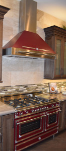
Let color infuse your focal point. This Bertazzoni Range in rich dark red creates a new energy in this kitchen. Other neutrals start to feel like the background elements, allowing this retro range to stand out. (Photo from the Fulton Model at Legacy.)

So jump into color – starting small or with a big push – and let your home’s décor pop!


The Right Study for You

Legacy Models 105Almost more than any room in your home, the study should fit your functional needs. If you are one of the fortunate people who can work from home, you will find yourself spending a lot of time in this room. And even if you head out to work every day, your study may become the perfect place to pay bills, handle any work you need to take home, or even review your email and other social media accounts.

With the commitment of time and energy a study may require, why not make it work in a way that really suits your needs? While function is number one, it’s also worth it to take the time to make it a room you enjoy spending time in. Here are a few things to consider as you plan your study’s functional needs and décor.

Legacy Models 045Desk space: If you use a laptop, you need less space than a desktop takes, but you may still want to plan additional room for holding notes or any mail you need to deal with when you get home. If your study is also your main workspace, consider room for in and out boxes and anything else that would make your work easier and more efficient.

Storage: Do you need file space or space for office supplies? Look for furniture style-file cabinets and other pieces so that your study is functional while still fitting in with the rest of your home.

Lighting: In addition to any ceiling lighting, take a look at floor and desk lamps to add just the right light as needed to do your work effectively. Think also about the ability to change the lighting depending upon the moment’s needs. The kind of light you need while working at the computer may be completely different from what you want when meeting with someone on business.

Style: If you like traditional looks, consider something like the study shown above. The stone wall adds a nice unusual pop of texture while staying in the traditional vein. On the other hand, if you want something more daring, how about a study like the one on the right? From the flooring to the ceiling light fixture, this room has a unique feeling.

Above all, make your study a space that works for you in every way, from function to style, so that you enjoy the time you spend there.


Homework Central Approaches

DSC_0184 (1)What can you do to help facilitate your children’s attention to homework? There are a number of approaches suggested, ranging from insisting that homework be finished immediately after school and parents keeping close track, to a more hands-off style where you expect the child to stay on top of it or suffer the consequences in school. Most parents fall somewhere in the middle.

There are things you can do to make the homework process easier without taking a “homework police” role. Here are a few suggestions.

Help each child create a test and homework calendar. Different classes could be designated by color, and milestones set for larger projects. This way both of you can keep up with what is due when, and “Have you checked your calendar” seems friendlier than “Did you do your homework yet?”

Designate a homework location in your home, complete with desk, office supplies, and a computer if needed. In this teen room located in the O’Connor model at Legacy, the desk provides good lighting, room for a laptop, and drawers and cupboards for books or knapsacks. You could add some office features such as in-and-out boxes, and there’s even room for a printer. With just a few additions, you can create a special “homework central” so that everything is ready whenever your child is.

To make it feel even more like a personal office, you could replace the artwork with a bulletin board and pin the current month’s calendar to it. Providing the opportunity to be organized makes the entire homework process easier and more enjoyable.

Finally, a few simple rewards such as a snack waiting when homework is done provide an extra incentive to finish and get to more fun activities.


Kitchen-Smart Ways to use Cabinet Drawers

Legacy Models 025In most of the kitchens of yesterday, you needed three drawers: one for silverware, one for other cooking utensils, and one “junk” drawer. Today’s kitchens often offer more sets of drawers than before. But what do you do with these extras? Here are a few suggestions.

Table linens: Placemats, tablecloths and even fabric napkins are making their way to lunch and dinner. A drawer allows you to lay these items flatter, leading to fewer wrinkles.

Serving dishes: Larger plates and platters take up a lot of room on a shelf. Consider storing them in drawers instead, enabling you to look down and select just the right bowl or other containers for a family dinner or party.

P241ots and pans: Deeper drawers are a great place to store frying pans and smaller pots. No need to stack much with a broad base for setting each item in its place.

Plastic containers: One tip, you can store the bases in one drawer and the lids in another, shallower drawer nearby. Everything stays more organized this way and you can take full advantage of your drawer space.

Office or homework supplies: The kitchen island provides a perfect place for completing homework or paperwork. Consider using one of the island drawers to hold your supplies, making it easy to grab a pen or paper clip as needed.

If you take the time to think outside the box when it comes to your kitchen drawers, in no time every one will be full and you’ll wonder how you ever managed in a kitchen without them all!


Outdoor Entertaining in Winter

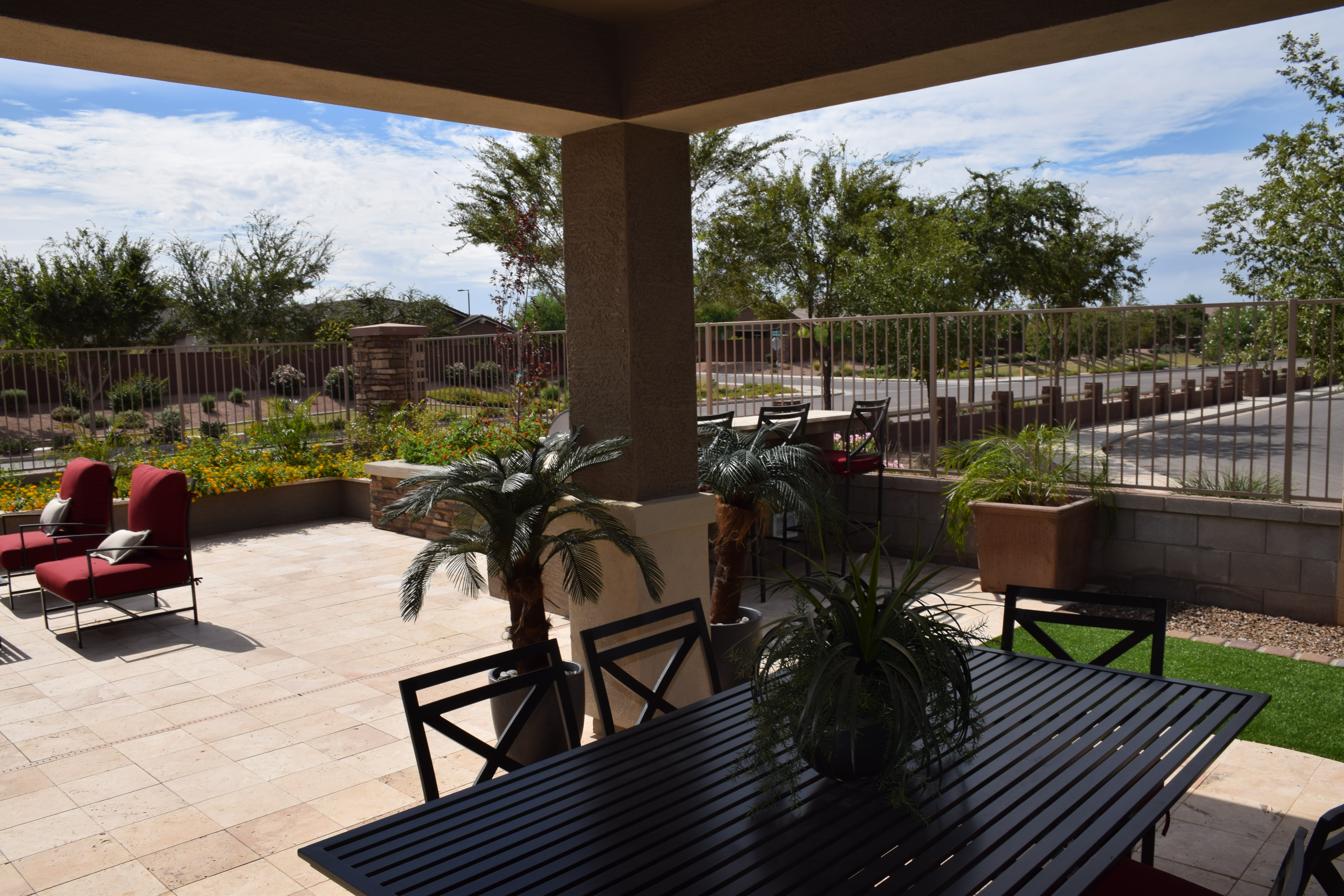
DSC_0038Although winter in the Southwest is nicer than in many other parts of the country, there are still plenty of chilly days and evenings. When you want to plan an outdoor party, there are things you can do to keep your guests warm and happy even when the weather is a bit nippy. Here are a few suggestions.

Set up a windbreak. Often the cold is worse when there is a strong breeze. Most of us don’t have an indoor courtyard like this one in Fulton Home’s Basha model at Legacy, but you can use fencing, foliage or even canvas to help protect your guests from the brunt of the wind.

Build a fire: If you have an outdoor fireplace you can just add wood or turn on the gas. But even if you don’t have this option, consider building or purchasing a fire pit. The flames add immediate warmth and provide a cozy place for people to gather. To take full advantage, offer the makings for s’mores along with some toasting forks for marshmallows. People will be much less likely to mind the cold.

Serve hot beverages or soup. When people are warm inside they will feel toastier outside. Plan your menu and any appetizers accordingly. Soup or chili makes an inviting cold weather entrée and hot cocoa, tea, cider or coffee helps keep the warm feeling even after the meal is over.

Make indoors an option. Some people have a hard time dealing with cold weather. Be sure to include some indoor seating and choices for those who simply can’t get comfortable outside.

With a little planning, you don’t have to let colder weather keep everyone indoors. Take advantage of an opportunity to throw a chilly but fun party.


Accessorizing your Outdoor Areas

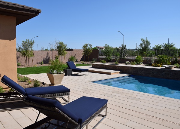
Legacy Models 065 (1)When designing a backyard pool space, often your focus is on the pool itself to the detriment of the rest of the area. This yard, from the O’Connor model at Legacy, shows how some careful attention to the furniture and features of your pool space can turn your yard into an appealing haven for family and friends.

Throughout this yard, clean lines and a contemporary style combine to make this yard clearly the result of a designed approach. The rectangular pool is echoed by the choice of rectangular stones for the hard surfaces. By continuing this same stone at the back of the pool with the raised area that holds the fountains, this yard maintains an inviting consistency.

Legacy Models 060 (1)Take a look at the lounge chairs surrounding the pool. Built for comfort, the blue cushions also add style by mirroring the color of the pool in a darker shade.

The planter shown in the photo to the right combines the sharp lines of every element of this yard with some height and color to break up the generous pool deck. Notice also the dark square next to the furthest lounge chair. Pieces such as these can be moved into various locations as needed, recruited to hold drinks or snacks around the pool.

Altogether, this minimalist approach with its clean lines and limited color palette lends itself to a contemporary approach to your yard. By taking this angle, the outdoor space for this home has the same design aesthetic as the rooms in the home itself. This yard demonstrates that design doesn’t need to stop at the back door.


Think Outside the Box with Lighting

DSC_0020 (1)With the generous amount of wall space and raised ceilings available at the Fulton Homes Legacy community, it pays to think outside the box with your lighting plans. This photo shows several ways lighting adds appeal to a generously-sized space.

DSC_0019This shot, taken from the entryway of the Basha model at Legacy, shows a number of lighting choices. The sconces in the foreground are part of the foyer lighting plan, combined with the dramatic ceiling light shown in the photo to the right. By sticking with the same bronze finish and curved elements, the sconces echo the feel of this large-scale ceiling fixture to create a lighting plan that takes full advantage of the turret-style space.

It would have been easy to use spots on the ceiling of the hall extending from the foyer, but instead three dramatic bowl lights carry the foyer’s focus into the home. In a smaller space these fixtures might grace a dining room, but here the scale is large enough to use them as hall lights.

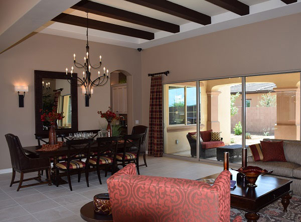
Legacy Models 115So what type of scale is needed to do justice to the generous dining area provided in this home? Take a look. This photo on the left showcases the powerful impact of a chandelier that fills the space perfectly. The size is impressive, but the graceful lines and use of negative space keeps this light from dominating. Two sconces provide additional light and interest.

Combined, the lighting of this home is designed to pull you into the home from the time you first enter it. Lighting is a powerful tool when decorating your home, as this model demonstrates. Use your lighting choices to welcome people into your home.