Pink can be Sophisticated

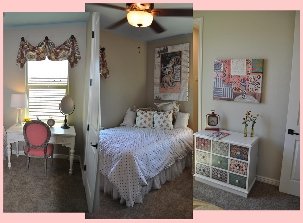
girl's_bedroom_montageFor most of us, when we hear that a girl’s bedroom has pink in the color scheme, it sounds cute and pretty, but not very sophisticated. But don’t limit your thinking. With the right accents and style, pink will surprise you. Let’s take a look at how this girl’s bedroom makes that happen.

The right accent colors: One quick and powerful way to add sophistication to any room is by throwing black into the mix. Used judiciously, black makes other colors pop and grounds the space. By mixing a light ballet-pink and black together, the final feel is daring and interesting, and definitely more than cute.

Using metallics: The bold gold on the bedding and poster make everything in the room pop. This is a risky choice and you can’t have a sophisticated look without taking some risks.

Mature fabric choices: It’s easy to go with a juvenile fabric when working with pink, but these fabrics pull you away from that. Adult patterns and moods in the fabric help make this room more grown-up.

Unusual artwork: The Wizard of Oz theme on the poster over the bed says it’s a children’s room, but the retro illustration combined with images from the book itself in the background make this poster worth more than a glance. Really, this piece feels like the inspiration for the entire room.

Eclectic furniture choices: The vanity has an old-fashioned style but the white paint makes it feel up to date. The small chest gets its personality with the different designs on each drawer, which are echoed in the canvas above. Once again a risky mix-and-match mood adds a chic feeling to the space.

Altogether, this room works for a young girl, yet opens up a glimpse of what kind of grown up she will eventually become. Visit Oasis at Queen Creek for a closer look.

Design Your Dream Master Bath

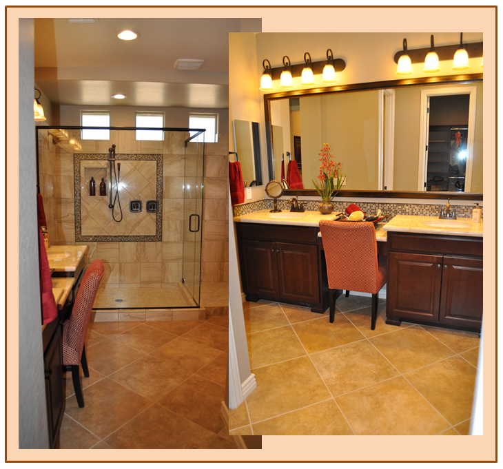
bath_montage_blogHave you ever thought about what you really want in your master bathroom? How about natural light while still maintaining privacy? This bathroom accomplishes that with the trio of square windows near the ceiling over the shower.

Would you like a bathroom that doesn’t feel cramped? The nice amount of square footage and open entrance gives you plenty of space. Using flooring on the diagonal adds to the sense of abundant room.

What about a roomy shower? Take a look at this option with room to move around and a subtle built-in niche that’s perfect for shampoo and body wash.

How about a mirror over the vanity that doesn’t look institutional? Take a look at how framing the mirror in the photo above adds an appealing finishing touch to the vanity area.

Would you like a spot to sit in the morning to apply make-up, or just to relax for a minute while chatting with your spouse before breakfast? This bath has just the place for a comfy chair by the mirror.

And what about style? Have you thought about the colors and finishes you would like in your master bath? What about the soft gold and rust tones of this space? Or maybe you’d rather have gentle green colors. With all of the Fulton Design Center options, it’s your choice.

While we’re at it, let’s add plenty of vanity storage, a double vanity/sink so you don’t have to share, and plenty of good and attractive lighting.

Is this your dream master bath? Want a closer look? Then how about visiting Oasis at Queen Creek Station to see it for yourself?

Architectural Details add Luxury

La-Quinta-family-room-webIf you want to turn a room from ordinary to something special, consider the opportunity to add architectural detail.

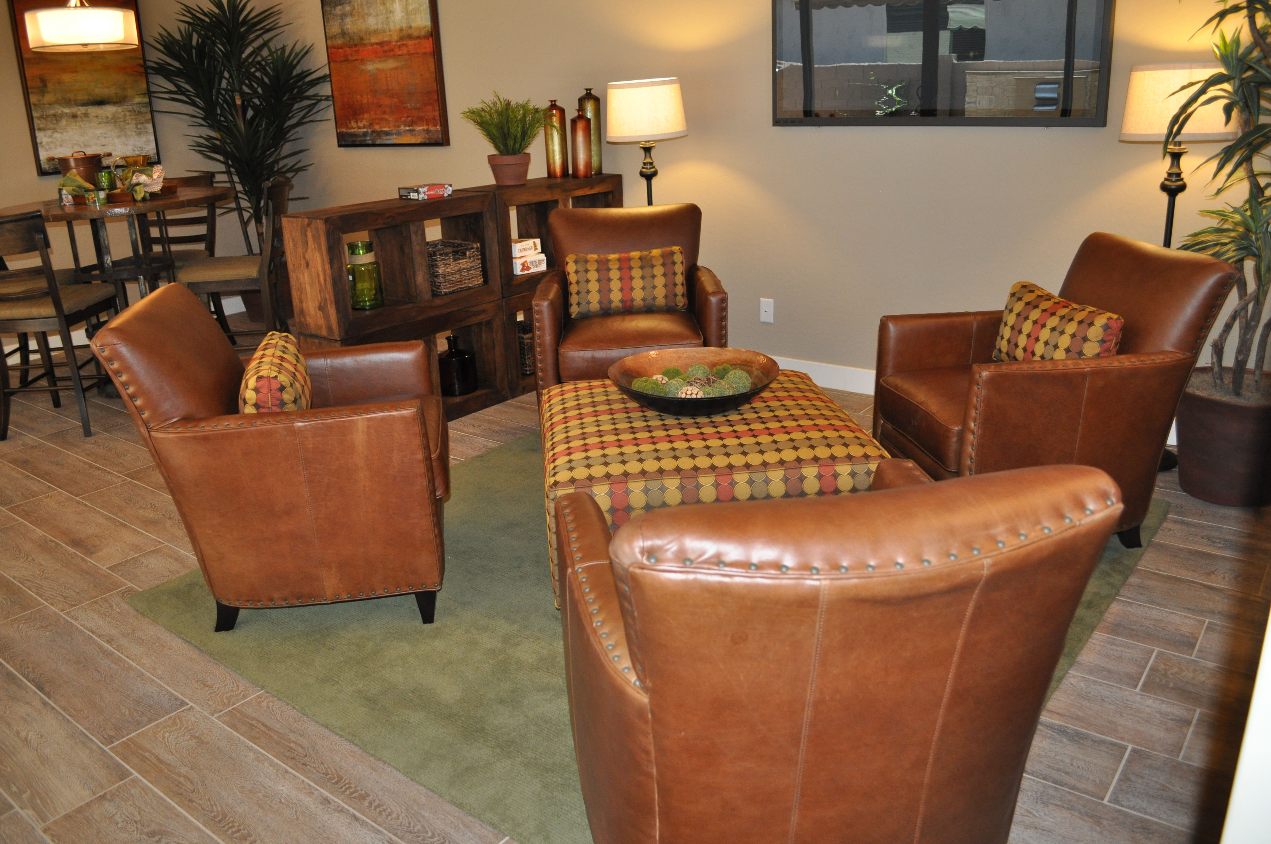
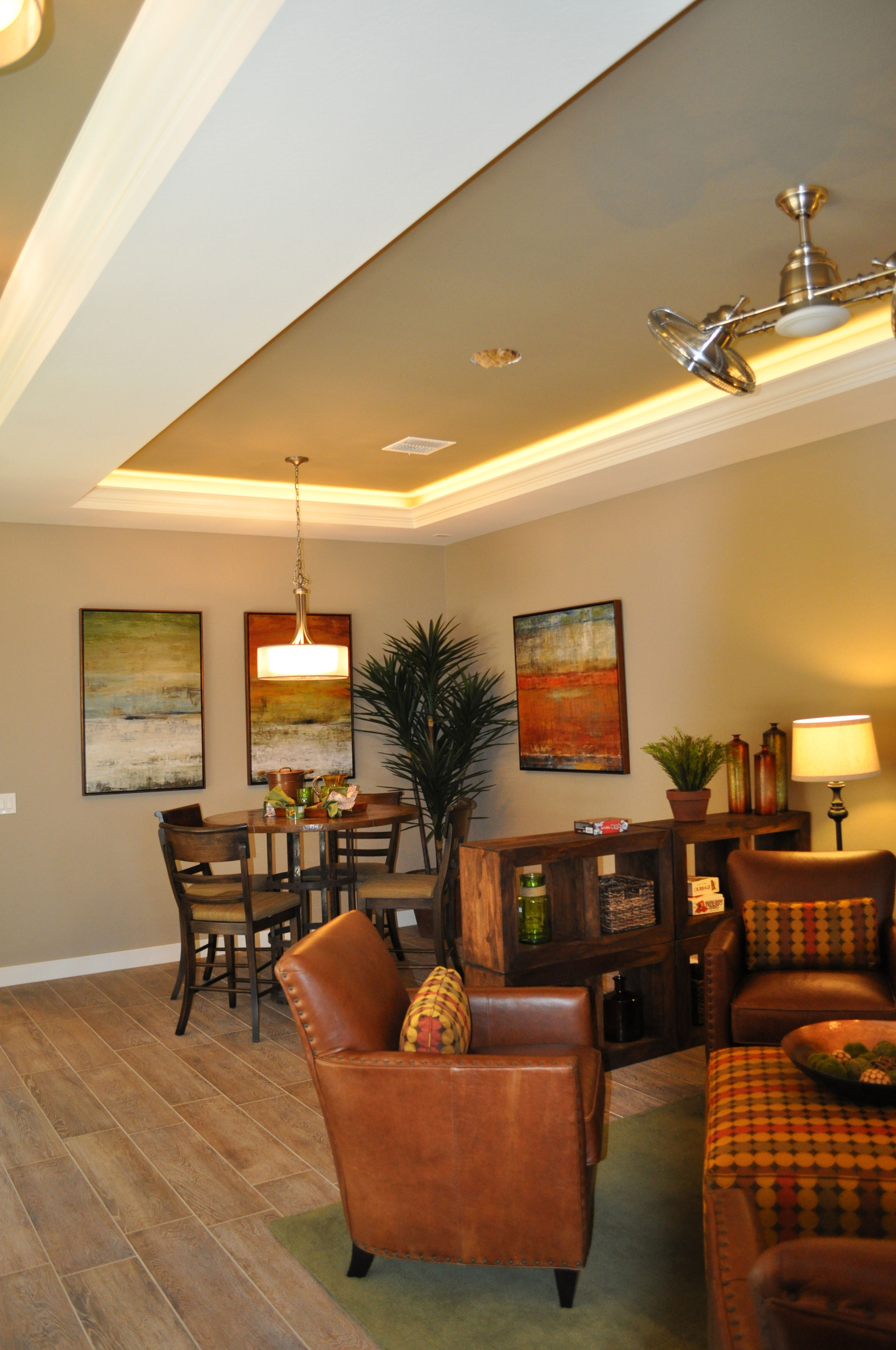
In this family room, from the La Quinta model at Oasis at Queen Creek, ceiling choices combine to make this room extraordinary. First, the coffered ceiling style adds depth and dimension. Choosing a combination of the wall color and a crisp white add valued contrast while emphasizing the structural features.

Lighting choices also add personality. The lights ringing the inside of the ceiling drop bring a soft tone to the ceiling edge. An intriguing ceiling fan and contemporary classic chandelier finish the ceiling’s appeal.

The flooring contributes to the finished look of this room. Porcelain tile planks that mimic wood have increased in popularity lately, as it gives homeowners the chance to have the appealing look of wood with the convenience and low maintenance of tile. This tone complements the wall color well.

The warmth of the room’s color choices are echoed in the décor. Leather seating in the appealing cognac color is supported with a rich pattern and contemporary art in rusts and greens. The room’s layout and the design choices are simple yet inviting. Notice that the baseboards are also white, connecting ceiling and floor in an effective way. This choice provides a good element of contrast.

To see this room in person, stop by our Oasis at Queen Creek community and take the time to visit our models.

Use Pinterest to Help Create the Home of your Dreams

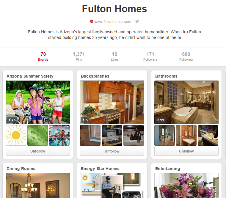
pinterest_fultonAre you planning to move into a new Fulton Home soon? Or maybe you’re still getting settled and deciding how to decorate your new home. Well, even if you’re just looking for ideas to update your home and add some pizazz, we suggest checking out Pinterest.

If you’re not familiar with Pinterest, it is set up like a collection of bulletin boards, allowing you to capture a favorite room, product, color or idea and save it in categories of your choice. For example, you may want to look at kitchens, or possibly just different backsplashes. Just open a Pinterest account of your own, add a board named for whatever you want to explore, and then use the search option at the top to see what’s out there.

Of course, you’re welcome to visit our Pinterest site. We have 70 boards holding almost 1,400 pins, and we add new ones just about every week. Our pins range from various home categories such as dining rooms and closets to more family-oriented topics such as our newest addition: Arizona Summer Safety.

The Fulton Home’s Pinterest site has been designed with you in mind. Whether you’re looking for ideas for general entertaining, birthday parties or something special for Father’s Day, we invite you to check our boards out for suggestions and tips. And if you like it, follow it for a chance to stop by easily whenever you want.

And if you discover something of value, whether on one of our boards or any others, you can just repin to your own Pinterest site to hang on to the idea and information. Then when it’s time to plan that party or redo that bathroom, all of your ideas are saved in one place.

If you are looking for information or ideas that we don’t list on our site, just let us know and we can add a board or pins to answer your questions or provide tips. After all, it’s there for you. Check out our Pinterest site by clicking here. We look forward to your visit.

Decorate Using the Four Elements: Water

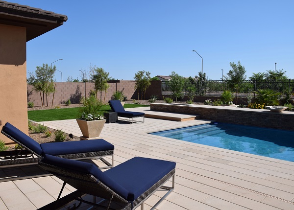
water-3-cropped-webWhen decorating a pool area, it’s natural to lean toward the element of water in your design decisions. You already have the blue from the pool, and sand tones or grey bring a natural look to the space. Blue and white also make a great combination for a water-themed space. In this photo, the light hardscaping is the color of driftwood, which makes the area feel a bit beach-like.

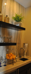
water-cropped-webYou don’t actually need water to have a water-themed area. Take a look at this butler’s pantry to the left. The natural stone backing combined with the countertop creates the feeling of water running down the wall and across the counter into the small sink. This mood is enhanced by the clear glasses along with gold and silver metallic accessories. The water theme makes this spot the perfect place to serve drinks to family and friends.

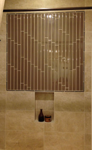
water-2-cropped-webA bathroom is the most logical place to carry through a water theme. Once again, even without the blue-green color scheme that is common to water spaces, the sensation of water can come by using ultra-shiny tile in a vertical display, as the photo on the right shows. In both smaller photos, placing a light above the wall so that it shines across the surface helps create that feeling of water flowing.

Whether you use this concept outside by a pool or water feature, or inside near a sink or bathroom, expanding the water theme beyond the function of a space into the design allows you to enhance your home décor. All photos are from Fulton’s Legacy community.

Decorate Using the Four Elements: Fire

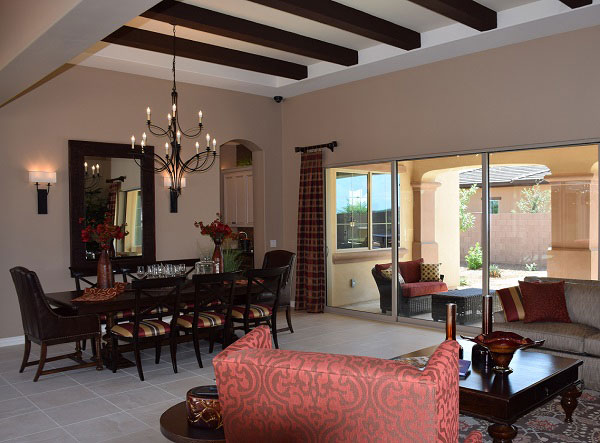
fire-3-cropped-sized-webThe power of fire first shows in a room with color choice. Look for red, rust, maroon, orange and gold. A fire room reflects the flames of an open fire either with the main color or in accents. Notice how this room brings rust tones into the living area through curtains, furniture, dining chairs, throw pillows and the tabletop décor.

Look next for some sort of open flame, or a close representation. In this room the two-tier chandelier holds electrified versions of candles. You may even find a candle-abra with actual candles in some fire rooms.

Accessories are often glass, formed when sand meets fire, in vivid colors. Notice the large glass bowl on the coffee table, colored like the flames that created it.

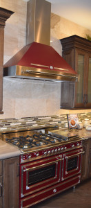
fire-2-cropped-webKitchens are effective rooms to introduce a fire theme because of their focus on cooking food. This amazing range and hood from Bertazzoni perfectly represents fire, with its style patterned on the company’s original wood stove design, enameled in this fire-inspired dark red.

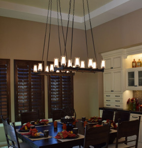
fire-1-cropped-webTake a look at this cozy breakfast nook. Once again the lighting
sends a fire message. You can imagine real candles in those glass shades. The rich metallic tile on the built-in breakfront brings fire colors to your attention, supported by orange and rust tones in accessories and the tablescape. A smoky wall color finishes up the look.

Fireplaces and outdoor fire pits always help create a fire-driven mood. On cold nights, everyone will feel warmer in a room designed with fire in mind. All photos are from Fulton’s Legacy community.

Decorate Using the Four Elements: Air

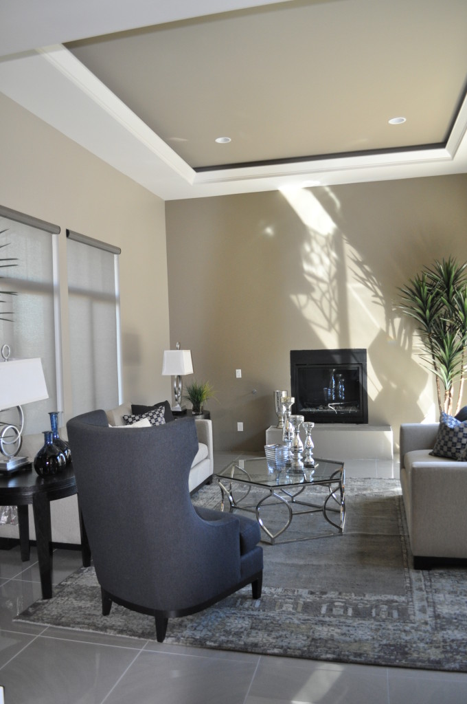
air photoAs we mentioned in our last blog, it’s interesting to take the long-ago perspective that the universe is made up of only four elements: Earth, Air, Fire and Water.  Today, let’s take a look at what a room would look like if it had an Air focus.

Vaulted ceilings, skylights and large windows fit this image. The ceiling is definitely a star in this photo. The coffered inlay is highlighted by the white trim and sunlight that creates magic shadows against the far wall. Silver and glass accessories suit air, as well as the subtle shades of grey that make up the color palette.

Notice the number of curves in the space, just as air curves as it passes buildings and trees. Even the plant in the back has an airy flow to it.

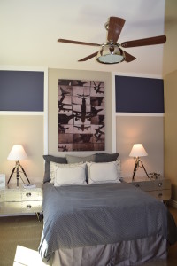
air 3This photo celebrates air, with the collage of planes in the background. Clearly this room was designed with air in mind. Again the color scheme reflects grey with soft lavender highlighted on the wall. A ceiling fan is a natural addition to an air-focused room. Skylights and clerestory windows also reflect the air feeling. Both photos are from the model homes at Legacy.

If you’re always looking up at the sky and enjoy having everything light and bright in your home, then maybe a focus on air is right for you.

In our next two blogs, we’ll look at what fire and water designs feel like.

Decorate Using the Four Elements: Earth

Mediterranean at Ironwood Crossing EarthLong before the science of chemistry came into existence, ancient philosophers and scientists thought the universe consisted of only four elements: Earth, Air, Fire and Water. And even though we know better now, it’s still fun to use these concepts to decorate your home. Let’s take a look at a room with an emphasis on earth.

The colors start the analysis. Earth tones predominate in this space. Notice the dark brown wood, brown sofas and beige and brown chairs. Brown and rust drapes complete the color scheme. There are a few touches of red and green – in the plants and the arrangement on the dining table. The deep blue of the throw pillows isn’t normally thought of as an earth tone, but against the brown sofas and combined with pillows that include that shade of blue along with earth-tone stripes, it works.

Next, let’s look at materials. Stone predominates, with the strong stone facing on the fireplace and porcelain tile in the dining area. Notice also the  pottery accessories on the coffee table. The clay that produced these three pieces is the ultimate earth material.

Choosing a warm wall color and the warm-toned shade of the table lamp at the back of this photo also echoes the feeling of the Earth element.

Are you the most comfortable in an Earth-focused family room? What other elements make a room feel like it’s connected to the earth for you?

Your Entertainment Wall

Legacy Models 071 (1)Designing an entertainment wall involves balancing design and function. You want a good place for the large HD TV while still keeping the screen itself low-key when it’s not turned on. These suggestions can help you think about what will work in your home.

Use color wisely: Dark grey-purple on the focal wall in this photo from Legacy draws the eye while reducing the footprint of the screen. The shelves and cabinet bring in lighter tones and the space is large and flexible enough to make changes in the future.

Models 065Incorporate an additional focal point: By adding the fireplace under the niche holding the television in the photo to the left, also from Legacy, the space feels nicely orchestrated. The screen becomes another dark rectangle, adding depth and balance to the light stone face. Once again dark purple draws the eye, with free-floating shelves providing opportunities to display accessories and carry the light tones out to the sides.

Consider seating: Positioning seating toward the entertainment area makes it more comfortable to watch programs, but you may want to place some seating facing toward the conversation area rather than aiming everything at your entertainment wall. This encourages discussion when you have guests, and the chair or chairs can easily be turned if they are needed for viewing a particular event or program.

Create flexible lighting options: A lighting arrangement that works well for a gathering may not serve your needs while watching your screen. Make sure you plan for both situations when setting up your lighting. A few ceiling spots may be all you need for television viewing, or consider a dimmer switch to provide enough ambient light while avoiding a glare on the screen.

Your family room can be flexible enough to meet all of your entertainment needs, whether you’re spending the evening chatting with friends or enjoying a DVD of a favorite film. Take the time to create a space that works for you and your family –in terms of both style and function.


The Pleasure of Water

Legacy Models 053Many thousands of years ago, desert dwellers knew that the presence, sight, sound and feel of water moving helped people cope with the hot dry desert. Today in the Southwest, commercial and residential landscape designs improve when you add water.

The Fulton Homes’ models at Legacy take full advantage of water’s power to soothe and create an inviting ambience. Positioning a fountain in the front courtyard like this one at Legacy draws the summer back a bit and allows visitors to refresh themselves even before entering your home.

Legacy Models 104If you want water to contribute to the comfort of your landscape, the following tips can help you make the best choice for your home.

Stop and look: Does the water’s spray catch the light? Is there a natural place to dip your hand in to catch a bit of moisture? Is the fountain visually appealing? Choose a fountain that you will enjoy looking at every day.

Listen: Make sure you have a chance to hear how your fountain will sound. Does the water sound musical? Is it an inviting background to conversation or quiet time? If your yard experiences traffic noise, a fountain provides a great way to mask and distract the ear. Make sure you choose one that has the right sound for your needs.

Integrate it in the space” Does the fountain match the look and style of your home? Can you incorporate some of the same materials that you already have in your landscape to make a stronger connection? Consider adding rocks, plants, tile and any other elements that will make your fountain seem like an organic part of your yard, not an afterthought.

Follow these suggestions and you will discover the water feature that helps make your desert landscape bloom winter and summer.