The Practical Beauty of Glass Tile

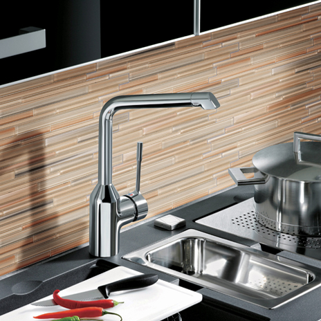
Watercolors-Ocean-Install-464x464Most of us would probably agree that glass tile is gorgeous to look at and adds a unique style to any space. But, aside from their aesthetic appeal, is glass tile a practical design choice?  After all, glass is delicate and breakable…isn’t it?

Characteristics of Glass Tile: Glass tile has many wonderful features that make it a great material for many projects, from both visual and practical standpoints.

  •  Shatter-Resistant: Unlike the type of glass used in vases and light bulbs, glass tiles are built to be shatter-resistant.
  • Durable: Strong and long lasting, glass tile is extremely practical.
  •  Water Resistant: As glass tiles don’t absorb water, they’re popular in areas with high humidity.
  • Easy-to-Clean: Since their surfaces aren’t highly porous, they’ll get back their shine with just a few wipes.
  • Heat Resistant: Heat resistant tile comes in a variety of styles, colors and materials, providing options that work with many different design schemes.

Glass Tile in the Home: Glass tiles can be incorporated in several areas of a home and are an affordable way to add a bit of glimmer to any area. Due to its heat and water resistance, glass tile is a perfect choice for fireplaces, kitchens and bathrooms.

Here are some different ways glass tile is commonly used:

  • When used in fireplace surrounds, the firelight makes the tile shimmer, creating an amazing ambience.
  • In kitchen backsplashes and countertops, glass creates a clean, contemporary look. Watercolors glass tiles provide a stunning look for a kitchen backsplash.Watercolors-Wheat-Field2-Install-464x464
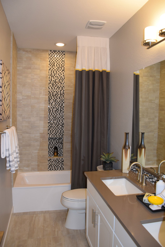
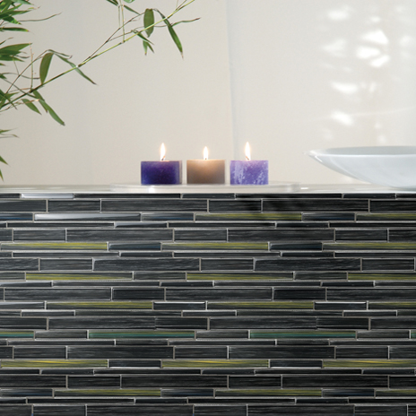
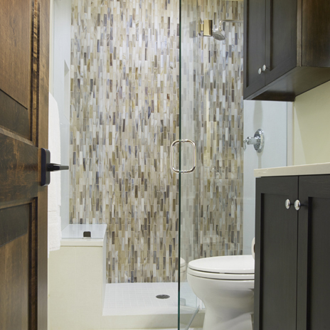
  • In bathroom countertops, tub surrounds, and shower walls. Shimmer glass is a particularly beautiful choice for bathroom designs as it is hand-poured, resulting in a variation of color among the individual mosaic tiles.

Shimmer-Abalone-Dallas-Patrick-shot2-2014-464x464As you can see, glass tile is extremely versatile! With the many different options available, and each type of glass having its own unique qualities, you can select the tile that truly reflects your style.

Kitchen Island Lighting Choices

Legacy Models 030You can take several approaches to lighting your kitchen island. The simplest and least noticeable is a collection of ceiling lights, distributed to provide even light for working. But with that choice you lose an opportunity to create a special style moment when people walk toward your kitchen.

Design Center pendant lightsPendant lights are one option that has grown in appeal over the years, with the opportunity to add a touch of style and color to your kitchen’s lighting. The photo to the right shows a number of pendants for your kitchen available through the Fulton Design Center.

The light in the photo above at Legacy takes a different approach from the more standard pendants to offer a shaded piece that provides even lighting on the surface of the island. This intriguing transitional piece suits this kitchen with the shade complementing the tile on the wall and island.

Models 086More unusual, these large long hanging glass pendants in the photo to the right, shown at Legacy, are lit inside by Edison bulbs which provide a unique yet classic touch. This island is large enough to support three of these pendant lights.

The clear glass allows you to connect immediately with the entire kitchen, yet the dramatic style brings these pendants to the forefront of your vision. This is quite a daring choice for island lighting.

What kind of lighting do you want over your kitchen island? We invite you to visit the model homes at Legacy and the Fulton Design Center to see a rich variety of choices in person.


The Pleasure of Water

Legacy Models 053Many thousands of years ago, desert dwellers knew that the presence, sight, sound and feel of water moving helped people cope with the hot dry desert. Today in the Southwest, commercial and residential landscape designs improve when you add water.

The Fulton Homes’ models at Legacy take full advantage of water’s power to soothe and create an inviting ambience. Positioning a fountain in the front courtyard like this one at Legacy draws the summer back a bit and allows visitors to refresh themselves even before entering your home.

Legacy Models 104If you want water to contribute to the comfort of your landscape, the following tips can help you make the best choice for your home.

Stop and look: Does the water’s spray catch the light? Is there a natural place to dip your hand in to catch a bit of moisture? Is the fountain visually appealing? Choose a fountain that you will enjoy looking at every day.

Listen: Make sure you have a chance to hear how your fountain will sound. Does the water sound musical? Is it an inviting background to conversation or quiet time? If your yard experiences traffic noise, a fountain provides a great way to mask and distract the ear. Make sure you choose one that has the right sound for your needs.

Integrate it in the space” Does the fountain match the look and style of your home? Can you incorporate some of the same materials that you already have in your landscape to make a stronger connection? Consider adding rocks, plants, tile and any other elements that will make your fountain seem like an organic part of your yard, not an afterthought.

Follow these suggestions and you will discover the water feature that helps make your desert landscape bloom winter and summer.


Flooring that stands out

DSC_0086Flooring often serves a passive role in decorating, as the background for other, more exciting things. But take a look at what happens when you give flooring top billing. These two examples from Fulton Home’s models at Legacy demonstrate the power of bringing flooring to the foreground.

The picture above shows the floor extending out from an entryway. Immediately your eyes are drawn down the hall and into the home. This combination of stone and wood provides a path and a promise that this is no ordinary place. The diagonal setting makes that point stronger and adds a dynamic feel. It pays to consider placing flooring on the diagonal. It can create a feeling of added space and energy. In this instance, the strong contrast also provides interest.

DSC_0108Small spaces provide another place to experiment with unusual flooring choices. This basic bathroom becomes intriguing with the addition of flooring in an ascending block pattern. Three shades of tile make up the drama here, capturing the eye. One of our Facebook fans suggested adding Escher prints on the walls to make this bathroom a statement space.

There’s no denying that these floors are a design risk, but why not take a few chances in your home? If these are too far out of your comfort zone, how about adding a border or some sort of contrast in your flooring. Remember that your floor and ceiling are the fifth and sixth walls in your home, so why should the first four have all the fun?


Pops of Color

Legacy Models 057Neutrals always feel safer when you’re decorating, but staying safe keeps you from enjoying the power of color in your home. If more vivid colors seem overwhelming or just too risky, consider taking a chance with a few pops of color. Here are a few ways to let color help bring your home to life.

A strong accent wall: Paint, wallpaper or fabric can turn one wall into a natural focal point with a strong color choice. And the option is relatively easy to eliminate if you aren’t happy with the result. Take a look at this entertainment area in the family room of the O’Connor model at Legacy. The deep purple has enough gray in it to soften the impact on the wall, and neutral furniture, shelves and accessories keep the overall feeling rather low-key.

Contrasting accessories: Adding the yellow glass bowl on the right side of this console helps the space to really pop. Yellow is the complementary color to purple, which means that they are on opposite sides of the color wheel. By adding just a small touch of yellow, the purple becomes more purposeful in the space. The other complementary colors are blue and orange and red and green. If your colors seem drab, adding just a spot of the color on the other side of the wheel will add a spark.Legacy Models 027 (2)

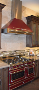
Let color infuse your focal point. This Bertazzoni Range in rich dark red creates a new energy in this kitchen. Other neutrals start to feel like the background elements, allowing this retro range to stand out. (Photo from the Fulton Model at Legacy.)

So jump into color – starting small or with a big push – and let your home’s décor pop!


The Right Study for You

Legacy Models 105Almost more than any room in your home, the study should fit your functional needs. If you are one of the fortunate people who can work from home, you will find yourself spending a lot of time in this room. And even if you head out to work every day, your study may become the perfect place to pay bills, handle any work you need to take home, or even review your email and other social media accounts.

With the commitment of time and energy a study may require, why not make it work in a way that really suits your needs? While function is number one, it’s also worth it to take the time to make it a room you enjoy spending time in. Here are a few things to consider as you plan your study’s functional needs and décor.

Legacy Models 045Desk space: If you use a laptop, you need less space than a desktop takes, but you may still want to plan additional room for holding notes or any mail you need to deal with when you get home. If your study is also your main workspace, consider room for in and out boxes and anything else that would make your work easier and more efficient.

Storage: Do you need file space or space for office supplies? Look for furniture style-file cabinets and other pieces so that your study is functional while still fitting in with the rest of your home.

Lighting: In addition to any ceiling lighting, take a look at floor and desk lamps to add just the right light as needed to do your work effectively. Think also about the ability to change the lighting depending upon the moment’s needs. The kind of light you need while working at the computer may be completely different from what you want when meeting with someone on business.

Style: If you like traditional looks, consider something like the study shown above. The stone wall adds a nice unusual pop of texture while staying in the traditional vein. On the other hand, if you want something more daring, how about a study like the one on the right? From the flooring to the ceiling light fixture, this room has a unique feeling.

Above all, make your study a space that works for you in every way, from function to style, so that you enjoy the time you spend there.


Think Outside the Box with Lighting

DSC_0020 (1)With the generous amount of wall space and raised ceilings available at the Fulton Homes Legacy community, it pays to think outside the box with your lighting plans. This photo shows several ways lighting adds appeal to a generously-sized space.

DSC_0019This shot, taken from the entryway of the Basha model at Legacy, shows a number of lighting choices. The sconces in the foreground are part of the foyer lighting plan, combined with the dramatic ceiling light shown in the photo to the right. By sticking with the same bronze finish and curved elements, the sconces echo the feel of this large-scale ceiling fixture to create a lighting plan that takes full advantage of the turret-style space.

It would have been easy to use spots on the ceiling of the hall extending from the foyer, but instead three dramatic bowl lights carry the foyer’s focus into the home. In a smaller space these fixtures might grace a dining room, but here the scale is large enough to use them as hall lights.

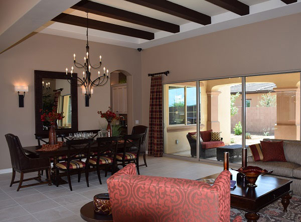
Legacy Models 115So what type of scale is needed to do justice to the generous dining area provided in this home? Take a look. This photo on the left showcases the powerful impact of a chandelier that fills the space perfectly. The size is impressive, but the graceful lines and use of negative space keeps this light from dominating. Two sconces provide additional light and interest.

Combined, the lighting of this home is designed to pull you into the home from the time you first enter it. Lighting is a powerful tool when decorating your home, as this model demonstrates. Use your lighting choices to welcome people into your home.


Using and Accessorizing your Kitchen Island

Models 081 (1)A large island such as this one from the Fulton Homes’ Legacy community provides the opportunity to accessorize and still have space for functional uses. Let’s look at two versions of this island to see several approaches.

In this first photo, the yellow accessories combine with the green plants to add color to a neutral kitchen. The yellow pops against the dark kitchen cabinets and adds warmth to the view.

Notice that several collections of accessories are positioned on trays. Each tray contains several smaller objects which gives them more importance from a design perspective. More importantly, trays can be easily moved to allow the island to serve as a breakfast bar or buffet for a party or family gathering.

Legacy Models 118In the photo to the right, the accessories bring a darker tone into the light kitchen, linking the island with the backsplash and above-cabinet tiles and anchoring the island in the space. In this case the positioning of accessories provides plenty of room to use the front area as an eating or snacking area without having to move anything.

Both of these islands have a powerful presence in their respective kitchens. By breaking up the surface with carefully-chosen accessories, you can take full advantage of the space while using the area to add interest and charm. Notice that each island’s accessories vary in height and heft. This helps create balance.

You can also use this space to incorporate personal items that make the kitchen your own. If you have heirlooms from a family member or favorite kitchen accessories, islands such as these provide the perfect place to showcase them. And don’t forget these islands’ primary functional purpose – to add much appreciated counter space for food preparation!


Lovely Lighting

Legacy Models 044With the steady increase in higher ceilings and open floor plans, lighting designers have finally started to think bigger with residential chandeliers, with dramatic results.

Take a look at this breathtaking example from the Fulton model home at Legacy. The chandelier inside has some traditional elements such as the candle-shaped lights and display of crystals. But add the surrounding bronze hoops and you suddenly have a daring transitional light that captures the eye and sets the tone for the entire room.

It takes a certain amount of design daring to flash this type of lighting fixture in your home. You can’t take it easy with the rest of the décor. Your other choices will have to live up to this. And you could never get away with it without the space to set it off properly. A high ceiling, plenty of space to showcase its drama, and other architectural details to complement it provide the proper setting.

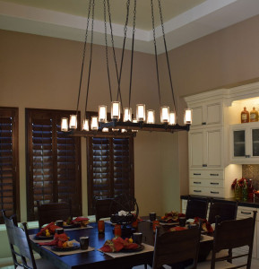
259 (1)Take a look at its position in the room to the right. It takes two of these chandeliers to make this space work. Adding a second one just contributes to the impact. And the ceiling provides just the right frame for this exciting choice.

The normally-recommended height for hanging a chandelier wouldn’t work here. Too low and these pieces would take over the table, compromising the entire feel of the room. Instead they are positioned half-way from ceiling to table, allowing guests to take in the entire picture when walking into the room.

Is this chandelier the light of your dreams? Visit our models at Legacy and see for yourself. Enjoy this and other lights that are designed to capture your interest and imagination.


Make a Dramatic Entrance

DSC_0086Your foyer creates the first impression people have when they walk into your home. What can you do to improve the impact of your entryway? Let’s take a look at the Fulton model from the Legacy community to get some ideas.

Flooring: The foyer provides a great place to be daring with your flooring. In this home the design includes a dramatic flooring layout. This floor combines dark and light contrast with a strong diagonal pattern to pull people into the home and announce immediately that this is no ordinary space.

Legacy Models 014Lighting: Most foyers have one primary light fixture, and this one is designed to draw the eye. The rich bronze echoes the brown lattice in the flooring.

Architecture: While the flooring is all sharp angles, the ceiling adds some soft curves to the design. The circular coffering on the ceiling, highlighted with a lighter color, takes advantage of the architecture of the space to add another layer of contrast. The curve is gently echoed with the high window, adding a spot of daylight and another point of interest. Overall, the architecture of the space contributes to the drama of this entrance.

DSC_0085Vista: What do people see beyond your foyer when walking into your home? In this case the flooring carries the eye into the rest of the home. Notice, however, that there are two unique sconces framing this view. Once again the dark bronze and long lines of this lighting choice mirror the flooring, pulling the room together.

What do you want your home’s entryway to say about you? If you take advantage of all of your choices, you can create a space that provides just the right first impression.