A view from Outside: Bathroom

Corsica-bath-webHave you ever thought about what a room looks like from the outside? That moment before you actually step into a room creates a person’s first impression of the space. Given this, you may want to spend a bit of time at your doorways looking at what people see as they first walk into every room in your home.

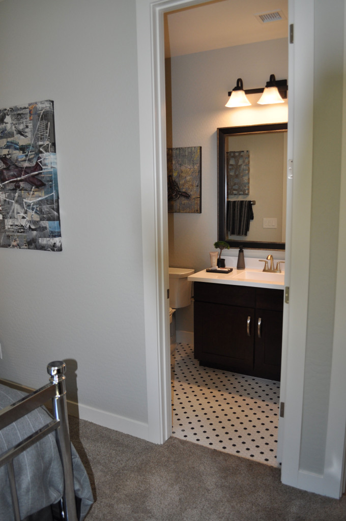
This bathroom takes advantage of every design and décor element to create just the right first impression. To begin with, the flooring transition is smooth, with an inviting and interesting tile pattern that fits well with the style and colors of the bedroom.

This bathroom is a study in contrast, and that is evident immediately when you look through the doorway. Notice how the mood created by the flooring is echoed in the sharp change in color between the dark vanity and light countertop.

The light fixture also supports that feeling, with a dark finish complementing the appealing light shades that shine without being overpowering.

Just a few accessories add charm to the vanity. Their dark tones also provide just the right amount of contrast to the white counter with size and shapes that are interesting without being overwhelming. Brown and grey tones from the artwork and towel suit the space while connecting the bath to the bedroom through color.

How much time have you spent looking into each room in your home from the hall or just outside? Take this opportunity to view your décor choices from a new perspective, and remember that the old adage “It’s never too late to make a first impression” works for rooms as well as people!

Create a Space to Learn

Marquesas-Ironwood--reading-nook-webIf you want your children to grow up to be good readers and students, there are choices you can make in your home décor to help support that goal. This corner in the Marquesas model from Ironwood Crossing demonstrates some important elements to consider.

A place for books: Plan for bookshelves in your home. You can have some built-in or select a piece of furniture such as this white shelf that provides plenty of space for books and yet still has its own style.  Don’t worry if you can’t fill them up right away. Just add accessories so that your book collection has room to grow.

A comfy chair: The upholstered chair and ottoman set to the left in the photo provides the perfect place to curl up with a book. Remember to include opportunities in terms of both time and space for reading.

A workable desk: Look for a desk with at least one drawer for supplies and a place for papers and files. Notice the three-tier storage container on this desk. It has a charming look and provides easy access to paper clips and other items your children might need to complete their homework.

Good lighting: The drop-down light fixture over the desk provides crisp task lighting for any project. Consider adding a good floor lamp behind that comfy chair too so that reading is easy in the evening.

A fan: sometimes having the air move around can keep a tired student more alert while studying. Good ventilation with a fan makes the area feel livelier when someone is focused and working.

Thoughtful design: Above all, make the reading and homework area charming and coordinated rather than an afterthought of leftover pieces. This effort shows your child or children that their time spent reading or doing homework is important, just as they are.

Guest Room Doubles as Personal Retreat

guest room Marquesas

From the Marquesas model at Ironwood Crossing

It’s nice to have a guest room in your home. If you have family and friends back east, it’s great to have a place to invite them so that they can escape the cold winter weather. Or if old friends or family have ended up scattered, it’s easier to encourage visits when you have a special place for them to stay in your home.

But even the busiest guest room has its down times, and that extra bedroom is always prime real estate in your home. So what can you do with the space between visitors? Well, this may be the perfect opportunity to create a special retreat just for you.

Even the most wonderful of families can get overwhelming at times, and this room could be your escape to relaxation. Whether you use it to read, watch your shows on television, take a nap or just sit and think, what a treat to have a room that’s just for you. Here are a couple of suggestions to make it special.

Have a comfy place to sit. This room turned a trundle bed into a day bed with the right kind of frame and pillows. Without eliminating a sleeping space, suddenly a bed is also a sofa, just waiting for you to settle in with a good book and a snack.

Decorate it to your personal taste. Add artwork, colors and accessories that mean something to you. Maybe you have a quilt your grandmother made, hang it on the wall where you can see and enjoy it. Or some mementos from school or special events could find a place in this room. These memories can be shared with guests, making your choices extra special.

Make room for a hobby. Do you like to sew, build models, or paint? Whatever you enjoy doing with your leisure time can be part of your personal space. These things can make your guest room an everyday treat for you rather than a room that stands empty between visitors.

Mosaic makes Strong Statement in Bathroom

Ironwood-bathroom-web-readySmaller spaces can capture interest with just a couple of daring design decisions. This bath, from the Marquesas model at Ironwood Crossing, has all the elements of a good design, particularly given the available space. Let’s take a look at why this bathroom works so well.

Make a splash with mosaic tiles. By choosing to position a stripe of highly contrasting tiles in the shower surround, this bathroom moves from blah to drama. Notice that the mosaic is repeated on the vanity backsplash. This shows a consistency of design and connects the two pieces – vanity and tub – together from a design standpoint.

Match flooring and tub surround materials. When working with a smaller space, using similar colors and textures for large surfaces help the room feel bigger. This choice has personality but doesn’t overtake the room.

Pull from a consistent color palette. In this case, white, taupe and cool browns integrate well with each other making this bathroom feel like a well-crafted unit.

Stay contemporary with clean lines. When your space is smaller, the simple lines of modern styles are less distracting. Your eye moves easily from one element to the next, making the room flow.

Add a few sophisticated elements. The color-blocked shower curtain adds an element of style that complements the mosaic. Altogether this is an interesting and inviting design.

Choose one accent color that pops. Notice the small elements of bright yellow in this room. The oval soap dish toward the front of the photo gets an echo from a thin yellow stripe on the shower curtain. Adding just one or two items in a signature accent color add a spark to this well-designed space.

Dark Blue Focal Wall Creates Drama

Models 019Sometimes it takes just one daring design decision to turn a room into something special. This family room is lovely, but without the dark blue focal wall, it would feel rather boring. Instead, the dark blue makes this room. Here are some tips for using a strong color like this and making it work.

Balance light and dark. Because this room has so much natural light, the dark blue wall adds personality while still letting the room feel light and airy. Light flooring and furniture also contribute to the well-strutured contrast of light and dark.

Pull the color into the room. Don’t let the strong color on one wall stand alone. In this room the navy sofa across the room ties everything together. A few blue bottles on the coffee table also support the blue theme. However, there’s not enough to make it feel overwhelming.

Bring in a second accent color. In this room, touches of yellow provide a positive contrast to the dark blue. Once again, just a few elements make the difference. Two matching ottomans flank the seating area, connecting with the tall yellow vase against the dark wall. Touches of yellow in the rug finish the connection.

Pay attention to the neutrals. Choosing a cool consistent tone for the neutral pieces in the space let the pops of color stand out. This shade of grey makes the blue and yellow stand strong while not looking out of place.

Take a look at your home. Do you have a wall that would benefit from a strong focal color? Why not take a chance?

Make your Backyard Special

corsica ironwood crossingWith a little planning, your backyard can become another entertainment, eating or relaxing space. The secret is setting up several independent “rooms” using furniture or other elements to define each functional space. Let’s take a look at one approach – this backyard from Ironwood Crossing’s Corsica model.

Use color and style. Just as you want to coordinate the colors and design choices in an open kitchen-family room-dining space in your home, you want to ensure that every separate area in your outdoor space works well together. Look for table and chair sets that use the same colors as your outdoor seating arrangements or bar chairs.

Notice in the photo above, the cushioned bar seating around the outdoor kitchen matches the cushions in the seating area. Also the chair backs coordinate with the outdoor dining chairs. This makes your yard feel coordinated and thoughtfully-designed rather than a haphazard collection of items.

Add accessories. While you don’t want to accessorize the outdoors at the same level as the inside of your home, a few additions make a difference. The plants in pots scattered through the yard contribute to the charming feel of the space, and adding throw pillows in the seating area gives it a finished look.

Consider the ground surface. If you add pavers, tile or finished concrete for a consistent appearance, they can make everything feel integrated. In this backyard grass, planters and columns create a sense of separation.

Think about what you want from your backyard and you can suddenly expand your home’s choices and add charm and fun to your home.

Use Pinterest to Help Create the Home of your Dreams

pinterest_fultonAre you planning to move into a new Fulton Home soon? Or maybe you’re still getting settled and deciding how to decorate your new home. Well, even if you’re just looking for ideas to update your home and add some pizazz, we suggest checking out Pinterest.

If you’re not familiar with Pinterest, it is set up like a collection of bulletin boards, allowing you to capture a favorite room, product, color or idea and save it in categories of your choice. For example, you may want to look at kitchens, or possibly just different backsplashes. Just open a Pinterest account of your own, add a board named for whatever you want to explore, and then use the search option at the top to see what’s out there.

Of course, you’re welcome to visit our Pinterest site. We have 70 boards holding almost 1,400 pins, and we add new ones just about every week. Our pins range from various home categories such as dining rooms and closets to more family-oriented topics such as our newest addition: Arizona Summer Safety.

The Fulton Home’s Pinterest site has been designed with you in mind. Whether you’re looking for ideas for general entertaining, birthday parties or something special for Father’s Day, we invite you to check our boards out for suggestions and tips. And if you like it, follow it for a chance to stop by easily whenever you want.

And if you discover something of value, whether on one of our boards or any others, you can just repin to your own Pinterest site to hang on to the idea and information. Then when it’s time to plan that party or redo that bathroom, all of your ideas are saved in one place.

If you are looking for information or ideas that we don’t list on our site, just let us know and we can add a board or pins to answer your questions or provide tips. After all, it’s there for you. Check out our Pinterest site by clicking here. We look forward to your visit.

Decorate Using the Four Elements: Fire

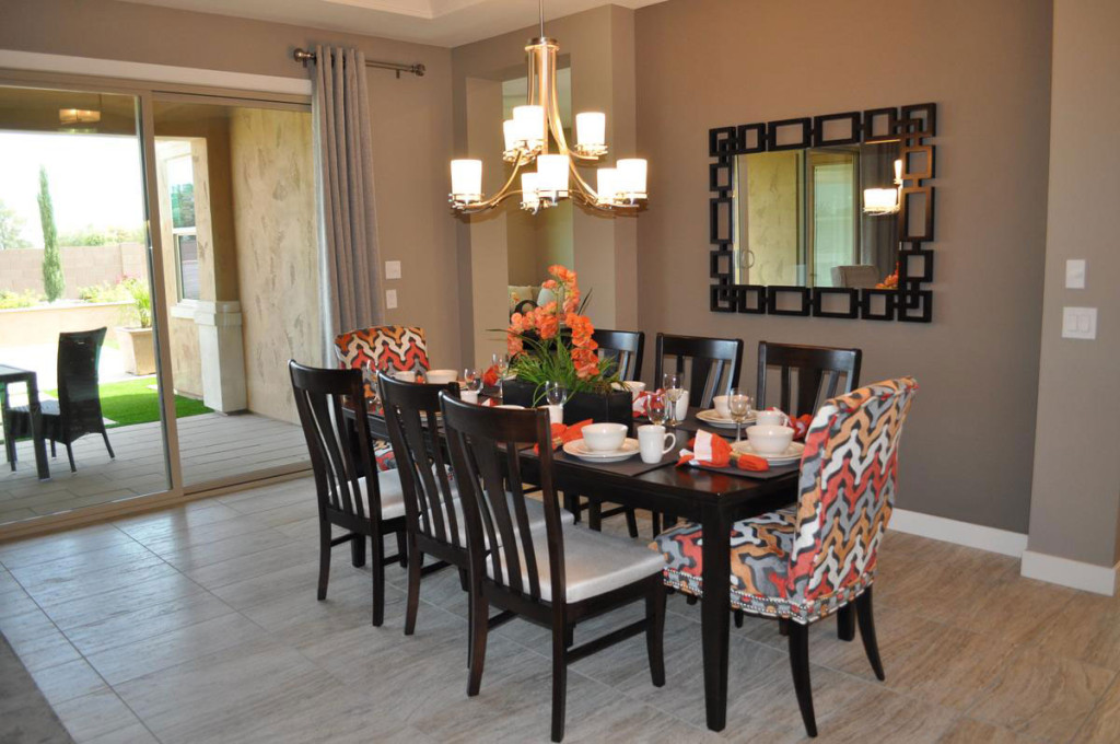
fire-3-cropped-sized-webThe power of fire first shows in a room with color choice. Look for red, rust, maroon, orange and gold. A fire room reflects the flames of an open fire either with the main color or in accents. Notice how this room brings rust tones into the living area through curtains, furniture, dining chairs, throw pillows and the tabletop décor.

Look next for some sort of open flame, or a close representation. In this room the two-tier chandelier holds electrified versions of candles. You may even find a candle-abra with actual candles in some fire rooms.

Accessories are often glass, formed when sand meets fire, in vivid colors. Notice the large glass bowl on the coffee table, colored like the flames that created it.

fire-2-cropped-webKitchens are effective rooms to introduce a fire theme because of their focus on cooking food. This amazing range and hood from Bertazzoni perfectly represents fire, with its style patterned on the company’s original wood stove design, enameled in this fire-inspired dark red.

fire-1-cropped-webTake a look at this cozy breakfast nook. Once again the lighting
sends a fire message. You can imagine real candles in those glass shades. The rich metallic tile on the built-in breakfront brings fire colors to your attention, supported by orange and rust tones in accessories and the tablescape. A smoky wall color finishes up the look.

Fireplaces and outdoor fire pits always help create a fire-driven mood. On cold nights, everyone will feel warmer in a room designed with fire in mind. All photos are from Fulton’s Legacy community.

Decorate Using the Four Elements: Air

air photoAs we mentioned in our last blog, it’s interesting to take the long-ago perspective that the universe is made up of only four elements: Earth, Air, Fire and Water.  Today, let’s take a look at what a room would look like if it had an Air focus.

Vaulted ceilings, skylights and large windows fit this image. The ceiling is definitely a star in this photo. The coffered inlay is highlighted by the white trim and sunlight that creates magic shadows against the far wall. Silver and glass accessories suit air, as well as the subtle shades of grey that make up the color palette.

Notice the number of curves in the space, just as air curves as it passes buildings and trees. Even the plant in the back has an airy flow to it.

air 3This photo celebrates air, with the collage of planes in the background. Clearly this room was designed with air in mind. Again the color scheme reflects grey with soft lavender highlighted on the wall. A ceiling fan is a natural addition to an air-focused room. Skylights and clerestory windows also reflect the air feeling. Both photos are from the model homes at Legacy.

If you’re always looking up at the sky and enjoy having everything light and bright in your home, then maybe a focus on air is right for you.

In our next two blogs, we’ll look at what fire and water designs feel like.

Decorate Using the Four Elements: Earth

Mediterranean at Ironwood Crossing EarthLong before the science of chemistry came into existence, ancient philosophers and scientists thought the universe consisted of only four elements: Earth, Air, Fire and Water. And even though we know better now, it’s still fun to use these concepts to decorate your home. Let’s take a look at a room with an emphasis on earth.

The colors start the analysis. Earth tones predominate in this space. Notice the dark brown wood, brown sofas and beige and brown chairs. Brown and rust drapes complete the color scheme. There are a few touches of red and green – in the plants and the arrangement on the dining table. The deep blue of the throw pillows isn’t normally thought of as an earth tone, but against the brown sofas and combined with pillows that include that shade of blue along with earth-tone stripes, it works.

Next, let’s look at materials. Stone predominates, with the strong stone facing on the fireplace and porcelain tile in the dining area. Notice also the  pottery accessories on the coffee table. The clay that produced these three pieces is the ultimate earth material.

Choosing a warm wall color and the warm-toned shade of the table lamp at the back of this photo also echoes the feeling of the Earth element.

Are you the most comfortable in an Earth-focused family room? What other elements make a room feel like it’s connected to the earth for you?