Help your Child Redecorate -Color and Pattern

12105159_S This stage is the most exciting part of redecorating a child’s room – or any room for that matter. There are a few simple ways to help your child define the colors and look of a bedroom without taking over the process. Here are some ideas.

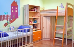
Picking colors: One easy way to determine a good main color for your child’s bedroom is to focus on a favorite color or colors. Another option is to consider the colors of your child’s favorite clothes. Don’t discourage bright tones – a child’s room can handle more vivid colors than you may want in the rest of the house. This is a great time to encourage experimentation and creativity. Colors can also be mixed – take a look at the broad variety of choices in the room above!

Choosing patterns: Fabric, rugs, stencils and wallpaper can all add pattern to a child’s space. In the room above, a simple mural provides the largest element of pattern. You might want to visit a fabric store or look at bed sheets and coverlets to see what appeals to your child. Be sure to consider stripes, checks, ginghams, polka dots, and other standard pattern styles.

6249365_SApplying color and pattern: Paint is the easiest way to establish color in a room, and the easiest to change later as your child’s taste changes. This can include walls and furniture. Wallpaper can also be applied to one wall or a piece of furniture to add pattern. Just be sure to prime the surface first so you will be able to strip the paper off later. Curtains, bed linens and rugs also provide methods for introducing color and pattern.

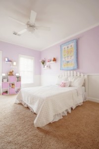
Working with existing choices: You can introduce colors that don’t seem to work with the current room options and still be successful. Take a look at the girl’s room to the right. The pastel pink and blue scheme wouldn’t be expected to connect with the light camel carpeting, but it does. As long as options such as flooring don’t actively clash, they will retreat to the background once the overall look of the room is established. An area rug or two also keeps the focus on the décor rather than the carpet.

So encourage your child to be daring – a child’s room should be fun, colorful, happy and expressive, and as a parent you have the chance to encourage those abilities in your children with their bedrooms and their lives.

Help your Child Redecorate – Function and Storage

7857385_SAs you and your child plan a room redo, be sure to factor in storage needs and functional demands.

Does your child do homework in his or her bedroom? Plan on a desk along with space for books and homework projects. How about overnight guests? Consider twin beds or a trundle. Closet organizers can also make space more efficient.

The box-style approach shown in the photo to the left provides a great storage solution for a less organized child. Labels can define each space, and these boxes work well for books and other items.

426141_SIf space is limited and functional and storage needs extensive, consider using vertical space. Take a look at the photo to the right. The raised bed provides extra play space and a storage shelf underneath, and the three-foot raised floor in part of the room holds storage containers including one box-style shelving unit, with lots of room underneath for extra storage or a special kid hideaway.

A simple desk and chair match the style and colors in the room while working well as a homework center. There is plenty of room under the bed’s platform for extra shelves or hooks for clothes. Colors and pattern integrate all the storage and functional pieces to make the room feel creative and exciting.

These options may or may not work for your child. But no matter what, it’s important to determine what storage and functional capabilities are needed when planning the renovation. Look for extra space under the bed or on the walls. And think outside the box to make the space inviting as well as productive.


Fulton Homes Super Browse Night

Design20Center20074 kitchen 4Would you like a chance to explore kitchen and bath ideas, talk with designers and product-knowledge specialists, and see some of the latest home design options available?

Fulton Homes invites you to join us this Thursday night, March 21st 2013, for Super Browse Night at our design center in Tempe. With 13,000 square feet of kitchen and bath vignettes, a rich variety of product displays, and our team of designers ready to answer your questions, this is an amazing opportunity to see the newest home products in a comfortable and inviting setting.

Desig20Center20071-doors-2-300x199From countertops to carpeting, cabinet doors to front doors, appliances to area rugs, you can browse every kind of home interior option set up in inviting and exciting displays.

Whether you’re considering a new home, purchasing a new home, or just want some good ideas for your current or future home, you’re welcome to join us for this exceptional event. We’ve invited our trade partners to join our designers and sales associates to share their insights into the best ways to make your home as special as you want it to be.

Design 20Center 20015 listellesJoin us Thursday March 21st 2013 from 5-8 p.m. at the Fulton Homes Design Center, 1241 West Warner Road, #106, Tempe, AZ. To find us turn south on Beck between Priest and Hardy. Turn right in the second driveway.

As an extra incentive (Maybe to help get your spouse to join you?) we’re giving away a 40 inch Samsung flat-screen TV to those who attend our event, with no purchase necessary to win. We look forward to seeing you there.

Cozy Fireplace Space

Peninsula 155On a chilly weekend like the one we just had, a cozy fireplace creates just the right ambience for relaxing and enjoying an evening.

You could watch a favorite program or movie on the flat-screen television above this fireplace, or maybe just settle down with a book and cup of tea or glass of wine. The extra warmth comes from the fireplace, ready to add color, heat and light to your family room. Let’s take a look at some of the design decisions that take full advantage of the fireplace in this space.

Lighted shelves: You can hold books there, but with the lighting, these shelves provide a great place to showcase favorite accessories such as glassware or framed photos. The lights echo the glow from the fireplace, adding even more warmth to the wall.

Large mantel: Placing a mantel over the fireplace and shelves connects them while providing an additional place for adding accessories. This mantel has an added touch of style thanks to the tile running under the stone top.

Peninsula 156Tinted alcove: Choosing a darker tone for the alcove holding the television adds interest and style to the fireplace wall. It also softens the line between the wall and the TV screen. This is a simple and low-cost way to add personality to a space.

Sconces: The matching sconces provide another source of light and suit the walls to either side of the television alcove.

Many years ago, people needed fireplaces to keep warm through the winter. Choosing a fireplace for your home today is more about adding an atmosphere of warmth. Plan your fireplace to add a welcoming focal point to your living or family room.

Daring Kitchen Tile Choices

Peninsula 167You don’t have to spend a lot of money to create a kitchen backsplash that captures attention. Take a look at this kitchen design from Fulton Home’s Woodside model in the Oasis at Freeman Farms community. One type of tile in two colors combine to create an exciting look that is different with a modern twist.

The granite chosen for this kitchen has a strong pattern with contrasting shades of gold, brown and black. Combine this with an intense tile pattern and the space would feel busy rather than interesting.

Total room design involves making choices that work well together to make a space intriguing. It’s the interaction among the various elements – cabinets, countertops, tile, flooring and lighting – that makes this kitchen stand out.

Peninsula 165Many people like to have a special look behind the range, and this kitchen creates that impact simply by changing the dark and light pattern of the long rectangular tiles. Notice in the photo to the right, the light tiles move down in a stair step design, but move in a back-and-forth direction over the range. This simple change helps create a meaningful difference in the kitchen.

The imagination of this kitchen designer didn’t stop at the backsplash. Take a look at the tile design on the island below. The same tile laid in vertical rows creates a very different look whilestill keeping everything integrated.

Peninsula 159Here’s a great look at this granite countertop. An island is a perfect place to showcase your granite choice, because the large expanse of open stone really displays the grain.

Don’t be afraid to make a daring choice for one or more of your options when designing your new home. And be sure to take advantage of the knowledge of your Fulton Design Center designer when determining which options will combine to help you create a home that demonstrates your taste and style.

Create an Outdoor Room

Peninsula 149This is the time of year when it’s wonderful to live in Arizona. So before the heat shows up, how about creating an outdoor space that can substitute for your living and dining room only outside?

It doesn’t take that much effort, just add a few things to make your patio an inviting place to eat a meal or spend an afternoon. Take a look at this space from the Fulton Homes Woodside Model at the Oasis in Freeman Farms Community.

Peninsula 153This patio has plenty of room for a living-room style seating arrangement and a comfortable spot for al fresco meals. Thanks to the new outdoor fabrics, all-weather cushions add comfort as well as color. Here are a few other ideas to build a living space outside.

Hang outdoor art: Metal or ceramic wall art such as this cast iron piece adds an element of charm while still able to handle the elements. Check patio stores, garden shops and small boutiques for pieces that match your style.

Add accessories: The throw pillow and plant on this patio help build a fully-furnished feeling. These pieces warm up the space.

Remember lighting: Your outdoor lights help make your outdoor space work through the evening. Add candles or lanterns to brighten the patio for parties and family gatherings.

Peninsula 150Choose flooring that mimics indoor style: Choosing tile, pavers or stone instead of settling for standard outdoor concrete allows you to add color and texture to your outdoor rooms. Consider picking up an outdoor rug to add even more color and personality.

Take your time choosing the right furniture and accessories, and you can take advantage of this season’s weather and add living space to your home by spending time outside.


Design Grammar: Good Phrasing

833591_SWhen you’re looking at the grammar of design, phrasing is all about creating moments of charm that capture the eye, just like a phrase in a sentence or a paragraph will capture your attention.

This bright red bench shines against the white and dark teal wall, while the red tile pillar brings the bench closer to the background. The grey stones with the little bit of green moss separating them provides a great contrast to the red. This is a well-phrased space.

15314602_SDesign phrasing is as much about the space between elements as it is about the moments of charm themselves. Too much stuff and the message can be lost in the abundance of words, or items. The eye needs white space, on a page or in a room.

Take a look at the children’s room to the right. While it appears cute at first, there are no places to rest the eye among all of the colors, designs and textures. There’s a lot of stimulating things to look at, but no place for your eyes to take a break. It’s simply too busy.

15058099_SThe bedroom shown on the left, on the other hand, uses design phrasing very well. The bed represents one phrase, with light bedding contrasting well with the dark wood wall behind it. Matching sconces and nightstands create a symmetrical presentation that is easy to read and draws the eye.

Another phrase comes from the upholstered chair with a side table and plant. The curtains connect the bed and chair, but they are neutral and undemanding enough to provide a break in the room. The flooring and the ceiling also provide good visual breaks in the room.

If you think of designing a room as a way to create and separate phrases of design, you will find yourself with a space that is both interesting and relaxing. How does the phrasing work in your home?

Design Grammar: Adjectives

12120327_SWhen we look at design grammar, it’s the adjectives and adverbs that liven up a sentence the way accessories make a room more interesting.

Even with no furniture, the accessories in the photo to the left create an inviting impression. Think of these finishing touches as developing the personality of a room. They may be functional, but their primary purpose is simply design, the way adjectives simply fill out whatever image a sentence makes.

15700367_STake a look at the room to the right. Imagine it without the pillows, rug, plants, and books and elephants on the shelves. OK, let’s do it with language. Compare “the dog barked when its owner came home” with “the happy old dog barked joyfully when his veteran owner came home from Iraq.” One gives you information and the other tells you a story.

Without the adjectives and adverbs in this room, you have a series of grey tones and simple lines. Now, it’s more trouble to add accessories or turn a simple piece of information into a story, but taking the effort helps you create a space that people notice and a story that people want to listen to.

People used to call unusual accessories conversation starters. They can tell people something about you or your interests. They may define you to visitors as traditional or modern in your style and thinking. They may be remembrances of travel or your hobbies. Ask yourself, are your spaces interesting enough that people will want to read more when they walk in? What stories do you want your home to tell?


Design Grammar: Articles Connect Nouns

2751374_SHow many of you remember what articles are from your grade school grammar class? Come on, raise your hands. If you’re one of those trying to hide behind Mary Grace because you’ve forgotten, articles are words such as “the” and “and”, which are used to connect other words together.

In the grammar of home design, articles represent the end tables, coffee tables, nightstands, and other items used to connect other pieces of furniture together.

What’s important to remember about articles in decorating? First, to make sure you have all of the pieces or words you need so that your design or your sentence make sense. For example in the room above, the square coffee table, the small woode table between the love seat and te sofa, and the glass-topped side table that matches the coffee table serve as the connecting articles in the space. Their purpose is primarily utilitarian, and they shouldn’t draw attention to themselves. The tables in this space complement the rest of the furniture without overpowering them.

13888922_SArticles also include nightstands such as the ones in the photo to the right. These pieces are also utilitarian, yet the style fits the contemporary look of the room. You can see the lamps serving a useful purpose as lighting for reading or dressing and the drawer provides hidden storage.

However the slightly bowed drawer and simple silver pull pull in the lamp’s curves and metallic finish. The dark wood tone mimics the art over the bed and choosing symmetrical matching lamps carries the modern masculine theme preented by the bedclothes through the room.

Remember to choose articles that aren’t intrusive yet still manage to make the sentence and the design stronger,


Design Grammar: Verbs

12620942_SIn this series on design grammar, verbs are the things in your home’s design that have some kind of action associated with them. These include lights, electronics, appliances and water features.

Take a look at the lighting choices in this bedroom. There are four light sources in the room, each with an active role in the design. The light showing under the bed adds color and makes the bed appear to be floating. The purple and gold lights shining down the walls provide color and space definition, and the simple lamp by the bed is functional and adds warmth.

13738899_SThis photo has two verbs in it  – light and water. Notice how candlelight provides soft and yet directed light, and adds to the inviting feeling of the space. The water in the background contributes movement and sound. Although this is just a snapshot, it has the feeling of action because your mind can infuse it with motion and sound to match the image.

8969356_SEven when it’s off, an electronic element such as a television provides an action point in a room because of its potential. One reason people like to hide a TV in an armoire or behind doors is so that potential is not part of the everyday living space. Take a look at the photo to the left. You don’t need to see the television to know exactly where it is and what these people are doing. The people are reacting to the main action in the room: whatever is on the invisible television.

When you choose to put verbs in your home, be sure to balance them in the space. A room with too many action items may become overwhelming. On the other hand, no verbs make a room feel static and boring. Take the time to figure out the right verbs to build your story/design with excitement but not to the point of exhaustion!