Make a Dramatic Entrance

DSC_0086Your foyer creates the first impression people have when they walk into your home. What can you do to improve the impact of your entryway? Let’s take a look at the Fulton model from the Legacy community to get some ideas.

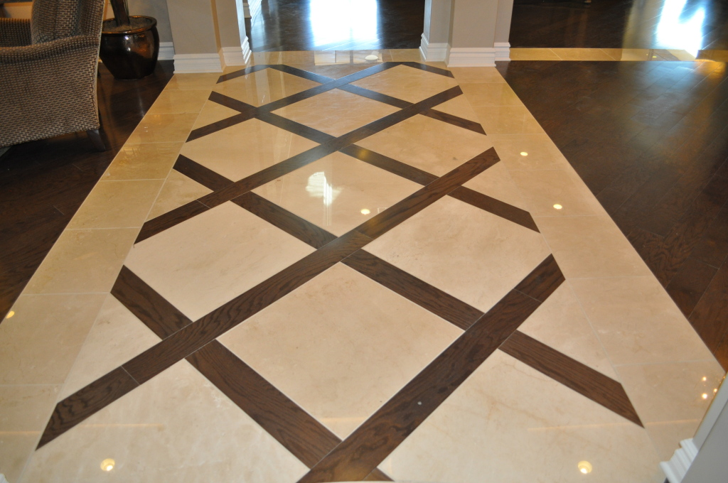
Flooring: The foyer provides a great place to be daring with your flooring. In this home the design includes a dramatic flooring layout. This floor combines dark and light contrast with a strong diagonal pattern to pull people into the home and announce immediately that this is no ordinary space.
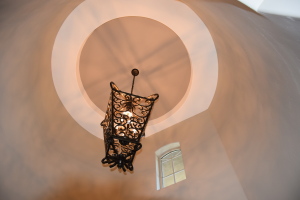
Legacy Models 014Lighting: Most foyers have one primary light fixture, and this one is designed to draw the eye. The rich bronze echoes the brown lattice in the flooring.

Architecture: While the flooring is all sharp angles, the ceiling adds some soft curves to the design. The circular coffering on the ceiling, highlighted with a lighter color, takes advantage of the architecture of the space to add another layer of contrast. The curve is gently echoed with the high window, adding a spot of daylight and another point of interest. Overall, the architecture of the space contributes to the drama of this entrance.
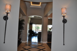
DSC_0085Vista: What do people see beyond your foyer when walking into your home? In this case the flooring carries the eye into the rest of the home. Notice, however, that there are two unique sconces framing this view. Once again the dark bronze and long lines of this lighting choice mirror the flooring, pulling the room together.

What do you want your home’s entryway to say about you? If you take advantage of all of your choices, you can create a space that provides just the right first impression.

 

Inviting Guest Bathrooms

DSC_0111Your guest bathroom may be the smallest room in your home, but that doesn’t mean that it can’t pack a design punch. Here are some approaches to create excitement in your guest bath.

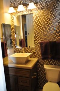
Add splash to one wall. In this bathroom, small square tiles in a mosaic pattern help the space to pop. This look would be hard to pull off in a larger room without looking busy, but a guest bath has the perfect proportions to allow you to take a chance. In addition to tile, consider a strong paint color or a large wall mural to add interest.

Bring in a stunning sink. Long ignored from a design perspective, sinks today can add style to your baths. This vessel option is deep enough to avoid splashing while making it stand out with its sleek shape and above-counter design. Choosing white for the porcelain fixtures is smart given the strong colors of the other design elements.

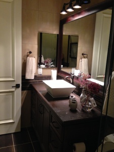
278Frame the mirror. Framing a bathroom mirror adds warmth. The frame allows you to carry the wood tone of the vanity up toward the ceiling and makes the space feel more like a dressing room rather than a standard utilitarian bathroom.

Use contrast. In the bath shown here to the right, the dark wood tone fits with the dark flooring and the lighter grout ties in with the white sink. Dark and light merge to create a drama that neither would be able to carry off on their own. White towels and accessories help finish the look.

Have fun with your guest bathrooms; they can contribute a lot of style in a small space. Both of these bathrooms are from the Fulton model in the Fulton Homes Legacy community.

Setting up a Holiday Tablescape

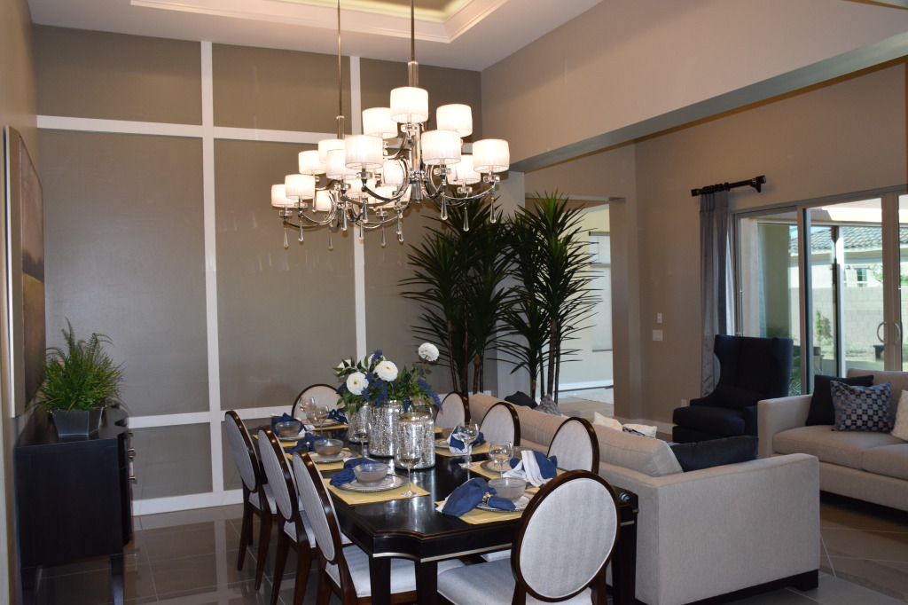
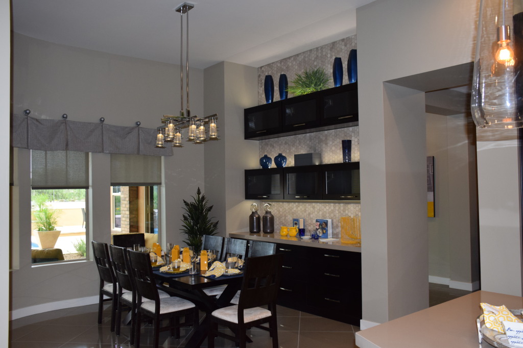
Legacy Models 068How would you decorate this dining space for the holidays? Here are a few suggestions.

Choose one or two colors, a neutral, and one metallic hue: In this room, silver seems like a natural choice thanks to the chandeliers and grey tones. Silver can link everything together. For the same reason, white or ivory would complement the space. From there you could do the traditional red and green colors, or jump into something more daring like purple or even hot pink and lime green. This room can handle the brighter colors, so take advantage of that to add drama to your tablescape.

Don’t stop at the table: In this room, the trees by the wall would benefit from some mini-lights and small ornaments. Think about adding some special touches to the chandeliers. (For more ideas on that, see our last blog.) The buffet could be a source for additional decorations that complement whatever you choose to do to the table. You could even change out the throw pillows on the two sofas for some that suit your holiday look. Once again the grey palette opens up a world of possibilities.

Keep your centerpiece low or set between chairs: You want to make sure everyone at the table can see everyone else, so plan a centerpiece that allows that. This long rectangular table gives you the opportunity to create a landscape of flowers, greens, ornaments, candles and other accessories. By using the buffet to hold serving dishes you have more room for decorations on the table itself.

Consider the chairs: These contemporary chairs with neutral grey upholstery provide the perfect space for a final holiday touch. It’s easy to tie some wide ribbon around the chair backs with a nice bow at the back of each one. Costco offers great prices on wire-edged holiday ribbon in two and three-inch widths. Choose one that works well for your holiday plan, and you will have plenty to use throughout your home.

Your final touch? Add the food – tables always look better with something to eat nearby!


Decorating lighting fixtures for the Holidays

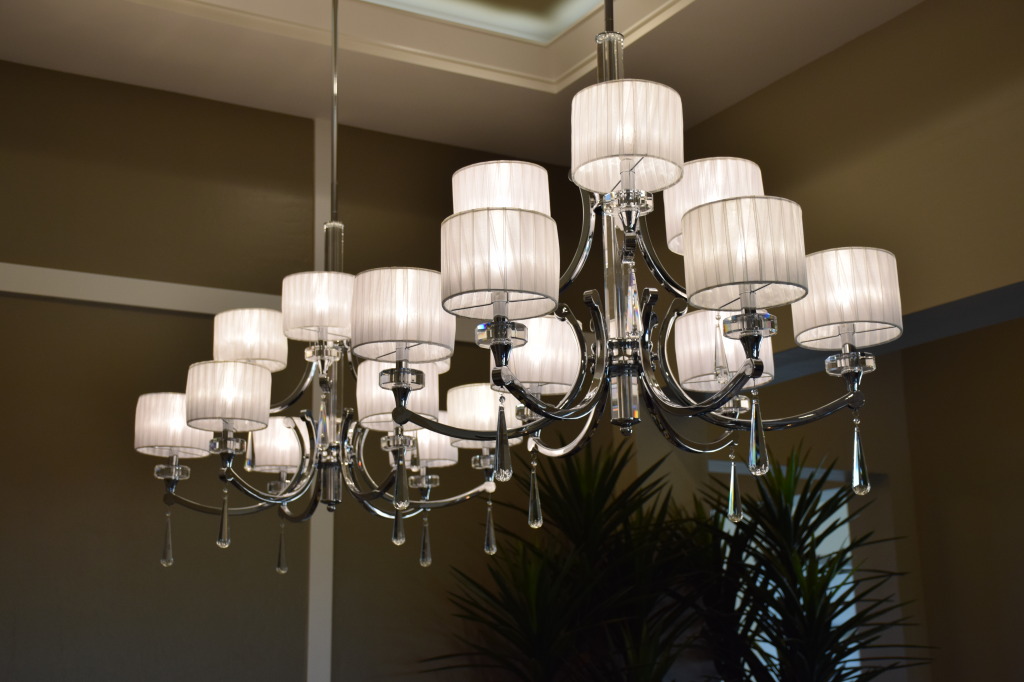
Legacy Models 069With lush lighting fixtures such as these two from the O’Connor model at Legacy, it’s tempting to make them part of the season by adding a holiday touch. Here are a few suggestions to make these lights reflect the holidays.

Holiday greens: Look for a garland that matches the style of your holiday decorations. You could choose real greens such as the red cedar garland available at Trader Joe’s this time of year, or just pick up some of their two-color holly. Use fishing line or ribbons to attach it under the lights of the chandeliers above.  For the photo below, drape the greens along the cross-beams above the lights.

Legacy Models 073Ribbons: You could tie some lovely red, green, gold or blue ribbons around the shades on the chandelier above to create an understated but festive touch. To contribute a bit more drama, tie a few to the loops under the lights and let them hang down to the table, maybe even puddling on the table itself or stopping just above your centerpiece to connect your lighting to your holiday tablescape. Ribbon loops could run across the crosspieces of the more contemporary light fixture below also.

LED lights. Add lights to your lighting with some of the new battery-powered LED lights in white, colors or even multicolored options. Hide the battery pack within some greenery and let the mini-lights swirl and drape around the structure of each chandelier.

Ornaments: One simple but effective approach would be to choose some favorite ornaments and hang them from the supports of each chandelier. Once again this addition is understated but would pull your lighting into the season. Why not bring the holiday to your home’s lighting, allowing it to shine with the rest of your home.

The Value of Built-in Cabinets

Models 082People recognize the value of built-in cabinets in a kitchen, but there are so many other places in your home where built-in cabinetry can make your life easier and your home more beautiful too. Consider these possibilities.

Dining or breakfast room: What better place to store serving pieces and entertainment items than right where you need them. Rather than taking up space in your kitchen, let another room in your home be of help. And a well-designed choice of cabinets including features such as glass-fronted doors and special lighting can make a bare wall into a design feature while providing extra storage. Take a look at how the space above has been transformed by adding the right type of built-in.

DSC_0049 (1)Laundry room: A well-designed laundry room can provide more than clean clothes. Use laundry built-in cabinets to hold cleaning supplies, craft tools, table linens or holiday decorations. The bins shown in the photo to the right could serve as a family “lost and found” with every family member assigned their own place to put anything left around the house.

DSC_0185 (1)Hallway: If you have halls that are wide enough or that have a natural niche, consider adding built-in cabinets. You will have extra storage, something we all can use, and create a space with personality rather than an empty area.

With built-in cabinets, you can customize their size and design to capitalize on all of the space and make maximum use of it. Take a walk through your home. You may be surprised at all the places that could benefit from built-ins.


Bathrooms with Upscale Style

basha bath 3If you want to give your home’s bathrooms an air of upscale style, it all comes down to your design decisions. Just a few changes from the standard approach can turn any bathroom into something that will catch the eye. Here are a few suggestions to make your bath stand out.

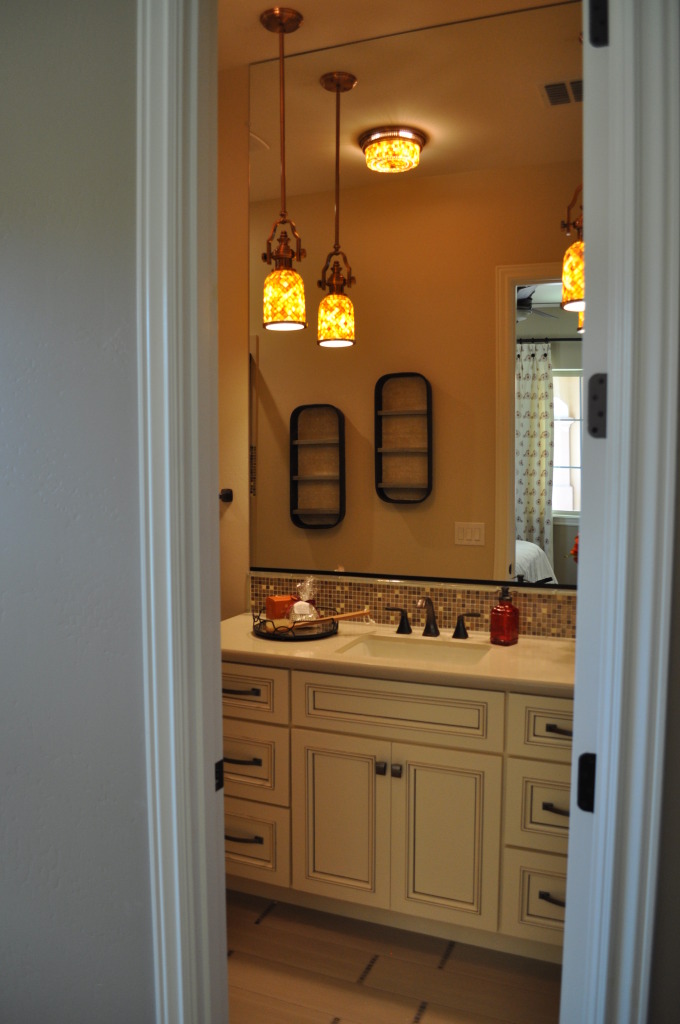
basha bath 2Lighting: Possibly the most important factor in bathroom design, lighting adds a decorative element and also has a direct impact on how the mirror reflects your face and the room itself. Notice how the dappled pendants soften the light in this bathroom. A choice like this one creates amber light and shadows – making the bathroom stand out even without any other special design elements. The oversized curved light in the second bathroom makes the lighting evenly distributed and the translucent shading softens it.

 Tile: The backsplash mosaic in the first bathroom adds personality as well as providing a focal point. With just a small profile, this tile allows visitors to enjoy the look while using the sink and mirror. The curved edge tile in the second backroom mirrors the curves of the light while bringing a deep contrast that works well with the painted and glazed cabinets.

Faucets and towel bars: Both of these bathrooms have oil-rubbed bronze fixtures, providing a warm and effective transitional look. Because these bathrooms are from the same model, the Basha at Legacy, the cabinet and faucet choices are the same, creating a consistent look throughout the house. But by choosing different tile, light fixtures and sinks, the bathrooms are completely different in style and feel.

As one of the smallest rooms in your home, the bathroom provides the perfect palette for adding style without adding a lot to your budget. For more great ideas to make your bathrooms exceptional, visit Legacy and check out the bathrooms in all of our models.


Design Center Kitchen a Study in Texture

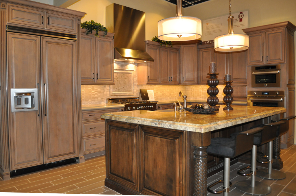
Bertazonni KitchenWhen designing and decorating a room, people often think in terms of color and contrast, but there’s another factor that can create interest – texture. This kitchen demonstrates how texture can make a space exciting. Let’s take a look at all the texture decisions that make this kitchen appealing.

Stainless and wood: One of the most popular contrasts in today’s kitchens comes from two common texture choices – shiny stainless appliances and soft wood cabinetry. In this vignette having the refrigerator provided with cabinet doors – as the largest appliance – creates a softer textural mood than you would have with a stainless refrigerator.

Cabinet finishes: The primary cabinets have a soft gentle glaze, giving them variety while allowing them to serve as a color base for the kitchen. On the other hand, the island cabinets show a more rustic texture that helps this element to stand out from the rest of the space.

Countertops: The countertops against the wall have a soft look with rounded edges and minimal contrast. On the island, strongly variegated granite adds an extra design element to this kitchen. Picture the island with the same soft counters as the rest of the kitchen – without that additional feature, the island would not have the impact it shows now.

Island columns: By choosing the braided texture on the island columns, you add the feel of rich old-world finishing. Once again, this choice brings the island to the forefront of this kitchen vignette.

The designer’s decision to use texture rather than tone to create interest in this kitchen helps to create a space that is cohesive, lower contrast, yet still interesting. That’s the power of texture.


Adding Style and Function to a Hall

Legacy Models 033Halls can serve two primary purposes: to connect a number of rooms efficiently and to provide some separation and privacy between the main living areas and the bedrooms. But this space can be used for more than an interior pathway.

Fulton’s Legacy community demonstrates this with its three models: The Basha, The Fulton and The O’Connor. Let’s take a look at some of the ways a hall can have multiple uses and design elements.

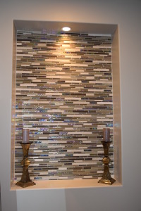
Take a look at the photo to the left. This niche, from the Fulton model at Legacy, adds an inviting design element to the hallway. Visible from the family room, this lighted niche provides the perfect location for a favorite piece of art. It could hold a wreath for the holidays, a family photo, a shadow-box of memorabilia, or almost anything of importance to you and your family. The glass tile background adds interest and DSC_0177personality.

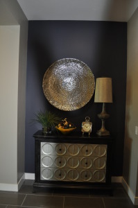
The next photo, to the right, is from the O’Connor model at Legacy. Here decorative elements combine with some storage to create a feature that is inviting and functional. You could use the chest to store guest linens or anything that’s nice to have in easy reach for the whole family.

The look of this location has been enhanced with the dark plum paint on the hall’s back wall. The contrast between the dark wall and the metallic silver chest and plate above it creates a moment of drama in what is often an overlooked area of the home. Notice that the hall has extra depth at this location allowing you more design flexibility, a thoughtful addition to this home.

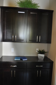
DSC_0185For a final addition to a hall space, take a look at this built-in cabinet and counter available in the O’Connor model. A corner of a hallway suddenly can become the perfect central location for charging mobile devices and keeping office and homework supplies handy. With its easily accessible central location every family member can use this as a drop-zone for homework, keys, purses and phones. Consider adding a small bowl or jar for spare change, which could be used for a family treat or dinner out once you accumulate enough. Add a bulletin board or calendar and it could also be the central location for messages and schedules.

For a closer look at these and other interesting approaches to hall space, come see the Fulton Homes models at Legacy in Gilbert. We think you’ll enjoy your visit.


Pops of Red add Personality to Bedroom.

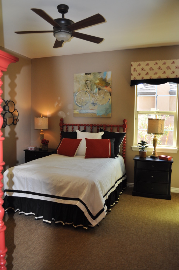
DSC_0090 (1)Whether the bedroom is a guest room, a child’s room, or your own, would you take a chance at adding strong color into the space?

Today it’s easy to find furniture in bright and inviting colors, or maybe you have a few pieces with nice lines but a dull look. A little paint and that boring piece can become the focal point of a room.

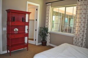
DSC_0091 (1)Two choices make this bed head and étagère stand out. The color is definitely one of them. The other highlight comes from the turned wood spindles that link the two red pieces together.

At one time, a bedroom like this would be loaded with at least one chest of drawers or dresser. These days, thanks to larger closets and well-arranged built-ins, most bedrooms can use furniture for decoration and style rather than clothes storage.

If you would like to create a mood like this in one of your own bedrooms but don’t have the furniture pieces, you can take advantage of consignment or thrift shops to look for older furniture with inviting lines. You don’t have to worry about the finish since you will be painting it.

Choose an accent color that works for you. It might be a red such as the one in this bedroom, or maybe a bright yellow, blue or green. If you prefer a more subtle color palette, consider a warm pumpkin or dark forest green. If you’re more daring, orange is still a popular color.

Pull the color into the room in other areas. For example, the curtains in this bedroom display elements of that same vivid red, and help bring the room together. You don’t have to keep everything red; the nightstands in dark wood work well in this space. Too much of even a great color can be overwhelming.

Want to take a closer look at this room as well investigating as a number of other interesting and creative design ideas for bedrooms? Visit our newest community, Legacy. We look forward to seeing you there.


Balancing Cabinetry and Appliances in your Kitchen

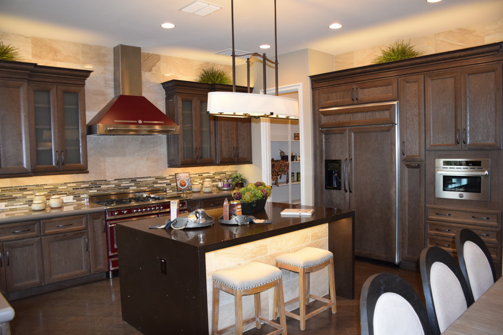
Models 061This kitchen, from the Fulton model at Legacy, shows two ways of approaching appliances in your kitchen: showcasing them like this Bertazzoni range and hood, or reducing their impact by blending them in with the cabinetry. You can see this with the built-in refrigerator to the right.

In this example, both design choices work. The drama and color of the oven creates a focal point in the kitchen. The generous size of the space allows this dramatic piece to shine without overwhelming the room. On the other hand, if the refrigerator had a stainless skin, it would be a distracting influence. Its size would draw the eye away from the strengths of this kitchen – the range and the island.

Transitional design allows you to take advantage of many choices combined into one integrated whole. In this case the moderately-traditional cabinets take a back seat to a strongly-contemporary island and a retro-style range. Smartly, the dark red of the range is allowed to stand alone rather than having the color echo throughout the kitchen. If you wanted to carry the color further, a few accessories would provide all the impact you need.

Notice the stainless microwave to the right. That could have been installed in black, but there are enough stainless accents throughout the kitchen to make this work. The small size ensures that this appliance does not become a distraction. However, cabinet pulls are dark rather than stainless. Design is always about balancing strong features with others that fall into the background.

For a better look at this kitchen as well as two others with interesting style and design elements, visit Fulton Homes Legacy in Gilbert and wander through our three new model homes.