Decorate Using the Four Elements: Earth

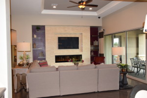
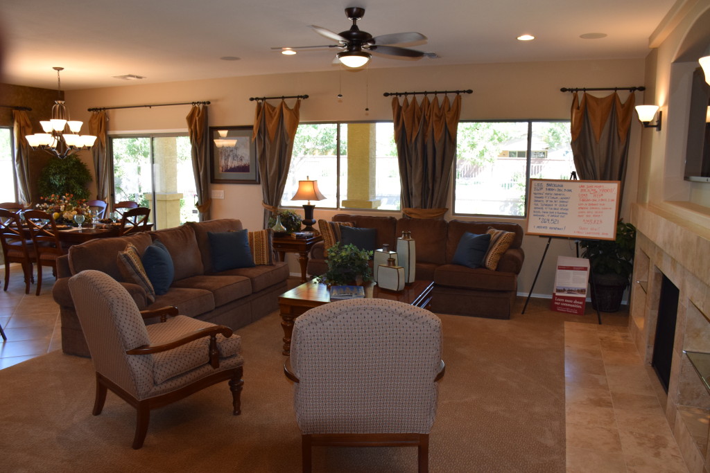
Mediterranean at Ironwood Crossing EarthLong before the science of chemistry came into existence, ancient philosophers and scientists thought the universe consisted of only four elements: Earth, Air, Fire and Water. And even though we know better now, it’s still fun to use these concepts to decorate your home. Let’s take a look at a room with an emphasis on earth.

The colors start the analysis. Earth tones predominate in this space. Notice the dark brown wood, brown sofas and beige and brown chairs. Brown and rust drapes complete the color scheme. There are a few touches of red and green – in the plants and the arrangement on the dining table. The deep blue of the throw pillows isn’t normally thought of as an earth tone, but against the brown sofas and combined with pillows that include that shade of blue along with earth-tone stripes, it works.

Next, let’s look at materials. Stone predominates, with the strong stone facing on the fireplace and porcelain tile in the dining area. Notice also the  pottery accessories on the coffee table. The clay that produced these three pieces is the ultimate earth material.

Choosing a warm wall color and the warm-toned shade of the table lamp at the back of this photo also echoes the feeling of the Earth element.

Are you the most comfortable in an Earth-focused family room? What other elements make a room feel like it’s connected to the earth for you?

Light or Dark: Designing your Dream Kitchen

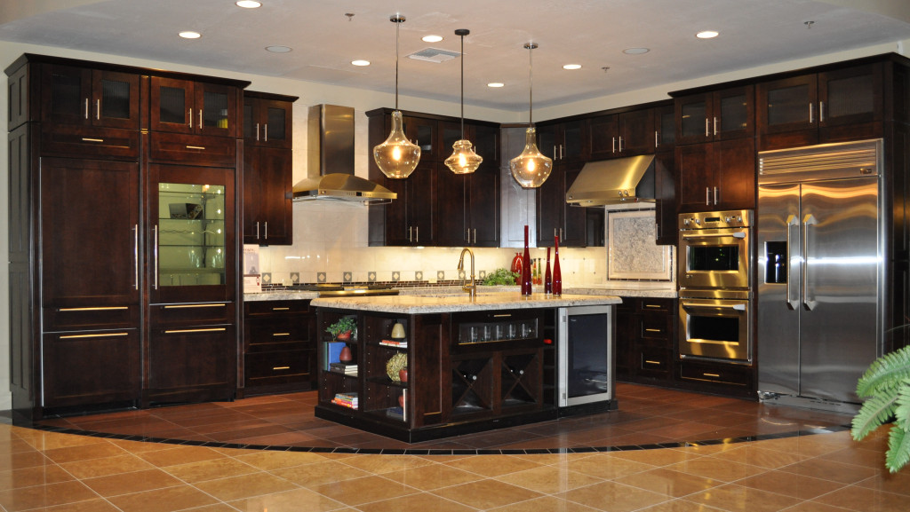
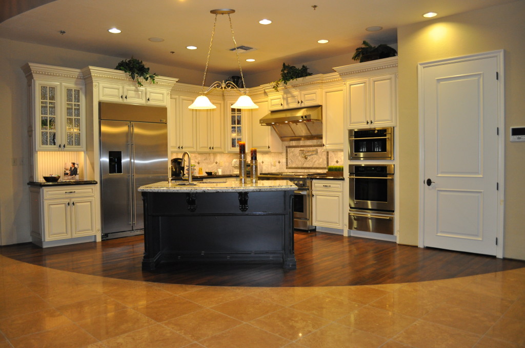
Kitchen 2 Design Center 052 (1)When you start designing your dream kitchen, the first choice you make is your cabinets. Do you want light wood or even painted cabinets, or darker stained wood? Each has advantages and disadvantages. \

If your kitchen has limited natural light, the painted cabinets bring a natural brightness into the space. They also work well with stained wood floors. One choice that adds interest to this particular kitchen is using dark cabinets on the island. This allows it to serve as a focal point in the kitchen and adds a nice contrast to the ivory.

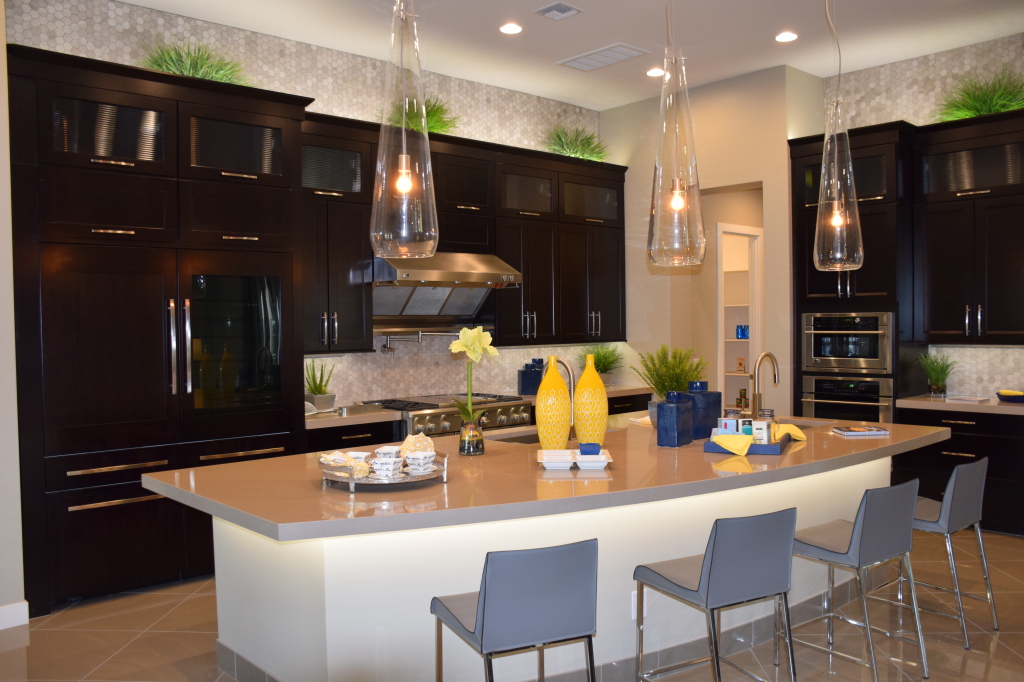
Kitchen 1Dark cabinets, on the other hand, provide richness to the kitchen and really play up the lighting. The light countertops provide a strong counterpoint to the dark wood, making it seem to glow. Darker cabinets are also less likely to show fingerprints from little smudgy fingers if you have children helping themselves to cabinet items.

Both kitchens contain stainless steel appliances, which gives you a good idea of how stainless works with the two types of cabinets.

Painted cabinets have a more old-fashioned feel, because they were popular in the old-style farmhouse kitchens of the past. Some of today’s choices, however, such as glazes and more non-traditional colors and styles, can shift those cabinets to work well in a contemporary home also.

Which do you prefer? You can see both these kitchen vignettes close-up during the Fulton Design Center browse night coming up on Thursday March 5th, 2015. We hope to see you there.


A Relaxing Master Bath

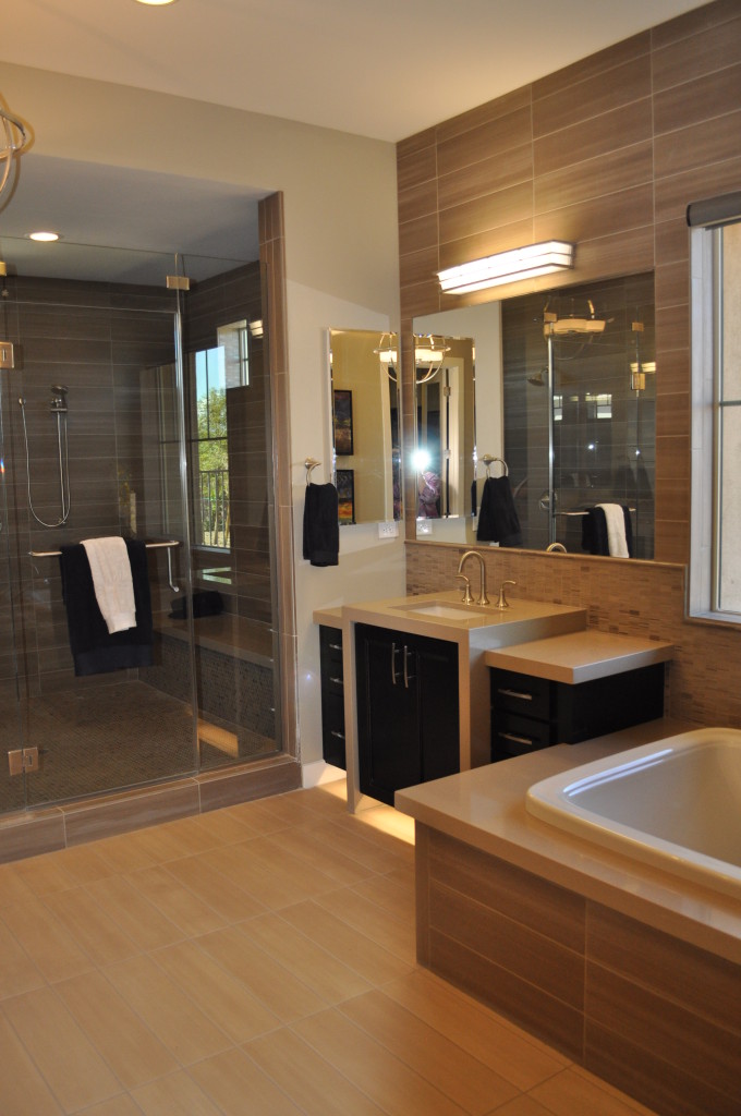
DSC_0153 (2)At the end of a long hard day, can you imagine sinking into a nice warm bath, maybe soothed by a generous helping of bubble bath in your favorite scent? The wide edging around the tub provides enough space to light a few candles and prop up a favorite paperback to read while soaking. This relaxing master bath is ready for you.

Or if you prefer showers, how about washing off the stress of the day in this oversized shower, complete with a bench to relax on?

No matter how you use your master bath, just walking into a room like this one can help reduce your stress. The vanity has plenty of storage space, making it easier to keep the counters tidy. The two tones of rectangular tile set the scene for a spa feeling.

Do you dream of a relaxing master bath like this one from Legacy? One with plenty of room, and designed to match your specific taste?

DSC_0098If instead you want one that has a more traditional style while kicking up the glamour, how about the master bath to the right? The gold pendant lights set the stage for luxury. Notice how the filigree creates an inviting pattern on the walls while the lower counter on the vanity provides a space to sit to fix your makeup.

This master bath also has a comfy tub in place, made for soaking. And if you peek in the mirror, you can see the reflection of a generous walk-in closet.

What would your ideal relaxing master bath look like? To get some great ideas, why not visit the models at our Legacy community? We think you will be enchanted by what you find there.


Your Entertainment Wall

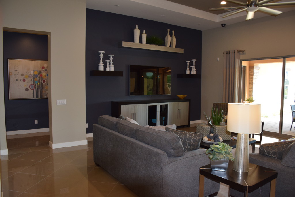
Legacy Models 071 (1)Designing an entertainment wall involves balancing design and function. You want a good place for the large HD TV while still keeping the screen itself low-key when it’s not turned on. These suggestions can help you think about what will work in your home.

Use color wisely: Dark grey-purple on the focal wall in this photo from Legacy draws the eye while reducing the footprint of the screen. The shelves and cabinet bring in lighter tones and the space is large and flexible enough to make changes in the future.

Models 065Incorporate an additional focal point: By adding the fireplace under the niche holding the television in the photo to the left, also from Legacy, the space feels nicely orchestrated. The screen becomes another dark rectangle, adding depth and balance to the light stone face. Once again dark purple draws the eye, with free-floating shelves providing opportunities to display accessories and carry the light tones out to the sides.

Consider seating: Positioning seating toward the entertainment area makes it more comfortable to watch programs, but you may want to place some seating facing toward the conversation area rather than aiming everything at your entertainment wall. This encourages discussion when you have guests, and the chair or chairs can easily be turned if they are needed for viewing a particular event or program.

Create flexible lighting options: A lighting arrangement that works well for a gathering may not serve your needs while watching your screen. Make sure you plan for both situations when setting up your lighting. A few ceiling spots may be all you need for television viewing, or consider a dimmer switch to provide enough ambient light while avoiding a glare on the screen.

Your family room can be flexible enough to meet all of your entertainment needs, whether you’re spending the evening chatting with friends or enjoying a DVD of a favorite film. Take the time to create a space that works for you and your family –in terms of both style and function.


The Pleasure of Water

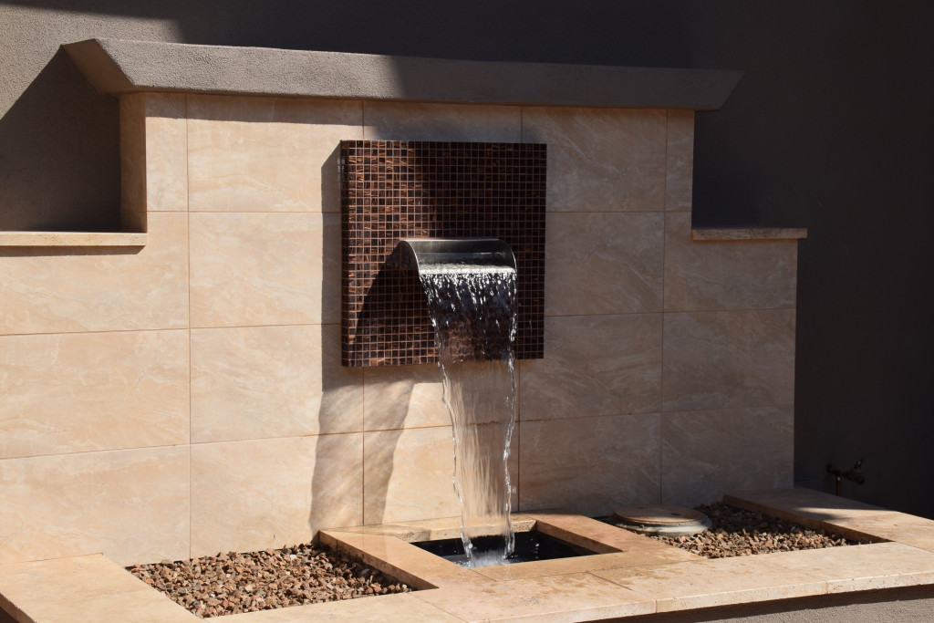
Legacy Models 053Many thousands of years ago, desert dwellers knew that the presence, sight, sound and feel of water moving helped people cope with the hot dry desert. Today in the Southwest, commercial and residential landscape designs improve when you add water.

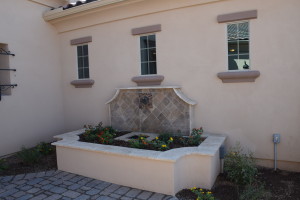
The Fulton Homes’ models at Legacy take full advantage of water’s power to soothe and create an inviting ambience. Positioning a fountain in the front courtyard like this one at Legacy draws the summer back a bit and allows visitors to refresh themselves even before entering your home.

Legacy Models 104If you want water to contribute to the comfort of your landscape, the following tips can help you make the best choice for your home.

Stop and look: Does the water’s spray catch the light? Is there a natural place to dip your hand in to catch a bit of moisture? Is the fountain visually appealing? Choose a fountain that you will enjoy looking at every day.

Listen: Make sure you have a chance to hear how your fountain will sound. Does the water sound musical? Is it an inviting background to conversation or quiet time? If your yard experiences traffic noise, a fountain provides a great way to mask and distract the ear. Make sure you choose one that has the right sound for your needs.

Integrate it in the space” Does the fountain match the look and style of your home? Can you incorporate some of the same materials that you already have in your landscape to make a stronger connection? Consider adding rocks, plants, tile and any other elements that will make your fountain seem like an organic part of your yard, not an afterthought.

Follow these suggestions and you will discover the water feature that helps make your desert landscape bloom winter and summer.


Flooring that stands out

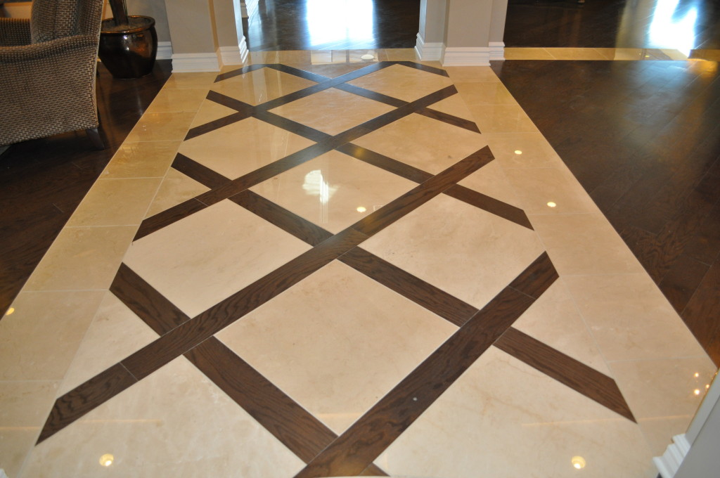
DSC_0086Flooring often serves a passive role in decorating, as the background for other, more exciting things. But take a look at what happens when you give flooring top billing. These two examples from Fulton Home’s models at Legacy demonstrate the power of bringing flooring to the foreground.

The picture above shows the floor extending out from an entryway. Immediately your eyes are drawn down the hall and into the home. This combination of stone and wood provides a path and a promise that this is no ordinary place. The diagonal setting makes that point stronger and adds a dynamic feel. It pays to consider placing flooring on the diagonal. It can create a feeling of added space and energy. In this instance, the strong contrast also provides interest.

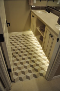
DSC_0108Small spaces provide another place to experiment with unusual flooring choices. This basic bathroom becomes intriguing with the addition of flooring in an ascending block pattern. Three shades of tile make up the drama here, capturing the eye. One of our Facebook fans suggested adding Escher prints on the walls to make this bathroom a statement space.

There’s no denying that these floors are a design risk, but why not take a few chances in your home? If these are too far out of your comfort zone, how about adding a border or some sort of contrast in your flooring. Remember that your floor and ceiling are the fifth and sixth walls in your home, so why should the first four have all the fun?


The Right Study for You

Legacy Models 105Almost more than any room in your home, the study should fit your functional needs. If you are one of the fortunate people who can work from home, you will find yourself spending a lot of time in this room. And even if you head out to work every day, your study may become the perfect place to pay bills, handle any work you need to take home, or even review your email and other social media accounts.

With the commitment of time and energy a study may require, why not make it work in a way that really suits your needs? While function is number one, it’s also worth it to take the time to make it a room you enjoy spending time in. Here are a few things to consider as you plan your study’s functional needs and décor.

Legacy Models 045Desk space: If you use a laptop, you need less space than a desktop takes, but you may still want to plan additional room for holding notes or any mail you need to deal with when you get home. If your study is also your main workspace, consider room for in and out boxes and anything else that would make your work easier and more efficient.

Storage: Do you need file space or space for office supplies? Look for furniture style-file cabinets and other pieces so that your study is functional while still fitting in with the rest of your home.

Lighting: In addition to any ceiling lighting, take a look at floor and desk lamps to add just the right light as needed to do your work effectively. Think also about the ability to change the lighting depending upon the moment’s needs. The kind of light you need while working at the computer may be completely different from what you want when meeting with someone on business.

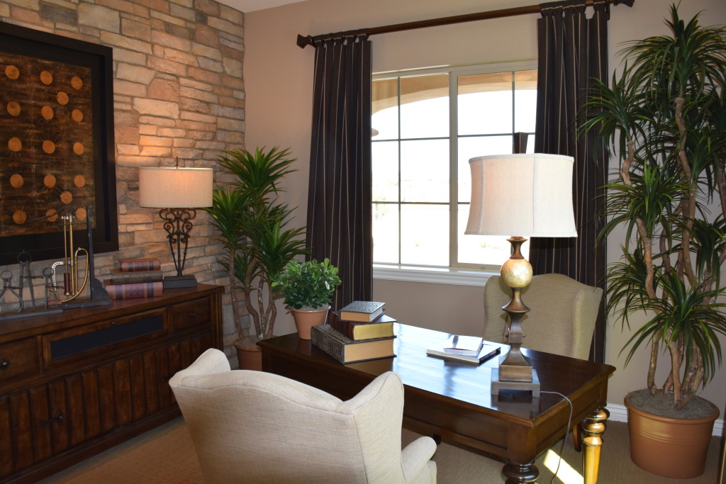
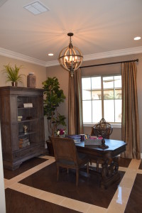
Style: If you like traditional looks, consider something like the study shown above. The stone wall adds a nice unusual pop of texture while staying in the traditional vein. On the other hand, if you want something more daring, how about a study like the one on the right? From the flooring to the ceiling light fixture, this room has a unique feeling.

Above all, make your study a space that works for you in every way, from function to style, so that you enjoy the time you spend there.


Think Outside the Box with Lighting

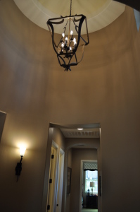
DSC_0020 (1)With the generous amount of wall space and raised ceilings available at the Fulton Homes Legacy community, it pays to think outside the box with your lighting plans. This photo shows several ways lighting adds appeal to a generously-sized space.

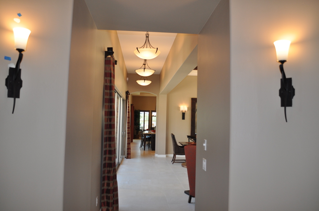
DSC_0019This shot, taken from the entryway of the Basha model at Legacy, shows a number of lighting choices. The sconces in the foreground are part of the foyer lighting plan, combined with the dramatic ceiling light shown in the photo to the right. By sticking with the same bronze finish and curved elements, the sconces echo the feel of this large-scale ceiling fixture to create a lighting plan that takes full advantage of the turret-style space.

It would have been easy to use spots on the ceiling of the hall extending from the foyer, but instead three dramatic bowl lights carry the foyer’s focus into the home. In a smaller space these fixtures might grace a dining room, but here the scale is large enough to use them as hall lights.

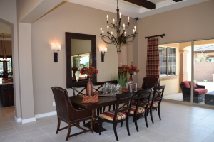
Legacy Models 115So what type of scale is needed to do justice to the generous dining area provided in this home? Take a look. This photo on the left showcases the powerful impact of a chandelier that fills the space perfectly. The size is impressive, but the graceful lines and use of negative space keeps this light from dominating. Two sconces provide additional light and interest.

Combined, the lighting of this home is designed to pull you into the home from the time you first enter it. Lighting is a powerful tool when decorating your home, as this model demonstrates. Use your lighting choices to welcome people into your home.


Using and Accessorizing your Kitchen Island

Models 081 (1)A large island such as this one from the Fulton Homes’ Legacy community provides the opportunity to accessorize and still have space for functional uses. Let’s look at two versions of this island to see several approaches.

In this first photo, the yellow accessories combine with the green plants to add color to a neutral kitchen. The yellow pops against the dark kitchen cabinets and adds warmth to the view.

Notice that several collections of accessories are positioned on trays. Each tray contains several smaller objects which gives them more importance from a design perspective. More importantly, trays can be easily moved to allow the island to serve as a breakfast bar or buffet for a party or family gathering.

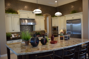
Legacy Models 118In the photo to the right, the accessories bring a darker tone into the light kitchen, linking the island with the backsplash and above-cabinet tiles and anchoring the island in the space. In this case the positioning of accessories provides plenty of room to use the front area as an eating or snacking area without having to move anything.

Both of these islands have a powerful presence in their respective kitchens. By breaking up the surface with carefully-chosen accessories, you can take full advantage of the space while using the area to add interest and charm. Notice that each island’s accessories vary in height and heft. This helps create balance.

You can also use this space to incorporate personal items that make the kitchen your own. If you have heirlooms from a family member or favorite kitchen accessories, islands such as these provide the perfect place to showcase them. And don’t forget these islands’ primary functional purpose – to add much appreciated counter space for food preparation!


Lovely Lighting

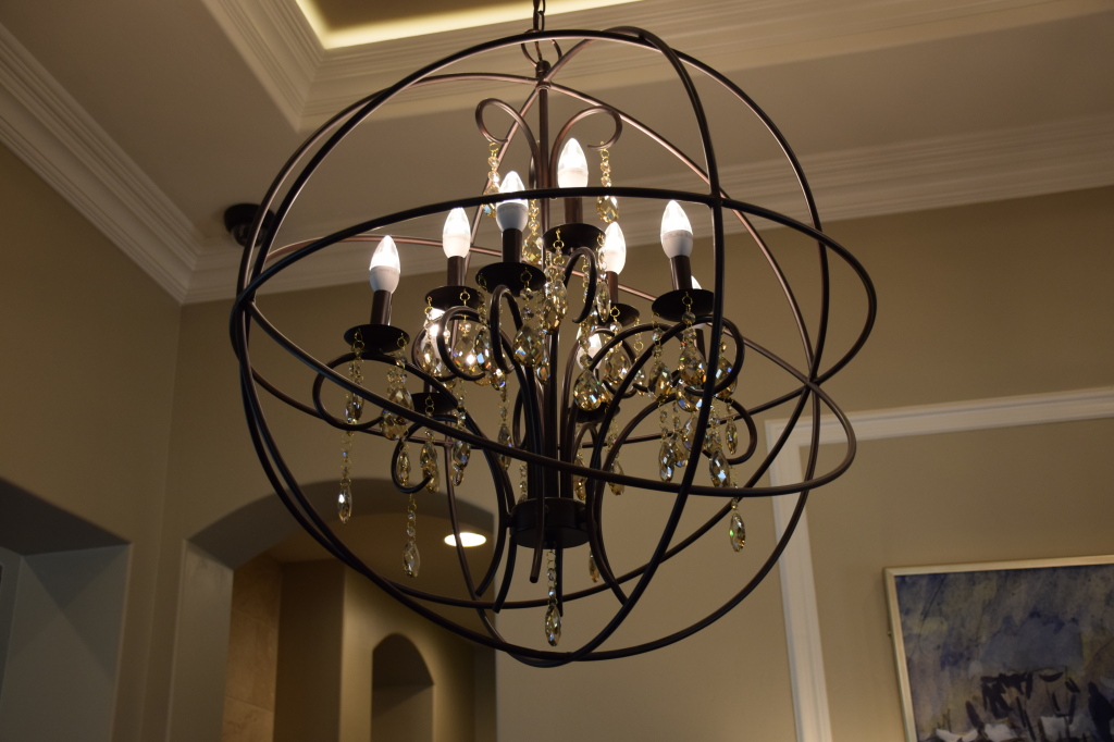
Legacy Models 044With the steady increase in higher ceilings and open floor plans, lighting designers have finally started to think bigger with residential chandeliers, with dramatic results.

Take a look at this breathtaking example from the Fulton model home at Legacy. The chandelier inside has some traditional elements such as the candle-shaped lights and display of crystals. But add the surrounding bronze hoops and you suddenly have a daring transitional light that captures the eye and sets the tone for the entire room.

It takes a certain amount of design daring to flash this type of lighting fixture in your home. You can’t take it easy with the rest of the décor. Your other choices will have to live up to this. And you could never get away with it without the space to set it off properly. A high ceiling, plenty of space to showcase its drama, and other architectural details to complement it provide the proper setting.

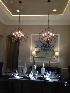
259 (1)Take a look at its position in the room to the right. It takes two of these chandeliers to make this space work. Adding a second one just contributes to the impact. And the ceiling provides just the right frame for this exciting choice.

The normally-recommended height for hanging a chandelier wouldn’t work here. Too low and these pieces would take over the table, compromising the entire feel of the room. Instead they are positioned half-way from ceiling to table, allowing guests to take in the entire picture when walking into the room.

Is this chandelier the light of your dreams? Visit our models at Legacy and see for yourself. Enjoy this and other lights that are designed to capture your interest and imagination.