The Basha: High Style Dining

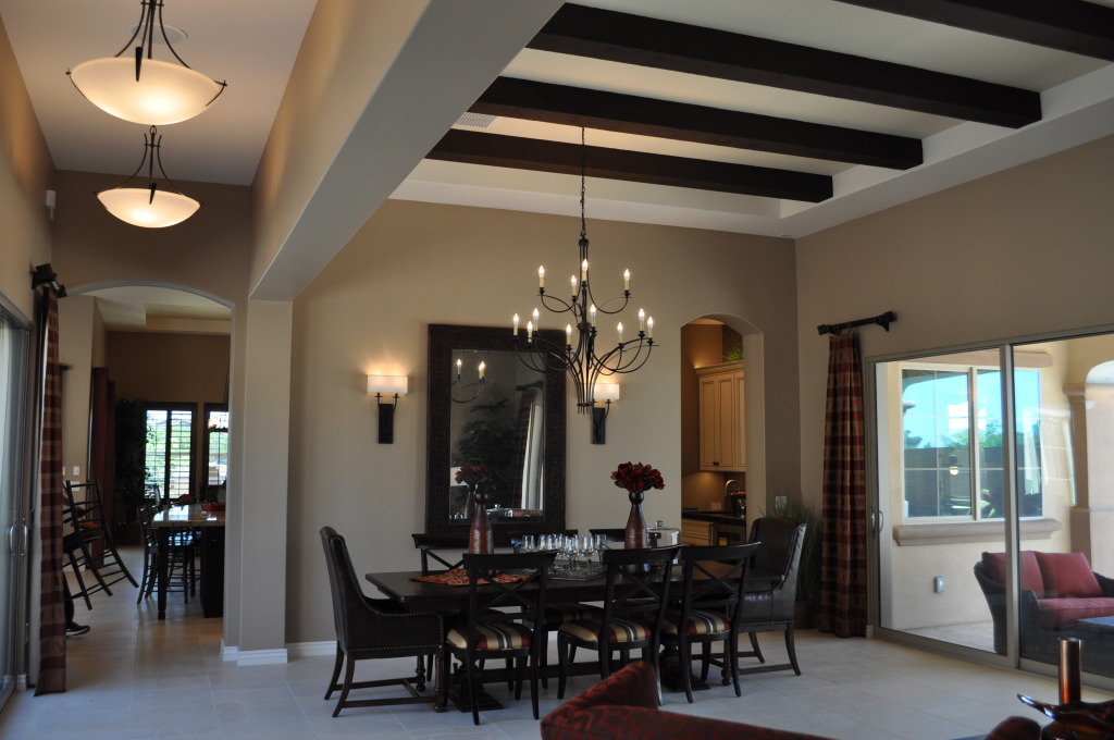
DSC_0022 (1)Some smart design decisions bring style to this dining space, from Fulton Home’s Basha floorplan at Legacy. The wall-mounted column and ceiling-based frame defines the dining and living spaces with a natural hallway that keeps the room open.

Proportion also has a place here. The chandelier has the grandeur to connect the raised ceiling to the table, while its delicate tracings of metal keep it light and graceful rather than too massive. This provides a good balance against the strong beams and more prominent design of the wall sconces. The lights in the hall could fit over a dining table in a smaller space, but here they stand up well to the requirements of the generous room.

The large dining room table is complemented by adding upholstered armchairs to each end. Dark leather works well with the massive mirror on the wall and the beams on the ceiling, while the stripes on the side chairs pull the room’s colors together.

While some people may consider a rug to add definition to the dining space, the other architectural details make that flooring choice optional. And positioned right next to the kitchen as a natural extension of the living room, this dining area is ideal for entertaining.

In the Basha, design and décor blend to create a friendly, welcome environment. We invite you to visit the Basha at Legacy in Gilbert. We think you will enjoy the style and appeal of this Fulton Home.

Dining Area Works

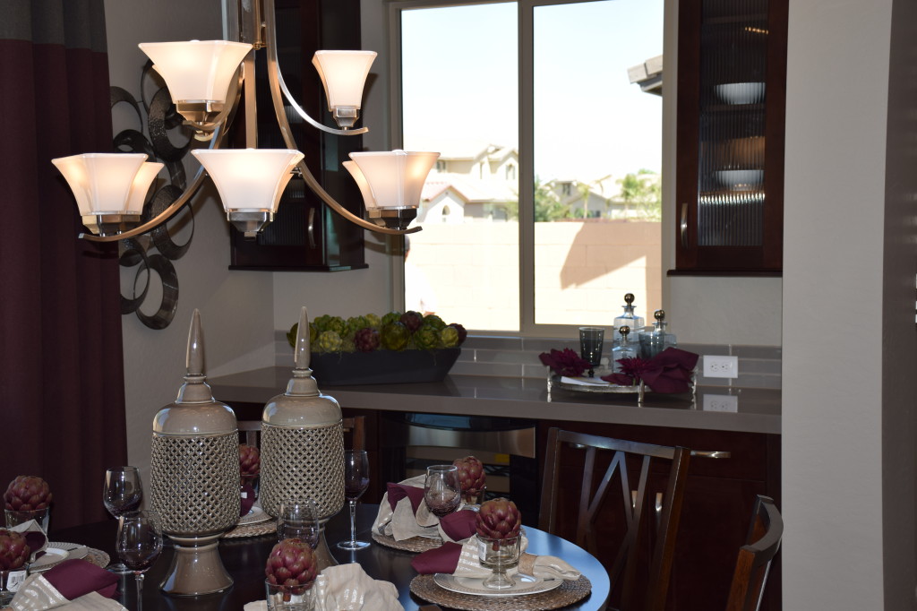
Corsica Model at Ironwood Crossing 015If you’ve experienced dining at a circular table, you know how the space encourages conversation while providing an inviting central area for flowers, a centerpiece, or bowls of good food. The table in this dining room – from the Fulton Homes Corsica model in Ironwood Crossing – also works well in the space. When you have a square shaped dining area a circular table takes advantage of the entire space while still leaving breathing room for wanderers.

This table seats six comfortably and could handle up to eight with just a little squeezing. If you want to try this circle shape, look for a pedestal table that allows you the most flexibility in seating – there are no table legs to interfere with your guests.

The round presentation from the room’s chandelier provides the perfect lighting for the table. Choosing a light fixture with upward-facing shades provides a generous amount of light while avoiding glare. Add a dimmer to allow for darker, more intimate gatherings, possibly with added candlelight.

The built-ins offer another lovely feature in this space. Notice how the upper cabinets frame the window with glass doors that reflect all of the light in this room. The countertop provides the perfect spot to serve a buffet, and you could use the cabinets to store serving dishes as well as table linens. The electric outlet right at countertop level supports heated dishes or after-dinner coffee.

Positioning right next to the kitchen makes it easy to make and serve everything from a quick family lunch to a gorgeous dinner party. The two windows add light to daytime gatherings and ambience in the evening. How would this dining space work for you and your family? Visit our Corsica model to see it in person.

Pinterest on Furniture

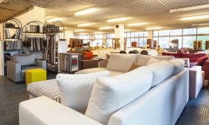
21363428_SIf you walk into a furniture store and immediately want to curl up on the nearest sofa and forget about shopping, you can start the process on your computer instead.

Do you know what you want in a sofa? A chair? A coffee table or bookcase? If you’re not sure, take a cruise to Pinterest and see all sorts of options in a room setting. Many furniture manufacturers have taken to Pinterest, so you can shop there. Or start simpler with a search for the type of room you’re looking to furnish.

Start with your own Pinterest account. Create a board that defines what you’re looking for – say a dining table and chairs. Then do a search for photos of your almost-unlimited options.

Pinterest allows you to envision the exact look you want, down to the paint color and accessories, just by seeing what other people have done. Be specific. If you want a traditional oval dining table, look for that. Or if you’re not sure, just browse the rooms in general and pin the ones that you’re drawn to. There’s a good chance that you’ll start seeing a trend.

Many designers also pin the rooms they’ve created, so you have the advantage of looking at what the professionals do. You can start by pinning everything you like and narrow down your choices later. Once you’ve developed a collection of pins you like, sit down and look at the board you’ve created. Do one or two pins stand out? What draws you to them? Think about color, furniture style and material, shapes and textures. With notes on your favorites, or pins in your Smartphone, you can shop with a much better idea of what you want.

Pinterest is a natural replacement for those folders of favorite rooms many of us keep with us while shopping for our home decor. Take this approach instead. It’s free, easy and much less cluttered than all those magazines and photos. Give it a try.

Linking Kitchen and Dining Spaces

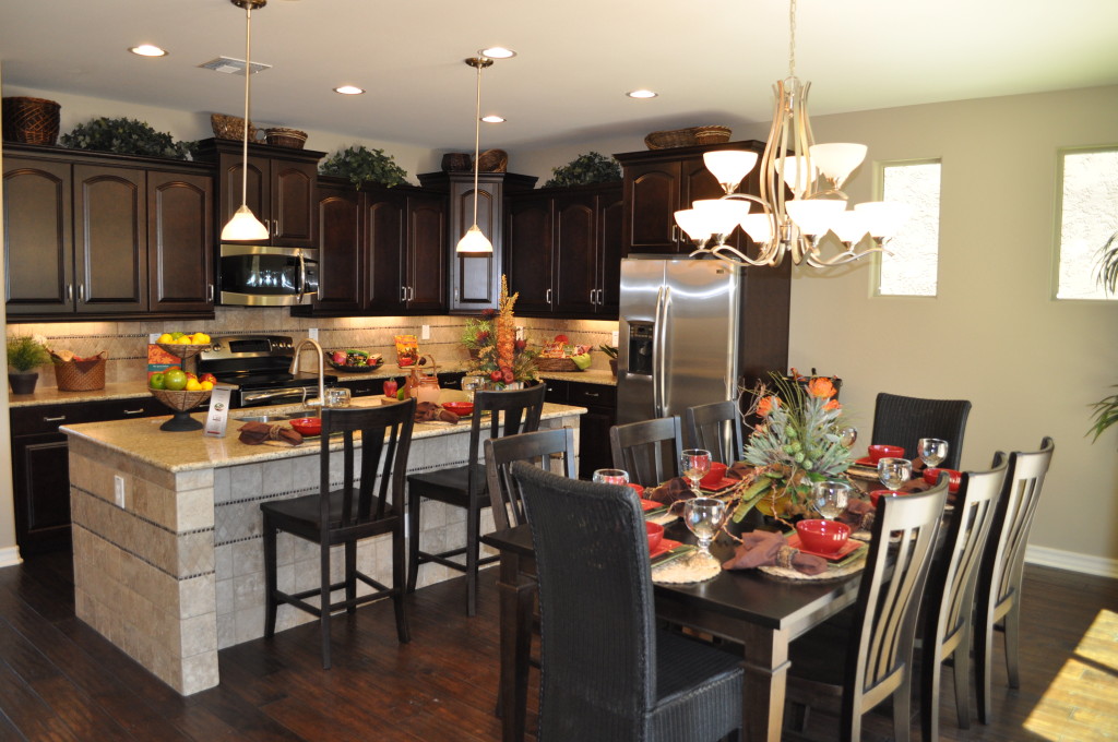
Kitchen20and20Nook20DSC_0244With an open floor plan it’s easy to connect with friends and family when fixing a meal. The distance to the table is short, making the transfer of food to table and dirty dishes back only a few steps.

If you have lived in a home without this kind of space, an open floor plan is a luxury indeed. But planning the décor requires attention to make the space feel unified. This Fulton Home model demonstrates how to connect the kitchen with the dining space. Let’s take a look at some of the decisions that make this space work so well.

Flooring: By staying with dark wood flooring throughout, everything feels like one room. The island provides the only break between the kitchen and dining table.

Cabinetry & Furniture: The cabinetry in the kitchen and the dining table and chairs coordinate in wood tone. Another connection comes when the chairs at the island sport the same design as the dining chairs. This keeps the one-room feeling intact.

Lighting: Although the pendant lighting above the island has a different function than the chandelier in the dining area, the glass globes are the same shape and both have the same brass finish. They are from the same family of lighting fixtures and they help integrate the space beautifully.

Accessories & Colors: The dishes, flowers and kitchen décor mirror the dining table’s tablescape. This causes your eyes to travel freely around the entire space without a pause. A difference in color or style from kitchen to dining room could create a jarring interruption.

If you are moving to a home with an open floor plan for the first time, be sure to factor the need to integrate several spaces into your design and décor plans.

Dining Room with Drama

From Fulton Homes Daylight Model

From Fulton Homes Daylight Model

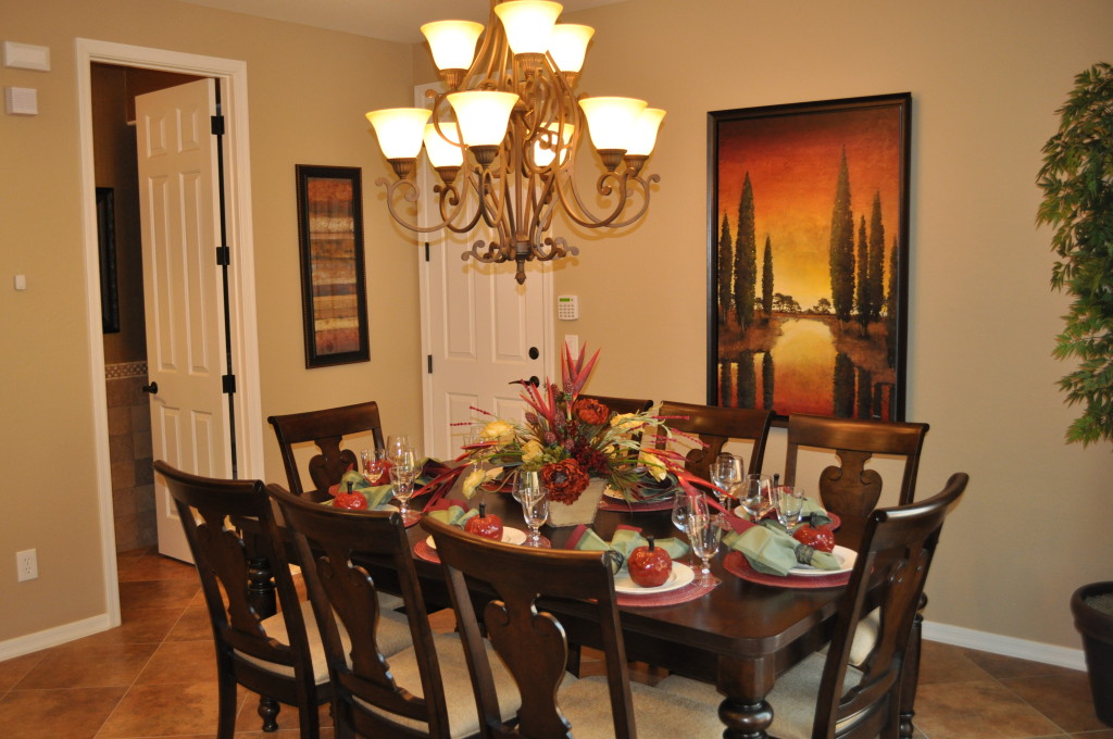
What makes this dining space special? A sense of drama captures the eye and invites you to have a seat and a meal. Let’s take a look at why.

Color: The walls have a rich tone that is darker than expected, creating a sense of intimacy. The leather-colored flooring echoes that warmth.

The artwork and tablescape complement each other – with rich red and dark olive green combined with a sunny gold. Brown links it all together, with the furniture, chandelier and art all showing a brown base color.

Comfort: The chairs are built for comfort with backs that slope and cushioned seats. If you want a lively dining experience with people lingering over their meals, be sure to select dining chairs that will be comfortable for several hours. Don’t be seduced into uncomfortable chairs by a certain look or style.

The lighting also makes the space feel inviting. Having the shades facing up makes the room bright enough without any glare. The slight amber tone also warms the space, helping to relax the environment.

Style: Everything in this room is consistent in flavor. The feel is sophisticated Mediterranean, building the expectation of a meal that starts with bruschetta and ends with a bowl of fruit, with pasta and maybe fish in the middle. Imagine the hostess removing the flower arrangement from the center of the table, replacing it with a large bowl of tossed salad and a basket of bread still warm from the oven.

Cloth napkins with napkin rings, the dark red chargers under the white plates – food always looks better on a white plate – and the simple ceramic apples at each dish promise a meal to remember. This room is set up in anticipation of a lovely meal with congenial company, and it invites you to sit down and enjoy it all.

Fulton Homes Design Online – Lighting Up Your Life

LED Under Cabinet 5 Light PkgAre you drawn to traditional lights with softly-curved glass shades like the ones in the photo? Maybe you want pendant lights over your island, and in oil-rubbed bronze. But wait, this light fixture was just made for the pool table you’re planning for the family room!

This room shows a generous amount of lighting, which is particularly appreciated in the kitchen. Notice the can lights in the ceiling, set to shine light against your cabinet doors, making them sparkle, as well as providing general task lighting for snooping in the fridge for a snack or checking your oven to see if a casserole is finished.

For closer work this kitchen features the Maxim LED CounterMax with five LED lights set under the counter. With its sleek profile and direct pre-wiring, the LED fixtures emit a crisp white light which illuminates without shadows. Long-lasting LED bulbs keep cabinets cool and safe and the bulb life is rated at 50,000 hours. LED lighting is also the most energy efficient choice.

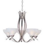
contour lighting collection by MaximWhat about the rest of the house? Light fixtures throughout will stay consistent in design because Fulton provides a full package of lights in your selected style. Would you prefer a contemporary look? How about this piece from the Contour Collection by Maxim on the left?

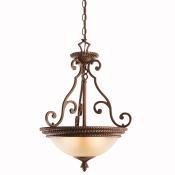
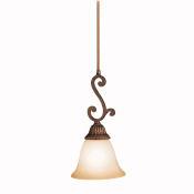
larissa inverted pendantOr you might like this Larissa Inverted three-light Pendant by Kichler shown on the right.

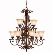
Craving a full size dramatic chandelier? Take a look at this choice, also part of the Larissa Collection. This fixture is ideal to take advantage of a vaulted ceiling over a dramatic entrance or in a formal dining space.larissa lighting package

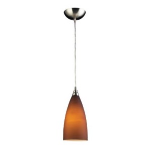
Let’s move back to the kitchen for a minute. Would you like some pendant lights over your island? They are getting more and more popular. Take a look at the choices below. On the left, you have the mini-pendant that goes with the Larissa Collection we saw above. The one on the right is a contemporary choice, the Elk Lighting Vesta Pendant in Tobacco. It comes in red, blue and white also.

elk lighting vista pendant in tobaccolarissa collection mini pendantThese photos show just a few of the choices available. Maybe it’s time to visit Fulton Homes Design Online to start narrowing down your choices – not an easy feat. But remember, your Fulton Design Center Designer is ready to help you make the right decisions for your home.


Design around your Needs

2555983_SDo you want to help your children with their homework while you fix dinner? Then plan for homework space in or near your kitchen. Have pets? Consider durability and maintenance when planning your flooring. Are seniors with canes or walkers regular visitors to your home? You may want to choose a plan that provides a bathroom and guest bedroom on the first floor.

Before you make decisions about your home’s plan or design, take a minute to consider your current and future needs.

Many people today find themselves caring for children and parents or grandparents at the same time. When you plan your home, think about providing the options you may need if a family member needs to stay with you to recover from surgery or an accident.

Be sure to choose a home that gives you and your family plenty of opportunities to interact. Whether this means a dining area that encourages eating dinner together every night or a family room with a game table for board games in the evening depends upon your family patterns. As you plan your new home’s layout and design, talk to everyone in your family about what they love (and don’t love) about your current home and what they would like to have as part of the new one.

Think about your own needs too. Do you dream of having a deep comfy bathtub for taking a luxurious break from everything? Maybe outdoor space for your morning coffee is your top priority. How about closets and other kinds of storage?

Design around your needs and your new home will be comfortable and enjoyable for everyone in your family.

The Decorating Power of Red

8161349_SRed is daring. Red is romantic. Red is sexy. That’s one reason why it’s the color of Valentine’s Day. A splash of red makes an outfit come alive. Whether you love red or not, the color is almost impossible to ignore.

In honor of the holiday, how about looking at red in decorating? Here are three variations on using red in your home, depending on just how daring you feel.

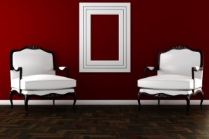
Hard-core red: This photo shows a room where red is the dominant color. This rich dark shade of red takes over the space. Red can be a great color for dining rooms because it raises the energy level in a room and draws people together, encouraging conversation. Your dinner parties could be livelier with red walls.

The secret to this type of luminous and rich red color on your walls is multiple coats of paint. Stop at one or two and you will end up with a red that looks washed out and flat. Plan on at least three coats, and consider five. It’s a lot more work, but getting a result like this makes the effort worthwhile. Also, notice that the rest of the room’s decor is fairly neutral. Once you commit to red, really watch out for any other color choices. Red like this is generally enough color for one space.

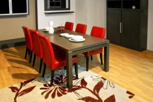
2409263_SA splash of red: By choosing red leather for this dining room’s chairs, the homeowner adds style and a spark to the space. Once again, neutrals keep the red to the forefront without having the color overwhelm the room. You may notice that the brown flowers in the rug look almost rust against the red. This actually works because of the extremely neutral effect of the rest of the room. The red chairs ensure that the table is the focal point of the room. Remember that your eye will always be drawn to any red in your home.

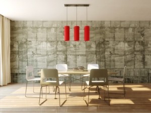
8961688_SJust a touch of red: If you’re not ready to jump into the world of red full-blast, how about dipping a toe in? This light fixture provides a dramatic impact in the room and saves it from a boring neutral look. If a permanent fixture seems too extreme, how about adding in a couple of throw pillows or a vase? You could even test out your red comfort zone with a bouquet of red flowers. But you might want to wait until later in the month – those red blooms are quite expensive at the moment!


Casual Dining Room

A casual dining room is not about table shape or size or whether chairs are padded or not. It’s the style of table and chairs, lighting and accessories that define a dining room as casual or more formal.

Take a look at the two dining rooms to the left. Both circular tables seat six comfortably. The dining chairs are padded and both have a chandelier hanging overhead. Let’s compare the two rooms to define casual dining spaces.

Table style: The formal table has a wood top and legs, with a top that needs to be protected from heat and water. The casual table allows both warm foods and wet glasses on it without damage. Notice that the chairs are also wipe-off in the casual room.

Lighting: Both of these rooms have plenty of natural light. The formal dining room has its chandelier hanging lower, making for a more intimate dining experience. The sconces on the back wall provide additional lighting if needed when you use the buffet. The style is also dressy, with a graceful and involved shape and candle-shaped light bulbs. Take a look at the casual chandelier. It is set higher to brighten the entire room rather than just the table and the little shades create a more casual feeling. Its lines are also much simpler.

Accessories: The large mirror, floor-to-ceiling curtains and the items on the windowsill all add to the formality and style of the dining room. In the casual room, accessories are much more limited. This may be because of the position of the room as part of the traffic pattern of the home, and a casual dining space may be used in many ways such as a place to pay bills or do homework. This makes it inconvenient to deal with too many accessories.

When deciding whether to have a formal or casual dining space, make plans based on the type and amount of use it will have, and then decorate it to suit your functional requirements. And remember, with a few candles and fresh flowers, you can make even the most casual dining room something special.

Classic Dining Room

Well, most of us do not have a dining room that will support a dinner party with 14 guests the way this one does, but the things that make this room work can be used in a dining room serving eight or even four people. Let’s look at the consistent features that every classic dining room should contain.

Space: Make sure every guest has two to two-and-a-half feet of linear space at the table. This oval table provides an additional advantage – it gives the people at either end extra leg space. Also plan on at least two feet of area rug beyond the edges of the table so that people don’t end up bumping off the edge every time they push their chairs back. Did you notice the padded chairs? Just like our contemporary dining room in Monday’s blog, the comfort of your guests is important if you want people to linger to chat after meals during your dinner parties.

Lighting: A chandelier’s height should be about 30 inches above the dining table’s surface, but you may hang it higher to make sure it lights the whole table. With a table this long, two chandeliers would also work, but the wall sconces and mirrors will help keep the room well-lit. Notice the medallion on the ceiling. This makes the light hold a stronger place in the room and works well with the rich display of crown molding on the edges. A medallion is a simple, inexpensive and effective way to emphasize your chandelier or any light fixture.

Tablescape: The crystal in the center of this table echoes the items in the cabinets along the wall as well as the mirrors and windows, keeping everything integrated. Be sure to keep anything in the center area of your table low enough for people to talk across.

Your dining room may not have the size and majesty of this one, but following the same rules for good dining allow you to make dinner parties at your home just as enjoyable.