The Decorating Power of Red

8161349_SRed is daring. Red is romantic. Red is sexy. That’s one reason why it’s the color of Valentine’s Day. A splash of red makes an outfit come alive. Whether you love red or not, the color is almost impossible to ignore.

In honor of the holiday, how about looking at red in decorating? Here are three variations on using red in your home, depending on just how daring you feel.

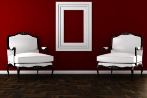
Hard-core red: This photo shows a room where red is the dominant color. This rich dark shade of red takes over the space. Red can be a great color for dining rooms because it raises the energy level in a room and draws people together, encouraging conversation. Your dinner parties could be livelier with red walls.

The secret to this type of luminous and rich red color on your walls is multiple coats of paint. Stop at one or two and you will end up with a red that looks washed out and flat. Plan on at least three coats, and consider five. It’s a lot more work, but getting a result like this makes the effort worthwhile. Also, notice that the rest of the room’s decor is fairly neutral. Once you commit to red, really watch out for any other color choices. Red like this is generally enough color for one space.

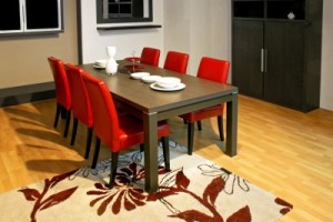
2409263_SA splash of red: By choosing red leather for this dining room’s chairs, the homeowner adds style and a spark to the space. Once again, neutrals keep the red to the forefront without having the color overwhelm the room. You may notice that the brown flowers in the rug look almost rust against the red. This actually works because of the extremely neutral effect of the rest of the room. The red chairs ensure that the table is the focal point of the room. Remember that your eye will always be drawn to any red in your home.

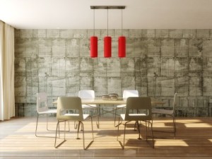
8961688_SJust a touch of red: If you’re not ready to jump into the world of red full-blast, how about dipping a toe in? This light fixture provides a dramatic impact in the room and saves it from a boring neutral look. If a permanent fixture seems too extreme, how about adding in a couple of throw pillows or a vase? You could even test out your red comfort zone with a bouquet of red flowers. But you might want to wait until later in the month – those red blooms are quite expensive at the moment!


A Beautiful Bath is all in the Details

Oasis at Freeman Farms 081Monday’s blog took a look at how finishing touches could dress up a kitchen. The same approach can turn a nice bath into an oasis in the middle of your home. Let’s check out the choices that are showcased in the master bath at the Fulton Homes Whitewater model in the Oasis at Freeman Farms community.

First, a double sink allows space for two to get ready for work in the morning. Many couples value their own sink, and both of these have plenty of counter space and storage.

Separating the two, a lower counter with a drawer provides the perfect place for styling –with a hair dryer and/or make-up. The comfy ottoman adds a splash of class with its simple cylindrical shape and luscious upholstery.

Oasis at Freeman Farms 082Warm tones enrich the look of this bath with gold/brown porcelain tile on the floor, different but still coordinated tile countertops, and inviting wallpaper carrying the gold tones up to the ceiling. Notice the backsplash behind the sinks. The small tiles set the space apart. The large mirror is framed to coordinate with the cabinetry – another option offered through Fulton Homes that creates a more finished look.

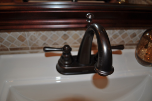
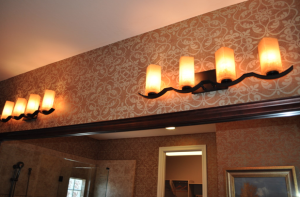
Oasis at Freeman Farms 083Oil-rubbed bronze faucets and lighting stay with the warm-toned theme. This finish has become a classic since its introduction and it works beautifully in both modern and more traditional homes. The light fixtures with their bronze bases and amber glass shades echo that warm feeling while their design stands out over the more standard bathroom fixtures.

These details separate this bathroom from a more basic look, and create a space that will serve as a particularly enjoyable spot to get ready in the morning and prepare for bed at night.


Finishing Touches make Kitchen Special

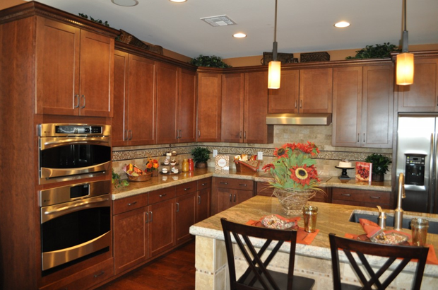
Oasis at Freeman Farms 072When designing a kitchen, you can easily get caught up in choosing just the right appliances, the perfect cabinets, and knock-out flooring. But don’t ignore the smaller decisions that can bring your kitchen from well-designed to wow! Let’s take a look at just a few of the finishing touches available at the Fulton Homes Design Center that help create a kitchen to turn heads.

Cabinet crown molding: These straightforward Shaker-style cabinets step it up with crown molding at the top. This is dentil crown molding – called that because the row of wood squares below the crown resembles teeth. This type of trim dresses the cabinets up and adds perceived value far beyond the minimal additional cost. Be sure to investigate your trim options when choosing your cabinets.

Pendant lights: These pendants have an industrial-appearing foundation with the look of matte iron, and a sharp squared-off glass shade. Add an amber tone to the glass and you have a stand-out sculptural look to these pendants. Check out the choices for pendants available at the Fulton Design Center and add that sophisticated and functional touch over your kitchen island.

Tile or stone trim: This kitchen’s backsplash is splashier thanks to the row of decorative stone running a few inches below the cabinets. Choosing to install a row of interesting tile or stone within a simpler pattern creates a much more interesting look with a minimal increase in cost. By adding a small line of the same stone as part of the tile surrounding the island, the two areas are tied together and both end up more interesting.

Each of these three choices had a minimal impact on this kitchen’s cost, but the result far exceeds the expense. So take the time to look at the details and create a truly special kitchen!

China Cabinet Provides Great Home Office Storage

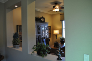
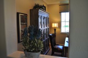
A home office that’s visible from other places in a home, particularly one like this one in the Fulton Homes La Quinta model at the Oasis at Freeman Farms community, needs to look like residential space. Metal file drawers and other evidence of a working space don’t suit most homes.

One smart solution for home office storage comes from the dining room – with a full-size china cabinet. If you choose one like this piece in the photo, the glass distracts from the office supplies within the cabinet, and it looks elegant and appealing in this room.

A china cabinet can hold files, paper and office supplies, as well as current projects. Combined with the simple desk and leather chair, the space feels more like a study than an office. Add a laptop that can be put away when you’re finished, and you have a fully functioning office that still works well in this residential environment.

With the help of a wireless router, peripherals such as printers can be located in another room with every computer in the house able to access them. The laundry-room countertop provides a great location for central access – out of the way yet convenient.

Be sure to decorate your home office with the same care you use in the rest of your home. Placing a floor lamp in the room allows you to work with softer lighting than a ceiling fixture. Art and accessories finish this space and connect it with the rest of the house. Window coverings should be selected to minimize glare on your computer screen.

With just a little thought and effort, you can have a home office that is functional and still suits your home’s style.


Lighting Connects Great Room Spaces

When you’re working with a great room, you want to balance the need to separate the functional areas with choices that integrate the spaces. Consistency in design helps make that integration possible.

In this great room, from the La Quinta model at the Oasis at Freeman Farms community, one unifying feature comes from the lighting. Let’s consider the light fixtures in this space.

First, take a look at the chandelier over the dining table. It has an appealing warm finish, with bell-shaped glass shades in an amber tone. Now notice the ceiling fan. The metal finish and the amber tone match the dining chandelier, although the type of fixture is completely different.

The pendants over the kitchen island have a more streamlined shape. This works well as they are in line-of-sight from the kitchen to the rest of the room. However, the glass mirrors the same amber tone that’s been part of the other light fixtures.

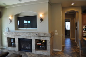
Finally, take a look at the sconces above the fireplace. The finish, the shape of the glass shades, and the color of the glass are the same as the chandelier.

Design consistencies such as these make a space feel connected throughout. Other elements such as the similar tiles on the kitchen island and the fireplace surround, the same flooring, and the paint choice integrates every aspect of this space.

A great-room design depends on choosing lighting, flooring, tile and colors that work for every functional area. In this room, everything flows together to create a warm and inviting space.

Glass Block Allows Light and Privacy

It’s a challenge with a bathroom. You want natural light but without losing the privacy that this room requires.

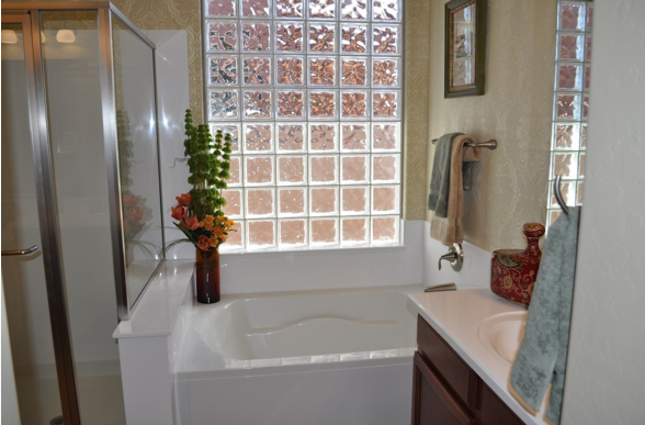
Here’s a great solution. This bath, from Fulton Homes’ Rancho Mirage model at the Oasis at Freeman Farms community, uses glass block to provide both natural light and privacy in one.

In this location, right above the bathtub, privacy is critical, but standard window coverings could be awkward. With block, you don’t need any additional screening, and the glass itself provides an inviting clean look. Glass block works well in both traditional and modern environments, and gives an inviting backdrop for accessories such as the vase of flowers on the tub surround.

Another smart feature with this bathroom design is the clear shower surround. This allows the natural light, or the bathroom lighting, to shine into the space, providing plenty of comfortable light for showers.

This type of four-piece bathroom design is popular for master bedroom ensuites (or bed and baths combined into one suite) because you have the option of showers for quick mornings and a tub for long soaks in the evening. This helps turn the bathroom into a place to relax and unwind from a long stressful day.

The décor uses brown and gold tones on the wallpaper, accessories and towels. This design choice helps to warm up the space. If you prefer a cooler look, consider doing this bath in blue and white. The glass block will combine with those colors to create a seaside feeling.

As you plan your bathrooms, consider including glass block to solve the light/privacy challenge, and to dress up the room with this interesting design element.

Mix of Colors Pop in Kitchen

Did you ever wonder why some spaces just seem more colorful than others? Well, one reason is the result of using complementary colors in a room. Complementary colors sit on opposite sides of the color wheel.

The primary complementary colors are orange and blue, yellow and purple, and red and green. If you put bright versions of these color pairs next to each other they will actually seem to vibrate. However, you may not want to use the strongest versions of those colors. Instead, choose a slightly different, lighter or darker shade to take advantage of the contrast without creating too much of a color conflict.

This kitchen, from the Fulton Homes Rancho Mirage model at Oasis at Freeman Farms, uses a coral shade of red and a few yellow-green hues combined to add color to the space. Although the fundamentals in this room – cabinets, flooring, countertops and appliances – are neutral, the careful addition of colorful accessories makes the room feel full of color.

This design concept continues onto the great room sofa visible in the foreground. Once again the larger piece – the sofa – is neutral but brightened by two throw pillows which echo the coral and green colors visible in the kitchen. The fun thing about this approach to color is that it’s easy to change out your choices without spending a lot of money. Paint, pillows and accessories could be adjusted with the seasons or even your mood.

Do you want more color in your home? Don’t let your current neutral decor keep you from adding pops of whatever colors take your fancy.

Triangular Kitchen Island has Multiple Uses

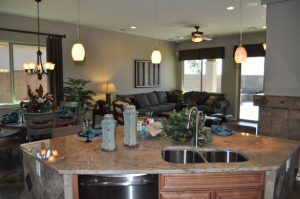
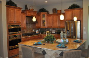
While most kitchen islands are rectangular, sometimes another shape provides additional functionality. Take a look at this island in the La Quinta model at Oasis at Freeman Farms. The modified triangle shape has several functional advantages.

Kitchen triangle: The classic shape for the most functional kitchen space is a working triangle, with oven, stove, refrigerator and sink in easy reach of each other. The trimmed edge of this island on the kitchen side creates an actual open triangle for cooking. The extra space makes this tidy kitchen feel more spacious, especially if two or more cooks are working together.

Eating space: The cropped edge on the great room side of the island provides room to spread for three and can hold up to five people comfortably, as you can see in the photo above. This space works well for quick breakfasts with someone playing short-order-cook at the stove or for homework with a parent’s help while they fix dinner. Remove the chairs and the island creates a perfect stage for party appetizers.

Cleaning with a view: After dinner at the dining table, dishes can be brought to the island and placed in the dishwasher while the cleaning crew chats with the rest of the family or guests. With the sink/dishwasher area set up in the island, post-meal clean up clean-up doesn’t isolate the tidying team.

Well-lit: The pendant lights provide additional spot lighting for any tasks completed on the island, while adding a contemporary element of style to the space. Between the lights and the island itself, the kitchen area is clearly defined without being separated from the rest of the home’s living area.

Thoughtful design makes this great-room kitchen functional and fun, with an island shape made for functionality, whether as part of a simple family dinner or entertaining a group of friends.

Outdoor Living Space

As we move through Arizona’s short and easy winter months – all two of them – it’s time to think about one of the best times of year here – spring. From about February until the heat finally comes upon us, we can spend serious time outside. Fulton Homes always factors appealing outdoor options into its home designs.

This patio, part of the La Quinta model at Oasis at Freeman Farms, provides a secluded space to enjoy our perfect weather. This inviting side patio shows the four F’s of working outdoor space –four smart decisions that make the space particularly appealing and effective. Take the time now to determine what you need to do to make your outdoor area ready for spring.

Function: What do you want to do with your outdoor space? Before you choose furniture and accessories, it’s smart to determine how the space will be used.

Flooring By continuing the inside tile choice outside, the space feels like a continuation of the indoor area. This makes both the indoor room and outdoor patio seem larger more integrated. Choosing tile also makes it easier to keep the patio clean and attractive.

Furnishings: Creating an outdoor space with a feel similar to indoor areas is easier than ever given the wide variety of sun and rain resistant fabrics and cushions. This patio is spacious enough to include a comfy conversation corner and a place for al-fresco dining. The consistency between the outdoor furnishings and the indoor pieces further the connection between the two areas.

Fountain: A wall-hugging fountain adds warmth to an outdoor space, both visually and aurally – with the sound of splashing water helping to reduce stress and creating an inviting ambience.

Well, alright, the fountain shouldn’t really count as the fourth F – it is optional. But if you spend some time in an outdoor space with a fountain, you may quickly determine that it is a necessity. To help you decide, we’d like to invite you to visit this outdoor area – currently on display in our La Quinta model home.

Cozy Guest Room

With the coldest of winter weather across the country, this is a great time for family and friends to decide to visit Arizona. Our sweater weather is still warm enough for folks from the East Coast to wear shorts, and they are totally unused to sunshine.

Given this, it’s wise to plan a guest room in your home. This room in the Whitewater model in Fulton Home’s Oasis at Freeman Farms community is a good example. A few simple choices can make your spare bedroom a welcoming space that keeps your visitors comfortable. Here are a few suggestions.

Use color: Look for a coverlet and shams in bright colors and lively patterns. This choice warms up a room and provides a strong focal point. Look for bed linen sets that include a duvet, shams, a dust ruffle, sheets and pillowcases. These packages are often on sale, or available with coupons. They also come in a variety of colors and styles so you can find one that appeals to your taste. Choose art that complements the bedding so that the room feels coordinated. It’s also nice to have a mirror in the room.

Provide lighting: This room has two bedside lamps that can be turned off once your guest or guests are in bed. This is particularly important considering that your guests don’t know their way around and you don’t want them wandering in the dark. You may also want to put a nightlight in the room.

Include extras: A chest of drawers and some space in a closet make your guests feel welcome. You may also want to place basic sundries such as travel sizes of shampoo and conditioner, a toothbrush and toothpaste. With just a few touches such as this, your guests will find themselves enjoying more than our warm weather and sunshine.