Design Center: Pot filler

4 Pot Filler Design Center 016Would you appreciate never having to haul a heavy pot of water between your sink and range again? If you enjoy pastas, soups and stews, you may find that a pot filler reduces back strain, prep time and makes meal preparation that much easier.

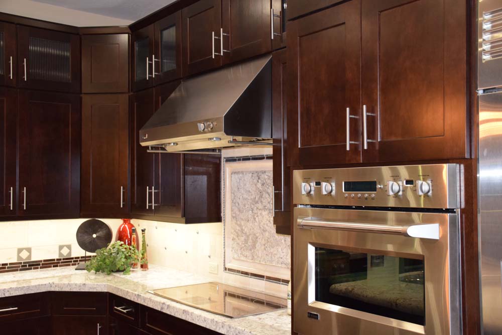
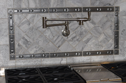
Even your largest pasta pot will fit under this faucet. Its hinged design means that you can push it out of the way when you don’t need it and grab it easily when you do. Whether you use it to fill large pots or just add water to your saute pan to slow down the cooking, this pot filler will save steps.

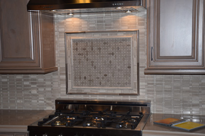
By adding metallic tiles to the backsplash, this pot filler is well integrated into the kitchen’s design. The structure allows you to pour water as needed for any pot or pan on your stove.

Are you not sure how much you would use this? Try an experiment. Put a post-it note above your stove and jot a check for every time you fill a pot, pan or kettle with water from the sink before you bring it to your range. You may be surprised at how often you could save yourself the steps if you could access water right at your stove. Now, multiply that by 52 – and don’t forget to factor in holidays, parties and family gatherings which will only add to the sink-to-stove trips. And don’t forget that all those trips include hauling heavy pots filled with water around!

Well, is it worth it for you? A pot filler may be one of your smartest kitchen features!

Design Center: Using the Kitchen Vignettes

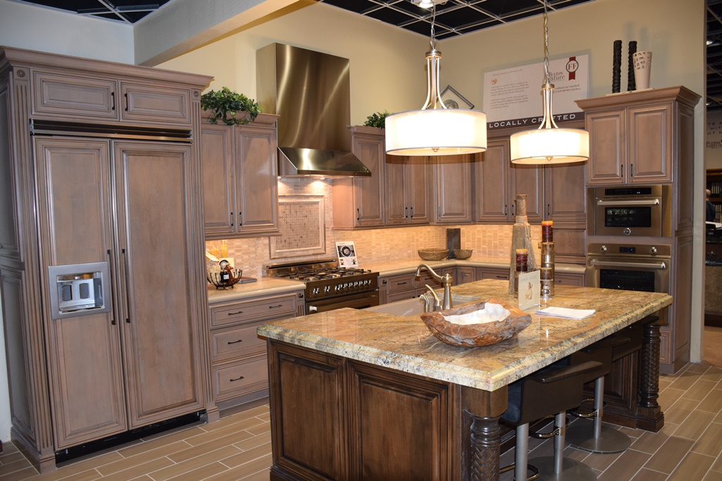
Design Center 016What do you like about this kitchen vignette from the Fulton Design Center? Let’s take a look at just some of the decisions this vignette can help you with when planning your own kitchen.
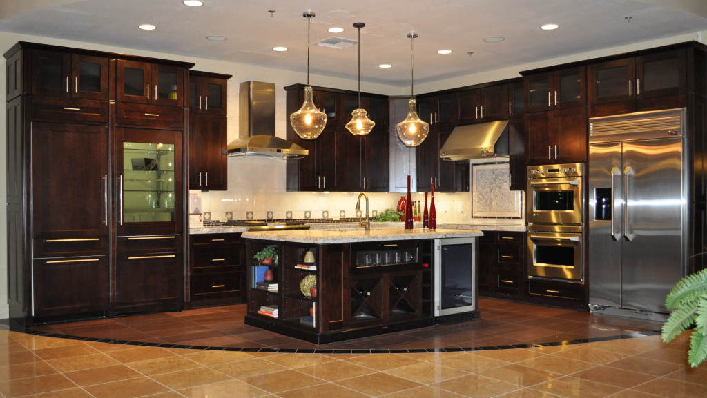
Stainless or cabinet doors on some appliances? Would you rather have your refrigerator with doors that match your cabinets like this one, or do you want the pop of stainless? You have a good opportunity to see this look, and can check out other vignettes that have stainless refrigerator doors. Also, this is a built-in refrigerator. Open the doors and see if the space would work for your family. Do you like this look better than a stand-alone?

Matching or contrasting island cabinetry? This island shows the same cabinet style – a good design decision – while demonstrating a darker warmer tone for the stain. Are you drawn to this look or would you rather have an island that matches the rest of your kitchen’s cabinets? Even if these aren’t the cabinets you would choose, you can get a good sense of the approach by walking through this kitchen.

Lower drawers or doors or both? More home cooks today have discovered the joy of large lower cabinet drawers. These can hold pots and pans, table linens, and other kitchen staples without the cook bending over and digging through a cabinet to find something.

Cabinet design characteristics: Do you want this staggered profile for the tops of your cabinets or an even approach? Would you prefer more or less crown molding – or maybe no crown molding?

Whatever decisions you need to make for your kitchen, the Fulton Design Center vignettes can help you when designing your own Fulton Home kitchen. So open doors and drawers, walk around and through, turn knobs and faucets and get a feel for what each vignette offers. This experience will help you make educated choices for yourself and your home.

Design Center: Backsplashes

 Backsplash in a Fulton Design Center kitchen vignette.

Backsplash in a Fulton Design Center kitchen vignette.

This backsplash links the cabinets and countertops, highlights the range through a focal-point approach in the tile design, and increases the easy maintenance of the kitchen. The overall design of the inviting horizontal rectangles takes this kitchen into the range of something special. Your backsplash is the art in your kitchen – one place where you can declare your taste with an eye-catching visual.

Would you like the warmth of stone on your backsplash? Perhaps you lean toward the traditional and might select a high-gloss subway tile. This approach, once considered retro, has developed into a high-style choice for kitchens and baths. Maybe you want something modern to add color. Then you may be inclined to choose glass tile in vivid shades and tones. No matter your choice, how about adding some embossed metal tiles to bring in the bling?

With its inviting and extensive selection of tiles, listelles, which are pre-designed rows of tile or stone, materials, colors and textures, your backsplash is one of the best ways to define yourself and your style in your kitchen.

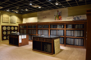
16 Tile Display Design Center 037Use your cabinet and countertop choices as a starting place. Do you want a backsplash that blends in with your selections or something with a strong contrast? You might want to experiment with the Fulton Homes Kitchen Designer on our website to give you some ideas. Then visit our Fulton Design Center kitchen vignettes to see some of the choices our designers made. Once you see some of the possibilities, you can create a backsplash that suits your style and taste. The relatively small square footage of your backsplash allows you to develop the look of your dreams without a severe hit to your budget.

For insight into your many backsplash options, why don’t you visit the Fulton Design Center on one of our browse nights? We’re open the first and third Thursday evenings of every month to allow you to explore at your own pace.

Design Center: Kitchen Plans

Kitchen 1 (1)Do you have a vision for your perfect kitchen? Perhaps you’ve visited friends with beautiful kitchens, selected some of your favorites from magazines and Pinterest, or just pictured the kitchen you would love to work in every day.

Well, you can do more than just dream of that kitchen; you can create it at the Fulton Design Center. With literally thousands of combinations of cabinets, countertops, flooring, appliances, faucets, lighting and backsplashes, your kitchen plan can come to life.

Cabinets Design Center 032Start by selecting your cabinets. With your choice of woods, styles and stains or paint, and your other options such as glass doors on upper cabinets, you are only limited by your imagination.

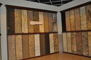
Countertops are a good second Design Center 014selection. Do you want granite or quartz? Light or dark, or maybe a gold with streaks of brown or black? Choose your favorite, using the sample of your cabinet choice to help narrow your decision.

Flooring comes as a natural next step, and you want to make sure the choice meshes well with your other selections. Enjoy the rich selection of tile available, possibly choosing one that reflects the tones of your countertop.

You might also take a look at the exciting new option of tile that patterns itself after wood, providing the warmth of that look while also including the low maintenance advantages of tile.

Consider a backsplash that adds a dash of daring to your kitchen space; one that you will enjoy looking at every time you fix a meal in the dream kitchen you planned for yourself. For more ideas, visit the Fulton Homes Pinterest board “Kitchens”.

Make a Fulton Home Yours – Kitchen Design Online

Fulton Design Center Kitchen Vignette

Fulton Design Center Kitchen Vignette

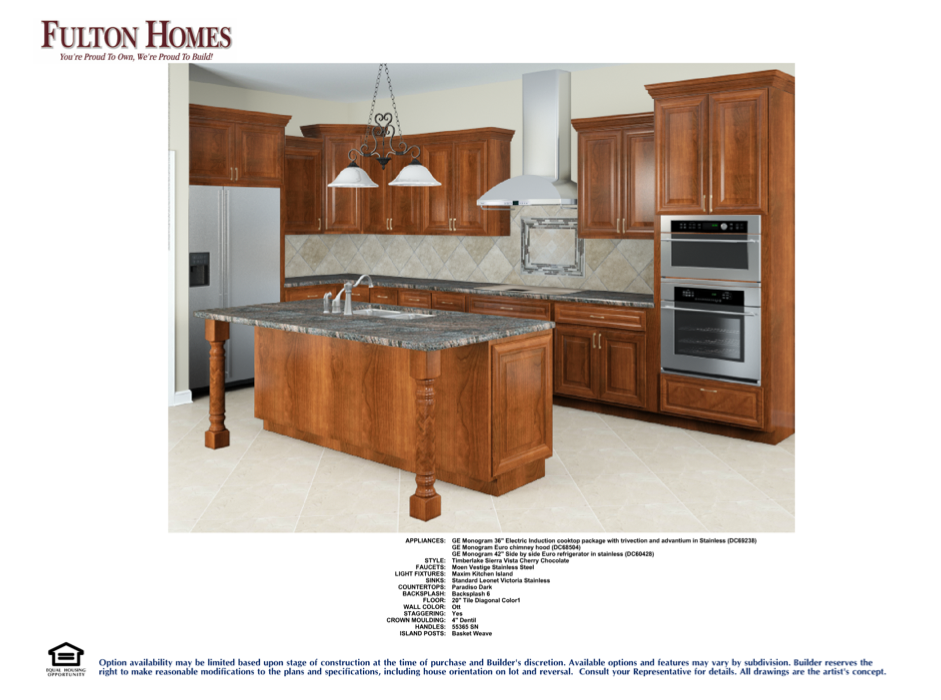
Is this your dream kitchen? Maybe – but what if you would rather have a more traditional cabinet style, a lighter wood, and a more dramatic range hood.

But maybe you’re not sure. You have an appointment at the Fulton Design Center next week, but you are still debating about the look you want in your kitchen.

Well, you’re in luck. With Fulton Homes Design Online program for kitchens, you can take a look at many styles and tones of cabinets, different countertops, flooring, lighting, backsplashes, appliances and even paint. Thinking about lighter cabinetry – try it out here. Are the black appliances too dark against the cabinets you like, switch to stainless steel – you can always switch back if you prefer.

Screen Shot 2014-06-30 at 11.11.39 PMSave your favorites so you can go back and review them later. Fulton lets you create your own account to collect your ideas.

The best part is your ability to try just one little change to see which way you like your kitchen best. Thinking about staggered cabinets but you’re not sure? Try your kitchen both ways to see which appeals to you the most. Dark cabinets can look good with dark countertops, but you might find a golden tone works best for the kitchen you want.

No, Fulton doesn’t offer every choice here that you have at the Fulton Design Center – it would take you forever to narrow everything down online with the incredible mix of options available. But this does give you a tool to figure out what you want as an overall look. Print out your favorite and bring it with you to your design appointment. Then focus on selecting just the perfect options to make your kitchen as unique as you are.

Why not experiment? Visit http://www.fultonhomes.com/kbchanger/changer to create your own look!

A Space all your Own

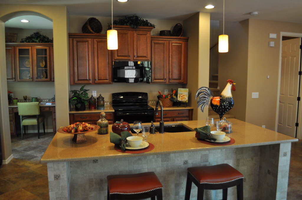
Kitchen DSC_0292Yes, this is a lovely kitchen. Pendant lights hang down on an oversized island. You have plenty of room to fix even the most complex of meals. But we’re not talking about the kitchen today. Instead, take a look to the left in this photo – to a small room off the kitchen with a built-in desk and cabinets. That space belongs to you.
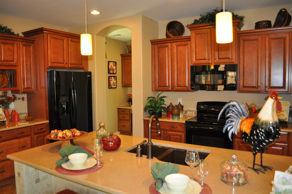
What would you do with this piece of real estate all your own with no structured purpose? It could be a spot for organizing the household – keeping the family calendar updated along with lists of responsibilities and plans for upcoming weekends.

It could be used to track and pay bills, check email and visit Facebook or Pinterest. Or how about using the space for scrapbooking or writing holiday cards or thank-you notes? The cabinets above the desk could hold extra notepaper or those holiday cards you bought on sale last January – easy to find when November rolls around again.

What about gift wrapping? It might be the place where you keep extra office and school supplies or even some art supplies for emergency homework projects. You could tuck yourself in here every evening with a nice cup of tea and write up your to-do list for tomorrow – or just read a magazine.

Finally, this space could fuel your dreams. Always wanted to start your own business? You could start it here. It’s your space to do with what you want. Fulton Homes wants to help you make all of your dreams come true, and give you the space for it.

Pinterest on Kitchens

From Fulton Home's Cascade model

From Fulton Home’s Cascade model

If you’re in the process of choosing finishes for your new Fulton Home, you may be challenged by all of the cabinets, countertops and other options. Pinterest provides a great way to start determining the right kitchen look for you. Check out the Fulton Homes Pinterest site and our board Kitchens. There you’ll find many of the kitchens created at the Fulton Design Center as well as in the various model homes.

Wondering if you want dark cabinets? You’ll see a number of kitchens with that choice. On the other hand, if you want painted cabinets take a look to see whether the look appeals to you. You can also get ideas for just the right backsplash, flooring and appliances.

Are you thinking of some special tile choices to make your island stand out? Fulton’s Pinterest board has some good examples. You’ll also see many of the kitchen lighting options in place.

While you’re looking at the photos, you may also want to read some of our past kitchen blogs to gain insights into the design process for your kitchen. You can access them at this site, or review the kitchen blogs on our Pinterest kitchen board.

Fulton Homes on Pinterest has been custom designed to make your home buying experience easier and provide interesting information for you once you’re settled in your new home. We hope you’ll visit it often.

Kitchen/Family Room with Color

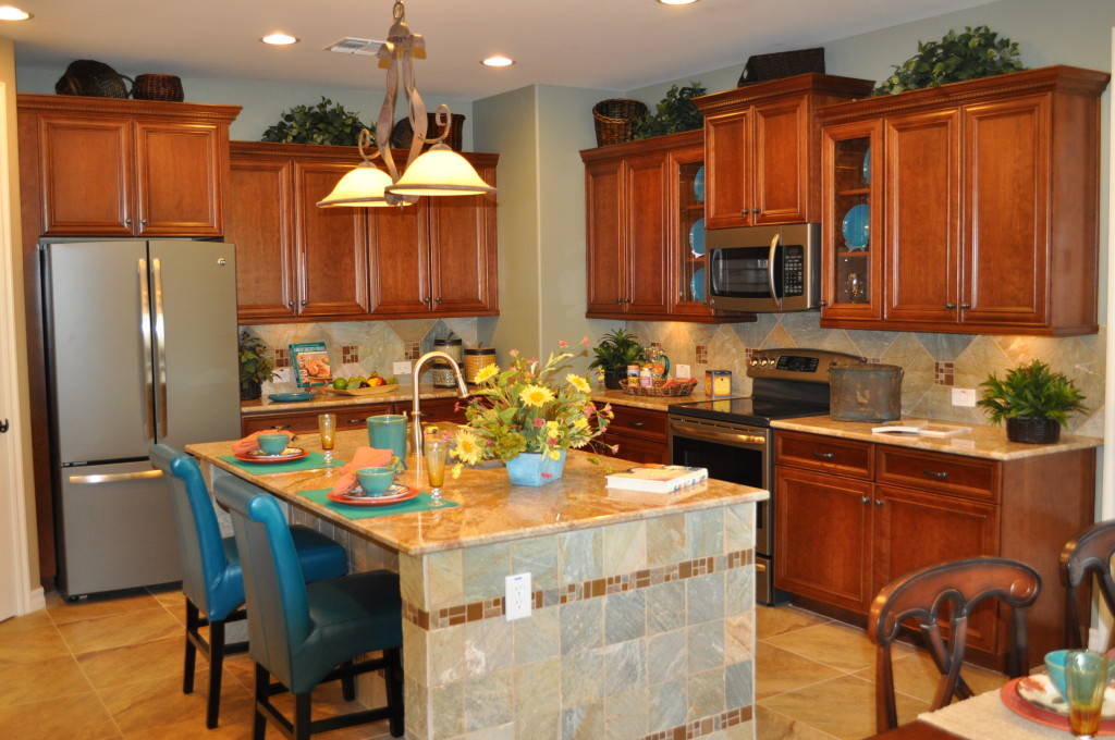
Kitchen DSC_0324Wood cabinetry, granite countertops and tile floors limit the color options unless you are willing to commit to a strong color choice that you will have to live with for a long time. But color can come into a space like this in so many ways.

This kitchen and family room, from the Fulton Homes Cascade model, demonstrates smart ways to introduce color. Let’s take a look.

Glass cabinet displays: Glass in several upper cabinets opens up a space and adds personality. This kitchen takes advantage of the visual by displaying blue plates. Notice that the tile on the side of the island has a blue cast, and this color is carried throughout the kitchen.

Island chairs: Selecting chairs to match the cabinets would be a safe choice, but lacking in creativity. This blue leather brings the plate colors to the other side of the kitchen while the wipe off finish makes them perfect for coping with after-school snack accidents.

Accessories: Placemats, dishes and flowers pull more colors into the space. Other counter accessories and even the items above the cabinets can carry a colorful theme throughout the room.

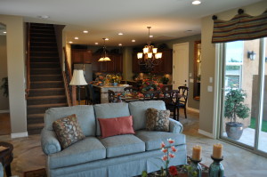
Family and Kitchen DSC_0306 outdoor connectionFamily room coordination: The family room provides more opportunities to introduce color, and the sofa, window treatments, accessories and throw pillows echo the kitchen colors. \

These choices keep color front-and-center in this family-friendly space. Blue and rust bring the space to life. What colors would you like to see in your kitchen and family room? Whatever you choose, color will warm your home and add interest while saying welcome to you and your guests.

Make the Most of your Kitchen Island


Fulton Homes Daylight Model

Fulton Homes Daylight Model

Kitchen islands create a better work situation in a kitchen, particularly when you have more than one cook. For example one person can chop vegetables while another pulls seasonings from a cabinet.

Or with a sink in the island like this one in the Daylight model of the ____ community, one person can stay ahead of the dishes when preparing for a party or big family dinner.

But an island also plays a role outside of cooking. How about using it as a place for appetizers as people arrive for a party? It provides a central location to draw people together as they get to know each other – people will always follow the food. You can start moving appetizers into the family room as your guests get more comfortable and break into smaller conversational groups.

A kitchen island makes a dynamite location for a buffet. Traffic can move on all four sides, and the trip from the kitchen is just a step. This works particularly well for hot or cold food that you want to keep refreshing. Setting chairs and tables in other parts of your home will encourage people to help themselves to food and then settle elsewhere.

When it’s just a few family members, eating at the island opens up a cozy setting for two or three. It’s also a great place for breakfast when family members are short on time and have staggered departures. Just provide plates and platters of food and everyone can help themselves. Or how about a cereal bar – several types of cereal, bowls, milk and extras such as raisins and fruit?

Look at your island as the kitchen’s stage, and you can take advantage of it for all of your food performances.

Selecting Tile Accents

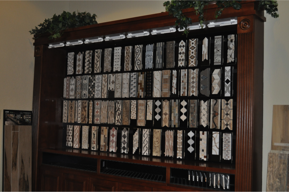
FultonTileAccentsListelles such as the ones shown above on display at the Fulton Design Center provide one of the best bangs for your buck when designing your new home. Just add a strip of personality along your shower at eye-level or below, or use it as a border at the top of your wall tile.

Spark up your backsplash by creating a rectangle above your stove using the listelle design you like the best. When you visit the Fulton Design Center, take a few minutes to browse your options for these accents. Color, tone and texture combine to make a rich selection of approaches to personalizing a kitchen or bath.

The geometric options work well with modern homes, although some like the diagonal squares in the bottom row of this display also have a classic appeal. Listelles also come in more organic designs. Take a look at the pattern on the top row, the fourth from the left. The vined approach would add a natural feeling to your home.

How strong do you want your accents to be overall? If you are looking for a subtle feel, choose tone combinations with minimal contrast that blend in with your other tile or stone choices. On the other hand, if you want to really showcase your accents, go for high contrast – both within the listelle itself and compared to your overall look.

Be sure to take a hands-on approach to your selection. Bring your main tile or stone selection over to this display and lay your favorites next to it to see the impact. Remember to factor in grout color. Have some fun with this choice. It’s a great way to make your Fulton Home uniquely yours.