Bedroom with Nautical Theme

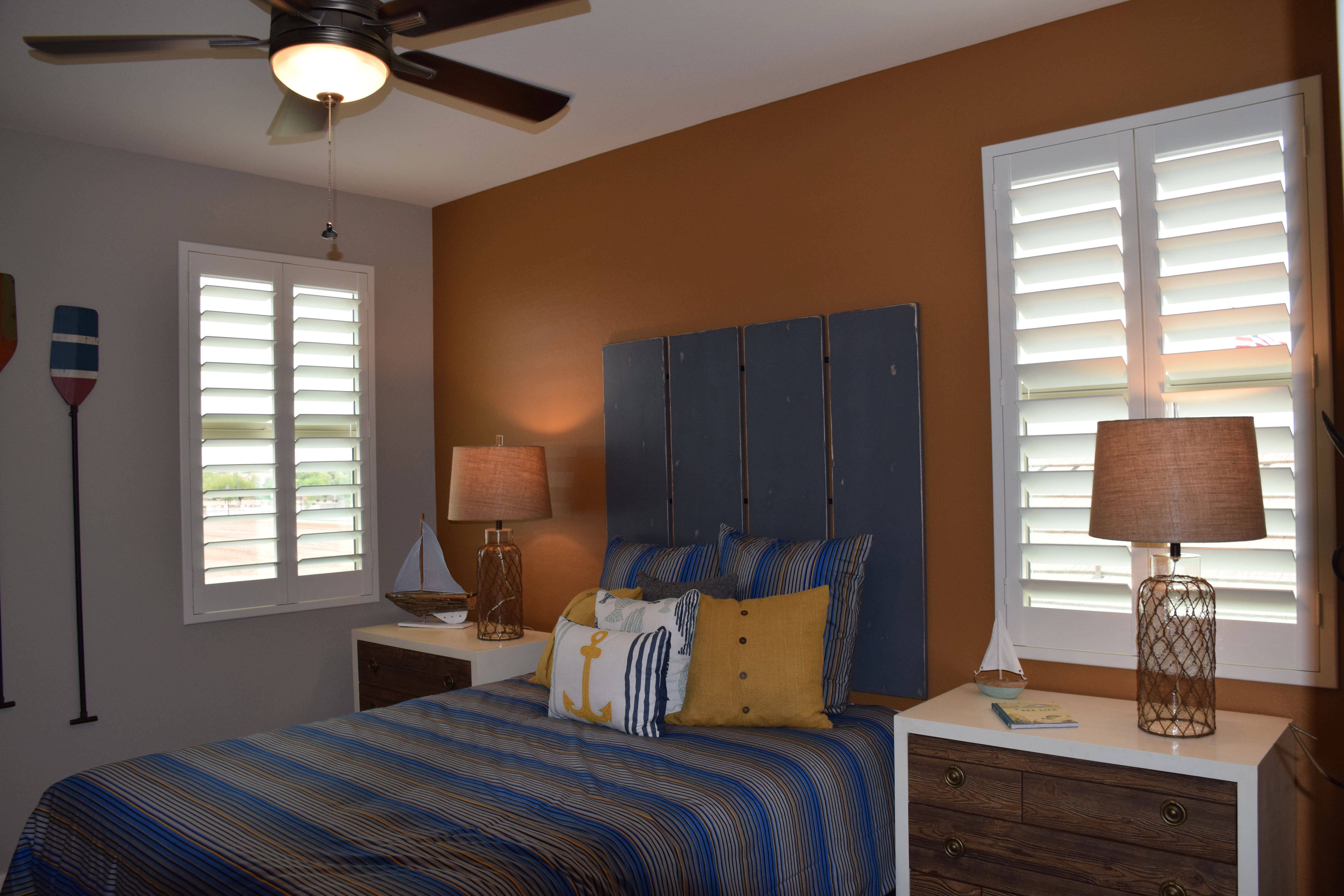
wWarner-Groves-at-Morrison-Ranch-070Decorating with a theme makes a room fun, and this nautical option offers lots of choices for colors and accessories. Let’s take a look at this inviting bedroom above to get some ideas.

Color scheme: Blue is a given. You want to capture the color of water when you bring in a beach/boat theme. The secondary color – the focal hue on the back wall – captures the feeling of sand.

Patterns: Notice the wave pattern on the bedspread. This gives the feeling of water in the room. The woven bases on the table lamps remind you of fishing nets, bringing in another element of the ocean to this beach-like bedroom.

Accessories: An anchor appliqued on the throw pillow certainly brings a nautical element into the space. Several model sailboats also contribute to the mood. A final fun element comes from the oars hanging on the walls. The paint choices make these items particularly interesting, Creativity certainly came into play in this space.

You don’t have to live on the water to bring an oceanside feeling into your home. With a little planning and some flair, you can create a beach space even if you live inland. To see this room in person, visit our Sycamore model in Warner Groves in Morrison Ranch.

Elegant Master Bedroom

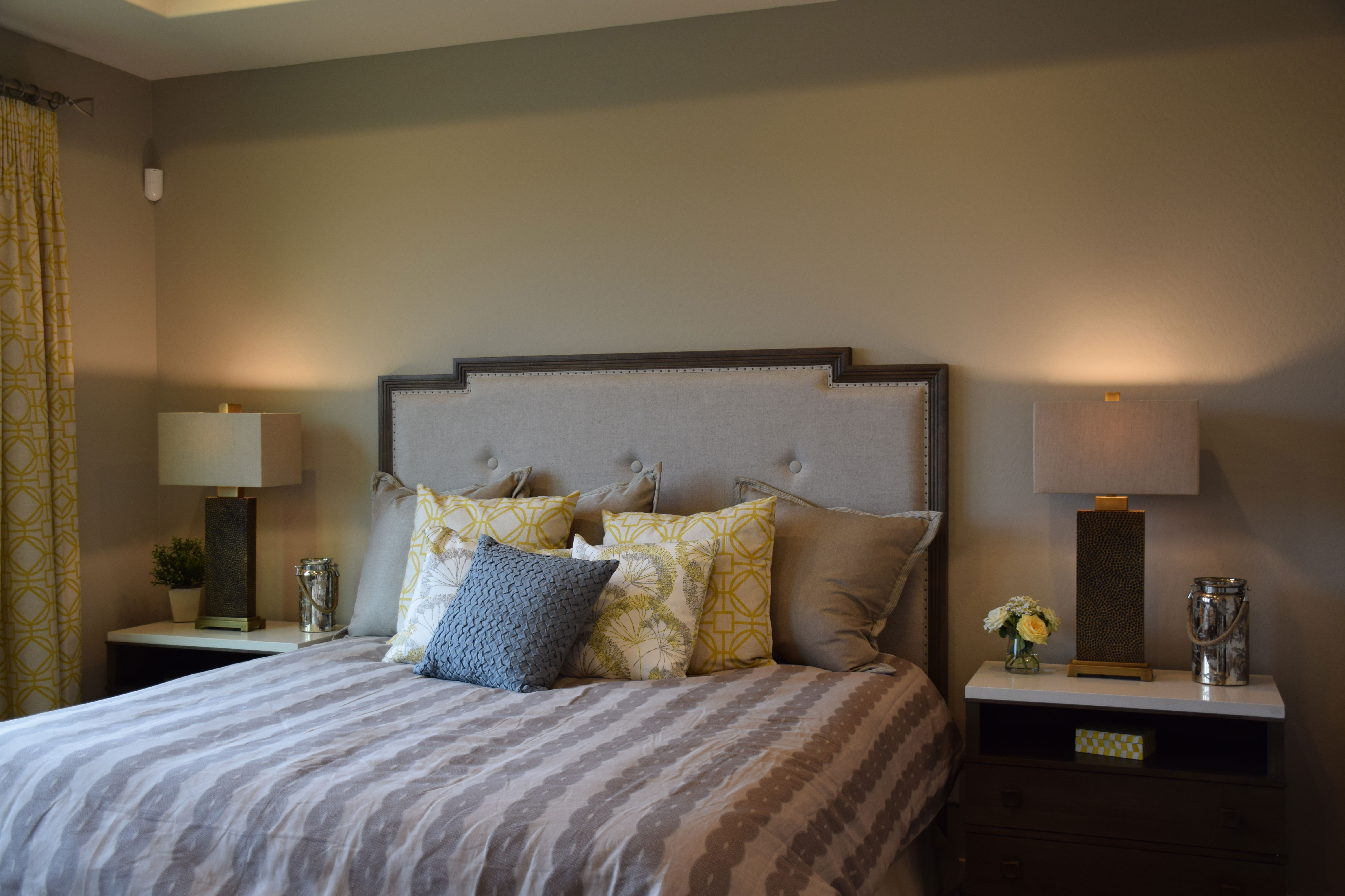
wWarner-Groves-at-Morrison-Ranch-062If you want a master bedroom with all the elegance of a fine hotel, you can create it with just a few touches. Let’s take a look at what makes this bedroom special.
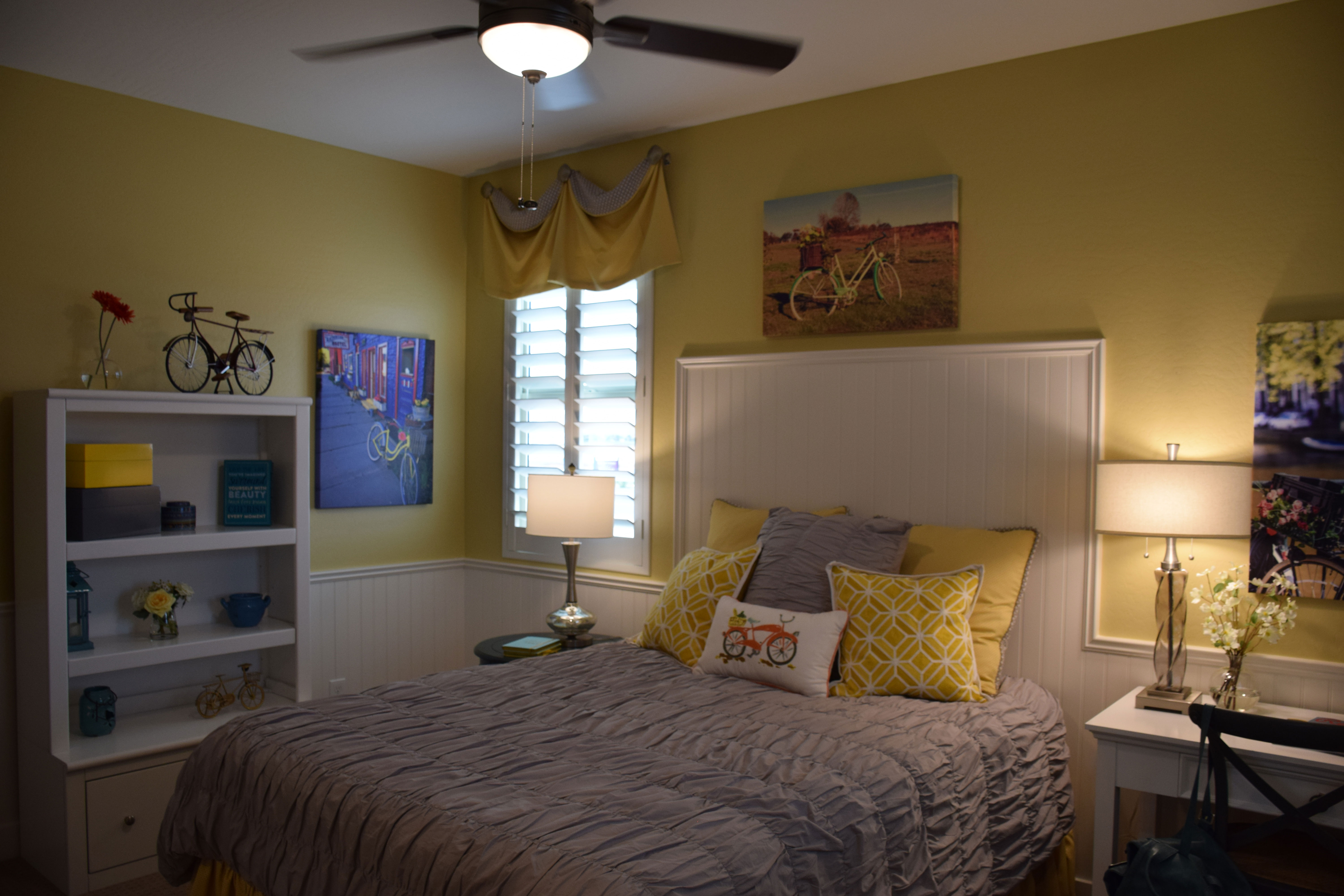
Padded headboard: If you like to read or watch television in bed, a padded headboard makes the entire experience much more enjoyable. This headboard is high enough to lean back without your head hitting the top, and the extra-large pillows make it easy to get comfy. A padded headboard is one investment that keeps paying you back.

Matching nightstands: There is a pleasure in the symmetry of matching nightstands. Take a look at how these two really set a style for the room. With their white marble tops and dark finish, they tie in with the headboard but still stand out. Notice the height also – a bit higher than standard to make them the right height for the raised bed.

Matching lamps: The rectangular linen shades provide a splash of sophistication. They match the bases, and also allow you to set the lamps further back than round shades would, leaving more room on the nightstands for whatever else you want to put there. The opaque shades light up the room without shining light into your eyes – a smart choice.

Subtle colors: Grey, a soft yellow, dark brown and white create a sophisticated palette. The fabrics offer just enough pattern and texture to add interest. All in all, this room is designed for stylish comfort. Check it out at the Sycamore model at Warner Groves in Morrison Ranch.

A Theme Bedroom to Reflect Interest

wWarner-Groves-at-Morrison-Ranch-068 - CopyIf you or a child of yours has a strong interest in something, it’s fun to pull that concept into your decor as a theme in a room. This room, from the Sycamore model at Warner Groves at Morrison Ranch, shows how to do this effectively while keeping design elements in place.
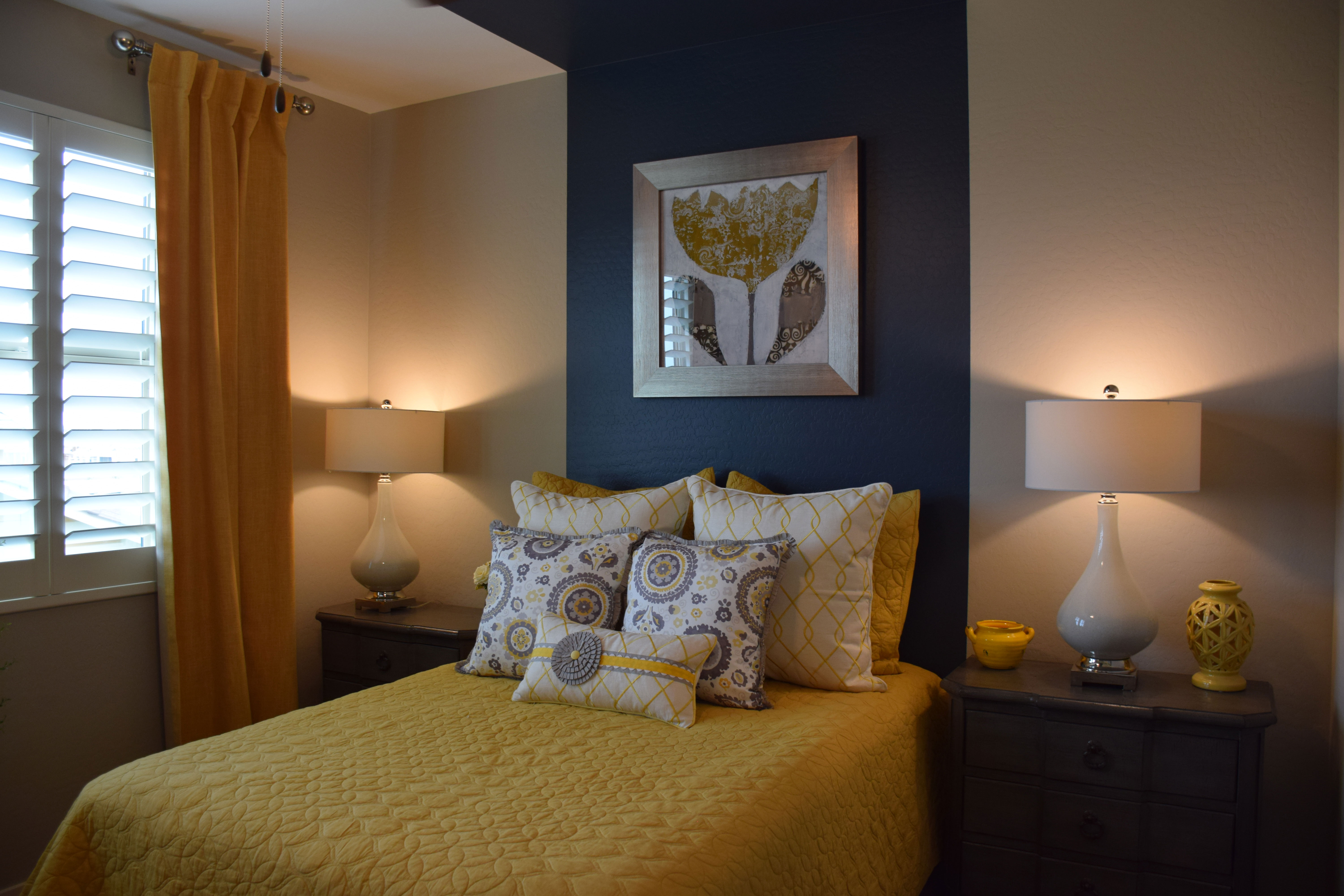
To start, the molding makes this room feel whimsical. Wainscoting jumps up to become a headboard for the bed, integrating the space while adding interest. The molding choice is echoed in the white painted furniture, working well with the wall-mounted headboard molding.

With the bright white furniture, this bedroom can handle a vivid yellow on the walls. Yellow is a tough color for walls because it can easily move from this cheerful lemon to a rather discouraging egg yolk if you’re not careful. In this case the shade is perfect – bright without being overwhelming.

The bicycle theme is consistently present in this room, but not to the extent of being irritating. One reason this works is the restraint in its use. The applique on the pillow, bike-themed artwork, and a couple of charming mini-bikes as accessories play up the theme without making the room scream with it. Smart and cute, this room would appeal to anyone who has ever enjoyed the pleasure of riding a bike.

Notice the addition of a grey bedspread and pillow. This tames the yellow, making it feel sophisticated rather than childish. A smart decision. Visit our models in Warner Groves at Morrison Ranch to see this and other charming bedrooms.

Let Color Create Character in a Room

wWarner-Groves-at-Morrison-Ranch-069 - CopyYou don’t need to spend a lot of money on furniture to create a guest room with personality. Take a look at this bedroom from the Sycamore model at Warner Groves at Morrison Ranch. The room has no headboard and simple matching nightstands with lamps. Yet it has a charm all its own. Let’s take a look at why.
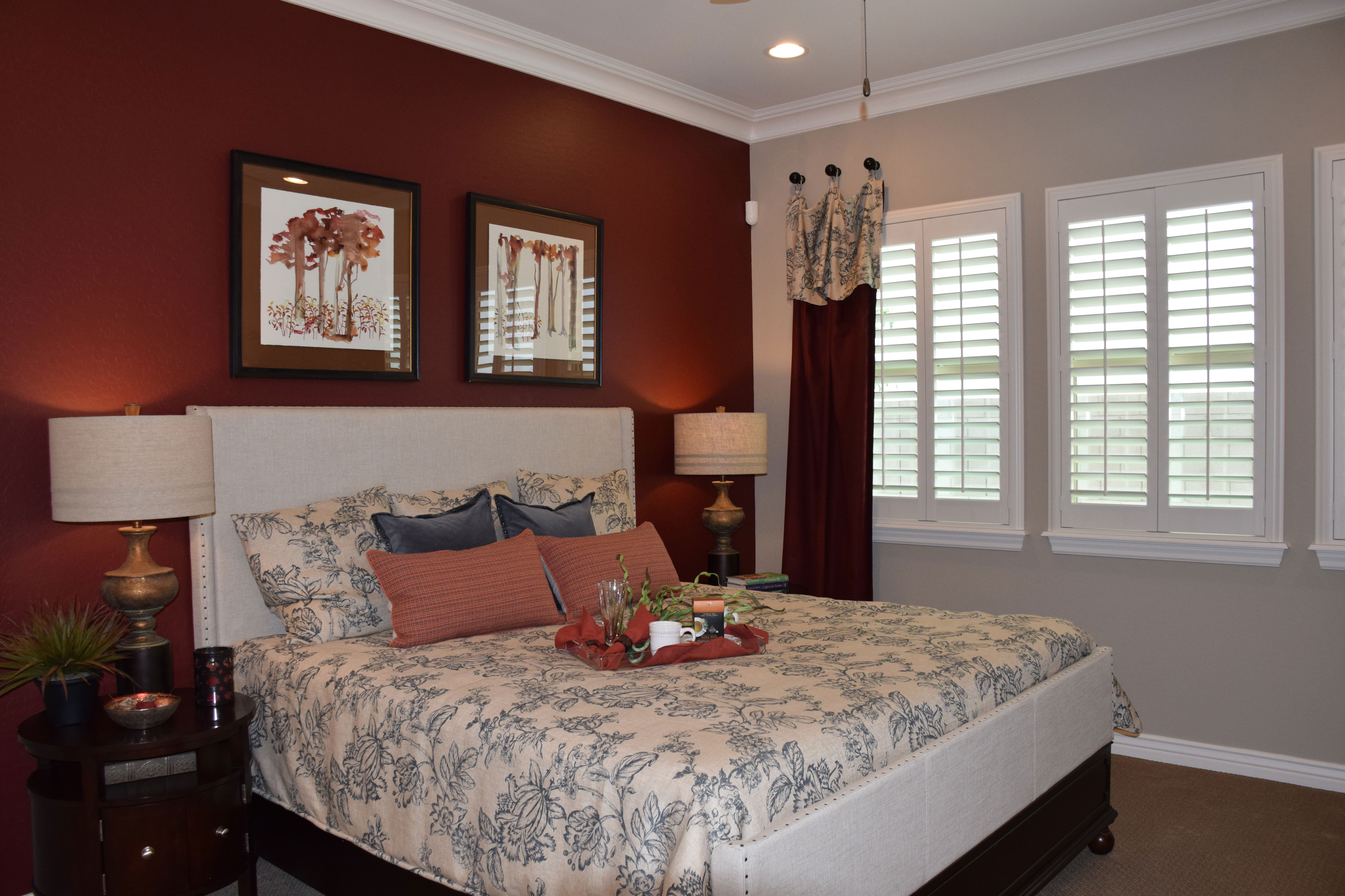
Smart use of paint: The dramatic wide blue stripe is a powerful substitute for a headboard for this bed. By pulling it up and onto the ceiling, the mind translates it into a canopy, making the bed feel very finished, even without a headboard.

Smart art: The distinctive piece of art hanging over the bed pulls everything together – yellow brings the bed coverings up to the wall and the silver frame reflects the grey on the pillows.

Smart bedclothes: Yellow and grey combine for a sophisticated bed. There is just enough white to let the colors pop. Pillows really make a difference with a bed, and they are a low-cost way to create just the right mix of color and pattern.

Smart curtains: Notice that the curtain is a darker yellow in a heavier fabric. This helps to anchor the window and keeps the room from feeling too matchy-matchy. It also provides an inviting contrast to the bright window.

Smart accessories: Lamps reflect the white from the bed pillows but there is just enough yellow pulled in with the accessories to keep that color front-and-center.

When you’re planning a guest room, don’t think that you have to spend a lot of money to make it special and inviting. It just takes imagination and a willingness to draw on color to create a room worth coming home to.


Use Toile in a Bedroom

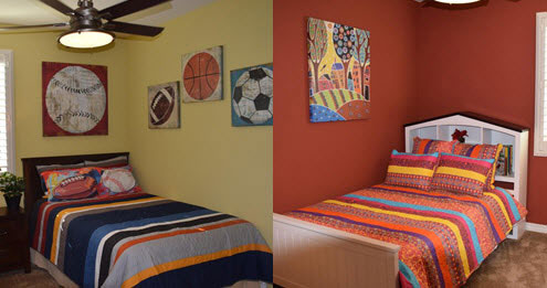
Warner-Groves-at-Morrison-Ranch-master-webPatterned fabric is always a nice addition to your home’s decor. In living and family rooms, stripes are the most common pattern choice, followed closely by geometric options. You will see some florals too. But one of the most intriguing patterns is an old-fashioned choice: toile.
Toile was originally produced in France when cotton fabric was first brought from India. The people of Europe were used to wool and silk clothing, fabric that didn’t wash well and was often hot in the summer. When cotton first appeared with its wash-and-wear sturdiness and cool weight, it was much in demand. The French Government was so concerned that cotton clothing would take over French cloth manufacturing that they tried to make cotton cloth illegal.

That idea soon failed, and printed cotton cloth became extremely popular. One of the first manufacturers used woodcuts and then a printing press to produce over thirty thousand different designs. Many of the designs depicted country scenes or exciting events of the day such as the first balloon ascension.

Most of these fabrics were printed in one color on white or off-white fabric with repeating patterns. The fabric was called toile de jouy which literally translates to cloth from jouy, or the part of France where the factory was based. Over time, the fabric name was shortened to toile.

This style of fabric has enjoyed a new popularity in home decor recent years, and you will see it in bedrooms and kitchens where people want a French country style. The bedspread above in blue and white shows the most popular color combination but you can find toile fabric in colors to suit virtually any decor.

Stripes make a Splash

two-striped-bedspreads-webWhen you’re planning a child’s room or a guest bedroom, patterned fabric provides a great way to add pizzazz without spending a lot of money. And for generations, one of the smartest patterns to choose is a stripe.
This photo showcases two different approaches to stripes for bedspreads and matching pillow shams. With today’s bedding stores and online options, you can pick up a bedspread and sham set, often with a matching dust ruffle, for less than $100.

Stripes are a fun choice. They also offer a lot of flexibility. You can pull out one color for the walls and use the others for accessories. Notice that both of these bedrooms focus on one strong color note drawn from the bedspreads.

On the left, the bedroom captures the spread’s gold and white tones in the artwork, while the walls themselves take that same gold and lighten it to make the space colorful without being overwhelming. This looks like a boy’s room, and most boys won’t be comfortable with too much color on the walls.

The other bedroom is geared toward a girl, and one who is not afraid of color. Notice how the artwork chosen brings out every color in the striped bedspread. While you’re not always fortunate enough to have that happen, take advantage of accessories and other elements in a bedroom to pull the stripe colors into the space.

Now in these two bedrooms the stripes provide the only patterned fabric. But one nice thing about stripes is that they leave the room open to other patterns. You could add several floral-patterned pillows in the same tones to the room on the right and it would still work. Another geometric pattern would suit the bedroom to the left.

When you want to introduce pattern to a room, it’s smart to choose stripes. They provide a safe way to be a little daring, because they always work well.

Touches of Luxury

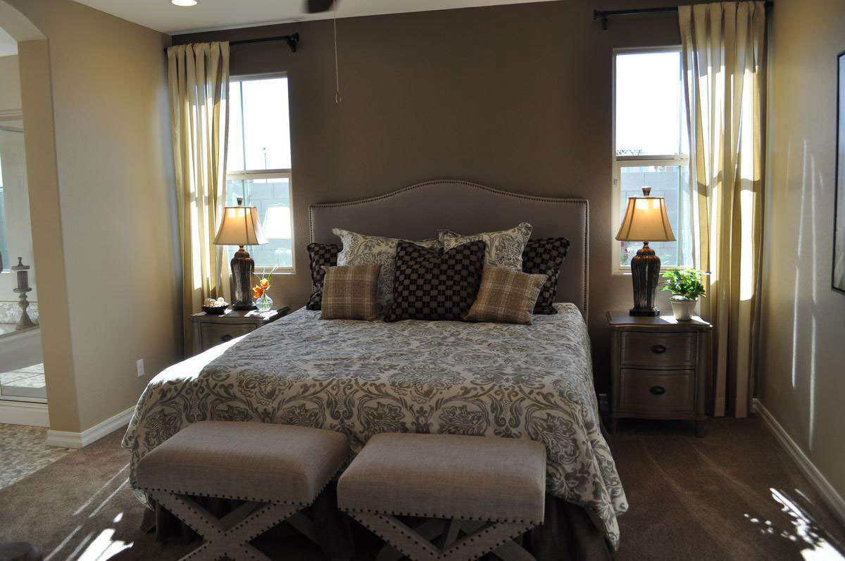
touches-of-luxurywWhen you’re planning your master bedroom, it doesn’t take a lot to make it feel like a luxurious getaway. This bedroom isn’t large, but some thoughtful touches help to create just the right place to relax. Let’s take a look at the choices that make this room work so well.

Color: By pulling a number of related neutrals in the room, the look is soft and inviting. There are a few lighter and darker tones for contrast, but the majority of colors are mid-tones that work well together. This is a smart approach for a medium-sized space, creating a unified feeling.

Texture: From the upholstered headboard and matching benches to the curtains, throw pillows and plush carpeting, everything in this room is soft and inviting. This softness encourages you to sit or lie down and rest.

Patterns on patterns: The mix of patterns in the bedclothes creates a feeling of abundance and extravagance.  The mix of large and small pattern florals with the plaid keeps the bedding from feeling too busy.

Matching elements: The nightstands, lamps, and benches come in pairs, setting a symmetrical pose that creates a sense of serenity. Symmetry leads to relaxation.

Mid-tone wall color: A darker wall color makes a room feel cozy and warm. This golden brown keeps this bedroom inviting and ready for sleep in the evening. Windows let in plenty of light during the day when you want it brighter.

How would you like this bedroom for your own? For an in-person look, come and visit Cooley Station. We’ve got some great ideas for your new Fulton Home.

Add Modern Luxury to Master Bedroom

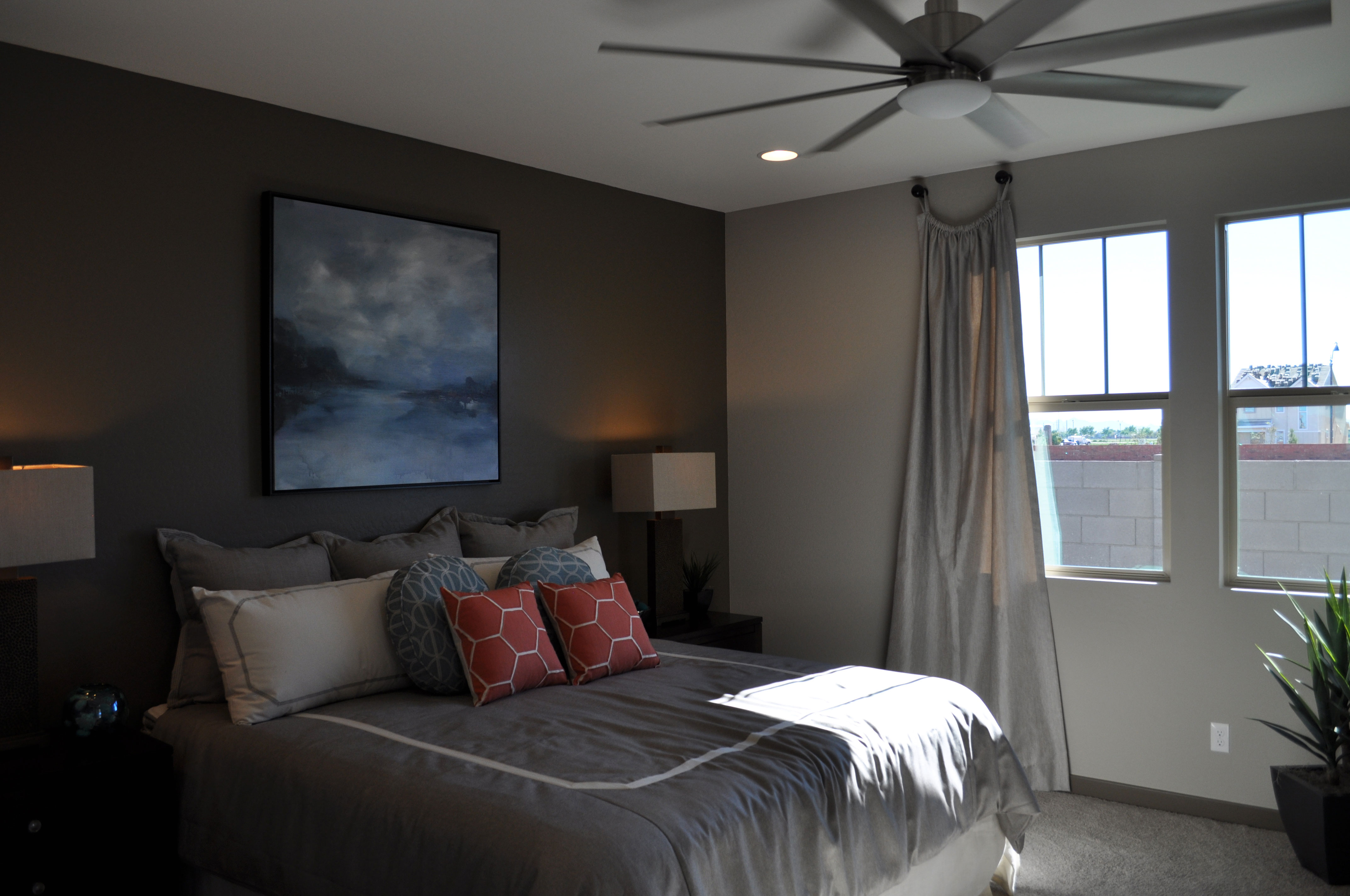
Master-BedroomwWhat can you do to make your master bedroom feel special and luxurious while still keeping a contemporary look? Here are a few suggestions to do just that, from this master in one of the Seaboard models at Cooley Station.

Dark colors: The rich dark brown wall behind the bed creates an immediate feeling of luxury. Darker colors are richer colors, and this tone strikes a feeling of bronze. The dark wood nightstands and pot as well as the lamp bases continue the dark tones.

Luxury bedding: With the European shams, two-color duvet cover with shams in a reverse color mix, and a generous number of pillows, the bedding says luxury. Making your bed look like someplace you want to land at the end of a long day is a great way to add a feeling of spoiling yourself to your bedroom.

Large-scale artwork: By positioning the large ocean-scape over the bed, it substitutes for a headboard. The blue tones work well with the dark brown wall to build almost a gallery feeling. This simple approach to art brings in a sense of luxury.

Unique ceiling fan: Investing in a ceiling fan that stands out from the norm turns a typical piece into a more sculptural light element. It makes a statement in the room.

Square shades on the table lamps: Once again, a non-standard choice makes the lamps stand out, giving them a decorator feel.

These elements turn a simple bedroom into something special – a hideaway designed for you to escape, relax, and prepare to face another day awake and refreshed from your moment of luxury.

Using Mirrors Effectively

mirror-1-webMirrors can serve both a functional and decorative purpose in a room. Of course you expect mirrors in the bathrooms of your home, but placing mirrors in other rooms also works well. Here are a couple of approaches from two different bedrooms from the Rancho Mirage model in the Oasis at Queen Creek community.

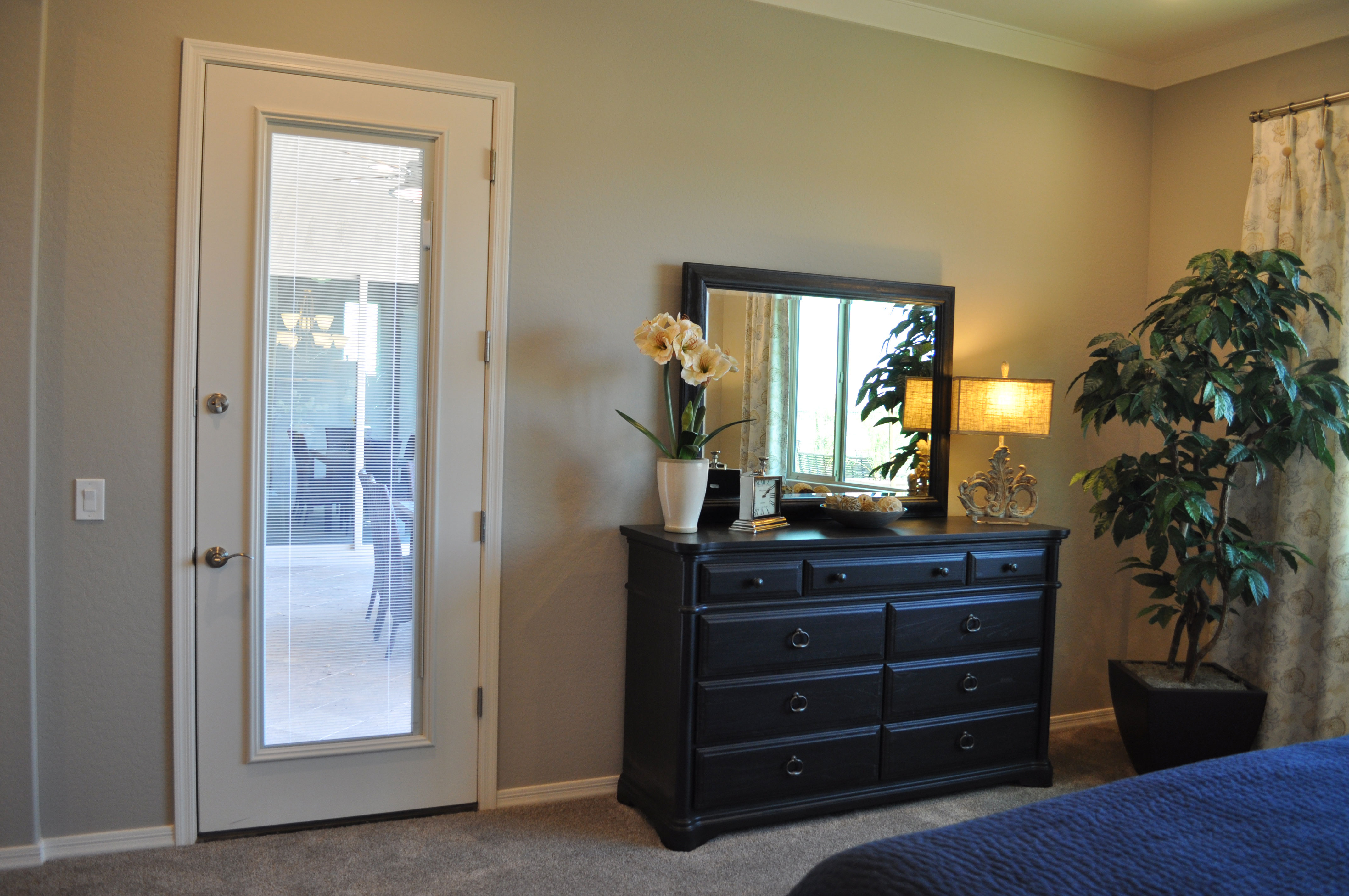
Bedroom mirror over furniture: In the photo above, the dresser is accented with a matching mirror. Notice that this mirror actually seems to be resting on top of the dresser. The mirror enriches the look of the dresser and brings more light into the room by reflecting both the lamp and daylight from the window to the right. Positioning the mirror like this connects the two pieces and works almost as well as a floor-to-ceiling mirror for checking out the day’s outfit.

From a safety standpoint, be sure to attach the mirror to the wall at the top to keep it stable over time. Also check out the framing of each person who will use the mirror before deciding on the final position. If one of the bedroom’s users is taller, you can attach the mirror above the dresser to enable the individual to see his or her head. If the height disparity is dramatic, consider positioning this mirror vertically.

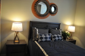
mirror 3Mirrors as art: These two mirrors hanging over the bed in the photo to the left don’t work well for checking out your reflection, but they maintain the room’s bold masculine look with their gear-shaped frames and industrial feel. And they do increase the light in the room by reflecting it from a nearby window. Don’t hesitate to use mirrors as art. Just be sure to look for choices such as this one where the frames have an interesting personality that complements the look of the room.

Pink can be Sophisticated

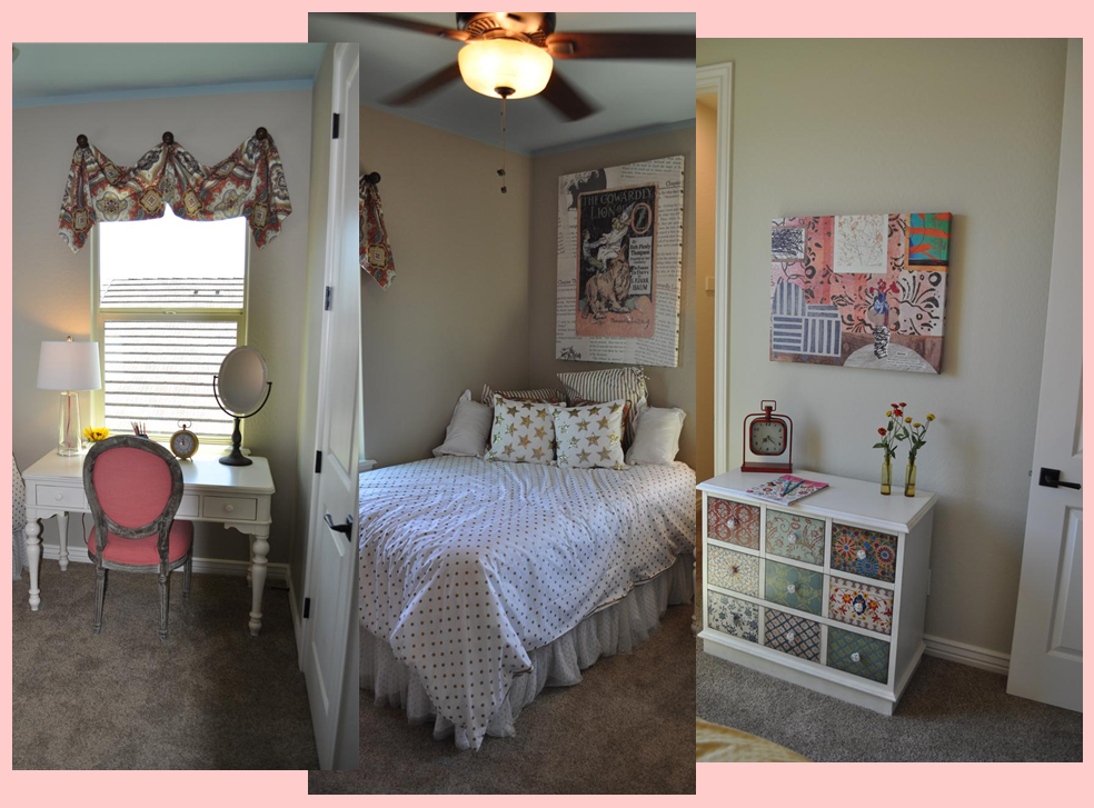
girl's_bedroom_montageFor most of us, when we hear that a girl’s bedroom has pink in the color scheme, it sounds cute and pretty, but not very sophisticated. But don’t limit your thinking. With the right accents and style, pink will surprise you. Let’s take a look at how this girl’s bedroom makes that happen.

The right accent colors: One quick and powerful way to add sophistication to any room is by throwing black into the mix. Used judiciously, black makes other colors pop and grounds the space. By mixing a light ballet-pink and black together, the final feel is daring and interesting, and definitely more than cute.

Using metallics: The bold gold on the bedding and poster make everything in the room pop. This is a risky choice and you can’t have a sophisticated look without taking some risks.

Mature fabric choices: It’s easy to go with a juvenile fabric when working with pink, but these fabrics pull you away from that. Adult patterns and moods in the fabric help make this room more grown-up.

Unusual artwork: The Wizard of Oz theme on the poster over the bed says it’s a children’s room, but the retro illustration combined with images from the book itself in the background make this poster worth more than a glance. Really, this piece feels like the inspiration for the entire room.

Eclectic furniture choices: The vanity has an old-fashioned style but the white paint makes it feel up to date. The small chest gets its personality with the different designs on each drawer, which are echoed in the canvas above. Once again a risky mix-and-match mood adds a chic feeling to the space.

Altogether, this room works for a young girl, yet opens up a glimpse of what kind of grown up she will eventually become. Visit Oasis at Queen Creek for a closer look.