Transforming your Garage

5214697_SDoes your garage look something like this? A recent U.S. poll showed that less than 60 percent of respondents use their garage to park their car.

If you tend to use your garage as the largest walk-in-closet in your home, the Fulton Homes garage options can change all that.

Let’s take a look at some of the choices available to you.

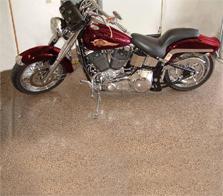
garage floor coatingGarage Floor Coating: This epoxy painted flooring keeps your garage floor looking fresh, and its durability can withstand years of parking your car on it. The easy-clean surface turns your garage into a functional and attractive space. Please note, however, that the motorcycle does not come with…

Rubbermaid Garage Storage: Professional organizers say one key to making a space attractive and organized is to keep everything off the floor. Rubbermaid’s flexible unique FastTrack® rail-mounted system does that, and can be customized using modular storage units to meet the needs of your household

tip-get-it-off-the-floor-largeRubbermaid Garage Cabinets: If you dream of having a workshop in your garage, or even some enclosed storage, take a look at the Garage Cabinet options that Fulton Homes offers. From a single cabinet to a wall full, Fulton Homes and Rubbermaid can meet your needs.

For more insights into how to make your garage more than a hiding place for clutter, visit the Fulton Homes Online Design Center. Who knows; you could end up proud enough to leave thegarage door open for the neighbors to see!

Fall Home Maintenance

For those of us who live in the Sonoran desert, our fall maintenance requirements are much simpler than for people in colder areas. However, it still pays to tackle several areas now that temperatures are starting to drop. Here are a few suggestions:

Check your home’s exterior. We had quite a bit of rain and wind in this summer’s monsoon. It’s smart to pop up on the roof and make sure everything is still in place. This is particularly important with an older home. While you’re up there, make sure your gutters are clean and operational. Finally, take a walk all around your home to look for signs of termites or other home challenges.

Test your heat. We will eventually get to an evening cold enough that we’ll be ready to turn the heat on again. It pays to check your heat before then to make sure it’s working well. Also, if you haven’t changed your filter recently, do so. The summer’s air conditioning demands really take their toll on filters and you will have better energy efficiency if you stay on top of them.

Trim your landscaping. In the heat of summer, it’s risky to trim bushes and trees because of the risk of sunburn on previously-protected foliage. Now that it’s cooling off you can start trimming back those plants that have gotten carried away this summer. For some plants such as citrus and roses, wait until December or January for serious trimming.

Paint your home’s exterior. The best temperatures for exterior paint are between 50 and 85 degrees. Because of our significant temperature variations between day and night, there is a small window when painting is ideal. The next month should be a great time for getting your house looking its best with a new coat of paint.

Now that the weather is nicer, outdoor maintenance feels like less of a chore, so take advantage and make sure your home looks and performs at its best.

Choosing Faucets

Many people think all faucets are a lot alike. But once you really review your options you may be surprised at the differences. Here are a couple of things to consider when you’re making kitchen and bath faucet selections.

To begin, think about functionality. Do you want a kitchen faucet with a pull-out sprayer to rinse out your sink or fill large pots? You may also want enough height to fill tall containers. What about extras such as a built-in soap dispenser?

It’s a good idea to take the time to feel the handles to see if they fit well in your hands as you turn them on and off. Would you rather have a one-handled faucet that moves to set the temperature or two handles?

Have you decided on your finish? If you are selecting stainless appliances, you’ll want to choose a finish that works well with them. Also, think about matching the style of your faucet to your kitchen. With a modern kitchen look for one with clean lines, while a traditional or country-style kitchen allows you to choose a more old-fashioned style.

In the bath, take the time to learn how the shower head and faucet and options work to make sure you choose something that you will be comfortable using every day. Once again, coordinate your faucet with your chosen bath design and towel racks. A bath is a great place to experiment. How about trying a different finish to step up the style?

Yes, all faucets give you hot and cold water when you turn them on, but it’s worthwhile to consider both function and fashion when you make your final choices.


Does Your Front Door Make a Great First Impression?

When people visit your home, they start to get a feeling for the place before they even walk inside. The outdoor landscaping in the front yard, the look of the outside of your home, and the entranceway as they walk up to your front door all color their first impressions. Don’t forget, your front door makes a statement about what they’re going to find inside.

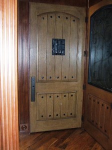
Have you thought about the impression you want your front door to make? The photo above shows two door styles available in the Fulton Homes Design Center. The door on the left is strong and formal. The panels give it a Mediterranean look. On the right, the door is more casual with an Arts and Crafts flavor. The glass panes add a welcoming touch to the outside and natural lighting inside. Both are beautiful, bold and still send very different messages about the home inside.

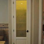
The photo on the right shows other Fulton door options. The first door makes a bold statement. The style, as well as the bronze door handle and ornaments, creates an old world look. The next door is more conservative, but the simple design is still striking.

Whichever style you choose, you will want what people see when they walk into your home to connect with that door. An important part of your home’s style is consistency. As you make a selection, you may want to consider how you plan to decorate your foyer to help link the outside and inside of your home.

Every one of these front doors says something about the house and the people who live in it. Have you thought about the message your front door sends? It’s about style, but it’s also about the impression you want your home to present to the world.

Area Rugs Define Spaces

An area rug can serve as artwork for your floor. On top of wood or tile floors or even carpeting, area rugs define conversation spaces and pull colors together while adding texture.

This birds-eye view provides some insight into how an area rug can enhance a room’s look. The rug is primarily rust and brown, and it has tones ranging from light to very dark. This variation captures and connects every other element in the room.

The lightest tones in the rug are reflected in the maple coffee table and the fireplace surround. That light wood wouldn’t work as well if placed directly on the warm mid-range wood flooring, but the rug allows it to serve as a dramatic contrast.

The black of the fireplace opening and tools connect with the dark outlines of some of the leaves in this rug. Two different shades of rust making up the sofa and chair hang together well thanks to the choices of color in the rug itself. Finally, the rug clearly defines the living space in this part of the home, providing a frame for the furniture.

The photo to the right demonstrates another way an area rug defines space. This corner is created by focusing on the space left where the rug’s border ends. A comfortable reading chair under a window becomes a special private nook, with a couple of tables for a cup of tea or a pair of reading glasses.

When you use area rugs to highlight specific design features in your home, the extra layer adds charm to your décor.  Contact us or come to Browse Night and take a look at our new line of beautiful and well-constructed Feizy area rugs or just to get more insight into how area rugs can complement your design plans.

Enrich Your Dining Room with Built-in Buffet

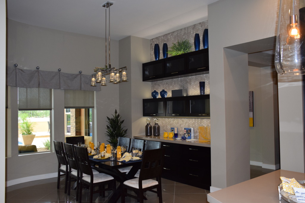
If you would like a buffet or china cabinet in your dining room but don’t want to sacrifice the space, a built-in might be the right solution for you.

If you choose to go in this direction, take a look at this successful installation from Fulton Home’s Tehama model in the Victoria Estates community. Here are a few design tips to help create a successful built-in buffet in your home.

Stay consistent: If your built-in will be stained wood, make sure it has the same basic tone as any other wood in the room. Notice that the table and chairs complement the buffet, while a touch of glaze on the cabinetry separates it from the other wood in the room.

Keep the furniture look: The height and depth variation in the buffet along with the floor molding help this piece read like furniture in the dining room rather than a traditional built-in. The inset is also a different height from the ceiling, wrapping itself around the piece as though the alcove was made for the buffet rather than the other way around.

Manage your flooring: Using tile or stone flooring to help contrast these beautiful wood cabinets, dining table, and chairs  will look better than wood flooring. Also, while it might be tempting to add an area rug, the location of the rug’s edge could affect people’s ability to walk comfortably next to the buffet.

Stay coordinated but not matchy-matchy: The rich rust on the walls, the soft taupe curtains, the artwork, and accessories pull all of the room’s elements together. Using a granite countertop for the buffet, the antique rattan chairs at the head and foot of the table also create an individualized look for both elements in the dining room.

By adding this built-in, the homeowner gained a generous amount of storage, a great solution for entertaining family and guests, and an additional sense of drama for the room itself. Consider built-ins when you make design plans. You may find them to be just the right solution for your home.

Turn your Bonus Room into a Fitness Center

With a busy life it can get harder and harder to take the time to stay in shape. Make it easier on yourself and create your own home gym out of your bonus room!

This family put together a treadmill, a glider machine with arm action and a bench for weights to create their own mini-gym. These choices help encourage fitness at all levels. Let’s take a look at their smart decisions.

First, these machines are sturdy and professional-grade. Take the time to look up reviews of equipment before buying, and consider used equipment rather than going for less expensive options. The variety available helps you vary your routines every day. Manage your budget by adding one new machine every year. An exercise bike would be a nice addition to the choices here.

Choosing free weights rather than a weight machine saves money and supports fitness better. Studies have shown that using free weights is more effective for building muscles than a weight machine. Free weights also support balance.

A large mirror helps make you more aware of your stance while exercising. Taking a regular look at yourself supports balance and posture. The mirror is also positioned to reflect natural light from the windows.

A ceiling fan helps you keep cool as you exercise. It whisks away perspiration, leaving you more comfortable and helping to make your exercise routine more enjoyable.

Add music to enhance your exercise routine, and possibly a DVD player to play yoga or other fitness videos. Carpeting will help provide the soft flooring you need for free-form exercises. This bonus room is large enough to hold the machines as well as provide space for exercise and simple dance routines.

Make your bonus room a special space just for you – designed to get you into the shape you want to be in a fun and relaxing way – just steps from your bedroom.

Front Entrance says Welcome

Before you even step in the front door, this home welcomes visitors. The design of the home itself provides a natural courtyard at the front entry. The layout draws you to the home, and a number of option and design choices enhance the look.

First, notice the stone covering the patio. Instead of more traditional concrete, using these pavers ties the patio floor to the rich color of the stucco walls. By choosing this type of flooring, there is a sense that you are already in the house.

Next, the white trim on the windows feels like the casing you expect inside a home. The molding and gutters framing the roof also almost have the same impact as crown molding in a home.

Choosing to use furniture on the patio provides a comfy place to sit and strengthens the sense that you are almost in an indoor room. With today’s outdoor fabrics, you can find colors and designs that are just as nice as anything to cover a sofa inside. This red with a thin white stripe provides a dynamite and inviting color contrast to the neutrals of the courtyard.

Finally, the plants in the corner add an indoor-outdoor feel and nicely accessorize the space. With no open dirt for plantings, the three pots with high-profile plants add a warmth and natural element to that corner. This entryway, from Fulton’s Spyglass model at Victoria Estates, can make your friends and family feel welcome the minute they come up your walk.

Outdoor Lighting – Make the Night Beautiful

Most people pay attention to the curb appeal of their home during the day, but what about at night? Outdoor lighting can combine functionality with beauty to create a home that is as appealing in the evening as it is all day long.

This Fulton home provides a good example of combining aesthetics and function with its lighting.

To start, the driveway entrance is clearly defined by low directional lights. Visitors don’t have to rely on their headlights alone to pull into the drive. The carriage lights on either side of the garage door as well as the windows on the door itself ensure that the home is easy to see.

From a security standpoint, the lighting and landscaping leave no places for trouble to hide. Even the backyard has lights that show off the trees while providing enough light to keep that area safe.

The front entrance is well lit, allowing the homeowners to see who is at the door and making sure evening visitors can see the entrance clearly. The walkways are easy to see from the street and the covered area by the front door protects guests from inclement weather while they’re waiting for their hosts.

The lines of this home are personality-rich, and the lighting really shows that. Notice how the rooflines create shadows that make the home even more attractive. Lights shining through the cross-hatched window panes add a feeling of welcome. This Fulton home provides just the right ambience for visitors and party-goers before anyone even walks in the door.

Be Daring with Wallpaper

How courageous are you willing to be when decorating your home? Would you be brave enough to use wallpaper with this much of a flourish?

The bold red color and the metallic gold leaves make this bathroom pop. Let’s take a look at why it works so well.

To start, a bathroom has a lot of things to break up the vivid wallpaper. The mirrors, windows, shower, and bathroom cabinetry break up the walls so that this pattern doesn’t overwhelm the space. A bathroom is a great way to start expanding your home design thinking.

Second, the rest of the room is neutral. It would be tempting to add red towels and lots of red accessories, but that could overwhelm the room and actually distract from the wallpaper. Instead the red is limited to the walls and a few small pieces. Towels are a simple stone color that fit well with the flooring. Even the chair at the make-up table is upholstered in black.

Notice in the photo to the right that the room is filled with plants. That choice mirrors theleaf wallpaper without mimicking it. This thematic connection in the bathroom is understated but it has a subtle design impact.

Finally, the other tone choices – while neutral – show both light and dark elements. This helps them stand out even against the strong wallpaper.

So if you’re tempted to take a chance with color or wallpaper, consider starting with your bathroom, and you may find yourself becoming more daring throughout your home!