Metallic Backsplash Adds Style

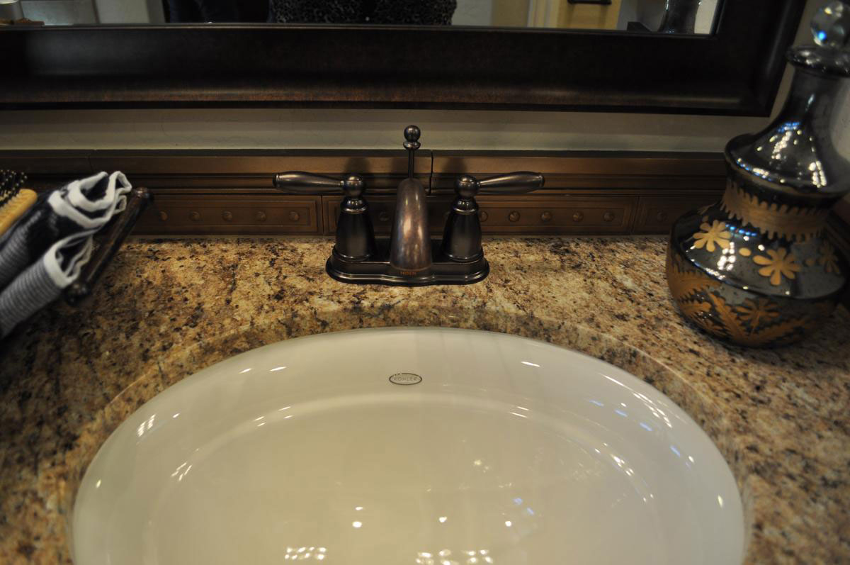
metallic-backsplash-adds-stylewBathrooms are by their very nature small. This can make them somewhat of a throwaway room when it comes to both design and decorating. But if you’re smart, a bathroom is the best place to splurge since it doesn’t take much square footage, or dollars, to make a big splash. Let’s take a close look at this bath vanity and see how smart design and décor makes a difference.

Oil-rubbed bronze fixtures: There’s something about oil-rubbed bronze that draws the eye. Maybe because we all grew up with classic chrome, seeing this look captures attention. It feels old-style without being too traditional. It also works well with granite like the choice shown here. The brown and gold really suits the soft dark tones of the bronze fixture.

Granite with personality: When you have a limited amount of counter space, choosing granite with a lot of contrast and veining really works. In this bathroom, the countertop adds drama and suits the simple white sink.

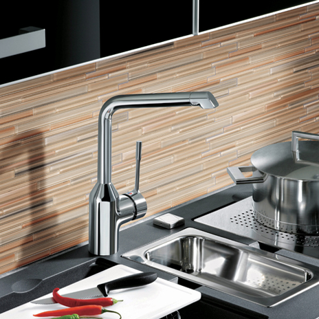
Metallic tile backsplash: This metallic is not the same finish as the faucet, but the dark tones help them set each other off when seen together. When the space is limited, choosing a tile with this much texture and a metallic finish means that it won’t be ignored by guests.

Framed mirror: The ultimate finishing touch is a framed mirror. Instead of a simple mounted wall mirror, the frame creates the feeling of completion that makes this bathroom something special.

Guest Bath with Color

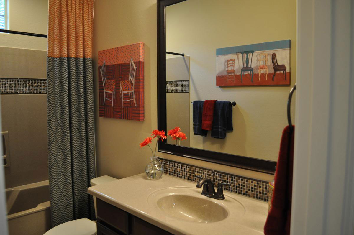
Guest-Bath-with-ColorwYou don’t have to put color in your permanent elements to make a room colorful. Let’s take a look at the savvy choices that make this guest bathroom something special.

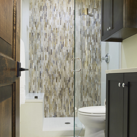
Tile mosaic: Although this mosaic contains only neutral tones, the variety of dark and light tiles open the space for color. When you add bright color near neutrals with strong contrasts, the colors will reflect onto the neutrals, pulling color into their space. Take a look at this photo. It looks like the backsplash mosaic has some color in it although it doesn’t.

Art: Art is one of the easiest ways to add color. these two canvases are different yet link together by color, style and subject matter. It’s smart to start choosing your color palette in a room like this one by choosing art. The rest of the color can be drawn out of the selection of prints or canvases you choose.

Towels: Today you can get towels in any color range from vivid almost-neon tones to soft muted shades. It’s smart to choose two or at the most three colors for a bathroom towel set so that the colors work well together yet provide enough contrast to make the space interesting.

Shower curtain: If your bathroom needs a shower curtain, consider adding a floor-to-ceiling decorative curtain like this one. This pulls the colors from the art and towels to another location in the bathroom and adds additional patterns to the mix. Altogether a nice addition to the space.

Accessories: The flowers are a bright spot in the bathroom. You don’t need a lot of accessories for this bath. Just enough to add interest and one more spot of color.

When you decorate your bathroom, don’t be afraid to add color wherever you can. You will also be adding warmth, personality and interest.

Accessorizing your Bathroom

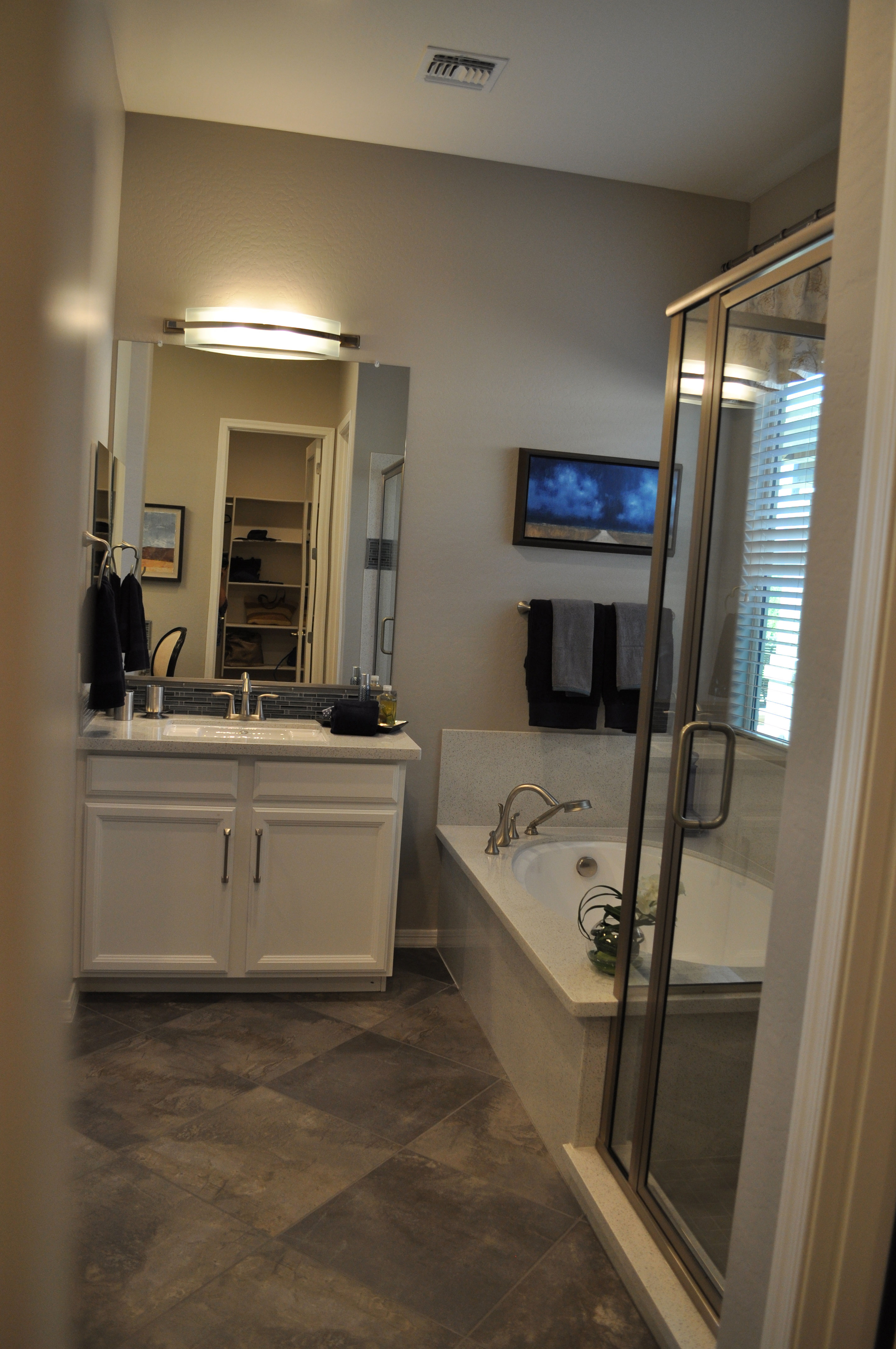
accessorizing-your-bathroom-webWith a bathroom, you have a limited space to work with when accessorizing, so you want to make the most of your choices.

Here are some things to consider  to make your bath a special space for you whether you’re getting ready for your day or relaxing while preparing for bed.

Color: Do you like soft subtle colors in a bathroom? Take a look at how well grey and white work in this bath from the Rancho Mirage model in the Oasis at Queen Creek community. From the natural look to the diagonal tile floor to the rich soft grey on the walls, the room has a gentle feel that encourages relaxation. Brown and grey towels fit well with this color scheme.

Lighting: Although a bathroom’s lighting is built-in, it has a strong influence in the mood of a room which really makes it count as an accessory. In this room the contemporary fixture features the same brushed nickel finish as the faucets and the trim on the shower. Everything feels coordinated and it all works with the grey color scheme.

Art: Although there is only one piece of art in this bathroom, it has a serene and appealing style, and it is set in just the right place for viewing when in the tub. The darkening cloud-filled landscape pulls some color into the room without requiring all of your attention. It is as relaxing and inviting as the rest of this space.

If you want to take a closer look at this bathroom and a number of others, we invite you to tour our models in Oasis at Queen Creek. You can explore all the choices before deciding on the perfect bathroom for you.

The Right Shower for You

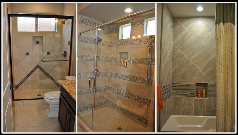
the_right_shower_for_youwebWhen you combine tiles, panels, listelles and features such as nooks to hold shampoo and soap, your shower can be customized to just the right combination of style and function to suit you. All three of these showers are light neutrals, yet each one has its own personality and flair.

The one on the left uses a diagonal layout for the tile backing with dark squares adding contrast and interest. In addition, the arrow shape coming up from the floor keeps the look from being predictable. The dark vanity connects the rest of the bathroom with the shower, creating a strong integrated look.

The middle shower is generous in size, and that space is emphasized by the dramatic stripes created by an intriguing mosaic. Contrast comes from the random pattern of dark and light squares throughout the mosaic stripes. Your eye shifts from the smooth neutral provided by the plain-colored tile to the pop of personality in the mosaics. The two balance each other out.

The final photo shows a tub-shower combo. Notice that the niche for soap and shampoo is lower, so a bather doesn’t have to stand up to reach their beauty products. In this case one stripe of glass tile adds a pop, which is supported by the shift of the standard tile from a square set on a diagonal to a rectangle set upright. This trick subtly defines a cozy bathing area while taking a more expansive feel in the higher shower range.

Which shower would you pick? Or maybe your ideal shower would be completely different! You can see these and other shower ideas at Oasis at Queen Creek, or visit the Fulton Design Center.

Design Your Dream Master Bath

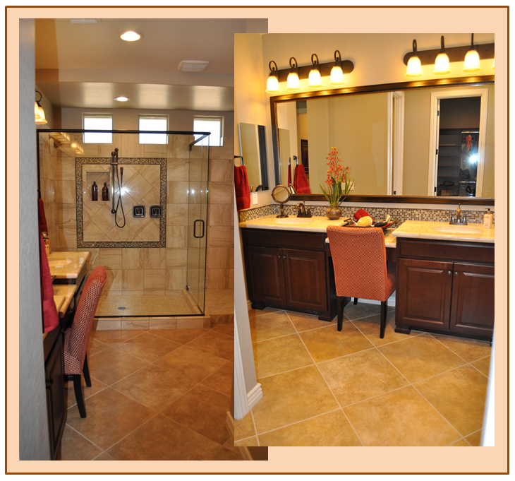
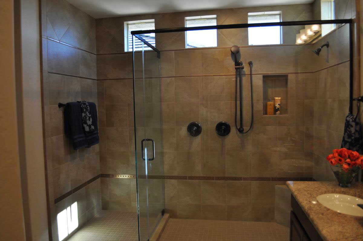
bath_montage_blogHave you ever thought about what you really want in your master bathroom? How about natural light while still maintaining privacy? This bathroom accomplishes that with the trio of square windows near the ceiling over the shower.

Would you like a bathroom that doesn’t feel cramped? The nice amount of square footage and open entrance gives you plenty of space. Using flooring on the diagonal adds to the sense of abundant room.

What about a roomy shower? Take a look at this option with room to move around and a subtle built-in niche that’s perfect for shampoo and body wash.

How about a mirror over the vanity that doesn’t look institutional? Take a look at how framing the mirror in the photo above adds an appealing finishing touch to the vanity area.

Would you like a spot to sit in the morning to apply make-up, or just to relax for a minute while chatting with your spouse before breakfast? This bath has just the place for a comfy chair by the mirror.

And what about style? Have you thought about the colors and finishes you would like in your master bath? What about the soft gold and rust tones of this space? Or maybe you’d rather have gentle green colors. With all of the Fulton Design Center options, it’s your choice.

While we’re at it, let’s add plenty of vanity storage, a double vanity/sink so you don’t have to share, and plenty of good and attractive lighting.

Is this your dream master bath? Want a closer look? Then how about visiting Oasis at Queen Creek Station to see it for yourself?

A view from Outside: Bathroom

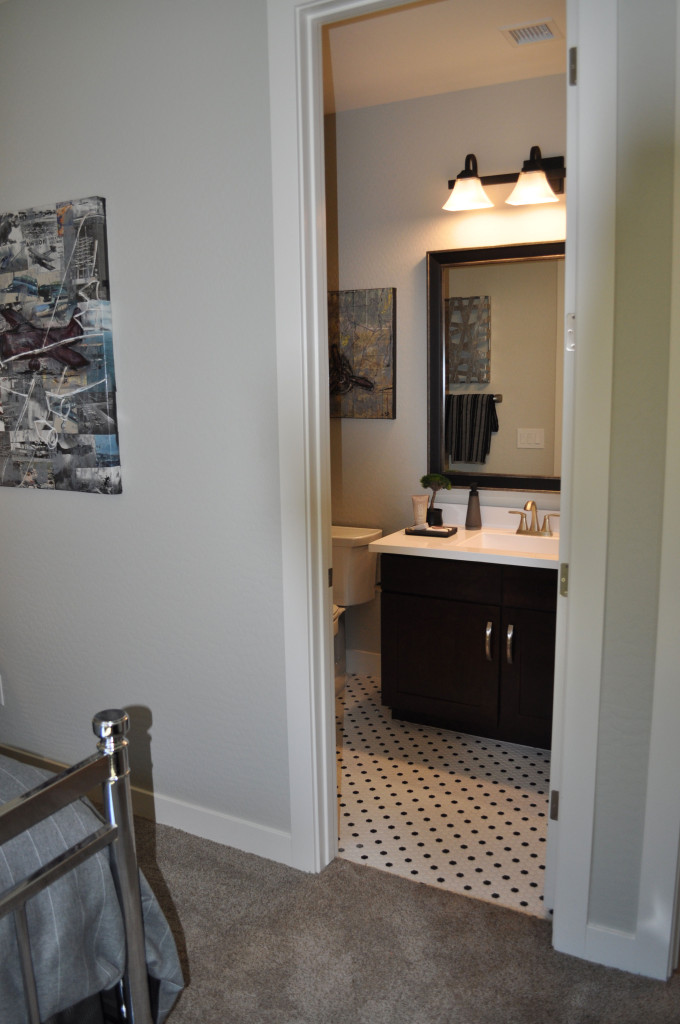
Corsica-bath-webHave you ever thought about what a room looks like from the outside? That moment before you actually step into a room creates a person’s first impression of the space. Given this, you may want to spend a bit of time at your doorways looking at what people see as they first walk into every room in your home.

This bathroom takes advantage of every design and décor element to create just the right first impression. To begin with, the flooring transition is smooth, with an inviting and interesting tile pattern that fits well with the style and colors of the bedroom.

This bathroom is a study in contrast, and that is evident immediately when you look through the doorway. Notice how the mood created by the flooring is echoed in the sharp change in color between the dark vanity and light countertop.

The light fixture also supports that feeling, with a dark finish complementing the appealing light shades that shine without being overpowering.

Just a few accessories add charm to the vanity. Their dark tones also provide just the right amount of contrast to the white counter with size and shapes that are interesting without being overwhelming. Brown and grey tones from the artwork and towel suit the space while connecting the bath to the bedroom through color.

How much time have you spent looking into each room in your home from the hall or just outside? Take this opportunity to view your décor choices from a new perspective, and remember that the old adage “It’s never too late to make a first impression” works for rooms as well as people!

Mosaic makes Strong Statement in Bathroom

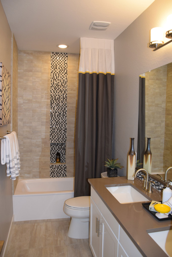
Ironwood-bathroom-web-readySmaller spaces can capture interest with just a couple of daring design decisions. This bath, from the Marquesas model at Ironwood Crossing, has all the elements of a good design, particularly given the available space. Let’s take a look at why this bathroom works so well.

Make a splash with mosaic tiles. By choosing to position a stripe of highly contrasting tiles in the shower surround, this bathroom moves from blah to drama. Notice that the mosaic is repeated on the vanity backsplash. This shows a consistency of design and connects the two pieces – vanity and tub – together from a design standpoint.

Match flooring and tub surround materials. When working with a smaller space, using similar colors and textures for large surfaces help the room feel bigger. This choice has personality but doesn’t overtake the room.

Pull from a consistent color palette. In this case, white, taupe and cool browns integrate well with each other making this bathroom feel like a well-crafted unit.

Stay contemporary with clean lines. When your space is smaller, the simple lines of modern styles are less distracting. Your eye moves easily from one element to the next, making the room flow.

Add a few sophisticated elements. The color-blocked shower curtain adds an element of style that complements the mosaic. Altogether this is an interesting and inviting design.

Choose one accent color that pops. Notice the small elements of bright yellow in this room. The oval soap dish toward the front of the photo gets an echo from a thin yellow stripe on the shower curtain. Adding just one or two items in a signature accent color add a spark to this well-designed space.

The Practical Beauty of Glass Tile

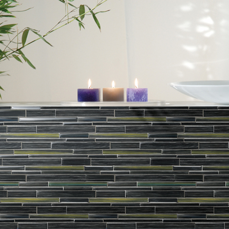
Watercolors-Ocean-Install-464x464Most of us would probably agree that glass tile is gorgeous to look at and adds a unique style to any space. But, aside from their aesthetic appeal, is glass tile a practical design choice?  After all, glass is delicate and breakable…isn’t it?

Characteristics of Glass Tile: Glass tile has many wonderful features that make it a great material for many projects, from both visual and practical standpoints.

  •  Shatter-Resistant: Unlike the type of glass used in vases and light bulbs, glass tiles are built to be shatter-resistant.
  • Durable: Strong and long lasting, glass tile is extremely practical.
  •  Water Resistant: As glass tiles don’t absorb water, they’re popular in areas with high humidity.
  • Easy-to-Clean: Since their surfaces aren’t highly porous, they’ll get back their shine with just a few wipes.
  • Heat Resistant: Heat resistant tile comes in a variety of styles, colors and materials, providing options that work with many different design schemes.

Glass Tile in the Home: Glass tiles can be incorporated in several areas of a home and are an affordable way to add a bit of glimmer to any area. Due to its heat and water resistance, glass tile is a perfect choice for fireplaces, kitchens and bathrooms.

Here are some different ways glass tile is commonly used:

  • When used in fireplace surrounds, the firelight makes the tile shimmer, creating an amazing ambience.
  • In kitchen backsplashes and countertops, glass creates a clean, contemporary look. Watercolors glass tiles provide a stunning look for a kitchen backsplash.Watercolors-Wheat-Field2-Install-464x464
  • In bathroom countertops, tub surrounds, and shower walls. Shimmer glass is a particularly beautiful choice for bathroom designs as it is hand-poured, resulting in a variation of color among the individual mosaic tiles.

Shimmer-Abalone-Dallas-Patrick-shot2-2014-464x464As you can see, glass tile is extremely versatile! With the many different options available, and each type of glass having its own unique qualities, you can select the tile that truly reflects your style.

A Relaxing Master Bath

DSC_0153 (2)At the end of a long hard day, can you imagine sinking into a nice warm bath, maybe soothed by a generous helping of bubble bath in your favorite scent? The wide edging around the tub provides enough space to light a few candles and prop up a favorite paperback to read while soaking. This relaxing master bath is ready for you.

Or if you prefer showers, how about washing off the stress of the day in this oversized shower, complete with a bench to relax on?

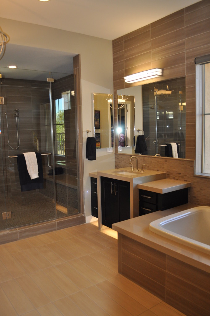
No matter how you use your master bath, just walking into a room like this one can help reduce your stress. The vanity has plenty of storage space, making it easier to keep the counters tidy. The two tones of rectangular tile set the scene for a spa feeling.

Do you dream of a relaxing master bath like this one from Legacy? One with plenty of room, and designed to match your specific taste?

DSC_0098If instead you want one that has a more traditional style while kicking up the glamour, how about the master bath to the right? The gold pendant lights set the stage for luxury. Notice how the filigree creates an inviting pattern on the walls while the lower counter on the vanity provides a space to sit to fix your makeup.

This master bath also has a comfy tub in place, made for soaking. And if you peek in the mirror, you can see the reflection of a generous walk-in closet.

What would your ideal relaxing master bath look like? To get some great ideas, why not visit the models at our Legacy community? We think you will be enchanted by what you find there.


Flooring that stands out

DSC_0086Flooring often serves a passive role in decorating, as the background for other, more exciting things. But take a look at what happens when you give flooring top billing. These two examples from Fulton Home’s models at Legacy demonstrate the power of bringing flooring to the foreground.

The picture above shows the floor extending out from an entryway. Immediately your eyes are drawn down the hall and into the home. This combination of stone and wood provides a path and a promise that this is no ordinary place. The diagonal setting makes that point stronger and adds a dynamic feel. It pays to consider placing flooring on the diagonal. It can create a feeling of added space and energy. In this instance, the strong contrast also provides interest.

DSC_0108Small spaces provide another place to experiment with unusual flooring choices. This basic bathroom becomes intriguing with the addition of flooring in an ascending block pattern. Three shades of tile make up the drama here, capturing the eye. One of our Facebook fans suggested adding Escher prints on the walls to make this bathroom a statement space.

There’s no denying that these floors are a design risk, but why not take a few chances in your home? If these are too far out of your comfort zone, how about adding a border or some sort of contrast in your flooring. Remember that your floor and ceiling are the fifth and sixth walls in your home, so why should the first four have all the fun?