Mosaic Art Backsplash

Cooley-Station-024-webKitchens are primarily functional, but just a few special touches can also make them stylish and interesting. In today’s homes with a focus on open floor plans, it pays to take the time to make your kitchen stand out.

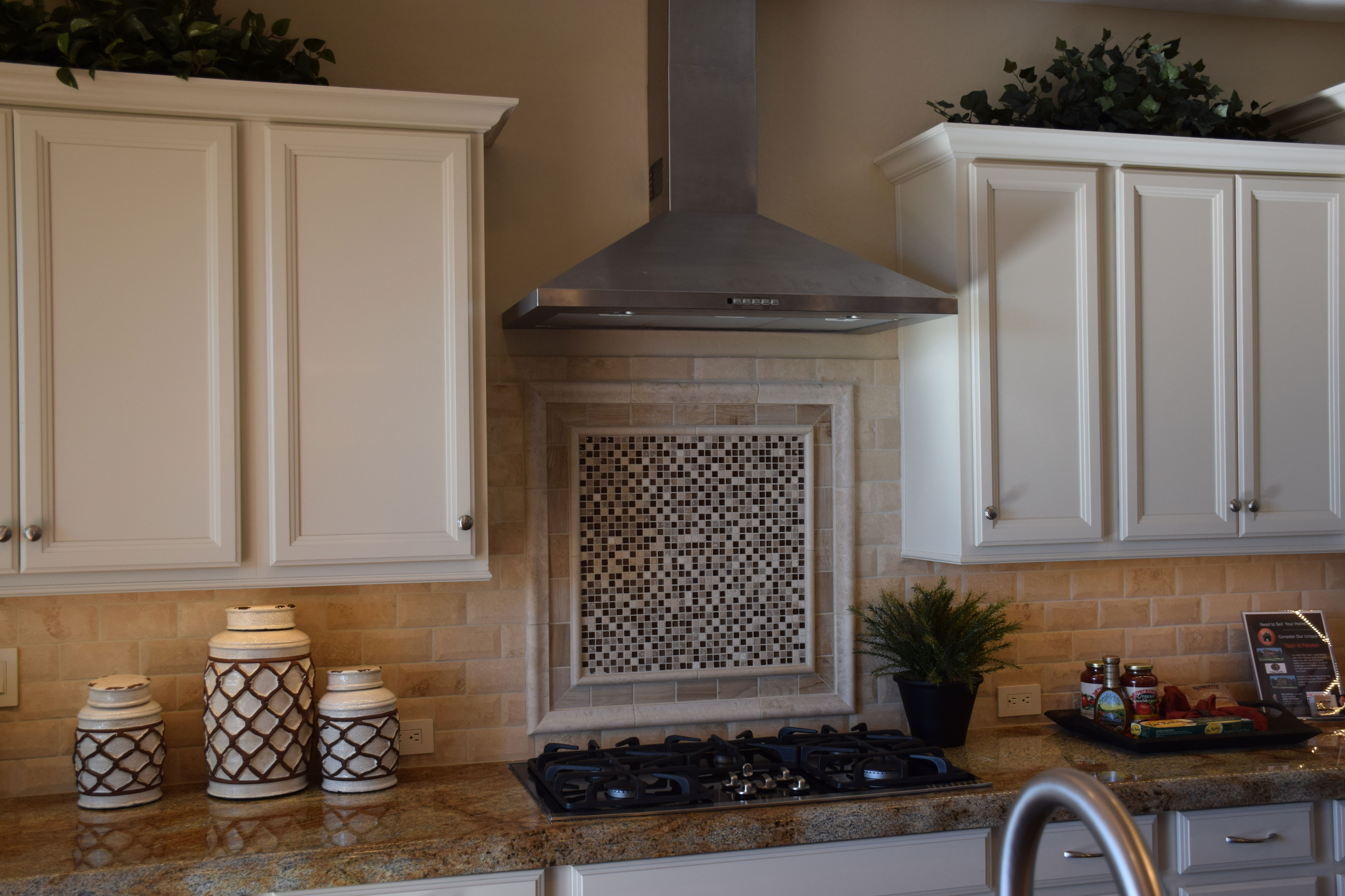
Choosing just the right tile backsplash is one great way to add style to any kitchen. Your backsplash doesn’t cover a large square footage, so you can select a more expensive tile option without spending a lot of money. The rough-edge subway style backsplash shown adds vintage charm and texture in this kitchen.

Many kitchens take advantage of the generous space between the stove and hood to position a backsplash focal point. You have a lot of choices for this spot. Some people choose a pictorial option, available in both tile and stone. But more often a mosaic adds personality.

Notice the raised framing around this mosaic. It coordinates well with the rustic-edge subway tiles, and the white frame integrates with the painted cabinets. But it all comes to a head with the dramatic mosaic.

The super-small squares combine with a three-tone semi-random geometric design to draw the eye. Its surprising contemporary flavor brings this kitchen into a more modern mood without detracting from the appealing old-world style of the space. It’s interesting how the canisters to the left echo the colors and shapes brought out in the mosaic, providing another integrative element.

A backsplash may seem unimportant, but this kitchen shows the power the right choice can have in making your kitchen uniquely yours.

A Splash of Red

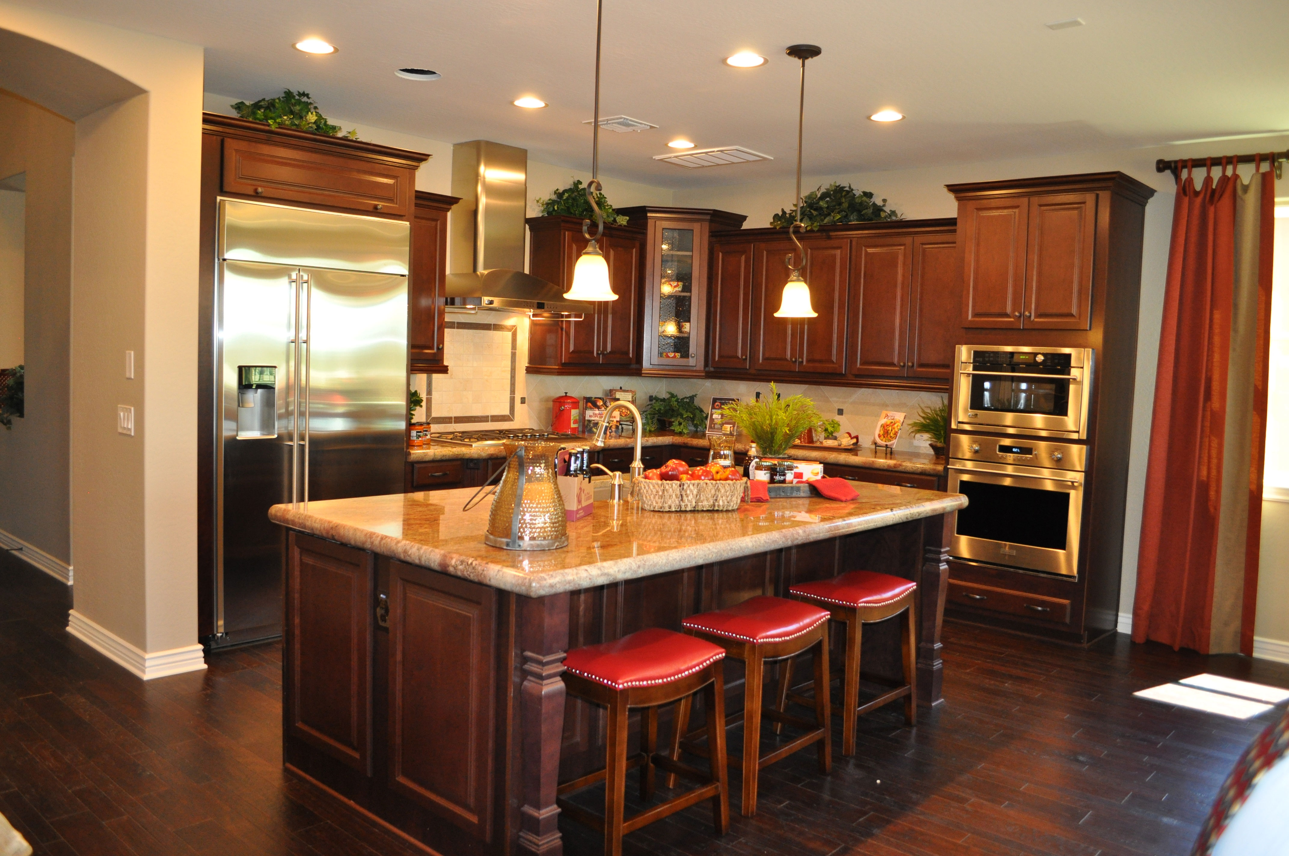
kitchen-whitewater-webWith this combination of dark cabinets and dark wood flooring, this luscious kitchen could easily feel like too much brown. But a wise choice of countertops and pops of red turn it into a cozy and inviting space. Let’s take a look at the smart decisions that make up this kitchen, from the Whitewater model in the Oasis at Queen Creek community.

Light walls and countertops: You don’t often see dark wood on dark wood in a kitchen. Of course today’s wood flooring finishes make wood workable for kitchens and even bathrooms, but it still seems like a design risk. Bringing in lighter tones with the countertops and soft beige walls provide the needed contrast. The backsplash also uses light tiles to showcase the dark wood cabinetry.

Stainless appliances: A little bling brightens up any room, and using appliances with a stainless finish breaks up the wood, while the reflective surfaces contribute to the overall glow.

Architectural details: The carved pillars at the outer corners of the island combined with crown molding and the door/drawer styles break up the wood look, adding shadows and highlights to the cabinets. In addition, the handscraped wood flooring provides its own three-dimensional element. Altogether these features add the interest needed to keep the space from feeling simply wood-on-wood in design.

Pops of color: The red leather seats set off the island, and this color is echoed in various accessories scattered through the kitchen. Red’s strong bright presence lights up the room.

Natural light: This kitchen can carry off the two dark woods thanks to the natural light that pours into the space. And in the evening, multiple lighting sources keep the kitchen light and bright.

Is this the kitchen for you? Why not visit our models in Oasis at Queen Creek and see for yourself!

Kitchen Island Lighting Choices

Legacy Models 030You can take several approaches to lighting your kitchen island. The simplest and least noticeable is a collection of ceiling lights, distributed to provide even light for working. But with that choice you lose an opportunity to create a special style moment when people walk toward your kitchen.

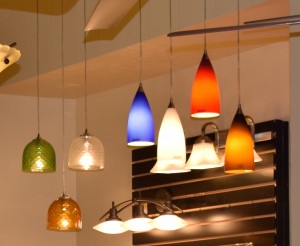
Design Center pendant lightsPendant lights are one option that has grown in appeal over the years, with the opportunity to add a touch of style and color to your kitchen’s lighting. The photo to the right shows a number of pendants for your kitchen available through the Fulton Design Center.

The light in the photo above at Legacy takes a different approach from the more standard pendants to offer a shaded piece that provides even lighting on the surface of the island. This intriguing transitional piece suits this kitchen with the shade complementing the tile on the wall and island.

Models 086More unusual, these large long hanging glass pendants in the photo to the right, shown at Legacy, are lit inside by Edison bulbs which provide a unique yet classic touch. This island is large enough to support three of these pendant lights.

The clear glass allows you to connect immediately with the entire kitchen, yet the dramatic style brings these pendants to the forefront of your vision. This is quite a daring choice for island lighting.

What kind of lighting do you want over your kitchen island? We invite you to visit the model homes at Legacy and the Fulton Design Center to see a rich variety of choices in person.


Kitchen-Smart Ways to use Cabinet Drawers

Legacy Models 025In most of the kitchens of yesterday, you needed three drawers: one for silverware, one for other cooking utensils, and one “junk” drawer. Today’s kitchens often offer more sets of drawers than before. But what do you do with these extras? Here are a few suggestions.

Table linens: Placemats, tablecloths and even fabric napkins are making their way to lunch and dinner. A drawer allows you to lay these items flatter, leading to fewer wrinkles.

Serving dishes: Larger plates and platters take up a lot of room on a shelf. Consider storing them in drawers instead, enabling you to look down and select just the right bowl or other containers for a family dinner or party.

P241ots and pans: Deeper drawers are a great place to store frying pans and smaller pots. No need to stack much with a broad base for setting each item in its place.

Plastic containers: One tip, you can store the bases in one drawer and the lids in another, shallower drawer nearby. Everything stays more organized this way and you can take full advantage of your drawer space.

Office or homework supplies: The kitchen island provides a perfect place for completing homework or paperwork. Consider using one of the island drawers to hold your supplies, making it easy to grab a pen or paper clip as needed.

If you take the time to think outside the box when it comes to your kitchen drawers, in no time every one will be full and you’ll wonder how you ever managed in a kitchen without them all!


Using and Accessorizing your Kitchen Island

Models 081 (1)A large island such as this one from the Fulton Homes’ Legacy community provides the opportunity to accessorize and still have space for functional uses. Let’s look at two versions of this island to see several approaches.

In this first photo, the yellow accessories combine with the green plants to add color to a neutral kitchen. The yellow pops against the dark kitchen cabinets and adds warmth to the view.

Notice that several collections of accessories are positioned on trays. Each tray contains several smaller objects which gives them more importance from a design perspective. More importantly, trays can be easily moved to allow the island to serve as a breakfast bar or buffet for a party or family gathering.

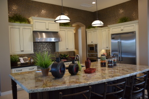
Legacy Models 118In the photo to the right, the accessories bring a darker tone into the light kitchen, linking the island with the backsplash and above-cabinet tiles and anchoring the island in the space. In this case the positioning of accessories provides plenty of room to use the front area as an eating or snacking area without having to move anything.

Both of these islands have a powerful presence in their respective kitchens. By breaking up the surface with carefully-chosen accessories, you can take full advantage of the space while using the area to add interest and charm. Notice that each island’s accessories vary in height and heft. This helps create balance.

You can also use this space to incorporate personal items that make the kitchen your own. If you have heirlooms from a family member or favorite kitchen accessories, islands such as these provide the perfect place to showcase them. And don’t forget these islands’ primary functional purpose – to add much appreciated counter space for food preparation!


The O’Connor: Entertaining from the Kitchen

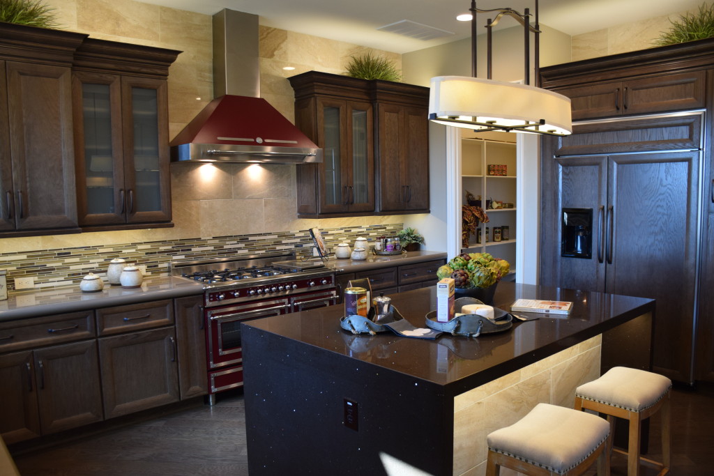
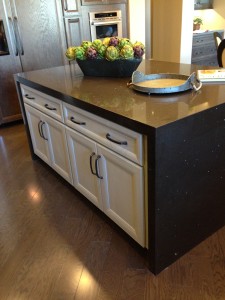
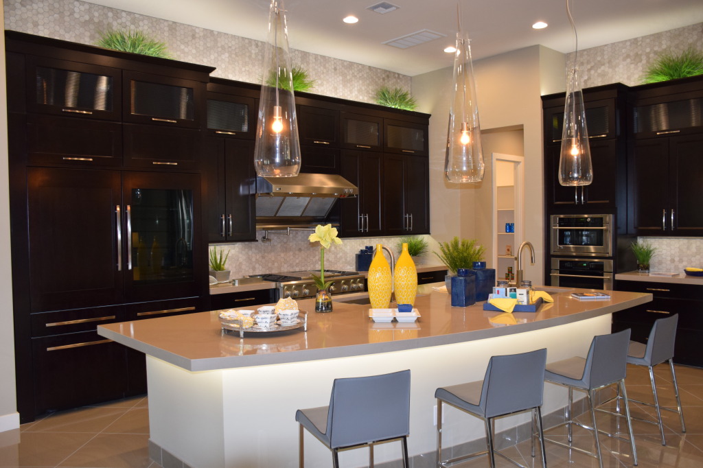
Models 081If you enjoy cooking for friends and family, this kitchen could make your dreams come true. With plenty of space for helpers and gawkers, you can prep, heat and dish up to your appreciative audience.

The Viking range and hood provide a close-to-professional cooking space with four gas burners and a center section that can serve as a grill or griddle, you have the capability and BTUs to fix a gourmet meal.

In the meantime, set up a buffet of appetizers to keep your guests happy until dinner. The generously-sized island has the perfect shape to share prep space with munchies. Two sinks provide flexibility to have helpers assigned to different responsibilities.

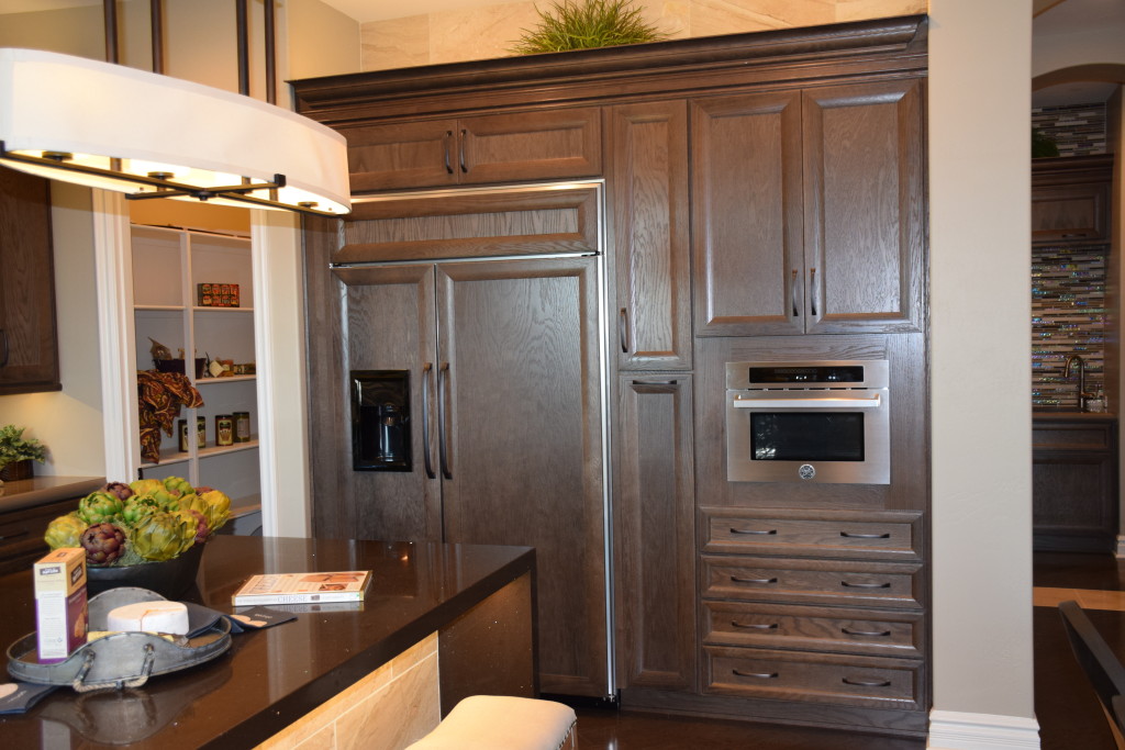
This kitchen is remarkably functional, but just as important, it shows style and flair. The rich dark color of the cabinets work well against stainless appliances, and the backsplash tiles become even more intriguing by also showing up above the cabinet lines. With two ovens, hot appetizers can bake while the meal does. And notice the pantry through the door in the back – ready to store all of your serving dishes until it’s time to plate.

The refrigerator/freezer is oversize, but with the doors matching the cabinetry, it is still a subtle look. Contemporary countertops and stainless handles work well with the stand-out industrial-style pendant lights over the island. Overall, this kitchen is designed to capture attention and serve as the center of your entertainment events.

Want a closer look? Visit Legacy and see what the O’Connor has to offer.

Design Center: Pot filler

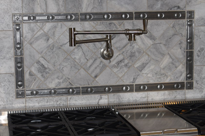
4 Pot Filler Design Center 016Would you appreciate never having to haul a heavy pot of water between your sink and range again? If you enjoy pastas, soups and stews, you may find that a pot filler reduces back strain, prep time and makes meal preparation that much easier.

Even your largest pasta pot will fit under this faucet. Its hinged design means that you can push it out of the way when you don’t need it and grab it easily when you do. Whether you use it to fill large pots or just add water to your saute pan to slow down the cooking, this pot filler will save steps.

By adding metallic tiles to the backsplash, this pot filler is well integrated into the kitchen’s design. The structure allows you to pour water as needed for any pot or pan on your stove.

Are you not sure how much you would use this? Try an experiment. Put a post-it note above your stove and jot a check for every time you fill a pot, pan or kettle with water from the sink before you bring it to your range. You may be surprised at how often you could save yourself the steps if you could access water right at your stove. Now, multiply that by 52 – and don’t forget to factor in holidays, parties and family gatherings which will only add to the sink-to-stove trips. And don’t forget that all those trips include hauling heavy pots filled with water around!

Well, is it worth it for you? A pot filler may be one of your smartest kitchen features!

Linking Kitchen and Dining Spaces

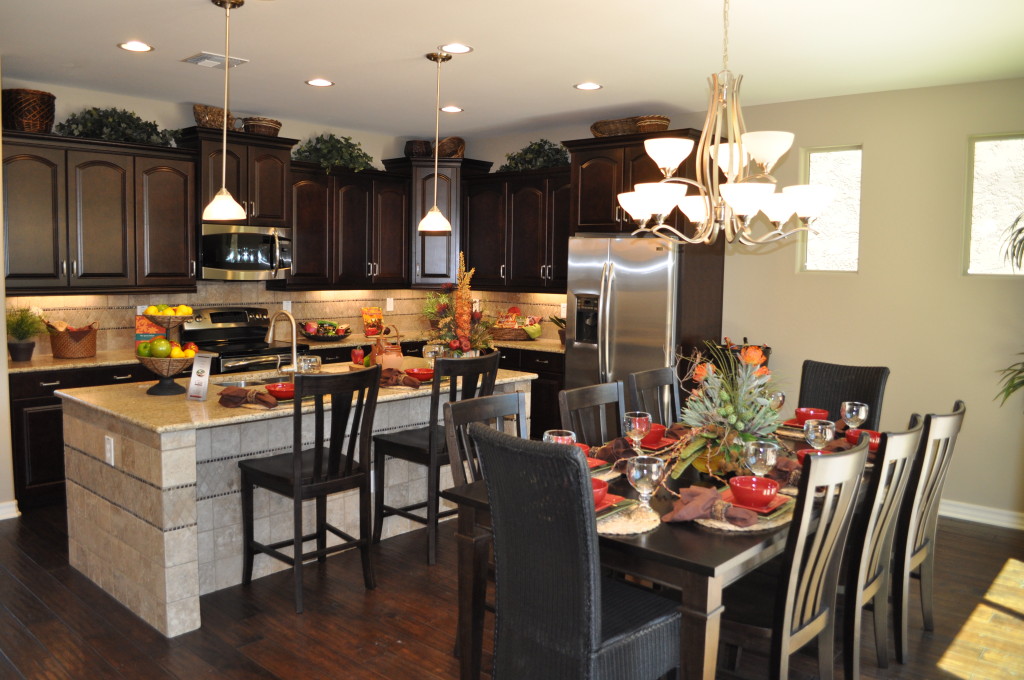
Kitchen20and20Nook20DSC_0244With an open floor plan it’s easy to connect with friends and family when fixing a meal. The distance to the table is short, making the transfer of food to table and dirty dishes back only a few steps.

If you have lived in a home without this kind of space, an open floor plan is a luxury indeed. But planning the décor requires attention to make the space feel unified. This Fulton Home model demonstrates how to connect the kitchen with the dining space. Let’s take a look at some of the decisions that make this space work so well.

Flooring: By staying with dark wood flooring throughout, everything feels like one room. The island provides the only break between the kitchen and dining table.

Cabinetry & Furniture: The cabinetry in the kitchen and the dining table and chairs coordinate in wood tone. Another connection comes when the chairs at the island sport the same design as the dining chairs. This keeps the one-room feeling intact.

Lighting: Although the pendant lighting above the island has a different function than the chandelier in the dining area, the glass globes are the same shape and both have the same brass finish. They are from the same family of lighting fixtures and they help integrate the space beautifully.

Accessories & Colors: The dishes, flowers and kitchen décor mirror the dining table’s tablescape. This causes your eyes to travel freely around the entire space without a pause. A difference in color or style from kitchen to dining room could create a jarring interruption.

If you are moving to a home with an open floor plan for the first time, be sure to factor the need to integrate several spaces into your design and décor plans.

More than Pictures on your Walls, Part 3

4552270_SIf you’re looking for ways to make room for some special items, consider turning your walls into active storage, while adding some style and variety to the look of your home at the same time.

The guitarist whose wall is shown in this photo created a truly wonderful display of his instruments while keeping them safe and handy for playing. Other musical instruments could be used in the same way. If you have a favorite hobby, consider hanging some of your favorite elements of it in plain sight.

11323448_SIf you’re a cook who enjoys the ability to grab the right tool without opening a drawer, how about hanging some of your favorites on a wall in your kitchen?

You can purchase a similar system of S-hooks and metal cross pieces at stores such as Ikea, and the pop of all this stainless steel would be a wonderful backdrop to complement your stainless appliances. Add a couple of colorful pot holders and you have a work unit that’s also a work of art.

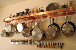
The kitchen display below combines decorative pieces from long ago with a nice selection of useful pots and pans. Maybe the teapots and trays atop the copper shelves belonged to the cook’s mother or grandmother, and they provide a nice reminder of helping to prepare meals as a child.

493988_SThe bright copper pot racks and the collection of cheese knives below bring life and color to the montage.

What do you have hidden in a drawer or cupboard that could add unexpected charm to some space in your home? You may want to position a shelf or two and see what you like sitting on them. All it takes is some imagination and a little daring and you can have walls as interesting as these are.

A Fresh Start on Organizing Your Home: The Kitchen

One of the kitchens on display at the Fulton Design Center

One of the kitchens on display at the Fulton Design Center

At first glance, getting your kitchen organized may seem like a daunting task. Chances are that when you moved in your goal was simply to get unpacked and able to make meals. Even if you had some plan of organization at the time, actually using your kitchen can help you discover that some items need to be rearranged. You have at least two ways to tackle your kitchen. See which one appeals to you.

Complete do-over. This is a full-day project, preferably with at least one other person to help as well. To make this work, try the following steps:

  • Clear off counters, placing any decorative items in another room for the day.
  • Have a bag ready for garbage and a box for giveaways.
  • Empty every shelf onto the counters and dining table.
  • Dispose of anything you don’t want or use in either the discard bag or giveaway box.
  • Wipe down counters and add or change shelf paper if desired.
  • Place the “sure things,” those items you already have a good place for, in their cupboards.
  • Thinking of function and utility, rearrange the other cabinets & drawers.
  • Determine if you need baskets or other containers for some items, and measure the space to know the size. Make a list for an upcoming shopping trip.
  • Measure your drawers for appropriate drawer dividers – these help keep drawers in shape once organized.
  • Compare the space left to the items left. Can you make them work? If not, consider more discards.
  • Put your kitchen counter accessories back, or not. Analyze what you actually want back in your kitchen.
  • Celebrate by going out to eat – you don’t want to mess up your newly-organized kitchen right away!

In our next organizing blog, look for advice on the second suggested method of kitchen organization. It takes longer but is less overwhelming.