Make Room for Art

make-room-for-artwWhen decorating a home, many people focus only on the big items such as furniture and then slowly add accessories over time, and this is a good approach. But while you’re furnishing your new home, be sure to include art in your plans.

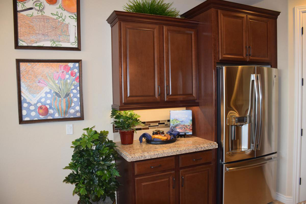
If you’ve been living in an apartment, you may find that your current collection of wall art looks rather small in your new larger rooms. This photo shows one way to deal with this – by hanging two smaller pieces together. This way the art takes up more space. Two or more pieces like these – with the same size, the same kind of frames and the same feel to the art – work well as a team on the wall.

Don’t limit your art thinking to walls. Notice the book set on the stand on the counter to the right of the photo. With the luscious photo on the cover, this book positions itself nicely as another art piece. In fact, if you didn’t look closely, it could be a small canvas set on an easel. You may have books or other elements that can double as art in your home if you take a look around.

If you would like more art on your walls but your budget is limited, consider photographs. Visit the Library of Congress photo collection online to view a rich choice of historical and other photos. You can have these reproduced for a minimal cost and frame them to create instant art at an extremely reasonable price. And family photos can be enlarged at your closest warehouse store at good rates.

Thrift shops and consignment stores are also a great resource for art at good prices. This is also an excellent place to pick up inexpensive frames. Just replace the art you don’t like with something that you do.

Take advantage of all your options to add art to your home. It can contribute color, interest, style and personality to your décor.

Integrating Space in an Open Floor Plan

integrating-space-in-an-open-floor-planwLiving with an open floor plan has so many advantages.  The space works well for families and entertaining and arrangements can be modified to expand and contract living and dining areas to meet specific needs. However, open architecture does present decorating challenges. Here are some tips to make your open living space work well.

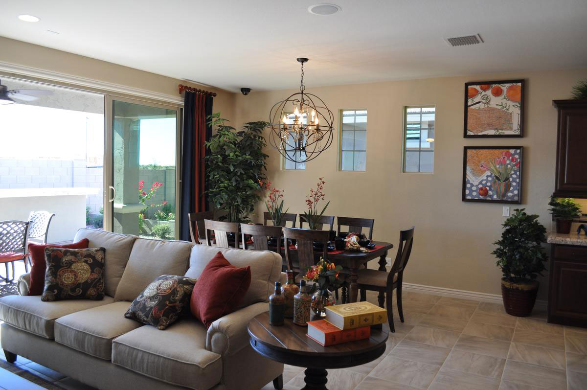
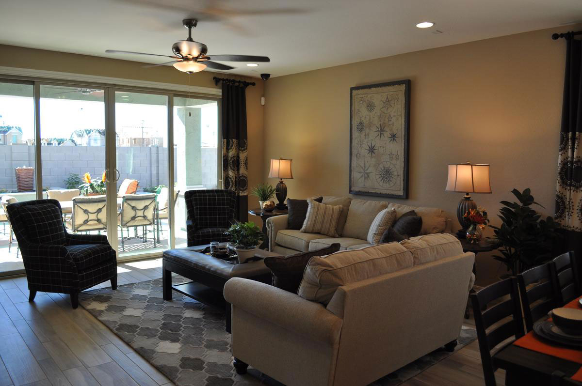
Define living areas: Use furniture, area rugs and artwork to define each living area. Without walls you can have the back of a sofa, a bookshelf, or a table set limits for a particular space.  Notice in this photo from the Cooley Station community how the sofa defines the end of the dining area and the start of the living area. Large pieces of furniture like sofas are some of the best tools for defining each space.

Create transitions: The plants on the kitchen counter and the floor and artwork make a softer natural transition between the kitchen and the dining area. Without these, the adjustment from one area to another can feel too abrupt. Having two larger houseplants in the dining area also helps define that space and keeps it connected.

Use lighting: Chandeliers such as the one over the dining table also help create a specific mood in one area of a large living space. Often the family room will have a ceiling fan. Our brains turn those light fixtures into room definitions.

Use color: Pulling the same accent colors throughout the space helps everything feel integrated. Throw pillows, area rugs, artwork and accessories in this room all use dark rust and peach tones to tie this living space together.

Bring Color into your Dining Room

web-bring-color-into-your-dining-room-blogMany people are hesitant to choose color for large furniture pieces for fear that they will tire of it or that it will go out of style. But you can bring temporary  color into your dining room with very little effort or expense. Let’s take a look at some of your options.

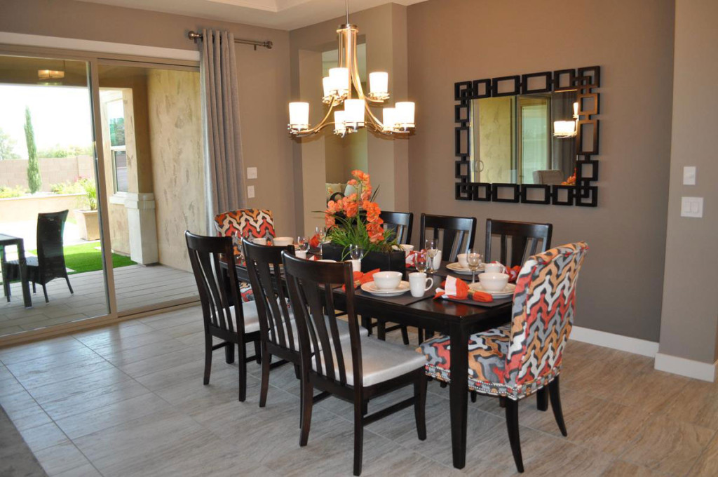
Slipcovers: The two chairs in this photo are upholstered in a fun coral, rust and gray pattern, but you can get the same result with slipcovers. Choose chairs in a simple style and you can have slipcovers made in a variety of fabrics and colors. By only covering the chairs at each end of the table, you get a nice pop of color without as much expense or trouble.

Table Linens: The placemats and napkins on this dining table match the colors on the two chairs, connecting everything together. This enables you to carry your colors across the table, once again with the flexibility to change your color scheme to match the season or your mood.

Centerpiece: Whether you use flowers, candles or other choices, your centerpiece can pull in all of your colors and integrate your color scheme. If you plan a buffet as part of your dinner plans, be sure to bring the colors into that area also.

Any dining room can be enhanced by adding temporary bursts of color. Be sure to look for opportunities to include color when planning your entertainment events.

Industrial and Traditional Styling Combine for Sophisticated Den

From the Atherton model in Penninsula at Queen Creek

From the Atherton model in Penninsula at Queen Creek

You may have noticed a decorating trend capturing an industrial feel in furniture and accessories. These items draw some inspiration from the Steampunk style, based on an alternate world where Victorian elements combine with steam-based technology to make an interesting setting for fictional universes.

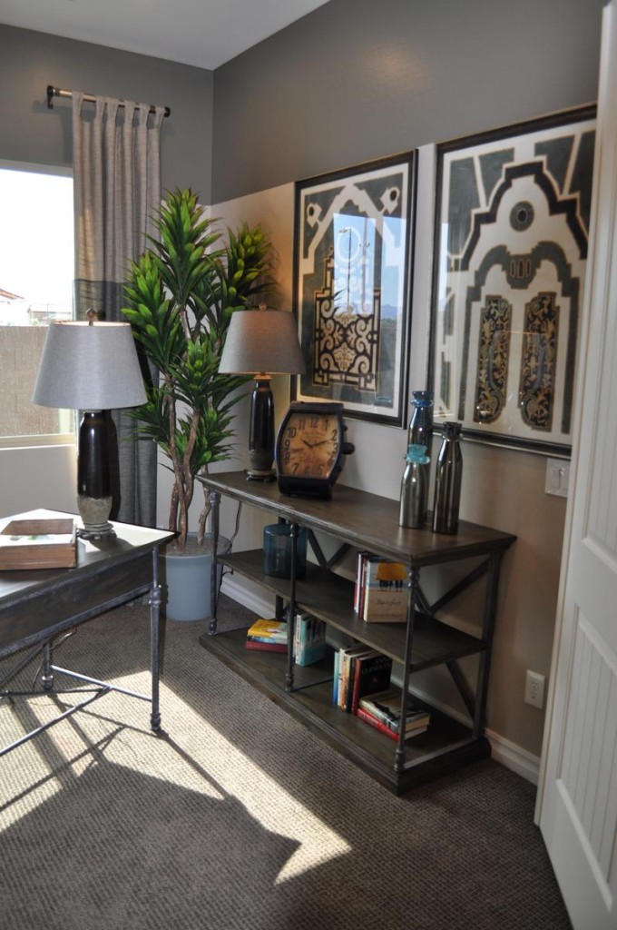
If you want to add that industrial feel to your home’s décor, you may be concerned that the look will lead to a cold space rather than one that is warm and inviting. However, you can incorporate industrial elements into a room without losing the warm feeling. This den is a good example.

The strong grey tones in the color scheme are consistent with industrial-style design. But notice the cream, gold and yellow fabric at play on the chair upholstery. Those colors are echoed subtly in various accessories, such as the gold clock face and several yellow books. These splashes of warmer tones go a long way toward making this space welcoming.

Industrial accessories such as the oversized watch face clock and the tool boxes say industrial, but the globe on the desk, the plants and other containers keep this residential space grounded in more traditional elements.

den 2The bookshelves show one of the best ways of combining industrial with traditional styles. The metal framing is classic industrial, but the wood shelves with crown molding along the top capture a much more traditional feel.

Finally, color-blocking on both the walls and the drapes add contrast and interest, while fitting with both an industrial and a traditional style.

Overall, the space makes the best use of two design styles, combining them to end up with a room that is sophisticated yet totally welcoming.

Create a Sophisticated Dining Room

From the Atherton Model at Penninsula in the Oasis at Queen Creek community

From the Atherton Model at Penninsula in the Oasis at Queen Creek community

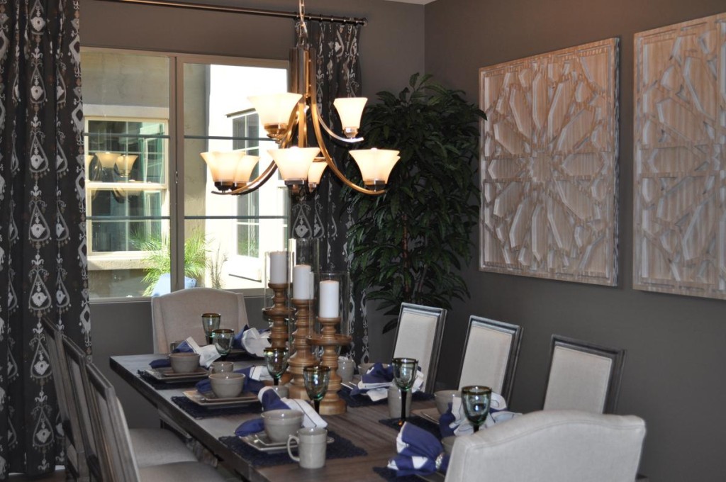
Grey has become a popular tone in decorating, and it is the strongest color influence in this dining room.  Yet this space feels warm and inviting. It’s the warm tones that balance the grey and make this dining room a place to linger. Let’s take a look at the elements that make this room so special.

Generous sizes: Start with a large table made with a thick top in a wood finish that combines grey with warmer hues. Add high-backed chairs with cushions and padded backs in a taupe/cream that uses both cool and warm tones. Finish with oversized art and substantial candlesticks on the table. All of these pieces give the room a weight and drama that combine to make the décor work.

Dark and light tones: Although most of this room uses neutrals, there is a nice distribution of light and dark tones to provide contrast and add interest. The curtains are the darkest permanent element in the room, but their pattern echoes the lightest tone. That light feeling is picked up in the chair upholstery and the candles. It’s too easy for a room filled with neutrals to end up boring, but these contrasts keep that from happening here.

A single pop of color: The blue napkins add a simple pop of color, drawing the eye to the table and adding just the right spark to the tablescape. Because the rest of the room is done in neutrals, you could easily switch out that blue for any bold color. How about yellow, red or coral? Or you could choose to go with black for extra drama. No matter your choice, this sophisticated dining room is ready for any dinner party.

Using Mirrors Effectively

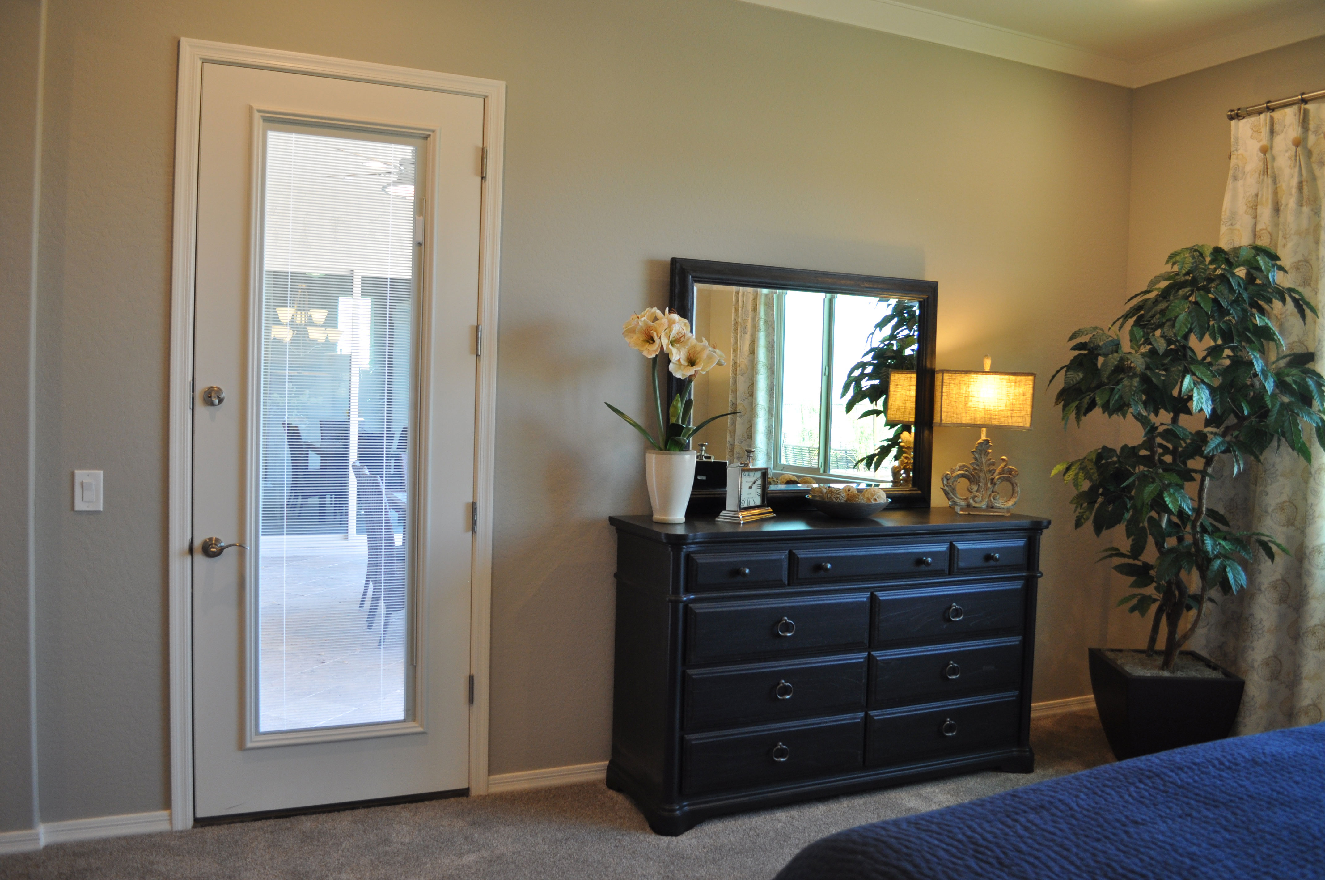
mirror-1-webMirrors can serve both a functional and decorative purpose in a room. Of course you expect mirrors in the bathrooms of your home, but placing mirrors in other rooms also works well. Here are a couple of approaches from two different bedrooms from the Rancho Mirage model in the Oasis at Queen Creek community.

Bedroom mirror over furniture: In the photo above, the dresser is accented with a matching mirror. Notice that this mirror actually seems to be resting on top of the dresser. The mirror enriches the look of the dresser and brings more light into the room by reflecting both the lamp and daylight from the window to the right. Positioning the mirror like this connects the two pieces and works almost as well as a floor-to-ceiling mirror for checking out the day’s outfit.

From a safety standpoint, be sure to attach the mirror to the wall at the top to keep it stable over time. Also check out the framing of each person who will use the mirror before deciding on the final position. If one of the bedroom’s users is taller, you can attach the mirror above the dresser to enable the individual to see his or her head. If the height disparity is dramatic, consider positioning this mirror vertically.

mirror 3Mirrors as art: These two mirrors hanging over the bed in the photo to the left don’t work well for checking out your reflection, but they maintain the room’s bold masculine look with their gear-shaped frames and industrial feel. And they do increase the light in the room by reflecting it from a nearby window. Don’t hesitate to use mirrors as art. Just be sure to look for choices such as this one where the frames have an interesting personality that complements the look of the room.

Easy yet Welcoming Entryway

entryway-webWhen people walk up to your front door, you want them to feel welcome before they even push the doorbell. On the other hand, going to an extreme with decorating your entryway can involve a lot of maintenance. Here is one example of a front entrance that provides an inviting feeling without a lot of effort on your part.

Interesting walkway: Instead of a standard concrete sidewalk, consider choosing a walkway material such as tile, stone or pavers to add interest and charm. This stone walk combines a diagonal placement with a simple border around the landscaping to make the entrance stand out. The additional stone on the wall around the front door adds to this entrance’s welcome.

Lighting: It’s easy to ignore exterior lighting, but it plays an important role in your home’s first impression. Take the time to choose lights that reflect your taste and style. Look for options that have personality and charm. This pair of coach lights suits the entrance yet have a feeling of whimsy that makes visitors take a second look. And when you turn those lights on at night, your guests know you are expecting them and looking forward to their visit.

Plants: Landscaping around your front entrance is important. Keep shrubs low so that the doorway isn’t hidden, but that touch of green adds interest. In this instance, several palms in pots add another splash of greenery and help integrate the sidewalk to the house itself. You can water these a few times a week or add a drip line to each one so that they get watered when your yard is irrigated. Then the only maintenance needed is occasional fertilizer and trimming any dead foliage off.

With just a few smart decisions, you can turn a standard entrance into something that makes a statement about how you feel about your home and the special people you invite to visit.

Turn a Hall into Something Special

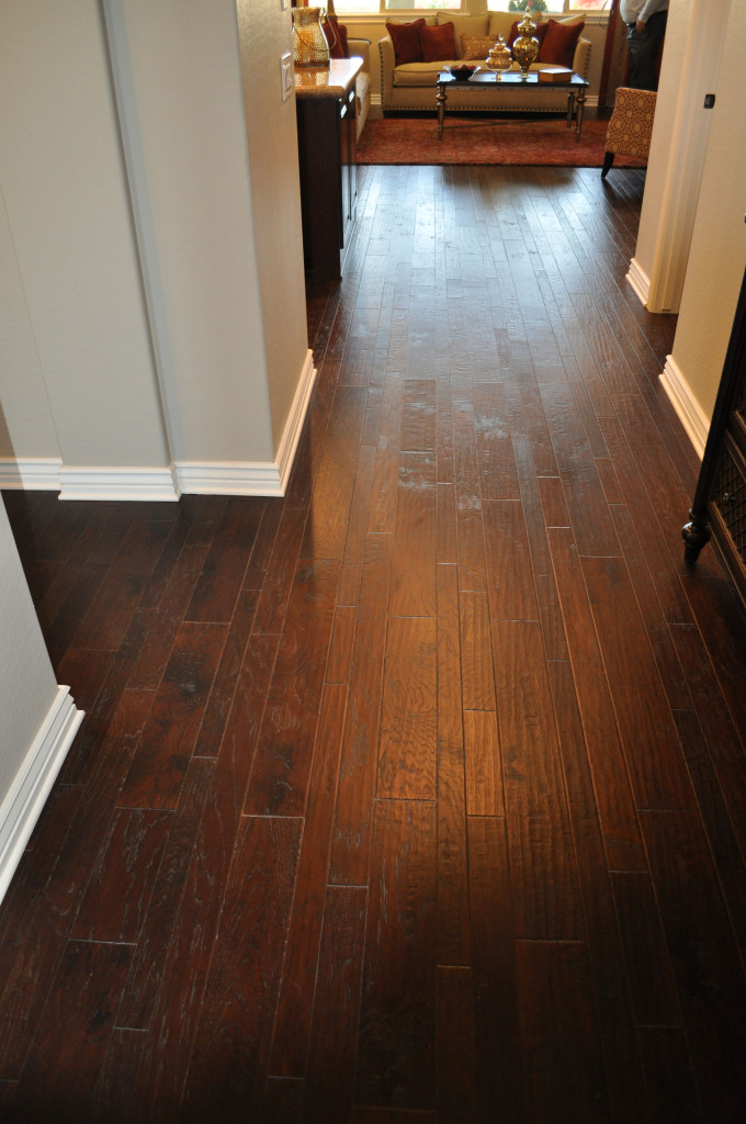
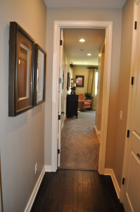
Hall-view-1Most people think of halls as simply a way to get from one room to another, but they can be much more than that. A thoughtful approach to hall design opens up possibilities throughout your home. Here are a few suggestions to make even the halls of your home a special experience.

Flooring: As an area with limited square footage, halls are a perfect place to splurge on flooring. For example, the mixed-width wood flooring in this hallway provides an inviting path to cross from room to room. Hallways also provide opportunities for border patterns, available in tile and stone as well as wood.

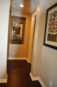
Hall-view-2Art: Consider a hall as a running photo gallery. The length and standard distance of the walls allow you to run a series of art pieces along one side, creating something interesting to look at on the way from one room to another.

Room views: Be sure to stop and take a look at how each room looks from the hall. That glimpse through the door generally provides a guest’s first impression of a room. In both these first photos, the rooms have some furniture facing the hall, making each room seem welcoming from that vista.

Hall-view-3Mirrors: Using a mirror at the end of a hall can make the space seem larger and reflect light, adding brightness to the hall.

Consider trying one or more of these options to make your halls much more than just a passageway. Make them an integral part of your home’s design.

Photos taken at the Whitewater model in Oasis at Queen Creek. We hope you’ll visit for even more design inspiration!

Decorate Using the Four Elements: Air

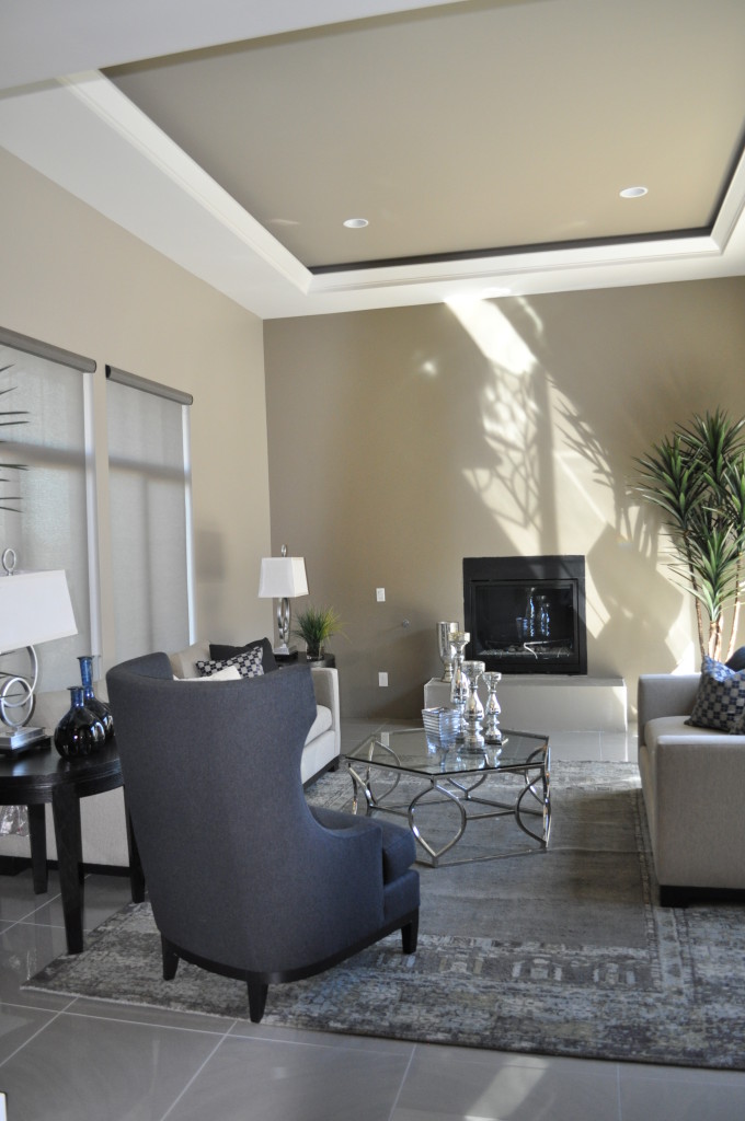
air photoAs we mentioned in our last blog, it’s interesting to take the long-ago perspective that the universe is made up of only four elements: Earth, Air, Fire and Water.  Today, let’s take a look at what a room would look like if it had an Air focus.

Vaulted ceilings, skylights and large windows fit this image. The ceiling is definitely a star in this photo. The coffered inlay is highlighted by the white trim and sunlight that creates magic shadows against the far wall. Silver and glass accessories suit air, as well as the subtle shades of grey that make up the color palette.

Notice the number of curves in the space, just as air curves as it passes buildings and trees. Even the plant in the back has an airy flow to it.

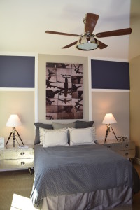
air 3This photo celebrates air, with the collage of planes in the background. Clearly this room was designed with air in mind. Again the color scheme reflects grey with soft lavender highlighted on the wall. A ceiling fan is a natural addition to an air-focused room. Skylights and clerestory windows also reflect the air feeling. Both photos are from the model homes at Legacy.

If you’re always looking up at the sky and enjoy having everything light and bright in your home, then maybe a focus on air is right for you.

In our next two blogs, we’ll look at what fire and water designs feel like.

Decorate Using the Four Elements: Earth

Mediterranean at Ironwood Crossing EarthLong before the science of chemistry came into existence, ancient philosophers and scientists thought the universe consisted of only four elements: Earth, Air, Fire and Water. And even though we know better now, it’s still fun to use these concepts to decorate your home. Let’s take a look at a room with an emphasis on earth.

The colors start the analysis. Earth tones predominate in this space. Notice the dark brown wood, brown sofas and beige and brown chairs. Brown and rust drapes complete the color scheme. There are a few touches of red and green – in the plants and the arrangement on the dining table. The deep blue of the throw pillows isn’t normally thought of as an earth tone, but against the brown sofas and combined with pillows that include that shade of blue along with earth-tone stripes, it works.

Next, let’s look at materials. Stone predominates, with the strong stone facing on the fireplace and porcelain tile in the dining area. Notice also the  pottery accessories on the coffee table. The clay that produced these three pieces is the ultimate earth material.

Choosing a warm wall color and the warm-toned shade of the table lamp at the back of this photo also echoes the feeling of the Earth element.

Are you the most comfortable in an Earth-focused family room? What other elements make a room feel like it’s connected to the earth for you?