Thanksgiving with Style: Part 1

If you want to decorate your home for Thanksgiving, your best resource is your local grocery store! Pumpkins – generally half price or less after Halloween – can join with pomegrantes gourds, squash and Indian corn to make your home inviting and seasonal.

Start by browsing through your collection of accessories. Do you have any antiques that would go well with autumn moods and colors? Baskets and pottery or metal bowls look inviting when filled with smaller fall products. If you purchase a nice selection of various squash, they will hold up throughout the season and are excellent roasted after their decorative use is over.

Once you’re finished rummaging through your home and local grocer, step outside and take full advantage of fall’s bounty. Do you have any trees with turning leaves? These can make for beautiful decorations on Thanksgiving day. Also look for dried grasses and berries on your property or along the roadside to add color and personality to your displays. With a little imagination and effort, you can create a fall environment in your home that will take your guest’s breath away.

Now, close your eyes and imagine how wonderful your house will look. Do you have any ideas or tips to make our vision of your home even better?

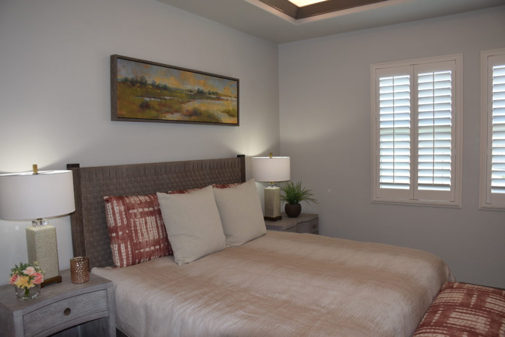
Bright Ideas on Lamps!

Harris Beach Model

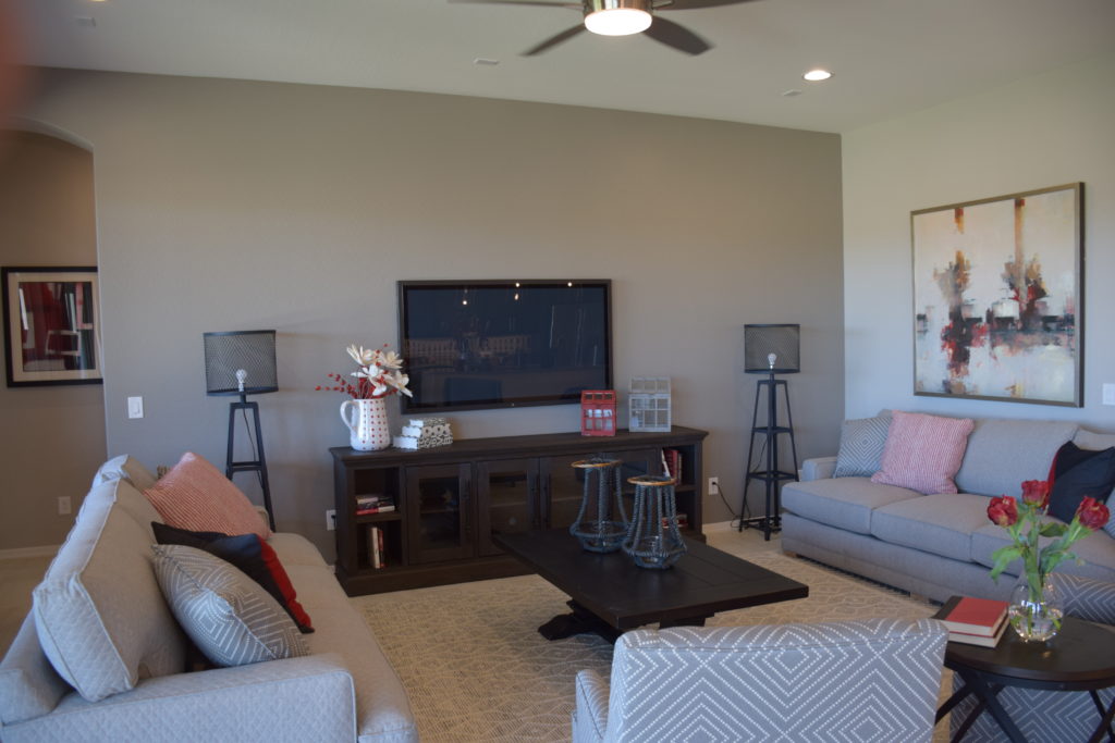
Lamps are some of the finishing touches you will purchase for your room when decorating. However, do not discount their importance to your room’s design. The right lamps can bring your room together perfectly. There are three main types of lamps to choose from—table lamps, floor lamps, and hanging lamps. Depending on the space you are decorating, the look you are going for, and how much light you will need the lamp to provide, one of these three types of lamps should suit your space.

The first thing you will want to do when deciding on what lamp to purchase is the size of the space it will be going. If it is a table lamp, be sure to measure your table so that you don’t get a lamp that overpowers it, or is too small to even be noticed. For hanging lamps and floor lamps the principle is the same thing, you will just be considering a different area.

Next, you will have to decide what kind of design you want for your lamp. There are so many choices out there and it can seem overwhelming but before you begin browsing sit down in the room and look around you. What is the theme of your design? Do you even have one or is it more eclectic than that?

Consider that glass bases will look lighter in your space and can work really well with modern designs. Wooden and metal bases offer a heavier feel to them and work well in more traditionally decorated rooms. The only way you’ll know what style to look for is to decide what will work best in the room.

Finally, you will want to figure out what the function of the lamp is. If your lamp is going to be the main source of light in your room, then you will want to go for a lamp that is both brighter and larger. A floor lamp or hanging lamp would work well in this situation. If your lamp’s purpose is more for bedside reading at night you should look for softer lighting like a small bedside table lamp with a low glow. These three steps should help ease your lamp buying process.

Tips for Monochromatic Decorating

Monochromatic decorating has a certain sophistication level that is perceived as elegant and classic. If you are not careful this style can easily become dull and lackluster. Let’s take a look to find out how to successfully pull off this look.

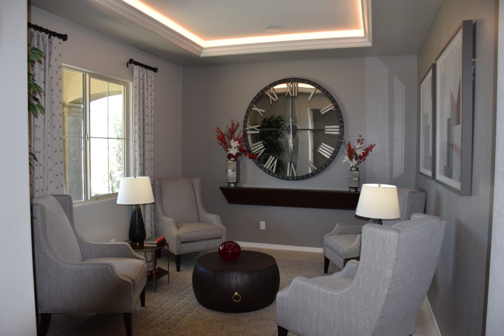
The most important factor in this style of decor is to create plenty of contrast. Contrast can be created by using light and dark monochromatic colors. An example of this could be contrast created with the help of the dark trellis or geometric pattern on accent pillows and dark fabric used on the drapery. Contrast could be made with a dark tray on a white table. An area rug with thin dark stripes is another example. Espresso brown is a common color of contrast against light colors and white.

Textures and layering are also important when decorating a monochromatic style. Example: Upholstery fabric on the sofa with a nice textured fabric, paired with different fabrics on the accent pillows. If the fabrics in this example not been mixed, the sofa would be washed out and boring. Another example is drapery panels coupled with the sheers. The can create an in-depth layer of texture and contrast.

The accessories in the room can also create the contrast we are looking for. Do this with glass and a little bit of shiny metal. This can add another layer of texture as well as some glitz. Glass items are always helpful when decorating in a monochromatic style.

Make sure to keep some life in the space. Fresh-cut flowers are an easy way to add life to a space. If no greenery appears in a monochromatic space it may feel cold and dull. In fact, all interior spaces benefit from plants, flowers and greenery. It is important to always place plant life within an interior!

Finally, the material of the floor is an important point to factor into the overall decorating scheme.  Be mindful to the contrast running through the remaining space.   

Let us know if you need further advice about your monochrome décor.  If you have an example, post a photo below!

Decorating with Mirrors

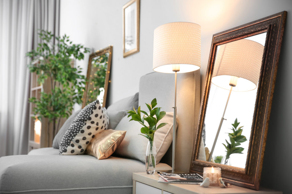
Elegant room interior with mirror on nightstand

When it comes to decorating with mirrors there are never any rules. Yes, mirrors are a great way to quickly add visual interest to your space. Using mirrors as a decorative element has numerous benefits. It can instantly add depth and bring in natural light. In addition, mirrors can create a special effect when they reflect colors and paintings on adjacent walls. Here’s how you use mirrors to add style and increased light to your home.

Place a floor length mirror between two windows

Implementing a floor length mirror between two windows creates the illusion of a third window. This helps bring in more light to your space. By casually propping a large framed mirror against the wall creates a relaxed feel.

Use mirrors to enhance the room elements

You can use mirrors as an accent to the focal point in a room. For instance, by hanging a mirror over a fireplace mantel that extends to the ceiling, you can create a dramatic look. This is a great way to create emphasis in a neutral living room.

Hang mirrors on adjacent walls

Are you ready to make a powerful statement with your home’s decor? Try lining, two large equally sized mirrors on adjacent walls. This enables light to bounce all around the room. This look will especially complement the dining room area because it expands the area and gives the illusion of a bigger crowd around the dining room table.

Forget the medicine cabinet

Forgo the traditional medicine cabinet hanging over the bathroom sink. Instead, you can use a mirror of any shape to make a statement. A circularly shaped mirror can break up all the sharp straight lines and adds character.

When using mirrors as an accent piece in the home try to select mirrors with interesting shapes and unique frames for further customization!

How to Decorate with Split Complementary Colors

Timber Cove

Looking for ways to transform a blank canvas? A split complementary color scheme will no doubt add great contrast to a room which instantly brings interest and variety to your space. However, the downside is that you can end up with a design that looks busy or messy. If you’re interested in doing something different with your home’s decor, this article will show you how you can pull this off successfully.

What Is A Split Complementary Scheme?

In a split complementary color scheme, you’ll be using three different colors. This decor consists of two complementary colors and then the color that sits opposite from the complementary color on the wheel. For instance, yellow and green are complementary colors. Violet is the split complementary color of yellow. Usually, this palette will consist of two warm colors and a cool tone. However, you can adjust the temperature balance as you see fit. If you want to create a warm and welcoming atmosphere then you should use more of the warmer colors in your decor. Paint your walls and use this color in your furniture upholstery. On the other hand, if you prefer to set a cool mood then you would do the opposite.

Clashing of the Colors

Yes, using a split complementary scheme can be challenging especially if you’re not particularly skillful at using colors. To avoid a harsh clashing of colors, which can make for an aesthetically unpleasing look, make sure you don’t overdo the contrast. For a sophisticated look, you can tone down the hues of the opposite color. You can even use more of the two complementary colors and the third color sparingly.

Example: Blue, Violet, and Orange

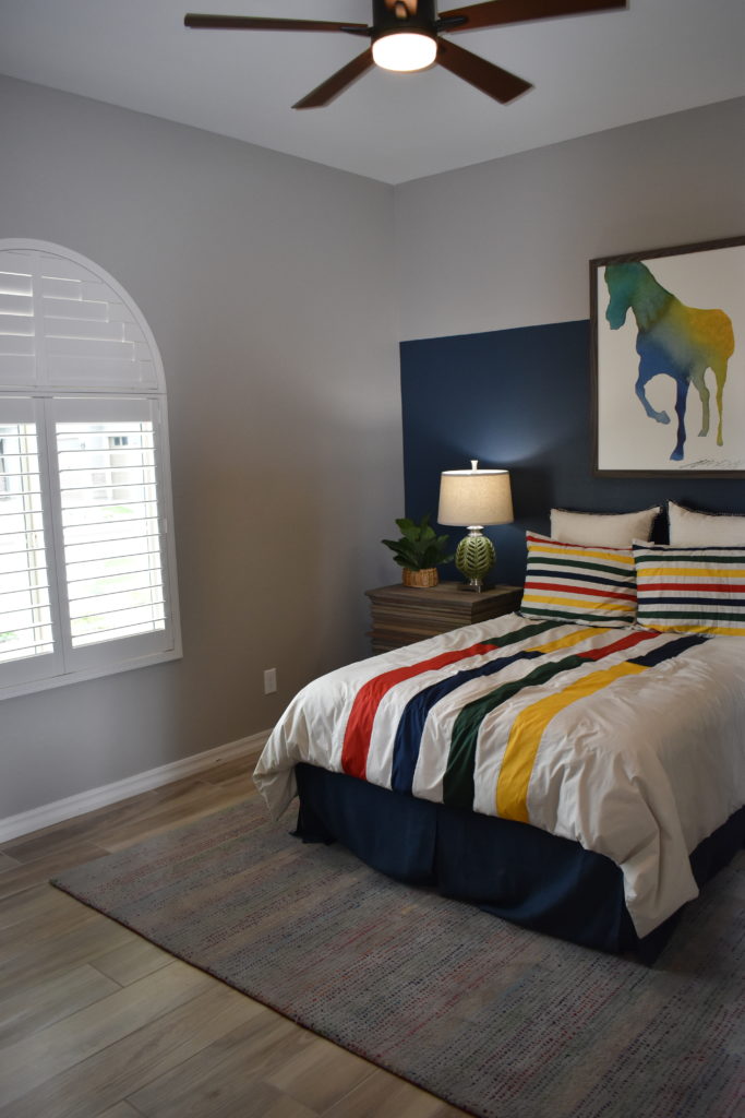
Blue and violet are complementary colors. In a split complementary design scheme, blue and violet are the dominant colors. Orange should be used sparingly as an accent color to make your space come alive. For instance, in a bedroom, you could consider painting the walls a pale violet and covering the arches in blue. Perhaps your bedding would also be violet or blue and you can add orange pillows as an accent.

Common Decorating Mistakes

You’re not alone! Common decorating mistakes are made time and time again. This post may help you by pointing out common mistakes so you can avoid making them!

If you don’t love it, Leave it!: Do not use something that you don’t love. Just because something has been inherited or gifted and you feel it needs to be used, doesn’t mean you have to use it. If you don’t love something, donate it!

Define your own personal style: Don’t decorate according to the latest trend. Decorate around your personal style. You will enjoy your décor much longer than you would if you used a trendy style. Decorating around your personal style gives unique character to your interior.  If you’re sick of the white tile in the kitchen, replace it with a bright warming color.

Clear the clutter, Go chunky: Small accessories tend to make a space look cluttered and unorganized; not to mention the dust they collect. Simplify your accessories by replacing many small items with a few chunkier pieces. Chunky accessories make a space look clean because few are needed to replace many small items.

Research Color: Avoid making the wrong choice with color. Different colors spark different moods on a subconscious level. Research what colors you are considering for carpet, tile, paint, etc. in order to ensure the right color choice for the appropriate room and its use. (or ask our designers for help!)

The most important advice we can give you is “Done is beautiful”. Incomplete spaces look uninviting and affect the people that live there as well as guests. Try not to get caught up in deciding the perfect look for a particular space. Find a way to complete spaces; they can always be modified down the road.

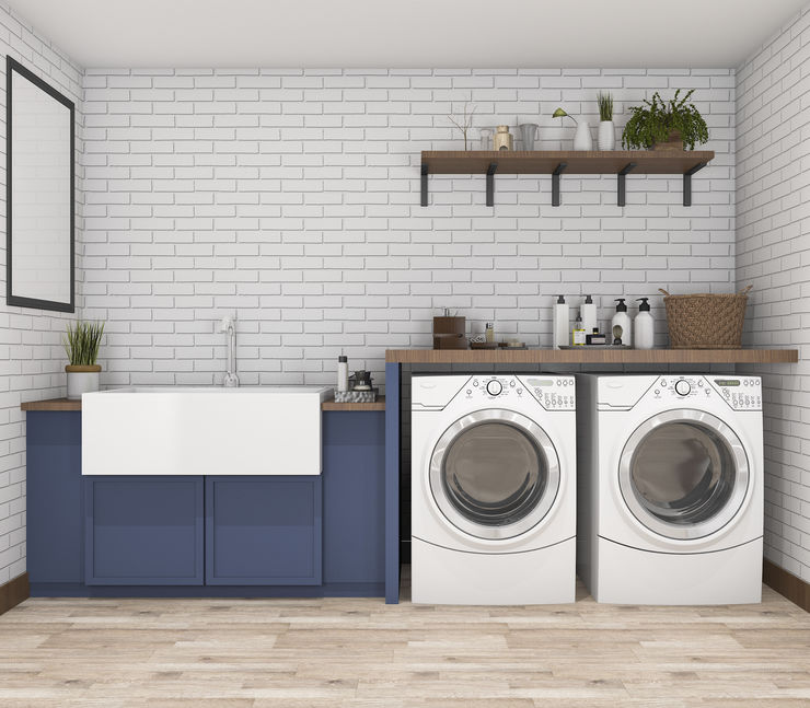
Decorating the Laundry Room

There are a few rooms in our home that we don’t really think about decorating. Hallways and powder rooms are two of them, but perhaps the most neglected room in our homes is the laundry room.  Despite spending hours every week in the laundry room, we rarely think to decorate this room. Maybe if we added some design style to the laundry room it might make doing laundry a little bit more enjoyable! Maybe? Probably not, but having a pretty laundry room might help us dread the task a little less.

If you have a laundry room on the second floor or main floor of your home, you probably already have finished flooring in the room. Basement laundry rooms tend to have cement floors. Adding laminate or tile to a basement laundry room floor would make the space feel more like a finished room.

Painting the walls of the laundry room a happy color you love could improve your mood when you are in the room.  This is especially true for basement laundry rooms. Cabinets can be painted or replaced with more stylish cabinet doors.  Open shelves can be put up to store laundry supplies in pretty glass jars.  A folding drawer or cabinet makes drying sweaters neater and keeps the room less cluttered.

Adding a chandelier or other fun hanging light can give an extra bit of style to the utilitarian room. If your laundry room has a window, put up decorative window treatments like cafe curtains or roman shades.

Where to Start When Creating a Gallery Wall

Question: Where do you start when trying to create a gallery wall? The idea is great, but knowing how or where to start is difficult.

Answer:

Creating a gallery wall does not have to be difficult. Here are some tips to use when creating one in order to make your experience painless!

First, gather together the pieces you are planning to use in your gallery.  Lay them out on the floor and start by selecting the piece that is the largest, the brightest or the most eye catching. This will be the focal point of the wall. By starting with the desired focal piece, the rest of the picture placement on your galley wall will be much simpler.

There is no right or wrong when deciding on the placement of various pieces that hang in a gallery grouping. It can be symmetrical or asymmetrical. Go with your intuition and try to balance the overall grouping throughout the placement.

The idea with your galley wall is to create a display of complementary pieces.  Each individual piece adds its own beauty, but the piece as a whole can also hold itself together.

Variety of subject matter will help the gallery grouping be more successful. Having variety will add interest and keep the eye moving around the grouping. It is fine to use color or black and white as a theme throughout the pictures. One idea is to to use a black and white center piece, surrounded by colorful pieces.

The most important thing to keep in mind is that it should feel balanced. Layout the grouping on the floor or a table surface and play around with different layouts. Decide the best layout and then install the grouping. It helps to create a sketch, so that you can remember where things go.

Hang the focal piece first, followed by the pictures closest to it as arranged beforehand.  Don’t worry if your arrangement changes as you hang each piece.  Your final arrangement on the wall will be the best layout of all!

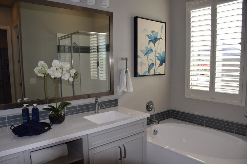
Decorating with Mirrors

Pelican Bay Model

When it comes to decorating with mirrors there are never any rules. Yes, mirrors are a great way to quickly add visual interest to a space. Using mirrors as a decorative element has multiple benefits. They can instantly add depth and bring in natural light. In addition, mirrors can create a special effect when they reflect colors and paintings on adjacent walls.

Here’s how you use mirrors to add style and increased light to your home.

Place a floor length mirror between two windows

Implementing a floor-length mirror between two windows creates the illusion of a third window. This helps bring in more light to the space. Casually propping a large framed mirror against the wall creates a relaxed feel.

Use Mirrors to Enhance The Room Elements

You can use mirrors as an accent to the focal point in a room. For instance, by hanging a mirror over a stacked fireplace mantel that extends to the ceiling you can create a dramatic look. This is a great way to create emphasis in a neutral living room.

Hanging Mirrors On Adjacent Walls

Are you ready to make a powerful statement with your home’s decor? Try lining two large equally sized mirrors on adjacent walls. This enables light to bounce all around the room. This look will especially complement the dining room area because it expands the area and gives the illusion of a bigger crowd around the dining room table.

Mirrored Backsplash

Update your kitchen by installing a mirrored backsplash around your counter area. A mirrored backsplash will open up a small kitchen and add glitz without being over the top.

Forget the Medicine Cabinet

Forgo the traditional medicine cabinet hanging over the bathroom sink. Instead, you can use a mirror of any shape to make a statement. A circular shaped mirror can break up all the sharp straight lines and adds character.When using mirrors as an accent piece in the home try to select mirrors with interesting shapes and unique frames.

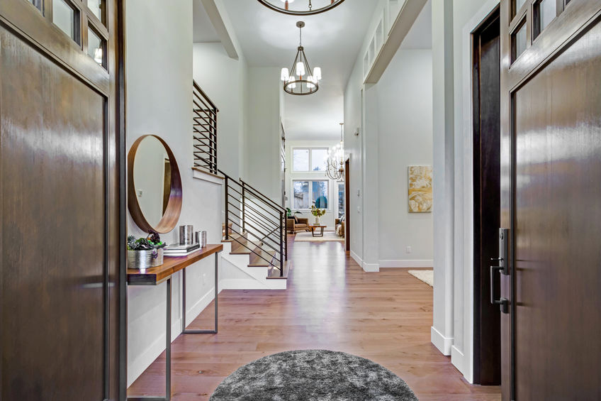
Ideas to Dress up Your Hallways

In a lot of homes, hallways are just a connection to other rooms, and homeowners often overlook their decorative potential. With hallways often being narrow and short, homeowners may throw up a picture or two and call it a day, but we believe hallways can be so much more.

7 Ideas to Dress Up Your Hallways

1. Blended

When working with the design in your hallway, you want to be sure that it continues the current design onto the next room. Your hall can be a subtle preview of what guests should expect when they enter your home’s next room. The design flow should never stop in the hallway because that tends to make the transition feel awkward. Instead, you want to make sure that each room blends well into the hall and leaves seamless transitions. 

2. The Main Event

Just like in any other room, you will want to create a “focal point” that becomes the center of attention in the hallway. This item can be anywhere from a gorgeous light fixture to an extravagant mirror. It will depend on what you want to do with the space and what decor pieces you plan on incorporating. 

3. A Perfect Runway

As flooring experts, we understand that no room is complete without the perfect touch of flooring. For hallways, we recommend purchasing a “runner” for the floor. This simple addition can instantly make your hardwood floors feel more cozy and chic.

4. Chic Shelving

In hallways, you want to keep the decor light and simple. Since there is not a lot of space to work with, a simple, chic shelving piece can do just the trick.

5. The Gallery.

Gallery walls are a trendy, inexpensive way to decorate any room, but they work exceptionally well in hallways. When creating your hallway’s gallery wall, you want to be sure that you keep it simple. Depending on the size of your wall, you will most likely want to use fewer items than you would typically in another area of your home. Try and keep it simple and light to create a refreshing look.

6. Look Up

If you are looking for a creative way to make your hallway unique, you could try painting your ceiling a fun color. Once you have decided on a color, you can incorporate it into your hallway’s design. This will help tie together everything. 

7. Captivating Wallpaper

Graphic wallpaper is a current trend everyone loves. It is especially perfect for hallways because it will help bring them to life. We recommend trying to use vertical graphic patterns in your hallways. This will help make the room look more substantial than it actually is.