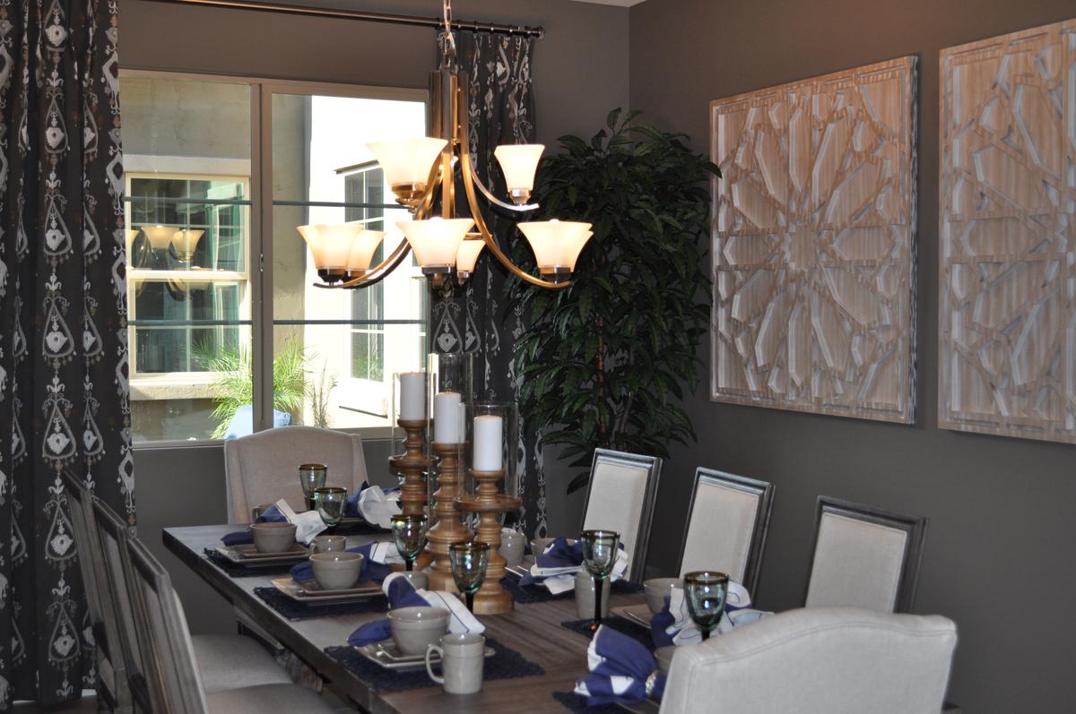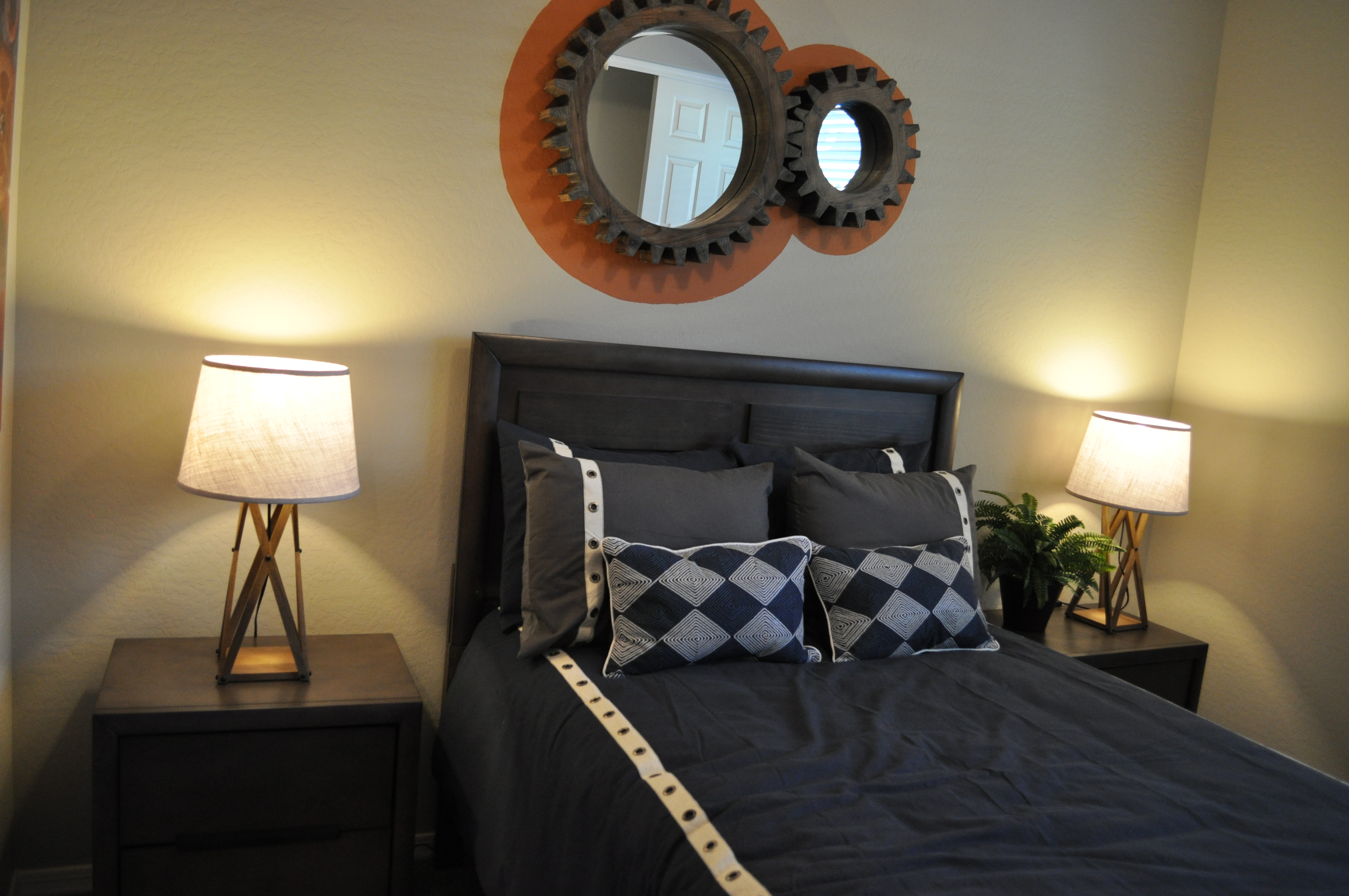
From the Atherton model in Penninsula at Queen Creek
You may have noticed a decorating trend capturing an industrial feel in furniture and accessories. These items draw some inspiration from the Steampunk style, based on an alternate world where Victorian elements combine with steam-based technology to make an interesting setting for fictional universes.
If you want to add that industrial feel to your home’s décor, you may be concerned that the look will lead to a cold space rather than one that is warm and inviting. However, you can incorporate industrial elements into a room without losing the warm feeling. This den is a good example.
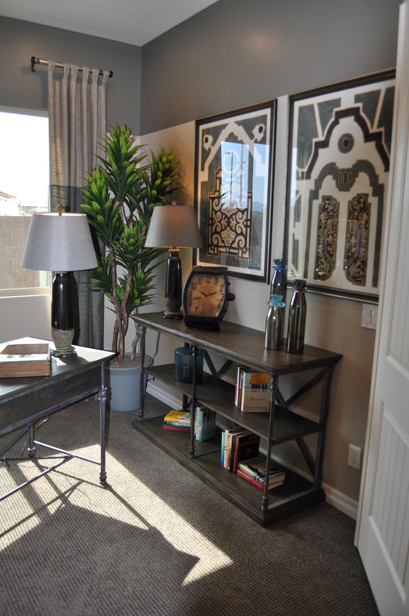
The strong grey tones in the color scheme are consistent with industrial-style design. But notice the cream, gold and yellow fabric at play on the chair upholstery. Those colors are echoed subtly in various accessories, such as the gold clock face and several yellow books. These splashes of warmer tones go a long way toward making this space welcoming.
Industrial accessories such as the oversized watch face clock and the tool boxes say industrial, but the globe on the desk, the plants and other containers keep this residential space grounded in more traditional elements.
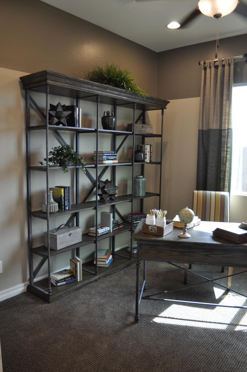 The bookshelves show one of the best ways of combining industrial with traditional styles. The metal framing is classic industrial, but the wood shelves with crown molding along the top capture a much more traditional feel.
Finally, color-blocking on both the walls and the drapes add contrast and interest, while fitting with both an industrial and a traditional style.
Overall, the space makes the best use of two design styles, combining them to end up with a room that is sophisticated yet totally welcoming.