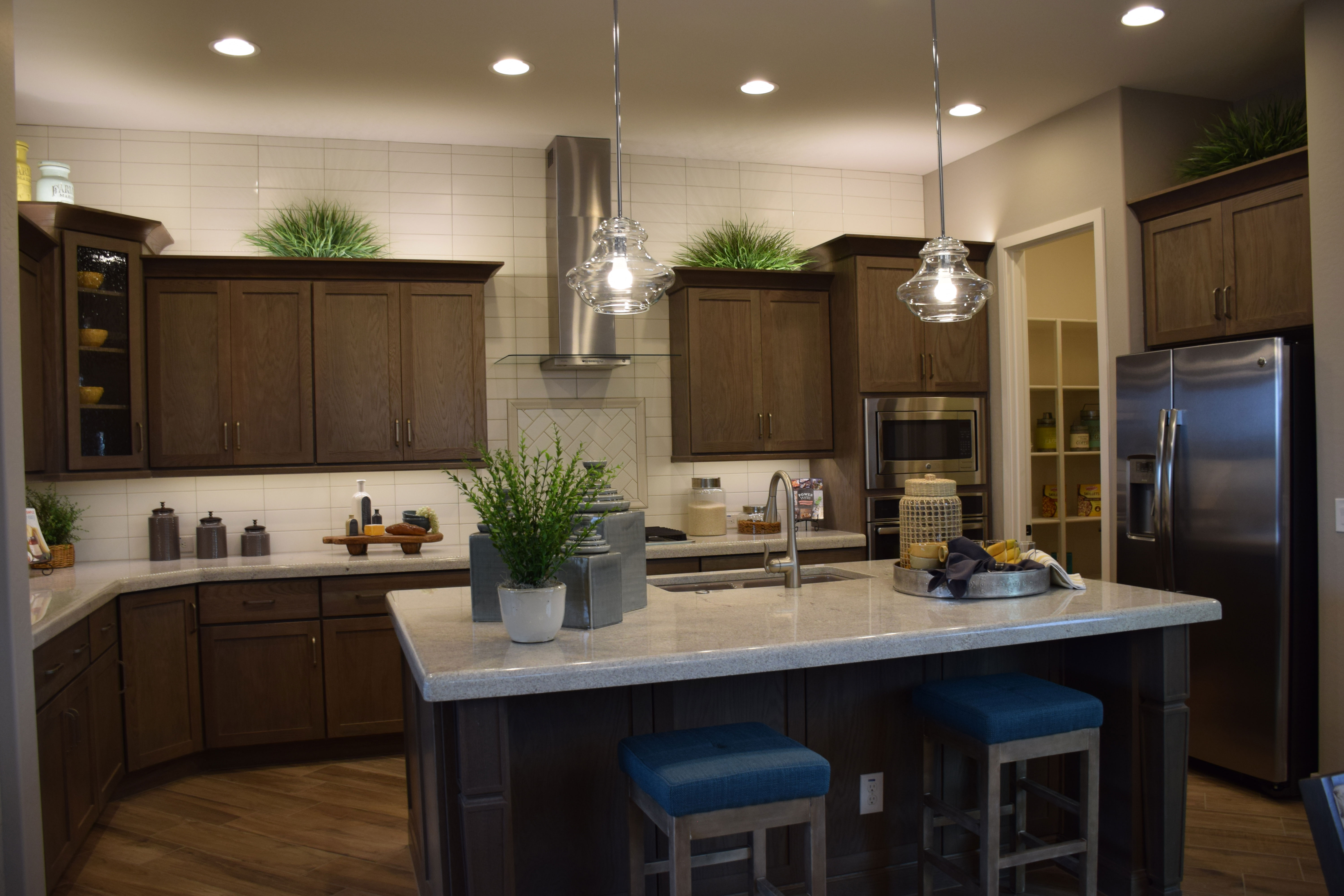
Making the Most of your Walk-In Pantry

wWarner-Groves-at-Morrison-Ranch-053 - CopyIf you’re lucky enough to have a kitchen with a walk-in pantry, you will soon wonder how you ever managed to make meals without one. It can’t be beat for helping you organize your space and make the most of your kitchen. Here are some suggestions to help your pantry really work for you.

Use a FIFO inventory system: FIFO means First In First Out. If you don’t pay close attention to this, it’s easy to let food get lost until it’s out of date. To protect against this, keep like products together and take the time to put the new purchases toward the back.

Use baskets to store small products: Packets of spice mixes or dips will quickly get lost on shelves if you don’t keep them contained. Look for small wicker or plastic bins to hold this type of item.

Store small appliances on lower shelves: It’s easy to have small appliances such as blenders and food processors absorb counter space. Instead, use your lower pantry shelves to store those appliances, keeping them out of the way yet making them easy to grab when you want them.

Use labeled clear airtight bins to store grains and staples: Oxo and other companies make great airtight bins for flour, sugar and cereals. You can use a label maker to print labels or just tape hand-written labels on the fronts of the containers. These are much more efficient in terms of space usage and will keep everything fresher than leaving things in original boxes.

Position a grocery list in your pantry: As you run low on standard pantry items, add them to your list. When you’re ready to go to the store, just add any fresh produce or meat needs and go.

With a little planning, your pantry can be the center of your well-organized and enjoyable kitchen.

Water Feature Makes a Yard Special

wBackyard-Sycamore-Warner-Groves-at-Morrison-Ranch-057 - CopyIf you want your backyard to feel unique, consider a water feature. Take a look at this one from the Sycamore model at Warner Groves at Morrison Ranch. This water feature, and this yard, have much more going for them than the standard approach. Let’s take a look at the elements that make this space special.

Dramatic waterfall trio: By positioning the three waterfall fountains along the back of the yard, this space has a unique focal point. Living in the desert, we are naturally drawn to water, and this arrangement provides a cooling look and sound as well as a refreshing place to sit and cool off.

Pavers used in hardscaping: Pavers are versatile and attractive and hold up extremely well in Arizona’s tough weather conditions. They are also a cost-effective alternative to tile and stone.

Raised planter beds: Raised beds allow plants to stand out in a landscape and make it easy to plan a drip irrigation system. They also allow you to make the most of your water use, by planting in the richer soil that is used in raised bed gardening. They also create a sense of intimacy in a backyard.

Comfortable outdoor furniture: Thanks to the new outdoor fabrics and fillers, you can have cushioned furniture outside year-round. This arrangement invites guests to relax for an evening of conversation and fun.

Start with a significant water feature and continue adding elements until you have a backyard like this one – a place to relax, entertain and enjoy.


Create Cozy

wWarner-Groves-at-Morrison-Ranch-074 - Copyit’s not hard to make your family room to feel cozy and welcoming like this one. Here are some suggestions to bring the cozy into your home.

Darker Walls: You may have heard that darker walls make a room feel smaller. Not true. Instead, dark walls make you feel more secure and enclosed. The dark grey wall in the back adds warmth even though it is a cool color. It also provides a nice contrast to the bright windows.

Comfortable Upholstered Furniture: Getting comfy is an important part of feeling cozy. This plush sectional offers plenty of room to sit or stretch out. Throw pillows add comfort. You can tuck one or two under your head or at your feet on the coffee table.

Floor and Table Lamps: Ceiling light fixtures alone can’t add the ambiance that floor and table lamps can. Set your ceiling lights at a low level and turn on the lamps to create a cozy feel to any space.

Low Furniture: The television, coffee table and console are all close to the ground. This means that you can sit on the floor and still access everything. It’s an inviting space for lounging.

Carpeting: The choice of carpeting or a large rug adds softness to a room. Once again, a comfy soft flooring surface invites lounging on the floor.

Make your family room a place where friends want to linger. Create a cozy space for relaxing and fun evenings with guests or just family. Visit the models at Warner Groves at Morrison Ranch for a closer look.

Layers in Decorating

wWarner-Groves-at-Morrison-Ranch-052 - CopyWhen you’re planning to decorate a room, it’s easy to focus on the furniture and accessories, but there’s much more to consider. Let’s take a look at this photo and consider all the elements we see.

The view: From this angle, the first thing our eyes focus on is what’s outside the house – the backyard. In a way, the focal point of this space is actually the trio of waterfall fountains in the back yard. It’s nice to have this kind of special view from your back windows because it adds so much not only to the yard itself but to your home too. But even if you don’t have a view like this, be sure to think about what people will see when they look outside. Plan your landscaping with the view in mind and keep the yard free of clutter.

The window treatments: This room has curtains framing the back window that capture the accent color in the room – yellow – as well as shutters behind the sofa where drapes would be awkward. When you’re choosing window treatments be sure to consider how furniture placement will affect your choice.

Lamp and accessories: Notice that the shape of the jar on the side table echoes the base of the lamp. That creates a comfortable consistency that makes the room feel well pulled-together. The colors also work well together – staying in the background rather than pulling too much attention to that corner. And the curves flow with the soft upholstery and throw pillows.

Altogether, the layers of this room work well to make the space feel integrated and well designed. This makes the room a pleasure to spend time in and share with family and guests.

Bedroom with Nautical Theme

wWarner-Groves-at-Morrison-Ranch-070Decorating with a theme makes a room fun, and this nautical option offers lots of choices for colors and accessories. Let’s take a look at this inviting bedroom above to get some ideas.

Color scheme: Blue is a given. You want to capture the color of water when you bring in a beach/boat theme. The secondary color – the focal hue on the back wall – captures the feeling of sand.

Patterns: Notice the wave pattern on the bedspread. This gives the feeling of water in the room. The woven bases on the table lamps remind you of fishing nets, bringing in another element of the ocean to this beach-like bedroom.

Accessories: An anchor appliqued on the throw pillow certainly brings a nautical element into the space. Several model sailboats also contribute to the mood. A final fun element comes from the oars hanging on the walls. The paint choices make these items particularly interesting, Creativity certainly came into play in this space.

You don’t have to live on the water to bring an oceanside feeling into your home. With a little planning and some flair, you can create a beach space even if you live inland. To see this room in person, visit our Sycamore model in Warner Groves in Morrison Ranch.

Daring Home Colors

wWarner-Groves-at-Morrison-Ranch-022Given our location in the Southwest, it’s easy to stick with earth tones for our homes. But don’t be narrow in your view of possibilities. Instead, consider adding some color to the outside of your home.

This blue option is the Evergreen Elm model at Warner Groves in Morrison Ranch. Notice that it still captures the best of the Southwest. It has stone trim on the front columns, adding a rustic look. In addition the front porch does a good job of creating shade as needed to cool the front of the house while adding a welcoming area.

But the blue is definitely daring. Contrasting darker blue trim highlights the more unusual approach to a Southwestern home. You could carry the blue into the interior or pull in other colors. It might be nice to have a blue element just as you walk in the door to make the connection. The house below shows another color option available in Warner Groves, with the Cottonwood model.

Warner-Groves-at-Morrison-Ranch-045wThis canary yellow with dark gold trim also takes a chance with color. The architectural details echo a farmhouse style. Notice that this home has brick trim anchoring the front porch area.

Are you willing to take a chance with color? How about visiting these models in person to see how the brighter hues lift the homes into another category with reminders of Midwest or East Coast color options.

An Inviting Dining Table

wWarner-Groves-at-Morrison-Ranch-065 - CopyWhen you’re planning the look of your dining area, there are a lot of elements that make the space inviting. Here are a few tips to make your dining area catch people’s attention.
The perfect chandelier: More even than the table itself, the right chandelier makes a dining space stand out. You want something that reflects the style of the space. You also want to make sure that it is the right size for your dining area and your table. It should also hang at the right height – not so low that it shines in your diners’ eyes, but not as high as most ceiling-mounted fixtures. Generally a chandelier should hang 32-40 inches above the table. It should be just large enough to light the table’s surface without lighting the diners.

The right dining chairs: If you want your guests to linger after dinner for an enjoyable conversation over dessert and coffee, pay careful attention to your dining chairs. Make sure they will be comfortable for at least an hour or two. Look for nice padding on the seat and maybe the back, and make sure the backs lean so that people aren’t forced too upright. Be sure to sit in any potential dining chairs for more than a few minutes before you make your choice.

Accessories that add interest: When you are not actually dining, look for a table centerpiece that helps link the table to the chandelier. These tall flowers do the trick in this photo. But when you have guests for dinner, put this arrangement on your island and keep any centerpieces low enough to converse across the table.

Colorful table linens and white plates: This rule is not written in stone, but many chefs swear that food looks better on white plates. Color in your table linens adds interest and personality to your table.

Cozy Outdoor Area for Two

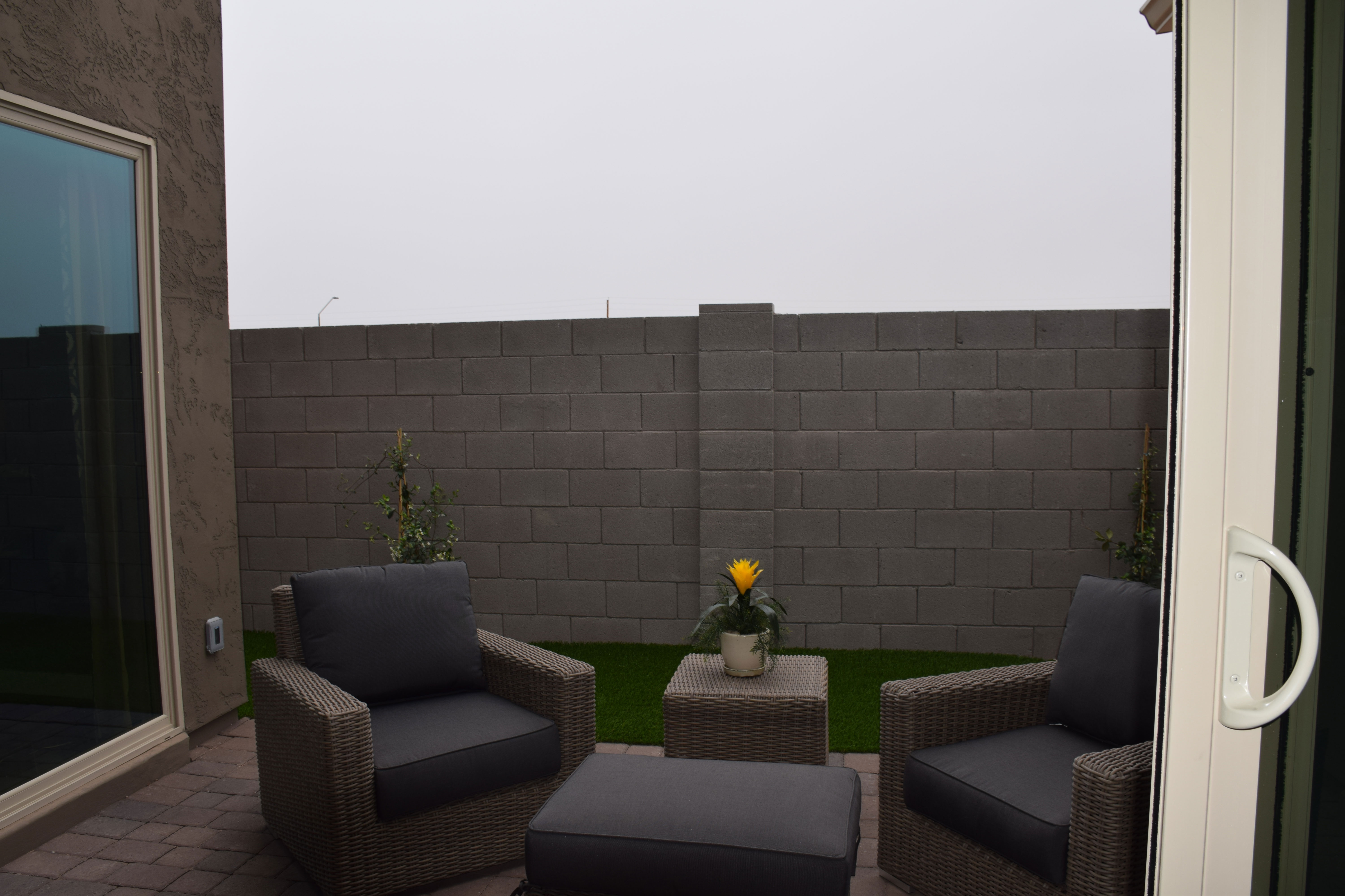
wWarner-Groves-at-Morrison-Ranch-067 - CopyMost people think about a table and chairs when planning outdoor areas, and that’s always terrific so that you’re ready for meals outside when our weather begs us to get out of the house. But this photo shows another delightful option, an opportunity for a special tete-a-tete in your own backyard.

This patio, right outside the master bedroom, provides the perfect place to relax in the morning before work with a cup of coffee. It’s also a great place for a rendezvous later in the evening. Imagine lingering here before bed, catching up on your day in the privacy of your backyard.

It doesn’t take much to make this idea a reality. Look for outdoor chairs with cushions so that you are comfortable enough to want to spend time there. The shared ottoman means that you can both put your feet up and relax. Other than that, a small table just large enough for a couple of cups of coffee or tea and you’re ready to go. All you need is a little time and an invitation.

So let the kids watch TV in the family room or play video games. You have a chance to get away from it all in peace and quiet, without ever leaving home.

Want to get a feel for this outdoor oasis for two? Visit our Sycamore model at Warner Groves at Morrison Ranch. You’ll be glad you did.

A Theme Bedroom to Reflect Interest

wWarner-Groves-at-Morrison-Ranch-068 - CopyIf you or a child of yours has a strong interest in something, it’s fun to pull that concept into your decor as a theme in a room. This room, from the Sycamore model at Warner Groves at Morrison Ranch, shows how to do this effectively while keeping design elements in place.

To start, the molding makes this room feel whimsical. Wainscoting jumps up to become a headboard for the bed, integrating the space while adding interest. The molding choice is echoed in the white painted furniture, working well with the wall-mounted headboard molding.

With the bright white furniture, this bedroom can handle a vivid yellow on the walls. Yellow is a tough color for walls because it can easily move from this cheerful lemon to a rather discouraging egg yolk if you’re not careful. In this case the shade is perfect – bright without being overwhelming.

The bicycle theme is consistently present in this room, but not to the extent of being irritating. One reason this works is the restraint in its use. The applique on the pillow, bike-themed artwork, and a couple of charming mini-bikes as accessories play up the theme without making the room scream with it. Smart and cute, this room would appeal to anyone who has ever enjoyed the pleasure of riding a bike.

Notice the addition of a grey bedspread and pillow. This tames the yellow, making it feel sophisticated rather than childish. A smart decision. Visit our models in Warner Groves at Morrison Ranch to see this and other charming bedrooms.

Let Color Create Character in a Room

wWarner-Groves-at-Morrison-Ranch-069 - CopyYou don’t need to spend a lot of money on furniture to create a guest room with personality. Take a look at this bedroom from the Sycamore model at Warner Groves at Morrison Ranch. The room has no headboard and simple matching nightstands with lamps. Yet it has a charm all its own. Let’s take a look at why.

Smart use of paint: The dramatic wide blue stripe is a powerful substitute for a headboard for this bed. By pulling it up and onto the ceiling, the mind translates it into a canopy, making the bed feel very finished, even without a headboard.

Smart art: The distinctive piece of art hanging over the bed pulls everything together – yellow brings the bed coverings up to the wall and the silver frame reflects the grey on the pillows.

Smart bedclothes: Yellow and grey combine for a sophisticated bed. There is just enough white to let the colors pop. Pillows really make a difference with a bed, and they are a low-cost way to create just the right mix of color and pattern.

Smart curtains: Notice that the curtain is a darker yellow in a heavier fabric. This helps to anchor the window and keeps the room from feeling too matchy-matchy. It also provides an inviting contrast to the bright window.

Smart accessories: Lamps reflect the white from the bed pillows but there is just enough yellow pulled in with the accessories to keep that color front-and-center.

When you’re planning a guest room, don’t think that you have to spend a lot of money to make it special and inviting. It just takes imagination and a willingness to draw on color to create a room worth coming home to.