Design Inspiration: Set a Breezy, Windswept Mood

17624016_SAt first it may seem impossible – to create the movement of the wind in a static room design. But if you take a look at the photo to the left, one thing stands out – the wind creates curves.

Palm trees fare well in windy areas because their trunks bend with strong breezes rather than break. The fronds also create a lovely picture of curving branches in this strong wind.

The photo below takes full advantage of curves to create a windswept mood. While the flooring is a straight plank wood, it still captures the curves with the line of three steps from one section of the space to another.

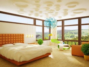
Curves are echoed throughout this room. The ceiling’s curving flow really stands out thanks to the contrast of orange and white. Lights follow the orange streak in the middle, providing a curve of light along the room in the evening.

9348004_SThe outside and inside walls are also curved, and the open-air stairway arc sweeps into the room like its own breeze.

The hanging lamp and black chairs continue the theme with circles and ovals as part of their design.

Even the plants look windswept, with their leaves demonstrating a number of curving positions. There’s hardly a straight line in the place, and the shift of colors keeps the eye moving.

You don’t need a fan to create a breezy mood in your home. Look for opportunities to introduce curved rather than straight lines – in furniture, rug designs, artwork and fabrics. Add some sheer curtains or blinds to the mix and you can create your own windy day.

Design Inspiration: Set a Cozy, Rainy Mood

9851687_SWhat’s the best way to enjoy the rain? From inside, of course. The wetter it is outside, the nicer and cozier you feel watching out the window from your dry and warm home.

There’s no denying, however, that sometimes it’s nice to spend time in a space that gives us that fresh rain feeling without getting wet. The following spaces make that happen with good design decisions. Would you like a rainy day even in sunny Arizona? Let’s see how to make it so.

Take a look at the photo to the left. What design elements come into play on a rainy day? Start with the color. This blue typifies the rain – cool and lively – not too light, not too dark, but both darker and lighter blue tones replace blacks and whites.

Next, notice the reflections – rain makes little mirrors of the sidewalks and anyplace that collects water. Instead of the shadows you expect in sunlight, you get blurred reversed views of the people along the sidewalk.

Finally, look for the small dots created by the water falling. Nothing is simply one solid color – everything has variations in shade and texture.

7521907_SNow, look at the photo of the restaurant to the right. Yes, you have a similar blue – color is one of the quickest ways to capture a mood. But there’s more that links this space to rain than color.

Check out the flooring. The large tiles are reflecting in a way very similar to the sidewalks in the photo above. All of the lights in the ceiling and above the bar also show their counterparts on that flooring. Finally, you get the contrast of light and shadow that echoes the photo above along with color variations in the flooring itself. This room really is a rainy day.

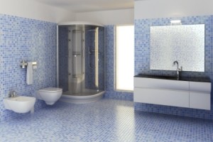
9264456_SWant the same mood at home? Well, you may not desire quite as much reflection, but these tiles shine. The shades of blue and small tile choice mimic the pattern and texture of a rainy day. Even the mirror above the sink reflects the tiles so that it looks almost like a contained wall of water.

Cool blues, texture and color variety, and a shine that reminds you of looking at yourself in a puddle before your foot hits it and splashes the image away. Make it rain.

Design Inspiration: Set a Sunny Mood

9417150_SDesigners will use many things for inspiration. They may think of a movie, a historic time period, a specific style or color, or they may choose something vaguer – something that sets a mood rather than openly defining their inspiration.

This week let’s consider a “what if.” What if weather provided design inspiration? With Fulton’s metropolitan Phoenix location, the obvious first choice is sunshine.

This room announces a sunny day with floor-to-ceiling windows flooded with light. The dark wood window trim makes a strong contrast to the bright view outside and the light colors inside. Choosing deep orange echoes the sunny mood without being obvious while the bright citrus green chair and coffee table provide the clear colors that appear with sunshine.

Although the sky outside is a cool light blue, the expectation of a strong bright blue sky appears with the contemporary light fixture in an inviting blue/teal. A few live plants bring us that much closer to being outside in the sun.

12760827_SA sunny mood is relatively easy to demonstrate with these windows and all the sunshine as support, but what if you wanted to create a sunny mood without the outdoor advantages? Take a look at this photo to the right.

This kitchen feels sunny and bright in spite of using only artificial light. What did the designer do here to make that happen?

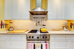
Using white cabinets sets the light mood, and pops of bright colors – particularly yellow – carry the message forward. The countertops are also light and the cutting board is a honey tone that feels mellowed in the sunshine.

Finally, the lighting splashes light down on the cabinet doors and under the cabinets. Add the reflections from the stainless steel range, hood, and kitchen accessories and sunshine seems to have been captured in this space. And while we take sunshine for granted in Arizona, other parts of the world can benefit from creating a sunny space indoors to compensate for grey skies outside.

Design Tips: Making Your Laundry Room Stand Out

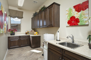
HRM0344With your Fulton home, your laundry room is generously-sized and functional, like this one from the Spyglass model at Victoria Estates. It’s nice to start with such a lovely space, and take it to the next level. Your laundry room can be the perfect place to experiment with some of your more daring design ideas. Here are a few suggestions to make it stand out.

Color: Have you always wanted a yellow room? How about robin’s egg blue? Or maybe you’re thinking about wallpaper. The room is small enough to make a project like this manageable, but you can create quite an impact with a little cash when you add color.

Art: Notice the bold and bright flowers decorating this laundry room. Maybe you’d enjoy enlargements of your favorite photos of family or your travels. You can get photos blown up to poster size for a reasonable price at most warehouse stores.

Go with a theme: This might be the space where you indulge in your love of country style, or perhaps you enjoy daisies or chickens or antique china. The laundry room is generally just for family, so have fun with the space.

Improve function: Would some hooks make it easier to hang clothes on hangars when they come out of the dryer? Maybe you could use a little sewing kit to tighten loose buttons. This might also be a good room for posting upcoming family events on a bulletin board. Take the time as you do laundry to think about additions you could make to this room to make cleaning clothes easier.

The laundry room is often the most ignored spot in the home, but you can make yours unique and special. So why not make your laundry room a space that makes you smile every time you walk in it?

Design Tips: Accessorizing Above your Kitchen Cabinets

11103954_SWhile it may not be a high priority as you move into your new Fulton home and get settled, one day you’re going to look up and realize that you want something above your kitchen cabinets besides air.

The challenge comes from selecting items that have only one purpose, to stay pretty-much permanently on display but out of reach.

This means that you don’t really want to spend a lot of money but you want it to look nice – as if you spent a lot of money. Here are a few suggestions to get you started.

3627780_SDecide on the look you want. Are you looking for bright and modern, traditional and homey or antique and unique? Stand back and really look at your kitchen. What look appeals to you?

Shop your closets. Do you have a bowl from Aunt Sally that you like but really never use? How about a couple of baskets that came with fruit which are just to pretty to throw away? Maybe you inherited a lovely pottery vase that you are uncomfortable using around your rambunctious family. Bring what you have into the kitchen and lay everything out on the counters underneath the cabinets to get started.

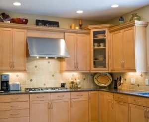
Include signs and pictures. Do you have an empty frame? Put a nice piece of fabric or scrapbook paper in it and prop it up against the wall. The “Bon Appetit” sign in this second photo was purchased, but could just as easily be written nicely on an old chalkboard.

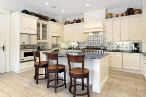
6732510_SDisplay a collection. The kitchen to the left showcases an interesting group of antique baskets and pottery. If you like this look but don’t have the collection, visit thrift shops and “age” your purchases with watered down brown and black paint or even strong coffee.

Take your time: One final note: You don’t have to finish this part of your kitchen in an afternoon. Start with a few things and add others as you get inspired over time. Move things around. And above all have fun making the space above your kitchen cabinets totally yours.

Design Tips: Setting up your Bookshelves

12728460_SAs you finish unpacking, do you find yourself staring at those empty bookshelves, unsure of how to tackle filling them so that they are attractive and functional? It may seem a bit overwhelming, but take it in stages and you will find it easier and maybe even fun. Let’s start with a question:

Do you have a lot of books? If the answer is yes, then your goal is to plan your shelves to showcase your nicest hardcovers in your main living area. While you want to keep your books organized, hardcover books will look the nicest on a shelf.

If you have only a few books, then you can still make your shelves attractive. Start by pulling together any larger decorative baskets or boxes that will fit on your shelves. Scatter these and your books in an evenly-balanced way throughout the shelf space.

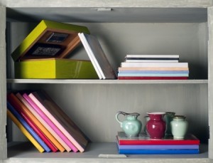
16564260_SDon’t limit your book directions to vertical. The books in this photo to the right are set slanted and horizontal. Some are even used as a base for smaller vases and pitchers. Look at placing your largest books horizontally on the lowest shelves. This will ground the arrangement while still making them accessible.

This photo also shows an open box. Play with your boxes and baskets to see if different angles or directions make the shelves look more interesting.

Next, add any photos or artwork. You may want to place these around eye level so people don’t have to strain to see them. Experiment with putting a photo or drawing against the back of the shelf with something else in front of it. Take advantage of your shelves’ depth.

17478352_SThis last photo shows a completed bookshelf. While it is a bit busy, you can see lots of good options for making your shelves interesting. Two larger boxes anchor the bottom of the shelves and books alternate with various accessories. The third shelf down demonstrates the power of layering and using different angles.

You may find yourself making changes and additions over time. That’s a good thing. Your shelves announce your interests and tastes to visitors, so have fun and experiment until you’re satisfied – for now!

Design Tips: A bit of Nature

14892527_SIn our last blog we mentioned that the plant provided a welcome diagonal element, but it also provides something else – a natural element to expand the décor.

By including a bit of nature in your home’s décor, you bring the outside in, add texture and color and connect your home with the world.

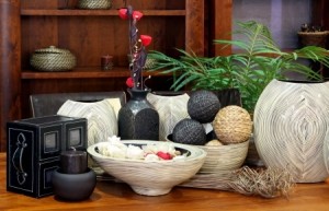
Don’t limit your thinking to houseplants. If you have a brown thumb, you can rely on dried plants, fresh flowers or other natural elements such as the bundle of grasses laying on the table in the photo above.

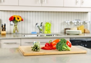
8089534_SThe kitchen to the right comes alive thanks to the fresh flowers and vegetables on the counter. And although these items are only temporary additions, notice the glass jars of rice and other dried items on the back counter. These provide ongoing natural elements in the room.

As you can see a touch of nature warms up a space and adds personality and interest. You can choose seasonal natural elements if you wish to keep your home even more in tune with nature.

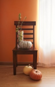
8437116_SYou don’t have to go overboard to make a statement, and don’t limit yourself to tables and counters. Take a look at how this chair creates a fall image with the addition of just a few pumpkins and some dried foliage. The chair and glass vase may be everyday design elements, but by adding the seasonal natural touches, autumn is present in the home.

2655244_S

One final point: think small as well as large when adding a touch of nature. This table setting moves from standard to special with a bit of nature tucked into the napkin ring. It’s up to you to let nature to inspire you to add this type of special touch to your home.


Design Tips: Balancing Heights

22021044_SWhen displaying anything – accessories on a side table, a buffet for a party, birthday or wedding presents, the impact is much stronger if you vary heights.

Designers know that getting the right balance of heights makes any visual more dramatic and interesting.

Let’s start with the photo above. The colors of pink and citrus green contrast nicely with the white china and the fabric to the left provides some textural interest. But notice that the difference between the tallest and shortest element is only a few inches. This pretty picture has charm but really doesn’t engage the eye.

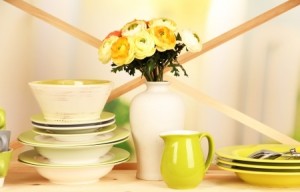
21556061_SIn contrast, take a look at the photo to the right. The colors are actually slightly more limited, but the eye flies across the image thanks to several design choices.

To begin with, the height differential is almost a foot between the lowest and highest elements. The crossed ribbons in the background emphasize the height differences while pulling attention from one part of the image to the next.

14892527_SNow you may have no reason to stack your plates and bowls, but you can use this same concept with accessories in any part of your home. In this last photo, the same concepts are applied to the accessories on a side table.

The grasses lying horizontal against the table are over a foot lower than the red flowers that top the vertical vase. The chair backs and the bookshelf in the background provide strong horizontal lines, so the verticals need to come from the accessories.

Finally, notice how the plant provides some nice diagonals to draw the eye the same way the crossed ribbons did in the second photo above. The look is completely different, but the same design concepts combine to make both arrangements powerful and eye-catching.

Design Tips: Like with Like

10593053_SDo you have a collection – either small or large – that you value? If so, think about finding a way to display it in your home with flair.

One fundamental design rule is to position like objects together: like with like. But don’t limit your thinking to only combining things that are exactly the same. Like can mean from the same period of time, in the same color or colors, the same shape, the same theme, or anything you can discover that makes a connection.

Now, the old leather-bound books shown above are together, but they don’t have much of a chance to make a statement sitting on a bookshelf.

7786742_STake a look at about the same number of books combined with a roll of older paper, an old inkwell and a feather that could be a quill pen. By combining the books with other items related to writing from approximately the same era, they change from a few interesting bindings to a design statement.

For small items or things that you don’t mind people playing with, look for interesting ways to build displays that use more than the sense of sight. For example, set music boxes or wind-up toys together on a table with a little note that says, “Please touch.”

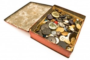
10847524_SMaybe you have your grandparents’ old collection of buttons or marbles tucked away in a closet. How about pulling them out and placing them in a container that fits the time those buttons or marbles were used? Set them on a side table next to a favorite spot for your visitors to sit, and you may have created an interactive accessory that your guests will really enjoy. For example, by setting the buttons in the photo in an open old tin box, you encourage people to stop, look, and touch the different materials, sizes and shapes.

These are just a few ideas. Now, when you draw on that designer tip of “like with like,” stretch your imagination to create home accessories that are as unique and interesting as you are.

Bridging Generations: Merging Styles

12310479_SSo your mom is moving in with you and your family. Your new Fulton home has a great extra master bedroom and a bathroom with special easy-access options for her. Everything, you think, is perfect.

Then she says, “Oh honey, I want you to use some of my furniture in your living and dining room. I know you will enjoy having such good things in your home.”

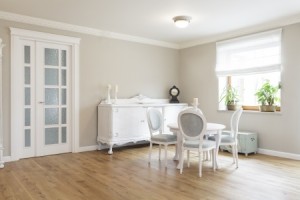
But your taste is very contemporary and her style is very like the photo shown here. You don’t want to hurt her feelings, but you’ve spent years getting just the right furniture in your style. Understanding that this is just the first of a number of bumps in the road as you all learn to live together, here are a few ways to make your home’s style work for all of you.

Go for Eclectic: Select a few of your mom’s favorite pieces and incorporate them into the living space of your home. You may be surprised to discover that a few more traditional pieces actually add character and charm.

Hand her a room: If she has a dining table and buffet that she is particularly proud of, move your more casual table into the kitchen eating area and set up the dining room with her pieces. Add a few pieces of modern art on the walls and a simple window covering, and you may find the room works well for you. Consider a daring paint color to make the space feel more adventurous.

Coordinate accessories: Does she have lamps that could work in your home? How about rugs or artwork? Consider grouping like accessories in one place, allowing them to provide a surprise punch of personality. For example, if she has numerous collector plates, fill a narrower wall at the end of a hall or the side of the entryway with plates set randomly from floor-to-ceiling about an inch apart.  She will see all her plates on display, and you have turned a plain wall into a point of interest in your home.

With a little imagination, you can merge both of your styles together, and who knows, you may find yourself happier building the differences into your home.