 Do you have a collection – either small or large – that you value? If so, think about finding a way to display it in your home with flair.
One fundamental design rule is to position like objects together: like with like. But don’t limit your thinking to only combining things that are exactly the same. Like can mean from the same period of time, in the same color or colors, the same shape, the same theme, or anything you can discover that makes a connection.
Now, the old leather-bound books shown above are together, but they don’t have much of a chance to make a statement sitting on a bookshelf.
 Take a look at about the same number of books combined with a roll of older paper, an old inkwell and a feather that could be a quill pen. By combining the books with other items related to writing from approximately the same era, they change from a few interesting bindings to a design statement.
For small items or things that you don’t mind people playing with, look for interesting ways to build displays that use more than the sense of sight. For example, set music boxes or wind-up toys together on a table with a little note that says, “Please touch.”
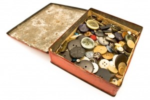
 Maybe you have your grandparents’ old collection of buttons or marbles tucked away in a closet. How about pulling them out and placing them in a container that fits the time those buttons or marbles were used? Set them on a side table next to a favorite spot for your visitors to sit, and you may have created an interactive accessory that your guests will really enjoy. For example, by setting the buttons in the photo in an open old tin box, you encourage people to stop, look, and touch the different materials, sizes and shapes.
These are just a few ideas. Now, when you draw on that designer tip of “like with like,” stretch your imagination to create home accessories that are as unique and interesting as you are.


