Make Room for Art

make-room-for-artwWhen decorating a home, many people focus only on the big items such as furniture and then slowly add accessories over time, and this is a good approach. But while you’re furnishing your new home, be sure to include art in your plans.

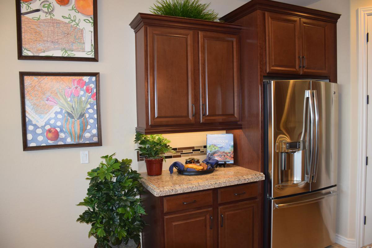
If you’ve been living in an apartment, you may find that your current collection of wall art looks rather small in your new larger rooms. This photo shows one way to deal with this – by hanging two smaller pieces together. This way the art takes up more space. Two or more pieces like these – with the same size, the same kind of frames and the same feel to the art – work well as a team on the wall.

Don’t limit your art thinking to walls. Notice the book set on the stand on the counter to the right of the photo. With the luscious photo on the cover, this book positions itself nicely as another art piece. In fact, if you didn’t look closely, it could be a small canvas set on an easel. You may have books or other elements that can double as art in your home if you take a look around.

If you would like more art on your walls but your budget is limited, consider photographs. Visit the Library of Congress photo collection online to view a rich choice of historical and other photos. You can have these reproduced for a minimal cost and frame them to create instant art at an extremely reasonable price. And family photos can be enlarged at your closest warehouse store at good rates.

Thrift shops and consignment stores are also a great resource for art at good prices. This is also an excellent place to pick up inexpensive frames. Just replace the art you don’t like with something that you do.

Take advantage of all your options to add art to your home. It can contribute color, interest, style and personality to your décor.

Dare to go Dark

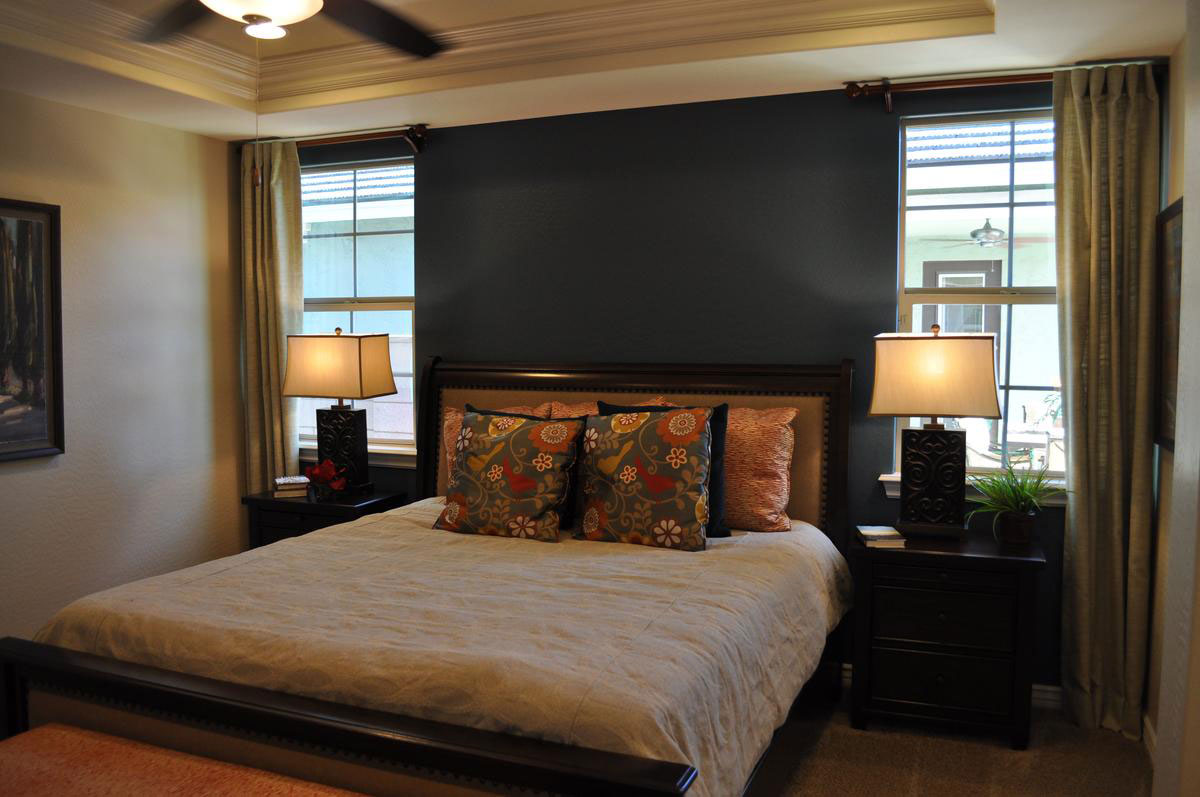
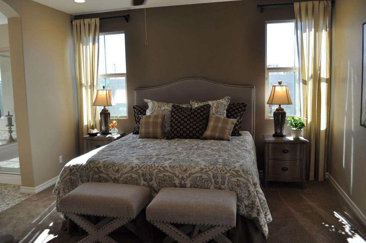
dare-to-go-dark2wJust how daring are you willing to be with your master bedroom’s look? How about painting a wall this dark? It may seem scary but it works remarkably well thanks to several thoughtful decisions.

Natural light: This wall comes between two generously-sized windows. The dark dark wall provides an inviting contrast to the natural light on either side. This is further supported by having curtains on only one side of each window, allowing the dark wall to seem as if it is part of the entire window display.

Light bedding: Yes, there are darker pillows, but the primary bedspread color is cream. Once again this places light right near the dark wall. The pillows pull that spread and the wall together, serving as an effective transition.

Rich color scheme: By bringing rich colors into the room, the dark wall feels like a natural continuation of the color choices. Rich and dark tones complement each other.

Gold: Gold always works well with black. In this case the trim on the nightstands and lamps combine with the dark wood to create a warm rich feel.

Plenty of light: Even at night the ceiling fan with lights and the matching lamps on either side of the bed will keep the room well lit.

Would you like to have a bedroom with this look of drama? How about considering a dark accent wall? To see this room in person, visit Fulton Home’s Cooley Station.

Comics Influence Boy’s Room

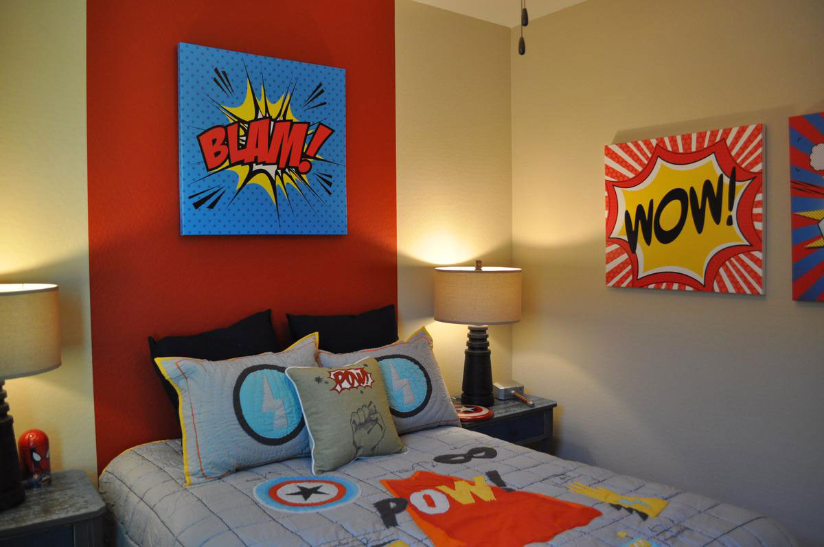
comic-books-influence-boy's-roomw - CopyIf you’re having trouble coming up with a good theme for a boy’s bedroom, take a clue from the comics. With their bright strong-contrast colors and powerful graphics they can quickly turn a room into an attention-grabber. Let’s take a look at how this room became a comic-book lover’s dream with very little effort or cost.

Bedding: Children can shift interests often, so it’s smart to choose lower-cost theme items for their bedrooms, allowing you to change things out in a few years as their tastes evolve. Bedding is one of the quickest and easiest ways to make a change. A bedspread, shams and a throw pillow start the theme off with recognizable yet relatively generic comic-book images such as stars and lightning bolts. The black European shams on the bed work well with the look yet can be recycled when your child moves on to other interests.

Paint: The red stripe on the wall behind the bed does double duty. It operates as a visual headboard and it dramatically links all the vivid elements together with their common red theme. This is also an easy-to-replace choice. Simply paint the wide stripe in another color or paint the entire wall.

Art: If you have a talented artist in the family, then you can have them create images like these on blank canvases with acrylic paint. If not, look for the right art in comic book stores and poster shops. You might even want to frame some favorite comic book covers or pictures of heroes to personalize the room.

This is a fun theme, so have fun with it. You could add shelves for action figures or table space for piles of comics. This could be your comic-loving child’s best dream come true!

Balance Formal Casual Traditional Contemporary

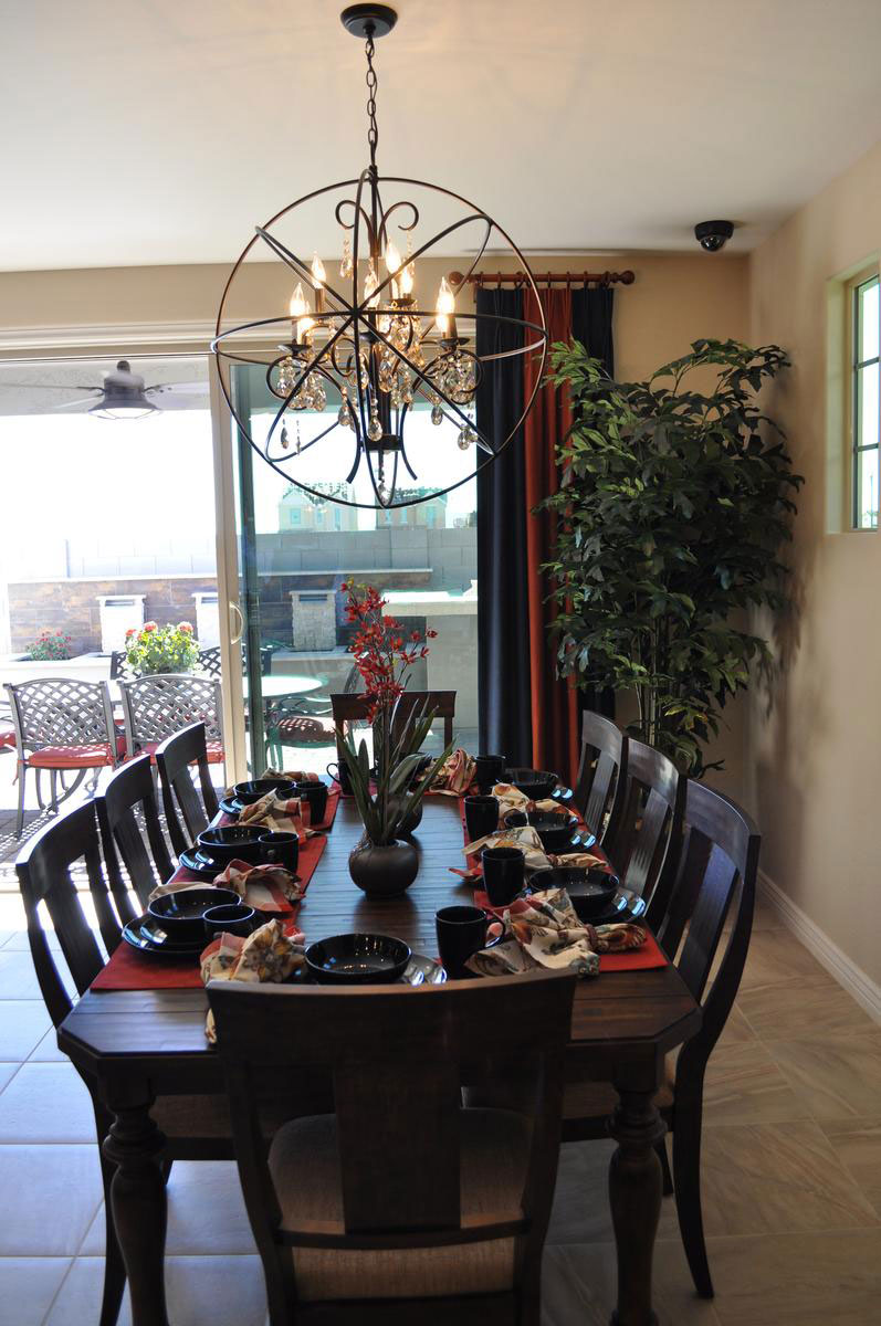
balance-of-casual-and-formal-traditional-and-contemporarywIs this dining room formal or casual? Traditional or contemporary? Actually, it has elements of all four. Let’s take a look at how it’s put together and why it works so well.

Formal: The basic chandelier has classic lines, even crystal pendants, to maintain a formal traditional theme. The table also shows its formal roots with the dark-wood finish, turned legs and detailed edging around the top.

Casual: the choice of placemats and napkins in bright colors and patterns rather than the more classic white tablecloth approach says casual. Also, choosing a simple fabric for the dining chairs’ upholstery maintains a more casual feel.

Traditional: The dining table and chairs as well as the chandelier’s basic lines are classic and traditional but…

Contemporary: Choosing the circular frame around the chandelier takes it out of the last century and bumps it firmly into this one. The stoneware is also modern in line and glaze.

Overall, this dining room combines many design approaches into one cohesive whole. It works for several reasons. The proportions fit well together and there is a nice mix of dark and light. It takes courage to blend these different approaches to décor together, but when it works – as it does in this case – it is a pleasure to see.

Bring Color into your Dining Room

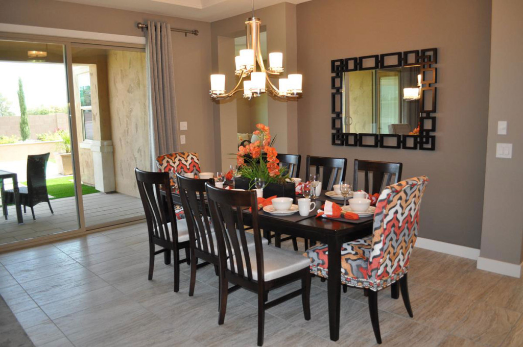
web-bring-color-into-your-dining-room-blogMany people are hesitant to choose color for large furniture pieces for fear that they will tire of it or that it will go out of style. But you can bring temporary  color into your dining room with very little effort or expense. Let’s take a look at some of your options.

Slipcovers: The two chairs in this photo are upholstered in a fun coral, rust and gray pattern, but you can get the same result with slipcovers. Choose chairs in a simple style and you can have slipcovers made in a variety of fabrics and colors. By only covering the chairs at each end of the table, you get a nice pop of color without as much expense or trouble.

Table Linens: The placemats and napkins on this dining table match the colors on the two chairs, connecting everything together. This enables you to carry your colors across the table, once again with the flexibility to change your color scheme to match the season or your mood.

Centerpiece: Whether you use flowers, candles or other choices, your centerpiece can pull in all of your colors and integrate your color scheme. If you plan a buffet as part of your dinner plans, be sure to bring the colors into that area also.

Any dining room can be enhanced by adding temporary bursts of color. Be sure to look for opportunities to include color when planning your entertainment events.

A Ceiling with Personality

web-a-ceiling-with-personality-blogWhen people plan their home’s décor, they think about flooring and the walls, but many ignore the sixth surface – the ceiling. Fulton Homes understands something that custom homebuilders have known for years – your ceiling provides an opportunity to showcase the lines of your home.

There are many ways to incorporate your ceiling into the design of a space. This photo shows some of the most effective options.

Dimension: By adding dimension to the ceiling the spaces are clearly defined. The living area ceiling builds an enclosure and creates a comfortable coziness. This type of ceiling, known as a coffered ceiling, has a long tradition. In this open living space it adds a line of demarcation as well as providing an additional appealing style element.

Color: By pulling the wall color up into the center of the coffered ceiling, the space is more clearly defined. The combination of dimension and color makes the ceiling even more dramatic. By using the same color on the ceiling as the walls the space has a warm centralized feel.

Lighting: Notice the light running along the edge of the coffered ceiling. This emphasizes the personality of the ceiling and creates a natural focal point at night. Entertaining in this room will be particularly effective thanks to this ceiling design.

It’s easy to ignore a ceiling, but if you do you’re sacrificing an opportunity to add style and drama to your home. Take a moment to picture this room without any furniture. Even empty, this space has its design own strength, and the ceiling is the reason why.

Interesting Lighting Livens Space

web-lighting-interesting-blogWhen you’re planning your home’s appearance, take the time to consider all the elements. Flooring has a dramatic impact, and wall color creates a finished look. Window coverings add warmth and help manage light. But it’s easy to ignore your home’s light fixtures, and that can lead to missing an opportunity.

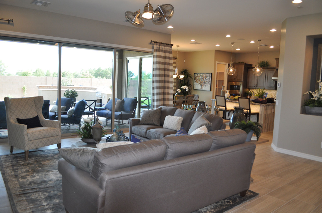
Lighting creates a mood, both in how an area is illuminated and how the lights themselves set a style. Let’s take a look at this open floor plan as an example. Four different choices of lighting make a real difference in this space.

Old-style ceiling fan: With the dual fan arrangement, this steel fan reflects a look that reflects the mood of hard-boiled detective fiction. You can imagine Humphrey Bogart in a room with a fan like this one, a steel file-cabinet in the background and his feet crossed on top of a battered wooden desk in the center of the office. A fan like this one says you’re not afraid to hark back to another era.

The pendant lights over the kitchen island also recollect another time. They mimic a classic schoolhouse style with their interesting shape. But the clear glass and Edison light bulbs bring them into the present. This combination of past and present blend to make a daring combination. Are you willing to take the design risk? The result is a room that steps out of the ordinary.

Ceiling lights provide the third light choice. These can be bright when needed for cooking or projects, or dimmed to set the right tone for evening events. Brushing along cabinets and walls, these lights are the quiet workhorses in your home. You really don’t want to do without them.

Finally, a simple chandelier sits over the dining table. Turned on for meals and off at other times, it’s functional yet creates an aura of warmth to match the meals served there. This light says hospitality.

Your home’s light fixtures are more important than you may realize. Take time to make the right lighting decisions for you and your family.

Industrial and Traditional Styling Combine for Sophisticated Den

From the Atherton model in Penninsula at Queen Creek

From the Atherton model in Penninsula at Queen Creek

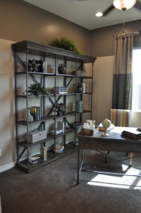
You may have noticed a decorating trend capturing an industrial feel in furniture and accessories. These items draw some inspiration from the Steampunk style, based on an alternate world where Victorian elements combine with steam-based technology to make an interesting setting for fictional universes.

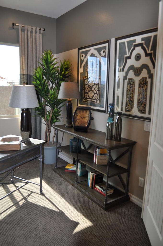
If you want to add that industrial feel to your home’s décor, you may be concerned that the look will lead to a cold space rather than one that is warm and inviting. However, you can incorporate industrial elements into a room without losing the warm feeling. This den is a good example.

The strong grey tones in the color scheme are consistent with industrial-style design. But notice the cream, gold and yellow fabric at play on the chair upholstery. Those colors are echoed subtly in various accessories, such as the gold clock face and several yellow books. These splashes of warmer tones go a long way toward making this space welcoming.

Industrial accessories such as the oversized watch face clock and the tool boxes say industrial, but the globe on the desk, the plants and other containers keep this residential space grounded in more traditional elements.

den 2The bookshelves show one of the best ways of combining industrial with traditional styles. The metal framing is classic industrial, but the wood shelves with crown molding along the top capture a much more traditional feel.

Finally, color-blocking on both the walls and the drapes add contrast and interest, while fitting with both an industrial and a traditional style.

Overall, the space makes the best use of two design styles, combining them to end up with a room that is sophisticated yet totally welcoming.

Think about Texture

From the Whitewater Model in the Oasis at Queen Creek Community

From the Whitewater Model in the Oasis at Queen Creek Community

When you’re planning your home’s décor, it’s easy to focus on color. But texture can be equally important. Choosing to include many different textures in your home makes it more interesting and unique. Let’s take a look at some options for adding textural elements to your home.

Architectural features: The stone focal wall in this study takes a standard room and makes it interesting. Since this room is open to the rest of the house, this one wall adds texture throughout the living area. Notice that the stone itself is fairly neutral and light. This allows you to modify the look and colors of the room over time without limiting your options.

Flooring: The dark wood floor has a handscraped finish which adds both depth and texture. With the handscraped option, floors reflect their wood origins more clearly. Whether you want wood, tile, carpeting or any other type of flooring, take the time to consider the flooring texture as well as the color.

Plants: Large-scale plants add texture through their leaves and branches. Shop around to find just the right variety for your home. Some do well in sun and some thrive in shade. Or you can incorporate silk plants for a lower-maintenance option.

Rugs: Layered flooring is one of the best ways to incorporate different textures into your home. The hard wood covered with a soft area rug grabs the eye and adds contrast to your floor.

Accessories: Everything from boxes and books to throw pillows can pull in additional texture. Take a look around each room in your home. Could you use more reflective surfaces? How about a nubby textile such as a wool throw?

By thinking beyond color to texture, you will add interest and sophistication to your home. Take a look around with texture in mind. You may be surprised at how just a few small changes can make a big difference.

Sofa Alternative

family room la quinta webThe standard approach to seating in a family room is a sofa with one or two chairs, or maybe a sectional with one additional chair. But how about considering this arrangement from the La Quinta model at Oasis at Queen Creek? Four chairs with an ottoman in the center offers a number of advantages.

Reflecting its space: If you have a square space, a sofa and chair combination doesn’t take full advantage of the area, instead ending up more as a rectangle. This four-chair approach reflects the available space and actually takes advantage of it by supporting the symmetrical structure.

Everyone has a seat: Rather than having to share, every person gets a comfy chair to sit in as they choose. The ottoman is big enough for everyone to share it without getting in each other’s way.

Arranged for conversation: With a sofa, some people end up sitting next to each other, making it awkward to hold a conversation. This four-chair set-up creates an environment where everyone can converse comfortably with everyone else.

Additional seating as needed: The ottoman could also be used as seating, and the space between each chair provides plenty of room to pull up extra chairs and join the conversation.

Color and pattern coordination: By including throw pillows on each chair of the same fabric as the ottoman, this grouping feels totally integrated. The rug, picking up one of the patterned fabric’s colors, wraps up the space.

If you’re planning a living or family room seating arrangement, consider the possibility of using four chairs for a fresh and appealing look that functions as well or better than the standard sofa seating option.