A Theme Bedroom to Reflect Interest

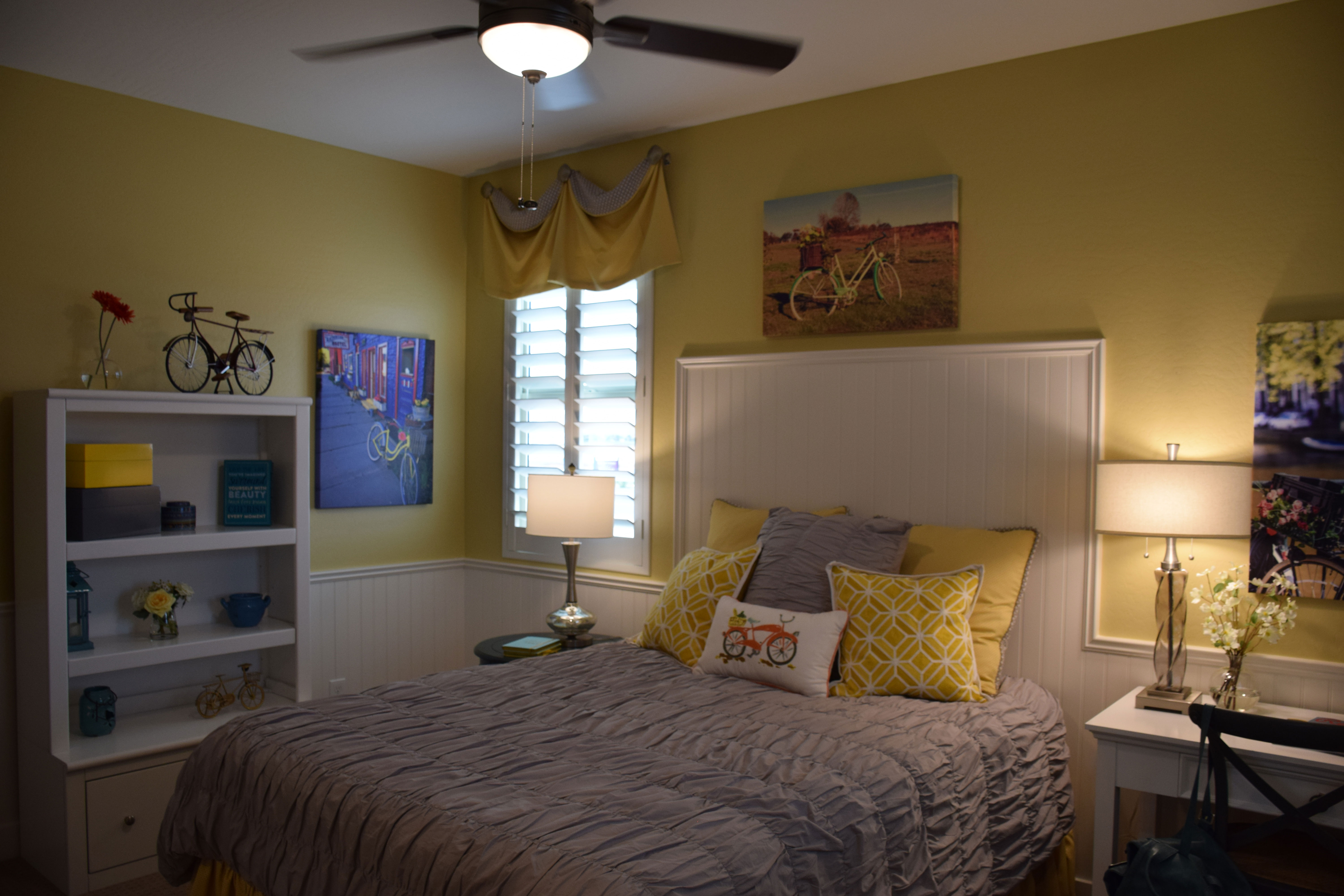
wWarner-Groves-at-Morrison-Ranch-068 - CopyIf you or a child of yours has a strong interest in something, it’s fun to pull that concept into your decor as a theme in a room. This room, from the Sycamore model at Warner Groves at Morrison Ranch, shows how to do this effectively while keeping design elements in place.

To start, the molding makes this room feel whimsical. Wainscoting jumps up to become a headboard for the bed, integrating the space while adding interest. The molding choice is echoed in the white painted furniture, working well with the wall-mounted headboard molding.

With the bright white furniture, this bedroom can handle a vivid yellow on the walls. Yellow is a tough color for walls because it can easily move from this cheerful lemon to a rather discouraging egg yolk if you’re not careful. In this case the shade is perfect – bright without being overwhelming.

The bicycle theme is consistently present in this room, but not to the extent of being irritating. One reason this works is the restraint in its use. The applique on the pillow, bike-themed artwork, and a couple of charming mini-bikes as accessories play up the theme without making the room scream with it. Smart and cute, this room would appeal to anyone who has ever enjoyed the pleasure of riding a bike.

Notice the addition of a grey bedspread and pillow. This tames the yellow, making it feel sophisticated rather than childish. A smart decision. Visit our models in Warner Groves at Morrison Ranch to see this and other charming bedrooms.

Let Color Create Character in a Room

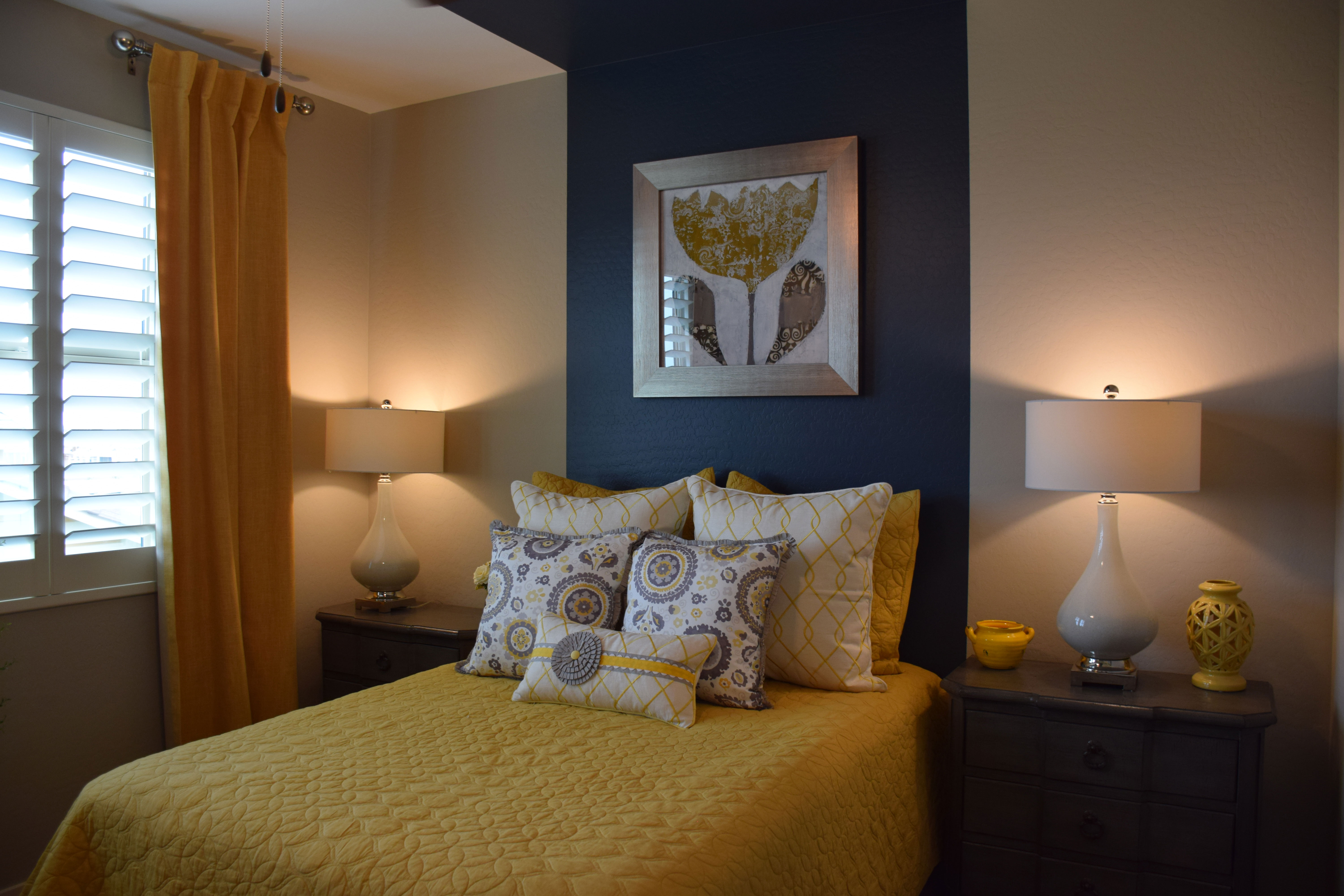
wWarner-Groves-at-Morrison-Ranch-069 - CopyYou don’t need to spend a lot of money on furniture to create a guest room with personality. Take a look at this bedroom from the Sycamore model at Warner Groves at Morrison Ranch. The room has no headboard and simple matching nightstands with lamps. Yet it has a charm all its own. Let’s take a look at why.
Smart use of paint: The dramatic wide blue stripe is a powerful substitute for a headboard for this bed. By pulling it up and onto the ceiling, the mind translates it into a canopy, making the bed feel very finished, even without a headboard.

Smart art: The distinctive piece of art hanging over the bed pulls everything together – yellow brings the bed coverings up to the wall and the silver frame reflects the grey on the pillows.

Smart bedclothes: Yellow and grey combine for a sophisticated bed. There is just enough white to let the colors pop. Pillows really make a difference with a bed, and they are a low-cost way to create just the right mix of color and pattern.

Smart curtains: Notice that the curtain is a darker yellow in a heavier fabric. This helps to anchor the window and keeps the room from feeling too matchy-matchy. It also provides an inviting contrast to the bright window.

Smart accessories: Lamps reflect the white from the bed pillows but there is just enough yellow pulled in with the accessories to keep that color front-and-center.

When you’re planning a guest room, don’t think that you have to spend a lot of money to make it special and inviting. It just takes imagination and a willingness to draw on color to create a room worth coming home to.


Stripes make a Splash

two-striped-bedspreads-webWhen you’re planning a child’s room or a guest bedroom, patterned fabric provides a great way to add pizzazz without spending a lot of money. And for generations, one of the smartest patterns to choose is a stripe.
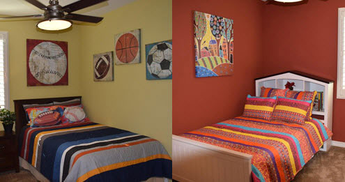
This photo showcases two different approaches to stripes for bedspreads and matching pillow shams. With today’s bedding stores and online options, you can pick up a bedspread and sham set, often with a matching dust ruffle, for less than $100.

Stripes are a fun choice. They also offer a lot of flexibility. You can pull out one color for the walls and use the others for accessories. Notice that both of these bedrooms focus on one strong color note drawn from the bedspreads.

On the left, the bedroom captures the spread’s gold and white tones in the artwork, while the walls themselves take that same gold and lighten it to make the space colorful without being overwhelming. This looks like a boy’s room, and most boys won’t be comfortable with too much color on the walls.

The other bedroom is geared toward a girl, and one who is not afraid of color. Notice how the artwork chosen brings out every color in the striped bedspread. While you’re not always fortunate enough to have that happen, take advantage of accessories and other elements in a bedroom to pull the stripe colors into the space.

Now in these two bedrooms the stripes provide the only patterned fabric. But one nice thing about stripes is that they leave the room open to other patterns. You could add several floral-patterned pillows in the same tones to the room on the right and it would still work. Another geometric pattern would suit the bedroom to the left.

When you want to introduce pattern to a room, it’s smart to choose stripes. They provide a safe way to be a little daring, because they always work well.

Light and Bright Laundry Room

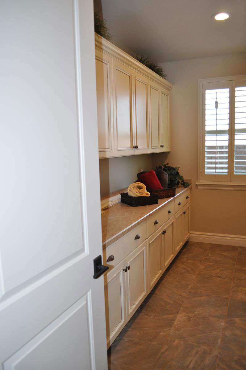
light-and-bright-laundry-room-webWhen you’re choosing your cabinetry, remember that your choice will also be part of your laundry room. Selecting a light painted cabinet like this soft cream creates a light and bright laundry room that is a pleasure to work in.

Whether you are sorting and folding clothes or using the space for other activities, the bright feeling of painted cabinets makes the mood inviting. With this light neutral you can choose almost any color for your laundry room, from a soft blue or mint green to darker tones such as navy blue or even metallic gold or copper.

Consider adding a washer and dryer in rich red and adding red accessories to allow that color to pop throughout the room. You could also go with black, letting that contrast make the room’s décor more dramatic and exciting. The color choices are almost endless.

This laundry room provides plenty of built-in storage. What would you use these cabinets for in your home? If you sew, the shelves could hold your fabric stash and equipment. Crafters would benefit from places to fit tools and supplies. This space could also be gift-wrap central or an easy place to put any gifts you buy on sale until you need them.

For a closer look at this laundry room and others, why not visit the Peninsula models at the Oasis at Queen Creek community? We look forward to seeing you there.

Dare to go Dark

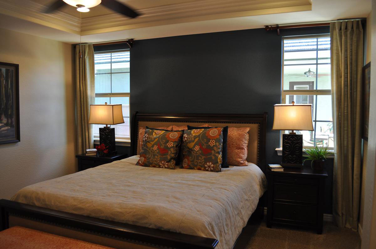
dare-to-go-dark2wJust how daring are you willing to be with your master bedroom’s look? How about painting a wall this dark? It may seem scary but it works remarkably well thanks to several thoughtful decisions.

Natural light: This wall comes between two generously-sized windows. The dark dark wall provides an inviting contrast to the natural light on either side. This is further supported by having curtains on only one side of each window, allowing the dark wall to seem as if it is part of the entire window display.

Light bedding: Yes, there are darker pillows, but the primary bedspread color is cream. Once again this places light right near the dark wall. The pillows pull that spread and the wall together, serving as an effective transition.

Rich color scheme: By bringing rich colors into the room, the dark wall feels like a natural continuation of the color choices. Rich and dark tones complement each other.

Gold: Gold always works well with black. In this case the trim on the nightstands and lamps combine with the dark wood to create a warm rich feel.

Plenty of light: Even at night the ceiling fan with lights and the matching lamps on either side of the bed will keep the room well lit.

Would you like to have a bedroom with this look of drama? How about considering a dark accent wall? To see this room in person, visit Fulton Home’s Cooley Station.

Exploring Fulton Homes: The Fulton Design Center

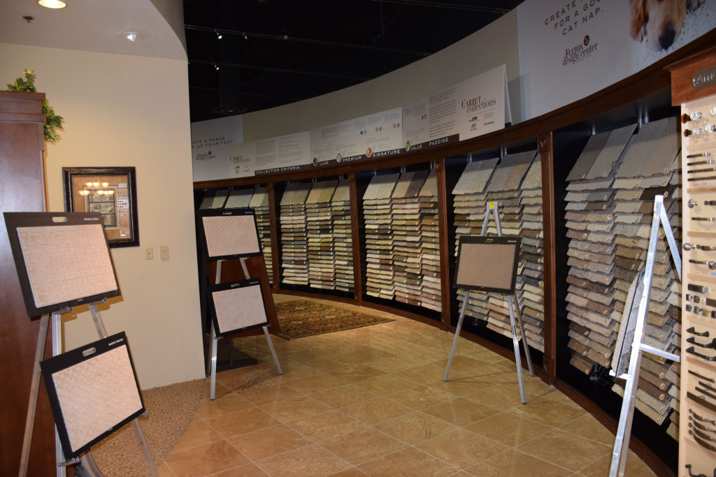
design-center-carpeting-webOne of the best aspects of buying a new Fulton Home is the opportunity to use the Fulton Design Center to create a home made just for you. You have the opportunity to select everything from your flooring to lighting and paint colors. And with our technology department you can create the perfect home theater and build the best security system for your needs.

Once you’ve visited a number of communities and models, it pays to visit the Fulton Design Center on one of our open browse nights. Scheduled the first and third Thursday evenings of every month from 5:00 pm to 8:00 pm, you have the opportunity to see all of the options available for customizing your home to your style and taste.

Fulton designers are available to answer your questions and show you around. You may be surprised at the variety of choices waiting for you. In this low-key environment you can enjoy various appetizers and drinks while wandering through the space. It also pays to get a sense of what sort of options you can select.

With over 13,000 square feet of space, there are kitchen and bathroom vignettes in a number of styles to give you ideas about your own home. The Design Center is frequently updated so that the products and examples are current in style and capability. Kitchens include a variety of cabinets and appliances so that you can try out the feel of them and determine those options that appeal to you.

Once you buy your Fulton Home, you will be visiting the Fulton Design Center to select your home’s options with the help of one of our trained designers. Exploring your choices ahead of time will make this process both easier and more fun.

With the Fulton Design Center, you can end up with a home that matches your taste and décor preferences as well as working with your family’s functional needs.

Bring Color into your Dining Room

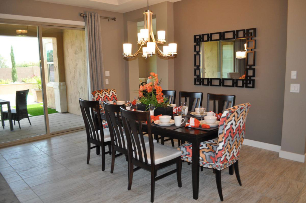
web-bring-color-into-your-dining-room-blogMany people are hesitant to choose color for large furniture pieces for fear that they will tire of it or that it will go out of style. But you can bring temporary  color into your dining room with very little effort or expense. Let’s take a look at some of your options.

Slipcovers: The two chairs in this photo are upholstered in a fun coral, rust and gray pattern, but you can get the same result with slipcovers. Choose chairs in a simple style and you can have slipcovers made in a variety of fabrics and colors. By only covering the chairs at each end of the table, you get a nice pop of color without as much expense or trouble.

Table Linens: The placemats and napkins on this dining table match the colors on the two chairs, connecting everything together. This enables you to carry your colors across the table, once again with the flexibility to change your color scheme to match the season or your mood.

Centerpiece: Whether you use flowers, candles or other choices, your centerpiece can pull in all of your colors and integrate your color scheme. If you plan a buffet as part of your dinner plans, be sure to bring the colors into that area also.

Any dining room can be enhanced by adding temporary bursts of color. Be sure to look for opportunities to include color when planning your entertainment events.

Create a Sophisticated Dining Room

From the Atherton Model at Penninsula in the Oasis at Queen Creek community

From the Atherton Model at Penninsula in the Oasis at Queen Creek community

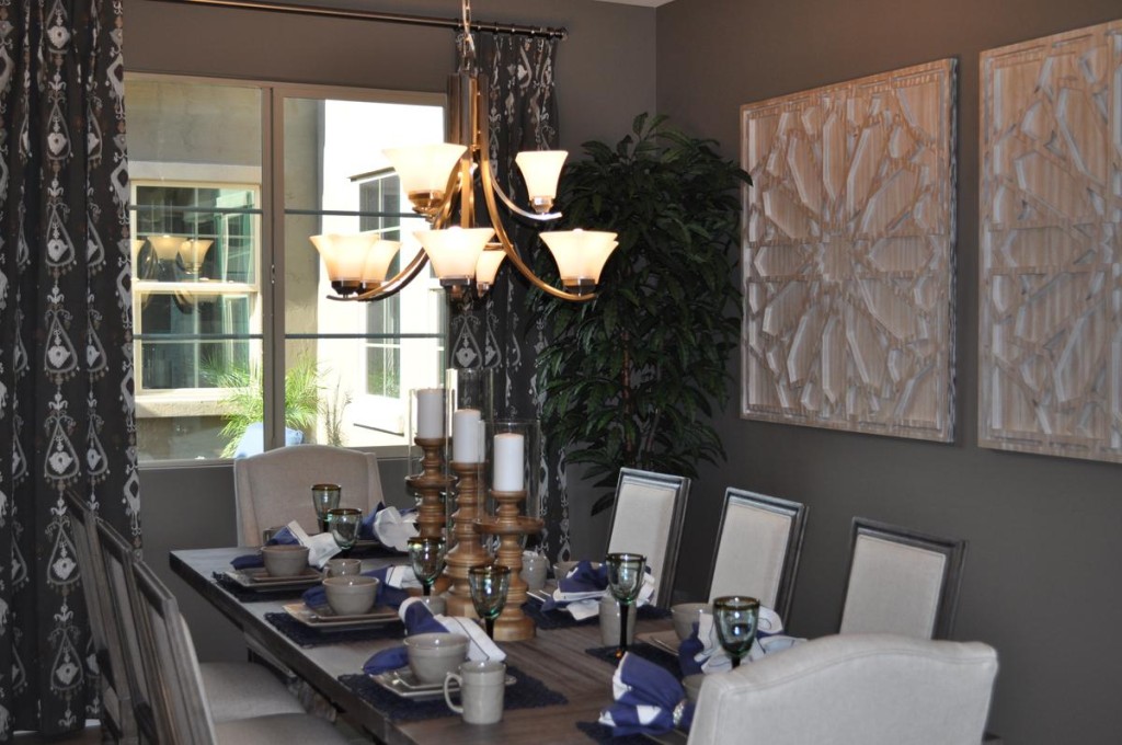
Grey has become a popular tone in decorating, and it is the strongest color influence in this dining room.  Yet this space feels warm and inviting. It’s the warm tones that balance the grey and make this dining room a place to linger. Let’s take a look at the elements that make this room so special.

Generous sizes: Start with a large table made with a thick top in a wood finish that combines grey with warmer hues. Add high-backed chairs with cushions and padded backs in a taupe/cream that uses both cool and warm tones. Finish with oversized art and substantial candlesticks on the table. All of these pieces give the room a weight and drama that combine to make the décor work.

Dark and light tones: Although most of this room uses neutrals, there is a nice distribution of light and dark tones to provide contrast and add interest. The curtains are the darkest permanent element in the room, but their pattern echoes the lightest tone. That light feeling is picked up in the chair upholstery and the candles. It’s too easy for a room filled with neutrals to end up boring, but these contrasts keep that from happening here.

A single pop of color: The blue napkins add a simple pop of color, drawing the eye to the table and adding just the right spark to the tablescape. Because the rest of the room is done in neutrals, you could easily switch out that blue for any bold color. How about yellow, red or coral? Or you could choose to go with black for extra drama. No matter your choice, this sophisticated dining room is ready for any dinner party.

Try out Unusual Neutrals

From Ironwood Crossing

From Ironwood Crossing

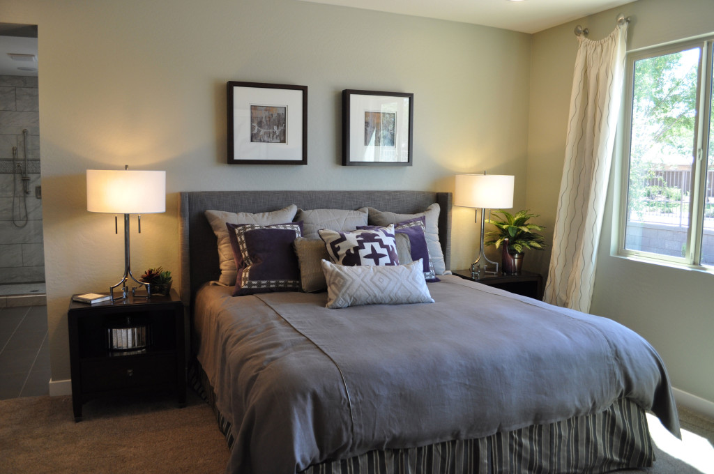
Are you getting just a bit tired of earth tones and beiges? If you’re not ready to go all out with color, but you’d like to expand your options, consider these almost neutrals: dusky lavender and soft green. Here are a few suggestions for pulling them into your home.

Mix with other soft neutrals: With the addition of grey and cream, this bedroom doesn’t feel like it’s swimming in color. The grey captures elements of the soft light purple, creating echoes without overwhelming the room. Light green on the walls is made gentler with cream drapes and shades. This room has invited color in without making too much of a statement.

Choose a cool metal accent tone: In this case, silver enhances the connection between lavender and grey and it easily reflects both tones.

Don’t be afraid of contrast: Dark nightstands keep the room grounded, and the depth of tone is mirrored in several of the throw pillows, the bed skirt and the frames on the artwork. Although the actual colors vary, bringing in a number of dark elements lets them work together to make the room more interesting.

Minimize the hues: Notice that the walls are a slight green, such a delicate tone that it almost seems to disappear. Green and lavender are an exciting combination, but in a bedroom the goal should be a soft appeal rather than splashy and attention-getting. The lavender tones selected are darker, but contain so much grey that they don’t announce their color. Only the three accent pillows remind you that purple is in the house.

If you’re ready for a new color, a bedroom provides a great place to start. Paint and bedding are not expensive, allowing you to try new ideas.

Dark Blue Focal Wall Creates Drama

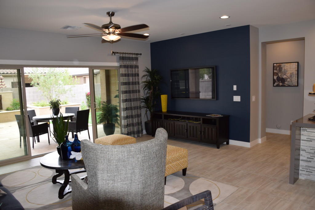
Models 019Sometimes it takes just one daring design decision to turn a room into something special. This family room is lovely, but without the dark blue focal wall, it would feel rather boring. Instead, the dark blue makes this room. Here are some tips for using a strong color like this and making it work.

Balance light and dark. Because this room has so much natural light, the dark blue wall adds personality while still letting the room feel light and airy. Light flooring and furniture also contribute to the well-strutured contrast of light and dark.

Pull the color into the room. Don’t let the strong color on one wall stand alone. In this room the navy sofa across the room ties everything together. A few blue bottles on the coffee table also support the blue theme. However, there’s not enough to make it feel overwhelming.

Bring in a second accent color. In this room, touches of yellow provide a positive contrast to the dark blue. Once again, just a few elements make the difference. Two matching ottomans flank the seating area, connecting with the tall yellow vase against the dark wall. Touches of yellow in the rug finish the connection.

Pay attention to the neutrals. Choosing a cool consistent tone for the neutral pieces in the space let the pops of color stand out. This shade of grey makes the blue and yellow stand strong while not looking out of place.

Take a look at your home. Do you have a wall that would benefit from a strong focal color? Why not take a chance?