Harmonious Color Combinations for the Home

When decorating, color plays a key component to create a wow factor for your house. It also compliments the flooring and furniture to complete the overall look and theme that you want to create.


To create harmonious color combinations, you have to understand the effect colors have on ourselves and our environment first and the best way to do that is by understanding the color wheel.

There are six basic colors: red, orange, yellow, green, blue, and purple and then there are mixes of the basic colors. When these colors are used together in a right way, it creates a combination that is harmonious to the eye.

Here are some color schemes that will create a harmonious effect for your home:

Monochromatic Color Scheme. For this scheme, a single color of varying lightness and saturation is used. For example, a dark brown bed over light brown flooring.

Analogous Color Scheme. This scheme uses colors that are adjacent to each other on the color wheel like green and light green or orange and yellow.

Complementary Color Scheme. Using colors that are adjacent in the color wheel makes each color appear brighter. Examples of colors in this scheme include blue and orange, red and green, purple and yellow.

Triadic color scheme. This scheme uses color like yellow-green, blue-violet, and red-orange. If you look at the color wheel, these three colors are equally distant from each other forming a triangle.

Colors define the ambiance and mood for your home so choose the right color scheme to make a welcoming feel for your house.

Posted in Uncategorized

Should Floors and Cabinetry Match?

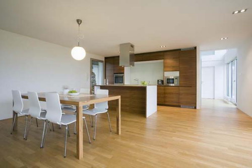
If you have every furnished your home from scratch, then you must have faced the dilemma of choosing the floor color, and whether to match it with your cabinet color or not. Although the answer to that question is quite subjective and depends really on what your preferences are, but here we’ll try to explain what the general trends are in this respect.

Some people feel it’s atrocious to have same colored floor and cabinets. Primarily because they get bored looking at the same color everywhere. Life is boring without diversity and this aptly applies when it comes to the color scheme of your home.

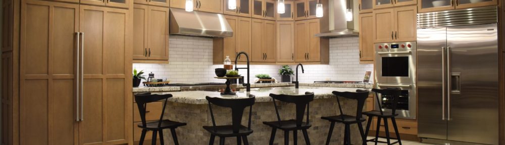
Home décor experts say it’s always best to have floor two or three shades lighter or darker than your cabinets. For example, if your cabinets are dark and rich in color, the floor you should opt for should have a light color; for instance, maple. This makes for a far more aesthetic look and typically, similar colors create confusion and are not as visually appealing.

It’s up to you to decide which color will goes with which. A combination of various colors, shades and textures gives your house that extra flair. They reflect liveliness and the personality of the person who owns it. You can use all your creativity to choose various color schemes, or have your interior decorator give you suggestions. But mixing is definitely better than matching your floor and cabinetry colors.

Posted in Uncategorized

Shutters: Versatile and Inviting

Have you considered shutters for your windows? They work equally well with modern or traditional styles, and can provide just the right balance of light and privacy.

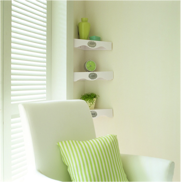
Take a look at how shutters work in this room with its simple lines and choices of colors. The adjustable louvers are set to let light in without glare and while maintaining privacy.

The pure white of this shutter choice is perfect with this room’s design choices. There is just enough light yellow-green to allow the whites to carry a soft shadow of color. Even in the heat of summer, this room provides a cool escape.

Everything about this space speaks to simple good taste. The slightly-different shades of green on the pillow, vase, clock and even the houseplant keep every piece interesting and individual. Choosing to add the silver labels on the shelves and one small turquoise element – the box – adds just enough difference to keep this corner from lapsing into the danger of too much matching.

The best part of this room is the quality of the light. With louvers keeping the sun under control, any window can provide a comfortable level of light at any time during the day. The soft feeling of this space comes from a sophisticated use of its shutters. Shutters come in many colors and wood tones. Here, the simple white painted effect suits the room’s design.

Are you ready to add shutters to your home? Come into our showroom and let us show you the rich variety of design choices available.

Posted in Uncategorized

FULTON HOMES Trade In Program

With FULTON HOMES Trade In Program
you can trade in your Old House for a brand newFULTON home.

Would you love a new Fulton Home in one of our vibrant new communities, but feel that you can’t get out of your existing home? Would you like to take advantage of historically low prices and interest rates, but feel stuck in your old home? You’re not alone, but we can help.

At Fulton Homes, we have been selling homes in the Valley for over 30 years. We understand real estate and how to market and sell homes. Put our team to work for you. We’ve helped many people just like you trade in their old home on a brand new Fulton Home. Consider this:

  • Why live in an Old House when you can live in a brand new energy efficient Fulton Home?
  • Fulton Homes Trade In Program offers many options for buyers who need to sell their homes before they buy
  • Even with no equity in your present home, or even negative equity, we will help you explore all of the possibilities. We care.
  • Simply contact our Sales Associate and he or she can explain how the Fulton Homes Trade in Program works.
  • You can contact us using this form or visit any of our sales offices to speak with one of our knowledgeable agents.
Listen to our customers. . .

After our son was born, my husband and I starting look for a new home. With a growing family, we needed more space. We looked at several builders and resale homes, but quickly decided that we wanted a new home at Fulton Ranch. The location was perfect and the homes were simply great. But, we were worried that we weren’t going to be able to get out of our existing house. We talked to several realtors who were downright pessimistic about us being able to cover our debt. Our old neighborhood had several foreclosures (one right across the street) driving prices down. We felt stuck. We looked at renting our old home, but really didn’t want to be landlords. It seemed pretty certain that our dream of buying a new home was not going to come true. But, then we talked to a Fulton Homes a sales agent about Fulton’s Trade-In Program. Fulton set us up with a real estate agent who had experience with people in our situation. They were great. After exploring our options, they helped us list our house for a fair price. Although my husband was convinced that we’d never be able to sell without taking a big loss, we were able to successfully close on our old house and get out exactly what we needed to get into our new Fulton home.

Thank you Fulton Homes, for making our dream of owning a new home possible!
– L. H. (buyer at Fulton Ranch)

Posted in Uncategorized

Stretch your Vision when Designing

What do you think of when you look at this photo? Maybe it reminds you of a gate you once came across in the country, or perhaps you’re drawn to the effective photography. It probably doesn’t remind you of a contemporary bedroom, but one designer saw the potential and created a room based on the photo that shows off the best of home design.

The connection came from drawing on the colors and textures to create a space that works while echoing the special qualities of this image. Take a look at the result below.

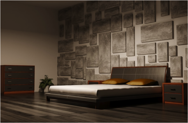
Home and fashion designers always look for opportunities to bring new ideas to their work. In this case, the designer discovered flooring that fit the gate’s wood patina while providing a smooth contemporary finish. Using several shades of grey and cool brown, the flooring sets the stage for the bedroom.

Next, the leather and cherry wood furniture brings in the tones of the metal bolt and lock. The brown leather shows the darker shades while the cherry hue matches the rusty red patina developed over time. The bedcover carries that dull silver visible on the lock. Notice the gold shams also. They mirror the brightest of the highlights on wood and metal.

Texture comes in with the wooden panels along the back wall. Their consistency of tone and rough abstract design and finish create a memory of the rough gate texture. It’s a daring way to bring the room up to the ceiling.

Are you ready to create a unique space by drawing on inspiration beyond the traditional? We’re here to help you find just the right flooring to meet your vision.

Posted in Uncategorized

The Inside Look for Windows is Only Half the Job

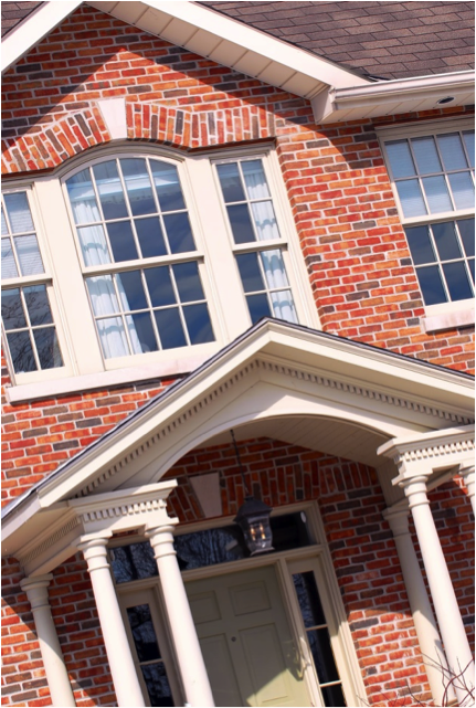
Often when people choose window coverings, they forget half of the job. You need to consider not only how they look in the room but how they look from outside.

The choices are many, but the biggest problem comes from people who make different selections from room to room in the front, leading to a patchwork look from the street. Have you considered both sides of your windows in your window covering decisions?

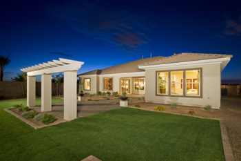
With this home, the homeowners decided to install simple white shades on all the front windows. This is a quick and relatively inexpensive option, but it still leaves you with window covering requirements inside the home since plain blinds have an unfinished look.

Other choices can provide a finished appearance both inside and outside. Two-inch wide wood blinds come in a variety of colors and wood stains to meet your decorating needs while providing a finished appearance inside and out. They also work well for privacy and light control.

The upper window shows one challenge with shades or blinds. The arch in the middle is exposed and the blind draws a line under it. Customized shutters would address that problem. Just like the blinds, they can be painted to match moldings or stained to match wood flooring and trim. Their appearance both inside and out is attractive and appealing.

One final window challenge faces this house – the front door. The window surround is attractive but can limit privacy. The homeowners added reflective glass to minimize the ability to peer inside. Stained or other glass choices can provide privacy while still adding light to the entryway.

Have you thought about your windows from the outside looking in? If not, how about taking a step outside to see how your house looks from the street?

Posted in Uncategorized

Fulton Homes “Packs for Kids” Campaign Helps Every Child Go Back-To-School

Leading Arizona Homebuilder and KMLE Country 108 Join Forces for Back to School Drive

Fulton Homes, Arizona’s leading homebuilder, is partnering with KMLE Country 108 FM Radio for its annual school supply drive with the help of Facebook. This year’s drive runs from July 18-Aug. 14.

The average cost to send a child into the classroom with school-recommended supplies is approximately $474 for elementary school and $545 for middle school students, according to Huntington Banks Backpack Index for 2010. The report says this figure includes clothing, books and classroom materials.

Area residents will be asked to visit the KMLE Facebook page and adopt a child from the Tim & Willy Fun-dation. Each child adopted will receive a backpack of school supply items, preparing them for a successful school year.

“Fulton Homes is committed to guaranteeing that every student, regardless of background, is equipped with the tools they need to receive the best education possible,” said Fulton Homes CEO Douglas Fulton. “With the advent of the 2011 school year, families across the country spend more and more of their incomes as their children grow. It can be a very stressful process, and we are here to help.”

For more details about Fulton Homes KMLE Packs for Kids, visit the KMLE Country 108 Facebook. For more information call (602) 452-1000 or go to www.fultonhomes.com and click on the “Fulton Foundation” link.

Posted in Uncategorized

Take a Chance with Color

When you’re ready to introduce color into a room, do you focus mainly on safe solids, adding maybe one color to an essentially neutral palette? In the concern to avoid a color mistake, many simply avoid it as much as possible.

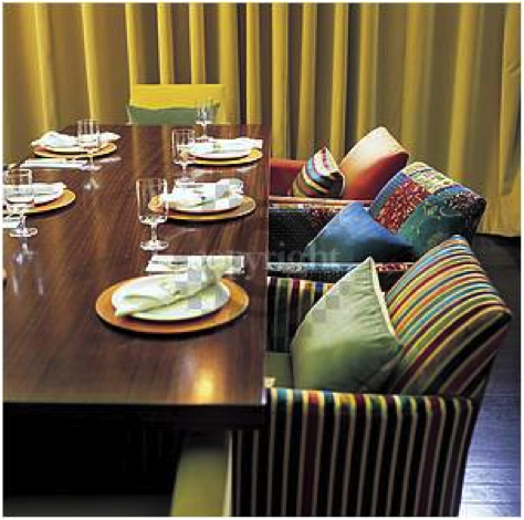
Take a look at this room where color plays a major role. Strong color and pattern choices in the dining chairs bring this room to a totally new level of design. What makes this room work so well? Let’s take a look.

To start, much of the room is actually neutral in tone. The floor’s luscious ebony wood finish helps the vivid colors pop. The dark brown table supports the warm tones of the chairs in contrast to the cool flooring. The yellow-gold draperies actually serve as a neutral in this space due to their lighter tone and full coverage of the back wall. Finally, the tableware provides the light neutral required to balance the room. All of these elements set the stage for the daring color present in the chairs.

The second reason this room works so well is in the choice of color and pattern. There are two primary pattern choices here – a stripe and a patchwork of floral designs. Both patterns are proportioned to work well on the chairs, and all the chairs are the same design. Now, let’s move from chair to chair to see how they work together despite their differences. First, about five colors are in play in the striped fabric, and these colors are also reflected in the floral patchwork chair. Green, blue, orange and gold are shown in the other chairs and throw pillows. The colors in the striped fabric from chair one are reproduced in the third chair’s pillow.

It takes planning to use this many colors this well. You can spend hours mixing your patterns and colors to get the result you want, but for many people the time and effort is worth it if you end up with a room like this one.

Posted in Uncategorized

Personal Territory and Furniture Placement

Every culture has its unique characteristics. One of the most interesting is people’s personal territory. This is how close to ourselves we are comfortable allowing strangers.

In the United States, our personal territory extends about 18 inches beyond our bodies. This is why our preferred method of greeting is the handshake – it allows for eighteen inches of distance. In Japan, for example, where the personal territory is three feet, the preferred greeting method is a bow – giving both people the room they need to be comfortable.

Understanding personal territory is very important when you plan seating in your home for a party. Even if your sofa would hold three comfortably, you may find that generally only two sit there. Love seats will generally only hold one. The exception is close family members who often don’t have personal territory among each other.

Notice the seating choices of the four people in this photo. Although there is extra space on the sofa, two of the people have chosen to sit on the floor to keep those 18 inches of personal space safe.

When you plan seating in your home, keep that 18 inch distance in mind. Placing furniture closer may lead to some empty chairs. Farther away and you will see that people will lean in to hold conversations. One good way to keep that distance set is by using an area rug. The right-size rug can define the distance between chairs and sofas, allowing you to set everything in that natural 18-inch comfort zone.

If you anticipate a multi-cultural crowd, it pays to be more flexible in your seating plan. For example, unlike the Japanese, the personal territory in South American cultures is 6-7 inches. There, a kiss on one or both cheeks is a common greeting. Add some floor cushions or movable chairs to allow people to set their own boundaries – letting everyone find their own comfort zone – and your party will be a success!

Posted in Uncategorized

Create a Special Space for your Little Girl


Children’s furniture needs to change and grow as they do. It’s better to keep your options inexpensive and easy to change over time.

Here is an inviting example of a dressing table if your little girl wants a special spot in her bedroom for jewelry, perfume or just to sit and dream.

This pretty dressing table has space for everything she will want as well as the charm she hopes for in her room.

Start by looking for an inexpensive or used dressing table. If one isn’t available, look for a simple table that you can dress up. This table is an old-fashioned piece of furniture newly-painted white. The glass top cut to fit provides an easy-wipe area for any spills. Add a mirror. Some dressing tables have mirrors included. If not, find a mirror that will coordinate well. If necessary paint the frame the same white as the table.

Look for knobs or pulls that have a feminine touch. Many discount stores have a variety to choose from, or visit a hardware store that specializes in them. Next, a hobby store can provide silk flowers and garlands in almost any color to add girly personality to the space. Add a few pretty boxes and maybe some flowery wrapping paper to line the drawers and it’s all ready.

Notice the simple pink ribbon at the bottom of the bedroom curtain. Simple touches such as this and maybe a pink and white area rug can make any room into your daughter’s dream space.

Posted in Uncategorized