Warm up your Bathroom

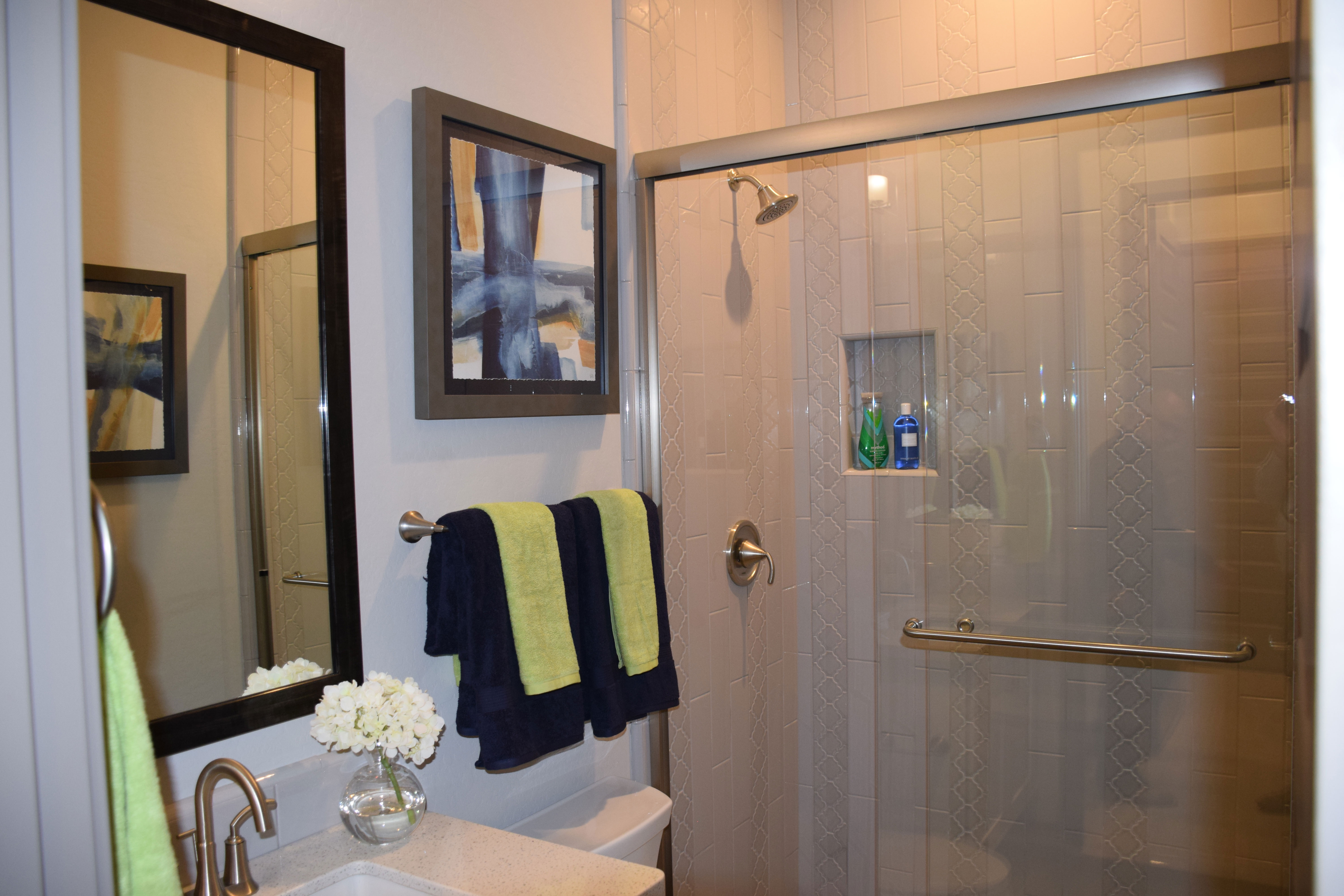
wModern-Shower-Evergreen-Elm-Warner-Groves-at-Morrison-Ranch-014By their very design, bathrooms tend to be colder in style. With all the glass, tile and porcelain, you have a lot of hard surfaces to contend with. But it doesn’t take much effort to warm up the feeling of a bathroom. Here are some tips to make a difference:
Be generous with towels: One of the best resources for adding warmth and color to any bathroom is by your choice of towels. For maximum effect, double up on the towels like these shown here. With the black towels as a base, the bright light green hand towels really pop. Look for opportunities to add more than the basic towels where you can. For example, the towel at the left of the photo on the ring is perfectly located for drying hands at the sink.

Add art: Whether it’s a print like the one shown here or fabric wall hangings, some wall art makes a bathroom more interesting and appealing. But be careful not to put anything particularly valuable in a bathroom. The moisture in the room during and after a shower can damage art, particularly watercolors and pastels. Instead, look for nice prints or photographs with minimal value.

Use accessories: Even a smaller vanity like the one in this photo will carry a simple accessory, and that addition personalizes the space and can make a real difference in a bathroom’s mood. The simple vase of flowers shown here adds charm without taking up too much space thanks to its small footprint.

Bathrooms are a  functional space in your home, but with just a bit of effort you can also make them feel more like a haven for friends and family. So warm up your bathrooms with these simple additions.

Slate Finish Appliances

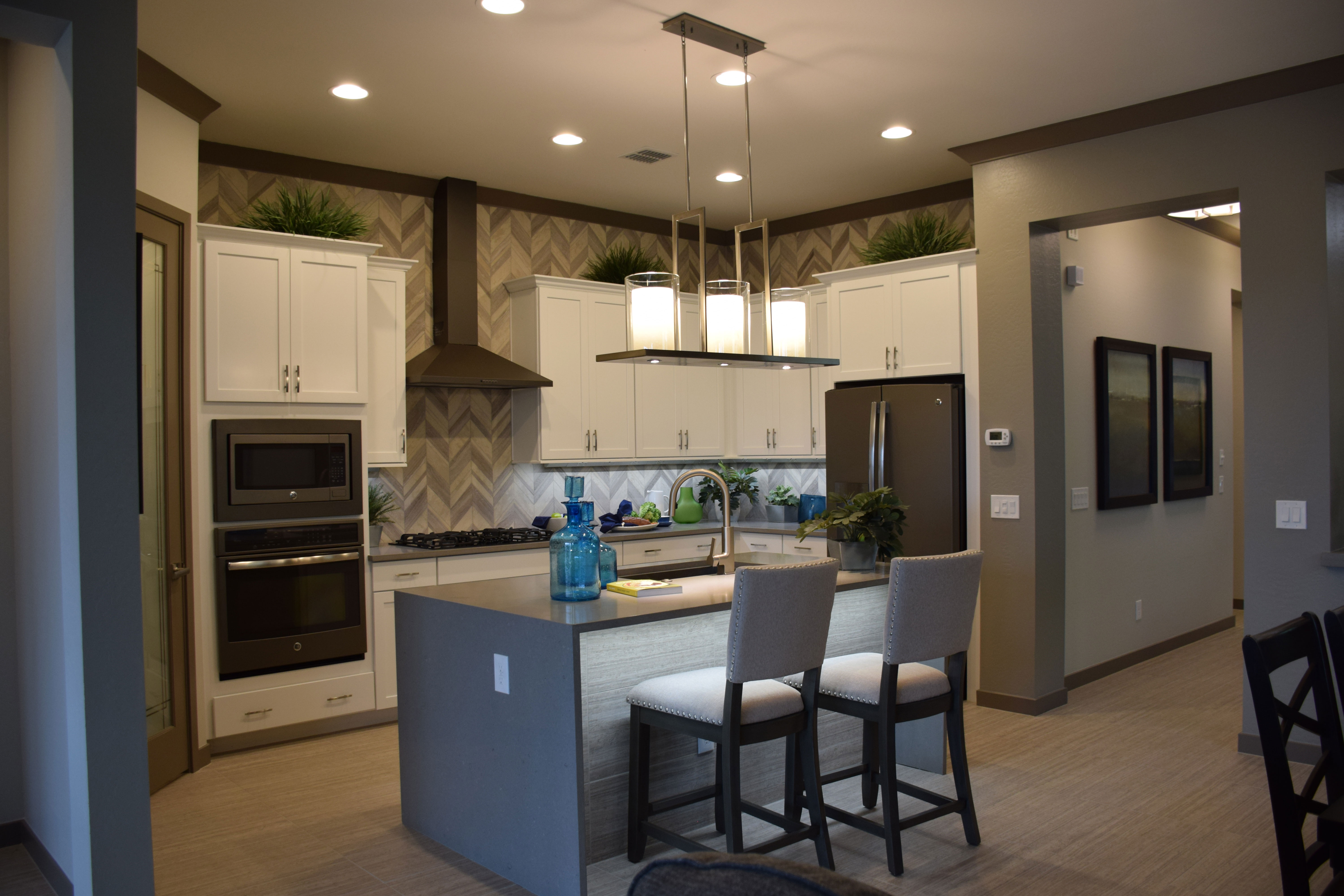
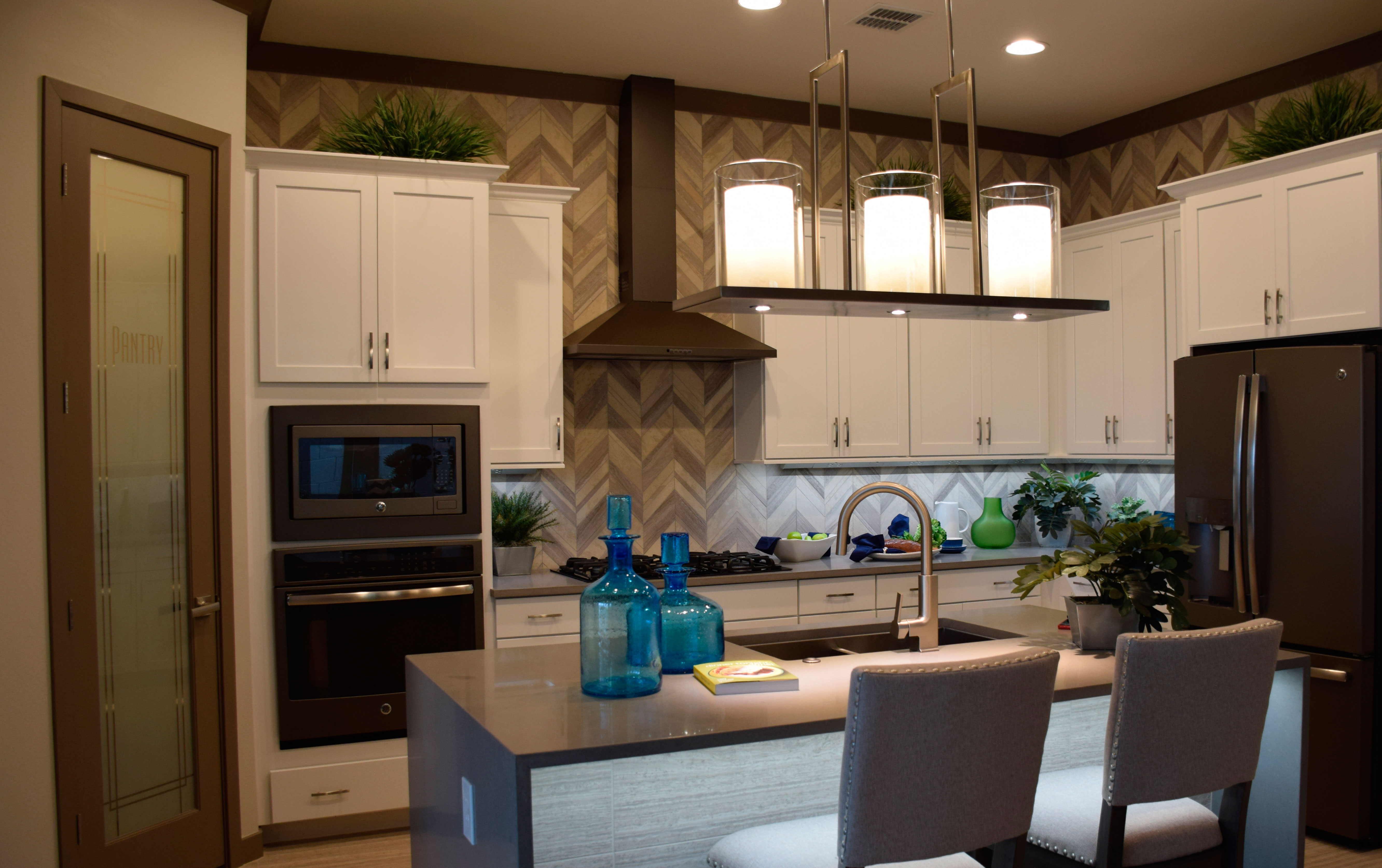
wModern-kitchen-Evergreen-Elm-at-Morrison-RanchStainless steel has been the go-to finish for kitchen appliances for over a decade. There is something fresh and crisp about the stainless look, so it’s popularity is no surprise. But it may be time to consider another option: slate. This kitchen, from the Evergreen Elm Model in Warner Grove at Morrison Ranch, shows a full line of slate-finish appliances.
This new look carries the sophistication of stainless steel, but with a darker, matte look. Slate has some of the advantages of stainless but with a sophistication all its own. Here are some of slate’s advantages:

  • It’s completely neutral, allowing you to make color decisions without factoring in your appliance finish.
  • The matte finish does more than reduce shine. It makes fingerprints almost nonexistent. This has always been a concern with stainless’s much less finger-forgiving finish.
  • It’s darker and warmer than stainless, providing some of the advantages of black appliances without taking over a kitchen the way shiny black can.
  • Foir a kitchen as light as this one, it adds a nice sense of contrast without having the appliances yell out in the room the way they would with black.
  • Unlike other finishes that have come and gone since stainless first came on the scene, slate finishes seem to be lasting in interest and appeal.

If you like the sophistication and professional look of stainless but would prefer a warmer look that is easier to maintain, take a look at slate. It’s available in many appliance options, with more coming online every day.

Farmhouse Style

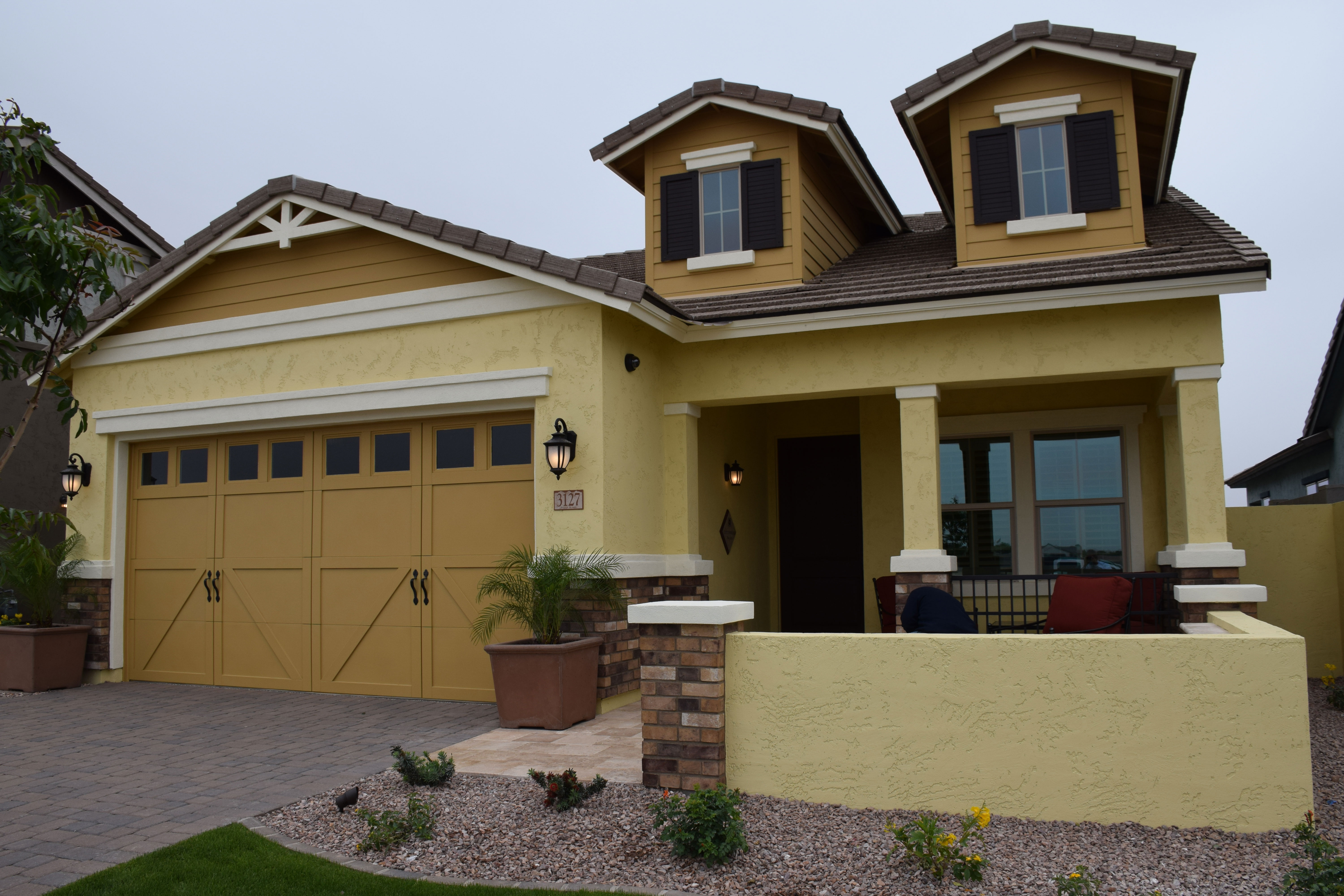
Warner-Groves-at-Morrison-Ranch-045wIf you’re looking for a home with a farmhouse feel, consider this model at Warner Groves in Morrison Ranch. The Cottonwood showcases all the elements that help this new home echo the style and appeal of a timeless place in the country. Let’s take a look at the design decisions that give this model its farmhouse appeal.
Color: The strong gold in two tones provides a country flavor. Rather than the traditional earth tones we tend to expect in the Southwest, this home takes a page from an older book, to give a long-ago feel to this home.

Barn-style garage doors: As a major element in the front of this house, choosing a style reminiscent of barn doors continues a country theme. The planking and wrought iron handles turn a standard door into something special.

Front porch: A home isn’t a country home without a front porch. This half-porch is a common style in country farmhouses. The walkway and the wall extension makes this space useful as well as decorative. You have plenty of room for outdoor furniture, adding to the charm of the front entrance.

Shutters and Trim: Nothing says country like shutters on front windows, and the extra trim carries on with the look. The brown color choice works well with the two shades of gold.

Plank-style siding: Adding elements featuring a country-style siding adds a touch of country personality.

If you crave that farmhouse look, you can find it right here in Arizona. Just check out the Cottonwood model to get in a country mood.


Eating Out

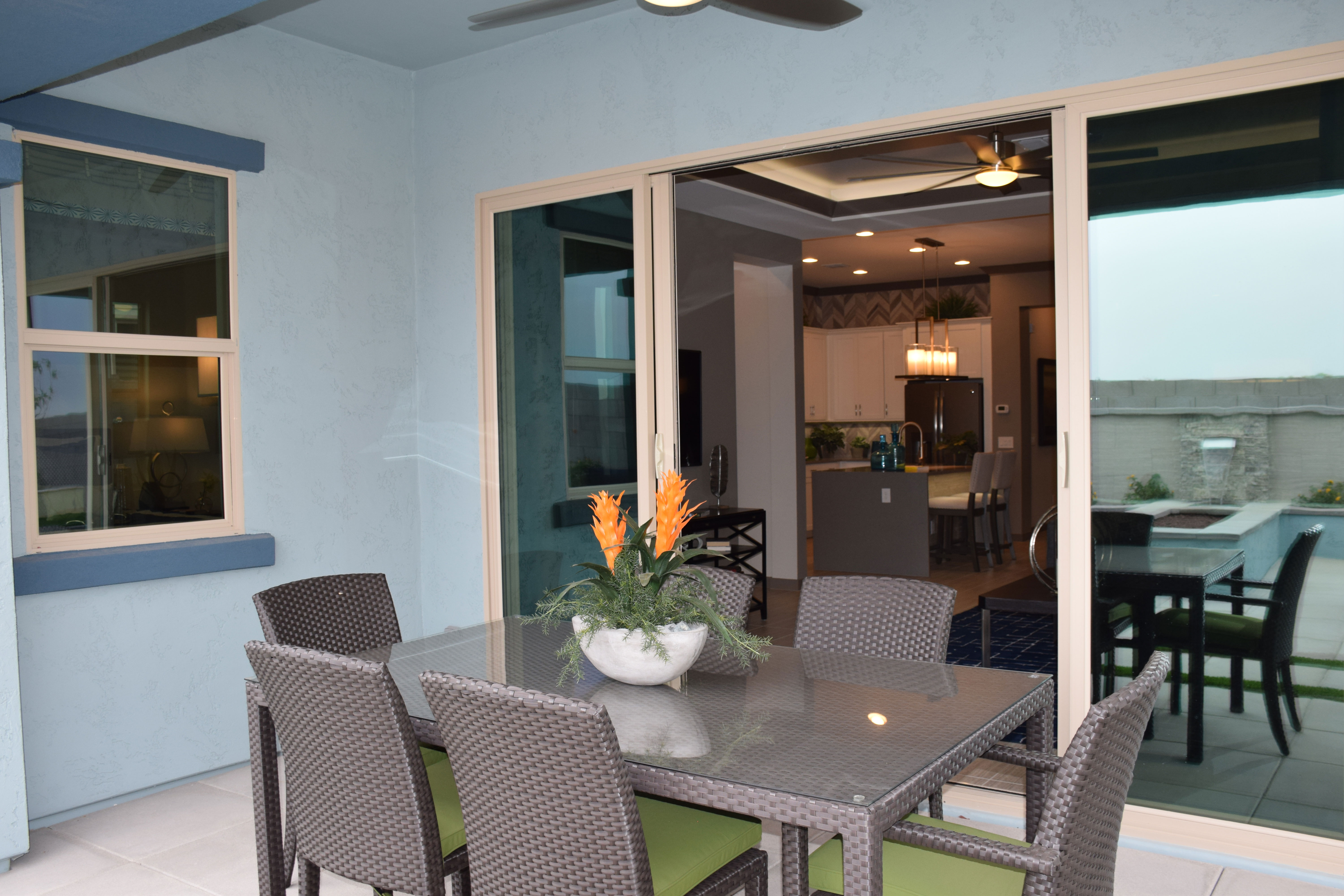
wBackyard-Evergreen-Elm-Warner-Groves-at-Morrison-Ranch-021No, we’re not talking about going to a fancy restaurant. Instead take just a few steps and eat outside. This lovely back patio from the Fulton Homes Evergreen Elm model at Morrison Grove at Warner Ranch provides you with the perfect spot to eat out. Outside, that is.
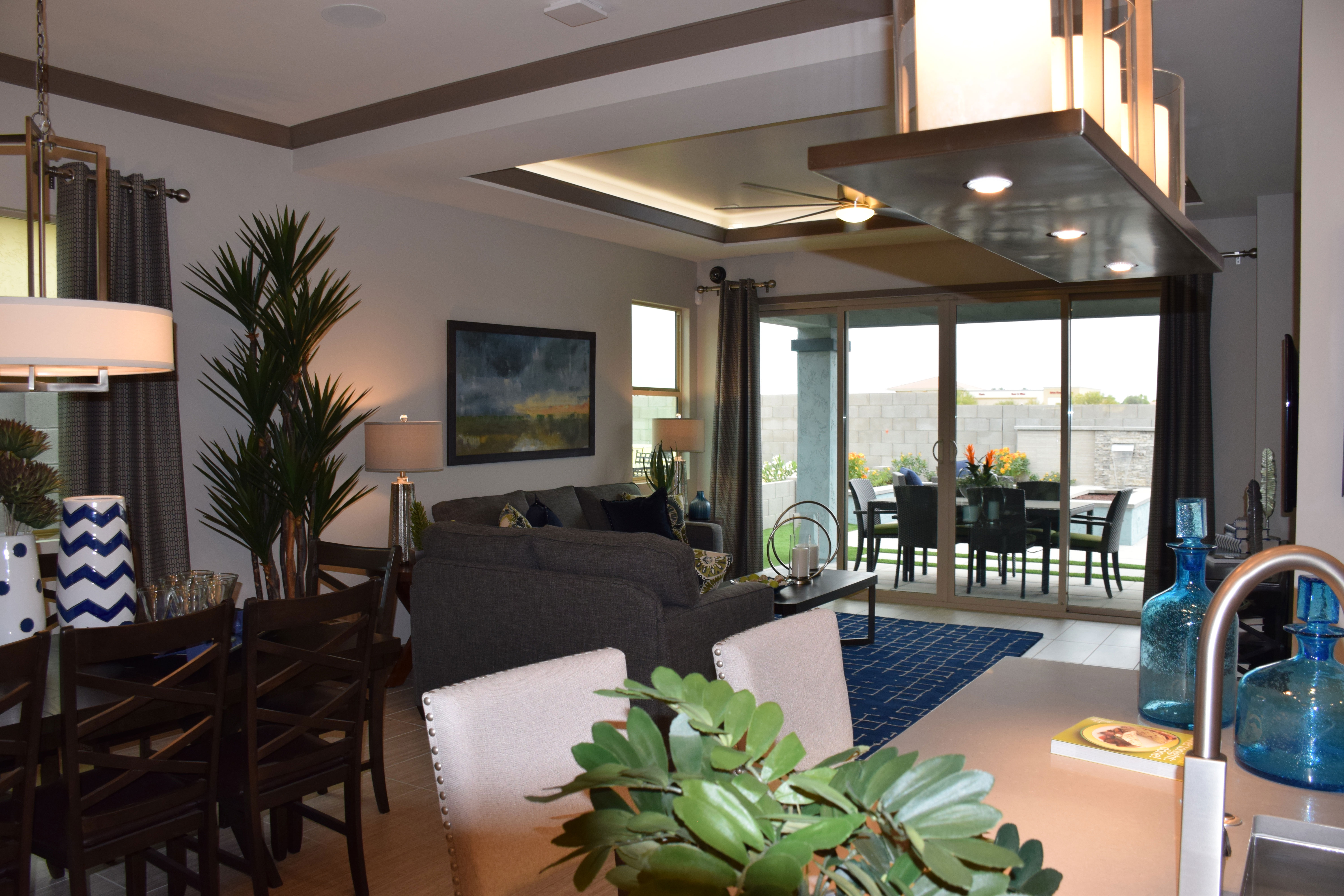
Extra-large french-style sliding glass doors give you a generous opening to help make the inside and outside of your home feel integrated. And it’s just a step from the kitchen to this outdoor table. Let’s take a look at some of the things you can do to make eating outside easier and more inviting.

Keep the table close to your doorway: It seems silly, but the further you have to walk to sit down and eat, the less likely you are to bother. When you can see the table just a step away from the door, eating outside is more appealing.

Have cleaning cloths easily accessible to clean off the table. Rather than run through a bunch of paper towels, just dampen a cleaning cloth and follow up with a dry one to make your outdoor table ready in a minute.

Keep your outdoor table ready for a meal. It may be tempting to use that table as a catch-all for outdoor toys or tools. Instead locate a potting bench or other type of table or storage unit outside for those items. If you have to clear off the table every time you want to eat outside, it just won’t happen.

Don’t limit your outdoor meals to dinner. Eating breakfast out makes for a great start to your day. Birds are more likely to be speaking their minds, and the fresh air will help sweep away sleep’s cobwebs. Try breakfast outside soon.

Have fun with your outdoor table and enjoy your backyard. With a spot like this you can eat out with all the comforts of home!

The Pleasure of an Open Floorplan

wModern-Family-Room-Evergreen-Elm-Warner-Groves-at-Morrison-Ranch-011If you haven’t lived in a home where the living space is set in an open floor plan, you’re in for a pleasant surprise. Open floor plans, like this one from Fulton Home’s Evergreen Elm model in Warner Groves at Morrison Ranch, change your approach to everyday living.
With an open floorplan, someone working in the kitchen can be part of the rest of the family’s activity. The bar stools at the kitchen island let families gather and talk during food preparation. Those people who are not involved in the kitchen efforts can sit, out of the way, and still interact easily with the cooks.

It’s also easy to cook and watch television, keep an eye on the kids, or chat with guests. As you can see from the photo, you’re just a step away from the action in the rest of the space.

Getting meals on the table is easy too. With a few short steps, you can move from the kitchen to the dining area. Grabbing extra silverware or condiments from the fridge is easy and fast. And dirty dishes have a short hop to get into the sink after a meal.

Open floorplans also work well for parties. The kitchen island is perfect for an appetizer buffet, and mingling is easier with fewer walls. As the host, you can see in a moment if any individuals or groups need a little extra attention.

Finally, an open floorplan makes everything feel larger. With no interior walls, the sightlines give you more of a vista. Instead of three little rooms, you have one generously-sized space. You also have some flexibility on where one living area ends and the next starts.

Once you experience an open floorplan, you may find you love it, for these and other reasons you won’t discover until you’re there. Why not check it out in person by visiting Evergreen Elm today?

Versatile Game Room

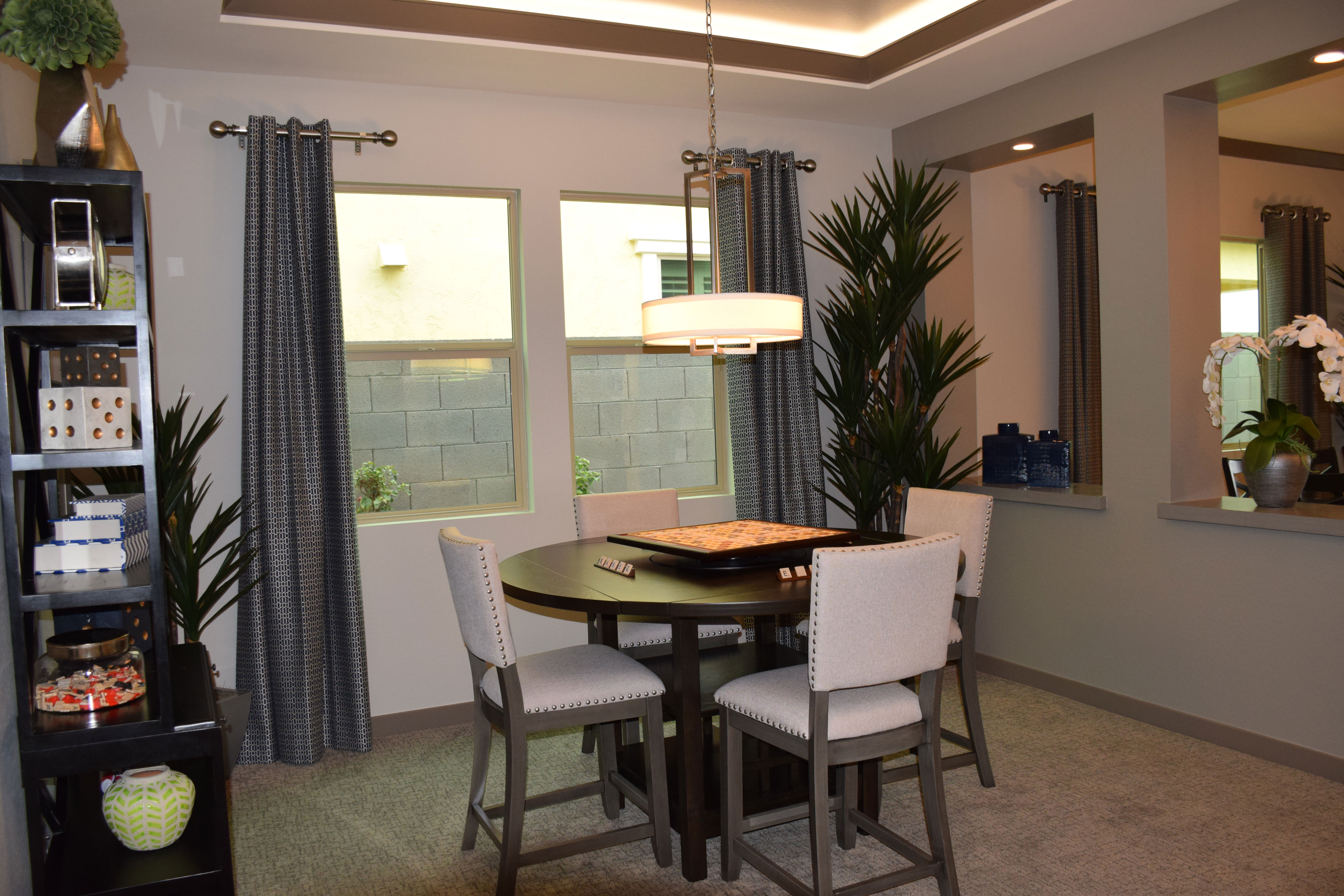
wModern-Game-room-Evergreen-Elm-Warner-Groves-at-Morrison-Ranch-006A game room like this one, in the Evergreen Elm model in Warner Groves at Morrison Ranch, offers the opportunity for versatility in your home. Let’s take a look at how this room adds to the convenience and functionality of your home’s living space.

An alternative for dining: If you are planning a small two-couple dinner party, this round table for four creates a more intimate dining experience. By moving the party away from the kitchen and into this more private room, you can make the dinner feel special. Consider having appetizers at the kitchen island, then moving the meal into the game room where you have the table set and ready for your guests.

As homework central: If your children don’t want to be too separated from the rest of the family while doing homework, this room may be your best solution. The table is large enough to spread out papers and books. And the space is separated from the rest of the living area, yet the interior windows eliminate any feeling of isolation. A parent’s help is one call away. And as a parent, you can easily monitor the action to make sure procrastination is not playing a part in why tonight’s homework is taking so long to finish!

For ongoing projects: Has your child entered in the school science fair? Do you have some crafts or sewing you want to focus on for holiday or birthday gifts? Maybe you need to gather information together for this year’s taxes. As an extra room and table, you can take it over for a week or two without interfering with the rest of the living space. And if you decide to leave it another day before tidying up, why not?

For playing games: Of course, it is a game room after all. Whether it’s an evening of bridge with friends, a rousing Monopoly tournament with your kids, or ongoing games of Settlers of Catan, this room and table is ready to take on all comers. And if you need to stop in the middle because bedtime has come around before you expected it, the game will be ready for everyone tomorrow evening. What could be better?

Fulton Homes a 2016 ENERGY STAR Partner of the Year

energy-star-2016Fulton Homes is proud to receive a 2016 ENERGY STAR Partner of the Year – New Home Builder Award from the U.S. Environmental Protection Agency (EPA). Fulton Homes received this award for its continuing outstanding efforts to build energy-efficient homes.

This is the second consecutive year that Fulton Homes has received this recognition, and our accomplishment will be recognized, along with all other ENERGY STAR Partners, on April 13th in Washington D.C.

This award comes in recognition of Fulton Homes:

  • Building more than 300 ENERGY STAR certified homes, with a total of over 3,000 since joining the program in 2009.
  • Launching an educational Energy Center in one of our model homes in a 600 home-site community. Visitors can learn about ENERGY STAR and EPA’s Indoor airPlus programs.
  • Offering training for all employees through the Fulton Homes Learning Center with courses covering more than 30 construction topics, with four sections focused on ENERGY STAR.
  • Leveraging social media, including Facebook, Twitter, and Pinterest, and producing a 60-second radio spot featuring ENERGY STAR that was heard on all major radio stations in Phoenix.
  • Committing to building all homes as EPA Indoor airPlus qualified homes, and providing additional comprehensive health protections to homeowners while emphasizing quality control, field reviews, and interest in ENERGY STAR certified products.

“Demonstrating a strong commitment to building energy-efficient homes, Fulton Homes has reaffirmed its reputation as a company that saves the American homebuyer energy and money,” said EPA Administrator Gina McCarthy. “This award recognizes Fulton Homes as a leader in building ENERGY STAR certified homes while reducing our nation’s greenhouse gas emissions that contribute to climate change.”

Create a Handy Gift-Wrap Center

Warner-Groves-at-Morrison-Ranchwrap-room-webAre you wondering what to do with that extra wall in your laundry room, garage or den? Here’s a great idea that is as useful as it is decorative: create a gift-wrap center. Start by installing several large peg boards. This display, visible at the Fulton Home models in Warner Groves at Morrison Ranch, used some nice wood to frame them, making the boards look finished. You can prime and paint the peg boards to match the colors in the room.

To hang the wrapping paper, you can use closet or curtain rods, set at the right width. These rods are mounted on the wood frames, making them as easy to hang as they would be on any wall. In this room, they chose to hang three rods, but you could easily fit six or even seven rods, giving you a nice choice of wrapping paper. Hooks set into the peg board on either side of the paper hold ribbon and bags.

You could put your scissors and tape in a container on the counter and store tissue paper and other package materials in drawers or baskets under the counter. This is also a great room for storing note paper, greeting cards and address lists.

When special holidays roll around, simply change out the every occasion paper for suitable gift wrap and you have your wrapping station ready. Tune your radio or iPad to holiday carols to put you in the mood and you’re all set!

Use Toile in a Bedroom

Warner-Groves-at-Morrison-Ranch-master-webPatterned fabric is always a nice addition to your home’s decor. In living and family rooms, stripes are the most common pattern choice, followed closely by geometric options. You will see some florals too. But one of the most intriguing patterns is an old-fashioned choice: toile.

Toile was originally produced in France when cotton fabric was first brought from India. The people of Europe were used to wool and silk clothing, fabric that didn’t wash well and was often hot in the summer. When cotton first appeared with its wash-and-wear sturdiness and cool weight, it was much in demand. The French Government was so concerned that cotton clothing would take over French cloth manufacturing that they tried to make cotton cloth illegal.

That idea soon failed, and printed cotton cloth became extremely popular. One of the first manufacturers used woodcuts and then a printing press to produce over thirty thousand different designs. Many of the designs depicted country scenes or exciting events of the day such as the first balloon ascension.

Most of these fabrics were printed in one color on white or off-white fabric with repeating patterns. The fabric was called toile de jouy which literally translates to cloth from jouy, or the part of France where the factory was based. Over time, the fabric name was shortened to toile.

This style of fabric has enjoyed a new popularity in home decor recent years, and you will see it in bedrooms and kitchens where people want a French country style. The bedspread above in blue and white shows the most popular color combination but you can find toile fabric in colors to suit virtually any decor.

Arts & Crafts Style Home

Cooley-Station-012-web - CopyAlthough this look has been around for a long time, the appeal of the Arts &  Crafts style has only grown in recent years. When you’re planning your next home, how about considering this warm and intriguing option?

Let’s begin with color. Arts & Craft architecture brings in rich dark colors to recreate the best of nature. This light and dark brown combination brings in classic colors for the style. In particular, the dark brown pediment echoes the feel of yesterday when the Arts & Crafts style first appeared. Notice how the white trim helps make the darker tones pop and keep the home from feeling too dark.

One way to spot an Arts & Crafts bungalow is by the porch columns. They always grow larger at the bottom, not unlike a tree trunk. The three columns here have that characteristic look.

Adding the rock base also demonstrates an understanding of the Arts & Crafts movement. The goal was a return to hand-crafted materials that take advantage of natural elements. This model, Sunset at Cooley Station, shows how the style can be reinterpreted in today’s new homes.

We invite you to visit this and our other models at Cooley Station. We think you’ll find them inviting and appealing.