The Right Shower for You

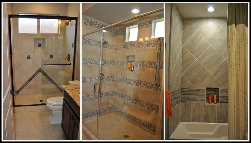
the_right_shower_for_youwebWhen you combine tiles, panels, listelles and features such as nooks to hold shampoo and soap, your shower can be customized to just the right combination of style and function to suit you. All three of these showers are light neutrals, yet each one has its own personality and flair.

The one on the left uses a diagonal layout for the tile backing with dark squares adding contrast and interest. In addition, the arrow shape coming up from the floor keeps the look from being predictable. The dark vanity connects the rest of the bathroom with the shower, creating a strong integrated look.

The middle shower is generous in size, and that space is emphasized by the dramatic stripes created by an intriguing mosaic. Contrast comes from the random pattern of dark and light squares throughout the mosaic stripes. Your eye shifts from the smooth neutral provided by the plain-colored tile to the pop of personality in the mosaics. The two balance each other out.

The final photo shows a tub-shower combo. Notice that the niche for soap and shampoo is lower, so a bather doesn’t have to stand up to reach their beauty products. In this case one stripe of glass tile adds a pop, which is supported by the shift of the standard tile from a square set on a diagonal to a rectangle set upright. This trick subtly defines a cozy bathing area while taking a more expansive feel in the higher shower range.

Which shower would you pick? Or maybe your ideal shower would be completely different! You can see these and other shower ideas at Oasis at Queen Creek, or visit the Fulton Design Center.

A Ceiling with Personality

web-a-ceiling-with-personality-blogWhen people plan their home’s décor, they think about flooring and the walls, but many ignore the sixth surface – the ceiling. Fulton Homes understands something that custom homebuilders have known for years – your ceiling provides an opportunity to showcase the lines of your home.

There are many ways to incorporate your ceiling into the design of a space. This photo shows some of the most effective options.

Dimension: By adding dimension to the ceiling the spaces are clearly defined. The living area ceiling builds an enclosure and creates a comfortable coziness. This type of ceiling, known as a coffered ceiling, has a long tradition. In this open living space it adds a line of demarcation as well as providing an additional appealing style element.

Color: By pulling the wall color up into the center of the coffered ceiling, the space is more clearly defined. The combination of dimension and color makes the ceiling even more dramatic. By using the same color on the ceiling as the walls the space has a warm centralized feel.

Lighting: Notice the light running along the edge of the coffered ceiling. This emphasizes the personality of the ceiling and creates a natural focal point at night. Entertaining in this room will be particularly effective thanks to this ceiling design.

It’s easy to ignore a ceiling, but if you do you’re sacrificing an opportunity to add style and drama to your home. Take a moment to picture this room without any furniture. Even empty, this space has its design own strength, and the ceiling is the reason why.

Interesting Lighting Livens Space

web-lighting-interesting-blogWhen you’re planning your home’s appearance, take the time to consider all the elements. Flooring has a dramatic impact, and wall color creates a finished look. Window coverings add warmth and help manage light. But it’s easy to ignore your home’s light fixtures, and that can lead to missing an opportunity.

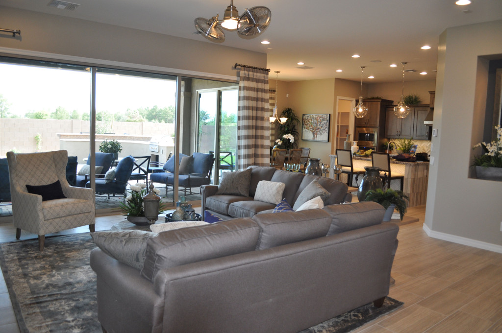
Lighting creates a mood, both in how an area is illuminated and how the lights themselves set a style. Let’s take a look at this open floor plan as an example. Four different choices of lighting make a real difference in this space.

Old-style ceiling fan: With the dual fan arrangement, this steel fan reflects a look that reflects the mood of hard-boiled detective fiction. You can imagine Humphrey Bogart in a room with a fan like this one, a steel file-cabinet in the background and his feet crossed on top of a battered wooden desk in the center of the office. A fan like this one says you’re not afraid to hark back to another era.

The pendant lights over the kitchen island also recollect another time. They mimic a classic schoolhouse style with their interesting shape. But the clear glass and Edison light bulbs bring them into the present. This combination of past and present blend to make a daring combination. Are you willing to take the design risk? The result is a room that steps out of the ordinary.

Ceiling lights provide the third light choice. These can be bright when needed for cooking or projects, or dimmed to set the right tone for evening events. Brushing along cabinets and walls, these lights are the quiet workhorses in your home. You really don’t want to do without them.

Finally, a simple chandelier sits over the dining table. Turned on for meals and off at other times, it’s functional yet creates an aura of warmth to match the meals served there. This light says hospitality.

Your home’s light fixtures are more important than you may realize. Take time to make the right lighting decisions for you and your family.

Industrial and Traditional Styling Combine for Sophisticated Den

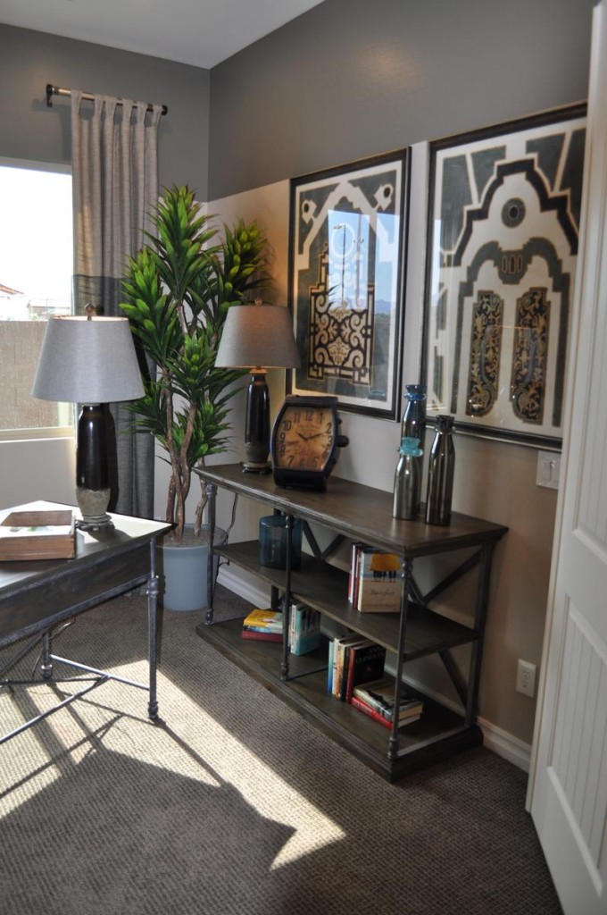
From the Atherton model in Penninsula at Queen Creek

From the Atherton model in Penninsula at Queen Creek

You may have noticed a decorating trend capturing an industrial feel in furniture and accessories. These items draw some inspiration from the Steampunk style, based on an alternate world where Victorian elements combine with steam-based technology to make an interesting setting for fictional universes.

If you want to add that industrial feel to your home’s décor, you may be concerned that the look will lead to a cold space rather than one that is warm and inviting. However, you can incorporate industrial elements into a room without losing the warm feeling. This den is a good example.

The strong grey tones in the color scheme are consistent with industrial-style design. But notice the cream, gold and yellow fabric at play on the chair upholstery. Those colors are echoed subtly in various accessories, such as the gold clock face and several yellow books. These splashes of warmer tones go a long way toward making this space welcoming.

Industrial accessories such as the oversized watch face clock and the tool boxes say industrial, but the globe on the desk, the plants and other containers keep this residential space grounded in more traditional elements.

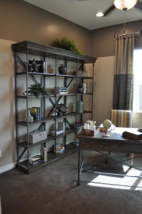
den 2The bookshelves show one of the best ways of combining industrial with traditional styles. The metal framing is classic industrial, but the wood shelves with crown molding along the top capture a much more traditional feel.

Finally, color-blocking on both the walls and the drapes add contrast and interest, while fitting with both an industrial and a traditional style.

Overall, the space makes the best use of two design styles, combining them to end up with a room that is sophisticated yet totally welcoming.

Create a Sophisticated Dining Room

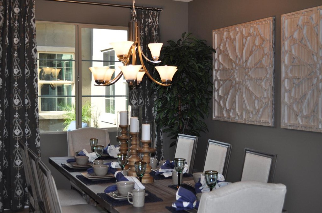
From the Atherton Model at Penninsula in the Oasis at Queen Creek community

From the Atherton Model at Penninsula in the Oasis at Queen Creek community

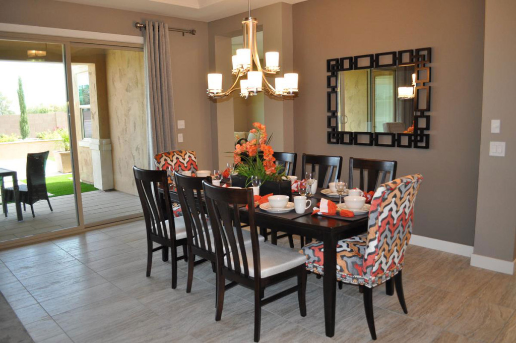
Grey has become a popular tone in decorating, and it is the strongest color influence in this dining room.  Yet this space feels warm and inviting. It’s the warm tones that balance the grey and make this dining room a place to linger. Let’s take a look at the elements that make this room so special.

Generous sizes: Start with a large table made with a thick top in a wood finish that combines grey with warmer hues. Add high-backed chairs with cushions and padded backs in a taupe/cream that uses both cool and warm tones. Finish with oversized art and substantial candlesticks on the table. All of these pieces give the room a weight and drama that combine to make the décor work.

Dark and light tones: Although most of this room uses neutrals, there is a nice distribution of light and dark tones to provide contrast and add interest. The curtains are the darkest permanent element in the room, but their pattern echoes the lightest tone. That light feeling is picked up in the chair upholstery and the candles. It’s too easy for a room filled with neutrals to end up boring, but these contrasts keep that from happening here.

A single pop of color: The blue napkins add a simple pop of color, drawing the eye to the table and adding just the right spark to the tablescape. Because the rest of the room is done in neutrals, you could easily switch out that blue for any bold color. How about yellow, red or coral? Or you could choose to go with black for extra drama. No matter your choice, this sophisticated dining room is ready for any dinner party.

The Pleasure of Reading in Bed

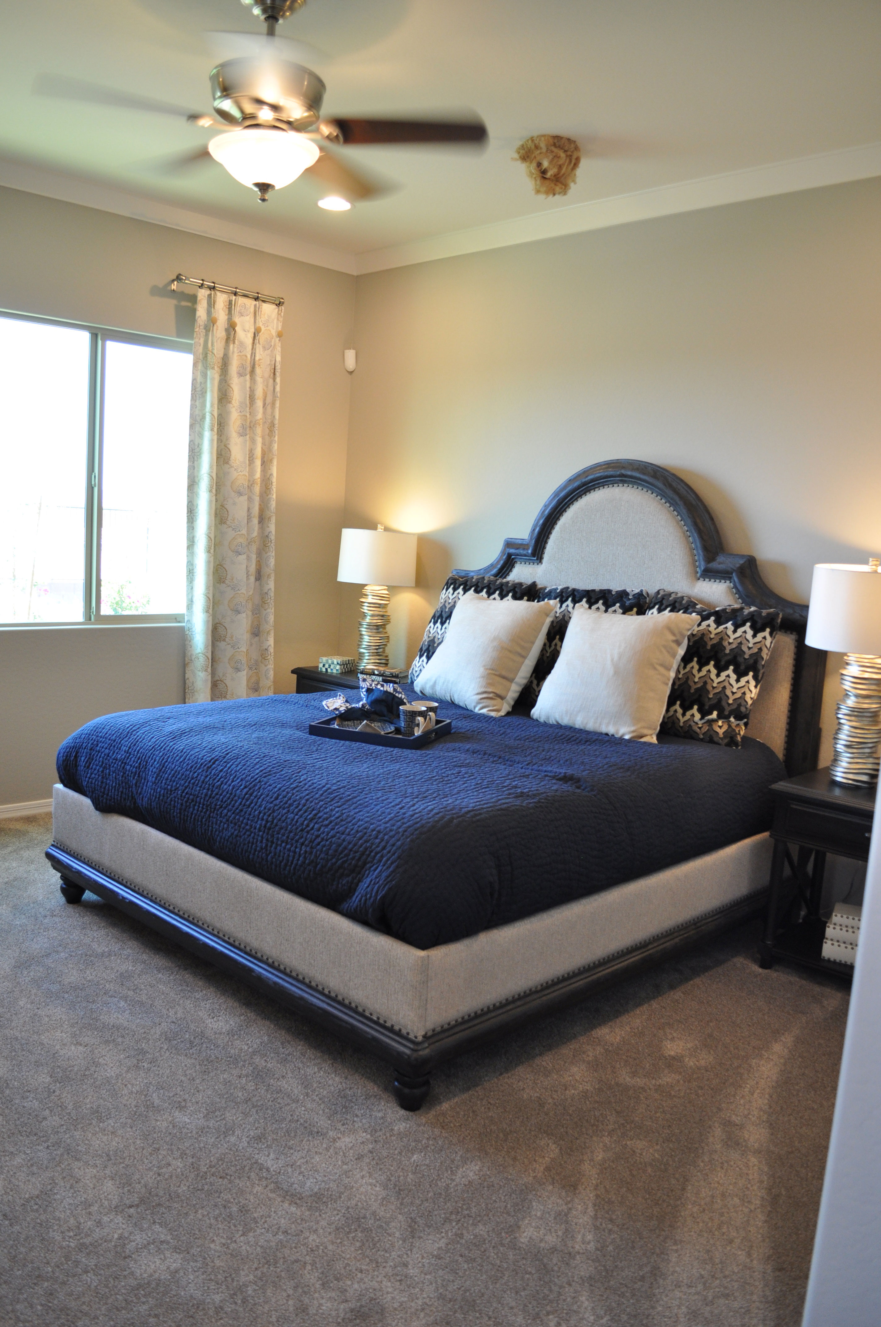
Master Bedroom photo from the Rancho Mirage model in the Oasis at Queen Creek community.

Master Bedroom photo from the Rancho Mirage model in the Oasis at Queen Creek community.

When you’re planning your bedroom, consider creating a space for reading in bed. For many people, spending time reading is a good way to get relaxed enough to fall asleep, and it’s so much nicer if all you have to do is turn off your light, put down your book and lie down.

To start, look for a padded headboard or one sloped for leaning against. This headboard adds drama to the master bedroom while the padded insert creates a good start to a comfy place to read.

Include some large pillows on your bed. These add style to your bedroom and provide the perfect elements to make a cozy place to curl up over a good book.

Think about lighting also. The matching lights on the nightstands give each person a direct light source for reading. The overhead light would also work, and with a remote to turn it off you don’t have to get out of bed when you’re ready to fall asleep.

If you are a regular bed reader but your partner would prefer to just fall asleep, consider investing in a tablet. You can read e-books on a back-lit surface without a light that might bother your partner at night. And if you are looking for your next book, library e-books are available 24-7 online.

While you’re planning your perfect reading spot, think also about how your bedroom will look. This combination of grey and navy is crisp and sophisticated. And the tray provides a perfect spot for a late-night cup of tea or a snack.

Make your bedroom work for you, in function as well as looks, and it can become your haven at the end of the day.

Think about Texture

From the Whitewater Model in the Oasis at Queen Creek Community

From the Whitewater Model in the Oasis at Queen Creek Community

When you’re planning your home’s décor, it’s easy to focus on color. But texture can be equally important. Choosing to include many different textures in your home makes it more interesting and unique. Let’s take a look at some options for adding textural elements to your home.

Architectural features: The stone focal wall in this study takes a standard room and makes it interesting. Since this room is open to the rest of the house, this one wall adds texture throughout the living area. Notice that the stone itself is fairly neutral and light. This allows you to modify the look and colors of the room over time without limiting your options.

Flooring: The dark wood floor has a handscraped finish which adds both depth and texture. With the handscraped option, floors reflect their wood origins more clearly. Whether you want wood, tile, carpeting or any other type of flooring, take the time to consider the flooring texture as well as the color.

Plants: Large-scale plants add texture through their leaves and branches. Shop around to find just the right variety for your home. Some do well in sun and some thrive in shade. Or you can incorporate silk plants for a lower-maintenance option.

Rugs: Layered flooring is one of the best ways to incorporate different textures into your home. The hard wood covered with a soft area rug grabs the eye and adds contrast to your floor.

Accessories: Everything from boxes and books to throw pillows can pull in additional texture. Take a look around each room in your home. Could you use more reflective surfaces? How about a nubby textile such as a wool throw?

By thinking beyond color to texture, you will add interest and sophistication to your home. Take a look around with texture in mind. You may be surprised at how just a few small changes can make a big difference.

Make the Most of your Laundry Room Storage

From the Rancho Mirage model in Oasis at Queen Creek.

From the Rancho Mirage model in Oasis at Queen Creek.

It’s easy to let your laundry room become a catch-all for those things you can’t figure out where to put. Holiday decorations, extra hangers, cleaning supplies and other odds and ends find their way into your laundry room cupboards and before you know it they’re full. Instead of this kind of unintentional use, how about turning your laundry room into a resource for specific types of storage? Here are a few suggestions.

Entertainment Central: Vases and other elements for table centerpieces and buffet decorations could find a convenient place in one or more laundry room cabinets. Add a frog, some pebbles or marbles for helping to stabilize flower arrangements and you’re ready for flower arranging or creating an interesting base for a buffet arrangement. You might add some of your favorite serving pieces and table linens for one-stop-shopping before a party.

Clothes Management: Pins, scissors and your sewing kit can be kept in the laundry room when you need to sew a button on tighter or stitch up a hem that’s coming loose. Stain removers, wrinkle release spray and even fusible sewing tape for any quick fixes can really come in handy when that jacket and skirt that you really wanted to wear needs mending.

Roadtrip Supplies: Cool bags, paper plates, disposable silverware, condiments in little packets, favorite road games and activities can be organized in one place ready to grab when you decide to take a weekend trip. Don’t forget a map or two for the kids to use to follow along where you’re going – reducing although not eliminating the cries of “are we there yet!”

Gift Wrap Center: Wrapping paper, ribbon, tape, scissors and a nice collection of gift cards help you be ready for those last-minute gift needs. Instead of searching through the house for everything you need, keep a special set of supplies in one cabinet just for gifts.

These are four quick ideas for ways to make the most of the storage in your laundry room. What other ideas can you come up with to make your laundry room useful for more than laundry?

Make a Smooth Transition Back to School

back to schoolWith school starting it can be hard for kids to adjust from the relaxing days of summer back into school mode. Here are a few tips to help them – and you – make the transition easier.

Pre-plan supplies: Don’t let everything go until the last minute. Shop for needed school clothes, shoes, school supplies and any technology on a schedule over several weeks. Structure special places in your home to stage school activities. Create several school outfits and hang them together in each child’s closet. Create a specific location for kids to find the pencils, pens, papers or other school supplies they may need so there’s no rushed morning searching.

Plan and negotiate lunches: Will your children be bringing their lunches to school or eating in the cafeteria? Or maybe there will be a mix during the week? Now is the time to negotiate the lunch issue so that you avoid those pre-school morning debates. Include planning a combination of wholesome foods with a few treats to make workable lunches for everyone. And while you’re at it – maybe you want to plan healthful lunches for yourself too. You can eat better and save money over eating out.

Pre-plan breakfast: Have a nice variety of easy and healthful breakfast options ready to go every morning. Hot cereal, eggs and toast, fresh fruit salad or frozen breakfast options such as whole-grain toaster waffles can combine to make a good start to the day for everyone. Plan on an extra 15-30 minutes in the morning so that no one has to rush.

Get an early start on going to bed: If your kids have gotten in the habit of going to bed late, start moving their bedtime to an earlier schedule a half-hour at a time every few days. By the time school starts, you want them to be able to wake up easily in the morning with a good night’s sleep behind them. Little ones can benefit from a standard bedtime routine with baths, books and good night kisses on a regular schedule.

Getting back into the mood for school can be tough, but as a parent taking these simple steps can make the process easier for everyone in the family.

Integrating Entertainment Technology in your Home

Entertainment center from the Rancho Mirage model in Oasis at Queen Creek

Entertainment center from the Rancho Mirage model in Oasis at Queen Creek

Technology has certainly changed since the days when telephones and televisions were the extent of it in your home. As televisions have gotten larger and flatter, and what we can do with them has evolved, it pays to plan for the entertainment technology in your home. Here are a few ideas.

Plan for family viewing: While you may like to have a television in your bedroom or kitchen, it pays to choose one main location for your entire family to enjoy. This allows you to invest in one larger-format set with theater-quality sound for watching films or special programs. Smaller-format sets or even computers work well for everyday screen time.

Build in convenient space for accessories: DVD’s, game consoles and controls, and whatever else you need for family entertainment is more likely to be used regularly if it’s convenient. Close-by shelving and storage helps keep everything in one place and easy to access when you need it. Notice that the shelves and cabinets in this entertainment space keep equipment and supplies out of sight when not in use, a tidier and more attractive look.

Create an integrated look: The wall color, tile insert and flooring, and black finish on the cabinets make the space feel well-planned and attractive. The choice to stay with light tones and black makes this wall a focal point while it still remains consistent from a design perspective with the rest of the room. Notice how the black finish on the coffee table supports this design goal.

Integrating entertainment technology into your home requires you to consider both functionality and design. For more ideas on how to make that work in your home, we invite you to visit our models in Oasis at Queen Creek.