5 Reasons Why Porcelain Wood Tile is Everything

Love the look of hardwood floors? Hardwood is a classic flooring choice because of it’s timeless beauty which is why it’s a common choice amongst homeowners. However, for many hardwood floors just isn’t in the budget. Before you count out other wood alternatives here are five reasons porcelain wood tile is a great substitute.

1.Porcelain Wood Tiles Can Go Virtually Everywhere
Unlike hardwood floors porcelain wood tiles can be installed in any area of the home. Hardwood isn’t durable in places that are exposed to repeated moisture such as the bathroom, basement or even the kitchen area. You’ll be able to get the luxurious look of wood in your bathroom and finished basement with porcelain wood because it’s not affected by drips and best of all it stays mildew free.

  1. Design Flexibility
    Want the look of cherry or oak floors? Porcelain wood tiles are manufactured to mimic any wood grain. There are literally hundreds of wood tile patterns and colors on the market that you can select from. You can purchase porcelain wood tiles that accent the hues used within the space. They are also versatile because you can install them on the floor or walls.

If you desire the look of white, gray or blond wood washes than your best bet is to lean towards porcelain wood tiles. Such wood washes are rare and difficult to find since it isn’t often cultivated.

  1. Durability
    Although, hardwood can last for decades it does require refinishing every so often to retain its beauty. Porcelain wood tiles can be durable. Unlike hardwood, porcelain tile is virtually scratch proof which makes it ideal for homes with small children and pets. Since tiles are impermeable you won’t have to worry about water damage in minor weather conditions.

  2. Easy Maintenance
    You can’t just use any cleaning product on hardwood floors because it’s susceptible to damage. Fortunately, porcelain doesn’t require any specialized cleaning product to retain its beauty. When spills occur it won’t stain the material and it can easy be wiped clean with a soap and water mixture. Inexpensive floor cleaners can be used on porcelain tiles.

Understanding Shade Variation in Tiles

Have you ever painted a room and realized that your results slightly varied from the in-store color sample? Well, you can also expect shade variation in ceramic and porcelain tile products. Often, when people see variations in their tile products they assume it’s a defect but it’s actually a result of the manufacturing process.

What Exactly Does Shade Variation Mean?
Shade variation affects the porcelain or ceramic tile that you’re considering purchasing. Advances in technology has allowed for tiles to be printed in all types of patterns and colors. Therefore, you can expect some slight variation is some of your printed tiles. During the production of ceramic and porcelain tiles you’ll notice that there isn’t just a variation in color but it can slightly alter in texture and shade. However, shade variation only occurs towards unpolished tile.

How does shade variation occur? Well, during the production process, natural clay elements are taken and fired at high temperatures and depending on the baking conditions and the materials it can generate slight variations in each batch. It’s similar to baking cookies. All the cookies will look the same but you can expect small changes in each batch.

For some tile designs, shade variation is done purposely. These days, most tile products will come with a shade variation rating.

Understanding Shade Variation Rating
In 2001 the Ceramic Tile Distributor Association (CTDA) developed a shade variation rating system. When shopping for ceramic or porcelain tiles it’s important to see what rating a tile product has so you can know what type of results to expect. Here is a breakdown of the CTDA rating system:

V1- Uniform Appearance
A tile product with a V1 rating you can expect very minimal variation between each tile.

V2 – Slight Variation
There will be some clearly distinguishable differences between each batch.

V3- Moderate Variation
A ceramic or porcelain tile with a V3 rating will vary significantly.

V4 – Substantial Variation
Products with a V4 rating will have random color differences in each tile. One tile might be saturated with a different shade of colors than the previous tile in the batch.

How to Choose the Right Size Tile

Although, tiles are one of the world’s oldest building materials it’s still just as relevant to modern design as it was centuries ago. Whether you’ve settled on a bold ceramic tiles for a space or subtle laminate subway tiles selecting the right size is important to achieve the desired look. Over the past few years, tile sizes have increased dramatically. From 4×4 to 8×12 you can purchase tiles in virtually any size. So what size should you choose?

Basic Tile Size Guidelines
While there are standard shapes and sizes of tiles as you will see most manufacturers create tiles with dimensions that are tailored to their inhouse design. Sometimes the sizes are unique and you probably won’t be able to find it anywhere else. That’s why it can be challenging to determine what the ideal tile size should be for a space. However, there are some general rules to picking out the perfect tile size for a space that you should consider.

Small rooms
Often, design experts recommend using larger scaled tiles in small rooms. Large format tiles in a small space will visually expand the area making it seem bigger than it actually is. This is because larger tiles allow for fewer grout lines breaking up the flow of the floor. However, if the room is tiny than floor tiles larger than 18 inches will overwhelm the space.

Long Room
What about a long, rectangular shaped space? Installing plank style, large tiles on galley-like rooms creates depth, makes the room appear wider and spacious.

Texture
If you desire to create interest and texture than you might want to opt for small mosaic tiles. With smaller tiles there will be more grout lines but the space will flow smooth since small shaped mosaic tiles can be easily fitted in corners and around fixtures. In this way, small tiles are similar to carpet and it can really create a proportionate and harmonized look.

Defining A Space
If you really want to define a space whether big or small you can use smaller sized tiles to create an accent or border around large format tiles.

Selecting the right size tile is largely dependent on the desired look that you’re seeking to achieve!

Mosaic Art Backsplash

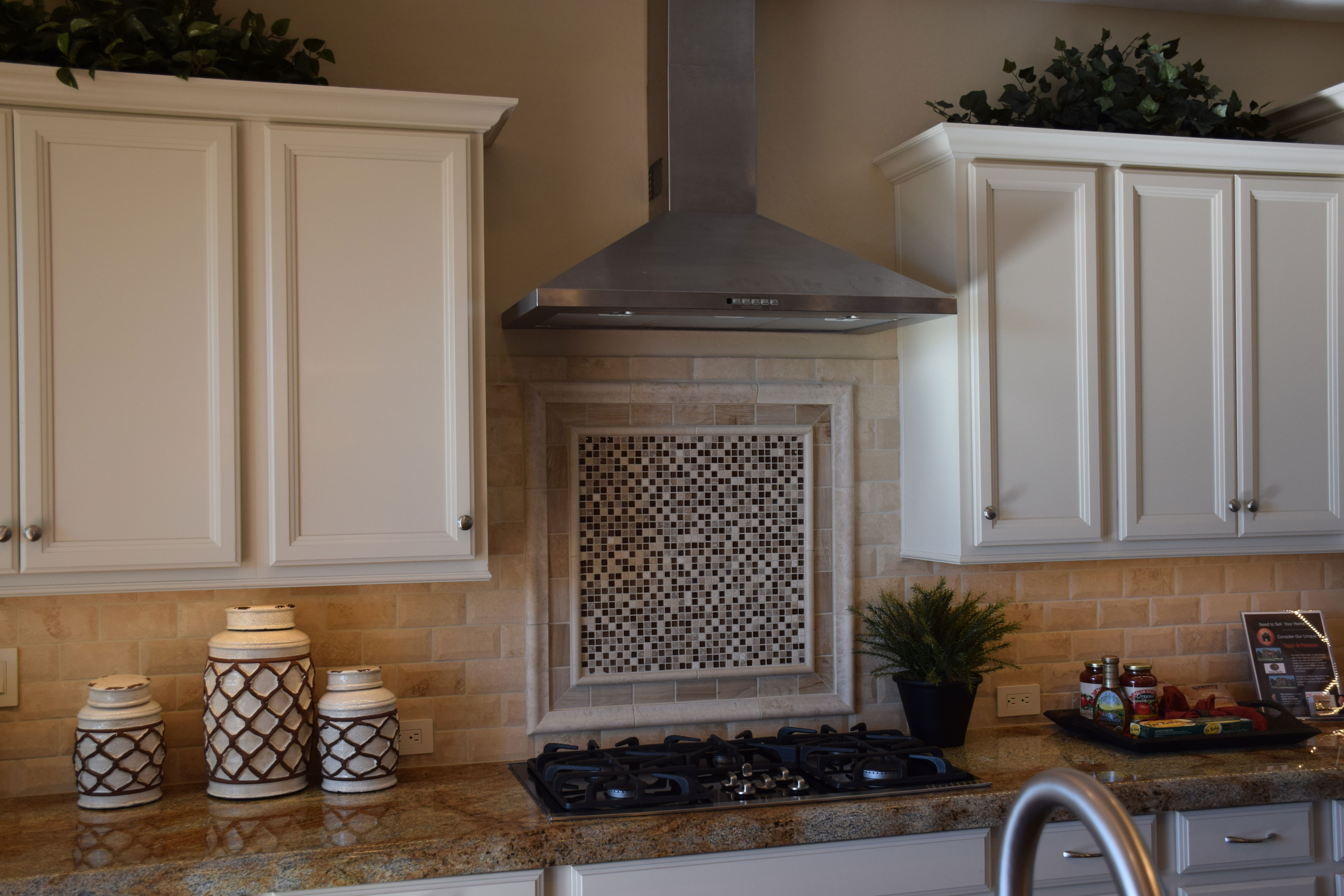
Cooley-Station-024-webKitchens are primarily functional, but just a few special touches can also make them stylish and interesting. In today’s homes with a focus on open floor plans, it pays to take the time to make your kitchen stand out.
Choosing just the right tile backsplash is one great way to add style to any kitchen. Your backsplash doesn’t cover a large square footage, so you can select a more expensive tile option without spending a lot of money. The rough-edge subway style backsplash shown adds vintage charm and texture in this kitchen.

Many kitchens take advantage of the generous space between the stove and hood to position a backsplash focal point. You have a lot of choices for this spot. Some people choose a pictorial option, available in both tile and stone. But more often a mosaic adds personality.

Notice the raised framing around this mosaic. It coordinates well with the rustic-edge subway tiles, and the white frame integrates with the painted cabinets. But it all comes to a head with the dramatic mosaic.

The super-small squares combine with a three-tone semi-random geometric design to draw the eye. Its surprising contemporary flavor brings this kitchen into a more modern mood without detracting from the appealing old-world style of the space. It’s interesting how the canisters to the left echo the colors and shapes brought out in the mosaic, providing another integrative element.

A backsplash may seem unimportant, but this kitchen shows the power the right choice can have in making your kitchen uniquely yours.

Listelles add Personality to your Tile Choices

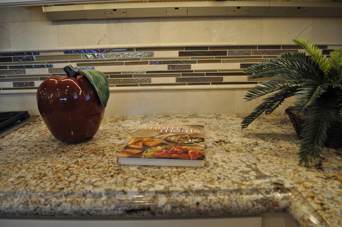
listelle-in-Peninsula-model-at-Queen-Creek-webUsing a listelle that includes glass tile, like the one shown above in the kitchen backsplash, adds a touch of personality to any space.

Listelles, or pre-designed strips of stone or tile, provide an easy way to create a mosaic effect anywhere in your home. The listelle shown above combines the sparkle of glass tile with a soft matte finish cream and dark brown tile to create an interesting and contemporary look.

The Fulton Design Center showcases a broad selection of listelles to highlight your home in stone and tile. Styles range from modern glass pieces like this one to more traditional choices. With the variety of options, you can find just the right choice to fit your taste and style.

By using a listelle, a simple tile placement becomes interesting and unique. Listelles work well on kitchen backsplashes, in bathrooms or fireplace surrounds. Listelles are pre-designed and cut, making them easy to install and ensuring that they look perfect in your home.

Notice the strip of electric outlets running along the top of the kitchen backsplash at the top of the page. Selecting this option for your home allows you to have plenty of outlets without breaking up the lines of your backsplash. While you’re at it, take a look at the under-counter LED lighting to give you great task lighting for your kitchen.

To take a closer look at this, visit our Peninsula models at our Oasis at Queen Creek Community.

Metallic Backsplash Adds Style

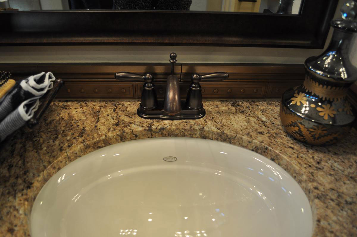
metallic-backsplash-adds-stylewBathrooms are by their very nature small. This can make them somewhat of a throwaway room when it comes to both design and decorating. But if you’re smart, a bathroom is the best place to splurge since it doesn’t take much square footage, or dollars, to make a big splash. Let’s take a close look at this bath vanity and see how smart design and décor makes a difference.

Oil-rubbed bronze fixtures: There’s something about oil-rubbed bronze that draws the eye. Maybe because we all grew up with classic chrome, seeing this look captures attention. It feels old-style without being too traditional. It also works well with granite like the choice shown here. The brown and gold really suits the soft dark tones of the bronze fixture.

Granite with personality: When you have a limited amount of counter space, choosing granite with a lot of contrast and veining really works. In this bathroom, the countertop adds drama and suits the simple white sink.

Metallic tile backsplash: This metallic is not the same finish as the faucet, but the dark tones help them set each other off when seen together. When the space is limited, choosing a tile with this much texture and a metallic finish means that it won’t be ignored by guests.

Framed mirror: The ultimate finishing touch is a framed mirror. Instead of a simple mounted wall mirror, the frame creates the feeling of completion that makes this bathroom something special.

The Right Shower for You

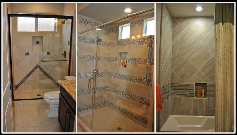
the_right_shower_for_youwebWhen you combine tiles, panels, listelles and features such as nooks to hold shampoo and soap, your shower can be customized to just the right combination of style and function to suit you. All three of these showers are light neutrals, yet each one has its own personality and flair.

The one on the left uses a diagonal layout for the tile backing with dark squares adding contrast and interest. In addition, the arrow shape coming up from the floor keeps the look from being predictable. The dark vanity connects the rest of the bathroom with the shower, creating a strong integrated look.

The middle shower is generous in size, and that space is emphasized by the dramatic stripes created by an intriguing mosaic. Contrast comes from the random pattern of dark and light squares throughout the mosaic stripes. Your eye shifts from the smooth neutral provided by the plain-colored tile to the pop of personality in the mosaics. The two balance each other out.

The final photo shows a tub-shower combo. Notice that the niche for soap and shampoo is lower, so a bather doesn’t have to stand up to reach their beauty products. In this case one stripe of glass tile adds a pop, which is supported by the shift of the standard tile from a square set on a diagonal to a rectangle set upright. This trick subtly defines a cozy bathing area while taking a more expansive feel in the higher shower range.

Which shower would you pick? Or maybe your ideal shower would be completely different! You can see these and other shower ideas at Oasis at Queen Creek, or visit the Fulton Design Center.

Easy yet Welcoming Entryway

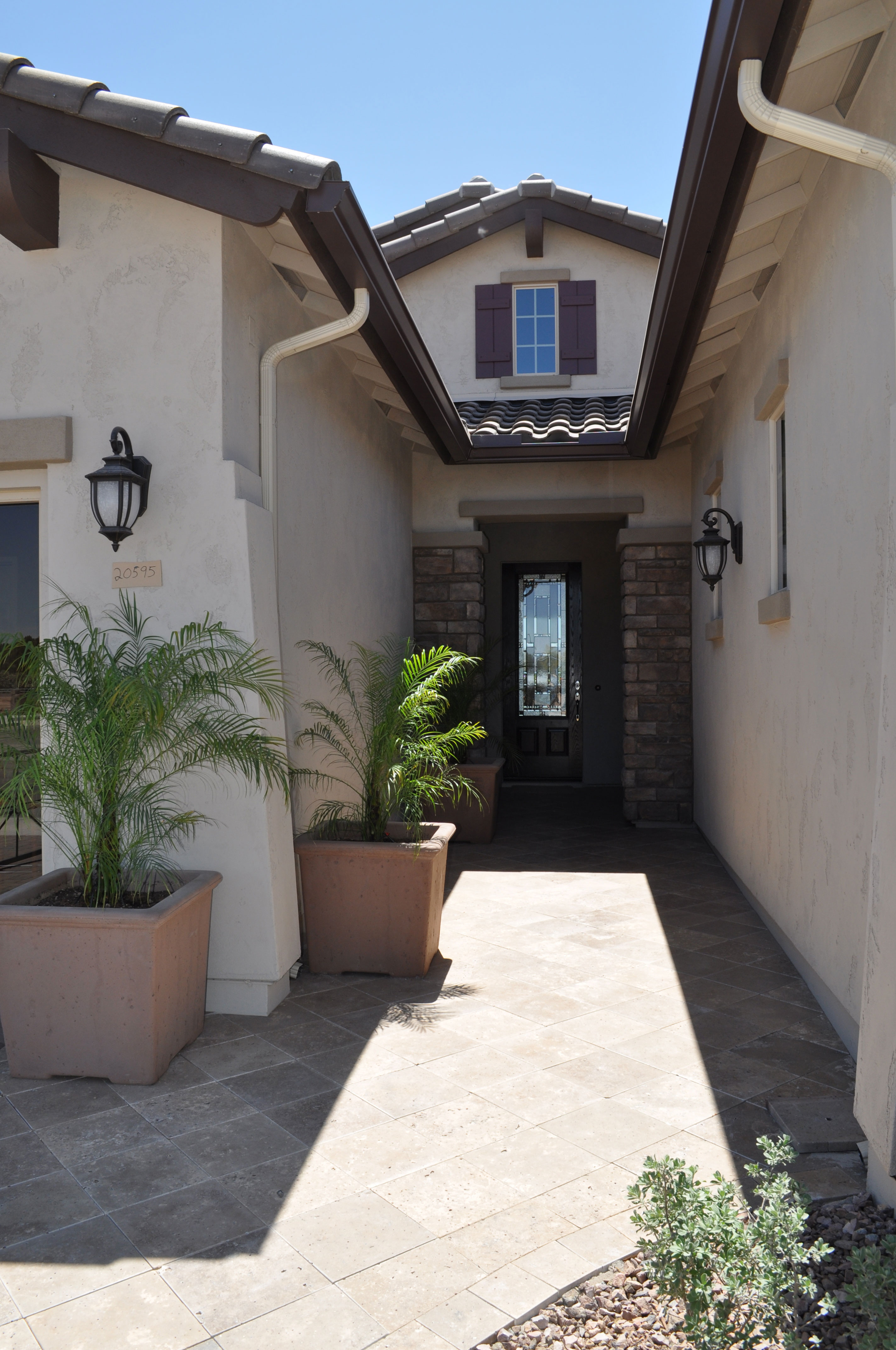
entryway-webWhen people walk up to your front door, you want them to feel welcome before they even push the doorbell. On the other hand, going to an extreme with decorating your entryway can involve a lot of maintenance. Here is one example of a front entrance that provides an inviting feeling without a lot of effort on your part.

Interesting walkway: Instead of a standard concrete sidewalk, consider choosing a walkway material such as tile, stone or pavers to add interest and charm. This stone walk combines a diagonal placement with a simple border around the landscaping to make the entrance stand out. The additional stone on the wall around the front door adds to this entrance’s welcome.

Lighting: It’s easy to ignore exterior lighting, but it plays an important role in your home’s first impression. Take the time to choose lights that reflect your taste and style. Look for options that have personality and charm. This pair of coach lights suits the entrance yet have a feeling of whimsy that makes visitors take a second look. And when you turn those lights on at night, your guests know you are expecting them and looking forward to their visit.

Plants: Landscaping around your front entrance is important. Keep shrubs low so that the doorway isn’t hidden, but that touch of green adds interest. In this instance, several palms in pots add another splash of greenery and help integrate the sidewalk to the house itself. You can water these a few times a week or add a drip line to each one so that they get watered when your yard is irrigated. Then the only maintenance needed is occasional fertilizer and trimming any dead foliage off.

With just a few smart decisions, you can turn a standard entrance into something that makes a statement about how you feel about your home and the special people you invite to visit.

Think about Texture

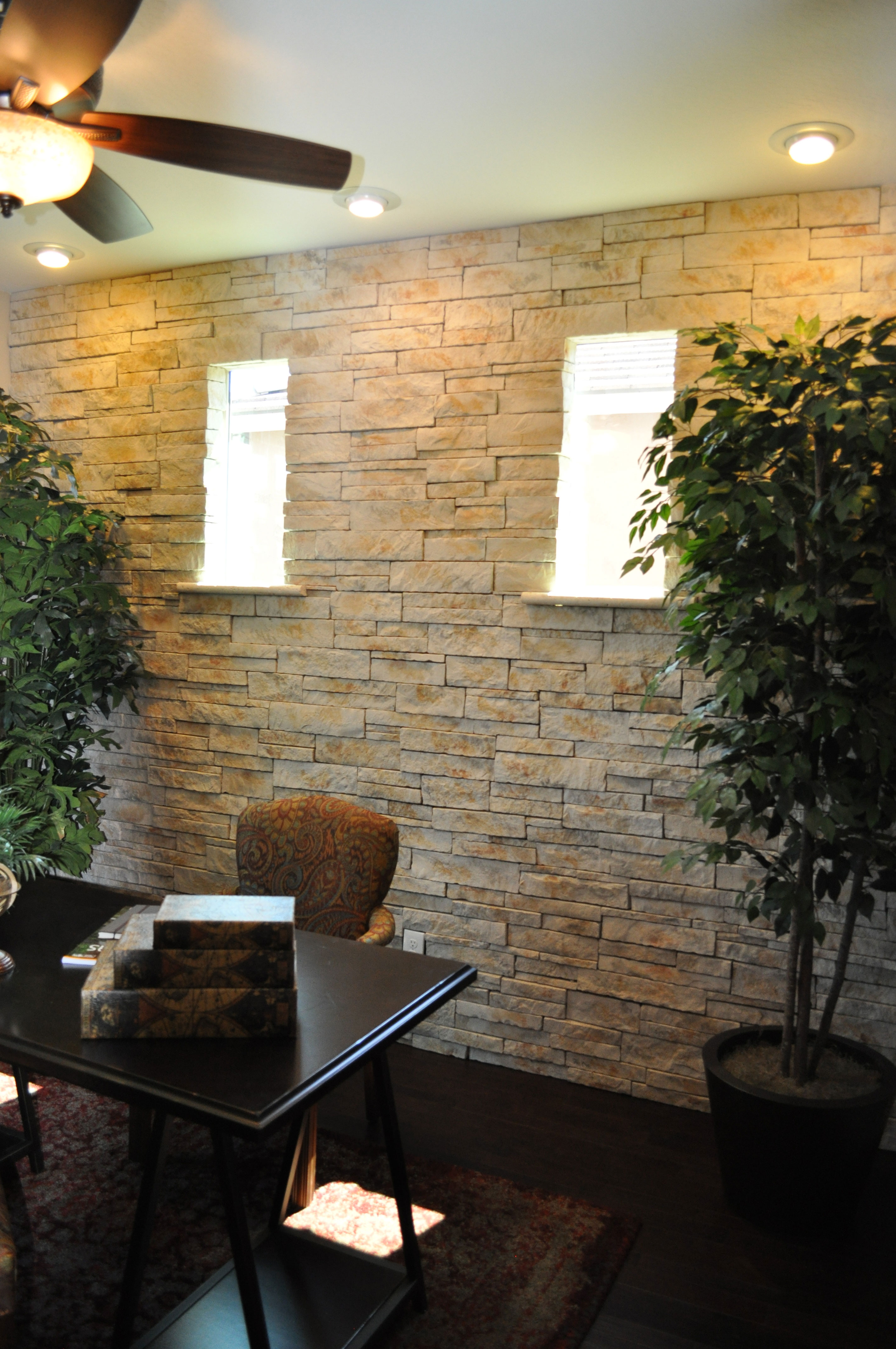
From the Whitewater Model in the Oasis at Queen Creek Community

From the Whitewater Model in the Oasis at Queen Creek Community

When you’re planning your home’s décor, it’s easy to focus on color. But texture can be equally important. Choosing to include many different textures in your home makes it more interesting and unique. Let’s take a look at some options for adding textural elements to your home.

Architectural features: The stone focal wall in this study takes a standard room and makes it interesting. Since this room is open to the rest of the house, this one wall adds texture throughout the living area. Notice that the stone itself is fairly neutral and light. This allows you to modify the look and colors of the room over time without limiting your options.

Flooring: The dark wood floor has a handscraped finish which adds both depth and texture. With the handscraped option, floors reflect their wood origins more clearly. Whether you want wood, tile, carpeting or any other type of flooring, take the time to consider the flooring texture as well as the color.

Plants: Large-scale plants add texture through their leaves and branches. Shop around to find just the right variety for your home. Some do well in sun and some thrive in shade. Or you can incorporate silk plants for a lower-maintenance option.

Rugs: Layered flooring is one of the best ways to incorporate different textures into your home. The hard wood covered with a soft area rug grabs the eye and adds contrast to your floor.

Accessories: Everything from boxes and books to throw pillows can pull in additional texture. Take a look around each room in your home. Could you use more reflective surfaces? How about a nubby textile such as a wool throw?

By thinking beyond color to texture, you will add interest and sophistication to your home. Take a look around with texture in mind. You may be surprised at how just a few small changes can make a big difference.

Quartz: A Popular Choice Among Homeowners

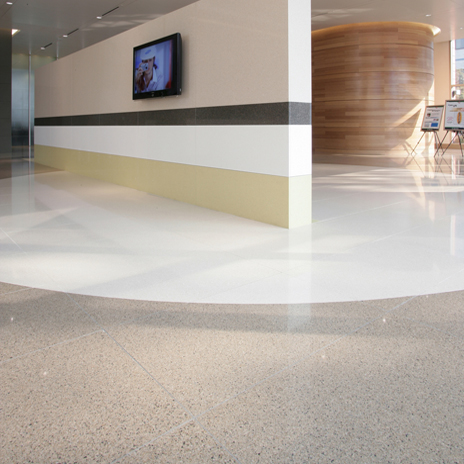
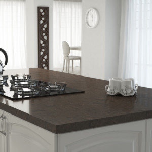
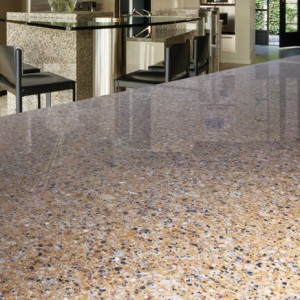
Quartz-Everest-White-Bristol-Beige-Allegheny-Amber-Install3-464x464Quartz has become a favorite material among homeowners in kitchen and bathroom design, being used for countertops and backsplashes, as well as vanities and showers. It’s really no surprise that its popularity continues to grow, since it has the best qualities of laminate and stone, along with its own unique features.
Characteristics of Quartz

Quartz has several appealing characteristics that make it a truly wonderful material for many design projects. Here are five great features that make quartz a top choice.

Durable: Quartz is extremely durable, with more than 93% of counters being made of natural quartz crystals, one of the hardest minerals found in nature. The result is a stone with a scratch resistant surface that’s stronger than granite and marble.

Quartz isn’t as heat resistant as other materials, however, and can be damaged by excessive heat. Extra care should be taken by using trivets for hot pots and pans in the kitchen, and exercising caution when using equipment such as hair dryers in the bathroom.

Quartz-Alberta-Install-464x464Stain Resistant: Quartz resists staining much better than other materials such as granite, concrete and marble, standing up to even the toughest food stains including coffee, cooking oils, and wine. This is certainly a huge plus for most of us!

Sanitary: Due to its nonporous surface, quartz doesn’t harbor bacteria or viruses, enabling you to keep your surfaces completely clean, which is especially important for both kitchens and bathrooms.

Easy to Maintain: Whereas granite and marble countertops must be sealed regularly to prevent staining and the growth of bacteria, adding to the cost of these materials, quartz doesn’t require sealing or other routine maintenance to retain its lovely appearance or durability. And it’s very easy to clean, requiring only soap and water to keep it looking as good as new or a stone cleaner to give it that polished shine!

Environmentally Friendly: Quartz is a plentiful mineral that impacts nature less than granite, making it an eco-friendly choice.

Quartz-Cumberland-Flax-Install-464x464An Extremely Versatile Material: In addition to all these fantastic characteristics, the manufacturing process provides uniform color and appearance, with large slabs that allow for more coverage and fewer seams than with natural stone. And its rich, luxurious look, and wide array of gorgeous colors and patterns, makes it easy to match any kitchen or bathroom design scheme.

For a material with an upscale, beautiful look and minimal maintenance requirements that’s also virtually indestructible, quartz is tough to beat. For more information on quartz, or to see some of the many looks available, visit the Fulton Design Center on a browse night or stop by Arizona Tile. You’ll find the perfect quartz surfaces for your new Fulton Home.