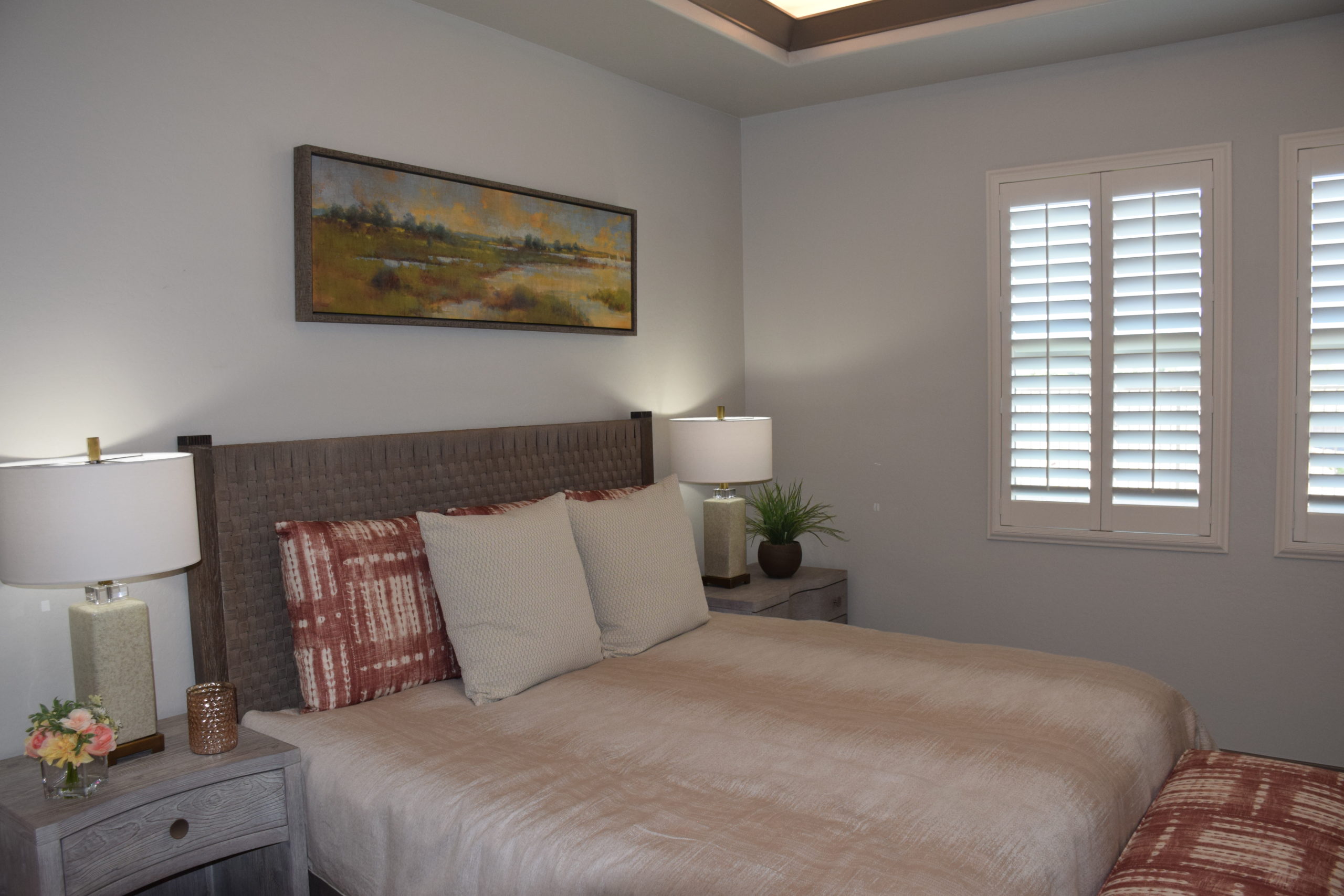
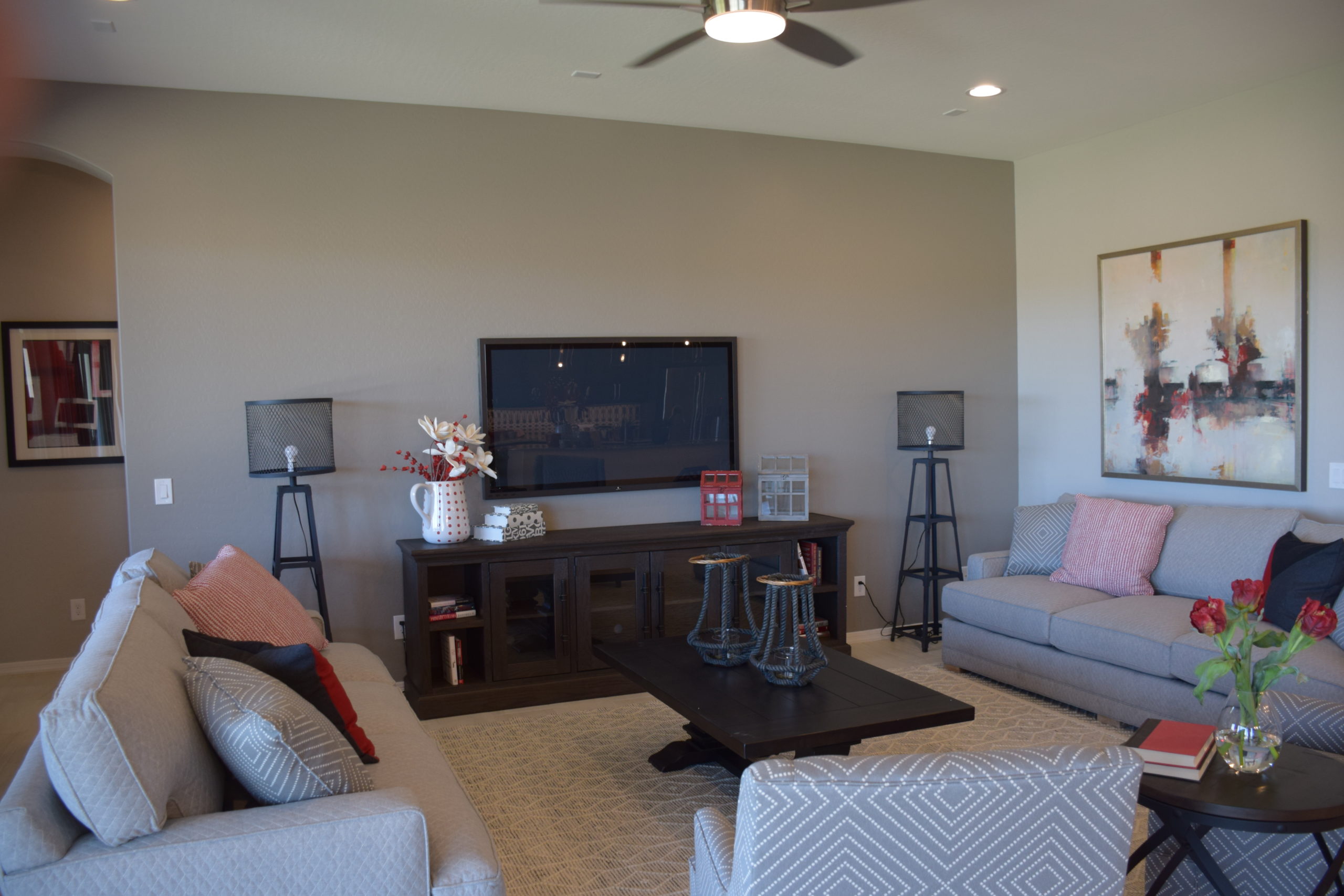
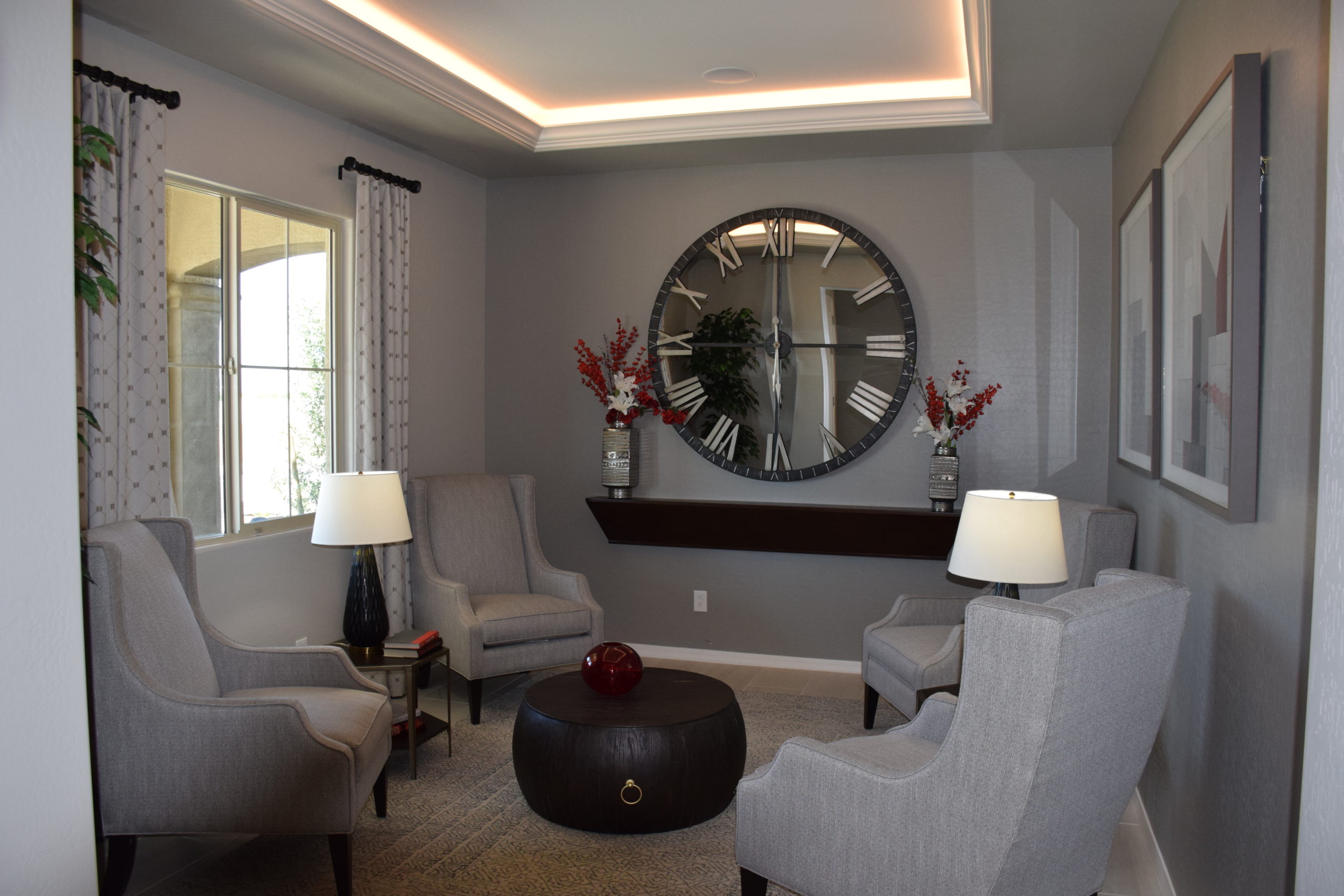
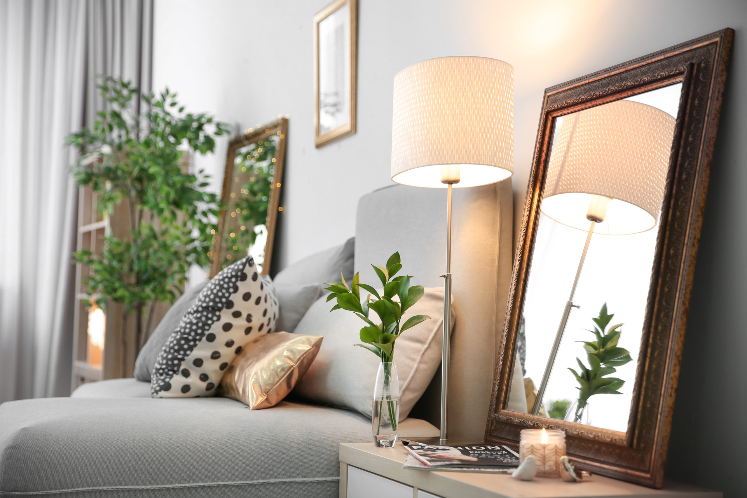
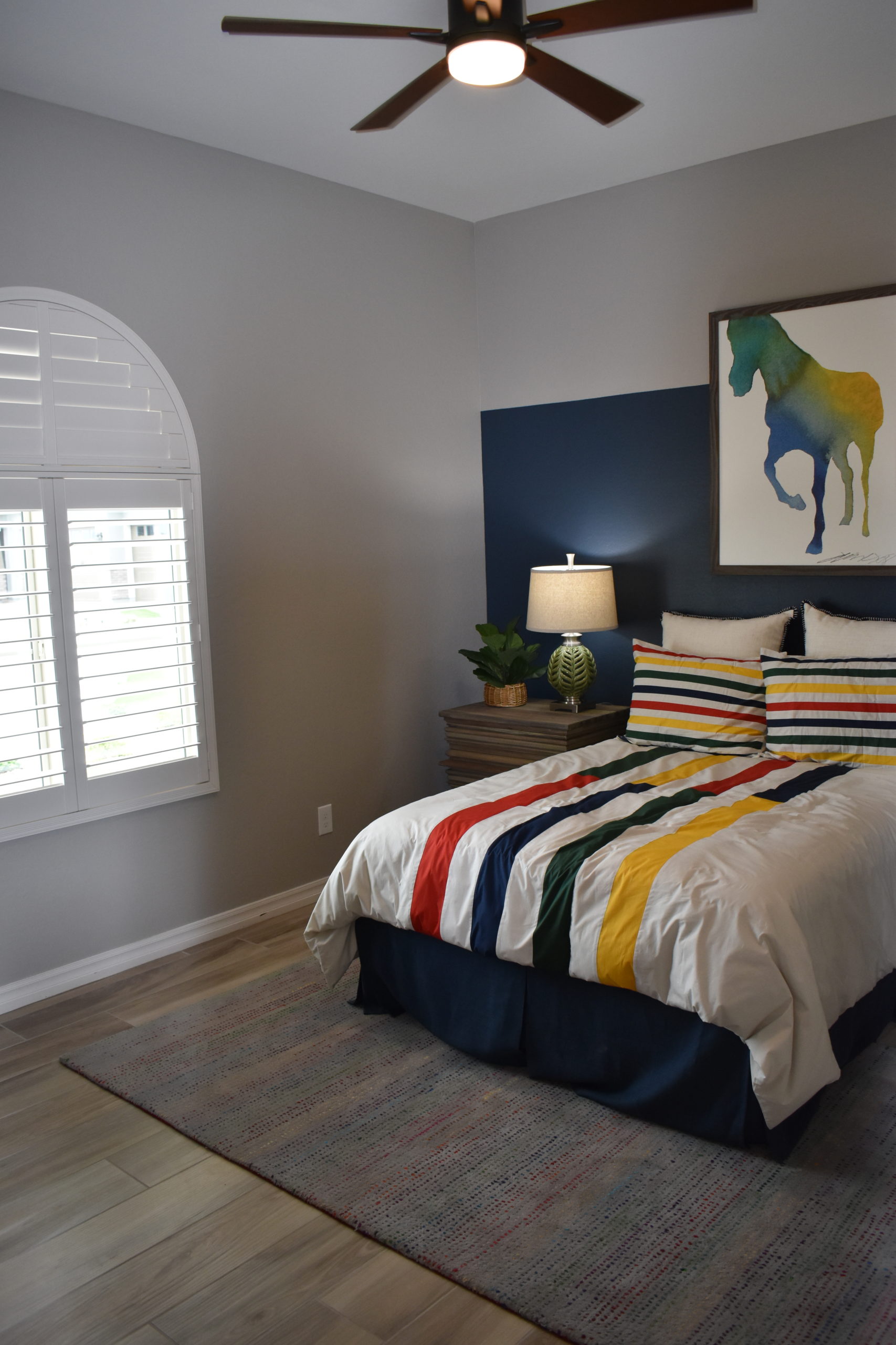
You’re not alone! Common decorating mistakes are made time and time again. This post may help you by pointing out common mistakes so you can avoid making them!
If you don’t love it, Leave it!: Do not use something that you don’t love. Just because something has been inherited or gifted and you feel it needs to be used, doesn’t mean you have to use it. If you don’t love something, donate it!
Define your own personal style: Don’t decorate according to the latest trend. Decorate around your personal style. You will enjoy your décor much longer than you would if you used a trendy style. Decorating around your personal style gives unique character to your interior. If you’re sick of the white tile in the kitchen, replace it with a bright warming color.
Clear the clutter, Go chunky: Small accessories tend to make a space look cluttered and unorganized; not to mention the dust they collect. Simplify your accessories by replacing many small items with a few chunkier pieces. Chunky accessories make a space look clean because few are needed to replace many small items.
Research Color: Avoid making the wrong choice with color. Different colors spark different moods on a subconscious level. Research what colors you are considering for carpet, tile, paint, etc. in order to ensure the right color choice for the appropriate room and its use. (or ask our designers for help!)
The most important advice we can give you is “Done is beautiful”. Incomplete spaces look uninviting and affect the people that live there as well as guests. Try not to get caught up in deciding the perfect look for a particular space. Find a way to complete spaces; they can always be modified down the road.
Warm vs. cool neutrals – which choice works best for your home.
Neutrals are wonderful tools when decorating. A completely neutral room can be both restful and sophisticated, while showing off different textures. A neutral room can also look like the person decorating it was afraid to take a chance with colors. One of the differences between the two rooms is an understanding that neutrals are not just a “safe” choice, but actually as powerful as colors.
A good place to start when analyzing neutrals is determining whether they are cool or warm. Just like colors, neutrals fall into these two categories. Warm neutrals include black, gold and tans, as well as beige. Cool neutrals feature white, gray, ivory and silver. Like colors, neutrals run on a continuum between cool and warm. If you’re not sure where a specific neutral falls, look for color undertones. If you see blue, it’s in the cool spectrum. Yellow or orange undertones take a neutral into the warm direction. Comparing neutrals can also help you decide the relative cool/warm nature of the tones.
Neutrals provide an effective background to a color-filled room and allow two challenging colors to live in the same space without competing. Many people choose neutrals for flooring for the flexibility they provide with the rest of the space.
When bringing a new neutral into an existing room or a new space, consider the neutral or neutrals in combination with the colors you will be introducing. Pull all of your samples together when shopping, or bring store samples home to see how they work in the designated space before making your final choice. Take time to evaluate everything to give you the opportunity to make the right selections. Neutrals can be remarkable – providing the glue that pulls a room together.
Posters on grey wall above wooden desk in natural home office interior with plants and lamp
A place to pay bills, check your email or work from home is a must for any home, especially these days. Ideally, you have an entire room dedicated to your home office. For some even if they have a spare room, they would rather just have a desk in the master bedroom or tucked into the corner of the kitchen or even living room. If your home office is a desk in another room, it should be a stylish addition to the room that works with the room’s existing décor.
A workspace can be a designated desk with drawers and file space or it can be a beautiful table. Traditional writing desks have a few small drawers under the top but open legs. Your furniture choices don’t have to feel like a traditional office outside the home. Choose what works best for your needs!
Reminder: For chairs with casters, a hardwood floor or a mat over the carpet makes movement easier and protects your floors. For chairs without casters, be sure to put felt protectors on the bottom of the chair legs or feet.
When decorating your stylish desk, consider a pair of lamps that make it feel like a console table. A mirror would be a nice addition above the desk to reflect light and break up the cream expanse of the wall. Or you could hang a framed artwork above the table to add color and pattern to the wall. The possibilities are endless!.
Have you noticed that rooms in magazines have everything perfectly lighted? Special architectural photographers may spend an hour or more setting up a shot and lighting it, and then take dozens of shots from different angles to find the perfect way to show a decorated room at its best.
If we want our homes to look more like the magazines, we need to pay attention to lighting the way professional photographers do.
Photo-shoots combine lights with reflectors. In your home, walls, ceilings and floors can act as reflectors, and windows can serve as lights. You need your living area to look good both during the day and in the evenings. For good daylight in a room, choose window coverings that can open or be raised during the day and closed at night for privacy. If windows get full sun, you may want to consider one of the new adjustable translucent window coverings that can be positioned to bring in light while keeping glare to a minimum.
In the evening, use a combination of overhead lighting, lamps and ceiling spots to create an inviting mood. A plain overhead light may work from a task-lighting standpoint but doesn’t really contribute to the ambience of a room. Look for table lamps and up-lighting from torch lamps to create the look you want.
Mirrors can also distribute light. Positioned opposite a window, mirrors can increase natural light in a room. Choosing light walls or flooring will also brighten a space. Look for shiny or metallic surfaces to reflect light also.
Your home may not be able to match those well-staged photographs in lifestyle magazines, but you can use light and reflections to highlight your home’s best features and create the mood and style you want.
Tartans have a long history as a pattern for textiles. Also known as plaids, these historic patterns trace their lineage back to Scotland where each clan has its own tartan. Some clans have multiple tartans for dress or every day. Each tartan is named for a specific Scottish clan. Tartans are still proudly worn by these ancient families but are loved the world over for their graphic pattern and color combinations.
In home designs, tartans have typically been used on blankets and upholstery. A tartan covered sofa can look great in any style home whether it is a traditional English country home inspired interior, a Fulton home in Arizona or a modern California ranch style living room. Tartans can also be found on wallpaper, curtains, and area rugs as well as throws and pillows.
Tartans can range from subtle tone on tone patterns, like the one pictured here, to larger pattern that employ contrasting colors along with white and black. The size and color of each tartan pattern makes it unique and easy to identify. Tartans are different from plaids although the two are similar in pattern. Tartans are specific to the clans of Scotland while plaids can be in any number of sizes and color combinations.
If you have Scottish heritage, you can bring a bit of your history into your home with a tartan of your ancestral clan. Even if you don’t have Scottish blood, decorating with tartans will add color and pattern to your floors, walls, and furniture. You can be as bold or as subtle as you’d like and best suits your personality when decorating with tartans.
If you look at the color ranges of farm fresh chicken eggs, you’ll see that even amongst white there are many shades. Shades of white can range from nearly pure white to whites subtly tinted with color. when you look at the spectrum of colors in a paint chart you can see the range of white that on its own look purely white but when placed side by side show their undertones of different shades. When choosing white for walls, floors or furniture, there is a white for everyone and every room.
Creamy whites can be easier to live with than pure whites. Whites that have undertones of cream or yellow lend a warmer tone to a room. Off whites that have a slight tan or brown undertone can also warm up a space and are good choices for slipcovers and furnishings. Pure whites are better in hard surfaces like trim and cabinetry that can be easily cleaned. A pure white rug or carpet will show dirt more than a rug that is more off white or slightly tinted with neutral undertones. White slipcovers can be washed and even bleached, check with your slipcover’s labeling before bleaching.
Many people are afraid of using white in their décor. If this is you, take a look at those white paint chips or even farm fresh eggs. You’ll see that white can be more blue, or pink, or even green. Finding the right undertone to the white will make it work for your interior. Whites can also be layered to create a subtle palette that has just a hint of color.
Whether you are decorating a family room for a new house or redecorating the one you have; there are some certain things to consider. A Family Room is most often a mixed-use type room. Normally it’s a place for the family to unwind at the end of the day, it’s sometimes used for family game nights and occasionally used to entertain guests while watching “The Big Game” on TV. At least once a year this space is used to accommodate an overflow of family guests during the holidays. The reason this type of room is considered “mixed-use” is because it’s casual, comfortable, has the most seating, and the best TV to watch. When decorating this type of room, keep function and comfort as your top two priorities. Wall color should be an inviting color in a warm tone, such as tan, gold, rust, or an earth tone green. The color of the walls has a way of setting the tone immediately. It provides a warm setting and compliments other warm furnishings in the room.
Occasional and accent furniture (coffee tables etc.) look best in this type of setting when they are made of wood and finished with a darker stain with light distressing. The sheen of the stain used should be more honed and less polished. This will ensure added warmth to the space as well as hide knicks and scratches. Lighting in a family room is very important. Select lighting that puts out a warm glow. Overhead lighting should be able to dim. This is important because in one instance you may need more light while playing games, on the other hand having lighting with dimming capabilities is nice to have when watching a movie.
Accessories should include collections of books, family photos in frames on tables as well as on the walls. Take advantage of a family room by highlighting memories made by family members. Keep in mind that all furnishings in a family room should be comfortable, durable, and functional. It is also nice to have plenty of storage for winter blankets, games, etc.!
Bare, blank walls can make a room feel unfinished. Choosing what to hang where in the home can also be intimidating for some. Staring at a blank wall when decorating is kind of like a writer staring at a blank page when writing. The blank stare can stifle us from making a decision. If you have blank walls in your bedroom, or anywhere in your home, we hope this article can help you take the first step to decorating your walls.
Bedrooms should be sanctuaries and calm places for us to restore our spirits as well as rest our bodies. Comfortable textiles on the bed, soft flooring like carpet or area rugs on the floor, curtains that can block light all create the environment for good sleep. You can add to the soothing and restorative qualities of your bedroom by what you hang on the walls.
Every wall in the room does not have to be filled with art. Empty spaces give the eye a place to rest. Art for the bedroom can be framed in frames that coordinate with the furniture, wall or floors. Metal frames can also add a little sparkle to the room. You can frame practically anything and it will look great on the wall. Framed art can include family photos, your wedding portrait or vacation photos. Fabric and paper can also be framed. Choose art that speaks to you. If you love it, you will love to see it as you fall asleep and wake up every day.
Seasonal decorating is a tradition many families will integrate into their homes. When winter comes, the Christmas tree and lights go up, and when spring comes, flowers are planted around your house. Autumn is a great season filled with holidays, festivities, and seasonal amenities which are fantastic to include in your home design.
It’s also a great time to spice up your space with new floors and countertops. In fact, flooring and countertops can set the stage for your design. From hand-scraped to wire-brushed trends to marble looks, the design possibilities are endless in 2020. Plus, with innovations in the industry, you do not have to settle for only one type of flooring in your home.
We put together a list of five Autumn décor ideas you will want to include in your home to express your festive-side:
Plaid
Fall has a sense of being cozy when you are indoors and a sense of adventure when out and about. Adding plaid blankets or a new area rug to your floors will give your house a nice warm and cozy feel. You can try adding plaid designs outside through welcome mats, outdoor pillows, and blankets.
Fall Plantation
Including fall harvest inside your home is another excellent way to make a statement. Outside your home, you can add straw, autumn flowers, or corn stalks. Inside your home you can take these same elements and create an arrangement for your countertop to set the mood for fall. Add pumpkins as a centerpiece on your table or you can even have a basket filled with fall foods like corn, squash, and baby pumpkins. Including faux wheat is another excellent decor piece to add to vases or pitchers around your home. Go a step further and add fall scents. You can incorporate things like cinnamon soaps or cider scented candles to help capture the fall feel.
However, if you notice that your countertops are not as pristine as they once were, you can have your countertops replaced. Currently homeowners love the natural, one-of-a-kind beauty of marble and quartz countertops. Marble countertops feature an authentic, beautiful veining that is unmatched by any other countertop. However, if you are looking for a more durable & low maintenance countertop, quartz is a great option, you can opt for beautiful quartz countertops. Quartz is composed of natural crystals, which makes it an insanely gorgeous countertop option. Plus, quartz countertops are perfect for homeowners who love to cook because they are scratch-, stain-, and heat-resistant.
Wood
Adding pictures with wood or incorporating wood into your home design can add to the overall warmth of a room. You can start using your fireplace more and decorate your mantle with festive fall décor. Put fallen leaves into picture frames and display the beautiful countryside colors of fall for an added touch.
Think Rustic
Rustic colors will make a substantial impact on your home’s decor and what you are trying to convey. Adding rustic display items and antiques will help fully encapsulate the fall spirit. Woven baskets are great to use in your home and can hold your plaid blankets. Adding warm reds to your home through curtains, throw rugs, area rugs and floral arrangements can give a rural influenced aesthetic in the fall season. Try adding rustic display items as a centerpiece to your kitchen island!
Pillows and Pictures
A simple, cost-effective task you can add is swapping out your current pictures and pillows. This is an easy tradition you can do for every season. Plaids and stripes with autumn hues can help bring your room full circle, but you do not have to commit to the look year-round fully.
Autumn can have so many fun decorations to add to your home. Try including some of these tricks and tips this fall season to your home.
Good design has a synergy between colors in the room. The wall, floor, furnishings and accents all work in harmony to create a beautiful color palette for the room. For professional designers and decorators, designing the color palette is a key part of the overall finished room’s successful design.
Learning to coordinate colors between different design elements can help you create a room that has a professional polished look. Coordinating colors doesn’t mean using the same color on every surface and object.
Picking up a color from one piece and bringing onto another surface can unite the two pieces. The paint chips pick up a highlight color in the fabrics. The same process can be used for the flooring and wallpaper in the room.
Using a single focal point unifies the overall design in the room. Upholstery or other fabrics can be a starting point. Paint color is next. Once the paint color is chosen the paint chip can be used to select carpet or an area rug.
Wallpaper, pillows, or other fabrics are great places to begin when coordinating colors for a room. Once you have the main colors coordinated you can introduce contrasting colors that appear on the opposite side of the color wheel from the main colors in the room. Use these in objects and small pops around the room.