A Splash of Red

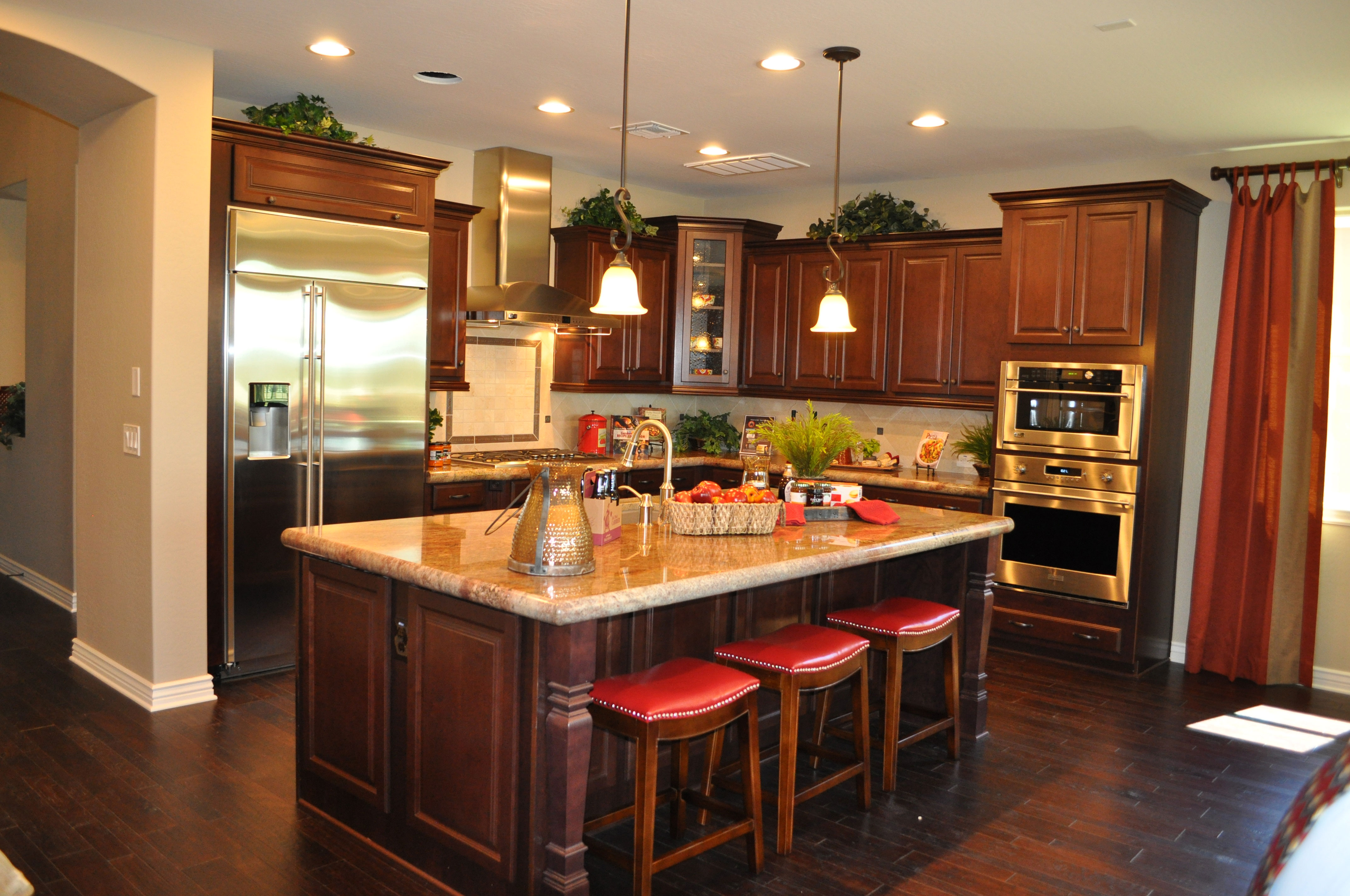
kitchen-whitewater-webWith this combination of dark cabinets and dark wood flooring, this luscious kitchen could easily feel like too much brown. But a wise choice of countertops and pops of red turn it into a cozy and inviting space. Let’s take a look at the smart decisions that make up this kitchen, from the Whitewater model in the Oasis at Queen Creek community.

Light walls and countertops: You don’t often see dark wood on dark wood in a kitchen. Of course today’s wood flooring finishes make wood workable for kitchens and even bathrooms, but it still seems like a design risk. Bringing in lighter tones with the countertops and soft beige walls provide the needed contrast. The backsplash also uses light tiles to showcase the dark wood cabinetry.

Stainless appliances: A little bling brightens up any room, and using appliances with a stainless finish breaks up the wood, while the reflective surfaces contribute to the overall glow.

Architectural details: The carved pillars at the outer corners of the island combined with crown molding and the door/drawer styles break up the wood look, adding shadows and highlights to the cabinets. In addition, the handscraped wood flooring provides its own three-dimensional element. Altogether these features add the interest needed to keep the space from feeling simply wood-on-wood in design.

Pops of color: The red leather seats set off the island, and this color is echoed in various accessories scattered through the kitchen. Red’s strong bright presence lights up the room.

Natural light: This kitchen can carry off the two dark woods thanks to the natural light that pours into the space. And in the evening, multiple lighting sources keep the kitchen light and bright.

Is this the kitchen for you? Why not visit our models in Oasis at Queen Creek and see for yourself!

Introducing Slate – GE’s New Appliance Finish

Rancho-Mirage-kitchen-webFor the last decade and more, stainless steel has been the preferred finish for kitchen appliances. Other choices have appeared, but none with the staying power of stainless.

At the same time there are disadvantages to stainless. It’s a magnet for fingerprints, which requires daily wiping if there are children in your home. The bright shiny surface looks good against dark wood cabinetry but isn’t quite as effective with painted or light cabinets.

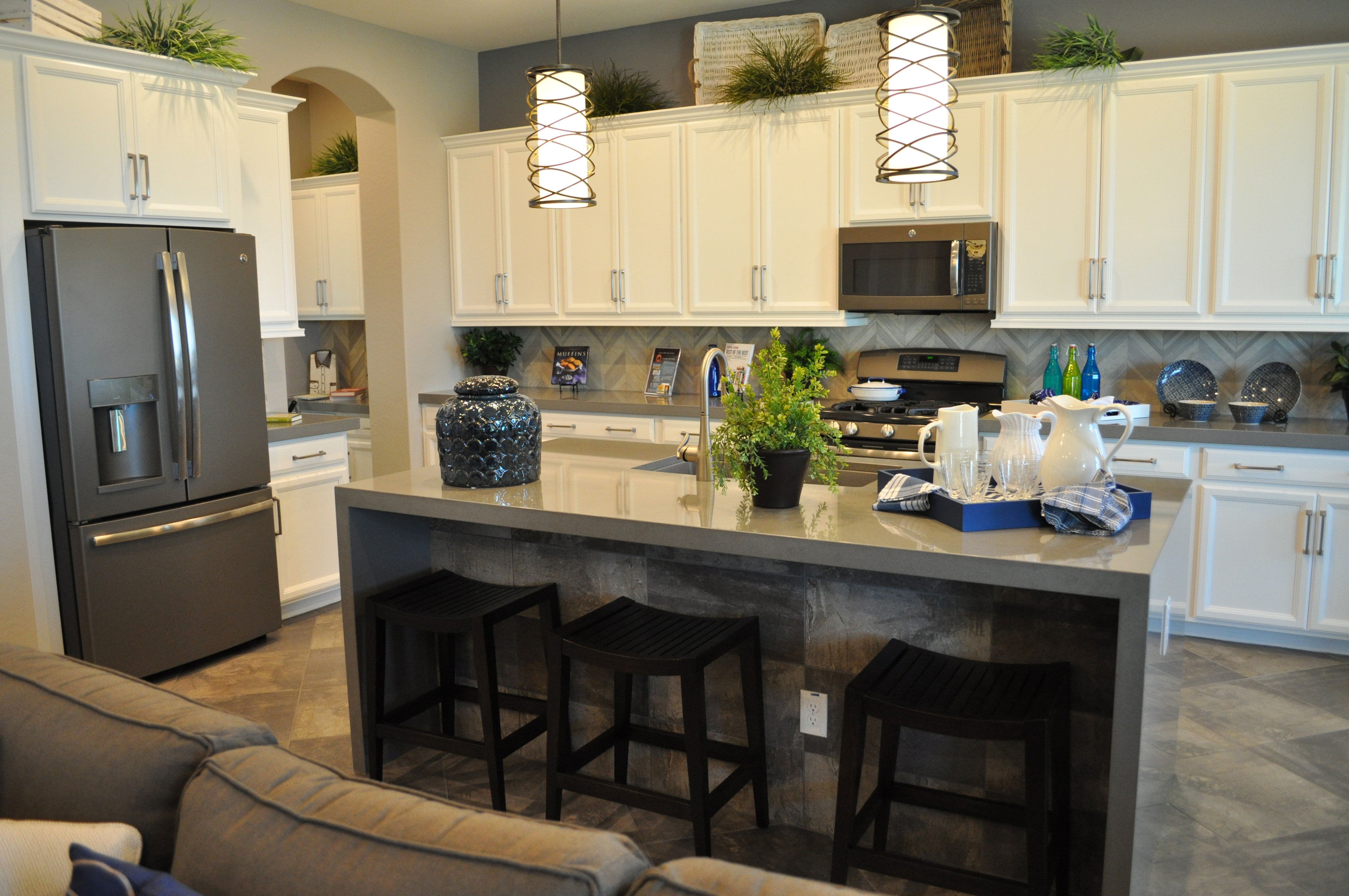
Now GE Appliances has introduced Slate. This darker look combines a charcoal tone with a matte finish that hides fingerprints and smudges. It also works exceptionally well with a kitchen that has grey colors. This cooler tone has grown in appeal lately.

Slate doesn’t demand the attention that stainless does. If you want your open-concept home to include a kitchen that incorporates itself into the rest of the space, Slate is more low-key.

Most important of all, so far this new appliance finish seems to have staying power. Introduced in 2012, the response has been so positive that GE continues to expand its Slate line. With its sophisticated look and feel – including just enough bling with glossy handles – Slate creates a feeling of cutting-edge style.

Thanks to its cool tones, Slate can also be used in a mix-and-match approach with stainless if you want. For a close-up look at GE’s new appliance finish in this kitchen, we invite you to check it out in our Oasis at Queen Creek community, where we showcase this and many other kitchen ideas designed with you in mind.

The Practical Beauty of Glass Tile

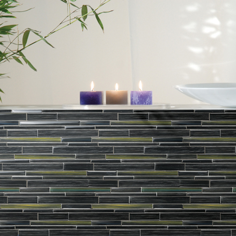
Watercolors-Ocean-Install-464x464Most of us would probably agree that glass tile is gorgeous to look at and adds a unique style to any space. But, aside from their aesthetic appeal, is glass tile a practical design choice?  After all, glass is delicate and breakable…isn’t it?

Characteristics of Glass Tile: Glass tile has many wonderful features that make it a great material for many projects, from both visual and practical standpoints.

  •  Shatter-Resistant: Unlike the type of glass used in vases and light bulbs, glass tiles are built to be shatter-resistant.
  • Durable: Strong and long lasting, glass tile is extremely practical.
  •  Water Resistant: As glass tiles don’t absorb water, they’re popular in areas with high humidity.
  • Easy-to-Clean: Since their surfaces aren’t highly porous, they’ll get back their shine with just a few wipes.
  • Heat Resistant: Heat resistant tile comes in a variety of styles, colors and materials, providing options that work with many different design schemes.

Glass Tile in the Home: Glass tiles can be incorporated in several areas of a home and are an affordable way to add a bit of glimmer to any area. Due to its heat and water resistance, glass tile is a perfect choice for fireplaces, kitchens and bathrooms.

Here are some different ways glass tile is commonly used:

  • When used in fireplace surrounds, the firelight makes the tile shimmer, creating an amazing ambience.
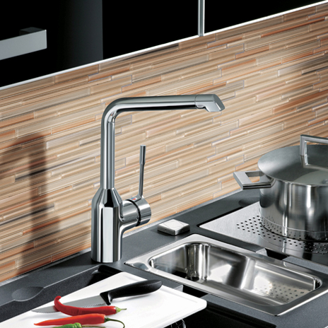
  • In kitchen backsplashes and countertops, glass creates a clean, contemporary look. Watercolors glass tiles provide a stunning look for a kitchen backsplash.Watercolors-Wheat-Field2-Install-464x464
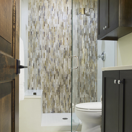
  • In bathroom countertops, tub surrounds, and shower walls. Shimmer glass is a particularly beautiful choice for bathroom designs as it is hand-poured, resulting in a variation of color among the individual mosaic tiles.

Shimmer-Abalone-Dallas-Patrick-shot2-2014-464x464As you can see, glass tile is extremely versatile! With the many different options available, and each type of glass having its own unique qualities, you can select the tile that truly reflects your style.

Kitchen Pantry Pleasure

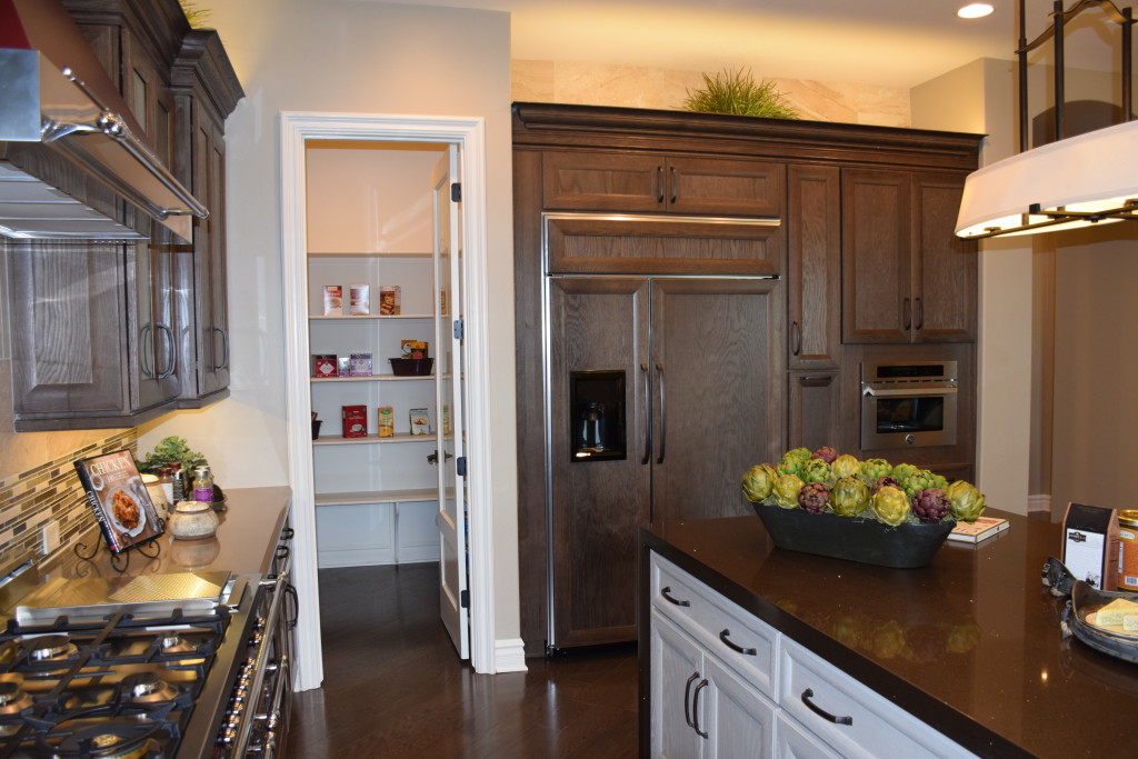
pantry 2 fultonOver the years, homeowners have enjoyed the pleasure and convenience of walk-in closets, and now many homeowners are discovering the benefits of a walk-in kitchen pantry.

Once a common feature in farmhouse kitchens where food storage was as important as preparation, pantries are now a luxury well worth the investment. Here are some of the advantages.

Large container storage: If you’re a fan of those warehouse stores, often you may need to set up a spot in the garage to hold the space-robbing containers of canned goods or paper products. With a pantry, you control shelf height, enabling you to fit even the most massive purchases right next to the kitchen.

Easy visibility: Instead of having to search through cabinets and drawers to find the cranberry sauce or soup, everything is easily visible when you walk in.

Perfect for storing serving pieces: The long shelves provide the space you need for larger trays or stock pots.

Off the kitchen but not in the kitchen: That much storage space would create a bank of bulky floor-to-ceiling cabinets in your kitchen extending out into the family room. Instead with a pantry an incredible amount of kitchen storage is just a doorway away.

Hidden storage: When guests come, simply close the door to hide the pantry and everything inside it. It’s also a perfect place to put half-empty bags and boxes of crackers or chips where they are out of sight but easy to grab when restocking appetizers or snacks at a party.

How will you use your walk-in pantry? Chances are once you have one, you’ll constantly find new ways to incorporate it into your regular kitchen routine, and you’ll wonder how you ever cooked or entertained without it!

Light or Dark: Designing your Dream Kitchen

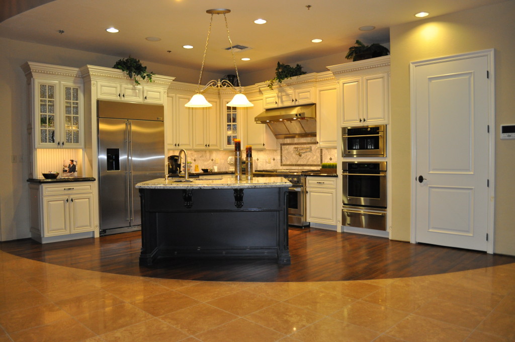
Kitchen 2 Design Center 052 (1)When you start designing your dream kitchen, the first choice you make is your cabinets. Do you want light wood or even painted cabinets, or darker stained wood? Each has advantages and disadvantages. \

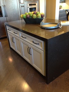
If your kitchen has limited natural light, the painted cabinets bring a natural brightness into the space. They also work well with stained wood floors. One choice that adds interest to this particular kitchen is using dark cabinets on the island. This allows it to serve as a focal point in the kitchen and adds a nice contrast to the ivory.

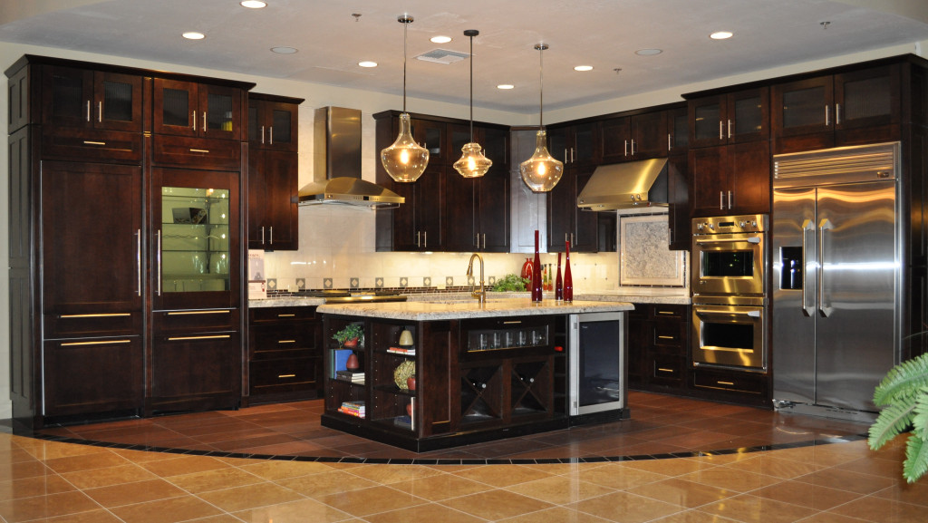
Kitchen 1Dark cabinets, on the other hand, provide richness to the kitchen and really play up the lighting. The light countertops provide a strong counterpoint to the dark wood, making it seem to glow. Darker cabinets are also less likely to show fingerprints from little smudgy fingers if you have children helping themselves to cabinet items.

Both kitchens contain stainless steel appliances, which gives you a good idea of how stainless works with the two types of cabinets.

Painted cabinets have a more old-fashioned feel, because they were popular in the old-style farmhouse kitchens of the past. Some of today’s choices, however, such as glazes and more non-traditional colors and styles, can shift those cabinets to work well in a contemporary home also.

Which do you prefer? You can see both these kitchen vignettes close-up during the Fulton Design Center browse night coming up on Thursday March 5th, 2015. We hope to see you there.


Kitchen Island Lighting Choices

Legacy Models 030You can take several approaches to lighting your kitchen island. The simplest and least noticeable is a collection of ceiling lights, distributed to provide even light for working. But with that choice you lose an opportunity to create a special style moment when people walk toward your kitchen.

Design Center pendant lightsPendant lights are one option that has grown in appeal over the years, with the opportunity to add a touch of style and color to your kitchen’s lighting. The photo to the right shows a number of pendants for your kitchen available through the Fulton Design Center.

The light in the photo above at Legacy takes a different approach from the more standard pendants to offer a shaded piece that provides even lighting on the surface of the island. This intriguing transitional piece suits this kitchen with the shade complementing the tile on the wall and island.

Models 086More unusual, these large long hanging glass pendants in the photo to the right, shown at Legacy, are lit inside by Edison bulbs which provide a unique yet classic touch. This island is large enough to support three of these pendant lights.

The clear glass allows you to connect immediately with the entire kitchen, yet the dramatic style brings these pendants to the forefront of your vision. This is quite a daring choice for island lighting.

What kind of lighting do you want over your kitchen island? We invite you to visit the model homes at Legacy and the Fulton Design Center to see a rich variety of choices in person.


Kitchen-Smart Ways to use Cabinet Drawers

Legacy Models 025In most of the kitchens of yesterday, you needed three drawers: one for silverware, one for other cooking utensils, and one “junk” drawer. Today’s kitchens often offer more sets of drawers than before. But what do you do with these extras? Here are a few suggestions.

Table linens: Placemats, tablecloths and even fabric napkins are making their way to lunch and dinner. A drawer allows you to lay these items flatter, leading to fewer wrinkles.

Serving dishes: Larger plates and platters take up a lot of room on a shelf. Consider storing them in drawers instead, enabling you to look down and select just the right bowl or other containers for a family dinner or party.

P241ots and pans: Deeper drawers are a great place to store frying pans and smaller pots. No need to stack much with a broad base for setting each item in its place.

Plastic containers: One tip, you can store the bases in one drawer and the lids in another, shallower drawer nearby. Everything stays more organized this way and you can take full advantage of your drawer space.

Office or homework supplies: The kitchen island provides a perfect place for completing homework or paperwork. Consider using one of the island drawers to hold your supplies, making it easy to grab a pen or paper clip as needed.

If you take the time to think outside the box when it comes to your kitchen drawers, in no time every one will be full and you’ll wonder how you ever managed in a kitchen without them all!


Using and Accessorizing your Kitchen Island

Models 081 (1)A large island such as this one from the Fulton Homes’ Legacy community provides the opportunity to accessorize and still have space for functional uses. Let’s look at two versions of this island to see several approaches.

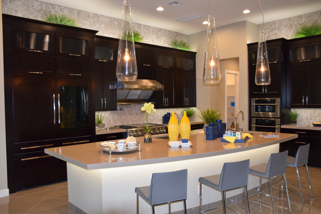
In this first photo, the yellow accessories combine with the green plants to add color to a neutral kitchen. The yellow pops against the dark kitchen cabinets and adds warmth to the view.

Notice that several collections of accessories are positioned on trays. Each tray contains several smaller objects which gives them more importance from a design perspective. More importantly, trays can be easily moved to allow the island to serve as a breakfast bar or buffet for a party or family gathering.

Legacy Models 118In the photo to the right, the accessories bring a darker tone into the light kitchen, linking the island with the backsplash and above-cabinet tiles and anchoring the island in the space. In this case the positioning of accessories provides plenty of room to use the front area as an eating or snacking area without having to move anything.

Both of these islands have a powerful presence in their respective kitchens. By breaking up the surface with carefully-chosen accessories, you can take full advantage of the space while using the area to add interest and charm. Notice that each island’s accessories vary in height and heft. This helps create balance.

You can also use this space to incorporate personal items that make the kitchen your own. If you have heirlooms from a family member or favorite kitchen accessories, islands such as these provide the perfect place to showcase them. And don’t forget these islands’ primary functional purpose – to add much appreciated counter space for food preparation!


Design Center Kitchen a Study in Texture

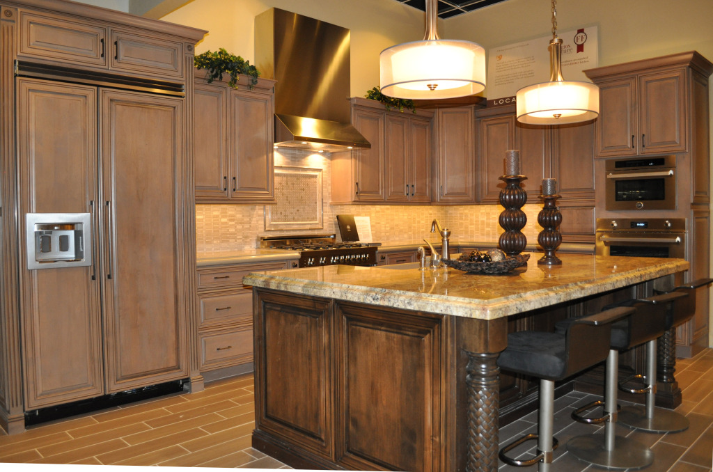
Bertazonni KitchenWhen designing and decorating a room, people often think in terms of color and contrast, but there’s another factor that can create interest – texture. This kitchen demonstrates how texture can make a space exciting. Let’s take a look at all the texture decisions that make this kitchen appealing.

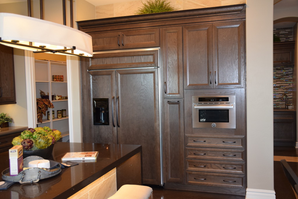
Stainless and wood: One of the most popular contrasts in today’s kitchens comes from two common texture choices – shiny stainless appliances and soft wood cabinetry. In this vignette having the refrigerator provided with cabinet doors – as the largest appliance – creates a softer textural mood than you would have with a stainless refrigerator.

Cabinet finishes: The primary cabinets have a soft gentle glaze, giving them variety while allowing them to serve as a color base for the kitchen. On the other hand, the island cabinets show a more rustic texture that helps this element to stand out from the rest of the space.

Countertops: The countertops against the wall have a soft look with rounded edges and minimal contrast. On the island, strongly variegated granite adds an extra design element to this kitchen. Picture the island with the same soft counters as the rest of the kitchen – without that additional feature, the island would not have the impact it shows now.

Island columns: By choosing the braided texture on the island columns, you add the feel of rich old-world finishing. Once again, this choice brings the island to the forefront of this kitchen vignette.

The designer’s decision to use texture rather than tone to create interest in this kitchen helps to create a space that is cohesive, lower contrast, yet still interesting. That’s the power of texture.


Balancing Cabinetry and Appliances in your Kitchen

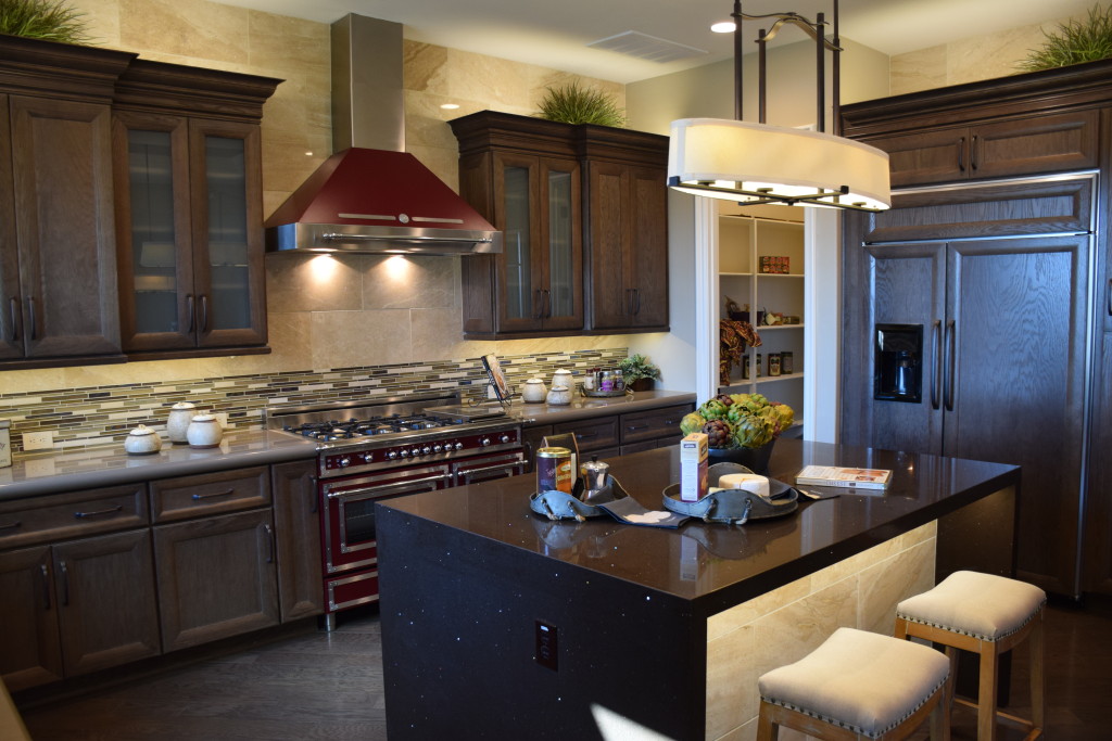
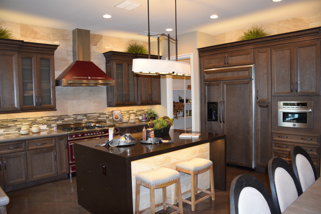
Models 061This kitchen, from the Fulton model at Legacy, shows two ways of approaching appliances in your kitchen: showcasing them like this Bertazzoni range and hood, or reducing their impact by blending them in with the cabinetry. You can see this with the built-in refrigerator to the right.

In this example, both design choices work. The drama and color of the oven creates a focal point in the kitchen. The generous size of the space allows this dramatic piece to shine without overwhelming the room. On the other hand, if the refrigerator had a stainless skin, it would be a distracting influence. Its size would draw the eye away from the strengths of this kitchen – the range and the island.

Transitional design allows you to take advantage of many choices combined into one integrated whole. In this case the moderately-traditional cabinets take a back seat to a strongly-contemporary island and a retro-style range. Smartly, the dark red of the range is allowed to stand alone rather than having the color echo throughout the kitchen. If you wanted to carry the color further, a few accessories would provide all the impact you need.

Notice the stainless microwave to the right. That could have been installed in black, but there are enough stainless accents throughout the kitchen to make this work. The small size ensures that this appliance does not become a distraction. However, cabinet pulls are dark rather than stainless. Design is always about balancing strong features with others that fall into the background.

For a better look at this kitchen as well as two others with interesting style and design elements, visit Fulton Homes Legacy in Gilbert and wander through our three new model homes.