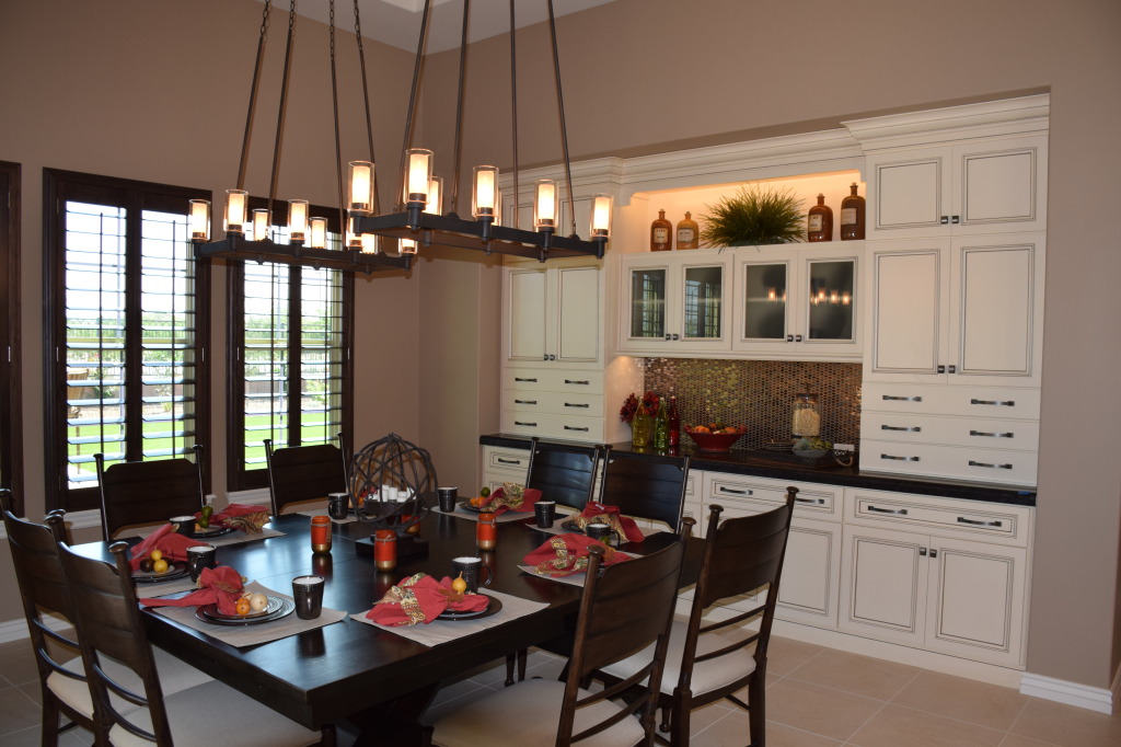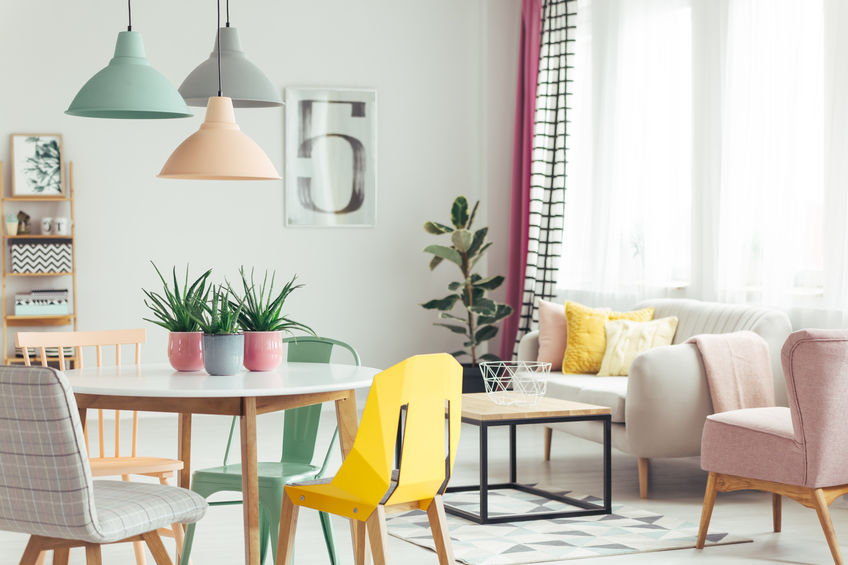
How to Create Tabletop Vignettes

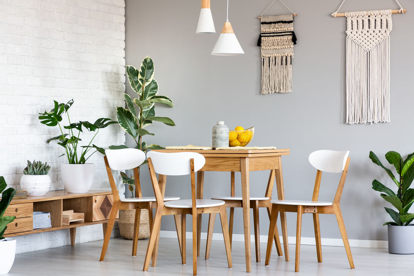
While nice furniture and quality flooring can add style to your home, it is also the smaller details that matter. Perhaps one of the most effortless ways to add sophistication to your home’s decor is by stylishly arranging vignettes on the tabletops and shelves. Creating such grouping is a form of art that, when done correctly, can be eye-catching.

You can use all kinds of accessories to form eye-catching vignettes. Plus, vignettes can be reinvented as the season changes or when you find a new piece or simply at your whim. To help you master vignettes, here are some tips for putting together great arrangements?:

Select an Anchor Piece

Start off by selecting an anchor piece. Your anchor piece is what makes a bold statement. Since this will serves as the center of interest, you must select an item that has value to you. Choose an item that has some visual width and height. Mix up the texture of the items as well. That means hard and soft, shiny textured items can all be displayed together.

Give Consideration to Visual Structure

Visual structure is everything; therefore, arrange items into a form. This type of structure will prevent things from looking thrown together. The shorter objects should be positioned at the outer edges. Linear arrangements only work if there is a relationship between the selected pieces. There should also be a hint of contrast.

Use Odd Groupings

To make a dramatic impact, try arranging similar objects in odd number groupings. For instance, objects arranged in groups of three and fives are more visually appealing.

Do Not Forget the Background

The background plays a vital role in the display. Busy wallpaper can cause the arrangement to look chaotic. It is vital that the background complements and unify the vignette. White walls are a neutral background. If you want to dress things up a bit, mirrored backgrounds can increase visual interest by magnifying light and color.

Build Around a Lighting Source

Your vignette will likely go unnoticed if you build it in a dark corner. Therefore, it is best to select a location that is well-lit so that your guests will be able to get the full effect of your arrangement.

We hope you found these tips and tricks helpful! Be sure to subscribe for more expert advice.

Ideal Measurements for the Perfect Dining Room Layout

Are you in the midst of decorating your dining room? The key to creating the perfect dining area that is both highly functional and well designed is having the appropriate measurements for the space. In fact, taking the ideal measurements for the dining room ensures that you do not form a layout that is uncomfortable and awkward to navigate. Keep in mind that you will be having meals with your family and entertaining in this area, thus understanding the dimensions of the room will help you create an enjoyable dining experience.

Understanding Dimensions

Planning for the perfect dining area requires that you are aware of the dimensions of the dining area. You will need to select furnishings that allow for clearances to maneuver, and you should also focus on purchasing pieces that are proportionate to the size of the dining room. Here are some standard measurements for the average dining table:

  • Rectangular Dining Table: Of course, the contour and size of the dining area should determine what type of table that you select. Rectangular-shaped dining tables will fill up narrow dining areas. If you desire a rectangular dining table, then you should consider one that goes with the dimensions of the room. Start off by measuring the length and width of the table. A standard size rectangular dining table measures about “36-40” inches wide. Depending on how many people you want to seat, it measures as much as 60” inches long to seat up to six people.
  • Round Dining Table: Round dining tables are a space-saving option because they often lack square corners. Round dining tables are ideal for smaller-scaled spaces. An average round table is approximately 48 inches in diameter. If you are considering adding a round table to your dining room, you will want to select something that can accommodate your desired amount of diners.

Walking Room

Whatever type of table you select, to furnish your table, be sure to leave at least 36 inches between the table area and the walls. This will give you enough space to move throughout the room.

Place Setting

What about the diners? When eating at the table, it is essential to make sure that there is enough space between each place setting. Each place settings should be at least 24 inches apart. This gives the diner elbow room and at least 20 inches of legroom underneath the table.

We hope you found this article helpful and for further assistance, be sure to check out our other blog posts here.

An Inviting Dining Table

wWarner-Groves-at-Morrison-Ranch-065 - CopyWhen you’re planning the look of your dining area, there are a lot of elements that make the space inviting. Here are a few tips to make your dining area catch people’s attention.
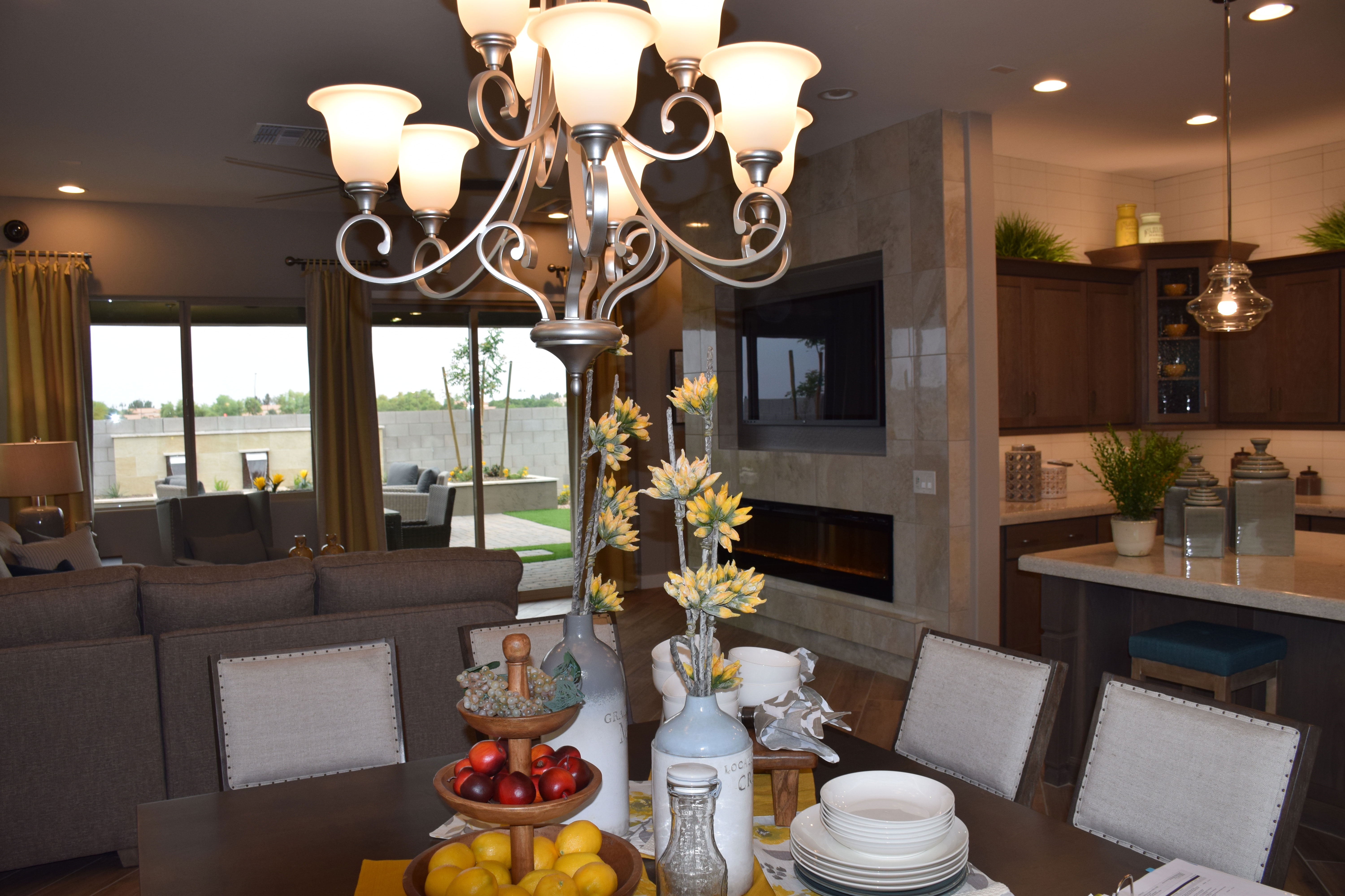
The perfect chandelier: More even than the table itself, the right chandelier makes a dining space stand out. You want something that reflects the style of the space. You also want to make sure that it is the right size for your dining area and your table. It should also hang at the right height – not so low that it shines in your diners’ eyes, but not as high as most ceiling-mounted fixtures. Generally a chandelier should hang 32-40 inches above the table. It should be just large enough to light the table’s surface without lighting the diners.

The right dining chairs: If you want your guests to linger after dinner for an enjoyable conversation over dessert and coffee, pay careful attention to your dining chairs. Make sure they will be comfortable for at least an hour or two. Look for nice padding on the seat and maybe the back, and make sure the backs lean so that people aren’t forced too upright. Be sure to sit in any potential dining chairs for more than a few minutes before you make your choice.

Accessories that add interest: When you are not actually dining, look for a table centerpiece that helps link the table to the chandelier. These tall flowers do the trick in this photo. But when you have guests for dinner, put this arrangement on your island and keep any centerpieces low enough to converse across the table.

Colorful table linens and white plates: This rule is not written in stone, but many chefs swear that food looks better on white plates. Color in your table linens adds interest and personality to your table.

Daring Lighting Makes a Room

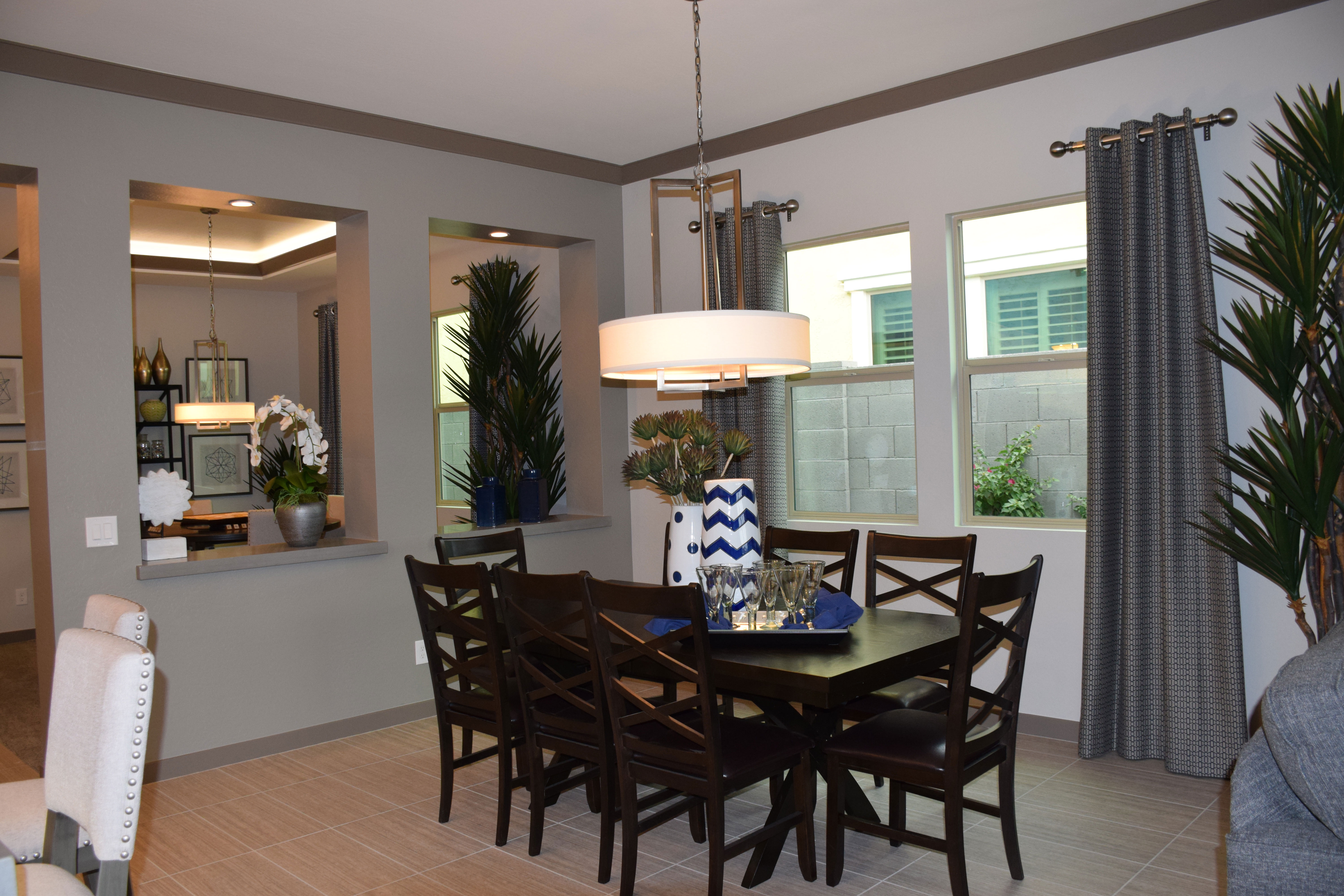
wWarner-Groves-at-Morrison-Ranch-009The dining area often provides the best opportunity to showcase daring lighting. If you are tired of the classic chandelier look, today’s light fixtures offer you plenty of interesting and contemporary alternatives. This light is a good example.
In the past few years, shades have grown in popularity. They help keep light evenly distributed and provide the opportunity to add a fabric element among all the metal. But this shade is far from standard.

First, the proportions are unusual. Only about six inches tall, the wide circle feels almost sculptural. This is helped by the dramatic rectangular design elements in the light itself. There’s an echo of some mid-century modern fixtures but with a styling that stays true to today.

Notice the second lamp just like the first one in the game room. Having two of the exact same lamps with almost a mirror look adds to the daring feel of this lighting choice. This particular light has a dramatic impact when viewed from a distance.

Lighting is a good way to bring style into a room. When you choose just the right light for each space, your choice can add a strong element of design. In this case the light is clearly the focal point for this dining area.

Fulton Home models provide a great venue for viewing some of the best of today’s lighting choices. Visit our new models at Warner Groves in Morrison Ranch to see this and other interesting and unusual lighting options.

Create a Sophisticated Dining Room

From the Atherton Model at Penninsula in the Oasis at Queen Creek community

From the Atherton Model at Penninsula in the Oasis at Queen Creek community

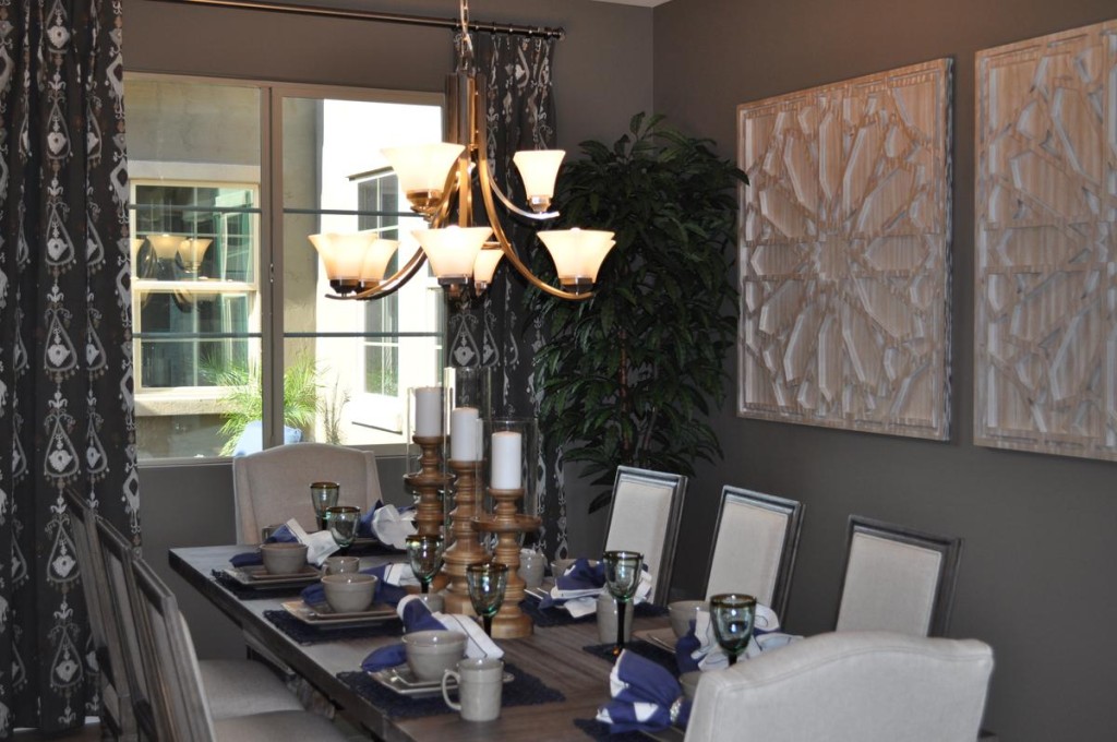
Grey has become a popular tone in decorating, and it is the strongest color influence in this dining room.  Yet this space feels warm and inviting. It’s the warm tones that balance the grey and make this dining room a place to linger. Let’s take a look at the elements that make this room so special.

Generous sizes: Start with a large table made with a thick top in a wood finish that combines grey with warmer hues. Add high-backed chairs with cushions and padded backs in a taupe/cream that uses both cool and warm tones. Finish with oversized art and substantial candlesticks on the table. All of these pieces give the room a weight and drama that combine to make the décor work.

Dark and light tones: Although most of this room uses neutrals, there is a nice distribution of light and dark tones to provide contrast and add interest. The curtains are the darkest permanent element in the room, but their pattern echoes the lightest tone. That light feeling is picked up in the chair upholstery and the candles. It’s too easy for a room filled with neutrals to end up boring, but these contrasts keep that from happening here.

A single pop of color: The blue napkins add a simple pop of color, drawing the eye to the table and adding just the right spark to the tablescape. Because the rest of the room is done in neutrals, you could easily switch out that blue for any bold color. How about yellow, red or coral? Or you could choose to go with black for extra drama. No matter your choice, this sophisticated dining room is ready for any dinner party.

Think Outside the Box with Lighting

DSC_0020 (1)With the generous amount of wall space and raised ceilings available at the Fulton Homes Legacy community, it pays to think outside the box with your lighting plans. This photo shows several ways lighting adds appeal to a generously-sized space.

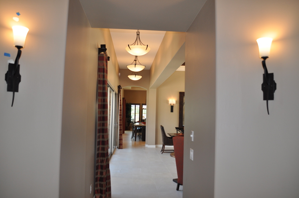
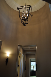
DSC_0019This shot, taken from the entryway of the Basha model at Legacy, shows a number of lighting choices. The sconces in the foreground are part of the foyer lighting plan, combined with the dramatic ceiling light shown in the photo to the right. By sticking with the same bronze finish and curved elements, the sconces echo the feel of this large-scale ceiling fixture to create a lighting plan that takes full advantage of the turret-style space.

It would have been easy to use spots on the ceiling of the hall extending from the foyer, but instead three dramatic bowl lights carry the foyer’s focus into the home. In a smaller space these fixtures might grace a dining room, but here the scale is large enough to use them as hall lights.

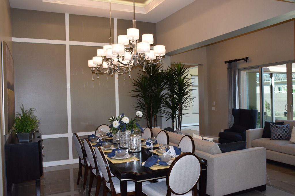
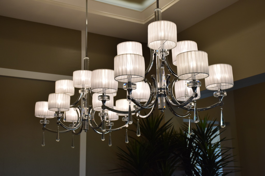
Legacy Models 115So what type of scale is needed to do justice to the generous dining area provided in this home? Take a look. This photo on the left showcases the powerful impact of a chandelier that fills the space perfectly. The size is impressive, but the graceful lines and use of negative space keeps this light from dominating. Two sconces provide additional light and interest.

Combined, the lighting of this home is designed to pull you into the home from the time you first enter it. Lighting is a powerful tool when decorating your home, as this model demonstrates. Use your lighting choices to welcome people into your home.


Lovely Lighting

Legacy Models 044With the steady increase in higher ceilings and open floor plans, lighting designers have finally started to think bigger with residential chandeliers, with dramatic results.

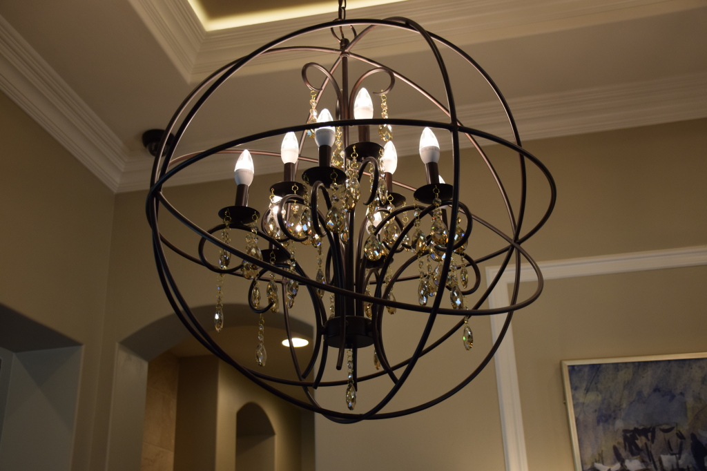
Take a look at this breathtaking example from the Fulton model home at Legacy. The chandelier inside has some traditional elements such as the candle-shaped lights and display of crystals. But add the surrounding bronze hoops and you suddenly have a daring transitional light that captures the eye and sets the tone for the entire room.

It takes a certain amount of design daring to flash this type of lighting fixture in your home. You can’t take it easy with the rest of the décor. Your other choices will have to live up to this. And you could never get away with it without the space to set it off properly. A high ceiling, plenty of space to showcase its drama, and other architectural details to complement it provide the proper setting.

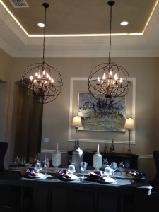
259 (1)Take a look at its position in the room to the right. It takes two of these chandeliers to make this space work. Adding a second one just contributes to the impact. And the ceiling provides just the right frame for this exciting choice.

The normally-recommended height for hanging a chandelier wouldn’t work here. Too low and these pieces would take over the table, compromising the entire feel of the room. Instead they are positioned half-way from ceiling to table, allowing guests to take in the entire picture when walking into the room.

Is this chandelier the light of your dreams? Visit our models at Legacy and see for yourself. Enjoy this and other lights that are designed to capture your interest and imagination.


Setting up a Holiday Tablescape

Legacy Models 068How would you decorate this dining space for the holidays? Here are a few suggestions.

Choose one or two colors, a neutral, and one metallic hue: In this room, silver seems like a natural choice thanks to the chandeliers and grey tones. Silver can link everything together. For the same reason, white or ivory would complement the space. From there you could do the traditional red and green colors, or jump into something more daring like purple or even hot pink and lime green. This room can handle the brighter colors, so take advantage of that to add drama to your tablescape.

Don’t stop at the table: In this room, the trees by the wall would benefit from some mini-lights and small ornaments. Think about adding some special touches to the chandeliers. (For more ideas on that, see our last blog.) The buffet could be a source for additional decorations that complement whatever you choose to do to the table. You could even change out the throw pillows on the two sofas for some that suit your holiday look. Once again the grey palette opens up a world of possibilities.

Keep your centerpiece low or set between chairs: You want to make sure everyone at the table can see everyone else, so plan a centerpiece that allows that. This long rectangular table gives you the opportunity to create a landscape of flowers, greens, ornaments, candles and other accessories. By using the buffet to hold serving dishes you have more room for decorations on the table itself.

Consider the chairs: These contemporary chairs with neutral grey upholstery provide the perfect space for a final holiday touch. It’s easy to tie some wide ribbon around the chair backs with a nice bow at the back of each one. Costco offers great prices on wire-edged holiday ribbon in two and three-inch widths. Choose one that works well for your holiday plan, and you will have plenty to use throughout your home.

Your final touch? Add the food – tables always look better with something to eat nearby!


Decorating lighting fixtures for the Holidays

Legacy Models 069With lush lighting fixtures such as these two from the O’Connor model at Legacy, it’s tempting to make them part of the season by adding a holiday touch. Here are a few suggestions to make these lights reflect the holidays.

Holiday greens: Look for a garland that matches the style of your holiday decorations. You could choose real greens such as the red cedar garland available at Trader Joe’s this time of year, or just pick up some of their two-color holly. Use fishing line or ribbons to attach it under the lights of the chandeliers above.  For the photo below, drape the greens along the cross-beams above the lights.

Legacy Models 073Ribbons: You could tie some lovely red, green, gold or blue ribbons around the shades on the chandelier above to create an understated but festive touch. To contribute a bit more drama, tie a few to the loops under the lights and let them hang down to the table, maybe even puddling on the table itself or stopping just above your centerpiece to connect your lighting to your holiday tablescape. Ribbon loops could run across the crosspieces of the more contemporary light fixture below also.

LED lights. Add lights to your lighting with some of the new battery-powered LED lights in white, colors or even multicolored options. Hide the battery pack within some greenery and let the mini-lights swirl and drape around the structure of each chandelier.

Ornaments: One simple but effective approach would be to choose some favorite ornaments and hang them from the supports of each chandelier. Once again this addition is understated but would pull your lighting into the season. Why not bring the holiday to your home’s lighting, allowing it to shine with the rest of your home.

Lighting that Shows Style as well as Function

Legacy Models 131 (1)One of the special treats awaiting you at Fulton Home’s Legacy community is a wealth of great lighting options. Take the opportunity to get a glimpse of the newest lighting styles as well as smart lighting decisions room-by-room.

This space, the breakfast nook in the Basha model, demonstrates how lighting can transform a space. The dramatic double light fixture over the table catches the eye immediately. Combining the strong lines to the ceiling with the contemporary-meets-traditional line of the glass framing the lights, and you have fixtures that set the tone for the entire room.

These fixtures mirror the contrast between dark and light painted wood in this space. Clean lines and this contrast make the space comfortable yet still on point for design. The smart choice to use two chandeliers provides even lighting across the table while adding balance for the generous breakfast arrangement.

The other lighting in the room – under the molding and cupboards on the built-in cabinetry – allows you to highlight certain accessories while adding another design feature. The additional lighting is particularly effective in highlighting the tile lining the back of the counter.

This space is ideal for holding a brunch buffet, and the lights combined with the backsplash add a splash of style to the space. Dark and metallic serving dishes would make the arrangement feel integrated and inviting as guests helped themselves.

Every model at Legacy showcases the smartest and most intriguing lighting decisions. We look forward to sharing these special design features with you when you visit.