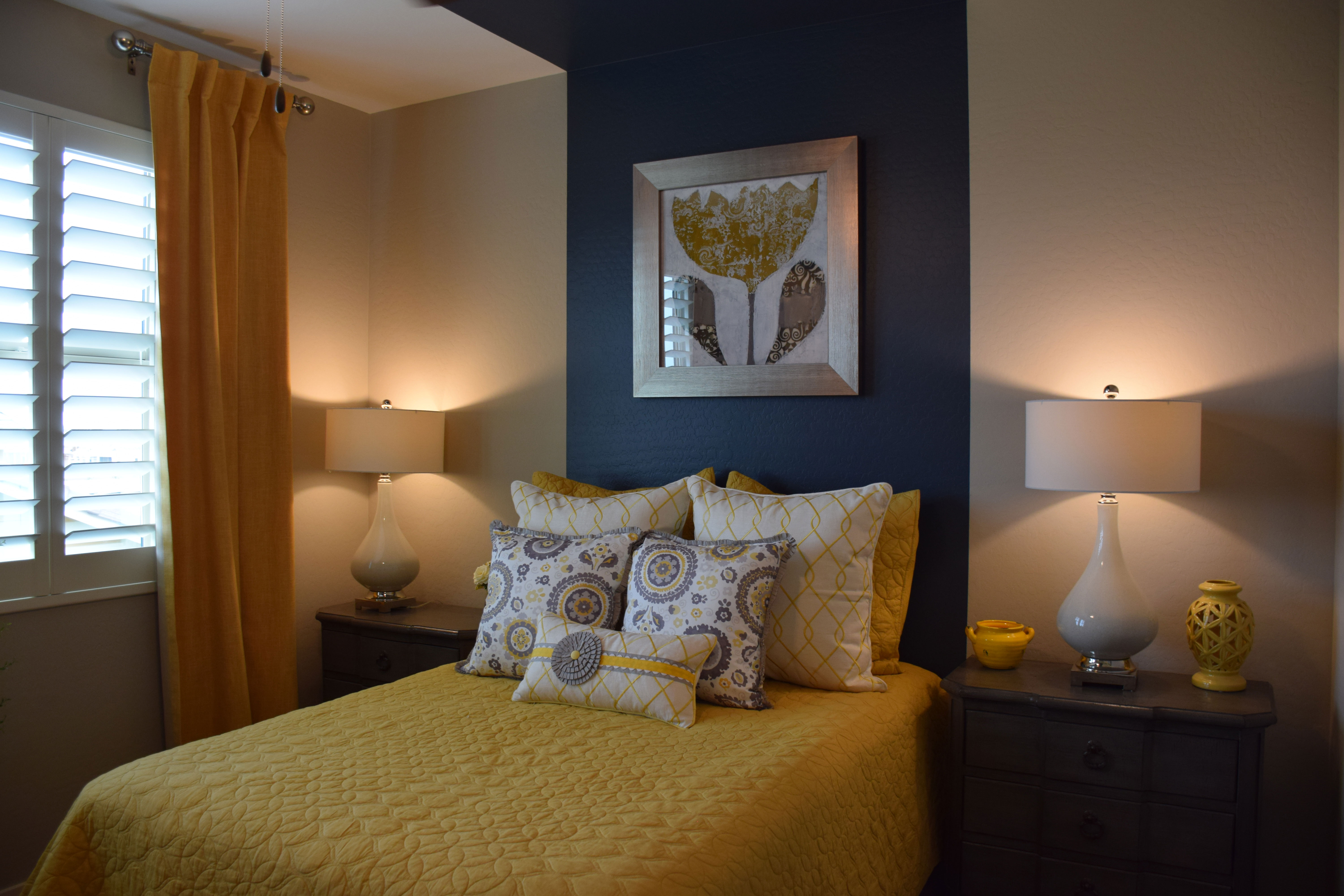
 You don’t need to spend a lot of money on furniture to create a guest room with personality. Take a look at this bedroom from the Sycamore model at Warner Groves at Morrison Ranch. The room has no headboard and simple matching nightstands with lamps. Yet it has a charm all its own. Let’s take a look at why.
Smart use of paint: The dramatic wide blue stripe is a powerful substitute for a headboard for this bed. By pulling it up and onto the ceiling, the mind translates it into a canopy, making the bed feel very finished, even without a headboard.
Smart art: The distinctive piece of art hanging over the bed pulls everything together – yellow brings the bed coverings up to the wall and the silver frame reflects the grey on the pillows.
Smart bedclothes: Yellow and grey combine for a sophisticated bed. There is just enough white to let the colors pop. Pillows really make a difference with a bed, and they are a low-cost way to create just the right mix of color and pattern.
Smart curtains: Notice that the curtain is a darker yellow in a heavier fabric. This helps to anchor the window and keeps the room from feeling too matchy-matchy. It also provides an inviting contrast to the bright window.
Smart accessories: Lamps reflect the white from the bed pillows but there is just enough yellow pulled in with the accessories to keep that color front-and-center.
When you’re planning a guest room, don’t think that you have to spend a lot of money to make it special and inviting. It just takes imagination and a willingness to draw on color to create a room worth coming home to.
 When you want to create a warm living space, consider choosing gold as the primary color. The hue fills a space with warmth. It also lends a sense of light.
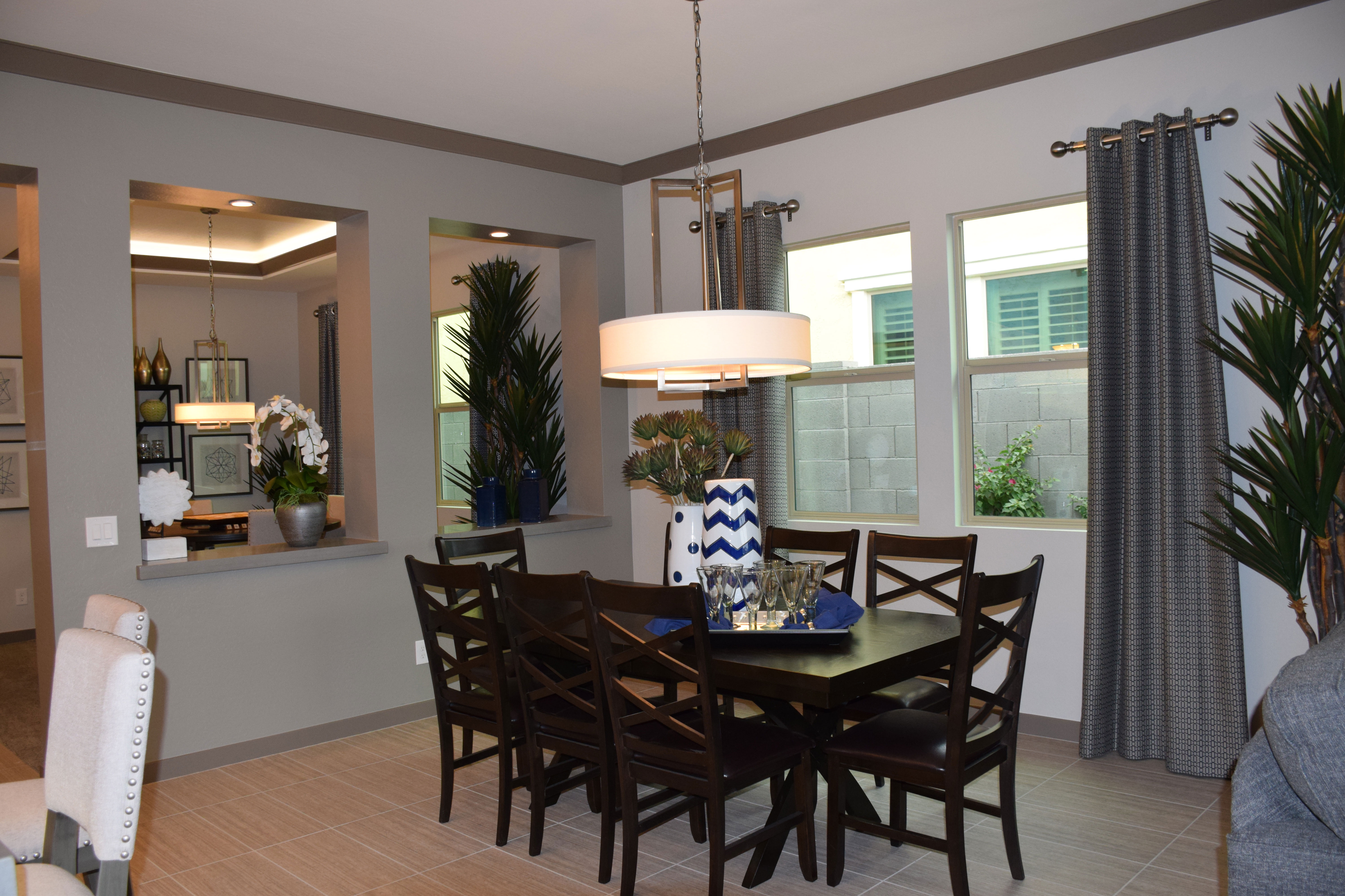 The dining area often provides the best opportunity to showcase daring lighting. If you are tired of the classic chandelier look, today’s light fixtures offer you plenty of interesting and contemporary alternatives. This light is a good example.
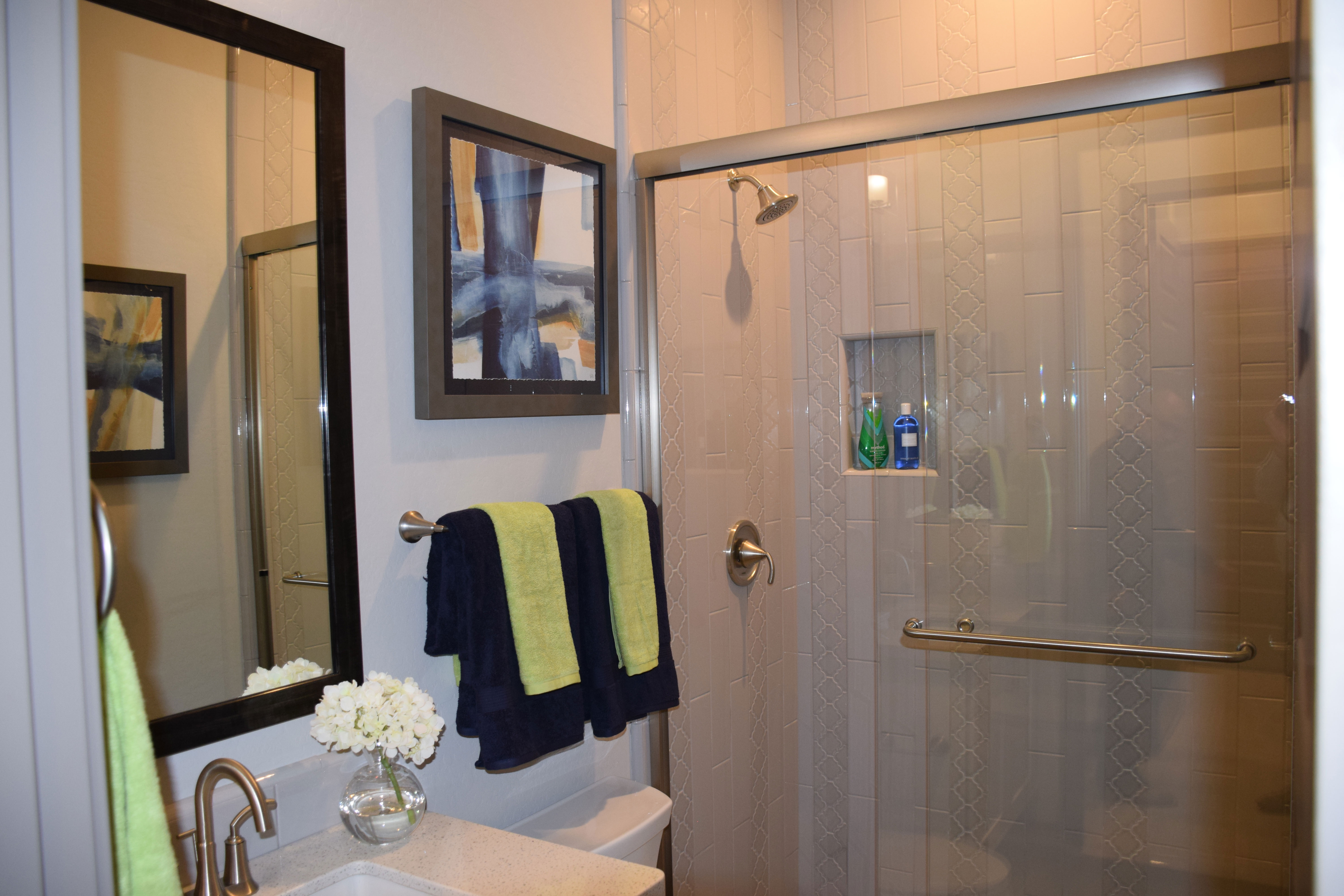 By their very design, bathrooms tend to be colder in style. With all the glass, tile and porcelain, you have a lot of hard surfaces to contend with. But it doesn’t take much effort to warm up the feeling of a bathroom. Here are some tips to make a difference:
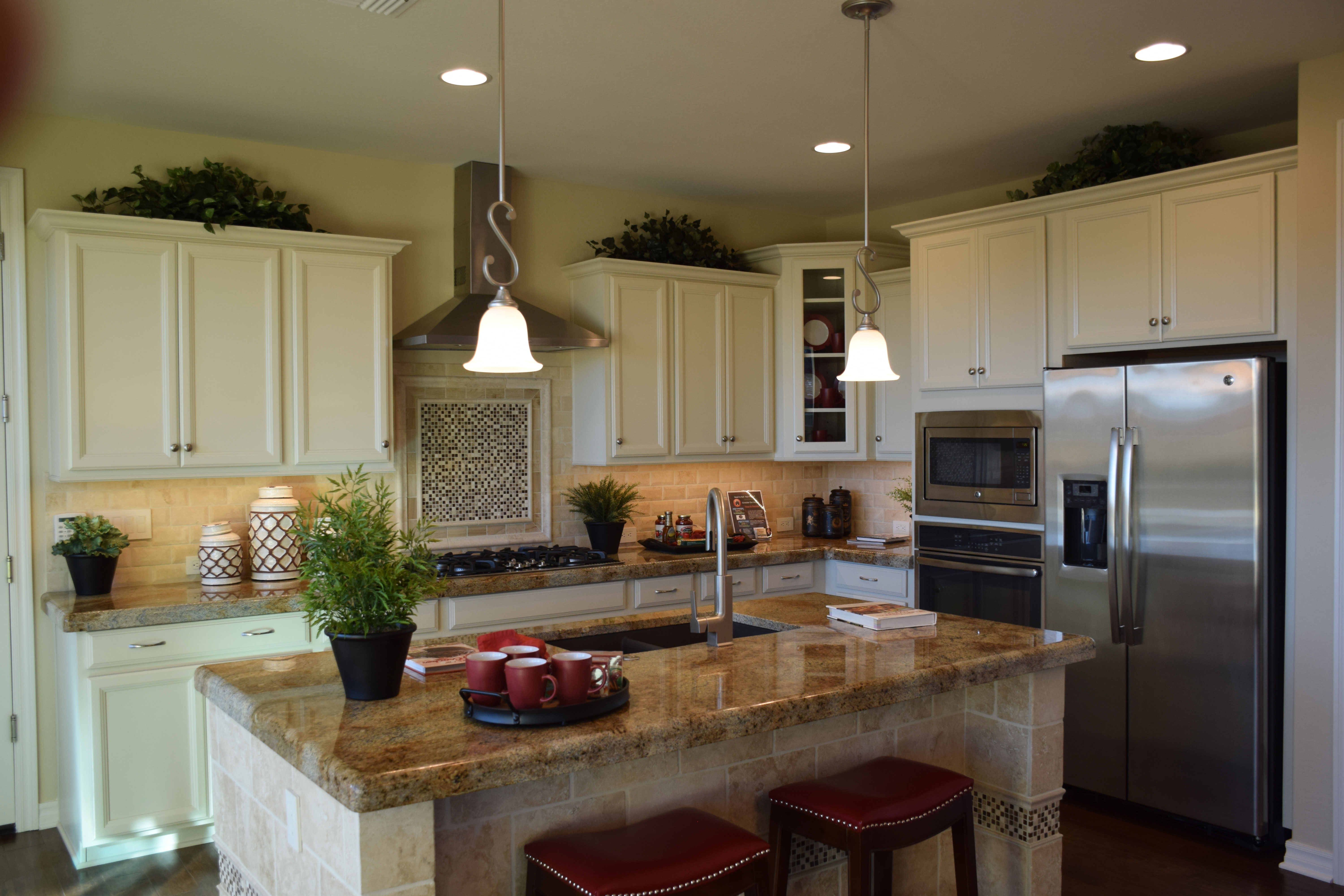
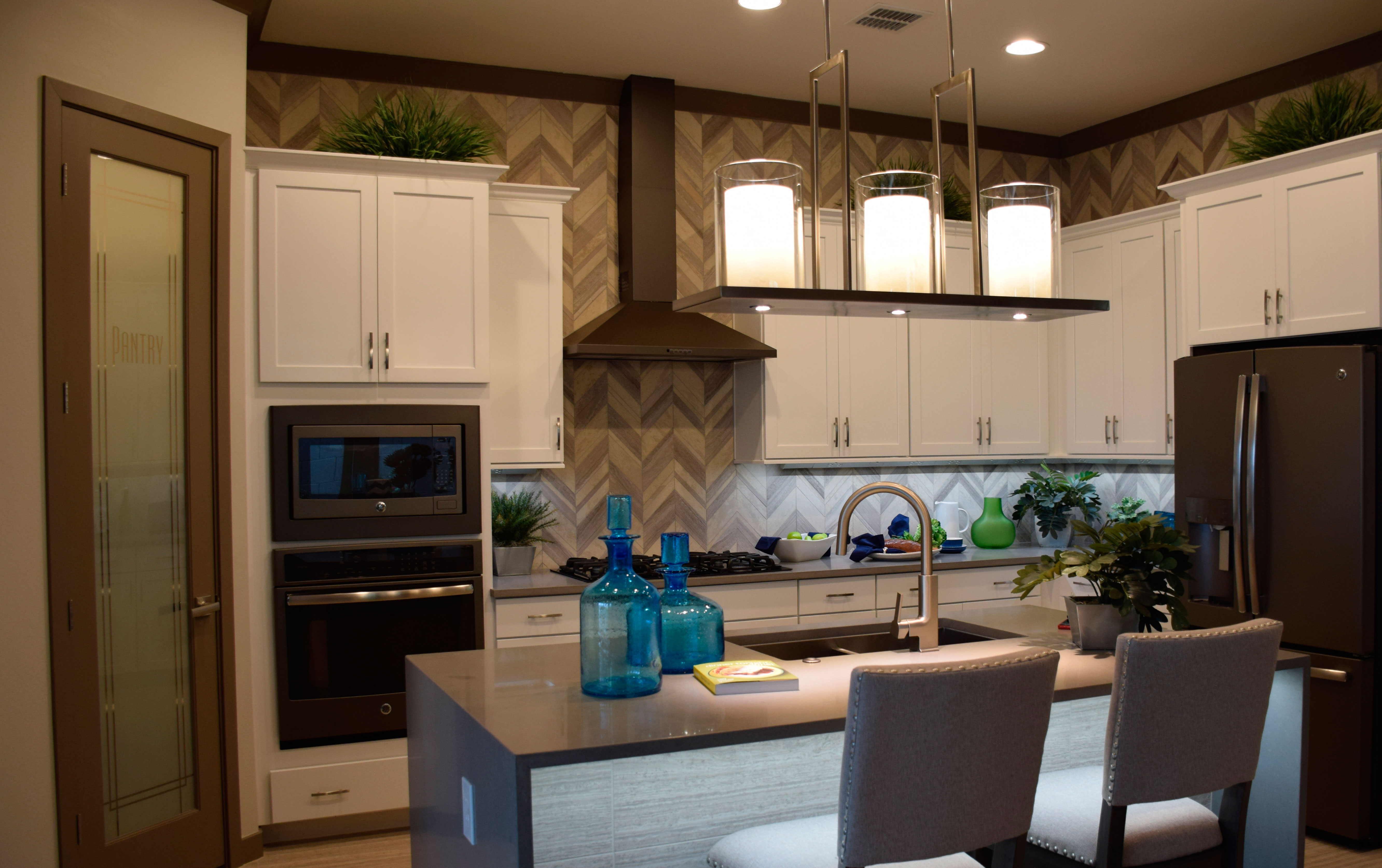 Stainless steel has been the go-to finish for kitchen appliances for over a decade. There is something fresh and crisp about the stainless look, so it’s popularity is no surprise. But it may be time to consider another option: slate. This kitchen, from the Evergreen Elm Model in Warner Grove at Morrison Ranch, shows a full line of slate-finish appliances.
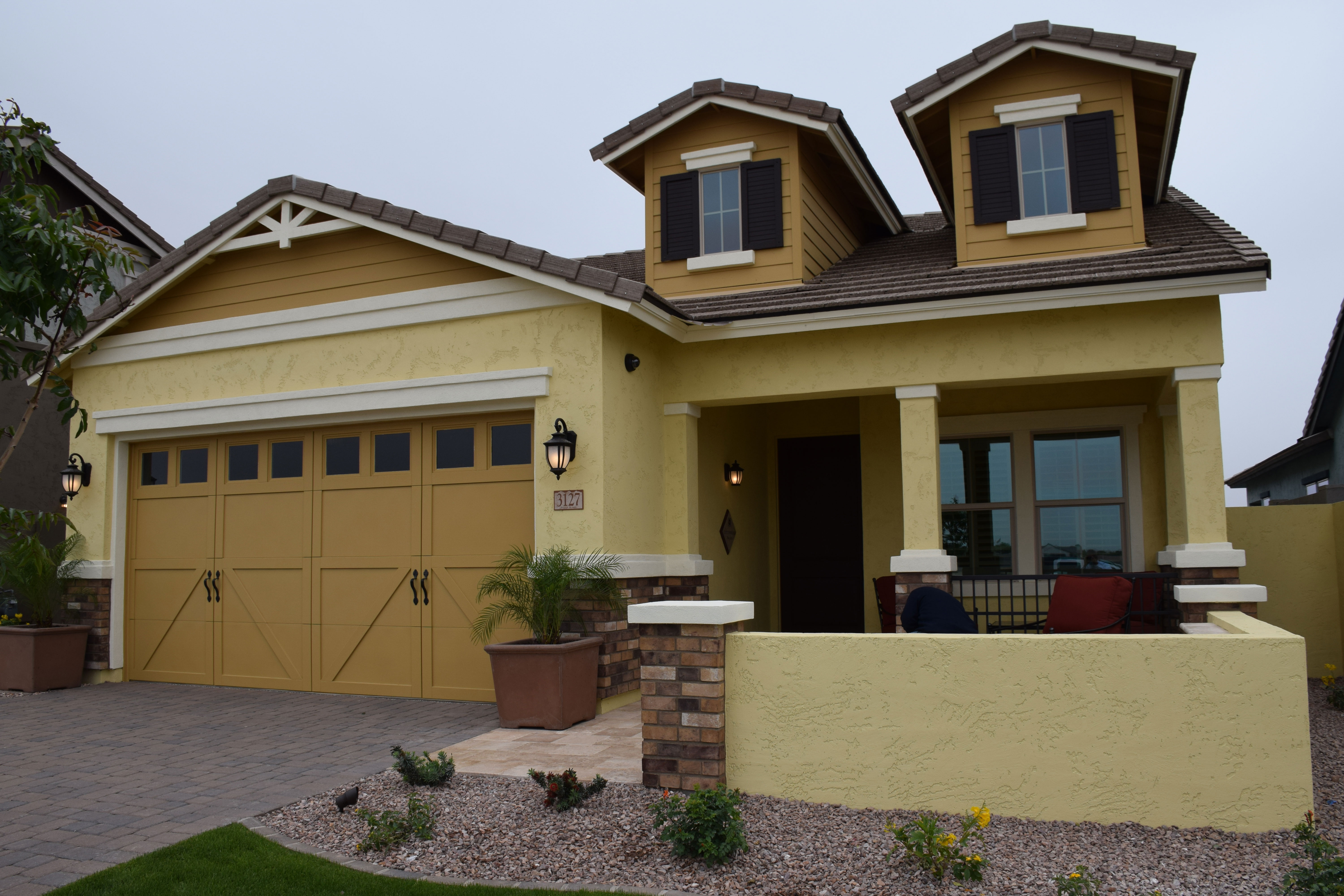 If you’re looking for a home with a farmhouse feel, consider this model at Warner Groves in Morrison Ranch. The Cottonwood showcases all the elements that help this new home echo the style and appeal of a timeless place in the country. Let’s take a look at the design decisions that give this model its farmhouse appeal.
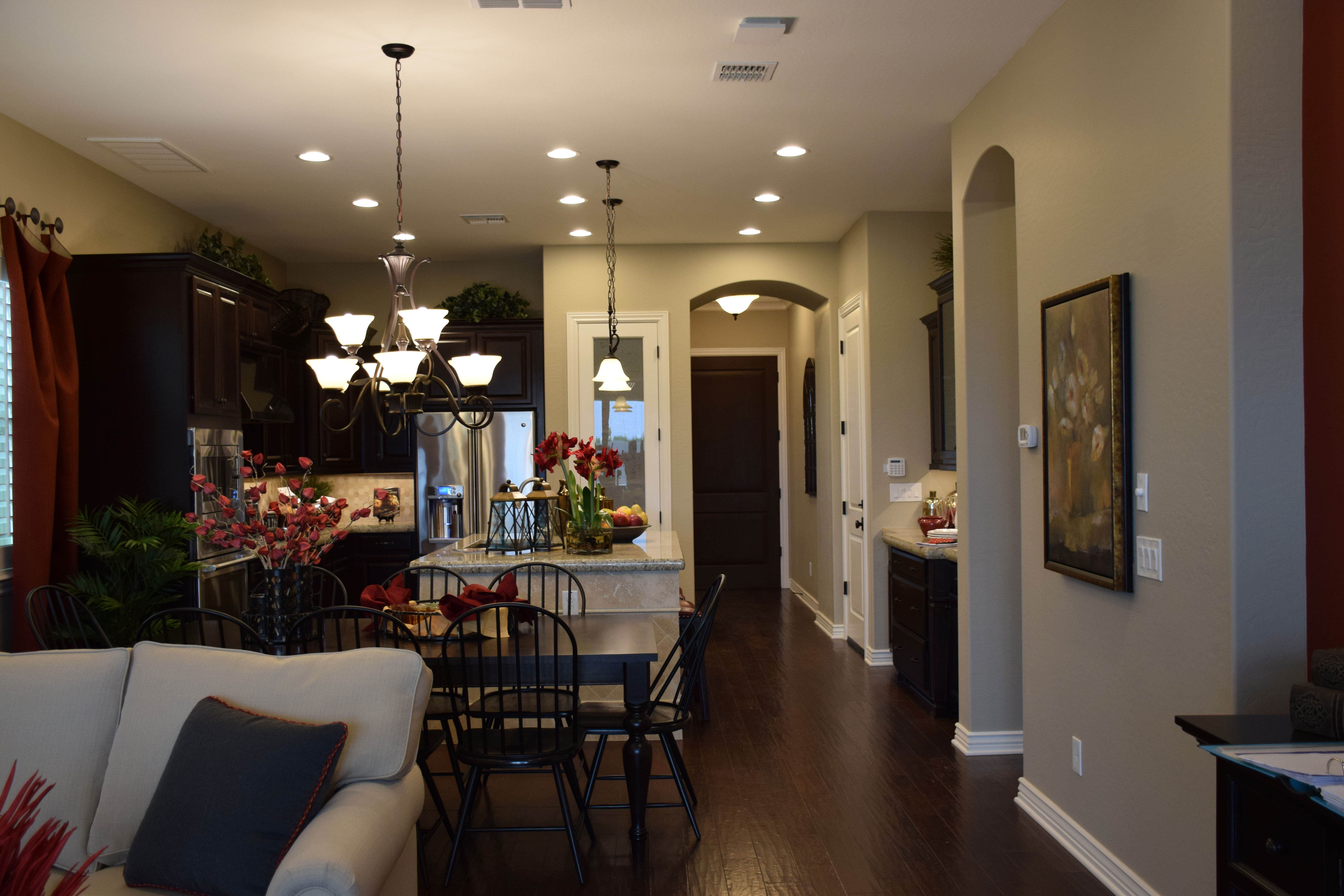 Have you ever stopped and just taken a look toward your front door from the back of your house? Most of us walk in the garage and then keep going, focusing on what we’re trying to accomplish rather than taking the time to really look around our homes.
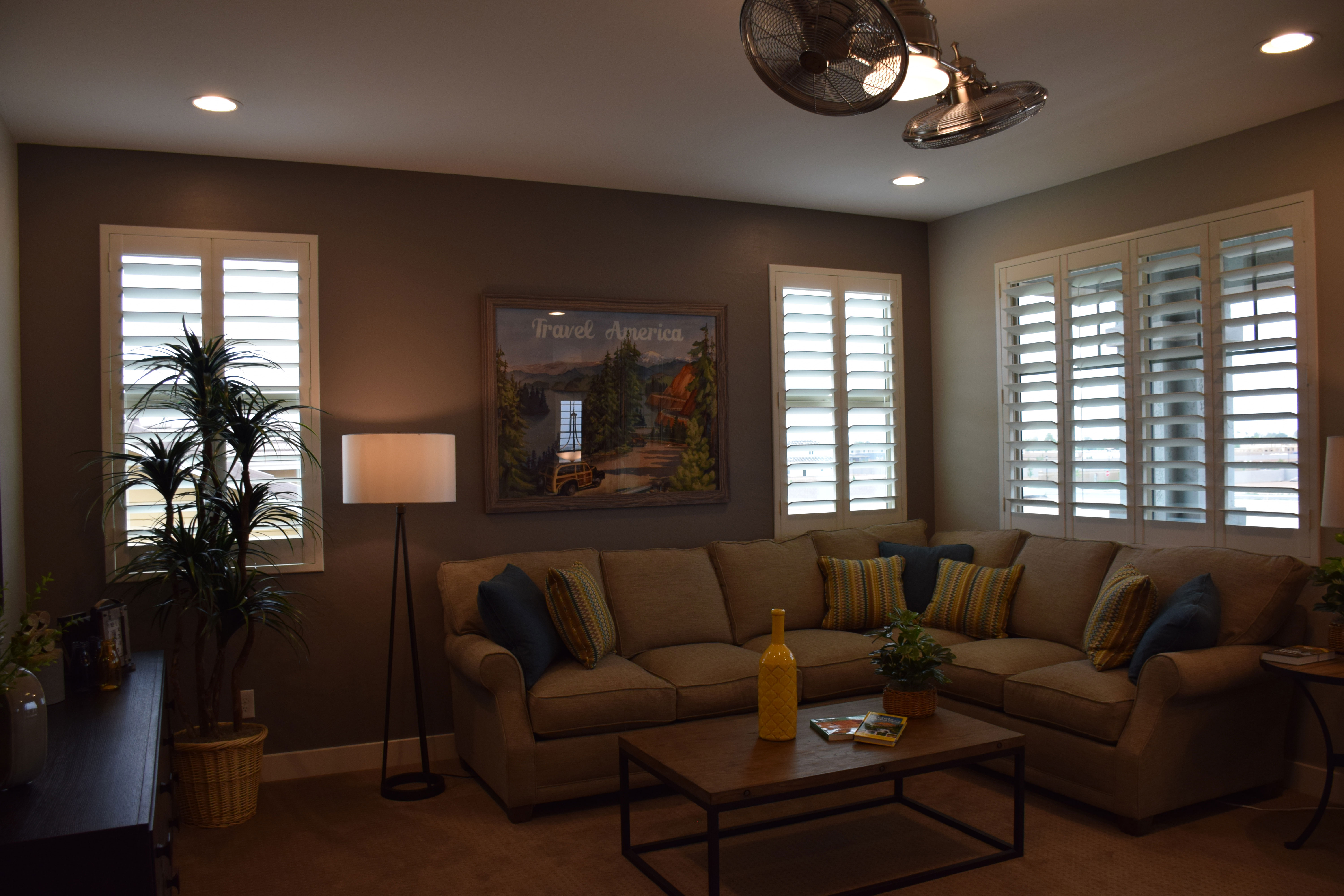
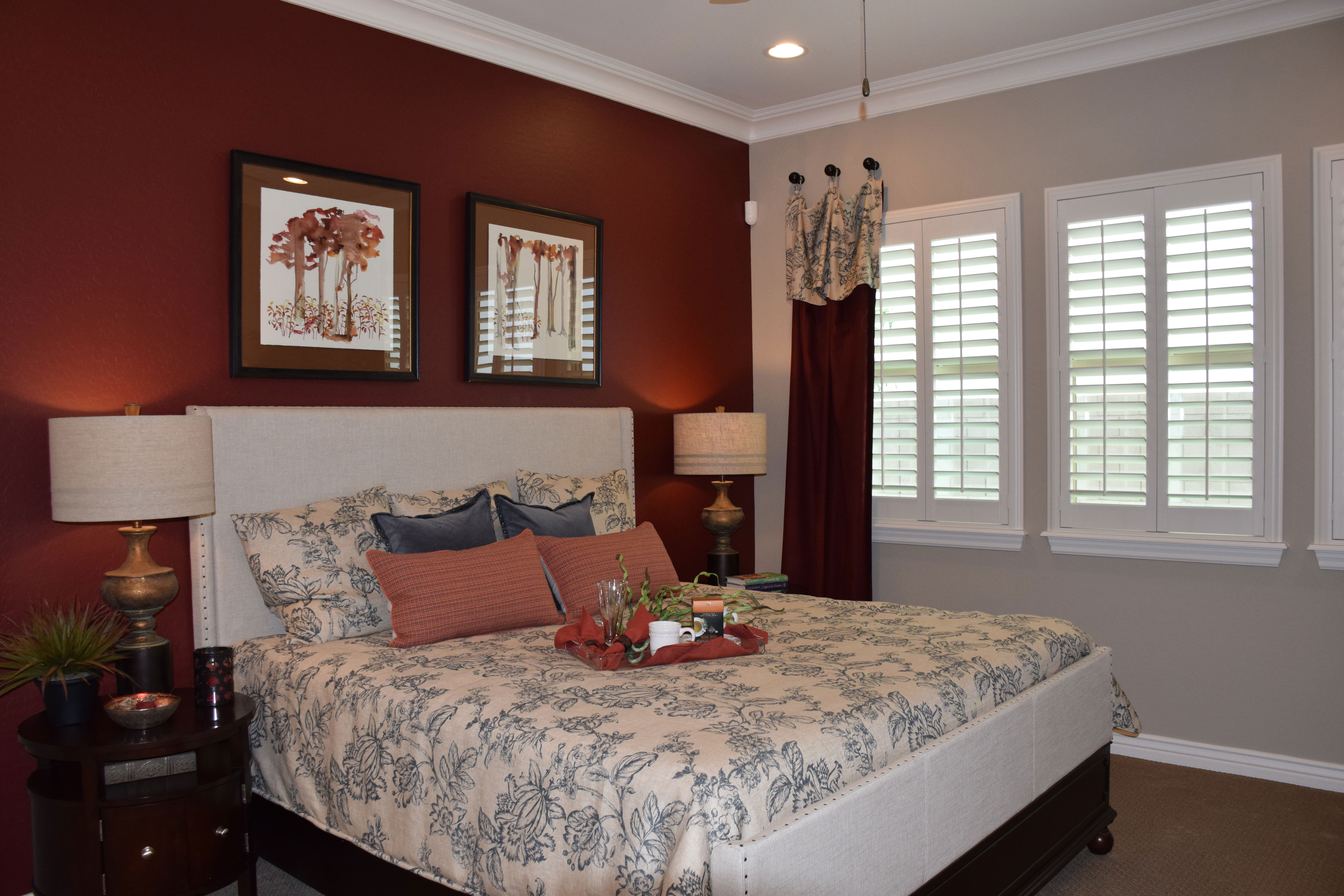 Patterned fabric is always a nice addition to your home’s decor. In living and family rooms, stripes are the most common pattern choice, followed closely by geometric options. You will see some florals too. But one of the most intriguing patterns is an old-fashioned choice: toile.
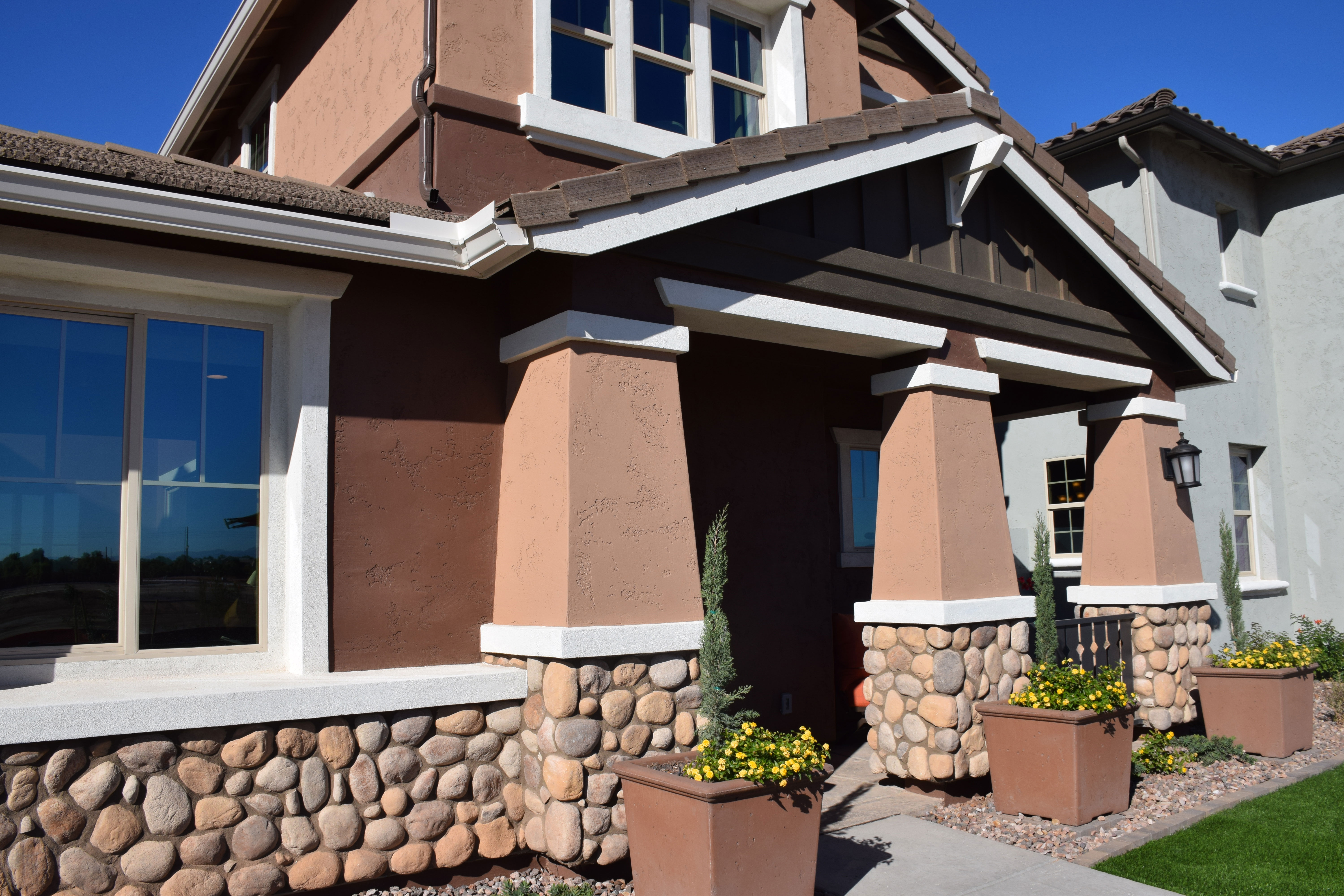 Although this look has been around for a long time, the appeal of the Arts & Crafts style has only grown in recent years. When you’re planning your next home, how about considering this warm and intriguing option?