Coordinating an Open Floor Plan – Family Room and Office

Family20Room20DSC_0251

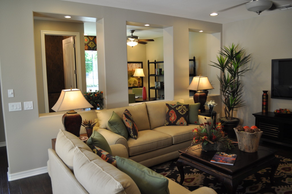
Fulton Homes Starlight Model

An open floor plan makes any home feel more spacious and interesting. Every step opens up a new view of living areas – kitchen, dining, family room and even office.

The office space in this home – the Fulton Homes Starlight model – demonstrates the appeal of an office or den that is open to the family room. the wall openings support a separate living area while still making the office feel part of the greater whole.

Decorating the office and family room to ensure that the spaces are seen as separate but still coordinated requires some planning. Here are some décor choices that make these spaces work well together.

Coordinating color-schemes: Neutrals pair well with black, red and a soft green to build a common theme of colors without too much repetition. The green chair in the office picks up the color of the family room throw pillows while the patterned fabric appears on the office valance and the other sofa throw pillows. Notice that the rug also carries those colors through to the family room.

Lighting: Both rooms have matching ceiling fans, but the real connection comes from the table and floor lamps. The unusual sloping square lampshades in a natural cream tone carry from one room to the next – providing nice focused light while marrying the style of the two rooms together.

Furniture tone: Both rooms feature dark wood – a good choice with the wall and furniture colors. The wood floor mirrors this tone, creating a unified whole. This level of thought and coordination takes full advantage of all the plusses of an open floor plan – maximizing comfort and style.

Design Inspiration – Coffee

Interior designers, and clothing designers, often find inspiration from things that are totally unrelated to homes and fashion. Colors, shapes, images and ideas can lead to unique design thinking.

In this week’s blogs, we’re going to take a look at three different types of design inspiration and how they turn into room designs. By the way, this week’s blogs were inspired by the kind words of one of our subscribers in Winnipeg, Canada.

This designer chose the photo of a steaming cup of coffee shown to the left as the basis for creating several hotel rooms. With a limited budget, he was still able to make an impact. The colors reflect the rich brown of the coffee beans with the flooring. The walls and bedding are represented by the warm light browns and creams of the stoneware coffee cup and saucer.

The designer also used the shapes of the steam rising from the coffee cup as an inspiration for the curving wall murals in each room. The furniture also curves to coordinate with the rounded cup as well as the oval mirror shaped to resemble the top of the cup in the photo. Even the chair looks like a cylindrical coffee mug missing the handle.

Although there is no actual image of the photo in either of the rooms, if you have the opportunity to compare them, the source of inspiration is clear.

What else would you add to this room to make the coffee imagery stronger? How about a jar filled with coffee beans or a do-it-yourself small coffeemaker?

Take the time to look at photos on the Internet. Do any of them inspire you to design your own space?