What do you want your eating counter to look like?

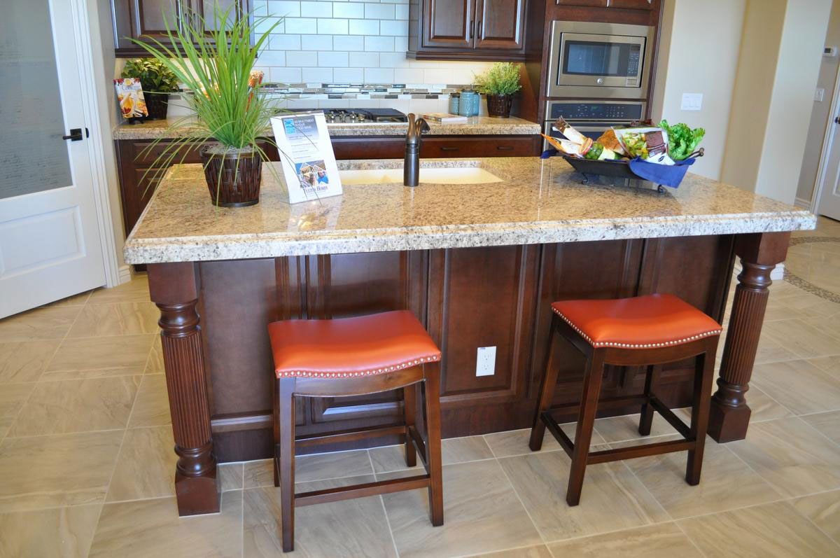
what-do-you-want-your-eating-counter-to-look-likewWhen you’re planning your kitchen, take some time to determine whether you want to include an eating counter like this one. There are some decisions to make if you decide a counter is for you, so let’s take a look at the things you may want to consider.

Counter depth: Your Fulton design-center designer can show you examples of standard counter depths. Don’t short-change your counter. You may find that this space becomes more than a snack area. It may be the choice location for your kids to do their homework or your prime appetizer spot when you have people over for dinner.

Counter edge: If you will have people leaning over the counter, make sure the edge will be comfortable. Some of the edges are fun and interesting, but not as easy on the stomach over time as your kids bend over it while munching on breakfast or a snack.

Stool height: Counters and stools come in all sorts of heights. Make sure you know how high your counter will be so that you select stools that will fit your counter well. Too high or too low and your guests will not be comfortable.

Design features: This under-counter area coordinates with the cabinetry. Other islands may have tile under the counter. Think about whether you will have kicking kids sitting at the counter or more well-behaved adults when choosing your materials. This counter also adds a bit of splash with two columns, giving a bit of extra personality to the kitchen. Check with your designer to see all of your column and other kitchen counter options.

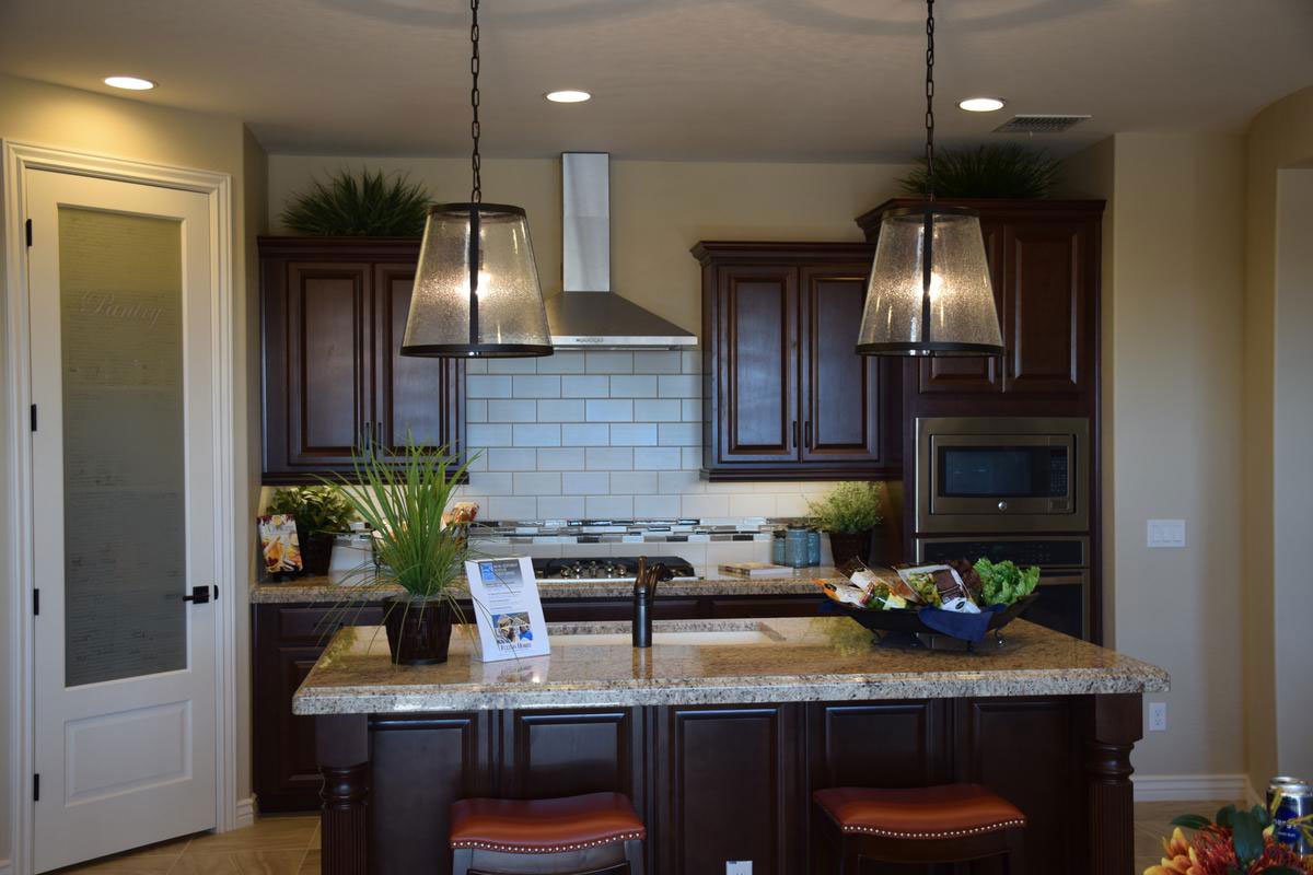
Urban Industrial Features Sharpen Kitchen’s Look

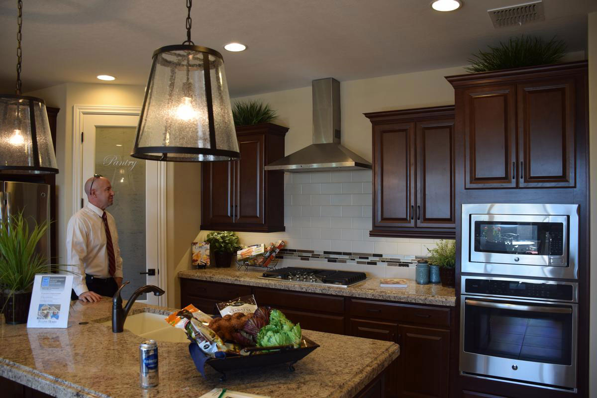
urban-industrial-touches-sharpen-kitchen's-lookwIf you want a kitchen with traditional styling but would like to add a bit of an edge, consider including a few urban industrial touches. This kitchen ups its look with just a couple of smart additions that fit the profile of today’s urban look. Let’s see what choices give this kitchen the flair of a city loft.

Subway tile: This is always as sophisticated option. Subway tile has a smart yet retro look that creates the mood of another time while standing out front in terms of style. This soft subtle cream-toned glaze doesn’t take over the space yet certainly adds life to the look of this kitchen.

Oversize pendants: You could imagine these pendants hanging over an old-style factory or shop in New York or Chicago at the turn of the Century – the one before this last one. The dark trim and speckled glass combine with the industrial shape and size to stretch the boundaries of this kitchen’s look. They add just the right touch of yesterday to the kitchen’s design.

Sleek stainless vent hood: The clean lines of this hood would work in a commercial kitchen and they add a touch of industrial style to this one. Sitting atop the subway tiles, the look would be believable in a restaurant hideaway in lower Manhattan, but it’s in your kitchen instead. Nice.

When you plan your kitchen, why not step just a bit away from the traditional? Add a few urban industrial elements and make your kitchen’s design just that much more daring and unique.

Smart Lighting for Smart-Looking Kitchen

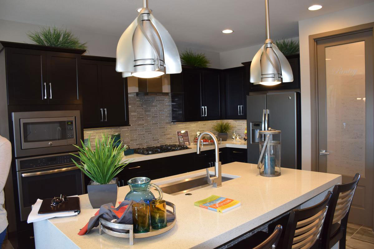
smart-lighting-for-smart-looking-kitchenwIf you want to add just one touch to make your kitchen stand out from the ordinary, consider unique pendant lighting. Positioned over the island that separates the kitchen from the eating area or family room, an island quickly becomes a focal point in your home. Selecting pendant lights like these makes your island capture attention.

The brushed nickel finish works well with the stainless appliances and sink, and the nickel faucet fits too. The kitchen’s fixtures, appliances and other stainless elements are a nice mix of straight and curvy lines. Notice how the appliance handles have soft curves along with the faucet, but the sink itself is a sharp rectangle.

These pendants almost look retro with the fin design, yet the finish and the light itself definitely put it in this century. In addition to the interesting shape and characteristics, it’s also a good source of light, covering the island well and evenly.

This kitchen has several nice light sources including can lights distributed across the ceiling. There is also task lighting set under the cabinets – handy when doing close work on the countertop. But there’s no denying that what catches the eye are the pendants.

Would you like to check this lighting out – along with this kitchen – in person? How about visiting our newest community, Seaboard at Cooley Station? We look forward to seeing you there.

Kitchen Clean-up Center

kitchen-clean-up-centerwFew people really enjoy cleaning up the kitchen, but if you have dirty dish duty, it’s hard to beat this kitchen clean-up center from Seaboard at Cooley Station. Let’s take a look at the advantages offered with this savvy layout.

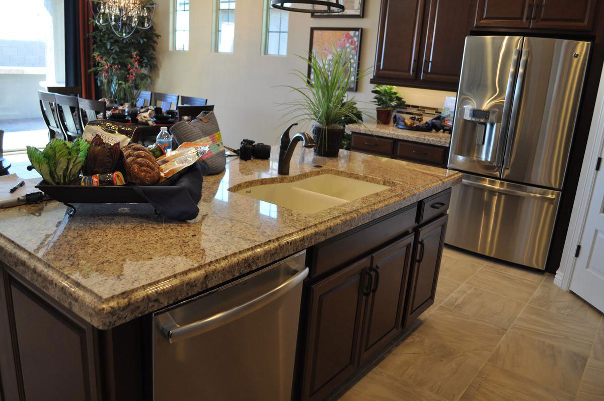
Plenty of counter space: With room on both sides of the sink, dirty dishes and pots can go on one side and clean items can fill a drainer on the other. Which side? Why don’t you pick? There’s plenty of room in either direction. With a dual sink, use one for rinsing and the other can be filled with hot sudsy water for things that don’t go in the dishwasher like your sharp knives.

Silverware drawer: A drawer for your silverware right on the island is a real step-saver. Clean silverware can move right from the dishwasher to the island drawer to the table when it’s time for dinner. Or maybe you prefer that drawer closer to the table for silverware? Then how about using that drawer so that your sharp knives and other prep utensils are always handy?

A nice view: A sink that faces the wall may make the person who draws clean-up duty feel isolated. But this island location helps keep the cleaner entertained with an easy view of the television or other activities in the family room. It’s more fun if you can make chores a family event.

One final wipe of that appealing stainless dishwasher door and you’re ready to head out of the kitchen for the evening. It’s not so bad getting clean-up duty when you’re working in a space like this one!

Inviting Open Kitchen

Inviting-open-kitchenwWhen you have room for an island in your kitchen, the end result is an open space that makes spending time there cooking and cleaning more pleasant.

Kitchens that are totally enclosed feel limiting. Very few people fit in such a space and often you find that more than one person working leads to awkward movements as people try to stay out of each other’s way. Holding a conversation can be difficult as there is no good place in an enclosed kitchen to put someone who is not working.

But with an open kitchen like this one, there are a number of convenient places for people to sit or stand, whether they are helping out or not. Park guests on the other side of the island and position some cheese and crackers handy. The cook has plenty of uninterrupted space to work yet he or she can still have a great conversation with family or friends.

If you have helpers in the kitchen, an open kitchen design like this gives you plenty of room for them to work in the space, yet you never feel crowded. This kitchen has lots of task lighting, but you also have a generous amount of ambient light because there is no wall blocking your access to all of the open floor plan windows.

Kitchens tend to be the warm center of a home, and this open and friendly kitchen certainly encourages everyone to spend time in it or nearby. To see this and other inviting open kitchens, visit the models at Cooley Station.

Inviting Open Kitchen

Inviting-open-kitchenwWhat makes a kitchen pleasant? Stylish cabinetry helps, along with lovely countertops and lighting that pushes the envelope like these pendants. It’s also fun to have your own walk-in pantry to make it easy to grab your ingredients as you need them.

Hard-core cooks really appreciate the advantages of a kitchen island. That wealth of counter space without any upper cabinets to block your view makes it easy to prep meals. There’s enough space with this island to throw two or three sous chefs around chopping up vegetables and fixing a salad of an evening.

For the non-cooks in your life, a comfortable stool or two on the other side of the island gives them just the perfect perch for chatting while you whip up a quick snack for everyone to munch on till dinner’s ready. And it’s only a step or two after the meal for them to help with clean-up, which is only fair if they didn’t pitch in before dinner!

Clean lines, luxurious appliances, good lighting and a smart layout – what else could you ask for in a kitchen? Well, it helps if it’s attached to a well-built Fulton Home. Come on out and take a look at this one and others at our Cooley Station community. Visit: http://www.fultonhomes.com/our-communities/cooley-station for more information.

Avoiding Space-wasting Corner Cabinets

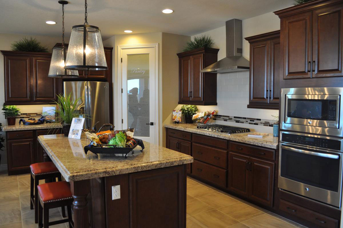
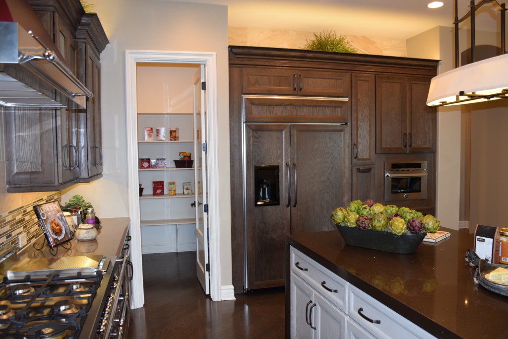
avoiding-spacer-wasting-corner-cabinetswIf you’ve visited many model homes or investigated many kitchens, you may have seen some designed in a U shape. These kitchens look efficient and take up a small amount of space, but there is one problem: the corner cabinet. When you have a U-shaped kitchen, one or two of the cabinets have space that is not easily accessible, so a large amount of storage space is essentially wasted.

Notice instead how this kitchen is designed to avoid cabinets in the corners. One corner holds the double ovens, and the other is taken up with a generous walk-in pantry. This means that all the space in every cabinet seen here is easily accessible from the front.

Often you have to spend time in a kitchen to determine how well it really is designed. A kitchen can look appealing but once you’ve settled in you find all of the problems. Issues such as corner cabinets with their wasted space aren’t obvious at first glance.

At Fulton Homes, our kitchens are designed to make cooking easy and fun. Plenty of lighting, great accessories and an effective layout of top quality cabinets and countertops make working in this kitchen a pleasure.

To see some of our kitchens in person, why not visit Cooley Station this week? You may just find the right kitchen for you!

A Splash of Red

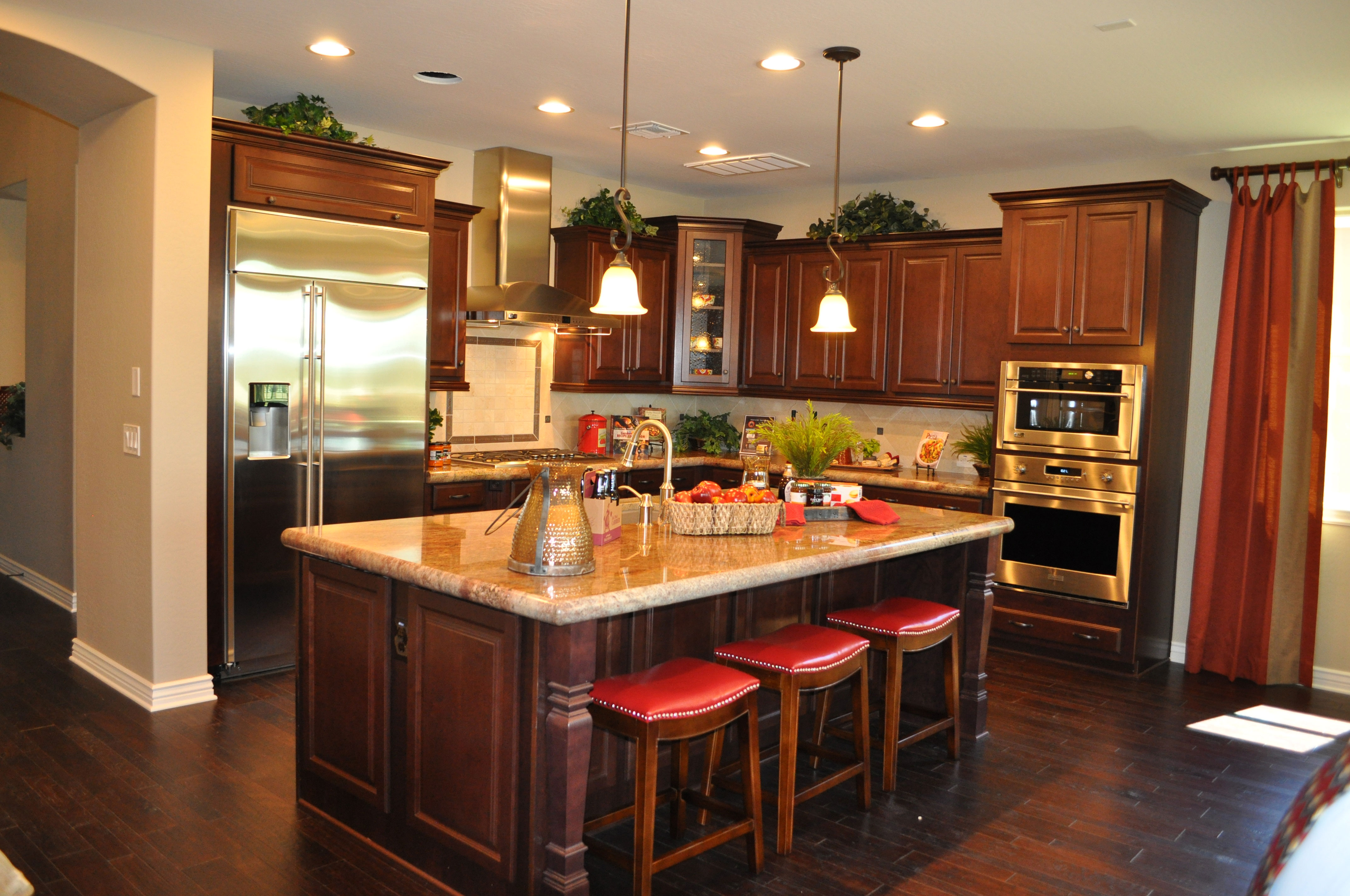
kitchen-whitewater-webWith this combination of dark cabinets and dark wood flooring, this luscious kitchen could easily feel like too much brown. But a wise choice of countertops and pops of red turn it into a cozy and inviting space. Let’s take a look at the smart decisions that make up this kitchen, from the Whitewater model in the Oasis at Queen Creek community.

Light walls and countertops: You don’t often see dark wood on dark wood in a kitchen. Of course today’s wood flooring finishes make wood workable for kitchens and even bathrooms, but it still seems like a design risk. Bringing in lighter tones with the countertops and soft beige walls provide the needed contrast. The backsplash also uses light tiles to showcase the dark wood cabinetry.

Stainless appliances: A little bling brightens up any room, and using appliances with a stainless finish breaks up the wood, while the reflective surfaces contribute to the overall glow.

Architectural details: The carved pillars at the outer corners of the island combined with crown molding and the door/drawer styles break up the wood look, adding shadows and highlights to the cabinets. In addition, the handscraped wood flooring provides its own three-dimensional element. Altogether these features add the interest needed to keep the space from feeling simply wood-on-wood in design.

Pops of color: The red leather seats set off the island, and this color is echoed in various accessories scattered through the kitchen. Red’s strong bright presence lights up the room.

Natural light: This kitchen can carry off the two dark woods thanks to the natural light that pours into the space. And in the evening, multiple lighting sources keep the kitchen light and bright.

Is this the kitchen for you? Why not visit our models in Oasis at Queen Creek and see for yourself!

Keep Kitchen Light and Bright

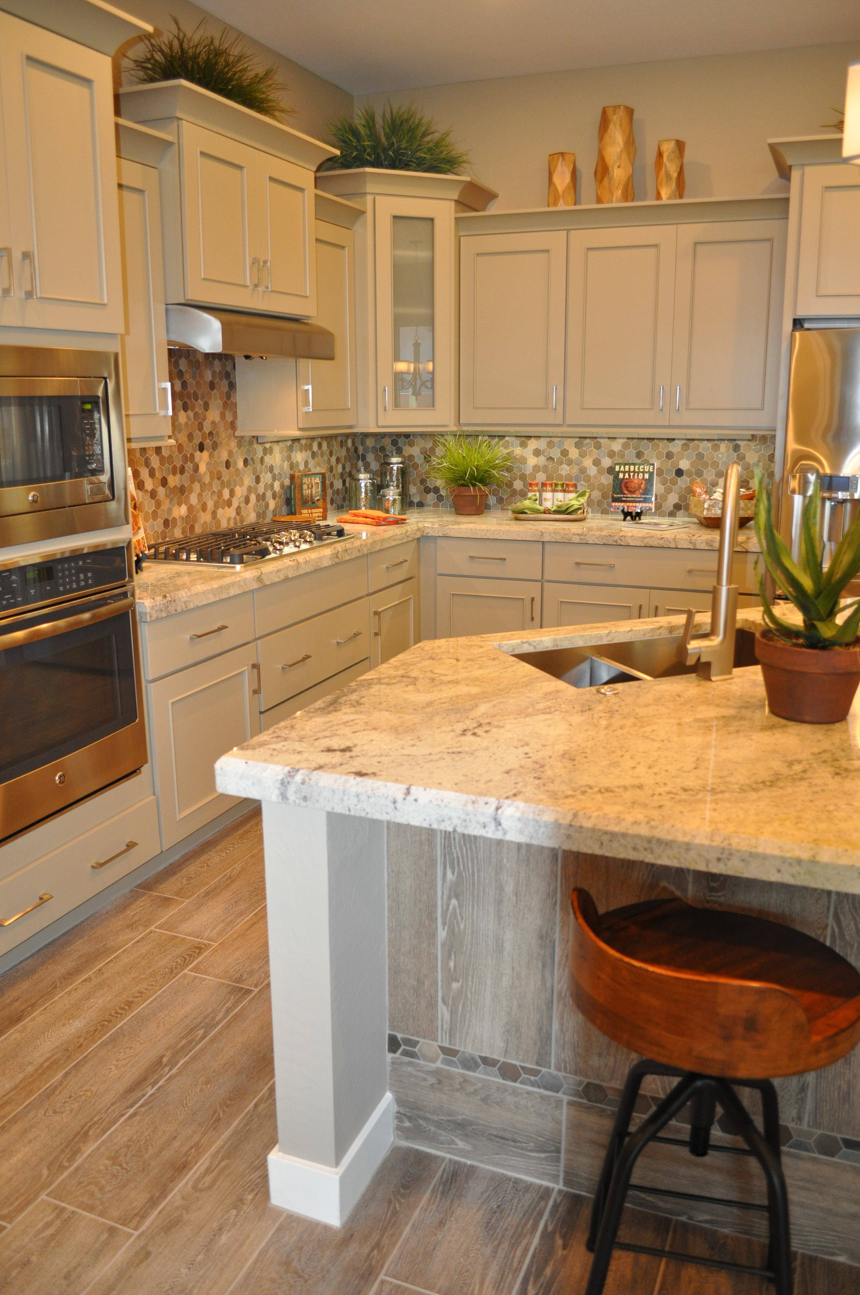
la quinta kitchen webWhat are you looking for in a kitchen? There are so many choices. If you want a light and bright kitchen, this one from the La Quinta model at Oasis at Queen Creek provides a great example. Let’s take a look at what makes this kitchen design work.

Painted cabinets: The look of stained wood is lovely, but nothing says clean and fresh quite like a white painted cabinet. The crisp color also creates a remembrance of kitchens gone by.

Light countertops: This light granite choice fits well with the cabinetry and the veining provides a gentle contrast. The edge treatment feels substantial and works with the crown molding at the top of the cabinets.

Light backsplash mosaic: By including white and primarily light tones in the backsplash, the bright impression is carried forward. Notice that there are a handful of dark tiles in the design. This contrast makes the backsplash more interesting.

Stainless steel and brushed nickel metal choices: By staying with the cool and crisp feel of stainless appliances and brushed nickel faucet and pulls it’s possible to provide contrast without going too far. Black appliances or oil-rubbed bronze metals would be too strong a conflict with the other choices in this kitchen.

Warm but light flooring: While this porcelain tile plank flooring is light, it also adds warmth with its wood-look. The tone works well with the kitchen, providing just enough dark elements to anchor this flooring in the room.

You can make a careful balance of choices to create a light, bright and inviting kitchen like this one. To see it in person, visit our models at Oasis at Queen Creek.

Kitchen Pantry Pleasure

pantry 2 fultonOver the years, homeowners have enjoyed the pleasure and convenience of walk-in closets, and now many homeowners are discovering the benefits of a walk-in kitchen pantry.

Once a common feature in farmhouse kitchens where food storage was as important as preparation, pantries are now a luxury well worth the investment. Here are some of the advantages.

Large container storage: If you’re a fan of those warehouse stores, often you may need to set up a spot in the garage to hold the space-robbing containers of canned goods or paper products. With a pantry, you control shelf height, enabling you to fit even the most massive purchases right next to the kitchen.

Easy visibility: Instead of having to search through cabinets and drawers to find the cranberry sauce or soup, everything is easily visible when you walk in.

Perfect for storing serving pieces: The long shelves provide the space you need for larger trays or stock pots.

Off the kitchen but not in the kitchen: That much storage space would create a bank of bulky floor-to-ceiling cabinets in your kitchen extending out into the family room. Instead with a pantry an incredible amount of kitchen storage is just a doorway away.

Hidden storage: When guests come, simply close the door to hide the pantry and everything inside it. It’s also a perfect place to put half-empty bags and boxes of crackers or chips where they are out of sight but easy to grab when restocking appetizers or snacks at a party.

How will you use your walk-in pantry? Chances are once you have one, you’ll constantly find new ways to incorporate it into your regular kitchen routine, and you’ll wonder how you ever cooked or entertained without it!