Creating the Perfect Kitchen for You

design center 2What would your perfect kitchen be like? Would looks or functionality be more important? Do you want great cabinets or would you compromise on that to have just the right appliances? Could you live with a smaller refrigerator as long as you have a gas range? Well, when you walk into the Fulton Design Center, those may be the decisions you will face, so it pays to think about them now.

Start by taking a look at your current kitchen. Would you like more cabinet space? How about better lighting? Do you like your current cooktop or do you want something different? How much countertop space do you have now? Could you use more? When you think about what you want in a new kitchen, analyzing your current kitchen is a good jumping off point.

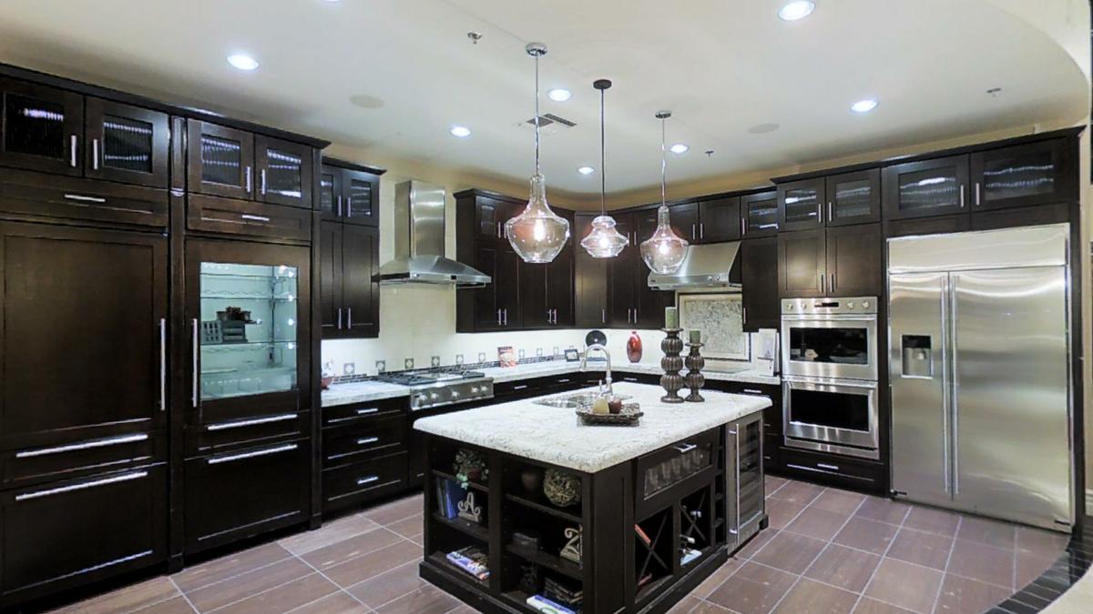
Next, visit the Fulton Design Center during one of our browse nights. Spend time in the various kitchen vignettes like this one. Take the time to see which kitchen feels the most comfortable for you. Are you drawn to the rich dark finish of these cabinets? Or maybe you’ll find you prefer the lighter tones of one of the other vignettes. Spend some time standing and looking around at the various choices. They’re designed to help give you ideas for your own home.

Finally, check out all of the options available. Some might be a good fit for your approach to cooking. Others may be unnecessary. Don’t project your dream of becoming a gourmet chef onto your kitchen if you know you specialize in tuna casseroles. On the other hand if you like hanging with your kids after school while you fix dinner then you probably want that island extension that gives them space to sit and chat with an after-school snack.

Whatever kitchen you create, we know it will be just as perfect  for yourself and your family as your new Fulton Home will be for all of you!

Slate Finish Appliances

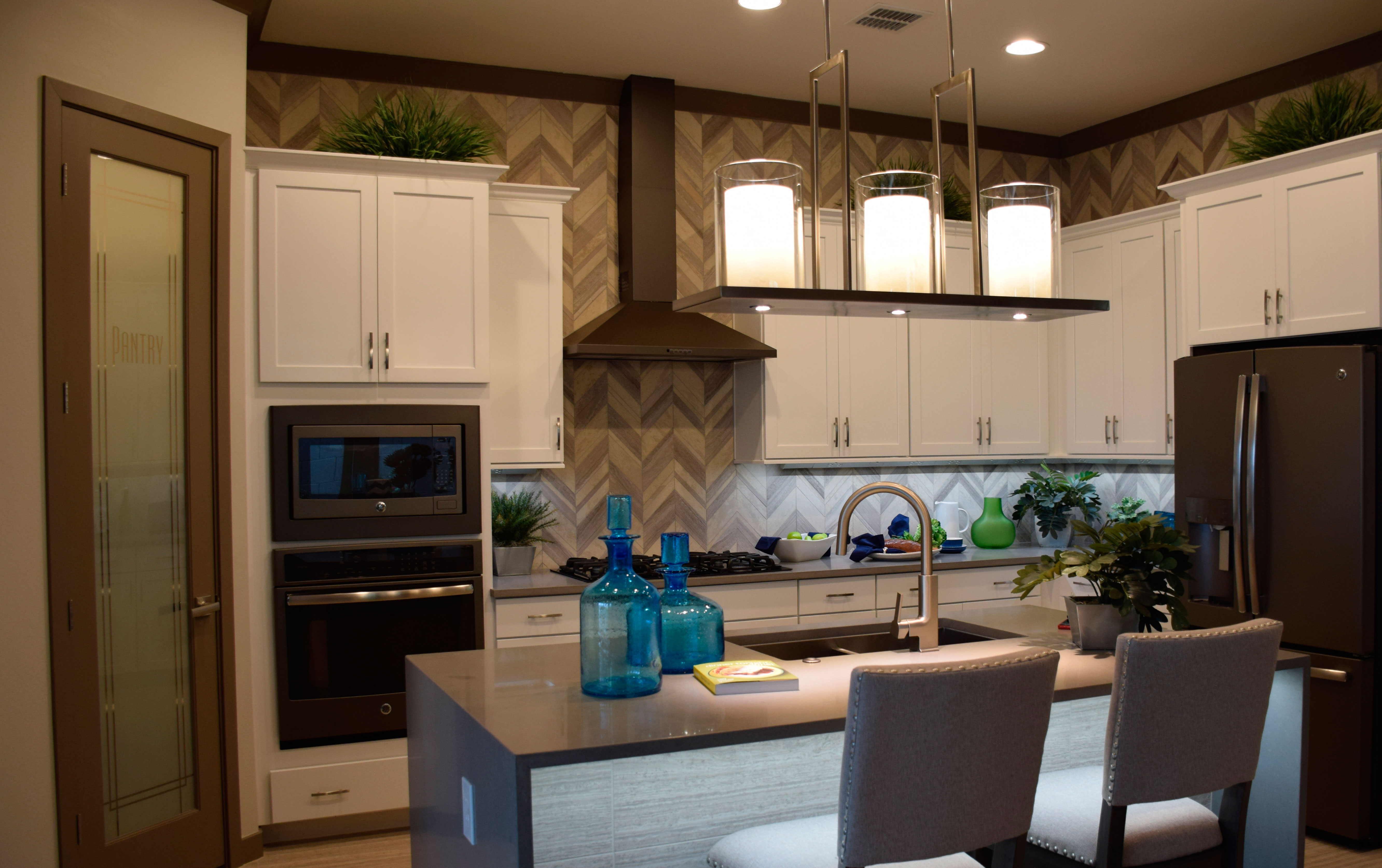
wModern-kitchen-Evergreen-Elm-at-Morrison-RanchStainless steel has been the go-to finish for kitchen appliances for over a decade. There is something fresh and crisp about the stainless look, so it’s popularity is no surprise. But it may be time to consider another option: slate. This kitchen, from the Evergreen Elm Model in Warner Grove at Morrison Ranch, shows a full line of slate-finish appliances.
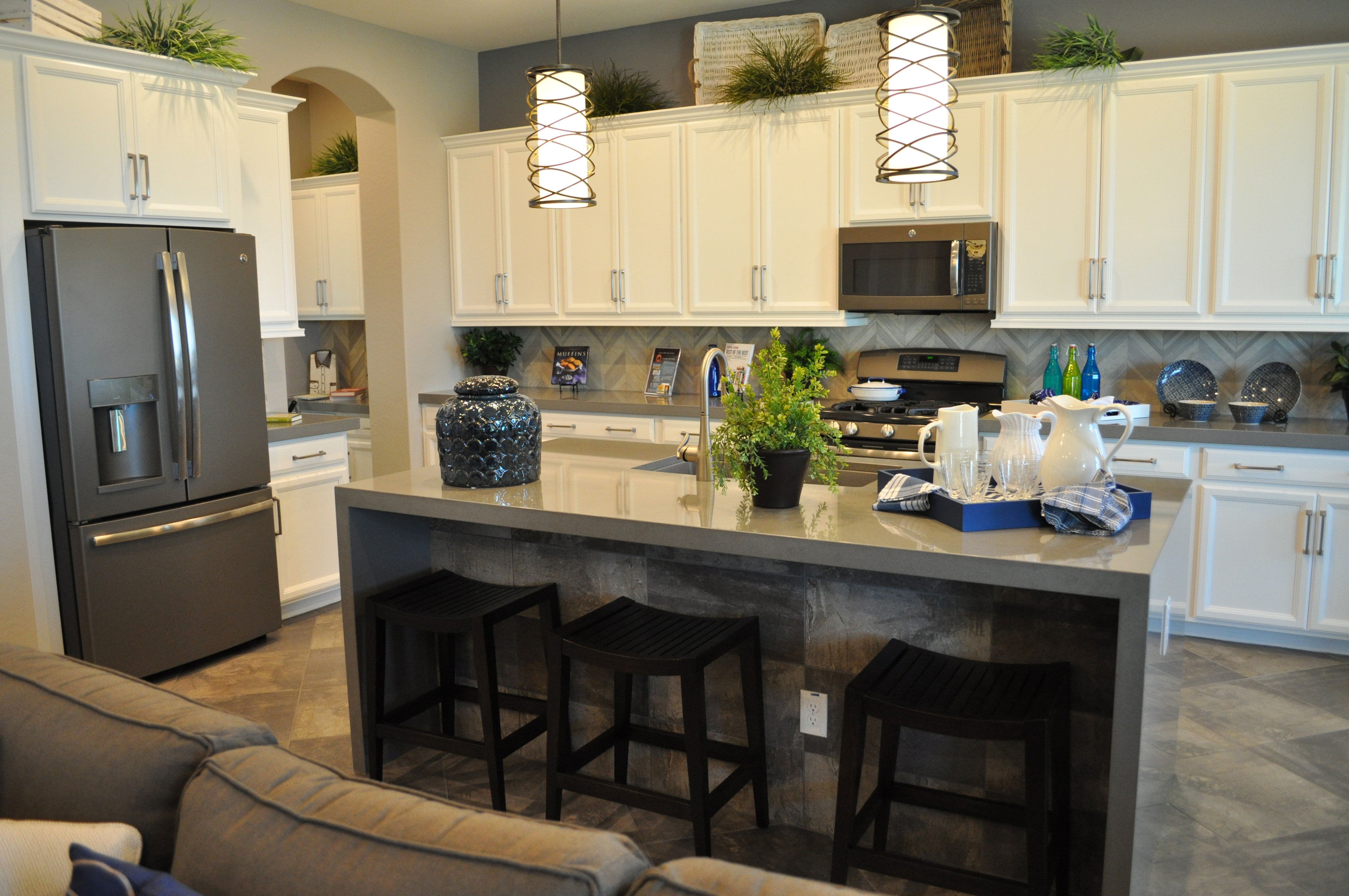
This new look carries the sophistication of stainless steel, but with a darker, matte look. Slate has some of the advantages of stainless but with a sophistication all its own. Here are some of slate’s advantages:

  • It’s completely neutral, allowing you to make color decisions without factoring in your appliance finish.
  • The matte finish does more than reduce shine. It makes fingerprints almost nonexistent. This has always been a concern with stainless’s much less finger-forgiving finish.
  • It’s darker and warmer than stainless, providing some of the advantages of black appliances without taking over a kitchen the way shiny black can.
  • Foir a kitchen as light as this one, it adds a nice sense of contrast without having the appliances yell out in the room the way they would with black.
  • Unlike other finishes that have come and gone since stainless first came on the scene, slate finishes seem to be lasting in interest and appeal.

If you like the sophistication and professional look of stainless but would prefer a warmer look that is easier to maintain, take a look at slate. It’s available in many appliance options, with more coming online every day.

Urban Industrial Features Sharpen Kitchen’s Look

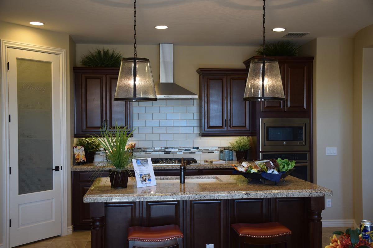
urban-industrial-touches-sharpen-kitchen's-lookwIf you want a kitchen with traditional styling but would like to add a bit of an edge, consider including a few urban industrial touches. This kitchen ups its look with just a couple of smart additions that fit the profile of today’s urban look. Let’s see what choices give this kitchen the flair of a city loft.

Subway tile: This is always as sophisticated option. Subway tile has a smart yet retro look that creates the mood of another time while standing out front in terms of style. This soft subtle cream-toned glaze doesn’t take over the space yet certainly adds life to the look of this kitchen.

Oversize pendants: You could imagine these pendants hanging over an old-style factory or shop in New York or Chicago at the turn of the Century – the one before this last one. The dark trim and speckled glass combine with the industrial shape and size to stretch the boundaries of this kitchen’s look. They add just the right touch of yesterday to the kitchen’s design.

Sleek stainless vent hood: The clean lines of this hood would work in a commercial kitchen and they add a touch of industrial style to this one. Sitting atop the subway tiles, the look would be believable in a restaurant hideaway in lower Manhattan, but it’s in your kitchen instead. Nice.

When you plan your kitchen, why not step just a bit away from the traditional? Add a few urban industrial elements and make your kitchen’s design just that much more daring and unique.

Kitchen Clean-up Center

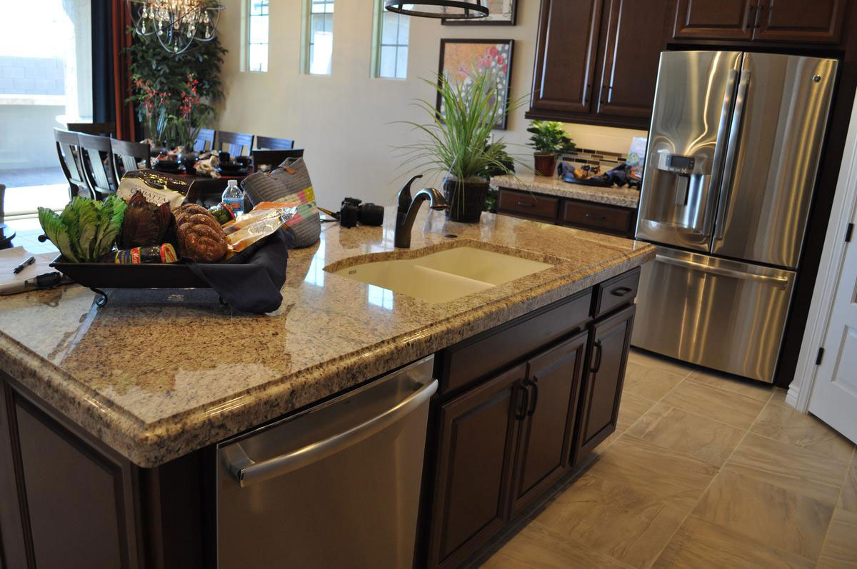
kitchen-clean-up-centerwFew people really enjoy cleaning up the kitchen, but if you have dirty dish duty, it’s hard to beat this kitchen clean-up center from Seaboard at Cooley Station. Let’s take a look at the advantages offered with this savvy layout.

Plenty of counter space: With room on both sides of the sink, dirty dishes and pots can go on one side and clean items can fill a drainer on the other. Which side? Why don’t you pick? There’s plenty of room in either direction. With a dual sink, use one for rinsing and the other can be filled with hot sudsy water for things that don’t go in the dishwasher like your sharp knives.

Silverware drawer: A drawer for your silverware right on the island is a real step-saver. Clean silverware can move right from the dishwasher to the island drawer to the table when it’s time for dinner. Or maybe you prefer that drawer closer to the table for silverware? Then how about using that drawer so that your sharp knives and other prep utensils are always handy?

A nice view: A sink that faces the wall may make the person who draws clean-up duty feel isolated. But this island location helps keep the cleaner entertained with an easy view of the television or other activities in the family room. It’s more fun if you can make chores a family event.

One final wipe of that appealing stainless dishwasher door and you’re ready to head out of the kitchen for the evening. It’s not so bad getting clean-up duty when you’re working in a space like this one!

Introducing Slate – GE’s New Appliance Finish

Rancho-Mirage-kitchen-webFor the last decade and more, stainless steel has been the preferred finish for kitchen appliances. Other choices have appeared, but none with the staying power of stainless.

At the same time there are disadvantages to stainless. It’s a magnet for fingerprints, which requires daily wiping if there are children in your home. The bright shiny surface looks good against dark wood cabinetry but isn’t quite as effective with painted or light cabinets.

Now GE Appliances has introduced Slate. This darker look combines a charcoal tone with a matte finish that hides fingerprints and smudges. It also works exceptionally well with a kitchen that has grey colors. This cooler tone has grown in appeal lately.

Slate doesn’t demand the attention that stainless does. If you want your open-concept home to include a kitchen that incorporates itself into the rest of the space, Slate is more low-key.

Most important of all, so far this new appliance finish seems to have staying power. Introduced in 2012, the response has been so positive that GE continues to expand its Slate line. With its sophisticated look and feel – including just enough bling with glossy handles – Slate creates a feeling of cutting-edge style.

Thanks to its cool tones, Slate can also be used in a mix-and-match approach with stainless if you want. For a close-up look at GE’s new appliance finish in this kitchen, we invite you to check it out in our Oasis at Queen Creek community, where we showcase this and many other kitchen ideas designed with you in mind.

Design Center Kitchen a Study in Texture

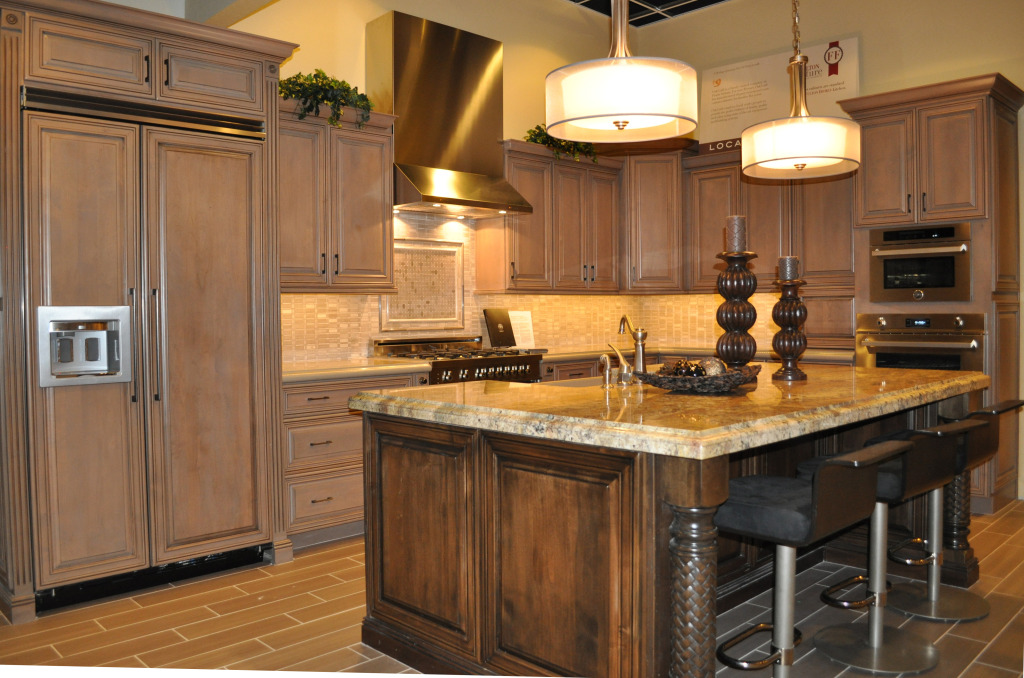
Bertazonni KitchenWhen designing and decorating a room, people often think in terms of color and contrast, but there’s another factor that can create interest – texture. This kitchen demonstrates how texture can make a space exciting. Let’s take a look at all the texture decisions that make this kitchen appealing.

Stainless and wood: One of the most popular contrasts in today’s kitchens comes from two common texture choices – shiny stainless appliances and soft wood cabinetry. In this vignette having the refrigerator provided with cabinet doors – as the largest appliance – creates a softer textural mood than you would have with a stainless refrigerator.

Cabinet finishes: The primary cabinets have a soft gentle glaze, giving them variety while allowing them to serve as a color base for the kitchen. On the other hand, the island cabinets show a more rustic texture that helps this element to stand out from the rest of the space.

Countertops: The countertops against the wall have a soft look with rounded edges and minimal contrast. On the island, strongly variegated granite adds an extra design element to this kitchen. Picture the island with the same soft counters as the rest of the kitchen – without that additional feature, the island would not have the impact it shows now.

Island columns: By choosing the braided texture on the island columns, you add the feel of rich old-world finishing. Once again, this choice brings the island to the forefront of this kitchen vignette.

The designer’s decision to use texture rather than tone to create interest in this kitchen helps to create a space that is cohesive, lower contrast, yet still interesting. That’s the power of texture.


Balancing Cabinetry and Appliances in your Kitchen

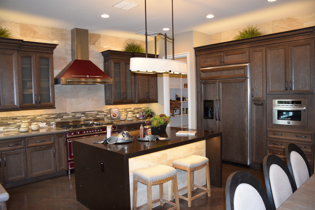
Models 061This kitchen, from the Fulton model at Legacy, shows two ways of approaching appliances in your kitchen: showcasing them like this Bertazzoni range and hood, or reducing their impact by blending them in with the cabinetry. You can see this with the built-in refrigerator to the right.

In this example, both design choices work. The drama and color of the oven creates a focal point in the kitchen. The generous size of the space allows this dramatic piece to shine without overwhelming the room. On the other hand, if the refrigerator had a stainless skin, it would be a distracting influence. Its size would draw the eye away from the strengths of this kitchen – the range and the island.

Transitional design allows you to take advantage of many choices combined into one integrated whole. In this case the moderately-traditional cabinets take a back seat to a strongly-contemporary island and a retro-style range. Smartly, the dark red of the range is allowed to stand alone rather than having the color echo throughout the kitchen. If you wanted to carry the color further, a few accessories would provide all the impact you need.

Notice the stainless microwave to the right. That could have been installed in black, but there are enough stainless accents throughout the kitchen to make this work. The small size ensures that this appliance does not become a distraction. However, cabinet pulls are dark rather than stainless. Design is always about balancing strong features with others that fall into the background.

For a better look at this kitchen as well as two others with interesting style and design elements, visit Fulton Homes Legacy in Gilbert and wander through our three new model homes.


A showstopper in your kitchen: Bertazzoni

Legacy Models 027 (1)You want to be the star in your own kitchen, and a star benefits from having other performers that will show you at your best.

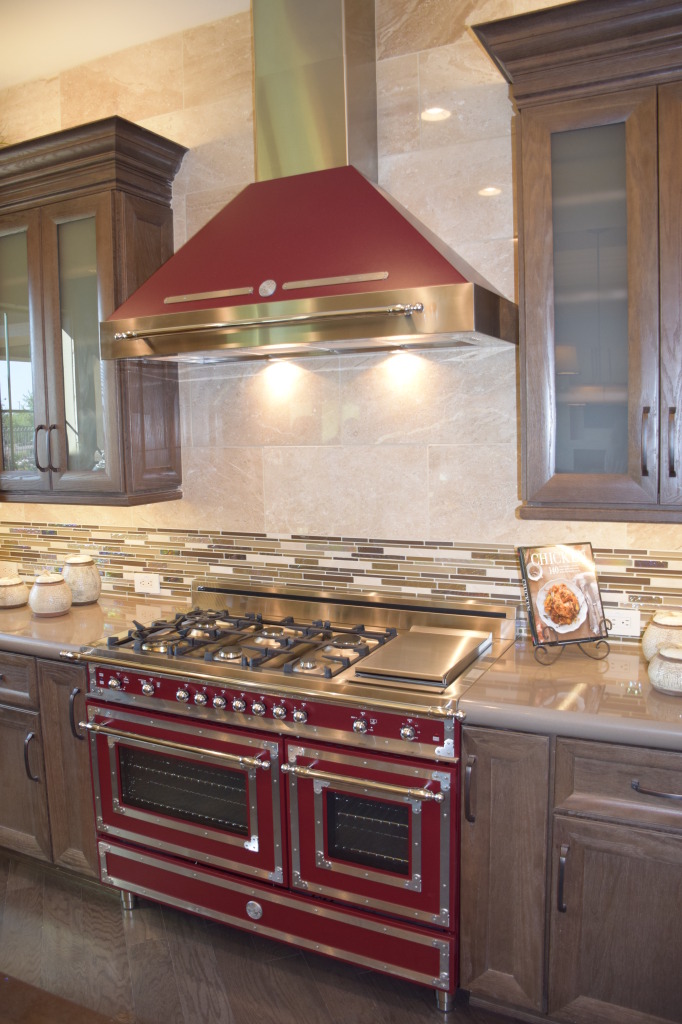
Well, here’s a co-star that will enable you to shine. Bertazzoni’s 48-inch gas range and oven combination is a stand-out in any kitchen. Bertazzoni has been making quality cooking products in Italy for over 135 years.

The heritage style shown was inspired by the original wood-burning stoves Bertazzoni built in the late eighteen hundreds. Look for Antonio Bertazzoni’s signature carved into the stainless above the oven, showing the pride of a family known for quality since his father Francesco built the first Bertazzoni wood-burning stoves and made them popular throughout Italy.

The amazing range and hood come in this glorious red as well as a luscious cream and classic black. Whichever you choose, this will make your kitchen into the showstopper you dream about.

And the beauty is designed to last. Because of their durable double-layer coating that uses the latest processes developed for the automobile industry, you will find the finish to be acid and temperature resistant, giving you a luster that will hold up over time.

This product is also more than just a pretty face. Its performance will help you create the gourmet meals you want with plenty of space on its six-burner range complete with griddle and double oven. Bertazzoni’s exclusive dual valve burners in brass provide high-efficiency, from a delicate low simmer to full power (750 –18,000 BTU). The power burner delivers best-in-class heat-up times.

Pots are placed closer to the flame, reaching the boiling point more quickly and reducing gas consumption during the cooking process. The one-touch, child safety ignition system lets you light and adjust burners with one hand. The safety system automatically stops the gas flow if the flame goes out, even when electrical power is cut

Bertazzoni’s one-piece worktop molding is best-in-class. With sealed burners, no sharp angles or dirt traps, cleaning is fast and easy. Heavy-duty cast iron grates allow easy movement of any kind of pot.

To see this stellar example of a kitchen appliance in person, visit the Fulton Design Center or check out the Fulton model home at Legacy. You’ll be glad you did.


Design Center: Pot filler

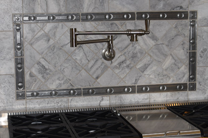
4 Pot Filler Design Center 016Would you appreciate never having to haul a heavy pot of water between your sink and range again? If you enjoy pastas, soups and stews, you may find that a pot filler reduces back strain, prep time and makes meal preparation that much easier.
Even your largest pasta pot will fit under this faucet. Its hinged design means that you can push it out of the way when you don’t need it and grab it easily when you do. Whether you use it to fill large pots or just add water to your saute pan to slow down the cooking, this pot filler will save steps.

By adding metallic tiles to the backsplash, this pot filler is well integrated into the kitchen’s design. The structure allows you to pour water as needed for any pot or pan on your stove.

Are you not sure how much you would use this? Try an experiment. Put a post-it note above your stove and jot a check for every time you fill a pot, pan or kettle with water from the sink before you bring it to your range. You may be surprised at how often you could save yourself the steps if you could access water right at your stove. Now, multiply that by 52 – and don’t forget to factor in holidays, parties and family gatherings which will only add to the sink-to-stove trips. And don’t forget that all those trips include hauling heavy pots filled with water around!

Well, is it worth it for you? A pot filler may be one of your smartest kitchen features!

Design Center: Using the Kitchen Vignettes

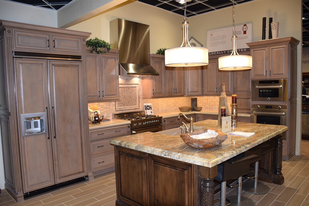
Design Center 016What do you like about this kitchen vignette from the Fulton Design Center? Let’s take a look at just some of the decisions this vignette can help you with when planning your own kitchen.

Stainless or cabinet doors on some appliances? Would you rather have your refrigerator with doors that match your cabinets like this one, or do you want the pop of stainless? You have a good opportunity to see this look, and can check out other vignettes that have stainless refrigerator doors. Also, this is a built-in refrigerator. Open the doors and see if the space would work for your family. Do you like this look better than a stand-alone?

Matching or contrasting island cabinetry? This island shows the same cabinet style – a good design decision – while demonstrating a darker warmer tone for the stain. Are you drawn to this look or would you rather have an island that matches the rest of your kitchen’s cabinets? Even if these aren’t the cabinets you would choose, you can get a good sense of the approach by walking through this kitchen.

Lower drawers or doors or both? More home cooks today have discovered the joy of large lower cabinet drawers. These can hold pots and pans, table linens, and other kitchen staples without the cook bending over and digging through a cabinet to find something.

Cabinet design characteristics: Do you want this staggered profile for the tops of your cabinets or an even approach? Would you prefer more or less crown molding – or maybe no crown molding?

Whatever decisions you need to make for your kitchen, the Fulton Design Center vignettes can help you when designing your own Fulton Home kitchen. So open doors and drawers, walk around and through, turn knobs and faucets and get a feel for what each vignette offers. This experience will help you make educated choices for yourself and your home.