Guest Bath with Color

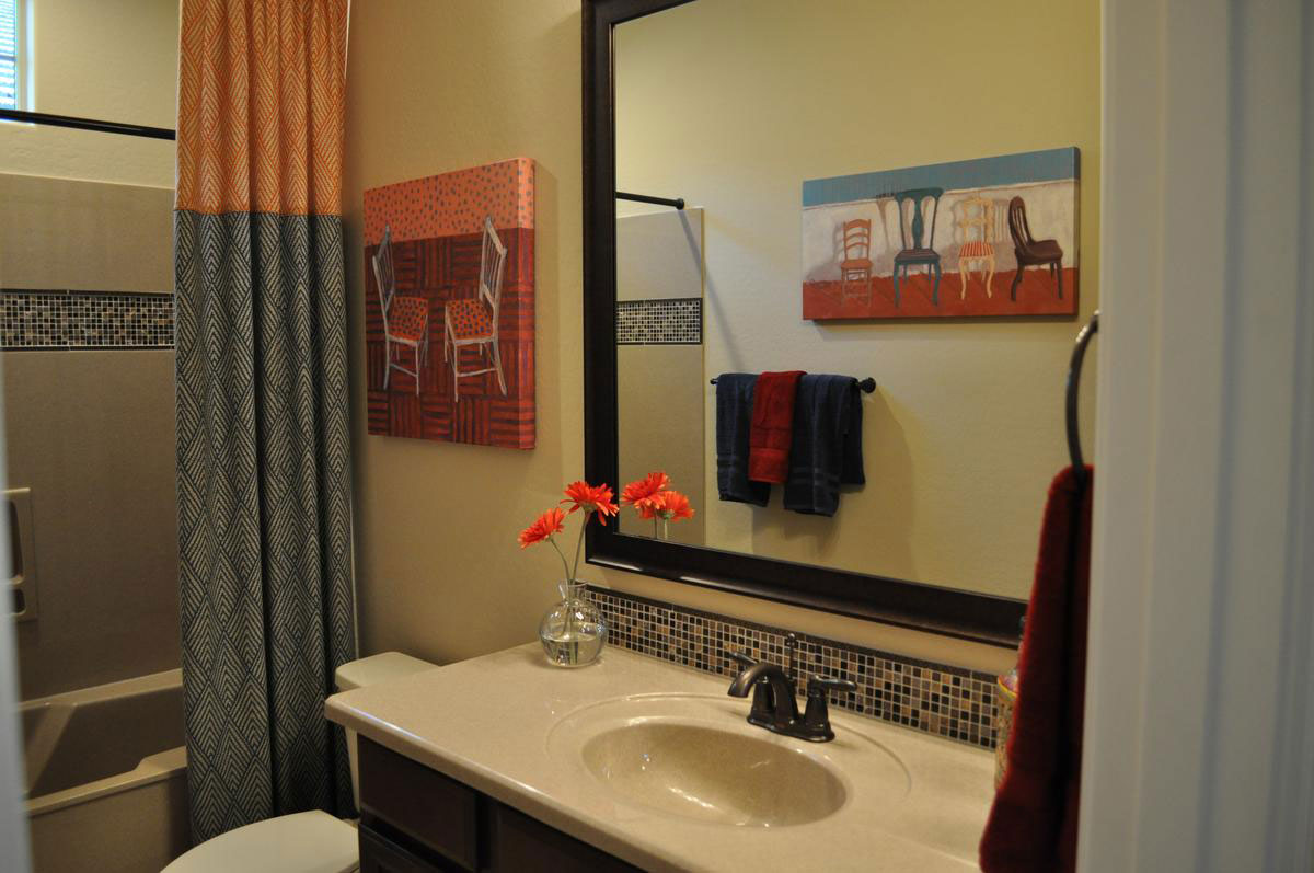
Guest-Bath-with-ColorwYou don’t have to put color in your permanent elements to make a room colorful. Let’s take a look at the savvy choices that make this guest bathroom something special.

Tile mosaic: Although this mosaic contains only neutral tones, the variety of dark and light tiles open the space for color. When you add bright color near neutrals with strong contrasts, the colors will reflect onto the neutrals, pulling color into their space. Take a look at this photo. It looks like the backsplash mosaic has some color in it although it doesn’t.

Art: Art is one of the easiest ways to add color. these two canvases are different yet link together by color, style and subject matter. It’s smart to start choosing your color palette in a room like this one by choosing art. The rest of the color can be drawn out of the selection of prints or canvases you choose.

Towels: Today you can get towels in any color range from vivid almost-neon tones to soft muted shades. It’s smart to choose two or at the most three colors for a bathroom towel set so that the colors work well together yet provide enough contrast to make the space interesting.

Shower curtain: If your bathroom needs a shower curtain, consider adding a floor-to-ceiling decorative curtain like this one. This pulls the colors from the art and towels to another location in the bathroom and adds additional patterns to the mix. Altogether a nice addition to the space.

Accessories: The flowers are a bright spot in the bathroom. You don’t need a lot of accessories for this bath. Just enough to add interest and one more spot of color.

When you decorate your bathroom, don’t be afraid to add color wherever you can. You will also be adding warmth, personality and interest.

Dare to go Dark

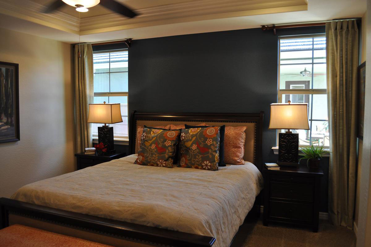
dare-to-go-dark2wJust how daring are you willing to be with your master bedroom’s look? How about painting a wall this dark? It may seem scary but it works remarkably well thanks to several thoughtful decisions.

Natural light: This wall comes between two generously-sized windows. The dark dark wall provides an inviting contrast to the natural light on either side. This is further supported by having curtains on only one side of each window, allowing the dark wall to seem as if it is part of the entire window display.

Light bedding: Yes, there are darker pillows, but the primary bedspread color is cream. Once again this places light right near the dark wall. The pillows pull that spread and the wall together, serving as an effective transition.

Rich color scheme: By bringing rich colors into the room, the dark wall feels like a natural continuation of the color choices. Rich and dark tones complement each other.

Gold: Gold always works well with black. In this case the trim on the nightstands and lamps combine with the dark wood to create a warm rich feel.

Plenty of light: Even at night the ceiling fan with lights and the matching lamps on either side of the bed will keep the room well lit.

Would you like to have a bedroom with this look of drama? How about considering a dark accent wall? To see this room in person, visit Fulton Home’s Cooley Station.

Comics Influence Boy’s Room

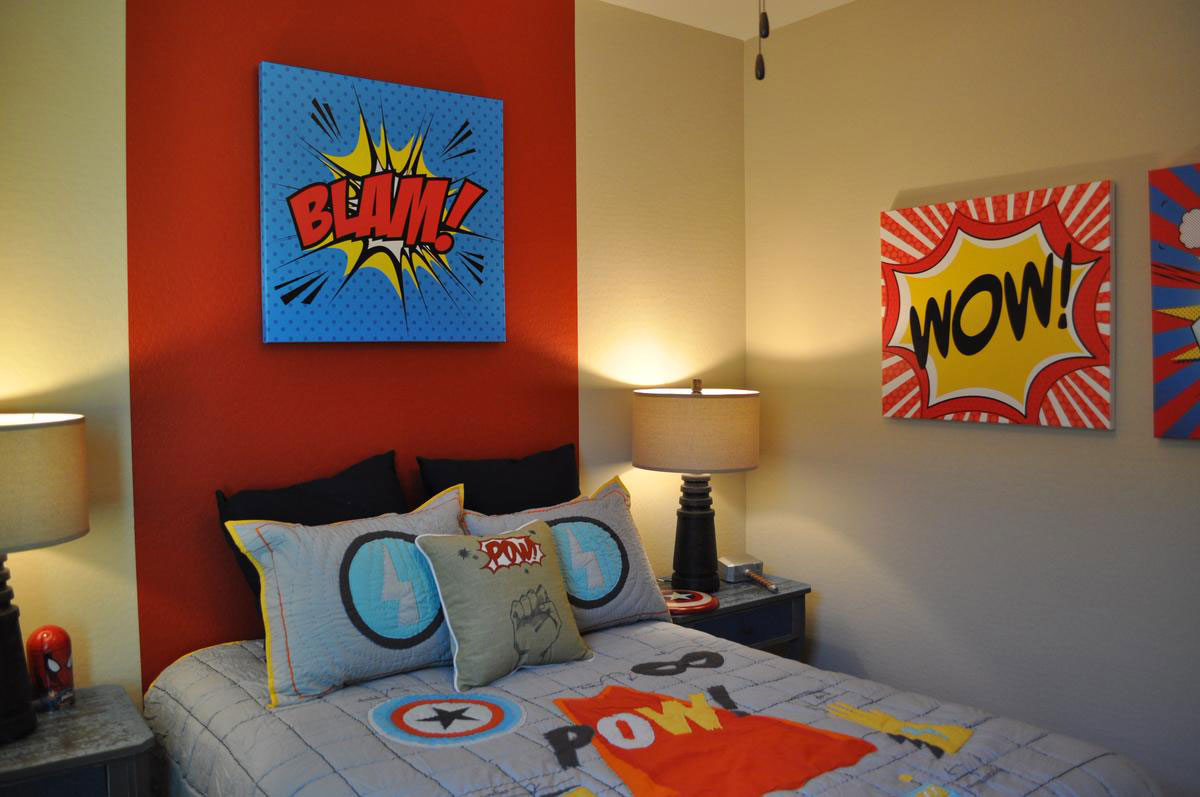
comic-books-influence-boy's-roomw - CopyIf you’re having trouble coming up with a good theme for a boy’s bedroom, take a clue from the comics. With their bright strong-contrast colors and powerful graphics they can quickly turn a room into an attention-grabber. Let’s take a look at how this room became a comic-book lover’s dream with very little effort or cost.

Bedding: Children can shift interests often, so it’s smart to choose lower-cost theme items for their bedrooms, allowing you to change things out in a few years as their tastes evolve. Bedding is one of the quickest and easiest ways to make a change. A bedspread, shams and a throw pillow start the theme off with recognizable yet relatively generic comic-book images such as stars and lightning bolts. The black European shams on the bed work well with the look yet can be recycled when your child moves on to other interests.

Paint: The red stripe on the wall behind the bed does double duty. It operates as a visual headboard and it dramatically links all the vivid elements together with their common red theme. This is also an easy-to-replace choice. Simply paint the wide stripe in another color or paint the entire wall.

Art: If you have a talented artist in the family, then you can have them create images like these on blank canvases with acrylic paint. If not, look for the right art in comic book stores and poster shops. You might even want to frame some favorite comic book covers or pictures of heroes to personalize the room.

This is a fun theme, so have fun with it. You could add shelves for action figures or table space for piles of comics. This could be your comic-loving child’s best dream come true!

Ceiling Makes Room Special

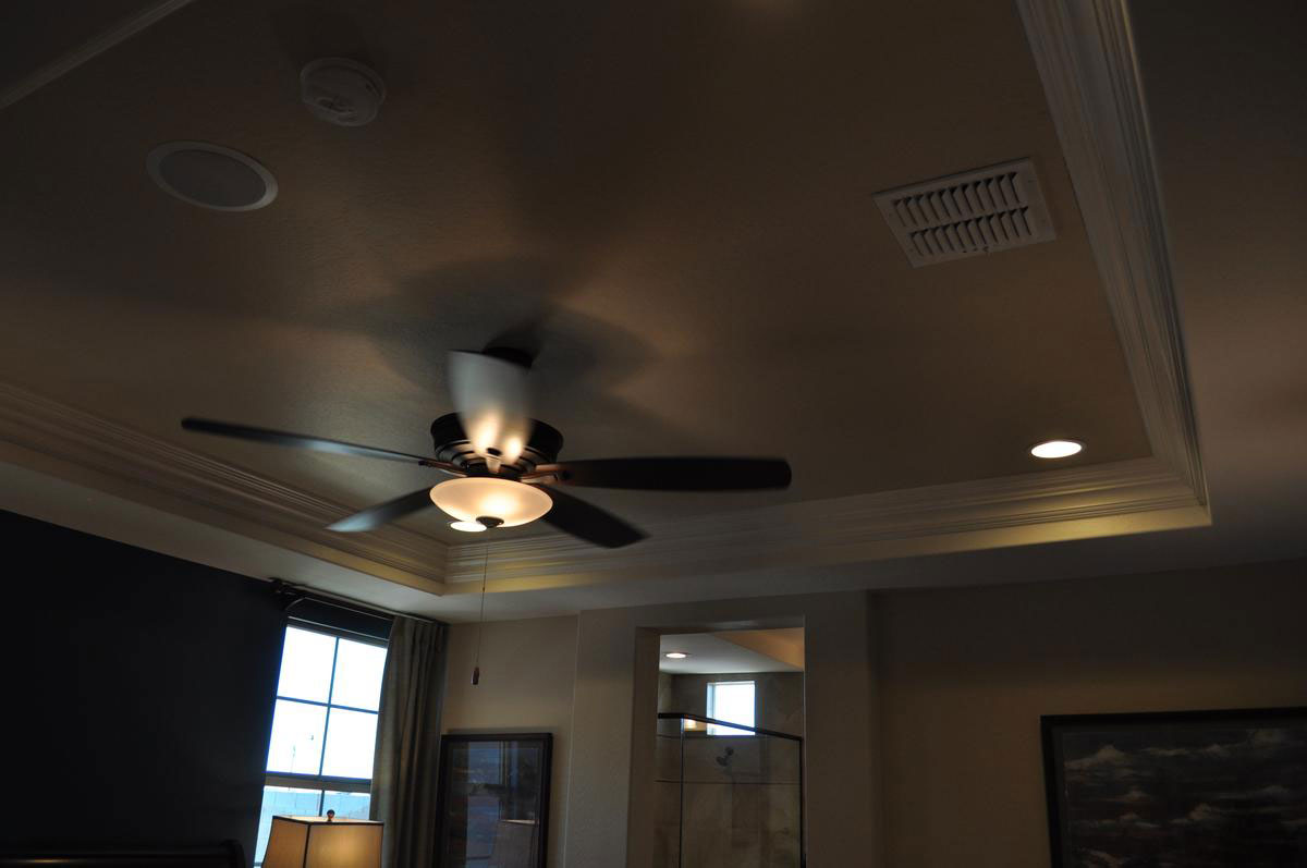
ceiling-design-makes-room-specialwWhen planning a home’s décor, most of us start with the flooring, then move on color choices. We may select a daring paint option for a room like the almost-black on this bedroom’s left wall. Window coverings often come next, followed by larger, then smaller pieces of furniture. We finish up with accessories and art.

But one thing we generally don’t do is worth the extra step. Before the flooring, the paint and the furniture, take a minute to look up. What does your ceiling have to offer in a room? If you’re stuck with one of those popcorn ceilings from a few decades ago, it may be time to hire someone to redo it. That will add value and selling your home will be easier if you lose that dated look. However, what about having a ceiling that makes the room something special?

This master bedroom gains luxury and style before you even notice the walls, floor or furniture with its dramatic coffered ceiling. The molding running along the inside adds interest and a bit of traditional flavor to a non-traditional approach. The lights and ceiling fan create shadows that make the entire ceiling intriguing. The white molding works well with the dark ceiling color to create contrast and keep the room feeling cozy and inviting.

When you’re planning a new home, think about every surface. Adding molding, wainscoting, lighting and ceiling architecture becomes the gift that keeps on giving – making your home a special one-of-a-kind place for you and your family.

Balance Formal Casual Traditional Contemporary

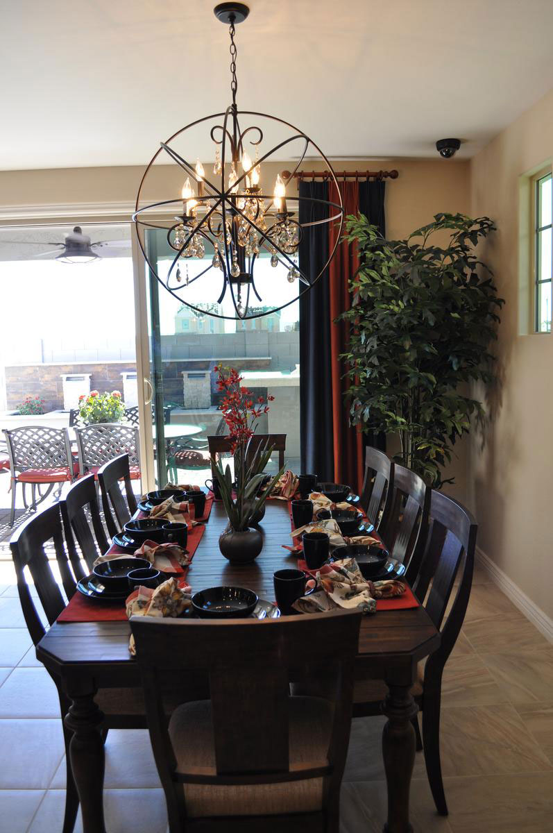
balance-of-casual-and-formal-traditional-and-contemporarywIs this dining room formal or casual? Traditional or contemporary? Actually, it has elements of all four. Let’s take a look at how it’s put together and why it works so well.

Formal: The basic chandelier has classic lines, even crystal pendants, to maintain a formal traditional theme. The table also shows its formal roots with the dark-wood finish, turned legs and detailed edging around the top.

Casual: the choice of placemats and napkins in bright colors and patterns rather than the more classic white tablecloth approach says casual. Also, choosing a simple fabric for the dining chairs’ upholstery maintains a more casual feel.

Traditional: The dining table and chairs as well as the chandelier’s basic lines are classic and traditional but…

Contemporary: Choosing the circular frame around the chandelier takes it out of the last century and bumps it firmly into this one. The stoneware is also modern in line and glaze.

Overall, this dining room combines many design approaches into one cohesive whole. It works for several reasons. The proportions fit well together and there is a nice mix of dark and light. It takes courage to blend these different approaches to décor together, but when it works – as it does in this case – it is a pleasure to see.

Avoiding Space-wasting Corner Cabinets

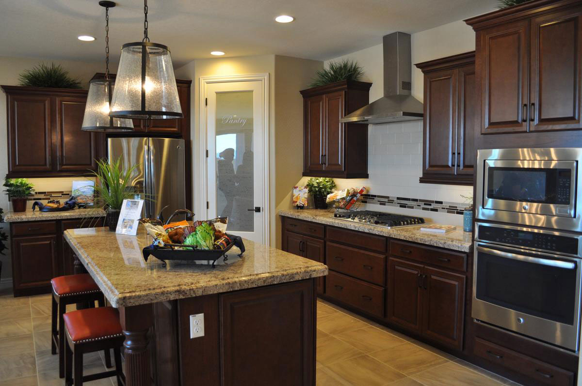
avoiding-spacer-wasting-corner-cabinetswIf you’ve visited many model homes or investigated many kitchens, you may have seen some designed in a U shape. These kitchens look efficient and take up a small amount of space, but there is one problem: the corner cabinet. When you have a U-shaped kitchen, one or two of the cabinets have space that is not easily accessible, so a large amount of storage space is essentially wasted.

Notice instead how this kitchen is designed to avoid cabinets in the corners. One corner holds the double ovens, and the other is taken up with a generous walk-in pantry. This means that all the space in every cabinet seen here is easily accessible from the front.

Often you have to spend time in a kitchen to determine how well it really is designed. A kitchen can look appealing but once you’ve settled in you find all of the problems. Issues such as corner cabinets with their wasted space aren’t obvious at first glance.

At Fulton Homes, our kitchens are designed to make cooking easy and fun. Plenty of lighting, great accessories and an effective layout of top quality cabinets and countertops make working in this kitchen a pleasure.

To see some of our kitchens in person, why not visit Cooley Station this week? You may just find the right kitchen for you!

Architectural Details Make Home Intriguing

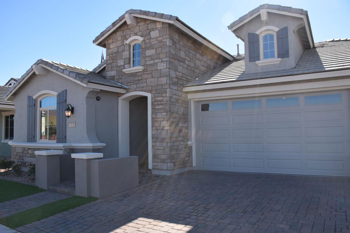
architectural-details-make-home-intriguingwOne common complaint with production homes is that they all look alike. There are many ways to make sure every home in a community looks and feels unique. Having a nice mix of models to choose from, ensuring that every street has a variety of home styles, and offering a good selection of external architectural details.

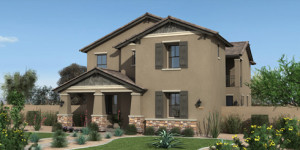
This home, one of the Seaboard models at Cooley Station, is a good example. To start, take a look at the stonework on the entryway. This adds color and texture to the home.  That same stone appears on the lower half of the front of the house, providing a base for the window and almost seeming like outdoor wainscoting.

Curves outline the top of each window and the front entry. The white case work also shows up under the roof line, above the lower stone work and atop the two half-columns at the sidewalk entrance. These splashes of white add contrast as well as charm.

Notice how the shutters bring an old-world feeling to the home. This mood is echoed in the gaslight-style outdoor carriage lamp just to the right of the front window.

One final touch of style comes from the pavers making up the driveway and sidewalk. This finishing touch makes this home worth more than a second look.

If this is the home you would like to claim as yours, we invite you to visit it and the rest of our models at Cooley Station. For more information, visit http://www.fultonhomes.com/our-communities/cooley-station.

Welcome to Cooley Station – Amenities

To do justice to Cooley Station, we’re showcasing the amenities using more photos in this blog. Whether you are young professionals, a family with growing children, or empty nesters, this masterplanned community, located in Gilbert, is designed with you in mind. Let’s take a look at some of the amenities available to our future homeowners.

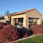
1 beautiful common areas3 beautiful common areasHere are several examples of the common areas available for Fulton homeowners. With covered spaces, outdoor fireplaces, seating and lovely landscaping, these provide great locations for meeting neighbors and entertaining family and friends.

10 community pool8 community pool4 community poolThree community swimming pools provide a perfect place to bring your children during hot summer afternoons. Taking a dip in a pool in the evening can reduce stress and cool you off for the rest of the night.

Think about creating your own swimming schedule. Swimming and water aerobics are some of the best ways to build and maintain muscle strength without putting too much pressure on your joints.

6 lots of green space5 play structuresGreen areas give your eyes a break from desert landscaping and cool down the area. Best of all, the homeowner’s association maintains these spaces so you don’t have to mow lawns or pull weeds in the summer heat!

Parks offer multiple play areas and tot lots, with swings and other features to keep your active children or grandchildren entertained. These are great places for play dates with other toddlers in the area. And you will find one just a short walk from your Fulton Home.

11 ramadas7 barbequesPlanning a barbeque or picnic? Check out the Cooley Station grills and ramadas. Take an evening to play a game of pick-up basketball on a neighborhood court.

This community has been designed to give you opportunities to live fully, whatever your preferred amenities, with a minimal cost of only $111 a month in homeowner association dues. If you’re planning a trip to visit Cooley Station, take a few minutes to drive around and visit our shared spaces.


Welcome to Cooley Station – Santa Fe Models

El Capitan ADo you enjoy exploring model homes? Then how about taking the opportunity to visit Fulton Homes’ newest community, Cooley Station? With three models and four designs set up for a quick move-in, if you are captured by one of the choices the Fulton team will work with you to get you ready to go in double-quick time.

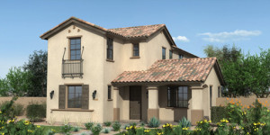
The Santa Fe series has four home designs, with three of them available to view as models. All of these homes are two stories and feature courtyards that can be transformed into outdoor living spaces. The photo above shows the El Capitan, which offers 3 to 5 bedrooms, 3 baths with an open study, loft, and huge side courtyard. With the option that adds a studio and bathroom, the addition of 261 square feet of living space makes the total home size 2557 feet.Grand Canyon G

The next model, the Grand Canyon, has a first-floor master bedroom and the option of two to four more bedrooms on the second floor.

The home has three full baths and an option to add a fourth. It also features a large loft and side courtyard. This home starts at 2458 square feet, with the possibility of expanding the upper level by 437 square feet, adding either an extra two bedrooms or an additional master suite on the second floor.

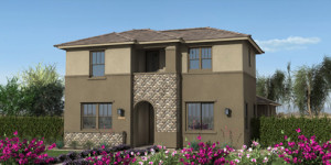
Phoenix Express EThe third model, the Phoenix Express, is 2658 square feet with 3 to 4 bedrooms and 3 full baths. This home design offers a large open study, a loft, and a side courtyard. One option offers an expansion of the second floor loft, adding an inviting covered balcony.

All of the Santa Fe homes feature eight-foot interior doors, 18 inch ceramic tile, 36 inch maple cabinets, granite countertops, ceilings fans, window coverings and front yard landscaping and maintenance. We’d love you to come out and take a look!


Welcome to Cooley Station

Cooley StationHow about Gilbert, Arizona for your new home? Gilbert, known for its small town feel with a big city appeal, has great shopping, restaurants, and excellent schools.

Fulton Homes selected Gilbert for its newest master-planned community, Cooley Station, for these reasons and many others. The neighborhood is only five minutes away from San Tan Mall, a wonderful source for some of the finest department stores in Arizona, such as Dillards and Macy’s, along exceptional national chains such as Best Buy and the Apple store.

Gordon Biersch, Grimaldi’s Pizzeria, Paradise Bakery, Johnny Rockets, and Blue Wasabi sushi are just a few of the enjoyable restaurants also available. Harkins Theaters provides the best in film viewing. This area of Gilbert has everything you need to live comfortably without traveling very far.

Cooley Station is designed to meet the needs of growing families, young professionals and empty nesters. Amenities are many and varied with choices to meet a variety of interests. while the HOA dues are just $111 per month.

All of the homes are designed with a side courtyard for an inviting outdoor area that is perfect for entertaining. This collection of two-story homes have landscaping designed for easy living: making them ideal for those who love to travel, with homes that work well for the “lock-and-leave” livestyle.

Cooley Station is located on Warner Road east of Higley Rd. and one mile north of the 202, making this an easy-to-get-to destination. We invite you to pay us a visit soon.